Just enjoyed posting an image a Bonobo Monkey at the Jacksonville Zoo – needed some wildlife post-processing practice! Used the Remove Tool, Sharpen Tool, a texture, Liquify Filter, layer for filling in hairs by painting using Coyote Mange animal hair brushes (still the best out there for this), Viveza, Lighten and Darken layers, Exposure Adjustment Layer for the eyes, Red Channel Curve Adjustment Layer, Luminar Leo Filter using my favorite Mystical effect, and Color Efex Pro Filter (an oldie but goodie for me). These are all techinques I have discussed on my Fun Photoshop Blog or my Tidbits Blog here at some time or another. As you can see, I still use them a lot. …… Digital Lady Syd
Just had fun with this one. Took a very blurry snapshot from an old colored short video of the streets of Paris. I actually wanted a copy of the dress one of the ladies was wearing in a different segment for drawing, and thought this interesting cafe image would be fun for try out. Just good ole’ Topaz plug-ins were used on this image. On a duplicate layer Topaz Studio 2 was opened and AI ReMix Crinkled Portrait preset was used changing some of the Brightness and Color sliders in the panel. Then on a New Layer above, Topaz ReStyle was opened to add the final effect using a preset called Midday Hay Fields. A Black & White, Color Balance, Levels and Selective Color Adjustment Layers were add and some text using the Broadway Engraved BT font. Enjoyed going back to my basic filters!…..Digital Lady Syd
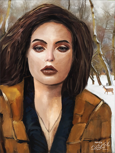
My AI Generated selfie has found herself surrounded by snow and wildlife creatures in her own winter wonderland. For this image I wanted more of a painterly effect, so mainly painted with Kyle’s Thinner Oil brush from his Winter 2024 set. Since I have covered just about everything I do with my selfies, I will only add a couple new tips. First off, on this image an Airbrush set to Opacity 100%, but Flow at only 18% was selected – softens a lot of the hard edges that the Thinner Oil brush left on her skin. Can use any brush tip for this brush (set Size Jitter Control to Pen Pressure, Transfer Opacity Jitter to 92% and Control to Pen Pressure, and Build-up and Smoothing checked on). The other tip I thought I would mention is that it helps a lot to do some screen shots of faces that have make up applied and would look good on AI the face. If you have used the AI Generative command at all, you know there are always bad variations created. Many of them are created and deleted to get something as nice as this variation, and then it can take several hours to get the painterly effect wanted, as in this case. The background was created by selecting the Selfie and inverting the selection, then in the Generative Fill prompt type “digital oil painting of wintry park scene.” The deer was taken from a different variation in the group (just used the old Apply Image Trick; selected the deer and copied it onto its own layer, and then moved into this image – see my Fun Photoshop Blog Placing Any Photoshop Generative Fill Variation on a Layer Easily). The other brushes used were the Painterly Smudge Brush and the 36% Blender for face from Grut’s watercolor Late Never brush. For settings on these brushes, see the bottom of my Fun Photoshop Blog A Few Selfie AI Tricks.) Hope you enjoy her!…..Digital Lady Syd
Will keep this short! On my original Selfie image, first ran Dave Kelly’s AI action at 70%. Then used the Quick Selection Tool to select just the background and hair from the whole selection created by Dave’s action. Last step was to invert selection to run Generative Fill Prompt: Digital oil paint glamor look. Chose a variation and selected the resulting layer mask. On Generative Fill panel clicked the Invert Selection so background and hair were selected and ran Generative Fill again with this prompt: Digital Oil painting with fancy hair and wintry background. From these results, created a stamped layer and duplicated it as a New Document with just this layer (right click on layer and choose Duplicate Layer – then in Document drop-down select New). This was the starting point of this image and how I usually work with these AI results. From here created different layers on top and painted over the face, hair, coat and background. Used these brushes – Kyle T. Webster’s Winter 2024 set Thinner Oil (see Skiing Selfie blog for settings used with it – definitely a New Favorite for painting especially skin) and Right Angled for the background, his Summer 2018 Ocean Brush (for hair), and Fay Sirkis’s Short Streaky Detail Blender (not sure it is still available anymore), but any small detail mixer brush would probably work for the little edges of the hair. Used Viveva to pull the whole look together….Digital Lady Syd
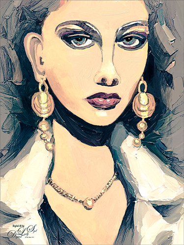
Just playing with another selfie that came from the Generative Fill variations in Photoshop 2024. Original prompt for image was “Oil Painting of beautiful woman with larger gold loop earrings and a white coat.” I was not sure if I liked the original crop but decided it added a modern art feel to it so it was kept. Used Escape Motions Rebelle 7 to metallic paint for the jewelry – cool new feature in this program. This image was so cleaned up it looked sterile. Therefore I took a stamped layer into Anthropics Smart Editor and added a Line Drawing effect to it which turned the layer black and white. It looked nice so the layer was set to Screen blend mode at 44% opacity. Then took another stamped layer into OnOne Effects 2023 where the Honky Tonk filter was applied which give it a bit of poster look. Used some new brushes from Kyle T. Webster: a new Winter 2024 brushes called Staccatto Ink for some edge lines, and Ocean Brush from the Summer 2018 set for painting- both are nice brushes to experiment using. Otherwise just the same process as before. Love these ladies!…..Digital Lady Syd
Flipped my selfie to give a little different look here. The selfie bathing suit was generated in Photoshop using the prompt “digital oil painting bathing suit.” This time, the background was generated in Adobe Firefly using the prompt “digital oil painting ocean beach scene with people in the background” and using the styles of Art and Acrylic paint. It was saved as a jpg and brought into the selfie file as a layer underneath her. The selfie blocks the people that were on the beach. The red palm tree over her head was generated in Photoshop afterwards. By using Apply Image and using a layer mask, it could be added to the Firefly layer. Otherwise it was just the usual brushes. Wish I was in this scene!…..Digital Lady Syd
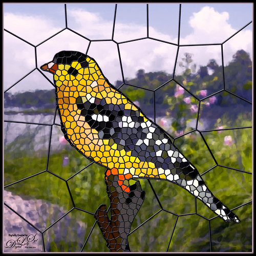
Had fun creating a different type of image. I found a video from Marty at Blue Lightning called How to Transform Photos into Stained Glass Windows in Photoshop! Marty has been doing PS videos for a long time and has some really nice ones. This video has a lot of steps but overall it is pretty easy. The main filter used was PS’s Filter Gallery-Stained Glass filter in the Texture group. I did need to add some clean up layers underneath the stained glass layer where some of the colors were off. Also had to adjust the layer styles to fit the resolution of my image so the stained glass leading looked right. The bird is one I drew (see my Tidbits American Goldfinch blog for how this was done) – just used the drawn bird and not my original background. This background is from a photo taken of the Halifax River (International Coastal Waterway or ICW) in Ormond Beach, Florida (see my Fun Photoshop Painting Effects – Which Ones to Use? blog that used this photo.) PS’s Filter Gallery-Glass filter in the Distort group was used on it. Overall just enjoyed trying a new effect. …..Digital Lady Syd
Another one of my selfie AI-generated portraits – this time put me in a skiing background scene using the Generative Fill prompt “Oil Painting of Ski Slopes in Background” – it took several variations and had to use one background with trees and one with the skiers which was reduced in size and moved. Used the same generating process that I discussed in the last several blogs (see blog links below). Parts of the coat had splashy colors which I did not like. I found a great brush that covers without being too heavy with the paint in Kyle T. Webster’s new Winter 2024 set called Thinner Oil (this set is free to download with Adobe Photoshop subscription members – just go to the Brush Panel upper right hamburger icon’s drop down and click Get More Brushes – it is at the top). The brush Size was changed to 25 pixels and in the Dual Brush section changed the Size to 17 pixels – then saved the brush to use for painting. On a New Layer the snow was painted in using Snow Large & Heavy-use Motion Blur -70/33 brush, one of the 9 nice brushes of Serge Ramelli’s that he gives away in his How to Create Snow in Photoshop CC tutorial from several years ago. I like how the snow can be placed exactly where I want it and removed in a layer mask off parts of the face. Also added my Snow Overlay slight blur png – a black layer mask was added (ALT+click in added white layer mask) and just painted back in the smaller sized snow into the trees on the right and on the brown distant trees. To get the skin tone right, used a Gradient Fill Adjustment Layer set to Linear and white to gold to clear gradient. Added a layer mask to remove from the gold from the trees. Could go on and on – it does take a while. Each time I do one, I learn something else. Lots of fun…..Digital Lady Syd
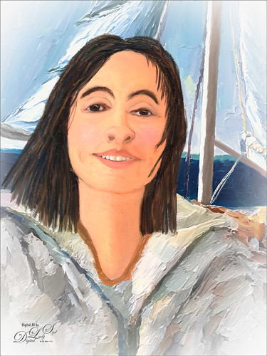
Just having more fun creating the crazy images from my selfie (about the only one I have actually). Use the same settings as for the previous sailing selfie by creating two versions of the image. One using 55% Brightness in the HSB settings for the subject, and the other using 65% Brightness setting for the background. On subject layer, the subject was selected by using the Quick Selection Tool before running the Generative Fill with prompt Oil Painting. On the Background layer, used the Quick Selection Tool to select the background and in Generative Fill the prompt read Oil Painting Lake Background. Created image layers using the Apply Image command (see my Placing any Photoshop Generative Fill Variation on a Layer Easily blog on how to do this) and then used a layer mask to hide my original image from the background layer. The sunglasses were selected and Generative Fill was used to add in the eyes – prompt Oil Paintng Eyes (and Apply Image also used.) Then painted on several separate layers to clean up. This time Mixers were used mainly. The birds are in a set by Wavenwater. Skylum’s Neo was used to add more tone into the image. Last step was a Black and White Adjustment Layer to adjust the colors just right. Can’t believe how many different looks you can get doing this!…..Digital Lady Syd
Just a quick blog here to show you how to get more of a realistic AI result as your subject, me in this case, and get a nice interesting background. The original is still the one of me in the car from the other pictures, except this time used both the 65% Brightness for one image, and 55% Brightness for the HSB setting for another image. By stacking the two Apply Images (see my blog Placing Any Photoshop Generative Fill Variation on a Layer Easily) from each Generative Fill layer, I was able to use a layer mask leaving the coat from the 65% layer and painting in the face from the 55% layer. Used an “Oil Painting” prompt for both layers. Created a stamped layer on top and selected the Subject in the Contextual Task Bar, which once the subject is selected turns into the Generative Fill command – must click the inverse icon to run Generative Fill to select the background. In this case the prompt was “Oil Painting small sailboat background” – it did not turn out great – no sails, just the sailboat lines. So had to select certain areas and run Gen Fill two more times for the white sails. Then lots of clean up layers which is what it often takes with the PS AI generation. Also lots of painting layers – had to use my nose, mouth and eyes from the original again – PS just is not doing that great a job with face details in my opinion. (See my blog Being One with Nature on how to do this.) And the Liquify filter and Luminar’s Neo filter were used. This may be the closest I can get to my selfie – hmmm…..Digital Lady Syd
Check out JPEG to RAW AI stand-alone software for converting JPEGs to DNG/Tiff files for RAW post processing technology. Subtle but wonderful and works great with phone images!
Topaz A.I. Gigapixels
Check out A.I. Gigapixel stand-alone software for upsizing your images. It’s incredible!
Luminar 4
Luminar is now available for Windows OS. Click here to visit Luminar for more info and check out their new AI Filters.
Please note that I do make a very small commission on purchases made if you click through to the websites using the links above – it helps me keep my site going. Thanks for clicking.