Anything Photoshop or Photography

Latest

Adobe Camera Raw – Not So Obvious in Photoshop Elements 10


Accessing Adobe Camera Raw (ACR) in Photoshop Elements is not that obvious. I decided to write a quick post here on how to accomplish this without too much stress and show the results you can get with just a few adjustments to the sliders. Usually you use ACR for processing RAW files, but a JPG can also be opened up in ACR following the same steps.

To access ACR in Elements, first go to File -> Open As and click on the drop down arrow on the left of the bottom box that by default shows Photoshop (*PSD, *PDD) where a long list of file formats is displayed. Select Camera Raw (with a whole bunch RAW formats listed). Now you are in the basic ACR plug-in. This dialog is composed of three panels – Basic, Detail and Camera Calibration. There is a Straightening Tool and Crop Tool at top of dialog that should be used now if image needs to be straightened or cropped.

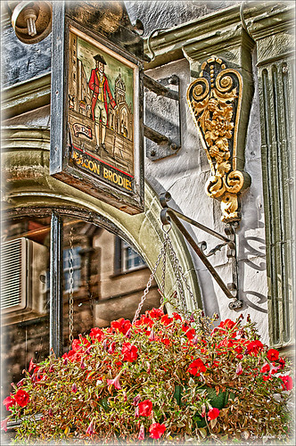
When I work in Camera Raw, I use the histogram as a basic guide for enhancing an image. Watch the edges and move the sliders so that the ends just touch the sides on both ends. Below is my workflow for processing an image before taking it into Photoshop Elements.

BASIC Panel:

White Balance drop-down – Click on the eyedropper icon on top and run over areas that are of a neutral gray content – the RGB numbers will show under the left side of the histogram. When numbers are all pretty close in range, click on that place in image to adjust color cast. (Usually never touch this unless there is an obvious color cast in the image.)

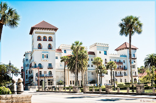
Exposure slider – slowly move the slider until the white line stretches to the right edge of the histogram. (For this image, exposure slider was set to -0.35)

Blacks slider – slowly move the slider left until the white line stretches to the left edge of the histogram. (Blacks slider set to 0)

Recovery slider – move right until you get a pleasing look to the colors. It darkens the the brightest areas. (Recovery set to 99 – usually I do not use this much, but the histogram required it.)

Fill Light slider – this slider may not need to be moved at all – each image is different so give it a try. It opens up detail in the shadow areas.  (This slider was left to 0.)

Temperature and Tint – these are not moved much if at all – use if you think there is a color cast in the image. Add a little yellow if the image seems too cool and you want to warm up the feel of the image. (In this case, the Temp slider was set to 7150 and the Tine was set to +4.)

Brightness slider – do not use this slider too much – it can tend to wash out colors. (Set to +53)

Contrast slider – don’t overdo using this but it can make an image pop. (Set to +63)

Clarity slider – add some but not more than +75 to add a bit of sharpness to the image but watch out for haloing if too much is used. I always use this slider. (Set to +63)

Vibrance slider – use if the colors need to pop just a bit more – it makes the colors that are not so bright a little more colorful. (Set to +28)

Saturation slider – usually do this adjustment in Photoshop.

DETAIL Panel:

Sharpening Section – I use this at the default – Amount 25%; Radius 1.0; Detail 25; and Masking 0. If noise in image, set Amount to 0 and do localized sharpening in Photoshop using the Sharpen Tool. (The default was used on this image.)

Noise Reduction Section – Use if any noise is apparent in the image – look at the image at 100% to find it. (Did not use on this image as there was no noise but I do not hesitate to use it if any is present.)

The Luminance slider can be very helpful in keeping the noise under control but you must find it at this early point in the image adjustment since you cannot come back into Camera Raw in Elements to fix.

Color slider – you may not need it if no color pixels in the dark areas.

CAMERA CALIBRATION Panel:

Adobe Standard is the default. In the drop-down, try some of the other choices. Camera Vivid gives some really bright colors. (For this bright colorful image, Camera Vivid was used.)

Click Open Image button and it now opens into the Editing Screen in Elements.

There is a lot of information on how to do this but once you get a workflow you are comfortable using, the image can be adjusted very quickly and results are definitely worth it.

Hope this workflow helps when trying to sort through the sliders.  Have fun experimenting…..Digital Lady Syd

PS:  This same workflow is a great starting point for ACR in CS5 – do open as a Smart Object so you can get back to the settings if needed.

Defringe that Nasty Blue Edge from Trees On a Bright Blue Sky!

This is a short but sweet way to get rid of most of those blue and cyan edges on trees shot in bright light against a blue sky. There are just times you have to take that image in the bright light of day and the fringe occurs frequently. These tips also work when you have a horizon line in a landscape shot that has similar issues.

Hue/Saturation Adjustment Layer: The image above has that very problem and this method was used to get rid of most of the fringe. Hover the above image to see the before defringing image.

1.  Simply add a Hue/Sat Adjustment Layer in Photoshop and in the Master field drop-down, adjust the Saturation slider left quite a bit and possibly the Hue slider a little until the blue edging disappears. For the above both Blue (Saturation set to -50 and Hue set to -8) and Cyan (Saturation set to -64).

2. Then Fill the attached adjustment layer mask with black (click on mask and CTRL+Backspace).

3. Click on the black layer mask and use a white brush to paint around the edges at roughly 40% opacity to remove the fringe color. You may have to go over it a couple of times but it will look more natural than setting the brush to 100% and painting over just once. You may need to adjust the opacity of the brush down more so the desaturation is not so noticeable.

Sponge Tool Method:  Perhaps the easiest way to get rid of any extra fringe that might still be lurking in the image is to select the Sponge Tool and set it to Mode Desaturate.  Turn off Vibrance in the Options Bar since that will only work on the more or less saturated colors and not the already saturated colors which we want to get rid of. Brushed over the fringe areas but try not to discolor too much of the neighboring sky also – it will look white and not the natural blue sky color.

Camera Raw Method:  Open image in Lightroom or ACR and go to the Lens Correction Panel Manual Tab in the Chromatic Aberration section, set the Defringe to All Edges and adjust the Red/Cyan slider to the left and Blue/Yellow slider to the right to get the best result. This may take a bit of adjusting to get the right balance and watch out for any color shifts in the sky area around the leaves. There is no way to use a Saturation Adjustment Brush effectively to paint out the fringe as it does not have the choice of colors to remove – it desaturates everything you paint over – and it is hard to just pinpoint the fringe.

Saturation Layer: Digital Lady Syd’s Favorite way to eliminate a slight fringe edge is with a tip I presented a while back in a Tidbits Blog called “Selective Desaturation – the Easy Way!” This is a very simple technique – simply add a New Layer on top of your image and set the blend mode to Saturation, select the Brush Tool, set color to black (white or gray will also work) and 15% opacity in the Options Bar. Paint over the area you want to desaturate several times until you get the look you are after. If too much desaturation occurs, add a layer mask back and use a black brush to paint back any areas that you did not mean to desaturate. I think this gives as good a result as the first method so give it a try if you do not like the results using any of the other methods. I would post the image again but it is very similar to after image above.

Here are four options to try:  Bottom line, try it and if you don’t like the results, don’t use it and try something else!

The final thought is a great quote I found from TWCDM’s Blog: “While these tricks are fine and dandy the best way to fix purple fringing to is avoid it in the first place. You can prevent purple fringing by using high quality lenses, stopping down your lens (shooting at an aperature of f8-f22), and if you are using a zoom lens avoid using the maximum and minimum focal range. A lenses “sweet spot” is usually somewhere in the middle focal lengths.” If you shoot it right to begin with you will not have this problem. (That apparently is my problem – hum!)

Hope these tips help you on those bright outdoor daytime images…..Digital Lady Syd

Black and White Photo or Not? Give It a Try on That Difficult Image

This image is of the beautiful cut glass display at the Lightner Museum located in the old Alcazar Hotel in St. Augustine. As you can see it is a very nice collection and I wanted to find out if the color in the image was distracting from actually seeing the ornate cut glass. See the black and white conversion by hovering over the color image. As I discovered, this image turned out to be a difficult choice to process no matter which effect you want.

Color Version

The top image was processed using the NIK Color Efex Pro 4 (CEP4) plug-in on a Smart Object layer (right click image and select “Convert to a Smart Object” since CEP4 will keep your settings and control points in case you want to adjust the results later) and stacking several filters including from top to bottom: Tonal Contrast, Darker/Lighten Center, Vignette, Glamour Glow, and Pro Contrast. Various control points were added to selectively choose areas for some of these effects. In Photoshop the cut glass edges were selectively sharpened using the Sharpen Tool on it own layer, and a final Curves Adjustment layer was added to get the correct contrast. Overall, this image is attractive since the blue-green sets off the glassware nicely.

Since there are some bright colors in the background that might be distracting from the main focus point, and the museum walls and columns have what I consider to be a rather bland creamy color to it, a black and white conversion might be appropriate to tone down some of the distraction and get rid of the creamy tones.

Black and White Version

I duplicated the cleaned up image layer and turned it into a Smart Object as above. Once in the NIK silver Efex Pro 2 (SEP2} plug-in, from the side preset panel the o14 Grad ND (EV -2) preset was selected and it really made the glass pop out clearly.  In Photoshop the Sharpen Tool was used to bring out some of the glass edges (again, do this on a New Layer above the image) and the opacity of this layer is reduced so artifacts are not viewed. A final Adjustment Curve is added to give just the right amount of contrast. The items on the back wall initially appear to be more distracting than in the color image but the creamy tones did convert to the white tones nicely.

 Conclusion

The image may not work as a black and white and the only way to figure this out is to try it. In this case SEP2 was used to convert the image to black and white, but the conversion can be done in lots of ways – in Adobe Camera Raw or Lightroom using a preset, or in Photoshop using a Black and White Adjustment Layer or Channels, as just a couple examples. NIK’s SEP2 is an excellent way to find out quickly since the presets allow you to glance over many black and white variations – if the image is really not going to look good as a black and white, you will know it.!

I am on the fence about which version I like best. The image was not the best choice to process to begin with and the glass creates a huge challenge just to get enough contrast to make the it stand out. Still it was good practice and I like the picture because I liked the cut glass collection. Just remember sometimes the image you want to process is not that great and does not work – but at least try a couple different effects including black and white and maybe there is a good shot hidden in there!…..Digital Lady Syd

Related Digital Lady Syd Blogs:
NIK’s Champion Plug-in – Silver Efex Pro 2
Topaz B&W Effects vs. Nik’s Silver Efex Pro
Topaz B&W Effects Plug-In – A Real Winner!

Elements & CS5 Friday: Adding a Texture for a Totally New Look to an Image

Friday blogs are going to be for Adobe Photoshop Elements along with some techniques crossing over with Adobe Photoshop CS5. I realize there is a huge group of digital fanatics out there using the quite capable little sister to CS5. So let’s start.

Unfortunately these beautiful trees are in a very run-down part of the city and located in front of a parking garage. I guess my point is that just because something is not in a gorgeous settng, it can make a really nice image with just a little effort. Hover over the image to see what the original image looked like.

To achieve this nice effect, all that was done is to add an interesting texture image as a layer on top of your basic picture. In this case, a really grungy looking texture creates this wonderful effect on the building and in the tree colors. This free texture is from Shadowhouse Creations and is called You’d Be Surprised – download it here. This is one of the best texture sites I have found on the internet – beautiful textures all for free!

Here are the steps required to create this look:

1. Open your image in Photoshop Elements (or CS5).

2. Clean up any areas that need to be touched up using the Clone Stamp Tool or Content Aware Healing Brush.

3.  Go to File -> Open and navigate to the downloaded texture, in this case You’d Be Surprised, to open in Elements (or CS5) as a separate image.

4.  Select image (CTRL + A), copy (CTRL + C) and then go to the original image and paste (CTRL +V) into the file which now puts the new image on top of your image.  Close the texture image without saving.

5.  Since the texture is probably too small to cover your image, we will use a Free Transform (CTRL+T) to expand the image – just drag the corners out to completely cover the original layer underneath.

6.  Change the texture layer to Overlay Blend Mode at the top of the Layers Panel (click on down arrow to the right of Normal).

7.  (Optional Step) If certain areas would look better without the texture, highlight this layer and click the Add a Mask icon (2nd icon over from left at bottom of the Layers Panel). This adds a white layer mask – click on it in the Layers Panel and paint with a black soft brush set to 50% opacity. Paint into areas you do not want the texture affecting.

For this image, the lamppost and light were painted out in black along with a little bit of the red leaves in the trees to increase the color range in the leaves, and some of the dark green bushes to add some lighter highlights for interest.

8.  (Optional Step) To sharpen parts of the image to make certain areas stand out, click on the Create a New Layer icon (1st icon at the bottom of the Layers Panel and 6th icon from left for CS5). Select the Sharpen Tool (it is nested with the Blur Tool and Smudge Tool – 3rd icon from the bottom on the Tool Bar or 11 from bottom for CS5) and leave the top options set to the default settings except check Sample All Layers. On this new layer, with a soft edged brush paint over the objects you want to sharpen – since the brush is set to a default Strength of 50%, go over the object a few times to build up a really sharp effect. Watch out for artifacts if too much is applied. The nice thing is, since this sharpening is on its own layer, it can be deleted and started over or the opacity can be reduced if too much is added.

In the image above, just the lamppost and light and a few of the top red and yellow leaves were sharpened.

You are done! And this texture creates a very beautiful look. Look at some of the other images Shadowhouse Creations used with this texture at the download site link above.

Well I hope you enjoyed this blog – I did. I love working with textures and this workflow can be used over and over again to achieve some beautiful results using any texture. Have Fun Creating!…..Digital Lady Syd

Little Nighttime Fun from Topaz!


Just listened to another interesting video from Topaz Labs on “Creating Striking Night Images.” If you are using or trying any of their Photoshop plug-ins, Topaz always has some interesting videos for creative uses at their Topaz Lab site. I followed the referenced video steps for processing this nighttime image taken on the Las Vegas Strip of Margaritaville. The video suggests that you first use their DeNoise Filter (this image did not require it), Topaz Adjust where they suggest using the Photo Pop preset was used with Shadow slider setting changed to 0, contrast slider moved left a little, and checking Process details independent of exposure box; and finally Topaz Lens Effects using the Single Tone – Hint of Blue Light and then adding some yellow cast to the mix. (See sidebar to get to Topaz’s site to download trials of these products.) The video also discussed taking long exposure nighttime photos. Since this was not a true long exposure night image, I used my Rick Sammon Spicify Soft Artsy preset using settings from the Topaz video “Rick Sammon’s Top Topaz Tricks, Tips and Techniques.” An OnOne PhotoFrame was added to finish off the look.

This image was a lot of fun to work on and pretty easy to do! I am looking forward to trying this processing technique on a serious nighttime image. Give this video a listen if you want some great nighttime tips…..Digital Lady Syd

Where Am I?

The above image was processed using the my regular Vivid Drawing Look Lightroom preset and my HDR Recipe for NIK Color Efex Pro 4. (See Fun Photoshop Blog “Pseudo HDR in NIK Color Efex Pro 4” and “Settings for Vivid Drawing Look ACR and Lightroom Preset and NIK Color Efex Pro 4 Pseudo HDR Recipe.”) The pseudo HDR treatment worked very well since the lighting was all over the place.

This is one of the most unusual places I have ever seen – it is in St. Augustine, Florida, and used to be part of the Hotel Alcazar, a Henry Flagler hotel opened in 1887, that was built across the street from the more famous and elegant Ponce de Leon Hotel (now Flagler College). This old hotel currently houses the City Hall, several businesses and shops, and the Lightner Museum. The above image is of the Cafe Alcazar that is located on the floor of the old hotel’s Casino Swimming Pool and gets very good food reviews. The top balcony level is the Old Ballroom that runs around the edge of the hotel and in the warm evenings, the roof was removed to see the night sky for the dancers.

This image shows how the Casino Swimming Pool looked in a by photo by William Henry Jackson in 1889 and is from Shorpy Historical Photo Archive site, a really interesting blog on old images. The water stayed at a steady 80 degrees because it was spring fed but it smelled like rotten eggs due to the sulfur in the water. The pool was 120 feet long and 50 feet wide and was from 3.5 feet to 6 feet deep. The National Women’s Swimming Championship was held here in 1925, and there was evening “pool entertainment” such as high diving, trapeze shows, water polo and swim racing.

To see this restaurant view, you need to pay to enter the Lightner Museum, that contains a very nice collection of paintings, glassware, and other collectibles – mostly from the Victorian era along with the views of the ballroom and pool area. Also there is a Russian steamroom that patrons used when it was still a hotel. Very interesting place to visit and definitely worth the small amount to enter. Check it out if you are in the area!…..Digital Lady Syd

Loving Both Filters!

The above image is one of the beautiful Lion Posts outside Flagler College in St. Augustine, Florida, which used to be the Ponce de Leon Hotel built in 1887. Absolutely beautiful building. Cannot miss it if you go to this wonderful historic city.

Wow – all I can say is that I cannot decide which program I like best – NIK Color Efex 4 or Topaz Black and White Effects. So different and so much alike! I keep trying the same image in each program and get totally different looks but both are really nice! What to do, what to do!

The top image was processed with NIK Color Efex Pro 4 using the Film Efex: Vintage filter on Film Type 14; Detail Extractor filter; and Brilliance/Warmth filter. I used the Sharpening Tool in Photoshop to sharpen the eyes and mane of the Lion. Then Grunge 03 OnOne PhotoFrame was applied in a dark navy. I loved how it became very artsy and colorful. And the background detail is incredible!

Topaz Black and White Effect produced a very different feel that can be seen by hovering over the image. Same exact image from Lightroom except this time I wanted to see what how this image would look as a black and white. I used the new Platinum Collection – Platinum VI as a starting point. What really improved this image was using the Local Adjustment Dodge brush and Detail brush on the shadows in the face and the lamp. This really brought the eyes out very clearly. Using the Color brush, the lights was added back into the lamp. A black border, dark edge exposure, and dark vignette was added. In Photoshop the Sharpen Tool was used on the eyes a little more and the mane. Overall a very different feel to the same image.

I really love both filters and I do not believe I can recommend one over the other. Both totally great. Give the trials a try and see what you think!…..Digital Lady Syd

Related Digital Lady Syd Blog Links:
Topaz B&W Effects Plug-in – A Real Winner!
NIK Color Efex Pro 4.0 – First Try!
The New Film Efex-Vintage Filter from NIK CEP 4
Quad Tones in Topaz Black and White Effects Plug-in
Sunny Preset for Topaz Black and White Effects
NIK Color Efex Pro 4 – Digital Lady Syd’s Review!
The Art Corner: Painting and Sculpture by Tassaert
Pseudo HDR Using NIK Color Efex Pro 4

Spooky Halloween Fun!

A little Halloween fun here. Basically using the Halloween brushes I listed in my “Halloween Resources – Time to Go Batty!” blog of a few days ago. The same two sets of Halloween brushes were used (Obsidian Dawn’s Halloween Vector Photoshop brushes and Halloween Brush Set by anodyne at Deviant Art), the orange sky was Obsidian Dawn’s Clouds 16 and 17, the beige background texture is from ShadowHouse Creation – Assorted Paper TS-P-6, my favorite font Fantaisie Artistique font, and a grunge background (acid burn controlled 11) from OnOne PhotoFrames (see sidebar for link to OnOne Software website) was used. Some background grunge was added and that is about it.

It is pretty easy to get a nice effect – just use lots of layer masks and brushes – it really is fun to put it all together.

Hope everyone has a great Halloween! …… Digital Lady Syd

Settings for Vivid Drawing Look ACR/Lightroom Preset and NIK Color Efex Pro 4 Pseudo HDR Recipe

The image is from The Royal Mile in Edinburgh, Scotland. Deacon Bodie has a very colorful history and this sign locates a pub named in his honor.

The above image used SJ-Vivid Drawing Look preset as a starting point in Adobe Camera Raw (note: change file extension to .xmp in zip folder to get file to work) and Lightroom. In my Fun Photoshop Blog “Pseudo HDR Using NIK Color Efex Pro 4“, I created a recipe for NIK Color Efex Pro called SJ-Pseudo HDR1. This recipe was applied without any changes to it. Back in Photoshop a Curves Adjustment Layer was added, and a High Pass Filter (radius 9.1) applied to a duplicate layer (set to Soft Blend Mode) was used to sharpen the image. That is it. Hoover over the image to see how it looks with just the Vivid Drawing Look preset applied.

Settings for Presets

For those of you who do not like to download files or might want to tweak what I have created, here are the settings for my favorite HDR feel ACR and Lightroom preset. Also the recipe I put together for NIK Color Efex Pro4 has been provided.

SJ Vivid Drawing Look settings: To make this preset in either Lightroom Develop Panel or Adobe Camera Raw, use these settings: Basic section: Exposure -o.32, Recovery +38, Fill Light +72, Blacks +12, Brightness +52, Contrast +55, Clarity +54, Vibrance 0 and Saturation 0; Tone Curve section: Highlights -30, Lights +16, Darks +23, Shadows -23, and Point Curve Linear; Split Toning Section: Highlights – Hue 50, Saturation 11, Balance 0, Shadows – Hue 50, and Saturation 34; Sharpening section: Amount 48, Radius 1.0, Detail 35, and Masking 69; Noise Reduction section: Luminance 82, Detail 95, Contrast 44, Color 20, and Detail 50; and Post-Crop Vignetting section: Style – Highlight Priority, Amount -18; Midpoint +47, Roundness 0; Feather +57, and Highlights 0.

SJ Pseudo HDR 1:  To make this recipe, the filters and settings are as follows: Tonal Contrast (Highlights -37%; Midtones -30%; Shadows -12%; Saturation +5%; Contrast Type set to Standard; and Shadows +58%; Darken/Lighten Center (Use#2 for lighten area; Center Luminosity -10%; Border Luminosity -64%; and Center Size +30%; Place Center in image); and Detail Extractor (Detail Extractor +69%; Contrast +56%; Saturation +16%; Effect Radius – Fine; and Shadows +14%.

I hope you put these presets to good use. I think they are both good starting points to creating that great pseudo HDR effect. Have fun. Have trying these out…..Digital Lady Syd

Save

Halloween Resources – Time To Go Batty!

Not sure how everyone elses kids are or were, but I think mine liked Halloween as much as Christmas! So to kick off this (at least 2nd biggest) holiday season, I created the above image.

Only a few resources were used and they are provided free for our use. All the objects were from Obsidian Dawn’s SS-Halloween-Vectors brushes (and include a lot more than what is used above) and are definitely of the high quality you expect from this site. The cobweb in the upper right corner was provided from a nice set of brushes called pureanodyne_halloween at Deviant Art – these are actually from a set created in 2004. The Happy Halloween font is called Groovy Ghosties and can be downloaded from DaFont.com. And my signature font is my favorite fun font – Fantaisie Artistique from DaFont. The white cracks and grungy textures are from OnOne PhotoFrames (see sidebar for link to site) called Taufer Texture 01 and Grunge 05. Now this effect could very easily be done in Photoshop using a few creative brushes on a couple layers, but the plug-in was really fast and I could experiment with different colors and textures very quickly. I guess that is the main reason why you buy Photoshop plug-ins – they all have to be based on some form of Photoshop technique.

Try out a few of these Halloween brushes – they do a really nice job for this time of year!  Have fun experimenting and look out for low flying bats!…..Digital Lady Syd