Anything Photoshop or Photography

Latest

Calendar Template for 2012


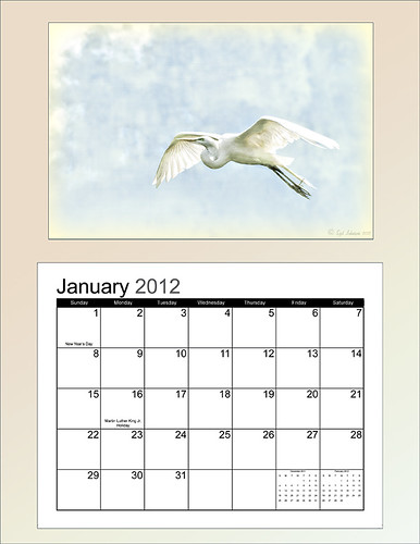
Above is another example of using the calendar template I created last year – the instructions are very easy to follow. Link over to my “Free Calendar Template” blog to download my calendar template and the calendar pdf file, and follow the easy steps. It prints out on an 8 1/2 inch X 11 inch sheet. (On Friday I will post how to do this in Elements – the same process except for copying the layer mask which is a copy and paste effort.)

For this calendar, I added a light colored gradient background instead of using a solid color. This was done by adding a New Layer on top and selecting the Gradient Tool. In the Options Bar, select your gradient, in this case it was from Muted Gradients Graphix1 – Muted 8, click first icon Linear, use Normal Mode at 100% opacity with Dither and Transparency checked.  Copy the Layer Mask from the Color Fill 2 layer by clicking on the layer mask and ALT + Drag up to the top gradient layer. The bird image was taken at the St. Augustine Alligator Farm Zoological Park’s Rookery, one of the best places to take pictures of birds in the Spring, and a texture from Ash was used (not sure they are available anymore, but click on the Textures category on right to find many more wonderful texture sites). A 3 stroke gray line was added around the inside and outside of the template by adding a Layer Style to the top gradient layer.

This calendar template makes for a great present. It can also give you a chance to show off your latest artistic endeavor. Give it a try!…..Digital Lady Syd

Digital Lady Syd Related Blogs:
Free Calendar Template
Free Calendar Template for Use with Elements
Create Calendar Photoshop Templates
Colorful Blown Out Look Lightroom and Adobe Camera Raw Preset

Digital Lady Syd’s Free Christmas Card Template Using Photoshop Elements


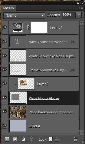
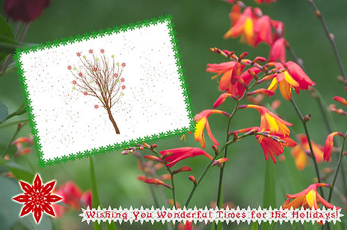
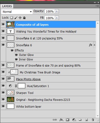
This template was processed completely in Photoshop Elements. Same steps as with the regular Photoshop program. Open up your other image(s), CTRL+A to select the whole image, and CTRL+C to copy the image. (These are both images I took last Christmas.) Switch to the template file, highlight the layer(s) that indicates where the photo(s) should be placed, and press CTRL+V to place the image above that layer. Then use the Move  Tool to scale, rotate, and move the image(s) to place it. The Background Image layer was changed to 73% opacity. That’s it.  Below is an image of the layers as they appear in the finished image above.


Note the Text Layer has a 1 pixel Stroke layer style set to Black and Outside. The Frame Layer has an Outer Glow layer style set to Blend Mode Screen at 75% opacity and Size 16 pixels to make the frame stand out a little. To find the Layer Styles in Elements, highlight your layer to add effect to, go to Menu -> Layer -> Layer Style -> Style Settings.  I painted a little beige color over the white flakes to make the lettering stand out better. The white snowflakes and frame snowflakes brushes are Design by Firgs Snowflake Brush 6. (Firg’s Snowflake Shape Pack is not free but now are for sale.  To try a different option download Obsidian Dawn’s free Snowflakes Photoshop Custom Shapes.)Font is Fantaisie Artistique – if you do not have it on your computer, your computer will substitute a different font or you can download it (right click on it after downloading to add to font list) and it will appear correct.

****DOWNLOAD LINK TO MY BASIC HOLIDAY CARD TEMPLATE****

This is pretty simple and you should be able to get lots of different looks. See my blog for other examples on how to use this template. Have a good time and enjoy!…..Digital Lady Syd

Digital Lady Syd’s Related Blogs:
Digital Lady Syd’s Free Christmas Card Template
Free Christmas Card Templates-Part 2
Free Christmas Card Vectors and Brushes
Some Holiday Cheer

Digital Lady Syd’s Free Christmas Card Template


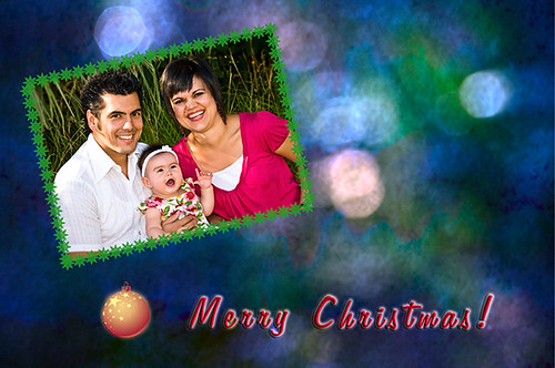
I have been wanting to create a versatile card template that could easily be used with your own images and background. Here is what I have come up with for a basic template for any kind of card. (Download at bottom.) It is set to 8 1/2 inches X 5 1/2 inches, one of the standard sizes for cards (and fits an 8 1/2 inch X 11 inch sheet). On the above image, the kids picture is one of mine that I scanned – it turned out pretty nice considering how old it is. The beautiful bokeh-like background is from ibJennyjenny Magical textures set 3, texture 3 with a Hue/Saturation Adjustment layer added to make color more greenish. I love the Christmas Toy Train font (look at the text file to learn how to use it if you download it) – it replaced the Fantaisie Artistique font in the template.

The file below is exactly how the card should look when using the downloaded template (with my images added). The one above has the “Place Your Photo Above” layer and the “Frame Snowflake 6…” layers turned 90 degrees.  This is where the flexibility is – almost all elements can be swapped out and changed and you still have the basic template to follow.


To help you understand how to use the layers, below is a copy of the Layers Panel for the downloaded Basic Template and on the right is the Layers Panel for the image above to show you how it was created.

The type font can be easily changed by highlighting the type layer and double-clicking on the T icon to activate the editing mode for the layer. (The template and the above photo both use my favorite free font Fantaisie Artistique – when you open the  template, if you do not have this font on your computer, one from your hard drive will be substituted or download this one, right click on the file and load to your computer.) Layer styles can be added to all the layers, like the Snowflake 6 brush (from Design by Firg’s Snowflake Shape Pack) layer with the White Inner Glow and Outer Glow.  Firg’s Snowflake Shape Pack is not free but now are for sale.  To try a different option download Obsidian Dawn’s free Snowflakes Photoshop Custom Shapes. All the snowflakes used in this image are the same brush. Need to give credit to the people who create these wonderful free resources on the internet: the tree image was created using a Winter Tree brush by Mels Brushes, Gorjuss Snowflake brushes for tree branches, and Snow Drops brush by FROSTBO for the pretty colored small snowflakes.
……

This image uses exactly the same template with a generic free family image (downloaded from stock.xchng). The Bitstream font is Freehand 575 BT. The same background is used from ibJennyjenny Magical textures set 3, texture 3, as used as above. The ornament is from Photoshop Free Brushes Christmas Balls set – painted a yellow ball on a layer, painted it in, then changed colors and painted it in a reddish color on top to make the design show through.

****DOWNLOAD LINK TO MY BASIC HOLIDAY CARD TEMPLATE****

To create the inside page, just turn off the photo image layers, make your text larger and create a little saying. Friday I will do a short example for my Photoshop Elements friends as this template works fine for this program also  also. Have fun using the template and Happy Holidays!…..Digital Lady Syd

Digital Lady Syd’s Related Blogs:
Digital Lady Syd’s Free Christmas Card Template Using Photoshop Elements
Free Christmas Card Templates-Part 2
Free Christmas Card Vectors and Brushes
Some Holiday Cheer
Some Free Christmas Overlays to Spice Up Your Christmas Cards

Another OnOne Perfect Effects Pix – Got to Love It!

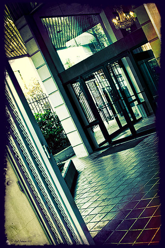
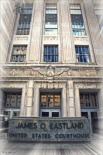
I discovered I really liked this image of an entryway into a building in Jackson, Mississippi, that was completely empty. Really sad to see such a nice space and nothing in it. Anyway, when I took the picture there was some vertical distortion (hover over image to see original) that I was not able to get rid of easily. While inside the Lens Correction Filter trying to straighten up these bowing lines, I discovered that the image looked really neat twisted – so that is how this picture started out.

The image was still a little flat so I decided to experiment some more in the updated plug-in from OnOne called Perfect Effects (see sidebar for website link). This image has three effects stacked –  in Black & White tab, Roadie filter was chosen and set to Overlay blend mode at 73%; in Movie Looks, Urban Sickness set to Color blend mode at 78%; and in Vintage, Nicely Toasted set to Darken blend mode at 100%. The layer was duplicated and rasterized (right click layer and select rasterize to get rid of smart object) and the Sponge Tool was applied to the yellow leaves in the background to color them a bit more. On a duplicate layer a High Pass filter set to 9.1 was to sharpen the image and set to Soft blend mode. A final Curves Adjustment Layer was added for contrast and OnOne.s PhotoFilter acid burn controlled frame. That is it and I love the results!

This is how I like to experiment – just try different things as you go into the various parts of Photoshop – it can be amazing what you come up with. I did not imagine this image as a diagonal, but it really does the image justice. I hope this will give you some inspiration to try this technique on some of your pictures – it can be quite interesting…..Digital Lady Syd

Digital Lady Syd’s Related Blogs:
Digital Lady Syd’s Review of OnOne Perfect Effects
Pseudo HDR in OnOne Perfect Effects
First Try – OnOne’s Perfect Effects 3

Elements or CS5: Stacking the Same Image for Effect


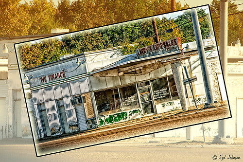
This image was created in Photoshop Elements 10 – it is of an old abandoned gas station not too far from the airport in Jackson, Mississippi. I am still figuring out this program so this was definitely just playing around and getting used to what the program can do. To create this optical illusion, follow these steps.

1. Open up image into Elements (or CS) and duplicate the layer (click OK in the dialog that opens).
2. In this case the top layer was taken into Nik Color Efex Pro 4 and an HDR preset was added to create the HDR effect. (If you have the plug-in or are using it as a trial version, my blog “Settings for Vivid Drawing Look ACR/Lightroom Preset and NIK Color Efex Pro 4 Pseudo HDR Recipe” has the preset settings you can enter manually or download already as a preset.) Any effect can be applied here.
3. After coming back into Elements (or CS), add a Layer Style was added – used an inner Glow using the default color at 114 pixels and opacity at 75%, and a black Stroke set to 18 pixels at 100% opacity. At this point the image can be transformed and rotated like the image above.
4. Next the bottom layer was highlighted and a New Layer was added below (ALT+click on the New Layer Icon) and filled with a beige color (CTRL+Backspace).
5. Set the image layer to Multiply blend mode at 88% opacity to make the bottom image much softer.
6. Go to the Adjustment Layers (third icon at bottom of Layers Palette) and select Gradient Map – the Light Brown gradient was chosen and the Layer was set to Soft Light blend mode to make image even softer.
7. Finally add a Levels Adjustment Layer to bring back a little contrast of the whole image.
8. The Sharpen Tool or Unsharp Mask filter can be added at this point if you want to sharpen the top layer image but since the Pseudo HDR preset was applied in NIK, it oversharpened the above image.
9. I created a Text Layer with my name and the copyright symbol was added using the Custom Shape Tool.

I was really pleased with the results and it gives an interesting effect. Try experimenting with the different layer combinations and see what you can get. It could turn out to be unexpectedly interesting!…..Digital Lady Syd

Pseudo HDR in OnOne Perfect Effects

Since I have tried this in other plug-ins, I thought I would give it a shot in OnOne’s new Perfect Effects plug-in (see sidebar for link to OnOne’s website) to see if I could get a similar effect. Just as I thought – no problemo!

This is a rather unremarkable image except I liked the carved eagle engraved on the building. Hover over the image to see the original. By using Perfect Effects, I was able to get that pseudo HDR effect easily. These are the effects used in this image stacked bottom to top: Black and White preset set to Roadie in Multiply Blend Mode at Strength 100; Color Enhancer (Open up Effect Options and select Color Enhancer) and Color Range Orange was chosen to bring out the Orange color by adjusting the Hue set to 37, Saturation set to 77 and Lightness set to 94 sliders; another Color Enhancer layer was added to adjust the Blue Color Range – Saturation to 92 and Lightness to -35; and another Color Enhancer layer set to Aqua Color Range – Saturation 46 and Lightness 18; next the Golden Hour Enhancer preset in the Landscape section at Strength 63; Vignette created in the Blending Options drop-down with Brightness set to -68, Midpoint 58, Feather 80 and Roundness 5 and Normal Mode; and finally Katy preset in Vintage section set to Strength 100. It sounds hard, but once done, just create a preset to recreate it anytime – very easy to apply. To finish up the image in Photoshop, on a New Layer the Sharpen Tool was used to selectively sharpen the Eagle and some of the window lines. Finally the OnOne’s PhotoFrames zoom_19 frame was applied.

NOTE:  After applying each layer preset or effects settings, be sure to click the Add button under the Strength slider to set the changes. To toggle the original and current views, press CTRL+P.

Well once again this was lots of fun and pretty easy to do. Give it a try and see if you like what you see. If you are interested in the pseudo HDR look, check some of my related posts below……Digital Lady Syd

Digital Lady Syd’s Related Blogs:
Digital Lady Syd’s Review of OnOne Perfect Effects
First Try – OnOne’s Perfect Effects 3!
Pseudo HDR Using NIK Color Efex Pro 4
Another Pseudo HDR Image with NIK CEP4 – Got to Love the Effect!
With One Good Photo – Try the Pseudo HDR Effect

Why I Love OnOne’s Perfect Layers!

OnOne’s Perfect Layers plug-in was used to add the texture to this image. It could have been done in Photoshop just as easily (and a lot of people say this), but the reasons I like Perfect Layers is that:
(1) you just have to click a button to get rid of a texture you are trying and do not like;
(2) just load a new texture to apply and add several others if you want. Much easier that placing a texture from Bridge and then going to the Layers Panel to try different blend modes.
(3) can create several virtual copies with different effects in Lightroom and bring them all into Perfect Layers as one file with lined up layers where the blend modes can be changed, textures added, and areas masked out. Major cool!
(4) even though it is not a Smart Object, when you open the PSD file in Photoshop, all the layers created in Perfect Layers are in place and reconstructed right there.

I am all for doing things faster and better and Perfect Layers does just that. I am not sure I have created a bad texturized image since getting this program. And that is why I Love Perfect Layers!

The image is of a building in Stirling, Scotland. The beautiful texture is provided free by ShadowHouse Creations and is called Oil Painting One (it has a nice short tutorial with the download that is very good also.) An OnOne PhotoFrame called acid burned controlled 05 was added and the image sampled to get a matching frame color.

Give Perfect Layers a try if you use Adobe Lightroom – can download a trial of Perfect Layers by clicking on the OnOne Perfect Photo Suite link on the side.  Until Later…..Digital Lady Syd

Digital Lady Syd’s Related Posts:
“Perfect” Perfect Layers
Clarifying Clarity! Adobe Camera Raw and Lightroom Quick Trick
New Plug-In for Lightroom

Photoshop Elements Scene Cleaner

Since I am new to Photoshop Elements, I was surprised by the accolades Elements is receiving for their PhotoMerge capabilities, especially Scene Cleaner. It is something that cannot be done nearly as easily in Photoshop CS5 but has been in Elements since version 7. (For Photoshop CS5 people, Mike Hale’s Stack Mode Panel at Russell Brown’s website does have a panel that can be added to do this very thing.)

The image above is of a street corner in St. Augustine, Florida. Both the Scene Cleaner and the Saturated Slide Show effect were applied to this image. Here is how this was done:


1. For Scene Cleaner there must be at least two shots of the same image with the moving objects in different positions. In this case, it was the guy on the bicycle that road into my view while I was photographing. If lots of tourists are in your image, you will need several shots which you probably will have anyway if you shoot in bursts like most people do, especially if using a DSLR camera. If not, remember to do this when taking a picture of a famous place with lots of people around – this technique will save your picture!

2. Open Photoshop Elements and adjust all images at once in Adobe Camera Raw, trying to get their exposures as close as possible. (See my Tidbits Blog “Adobe Camera Raw – Not So Obvious in Photoshop Elements 10” on how to do this.) Click Open Image button and open all images up into Photoshop Elements. Do the adjustments this way so you do not have a bunch of layers to merge down before doing the next step.

3. Make sure the Project Bin at bottom is open (double click on the words Project Bin to toggle between open and closed) so all three images show up in it.

4. Go to Edit tab on right and select Guided, then PhotoMerge section, and finally Scene Cleaner. The program is now aligning the images. One of the images will appear in the left image box called the Source.

5. Need to look at all your images and decide which one is exposed the best for the final image. In the bin click and drag this image into the right Final image location. In the case above, the bottom image was used as the Final image and top image was the Source image. If more images had been available, different images can be changed out as the source image by just clicking on each one in the bottom bin.

6. Select a Source image that has an area cleared of any object or tourist that is ruining the other image. Select the pencil tool and set the brush size to about 35 pixels. This is key to getting this to work – Paint roughly in the Source image in the area where you think the interfering object is in the Final image – the object magically disappears in the other Final image. It may not be a perfect removal, but it does a pretty good job!  A second image can be selected as a Source and marked up to remove other problem areas in the Final if needed. If you get lost, follow the Guide notes – they even have some advanced tips. The Show Regions box can be checked to see how each image is affecting the final result. Click Done to apply.

7. Use Crop Tool to cut away any mismatched white areas around Final image.

8. The image above still showed a bit of a hand. Therefore a Clone Layer was added and the hand blended out.

9. For the concrete shadow color issue (can see the different colors between the two images used above), the Lasso Tool was used to select the bad colored cement and it was placed on its own layer (with selection active, click CTRL+J). A Hue/Saturation Adjustment Layer was opened and the Colorize box was checked (these settings were set: Hue 210, Saturation 14, and Lightness -28) to match the cements.

10. The final step involved going to Edit -> Guided -> Saturated Slide Show Effect. It was applied 6 times to get the over-saturated look I liked.

This sounds like it was hard to do, but in reality it was really simple. The biggest issue is getting two or more shots that have different enough views to be able to remove the moving objects. Everyone says the Scene Cleaner is really a great addition and personally I wish they had it in Photoshop CS5. It has been fun learning a new technique in Elements. Give it a try!…..Digital Lady Syd

First Try – OnOne’s Perfect Effects 3!

I love OnOne’s PhotoFrames (see sideboard to access OnOne’s site) – not sure anyone can beat this plug-in for its versatility and choices for adding borders onto an image. I use this plug-in probably 90% of the time. It surprised me how handy it is and how much I use it.

That said, I have not been as big a fan of PhotoTools 2.6 – still a very versatile plug-in but it was a lot harder for me to use than PhotoFrames. Therefore I did not use it near as much as many of the other plug-ins I have covered here in my Tidbits Blog and in my Fun Photoshop Blog. I have been waiting anxiously for the newer version of PhotoTools to be release and it is finally here in the form of a new name – Perfect Effects 3 – and interface. The whole suite of plug-ins (which these are two of the plug-ins in the Suite) has been re-engineered into an interface that can be opened from one place in the new OnOne Perfect Photo Suite 6.0.

The above image is of a beautiful clock in the historic district of St. Augustine. Not much was done with the sliders – I was just trying out the interface and getting around. This image has three effects stacked in this order: Texturizer section – Itchy preset; Vignette section – Grunge Vignette Dark; and Borders – Russell preset.  Before applying the first preset, the clock was masked with the Masking Brush (Show Mask set to Overlay and Painting Mode to Paint Out) so the texture would not cover it.

It is nice to see some interesting borders included with this plug-in. The interface is improved but I still am learning how to get around it completely yet. I have just done a longer review at my Fun Photoshop Blog “Digital Lady Syd’s Review of OnOne Perfect Effects.” Download a trial version yourself – there is a 30-day fully functional trial period.  Have fun experimenting…..Digital Lady Syd

Related Digital Lady Syd’s Blogs:
Same Image-Different Plug-in
Adding a Texture for Flair!
Dual Tone Plug-in Comparison

Another Pseudo HDR Image with NIK CEP4 – Got to Love the Effect!

I am loving this pseudo HDR effect with NIK Color Efex Pro 4 (CEP4). This image just about represents my look when I am processing a picture – just love the sharpness and color. Before it took a lot more manipulation to get to the same place but with CEP4, it just pops into place. The steps I used to process this image are as follows:

1. In Lightroom, I applied my Vivid Drawing Look ACR/Lightroom Preset (see below for my blog link where you can manually apply the settings or download the presets). The Exposure, Blacks and Fill Light were adjusted just a bit and it was opened up in Photoshop.

2. Open image up as a regular copy and do any clean up using Clone Stamp or Healing Brush.

3. Duplicate cleaned up image layer and Convert to a Smart Object by right clicking on the layer and selecting Convert to a Smart Object.

3. Go into CEP4 and use the following filter effects stacked top to bottom:

  • Apply Tonal Contrast, Darken/Lighten Center, Detail Extractor, (these three filters are contained in my Pseudo HDR1 recipe (see Settings for Vivid Drawing Look ACR/Lightroom Preset and NIK’s CEP4 Pseudo HDR Recipe to download or enter slider amounts manually);
  • Glamour Glow with 3 control points (each covering 20% of image) to remove most of the effect from clock face and center of porch (Glow 32%, Saturation -100%, and Glow Warmth -47%, Shadows 41%, and Highlights 44%);
  • Photo Stylizer adding a plus control point in center of image to place effect just there covering 42%  of image (Varitone, Style 6, Strength 67%); and
  • Vignette (Vignette Color whitish as sampled from image, Shape 2, Adapt Edges 0%, Transition 80%, Size 0%, and Opacity 43%).

3. After coming out of the plug-in and back into Photoshop, the image was sharpened with the Unsharp Mask filter although I now prefer the more localized use of the Sharpen Tool.

4. Added Inner Glow and Stroke Layer Styles.

5. Added a Curves Adjustment Layer to get that good final contrast.

6. One of the things I did do on this image was double-click on the right side of the Color Efex Pro 4 layer inside the Smart Object and reduced the effect to 75%.

I love the final result – it really looks like the old historic St. Augustine on the day I visited. Try this little recipe on one of your detailed images and see if you like what you see…..Digital Lady Syd

Related Digital Lady Syd blogs:
Pseudo HDR Using NIK Color Efex Pro 4
Where Am I?
With One Good Photo – Try the Pseudo HDR Effect
Why I Love Topaz Adjust!