Anything Photoshop or Photography

Latest

Create a Great Shot with a Good Crop

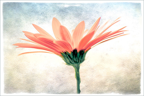
Thought I would show you what a difference a good crop can do for turning an ordinary image into something that has some real eye appeal. The rain on the petals could not even be seen in the original shot.

For Lightroom Users:  The above image was first cropped in Lightroom using the Crop Tool, but you can do this in Adobe Camera Raw or even Photoshop or Elements to get the correct look. I have found that by zooming in on an image using the Navigator at a canned magnification zoom like 2:1, then using the hand to move the image around, gives you a quick feel for what kind of crop you need. Then it was adjusted using the other sliders.

For Photoshop or Elements: Open your image in Adobe Camera Raw and select the Crop Tool from the Camera Raw Tools at top (6th icon over). Use the Zoom pop-down box in the lower left to try different zoom magnifications. Hold down the Space Bar to move image around to see how a crop would look.  Click the little arrow in the right bottom corner of the Crop Tool – this should be set to Constrain to Image and in my case, 2 to 3 since I want a 4 X 6 image to print. There are corner tabs that can be pulled out to adjust the crop at this point and get the final look. Now do your adjustments in ACR and the final crop will be applied once it is opened in Photoshop or Elements. Similar steps can be done using the Crop Tool in Photoshop or Elements after exiting ACR.

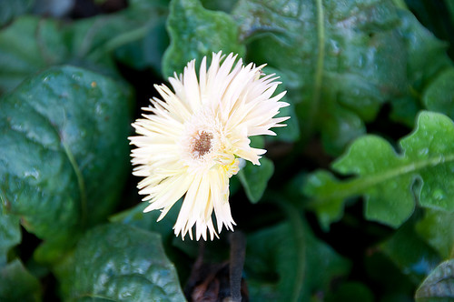
Below is my original RAW file. As you can see, it was blown out a bit and not well composed. Note that sometimes the close-up cropping just does not work for the image. JPG’s usually do not have as much information as RAW files and may not have enough information to give a clean close-up crop. But it is still worth a try to see.

After applying ACR adjustments, the image was opened up in Topaz Black and White Effects plug-in using a Traditional Collection preset as a starting point. A Transparency of 1.00 was set to bring back the some color into the black and white image, and Quad Tones were added using the colors Black, Darker Blue, Light Blue and White to add the bluish tones. In Local Adjustments the center color was painted back in, details painted in, and a little dodge to add contrast.

Next time you think an image is just not going to work, try some different types of cropping. You might find a really interesting look!…..Digital Lady Syd

Adding Copyright Information to Your Image

Well since it is that time of year when everything that has a date in it has to be updated, I am going to review with you how to put a copyright symbol and name on an image. This is pretty basic, but it is easy to forget how to do since you only have to do it once a year. This can be done in both Photoshop CS5/CS6 and Elements. And the time-savings by having it handy definitely makes it worth creating!

Simple steps:

1. Start a new document in Photoshop, set the foreground color to black, and Create a New Layer on top. For CS5/CS6 users, make sure the Image -> Mode is set to 8 bit.

2. It used to be that you could get a copyright symbol to appear with CTRL+ALT+C, but in CS5 on and Elements, the Canvas Size dialog box opens up so this does not work anymore. To find the copyright symbol, the work around is to select the Custom Shape Tool. For Photoshop users, in the Options bar set the tool to Fill Pixels (4th icon for over CS5 and 2nd icon over for CS6) and then select Shape from drop-down menu – highlight the copyright symbol from the default shape list in the drop-down menu (I like the one included in the Symbols set that can be loaded from the fly out menu in the Shape field). For Elements users, click the Shape drop-down menu, click the double arrow fly-out menu, and select Symbols – then select the copyright symbol. Drag out a Copyright symbol in black but do not make it too big. Hold SHIFT while doing this to keep the constrain and keep the symbol round.

3. Select the Text Tool and create a text layer with your signature in a font you use. Line it up with the Copyright Symbol and adjust text size to line up with the copyright symbol. I had to make my numbers smaller as they appear bigger than the letters when typed. The font I use is Freehand 575, a font I bought a while ago but there are many places to download free ones.

4. With the Rectangular Marquee Tool create a selection around both the symbol and the text. Make this a pretty tight rectangular – you do not need a lot of space around it.

5. Go to Edit -> Define Brush and name it – I called mine 2012 Copyright so that in Photoshop it will appear at the top of my Tool Picker Preset brush list in Step 8 and click OK. Deselect the Marquee Selection (CTRL+D).

6. Select the Brush Tool. In Photoshop the new brush will appear at the end of the Brush Presets Panel list. In Elements the brush will be at the end of the brush list in the brush drop-down menu (2nd arrow pointing down) at the top left Options Bar.

7. Now test out the brush and see what size you want as a default – I set mine at 367 which seems to work pretty well on 12 megapixel images.

8. The last step in crucial so that if you accidentally delete your brush or change the ones load, you can add it in easily.

Elements folks need to go to Edit -> Preset Manager and choose Save Set – then save the brush in the brushes preset file for the program (in Windows 7, go to (User Name) -> AppData -> Roaming -> Adobe -> Photoshop Elements -> 10.0 -> Presets -> Brushes) – I called mine SJ-Copyright Brush. Now anytime you need to add it to the brush group you are using, your Brush Preset Manager will go to this file so it can be reloaded.

Photoshop users, go up to the Tool Picker Preset, top left icon in the Options Bar, and open up the drop-down list. This contains the Preset List for the Brush Tool which means every time the Brush Tool is chosen, this group is available for quick access. Be sure the Current Tool Only box is checked or else a huge list shows up. Click on the bottom icon on the right side that says Create New Tool Preset. Keep the same name using a number first. This saves time by putting your brush at the top of the list since the Brush Tool Preset Picker has many Photoshop brushes in this list, and it is handy to keep the ones you use all time here also. Be sure to save this down as a set in the Preset Manager (2nd icon over at the bottom of the Brush Panel and then select Preset Type Tools – highlight the ones you created, drag to set up a different order if you want, and save. I usually make it a date like 010113 SJ – can back up all your created presets here) so that it is saved on your computer. If you load other people’s tools and lose yours, you can easily add them back in. See Step 8 in my Fun Photoshop How to Create Photoshop Brushes from Objects or Text blog for more info on how to do this.

That’s it! Now it is available every time you finish an image. Just add a New Layer on the top of your image, open the Tool Preset Picker for Photoshop or choose your brush in the brush drop-down list for Elements, select a nice color, and click once to paint in. The size of the brush can be changed – just CTRL+X to delete and change the size and click again. Sometimes it is helpful to adjust the opacity when the copyright becomes distracting in the image. Very handy…..Digital Lady Syd

Digital Lady Syd’s Rule No. 5: Just Step Outside and Look Around!

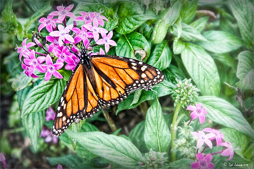
If you find yourself bored because you have not taken any interesting images recently, just step outside and take a look around. I was feeling just this way this past week – with the holidays there just was not much time to go out and take some interesting pictures. So on Christmas Day, I decided to walk around outside just on the off chance there was something interesting. It was warmer than usual outside and there was this beautiful unexpected Monarch butterfly in my Purple Queen flowers. He seemed a little aggravated that I was taking his picture, but hey, I wasn’t really bothering him. (You can tell the butterfly is a male because of the black spot on his mid-hind wings in the vein.)

The image was shot with a Nikon D300 using my 18-200mm zoom lens at 200 mm, f/9.5, 1/90 sec, ISO 400 – did not have time to change to a macro lens or I would have missed the shot. I shot in burst mode and several of the shots were blurry as he was moving his wings so fast! Not used to taking pictures of butterflies! This image was processed using NIK Color Efex Pro 4 with the Detail Extractor Filter, Vignette Blur to get ride of distracting leaves and ground in the image, and a regular Vignette. Used the Sharpen Tool on another layer and a Curves Adjustment Layer to finish off.

It was fun to take more of a macro shot for a change  I always love taking pictures of flowers. Great change of pace and it got me interested in working on my flower photos for a few days while the weather is pretty bad. In the meantime, take a look around outside your house and maybe you will find something interesting, like I did, that you had not noticed before!….Digital Lady Syd

Getting That Vintage Look!


I had not done an HDR image or post in a long time so I pulled out NIK’s HDR Efex Pro, which usually gives me the look I want. Personally, I think it is a little harder to use than Photomatix Pro and Photoshop CS5’s Merge to HDR, but the results can be spectacular if done correctly. This image is of an Ice Cream Shop on St. George Street in St. Augustine, Florida. This is a great example of the typical Spanish home that was built back in the early 1800’s. The texture in the building came out really nice. What I like about this program is on the right side of the program, there is a drop-down menu called HDR Method where a lot of different looks can be tried out. The basic global adjustment sliders and the U-Point controls are still available so control points can be placed where needed and the strength adjusted to fit the location. In this case, the Fresco method was chosen at 70% strength. I did bring the image into Photoshop to clean up some of the distracting items and to sharpen the lettering in the signage with the Sharpen Tool. The edges were treated with OnOne’s PhotoFrame Taufer Texture 12 in dark black (see sidebar for link to website). Overall it gives a pretty convincing vintage look.

Another great program from NIK!…..Digital Lady Syd

Digital Lady Syd Related Posts:
Different Images-Same Look Using HDR!
Where Am I?

A Little After-Holiday Cheer!

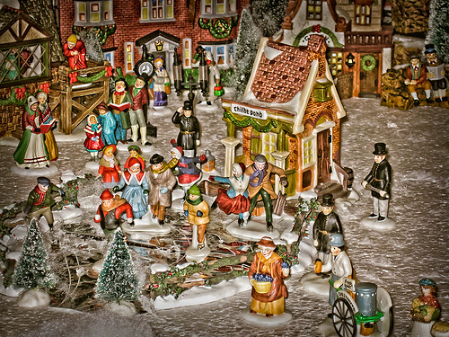
With the holidays winding down, I thought I would post one of the shots I took with my little point and shoot Canon 1000 camera of a friend’s Dickens Village set up in her living room. I can’t say enough about how beautiful it looked, especially in the evening when the houses were all lit up. Absolutely Amazing!

The image was processed in Lightroom just a bit – the colors were so strong it did not need much adjustment. Next NIK’s Color Efex Pro 4 was applied using the Detail Extractor filter and setting points so the snow was not affected as much, and a slight darkening Vignette filter. Back in Photoshop the Sharpen Tool was used on some of the figure’s faces and back edges to make them stand out a little more and that was it.

Hope you had a great holiday – I know I did……Digital Lady Syd

Digital Lady Syd Related Blogs:
NIK Color Efex Pro 4 – Digital Lady Syd’s Review!
Pseudo HDR Using NIK Color Efex Pro 4
NIK Color Efex Pro 4 – First Try!

More Holiday Card Fun!


Just a final card I thought I would share that was constructed completely in Elements with a little help from Topaz Adjust 5. I seem to be using the same holiday resources over and over – guess I have found the ones I like. This card started with three different layers of snowflakes – I created brushes from the custom shapes provided with the Shape Tool, but you can download them in lots of places (try these from Obsidian Dawn), and used layer styles and blend modes to get the various effects; the font is Fantaisie Artistique (my favorite) doubled up for each line of text and the bottom filled with black, then dragged out to form a sharp shadow edge; Snow Drops brush by Frostbo for small flake layer – adjust size to get different effects; Santa sleigh in Christmas Brushes by Fina with Outer Glow layer style; and finally Topaz Adjust 5 (see sidebar for link to website) using the Film Collection – Vintage Grunge III preset. This was very easy to create and pretty fast.

I hope you have Happy Holidays and enjoy!…..Digital Lady Syd

Christmas Card from Digital Lady Syd!


Thought I would post this card I did today which follows a really interesting tutorial called “Fun & Exciting Text Effect in Photoshop” where patterns were inserted onto each letter to create this interesting effect. The basic tutorial steps were OK but they forgot to mention that each letter has to be on an individual text layer so a different pattern Layer Style can be applied for each layer. This was a fun project and I like the way it turned out.

There were many resources in this card that I will mention in one lump group. Please check out their sites, these people generously give their expertise away for free so they deserve some recognition! Resources are as follows: Grunge brushes were from Websoulz Super Grunge set; yellow (#3) and green (#1) lines from Swirls by Rocked Out set-these apparently are no long available but try this set of Flowing Line Brushes by Thurgood; background snow brushes are Snow Drop brush by Frostbo and Snow White brush #36 from Supreme-neko; the font is 02 from a Cosmi font set I bought years ago and is not longer available as far as I can tell, but go to daFont.com and look for a larger fat font – there should be several available; the bottom font is my favorite Fantaisie Artistique; Patterns were from Grungy Dirty Patterns from Obsidian Dawn, Free Christmas Patterns, Christmas Patterns by Peter Plastic, Free Christmas Patterns by Succo Design, and Christmas Patterns by slave to fashion 69; Sleigh brush from Obsidian Dawn’s Holiday set; and Dave Cross _01 OnOne PhotoFrame (see sidebar for link to website).

Hope everyone has a wonderful holiday and try out this text effect – great effect for any occasion……Digital Lady Syd

Digital Lady Syd Related Blogs:
How to Add Images to Text
Playing in Photoshop
How to Create Photoshop Brushes from Objects or Text
Free Christmas Card Templates-Part 2
Digital Lady Syd’s Free Christmas Card Template Using Photoshop Elements
Digital Lady Syd’s Free Christmas Card Template
Free Christmas Card Vectors and Brushes
Some Holiday Cheer

Creating a Calendar in Adobe Lightroom


Since I have been presenting calendar techniques this past week, I thought I would pass along yet another way to create a calendar via the Lightroom and Photoshop guru, Matt Kloskowski, on his Killer Lightroom Tips Blog. See his blog “Creating Calendars in the Print Module.”

Basically the technique involves first downloading the calendars (Matt used some from iStockPhoto.com but I used this free download link from PrintRunner – scroll down to the Calendars section and select the first one). I used Photoshop to open the calendar files – go to File –> Open and select the month you want to insert from the downloaded Printrunner PDF file and click OK. NOTE: You must open the file from within Photoshop – I could not get the Bridge to open the PDF files to place into Photoshop.) Save to the Graphics folder as a jpg file.

Then go into Lightroom and highlight your Graphic’s folder or collection and enter the Print Module. In Page Set Up, select the size (Matt used 17″ X 22″ but my printer does not support this, so I used standard paper size 8 1/2″ X 11″.) Check the Lock Aspect Ratio in Cells section, and just drag your calendar month into your document along with an image for the top. Now you can Print to: Print or JPEG File (click Print to File to save down as a JPEG to E-mail out or post on-line). Very simple technique!

I personally like using my template (see links below) but this is definitely a nice alternative. Hope this gives you another great idea on creating your own personal calendars. Have a Happy New Year!…..Digital Lady Syd

Digital Lady Syd Related Blogs:
Free Calendar Template
Calendar Template for 2012
Create Calendar Photoshop Templates
Colorful Blown Out Look Lightroom and Adobe Camera Raw Preset

Free Calendar Template for Use with Elements

For my Elements friends, here is the same template following basically the exact same instructions as noted in my blog “Free Calendar Template” from last year. The template opens up great in Elements and the same steps to placing the items is totally the same. The only difference is that the step that it in the layer mask for the Gradient Layer. In this case, to copy the layer mask on the Color Fill 2 layer, you must: 1) click on the Color Fill 2 layer mask, 2) CTRL+A to select the whole mask, 3) CTRL+C to copy the whole mask, and 4) highlight the top layer and CTRL+V to paste the layer mask into this layer. A New Layer was created on top and snow was sprinkled around the edges. That’s it! Very simple.

The image is the top of the Standard Life building in Jackson, Mississippi. The gradient used is from Gorgeous Gradients – PrimaveraII, and the snow is a very useful snow brush called Snow Drop by Frostbo. The lettering on the building is called Kingsthings Christmas font, the Flying Santa Sleigh is by Fina, the fog was created using Sampled Brush #3 and #12 from Brushes Fogs and Mists, the green Christmas Tree and Icicles are in Obisian Dawn’s Holiday set, and the icy edges are an OnOne PhotoFrame Taufer Texture 08 frame (see sidebar for OnOne Perfect Photo Suite 6.0 for website). I have to admit this image was a bit of a challenge but I really liked the final effect.

Well, once again, it just goes to show that lots of what can be done in Photoshop can be done in Elements – sometimes with just a few workarounds. Try putting some of your new photos together and make a calendar for a family keepsake! Enjoy!…..Digital Lady Syd

Digital Lady Syd Related Blogs:
Free Calendar Template
Calendar Template for 2012
Create Calendar Photoshop Templates
Colorful Blown Out Look Lightroom and Adobe Camera Raw Preset

The Art Corner: Little Girl Knitting – A Mystery Sculpture!


I recently was visiting the Lightner Museum located in the old Alcazar Hotel in St. Augustine, Florida, and found this beautiful sculpture of a little girl sitting on a big pedestal in the corner. I think it turned out to be my favorite piece in the museum and the gorgeous antique mirror next to her is perfect for the setting. The sculpture is by Ella Pollock Bidwell of which very little known. The art was signed by the artist with Florence 1889, Carrera Marble was the medium used, and listed on a separate line “American(?).”

The Museum’s information sign by the work states “Despite the fact that this is a highly executed work of are, no concrete information has come to light on Ella Pollock Bidwell. Whether she actually sculpted this from marble herself or only did a clay maquette to be copied by others is left for us to speculate. There is some possibility that Ella Pollock Bidwell may have been an American working in Italy as many American Artists of the 19th Century were want to do. Alas we have no proof to offer of this either. Although the Artist is unknown to us today, her legacy remains with us in this charming and beautifully crafted work of art.” While searching on-line, the Bidwell Family Crest and History came up and listed that in 1892, a woman by the name of Ella P. Bidwell came through Ellis Island from London at the age of 30. Can’t help but wonder if this is the same woman who did this beautiful sculpture. You also have to wonder if this woman made more beautiful sculptures during her lifetime – what a shame we do not know!

The image was processed mainly in Lightroom. I created the tinted preset from reading David duChemin’s book “Vision & Voice – Refining Your Vision in Adobe Photoshop Lightroom.” See my blog “Inexpensive Gifts for the Photoshop Lover on Your List” No. 2.  This book is a great read if you use Lightroom – he teaches you how to make some very beautiful presets. I use them all the time. The one applied to this image I named Maasai Chocolate split-tone & vignette to use as a starting point, but ended up changing several of the settings in the Black & White Mix. The image was also cropped to bring the mirror and the girl into closer view. In Photoshop a Curves Adjustment Layer was added and the Sharpen Tool was used on its own layer to locally sharpen parts of her features. Finally her face was Dodged just a small amount. I really loved the results of this preset on the sculpture…..Digital Lady Syd