
Hello from a Queen
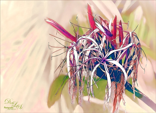
I was updating all my Topaz (see sidebar for website link) plug-ins this morning (many were updated in December 2016) and ended up experimenting with a few. I was using this beautiful Queen Emma Lily bloom, which was a difficult image to remove the distracting green background from the bloom. So I just started applying filters as I was checking update info. Topaz Black and White Effects was used to create an image with some color in it. Then on a stamped layer (CTRL+ALT+SHIFT+E) Topaz Clean’s Cartoon Desaturated preset was used to get a more detailed effect. On a duplicate layer Topaz ReStyle’s Zombie Ziggurat preset was applied. On another duplicate layer Topaz Glow was used. Lots of clean up layers were created to make sure it looks right. I finally found a fabulous Photoshop Pencil – Grut’s P Tin Softy – a new one he recently included in a great collection of 43 pencils. This brush was used to fill in black lines which were missing and adding a little color in little areas. Last step was adding Nik Viveza 2 to even out the background. That was all that was done!…..Digital Lady Syd
My Glowing Porch Flowers!
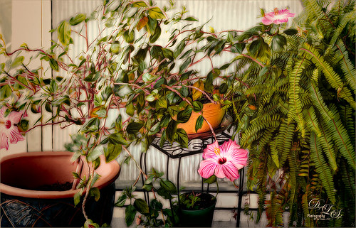
These are more flowers on my porch – Painted Lady Hibiscus and a Boston Fern. Clean up was done, Topaz (see sidebar for website link) DeNoise set to Overall 0.09, and Topaz Clarity (My John Barclay Basic Settings preset-Micro Contrast 0.36, Low Contrast 0.20, Medium Contrast -0.11, and High Contrast -0.23; then Tone Level Black Level 0.14, Midtones -0.30, and White Level -0.20; Hue Yellow -0.58 and Green -0.19; Sat Green 0.27 and Blue -0.34; and Lum Red -0.08, Orange -0.52, Green 0.11, and Blue -0.42). On a stamped layer (CTRL+ALT+SHIFT+E) Topaz (see sidebar for website link) Glow was applied. (SJ Painterly Wonderland preset-Set to Overlay. Primary Glow change Effect Sharpness to 1.00, Electrify 0.38, Secondary Effect Sharpness 0.48, Brightness 0.23, and Contrast -0.01; Color – Overall Hue -0.29, Orange Sat 0.43, Yellow Hue 0.14 and Lightness 0.50, Green Sat -0.77 and Lightness -0.44, Aqua Sat -1.00, and Blue Sat -0.50. Set back to Normal to take into PS – then adjust there.) Topaz Black and White Effects was applied. (SJ Soft Color Effect preset – Conversion section – Basic Exposure Contrast 0.04 and Brightness 0.05; Adaptive Exposure 0.24, Regions 16, Detail 0.98 and Detail Boost 1.05; Creativity Effects Diffusion Softness 0.71, Diffusion 0.67, and Diffusion Transition 0.56; Finishing Touches section – Silver and Paper Tone Tonal Strength 0.85, Balance 0.22, Silver Hue 27.00, Silver Tone Strength 0.61, Paper Hue 45.00, and Paper Tone Strength 0.42; Quad Tone Color Region 1 black set to 7.46, Color Region 2 set to Color (R67/G48/B32) and 77.12, Color 3 Region to Color (R173/G148/B104) and 181.6, and Color Region 4 set to white and 255.0; Vignette Strength -0.28, Vignette Size 0.61, Vignette Transition 0.83, and Vignette Curvature 0.83; and Transparency Overall 1.00. In Local Adjustments set to Detail – Brush Size 254, Opacity 0.25, Hardness 0.05 and Edge Aware to 0.50 – painted back the front flower and the orange colored dish so that it was a focal point. The Overall Strength was set to 1.00. Set same brush to Color and painted back the pink flowers. Vignette Strength set to -0.32, Vignette Size to 0.68, Vignette Transition to 0.63, and Vignette Curvature 0.82 – center vignette on just above the center pink flower. Changed Overall Transparency to 0.75.) On another stamped layer the Camera Raw Filter Radial filter was applied to adjust the focus on the orange pot and center pink flower. That was it. Lots of Topaz on this one!…..Digital Lady Syd
Just a Little Hibiscus

Image of my pink Painted Lady Hibiscus on my porch – they are such beautiful blooms! Thought I better practice painting a little in Photoshop as I had not done anything recently so here it is. In Lightroom and Dave Delnea’s Backlight 002 vertical preset was applied, and the middles of the flower was sharpened. The image was brought into Photoshop and Topaz (see sidebar for website link) Clarity using John Barclay’s Basic settings (Micro Contrast 0.36, Low Contrast 0.20, Medium Contrast -0.11, and High Contrast -0.23 – then my settings of Red Sat 0.22; and Lum Red -0.17 and Green 0.72). Next Topaz Black & White Effects plug-in was applied using a plug-in I call SJ Church (Conversion Basic Exposure Contrast 0.06 and Brightness 0.05; Quad Tone Color 1 Region Color (R7/G0/B7) and slider 9.95, Color 2 Region Color (R59/G51/B53) and slider 69.66), Color 3 Region Color (R158/G143/B146) and slider 150.6, and Color 4 Region Color (R255/G253/B216) and slider 255.0: and Transparency 0.58 – in the Mask, painted detail on stem and pistal using Brush Opacity 0.25/Hardness 0/Edge Aware 0.50 brush. Using same brush set to a small size 73, selected Burn and painted in the pistil shadow and some detail in the flower top. Used Color adjustment and painted in a little on flower tips. Dodges the left side of pistil and stem.) On a layer above, Jai Johnson’s beautiful free Spring Blush Canvas texture was added and a layer mask was added. Used my SJ Pastel 11 brush (I used Pastel 11 in SDW Pastel Brushes-this comes in as a huge 2130 px brush! I made it a 70 px brush – added Shape Dynamics and Texture to make a nice painting brush) set to 29% or less brush opacity, the flower was gently painted back in the layer mask. Text was added and a Levels Adjustment Layer was used to add back some contrast. That was it!…..Digital Lady Syd
Some Vintage Zinnias

Just playing with my Zinnias. I was trying to a vintage, wallpaper feel behind them. I actually opened Topaz (see sidebar for website link) photoFXlab from Lightroom. Here are the steps completed: Applied Topaz Clarity – SJ Illustrative Look – with a few adjustments, duplicated layer, set Dynamics slider to 9 and Saturation -17, duplicated layer, enter Topaz Adjust and apply my Rick Sammon Spicify Soft Artsy, back in photoFXlab the Adjustments settings stayed on this layer, duplicated layer, duplicate layer, in B&W Effects applied SJ_Quad_DkB_GR_Yel_Wh preset, an exited the plug-in to Photoshop. Just a few steps here. Guess what I am trying to show is that there is a lot of versatility here with photoFXlab. Once in Photoshop some clean up was done and French Kiss Studio Selections 3 White Wash texture was applied (I use this texture a lot and it is in a very reasonably priced set). On the white was I used Brush Lovers Art Flowers 2000 (liked the brush best when applied directly to the French Kiss WhiteWash texture – just looked better). This brush was set up as a preset – had to select the dark red color 4e322e and dark green color 3c3e38. In the Brush Panel I turned on Shape Dynamics, Scattering and Smoothing, Size 394 px, Spacing 434% and then Color Dynamics was added and size changed to 201 px. A layer mask was added to the layer to lightly brush out texture from the flower, but leaving a little to keep the grain intact. A Curves Adjustment Layer was clipped to the texture to bring out the cool texture a little bit more. 2 Lil’ Owls Studio Color Bokeh Grunge Set 4 (see sidebar for website link) was applied at 50% opacity and in the layer style, the Blend If This Layer’s white tab was set to 164. The last step involved adding two New Layers where just a couple strokes were applied, one layer using green and one the dark red color to add a little grunge feel to the image. The brush used was Nakatoni Custom Brushes texture brush (does not appear to be available anymore but any soft grunge brush would do). The preset settings are listed below. ….Digital Lady Syd
Here are the plug-in preset settings used if you are interested:
Topaz Clarity SJ Illustrative Look settings: If you would like the illustrative look, here are settings: in Clarity Section – Dynamics: Micro Contrast 1.00, Low Contrast 0.28, Medium Contrast -0.50, and High Contrast 0.06; Tone Level: Black Level 0.61, Midtones 0.14, and White Level 0.72; and in Hue/Sat/Lum Section – Hue: Only Red 0.16, Yellow -0.05, and Green -0.17 were adjusted; Sat: only Green -0.22 and Overall -0.45 were adjusted; and Lum: Only Orange 0.36, Yellow 0.89, Green -0.91, Aqua 0.30, and Blue -0.09 were adjusted.
Topaz Adjust Rick Sammon Spicify Soft Artsy settings: Adaptive Exposure section: Adaptive Exposure 0.50, Regions 25, Contrast -0.56, Brightness -0.13, Protect Highlights 0.03, and Protect Shadows 0.03; Details section: Strength 0.87, Detail Boost 1.15, Threshold 0.12, Radius 25.00, and Sharpen 1.01; Color section: Adaptive Saturation 0.33, Color Regions 10, Saturation 1.00, Saturation Boost 1.00, and Hue 0.00; and Noise section: Suppression 3.24, Amount 0.51, and check Use Topaz DeNoise.
Topaz B&W Effects SJ Quad DkB_Gr_Yel_Wh settings: Quad Tone: Color 1 Region: Color (R1/G1/B12) and set to 15.08, Color Region 2: Color (R63/G78/B85) and set to 143.9, Color Region 3: Color (R216/G211/B129) and set to 227.5, and Color Region 4: Color (R255/G254/B237) and set to 255.0: and Transparency: Overall Transparency 1.00.
Beautiful Feathers!

These beautiful feathers were from the 24th Annual Native American Festival held in Ormond Beach, Florida. Totally enjoyed looking at the many exhibits and vendor tents, and the shows were very entertaining. This image is of a display of feather hair bungies that was in a vendor tent. Very little treatment was done to the image. The biggest change in Lightroom was changing the aspect ratio to a square crop. A few Basic sliders were adjusted before opening Photoshop. First the image was taken into Topaz (see sidebar for website link) photoFXlab where the layer was duplicated and in the Effects tab, Black and White Albumen – Chocolate was applied (this is actually a preset in the Black and White Effects plug-in). Next in the Adjustment Tab, Saturation was set to 2, Exposure to -0.05, Contrast to -5, and Dynamics 25. The top layer was set to 52% opacity and a Color Blend Mode. Once back in Photoshop, Topaz Detail 3 was opened and the Overall Medium Detail preset applied. A black layer mask was added and with a soft white low opacity brush, only areas I wanted really sharpened were painted back in. Then a little clean up to smooth the background was done. I really like the soft looking feathers in this image. What a fun place to take pictures – and not much processing needed afterwards!…..Digital Lady Syd
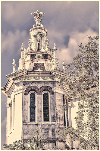
Digital Lady Syd’s Rule No. 7: Check Out Your Local History

Just because you don’t get to go on that exotic vacation this year, it can be very satisfying to visit some of the local historical places near you. I have been cutting out of the newspaper little articles of unknown treasures in the area and keeping them in a file for a day when I need something new to shoot. The image above is from the center living area of the beautiful old home known as The Casements (circa 1900), and purchased as John D. Rockefeller’s winter home in 1918. It was located across the street from the old (now non-existent Hotel Ormond). I have driven by this local landmark a hundred times and never stopped, but a few weeks ago I did. Not that large a place but really fun to explore.
A tonemapped Tiff file was created using 5 images and taking them into Nik’s new version of HDR Efex Pro 2. In Photoshop it was processed using Topaz (see sidebar for website link) photoFXlab using the Plugins tab and opening Black and White Effects. A Cyanotype Collection preset called Cerulean Tea Rose Dynamics was selected and adding the Color Filter with Hue set to 329.9 and Strength 0.84, and Overall Transparency set to 1.00. Back in photoFXlab in the Adjustment tab, the Dynamics slider was increased slightly. The Detail Brush was used at full strength and the door, lights, flowers and rugs were painted over to sharpen.
I hope to continue exploring locally this year and find some more close-by treasures. So don’t get discouraged – just pick up the local newspaper or surf on the internet for historical places in your area. Then do not forget to download your images and play in Photoshop – the best entertainment there is!…..Digital Lady Syd
Digital Lady Syd Related Blogs:
Digital Lady Syd Reviews Nik HDR Efex Pro 2
Black and White Effects on Outside Art
Digital Lady Syd’s Review of Topaz photoFXlab v1.1
InstaTone in photoFXlabs – Great Fun and Great Results!
Black and White Effects on Outside Art

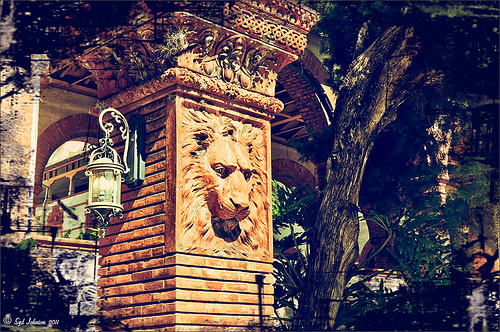
I call this image “Who’s Looking at You?” I almost fell down taking this image and everybody at the Flagler College (old Ponce de Leon Hotel in St. Augustine, Florida) thought it was funny as the tour guide just said one of her rules was no one was allowed to fall down! Oh my! Anyway, I was totally struck by the beautiful face on this figure which is part of the Ladies Side Courtyard Entrance. I do not know who actually created the figure but it appears to be similar to the Lion Statues outside the entranceway (see my Tidbits Blog Loving Both Filters!) Used Topaz Black and White Effects on image selecting the Cyanatype Collection -> Cerulean Dynamic preset to get the color effect started. Also used a Gradient Fill Adjustment Layer using a Gorgeous Gradient Royal set to Linear Style, 90 degrees, and Reverse with layer set to Overlay blend mode and 62% opacity – painted out the face a little using a white layer mask and low opacity black brush. Sharpened the face and that was it. I loved the final result!…..Digital Lady Syd
Some of My Favorite Plug-Ins
 |
I am starting to sort through all the plug-ins that are out there and slowly figuring out what really works for my workflow. This is a really hard process since there are so many great plug-ins and some of them give very similar results. I have blogged on this many times showing how the same images look with the various plug-in effects.
I started working on this image – not one I was totally in love with, but the old Flagler Presbyterian Church is so beautiful to look at that I wanted to create that sensation in the image. I began by manipulating the file in Topaz Adjust 5 (see link to website in sidebar) and hit the “Get Lucky” button just for the heck of it – and this really cool illustrated look appeared that I was not sure what to do with it. (Hover over image to see the Topaz 5 illustrated image.) I decided it needed a new sky so I opened up OnOne’s Perfect Mask (see website link in sidebar) and added a sky I had placed below the image. This plug-in is the best one I have found for replacing skies quickly – check out the little holes in the trees where the sky peaks through. Next several different effects were tried but none made me go “Wow” — that is until I decided to go into the Topaz Black and White Effects plug-in (see link to website in sidebar). It took no time at all – in fact I started with the same settings from my “My Office Friend Ted” image which was a totally different type of image. A few things were adjusted but it still was not quite right. Back in Photoshop a Color Balance Adjustment Layer was added to bring out the blues in the sky a bit more to get the right look. Now it looks like I remember it – but it took some effort. Luckily, I had a plug-in that gave me a great start.
I guess I can honestly say I still love both Topaz Adjust and Black and White Effects – they do have that versatility to turn an okay image around. Definitely great plug-ins and reasonably priced too! And OnOne Perfect Mask is the best for skies – still figuring this plug-in out for other types of selections. I hope to have a page set up soon on which plug-ins have made it into my workflow……Digital Lady Syd
Digital Lady Syd Related Blogs:
Topaz Plug-Ins – Same Image Trying Each!
Same Image – Different Plug-In
My Office Friend Ted

This bear now sits in my office but I was never sure why I got him. Last week there was an interesting post by Ian Summers called “3 Exercises to Keep Creative Imagery Flowing” which gave me an insight to this conundrum. One of his generic creative exercises is called “Create a Giant Love Nest,” an environment that involves surrounding your work/creative area with many of the things you liked as a kid to help feed your creativity. I guess that is how Ted arrived – I found him at a bargain price in Cracker Barrel and had to have him. I am not even sure I had a Teddy Bear as a child but I liked his happy look (he never complains) and he is very soft and big (31 1/2″ tall). What’s not to like? So in honor of using childhood (and adult) toys and collectibles as a way to increase your creativity (and a good excuse to keep some of those things you just can’t part with), I am presenting my office friend “Ted.”…..Digital Lady Syd
PS. Ted was processed in Lightroom Beta 4 (see my Tidbits Blog “Trying Out Lightroom Beta 4“) and Photoshop using Topaz Black and White Effect (see my Fun Photoshop Blog “Topaz B&W Effects Plug-In-A Real Winner” and click on sidebar for website link). I started with the Opalotype Collection Flavescent preset and essentially adapted it by cranking up the transparency to 100, and adjusting the strength and placement of the vignette. A little localized face detail and burning on his mouth was added. That’s all.
Create a Great Shot with a Good Crop

Thought I would show you what a difference a good crop can do for turning an ordinary image into something that has some real eye appeal. The rain on the petals could not even be seen in the original shot.
For Lightroom Users: The above image was first cropped in Lightroom using the Crop Tool, but you can do this in Adobe Camera Raw or even Photoshop or Elements to get the correct look. I have found that by zooming in on an image using the Navigator at a canned magnification zoom like 2:1, then using the hand to move the image around, gives you a quick feel for what kind of crop you need. Then it was adjusted using the other sliders.
For Photoshop or Elements: Open your image in Adobe Camera Raw and select the Crop Tool from the Camera Raw Tools at top (6th icon over). Use the Zoom pop-down box in the lower left to try different zoom magnifications. Hold down the Space Bar to move image around to see how a crop would look. Click the little arrow in the right bottom corner of the Crop Tool – this should be set to Constrain to Image and in my case, 2 to 3 since I want a 4 X 6 image to print. There are corner tabs that can be pulled out to adjust the crop at this point and get the final look. Now do your adjustments in ACR and the final crop will be applied once it is opened in Photoshop or Elements. Similar steps can be done using the Crop Tool in Photoshop or Elements after exiting ACR.
Below is my original RAW file. As you can see, it was blown out a bit and not well composed. Note that sometimes the close-up cropping just does not work for the image. JPG’s usually do not have as much information as RAW files and may not have enough information to give a clean close-up crop. But it is still worth a try to see.

After applying ACR adjustments, the image was opened up in Topaz Black and White Effects plug-in using a Traditional Collection preset as a starting point. A Transparency of 1.00 was set to bring back the some color into the black and white image, and Quad Tones were added using the colors Black, Darker Blue, Light Blue and White to add the bluish tones. In Local Adjustments the center color was painted back in, details painted in, and a little dodge to add contrast.
Next time you think an image is just not going to work, try some different types of cropping. You might find a really interesting look!…..Digital Lady Syd
Loving Both Filters!
 |
The above image is one of the beautiful Lion Posts outside Flagler College in St. Augustine, Florida, which used to be the Ponce de Leon Hotel built in 1887. Absolutely beautiful building. Cannot miss it if you go to this wonderful historic city.
Wow – all I can say is that I cannot decide which program I like best – NIK Color Efex 4 or Topaz Black and White Effects. So different and so much alike! I keep trying the same image in each program and get totally different looks but both are really nice! What to do, what to do!
The top image was processed with NIK Color Efex Pro 4 using the Film Efex: Vintage filter on Film Type 14; Detail Extractor filter; and Brilliance/Warmth filter. I used the Sharpening Tool in Photoshop to sharpen the eyes and mane of the Lion. Then Grunge 03 OnOne PhotoFrame was applied in a dark navy. I loved how it became very artsy and colorful. And the background detail is incredible!
Topaz Black and White Effect produced a very different feel that can be seen by hovering over the image. Same exact image from Lightroom except this time I wanted to see what how this image would look as a black and white. I used the new Platinum Collection – Platinum VI as a starting point. What really improved this image was using the Local Adjustment Dodge brush and Detail brush on the shadows in the face and the lamp. This really brought the eyes out very clearly. Using the Color brush, the lights was added back into the lamp. A black border, dark edge exposure, and dark vignette was added. In Photoshop the Sharpen Tool was used on the eyes a little more and the mane. Overall a very different feel to the same image.
I really love both filters and I do not believe I can recommend one over the other. Both totally great. Give the trials a try and see what you think!…..Digital Lady Syd
Related Digital Lady Syd Blog Links:
Topaz B&W Effects Plug-in – A Real Winner!
NIK Color Efex Pro 4.0 – First Try!
The New Film Efex-Vintage Filter from NIK CEP 4
Quad Tones in Topaz Black and White Effects Plug-in
Sunny Preset for Topaz Black and White Effects
NIK Color Efex Pro 4 – Digital Lady Syd’s Review!
The Art Corner: Painting and Sculpture by Tassaert
Pseudo HDR Using NIK Color Efex Pro 4
The Art Corner: Painting and Sculpture by Tassaert

The above piece of artwork is found in the East Sculpture Hall of the National Gallery of Art in Washington, DC, and was sculpted in 1774-1778 in Paris by Jean-Pierre-Antoine Tassaert, a lesser-know Flemish sculptor who lived from 1727 to 1788. I found this piece to be very charming once you understand what the head in the artwork represents. The children are so detailed and sweet looking. From the National Gallery of Art’s website: “With Clodion’s Poetry and Music (also located in the same area of the Gallery), this allegory was one of four that were meant to bring to life the abstract concepts of the arts and sciences. They were commissioned by Louis XV’s finance minister Abbé (Joseph-Marie) Terray for his elaborate Paris residence (to decorate the dining room of his Parisian mansion). The subject was an appropriate one for Terray, since he also served briefly as the director of the king’s buildings with overall responsibility for the state of the arts in France. Painting, sculpture, music, and literature are celebrated by the young cupidlike figures in the two works here; other children carved by two other artists represented geometry, geography, architecture, and astronomy.” The last two pieces, Geometry and Architecture by Jean-Jacques Caffieri created in 1776 and Astronomy and Geometry by Felix Lecomte created in 1778 are located at the National Trust, Waddesdon Manor, Buckinghamshire, England. I think Tassaert’s sculpture is the best of the four in the series.
I processed this piece in the Photoshop plug-in Topaz’s Black and White Effects (see sidebar for link) using the Warm Tone I preset as a starting point, then adding a Quad Tone Effect (Color 1 Region was set to black with slider set to 0.oo, Color 2 Region set to R75/G78/B96 with slider at 142.5; Color 3 Region set to R222/G220/B172 with slider at 228.9 and Color 4 Region set to White with slider at 255.0 – these tones made a very nice soft contrast for this type of image). Some Local Adjustments using the Details and Burn Brushes were used on the sculpture itself. Finally a vignette was added and centered on the children to make them appear spotlighted. Be sure to create a preset if you like the results.
If you get a chance, try to go to one of the two places showing the sculptures discussed. They are very interesting pieces. I did not get an image of Poetry and Music so that is on my list for my next trip to the National Gallery of Art!…..Digital Lady Syd
Sunny Preset for Topaz Black and White Effects
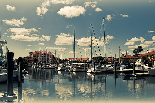 |
This image of Camachee Cove Yacht Harbor in St. Augustine, Florida, was adjusted using Topaz Black and White Effects. I wrote a longer blog on trying to achieve this same effect using other plug-ins on my Fun Photoshop Blog “Same Image – Different Plug-ins.” Hover over the image to see original. It took literally two minute to get this effect. There was just one further adjustment made in Photoshop which, unfortunately when adding most plug-ins, there is some noise created. I took the image back into Adobe Camera Raw (see my blog “Edit Layers with ACR Script“) which I prefer over the other Noise Reduction plug-ins. The Luminance was set to +75, Detail +37 and Contrast +48. I was really pleased with the color and how it looks on the water and the sky, especially around the horizon line. I wanted to share with you how I created this sunny preset in Topaz’s Black and White Effects.
First the Van Dyke Brown Collection was used with the Wenge Dynamic Preset. This gives the correct settings in the Conversion Section on Basic Exposure sliders and the Adaptive Exposure sliders.
In the Finishing Touches Section, Film Grain should be unchecked unless you want some graininess. This image does not use it. Next the Quad Tones needed to be changed for this effect. By clicking on each of the color swatches, the following colors can be changed: Color 1 Region set to R1G1B12 and slider to 9.60; Color 2 Region set to R63 G78 B85 and slider to 95.97; Color 3 Region set to R216G211B129 and slider to 141.2; and Color4 Region set to R255G254B255 and slider set to 237.0. This is the key to the effect and gives the preset the sunny feel.
The Edge Exposure area is optional but the above image used these settings. The Edge Exposure settings should be set to: Top – Edge Size o.26, Edge Exposure (-0.22), and Edge Transition 0.32; Bottom – Edge Size 0.19, Edge Exposure (-0.43), and Edge Transition 0.27; Right and Left set to their defaults since there is no edge on the sides – Edge Size 0.20, Edge Exposure 0.00, and Edge Transition 0.20.
Finally check Transparency and set the Overall Transparency slider to 1.00.
It is important to create a preset now either in My Collection or the individual Effects Presets so it can be reused again and again.
Hope this will give you a chance to try out a new Quad Tone look (see Tidbits Blog “Quad Tones in Topaz Black and White Effects Plug-in“) – I plan on making some more presets in this program soon. Try out this look and see if you like it as much as I do…..Digital Lady Syd
Quad Tones in Topaz Black and White Effects Plug-in
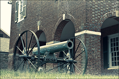 |
This image is of an old cannon on the grounds of the Historic Fairfax County Courthouse in Virginia. I do love NIK’s new Color Efex Pro 4 plug-in, but I keep going back to Topaz’s new Black and White Effects plug-in. (Hover over image to see original shot.)
The Topaz Black and White Effects preset I created gives a really nice sunny vintage feel and I think it is great for that historic look. To create the preset, select the Van Dyke Brown Collection Effect and Chamoisee Cyan preset as a starting point. The trick to getting this look is to set up in Finishing Touches the Quad Tones using these settings: Color 1 Region (R1 G1 B12) – 15.08; Color 2 Region (R63 G78 B85) – 143.9; Color 3 Region (R216 G211 B129) – 227.5; and Color 4 Region (R255 G254 B237) – 225.0. The sliders will need to be adjusted depending upon the image used. The Transparency setting was set to 1.00. For this image a small light Edge was added. Also, I was able to brush away the distortion over the back part of the left wheel using the Burn tool with a large brush and lightly clicking a few times, then using a smaller brush to run over the details just a bit. It totally disappeared! These brushes work wonders! To bring out the cannon a little more, back in Photoshop the image was sharpened using a High Pass Filter set to 9.1 Radius, a black mask was added to cover up the effect, and then by painting just the cannon on the mask, only it becomes sharp.
I really like the Quad Tone effect in this plug-in. Topaz has created a very nice video on how to use this section called “Quick Tip – Quad Toning Explored.” This may be the key to why it is hard to reproduce this look in other plug-ins.
For more information on this plug-in, see these related posts:
Fun Photoshop Blog: “Topaz B&W Effects Plug-In-A Real Winner!”
Tidbits Blog: “Topaz B&W Effects vs. Nik’s Silver Efex Pro”
Tidbits Blog: “Just Another Topaz Black and White Effect Example“
Get Rid of Those Power Lines Fast – with Paths and Spot Healing Tool!
Since I like to shoot old buildings, and there always seems to be a never-ending batch of power lines in these images, here is the technique that works best to clean up those lines.This tip is from Bryan Hughes, Product Manager for Adobe Photoshop, called simply “Remove Power Lines.” Below is an example of an image of the State Capital Building in Jackson, Mississippi, that had some real problems with lines. Hover over the image to see the original power-lined shot. It was processed with Topaz’s Black and White Effects plug-in.
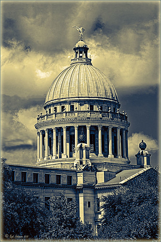 |
Most of the lines were removed following the steps below:
- Select the Pen Tool (P).
- Go to the Path Panel and click along the wire setting anchor points as you go.
- Next select the Spot Healing Brush (J) – in Options Bar be sure that the Content Aware box is checked and that the size of the brush is roughly twice the size of the wire you want to remove.
- In the Paths Panel, click the “Stroke Path with Brush” icon at bottom of panel (2nd over from left).
- Once the wire disappears, delete the Work Path by clicking on the Trash Can. If the wire did not completely disappear, just paint with the Spot Healing brush over the exposed area to clean up.
This technique works great as long as you are not in front of areas like the building columns or details. I found in this case, still use the Spot Healing Brush on these areas – but just click once and move along. It will do an amazing job in most cases. Note: To get rid of the path line on the image, open Path Panel and press DEL to remove the work path.
In the image above, the only areas that caused a problem was where one line went through the large ornamental balls – these had to be copied onto another layer, transformed, and layer masked to line up. Otherwise, no major problems and very fast even though there were lots of power lines. The traffic light was cloned out, and street light was removed using Edit -> Fill – Content-Aware after selecting with Lasso Tool. The new Topaz Black and White Effects was used to create the color effect on this image.
Try using this tip – it is really fast and great to have in your arsenal of quick tricks…..Digital Lady Syd
Just a Tree!
Sometimes I find that combining recent effects I have learned in Photoshop can create something that is quite unique. Obviously not all things I create are that great, but even so, I am learning something about how all the different elements go together. This image is an example of this type of creativity. Just had fun putting together some of my favorite brushes and filters and came up with this tree.

The tree is one of Mels Winter Tree Brushes placed on a layer above the background, and on the next layer foliage was added using several of Gorguss Grunge Again (click on upper right – Photoshop Brushes) brushes. Both brush sets are favorites of mine. Two of ShadowHouse Creation Textures (5 Assorted Textures Set and Vintage Oil Painting Texture Set-2) were stacked underneath. A composite layer was made (CTRL+SHIFT+ALT+E) and opened up in Topaz B&W Effects plug-in (see sidebar for link) – a Cyanotype Collection preset was used to get the bluish appearance, and the Transparency was lowered so some of the colors showed through. Back in Photoshop a new layer was created on top and using Texturemate’s Rough Sand Texture brush 9 in blue on top at 70% opacity. That was it. I really like the effect.
It can really be a lot of fun to mix and match – give it a try!…..Digital Lady Syd
Just Another Topaz Black & White Effect Example

This image was taken at Edinburgh Castle in Scotland. I just keep playing around and finding new looks for images. The cannon and opening were selected and placed on their own layer, then a white layer was added below it, and a texture from ShadowHouse Creations Another Mixed Bag Texture Set (some really beautiful free textures on this site) was added. On several layers above and below using different colors from the image, various brush marks were added using Gorjuss Grunge Again brushes (unfortunately these are no long available), some really nice brushes to add a bit of color and detail. Create a composite and duplicate this layer. Next use the Topaz Black and White plug-in with the Opalotype Collection Effect and Yellow Lilac preset as a start. A lot of changes were made in the Conversion and Finishing Touches panels and Detail and Burn brushes were used to emphasize the stone. (See my Fun Photoshop Blog “Topaz B&W Effects Plug-in – a Real Winner!) and Tidbits Blog “Topaz B&W Effects vs. Nik’s Silver Efex Pro” for more information on this plug-in.) The plug-in layer was set to 52% opacity back in Photoshop. A Curves Adjustment Layer was added and some sharpening applied. It was a really fun image to do.
Hope you got an idea for creating a little different effect with this plug-in…..Digital Lady Syd


