
Mockupped Sailboats
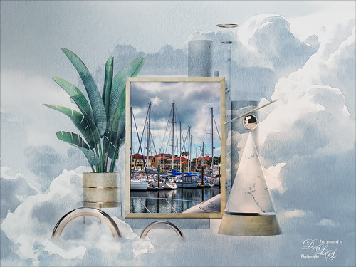
I have never used a Mockup File before to show off my images, but this one sort of seemed to fit this image since there is a strong triangle effect. First a free Abstract Mockup file by Best Pixels was opened up in Photoshop. The top layer is a Smart Object layer which must be opened by double-clicking on the thumbnail icon and then your own image can be placed in and aligned with a Free Transform (CTRL+T) if needed to fit the frame opening – must Save this image when warning comes up (the file does not appear anywhere in your folders but you still have to save to add in your image). This is where my Sailboat image from Camachee Cove was added into the image. On top of the bottom layer a Solid Color Fill Adjustment Layer was added using a light blue sky color. Next one of several free beautiful Watercolor Clouds Textures by Presets Galore was placed under the Smart Object ans set to 45% layer opacity. In a layer mask, the picture frame areas and few other places were masked out with a black brush. On top a Curves Adjustment Layer was added. Nik Viveza 2 was added on top where a little warmth was added into parts of the mockup. That was it. I love the dreamy feel this created…..Digital Lady Syd
A Little Wintry Guitar Playing
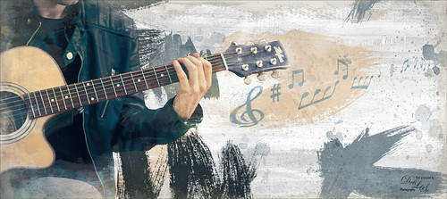
Well here is one of my favorite ISORepublic images called Guitar Man that I often choose when trying out a new technique. I used to play guitar and I think that is why I like it. This time I liked the result so well I decided to post it. I spent a lot of today watching a video (unfortunately it was not a talky), but it was so good I took notes and worked along with the basic steps anyway. The video is on You Tube and called Technical Dost/Digital Painting/Smudge Painting/Photoshop Tutorial by Nikhil Shirkar – some of the technique just did not work for this image like a lot of the smudging, which seems to apply to portraits more than this type of image. What I did like were the brushes he linked for the download. I especially liked the Danger Pig Strokes 01 free brush set and there was also a nice white watercolor grunge texture to use. I decided to use my own background texture, but his is quite nice. Otherwise it is just adding in elements and strokes to get a nice grunge feel. I used a watercolor border at low opacity to give a little vignette effect. The notes were created from some sheet that was downloaded and made them into brushes – I use them all the time. Overall just a lot of fun to do and the only filter used was Topaz (see sidebar for website link) AI Clear to sharpen the image. And also beware that when using some free images (including this image), the resolution is set to 72 dpi. Need to adjust this by going to Image -> Image Size and setting the Resolution to 300, then uncheck the Resample – the Width and Height will readjust – and recheck. That will give you a normal size image with the correct Resolution. ….. Digital Lady Syd
First Snow of the Season
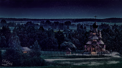
Decided to try using Serge Ramelli tutorial in KelbyOne’s Lightroom 30 Magazine on how to “Transform a Day Photo into a Night Photo.” It would probably be better if a street scene was chosen, but after fiddling around with the Radial Filters in Lightroom a bit, the results turned out pretty nice. Then the image was taken into Photoshop and I decided to add this wonderful, fairly new plug-in for us Windows users, called Luminar 2018 (see sidebar for website link). Several filters were added to get just the correct light to dark ratio (Accent AI Filter, Saturation/Vibrance, Dehaze, Brilliance/Warmth, and LUT Mapping using Color Punch Hot preset). On a second layer in the plugin Joel Grimes Indian Summer preset was applied which really sharpened up the church details. Then I decided I wanted a little snow effect so a couple layers were created using Glyn Dewis’s Dirt Debris Snow brush (created in his How to make a Dirt, Debris and Snow Brush in Photoshop video). A little snow was piled up on the sidewalk and roofs with a few specialty brushes I had created. I really liked the overall effect using a really bright image……Digital Lady Syd
Color of the Wind
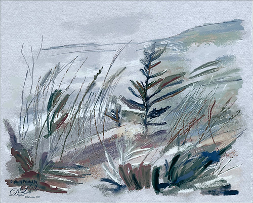
Once again just had some fun – this time painting with Grut’s Ink Brushes and paper. Decided to try and create an image somewhat like an Andrew Wyeth. (Right, like I could paint like Andrew Wyeth – I would be in heaven!) He is one of my favorite painters. It also gave me a chance to go through all the wonderful Ink Brush Nicolai has created at his Grut Brush site. There were so many I wanted to use but stayed instead to these brushes: Gone Coral, Coven Sloth, Pensive Linny, Bed Kelp, Bone Soak, Holy Slips, Go Folly, Raggedy Tag, and Wain Pip. (These were all placed into a brush Group named SJ Grut Ink Brush Favs – and backed up in the Preset Manager.) I also used his Oil Impasto Chip Gimble brush for ground cover. All these were used on separate layers so they could be adjusted and the opacity set correctly. Nicolai also has some marvelous papers – this one started with SP Espaloaf which gave the beautiful overall texture. To finish up, Topaz ReStyle was opened up and the Peppermint Gray preset applied for a very cool feeling to the image. Last step was to use Nik Viveza 2 to bring in the focus to the main tree. If you like ink brushes I suggest you check the Grut Brush Site – lots to choose from and for a low price, you can get all his brushes including these ink brushes. And the best deal is he gives away a free brush each week under his Freebies tab – all different kinds. I can’t tell you how many brushes I have gotten from this free downloads. …..Digital Lady Syd
Happy Halloween!
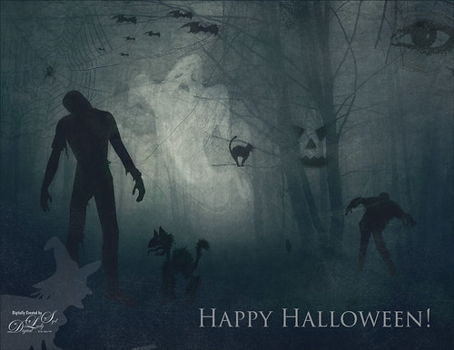
Happy Halloween! Had to do my annual post – they are so much fun to create! And had to do a post to thank all the various people who take the effort to create these wonderful Halloween objects. I would never be able to do these images without them!
So the create this image the base image is from a Creative Market Mysterious Forest Halloween Pack-01. The zombies are vector elements from Ben Blogged Zombieai – even though they are vectors, they will opened in PS – were copied over into the image on their own layers. The cats are all different: I love the foreground scary cat – he is a Halloween_Cat__s_Brush_by_altergromit, the cat in the tree is from a shape set of Halloween items, and the little cat way in the background is a brush from pureanodyne halloween-ciruelo cabral blackcat. Several cobweb and bat layers from the same set were also created. More spider and web layers, and a witch layer, were created using Obsidian Dawn’s Halloween brushes. The ghost was from Creative Market’s Halloween Illustrations – an Inner Glow layer style was used to give the transparent look. Two 2 Lil’ Owls Studio (see sidebar for website link) textures were used: Crackle 13 set to Hard Light at 81% layer opacity and texture 4 from the Artisan Collection Big Set 2, which was set to Linear Burn blend mode and 23% layer opacity. PS’s Foggy Night Color Lookup preset was set to 74% layer opacity to further darken down the image. The eye is one of I created in Photoshop. On another layer Function Subtle Grunge 6 brush by Liam McKay was added. The font is Trajan Pro 3, always a favorite. That was it. Lots of fun and lots of references – thanks creators for sharing!…..Digital Lady Syd
The Beautiful Comet 67P
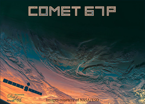
Totally enjoy downloading different images from the NASA and ESO websites and trying out different colors on them. (See my Colorizing NASA Photos Using Topaz Studio (And Check Out Updated Detail) blog for one with Saturn’s rings.) This is not a recent image (from November 13, 2009 and posted July 29, 2015) on the ESA’s website – check out all their images that can be downloaded. Added an image of the Rosetta Spacecraft Model from Wikipedia. Just played around with different fonts and colors and this is what I got!…..Digital Lady Syd
Viewing the Moon from a Scary Place
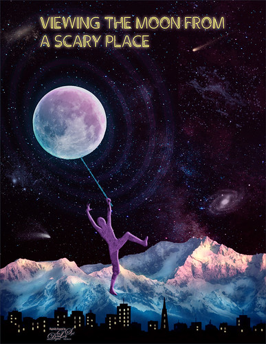
Just having fun with this crazy image of a guy hanging from the moon. Got part of the idea from Chris Spooner’s tutorial called How to Create 80’s Style Retrowave in Adobe Photoshop. Added several objects and blended in them using blend modes and opacity. Items included: Milky Way background image, White and Black Mountain image, Wireframe Vectors 30 by Designer Candies, Valentine by Julie Mead Valentine Gift6 to add some background fog, Wikimedia Commons Full Moon 2010, LifeLine by Gamarai Urb Brushes for the person and cityscape, Obsidian Dawn’s Space brushes for the comets, galaxy, and dust. The font is called Clip. After this just added a few adjustment layers: Darken Curve, Lighten Curve, and Color Balance. That was it. Sometimes it is just fun to create something different!…..Digital Lady Syd
A Miniature Horse
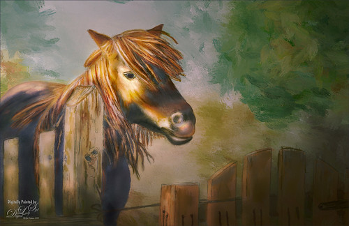
Doing a little more drawing and painting practice. This was a little miniature horse whose image was taken outside Minsk in Belarus. He was totally adorable. I decided he would make a good subject to paint. This time I did cheat a little on the rough drawing – used Topaz Simplify to create a very loose outline of the image and then removed the white using Select -> Color Range using the Shadows in the drop down. Then the Refined Drawing was done from this. After that the Local Color was added, Shadows and Highlights, and finally the texture was added to the horse, fence and gate. It is essentially the same workflow as was used in my Wolf drawing – see my Learning to Draw a Wolf! blog. Follow the links in my wolf blog for the great video by Aaron Blaise on how to do this. The background is one I created in Corel Painter a while ago and just seemed to fit this wonderful little guy. I am really enjoying trying out this new painting style in Photoshop. …..Digital Lady Syd
Trafalgar Square Fun!
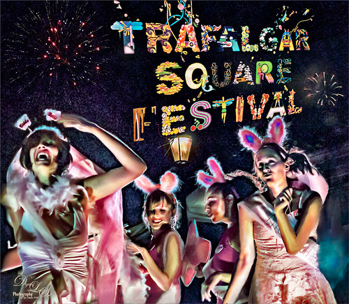
I am not sure why I did this image except that it was just fun to put together some older images I liked but were not that great to post as is. This is a composite using some of the girls that were in a nighttime show called Fashion Bus on the Square Show (a comedy fashion and dance show) at Trafalgar Square in London where it was pretty dark and crowded. The lettering was a banner at Trafalgar Square and the fireworks were added separately from my own sources. It ended up being a high-key image that looks pretty much how it did at the time of the event. The girl image was taken into Luminar 2018 (see sidebar for website link) where Joel Grimes Portrait Pop the Blues preset was applied (check to see if they are still available as a free preset from Luminar when in the software). Then it was mainly just a major clean up effort using clone stamps and mixer brushes. It was fun to try something kind of different. …..Digital Lady Syd
Flamingo Standing Guard
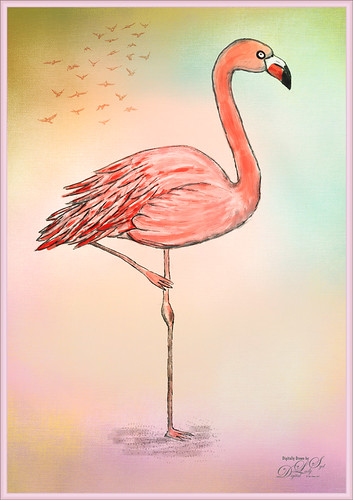
This image is drawn in Photoshop following a tutorial by Eugenia Hauss at Envato Tuts called How to Draw a Flamingo. I find her tutorials work really well digitally. (See my Enjoying a Swim blog.) Mainly used my favorite Grut I Qwillo brush for the outline and then increased the size to paint in the colors under the line drawing. Used one of my painter backgrounds and created a layer style for the border. Just a lot of fun – which is what Photoshop is all about for me!…..Digital Lady Syd
Having a Snack
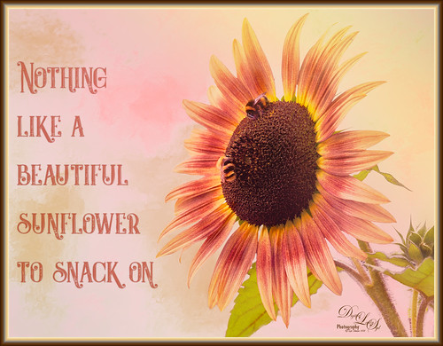
These two little bees were quite happy hanging around with this beautiful colored sunflower at the Old Village of Ayaymku restoration in Belarus. It was really simple to post-process. In Lightroom the new Artistic 02 profile was applied and then just a few Basic panel changes. The flower was selected from the busy background in Photoshop’s Select and Refine dialog. A background was placed behind the flower – one I had painted in Corel Painter that had some nice green and pink strokes. Created a Color Burn blank New Layer and painted with white to emphasize some of the color in the petals and set it to 70% layer opacity. Cleaned up the bees just a little so they stood out a little more. Added the text using the Castile Inline Grunge font. A Light Leak was applied using a pink to yellow leak. A little Nik Viveza 2 was applied and one of my borders using a layer style was added. (See my How to Create a Quick Layer Style Border or Frame blog). That was it. Have a great day!…..Digital Lady Syd
The Mighty Zebra
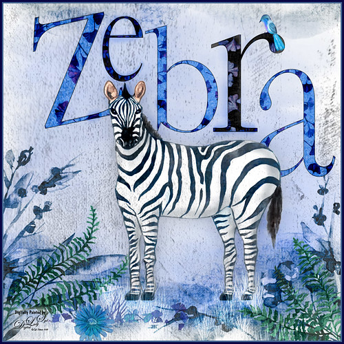
Just had a little fun with this one – started by painting a blue background with a large watercolor brush. Next added a background template by Anastezia-Luneva which added the side detail. Next a Zebra from Freepik was added. The letters from Ginko Textured Watercolor Graphics by Paperly Studio were added underneath along with the green ferns and flowers in foreground. Topaz (see sidebar for website link) Studio was opened and the new Topaz AI ReMix adjustment (see my What is Topaz AI ReMix???? blog) was applied using the swatch that looks like a B&W drawing (Col 2/Row 9). The adjustment was set to Opacity 0.47 and Overlay blend mode. Then added a Texture adjustment and used my cat painting texture (can download at my Deviant Art site) and painted the texture off the dark parts of the lettering. Last added an HSL Color Tuning adjustment and changed the Blue and Gray saturation sliders. The brush used to create the grass was from one of my very favorite natural brush sets at DeviantArt called Grass Set2 Frostbo Grass. A basic little painted bird was added. Some shading was painted onto the Zebra to give him some depth. The border is my Layer Style with sampled colors from the image (can download here). That is all that was done but it was a lot of fun to do!…..Digital Lady Syd
A Pretty Design
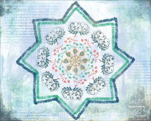
Decided to try out the Paint Symmetry in Photoshop CC 2018 – to load go to Preferences -> Technology Previews -> Enable Paint Symmetry. A little butterfly icon shows up in the Options Bar when the Brush Tool (or Eraser Tool or Pencil Tool) is chosen. Click the icon and several choices can be made from a drop-down menu. Once a shape mode is selected, it can be manipulated by adjusting the already activated transform controls or any of the Path Tools. Since this image would be using a special option called the Radial Symmetry, the New Dual Axis was chosen. The path in the Paths Panel was renamed to “radial symmetry 8” (can set up to 12 segments) – this can be added anytime while you are adding strokes. This will create the identical lines all around the design. There is also a Mandala Symmetry which is a little more complicated and will give a different look – just rename the path “mandala symmetry 8” (can be set up to 10 segments). Then go to the Layer Panel and choose a brush (does not support airbrush, bristles tip or erodible types) to create your effect. With a little experimentation, some great looks can be obtained. The thick lines are regular brush strokes using Grut’s G Flow Co brush, and the floral designs were created by a single stamp from 3 different brushes in a set by Coy Dreamer Floral Brushes and. Under these layers one of my Gesso textures was placed which had text added. On a new layer on top, a gritty brush effect was added to the edges. The last step used 2 Lil’ Owls Studio (see sidebar for website link) Cosmos 18 set to Pin Light at 77% layer opacity. This was just a fun little project to see learn how the Symmetry Painting worked. I wonder if Adobe will have some new features when it is actually added into the program. …..Digital Lady Syd
Enjoying a Swim
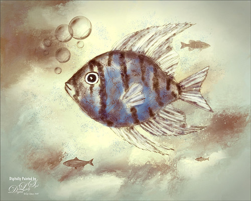
I am not the best drawer, but I did this Angelfish image following a really fun blog called How to Draw a Tropical Fish by Eugenia Hauss at Envato Tuts. It does not look exactly like the final result of the tutorial, but this was all done digitally where the tutorial is using actual graphite pencils. For the drawing Grut’s I Qwillo brush for doing the beginning design, Grut’s H Hatch Blanket brush (he has the best hatch brushes around), and Grut’s NM Shim Timber for shading were used. One of my Corel Painter textures was placed underneath for the watery look. The little fish are from Fish No2 Ars Frafix (no longer available) and the bubbles are from Lisa Carney’s Filters and Smart Objects Creative Live class which created a bubbles brush. A stamped layer was placed on top and Topaz ReStyle’s Silver and Ivory Cloak preset was applied with a few changes. Nik’s Color Efex Pro 4 was used on another stamped layer and the Film Efex Vintage filter with no changes and a Vignette set very softly were added. A Luminosity Red Channel Curves Adjustment Layer and a Dodge and Burn layer using a 50% gray layer set to Overlay to finish up. It was a lot of fun to create!…..Digital Lady Syd
Entangled Noses
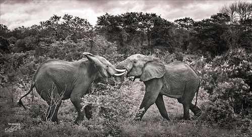
I usually take my own image but this interesting image of elephants in an encounter look good for trying the effect used in the video linked below. It was taken at the Kruger National Park in South Africa and provided in a set of animal wildlife images from Deal Jumbo. The video followed is called Create a Powerful Emotional Effect for Your Portraits in 9 Easy Steps by Adam Scheff. This image was converted to the resulting sepia tone using a split tone preset in the Camera Raw filter. Some dodging and burning and sharpening was also used on this image. A Levels Adjustment Layer was used to give a slight matte tone to the shadows. Just a lot of fun to try a different look……Digital Lady Syd
Happy Valentines Day
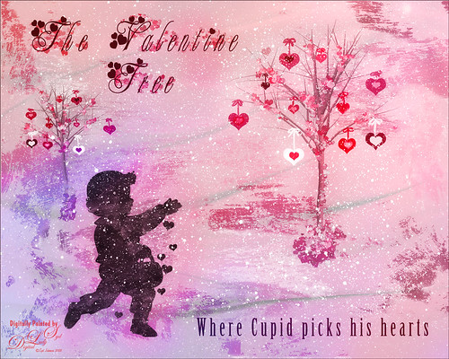
Just another Valentine – love to create them. These are my Valentine Trees created using the Render Tree filter (see my How to Create a Photoshop Artistic Tree blog) in Photoshop by selecting the Foliage Plant with no leaves. Some hearts were brushed on to hang from the tree using the shape brush created in my Happy Valentines Day (with a Few Tips!) blog. The little scattered valentines were added to the branches and used to create some valentine flowers at the bottom. Paint Swipes (White) by People Love Process is a freebie called Design and Illustration Textures from Design Cuts if you sign up with them – this is a wonderful pack of PNG and PSD files. Different shades of pink were used to paint in the paint swipes. And their Spatter Spray (White) was applied for the snowing looking background. The cupid is one of the brushes I created using Julie Mead at E-scape & Scrap set also from my Valentine blog tips. The image was taken into Luminar 2018 (see sidebar for website link) and the Accent Filter, Image Radiance, Sun Rays very lightly applied to brighten the trees, and the Darken & Lighten filters were used. In PS the layer was set to 57% layer opacity. A pink and blue overlay set to Hue blend mode at 82% was applied to add a little more color in the background. The fonts used were MC Sweetie Hearts and Birch Standard. The last step was adding a Red Channel Luminosity Curves Adjustment Layer. Hope everyone has a Happy Valentines Day!…..Digital Lady Syd
Happy New Year!
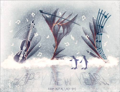
Just wishing everyone a Happy New Year! I am really looking forward to trying out some new techniques and keep working on my digital art, as shown above. I actually painted this image a while ago and decided to make into a Happy New Year greeting by adding the cute penguins brush by Altergromit and some text. There are lots of layers in this image. To get the string look, a Corel Painter brush called Spring Light was used to get this effect. It was saved down as a PSD file and where I could finish up the design. Violin and Bow are from the Design Shop.The notes are from FX Ray Music Brushes. The font is Starway. And lots of snow brushes were used – mine and other peoples to get this wintry look.
Five Flowers and Plants
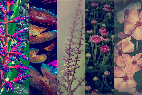
Had a lot of fun putting this template together with some of my favorite flowers and plants from this year. If you would like the full instructions on how to do this, check KelbyOne Insider’s blog called Down & Dirty Tricks: Five-Up Photo Layout by Scott Kelby (I am hoping you can access this link). This is not a video so just follow the steps as they appear to make the template and then it can be used over with different images. Once I created and filled the template, just added a Curves Adjustment Layer to give more of a vintage feel. Very simple but fun to do…..Digital Lady Syd
Me and My Shadow
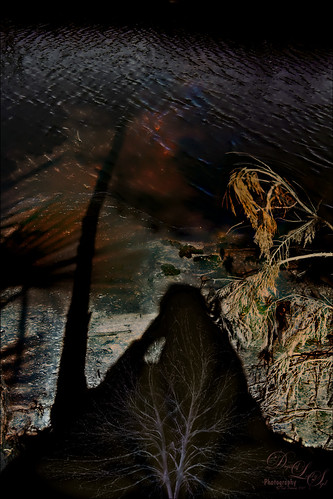
This image represents to me a contemplative mood – a connection with the Fall season and nature, and the nature of man with nature. It was a lot of fun to create. A tree from Pixelsquid was added into the shadow. Some of the colors are from using Lucis Pro. Topaz (see sidebar for website link) ReStyle’s Single Fawn was applied to the image. This image was taken into Luminar 2018 (see sidebar for website link) and the Adjustable Gradient Filter was added to the whole photo and the Sun Rays filter was added to just the foreground tree by using a layer mask. Loved how the tree turned out. PS Liquify filter was used to stretch the foreground tree where I wanted it. Some clean up layers and that was it. Love the whole concept of this image…..Digital Lady Syd
Dreaming
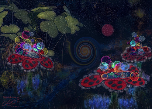
Have you ever had a dream that just seems so vivid that you remember several parts of it. Well that is what a lot of this image is showing – one of my very vivid dreams. I see a lots of stories going on here – like flowers actually filling the sky with planets or moons? Or bubbles being shot at a target? Really??? And what about those giant 3-leaf clovers guarding the bubble machines? Hum! So there you have it, the inside workings of my sleeping brain. So what I did here is basically just sketch this out and paint it. The clover is from PixelSquid, my favorite resource for all kinds of odd things. The bubbles were created using Grut’s FX IL Rinse Drip from his Inky Leaks Set (I love this brush set) and used Hue/Saturation Adjustment Layers with black layer masks to paint in the different color bubbles. The little bubbles were from Lizard Queen Water brush 8. The last step was using Topaz (see sidebar for website link) ReStyle Swamp and Sherpea Blue preset set to Screen blend mode in the plug-in and 44% layer opacity in PS to adjust the colors to match my dream. Sometimes things get a little crazy when you paint what you dream!…..Digital Lady Syd
The Magic Violin
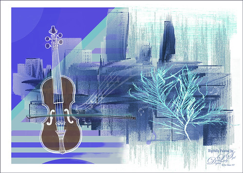
This image was inspired by a wonderful piece of clip-art from The Design Shop called Vintage Violin clip art. From there the image just kept building. The background abstract city element was created in Corel Painter and a few cool brushes created in PS for more detailed elements. This whole image was just a lot of fun to do and no filters this time!…..Digital Lady Syd
Trick or Treat!

Happy Halloween to everyone! Just thought I would post a little Halloween cheer using a photo taken at the local Lowe’s Garden Center. Sometimes the displays are more creative than what you see in the neighborhood! I am not sure what this little guy is but he sure is scary! So had some fun with this image. Started by selecting the subject and putting him on his own layer. Then underneath used Shadowhouse Creations Halloween Pattern 3 HP3 and topped it with Julia Dreams Halloween icons Pattern 1 – actually used the Blend If slider to get the strips to show up underneath by setting This Layer black tabs split to 131/174. It gave a really nice effect. Add the Machovka_bat and text – the Adrenaline Brush font with a Stroke Layer Style- were added. Color was added to the letters by clipping Pattern Fill Adjustment Layers to the three text files. Had to replace the font on the bowl as it was not very sharp and added the Old English Text MT font – a layer style was added using a Stroke, Inner Shadow and Outer Glow effects. On a Stamped Layer (CTRL+ALT+SHIFT+E), Nik Viveza 2 was applied to adjust the focal point of the image. Then a 50% Gray Fill Layer was used to Dodge and Burn with just a black or white brush. The cobwebs were placed in the subject’s eyes – Obsidian Dawn’s Halloween Vector Cobweb 10 brush was used. Last step involved add Halloween Cats Brush by altergromit (love this cat) – added a mask to pop him out of the bowl and added an orange Outer Glow Layer Style around him. That was it – check out some of these resources for other interesting Halloween items…..Digital Lady Syd
Happy Halloween

This Halloween grouping was taken at a local Lowe’s Garden Center on my Android – just could not resist the cuteness of these guys. I would love to have one of those straw looking characters but we do not get many Trick-or-Treaters here so no need to put outside. Anyway, since it was just a JPEG taken on the fly, the image itself needed some work. Only basic adjustments were done in LR, then in Photoshop the first thing done was to run the Shake Reduction Filter to try and sharpen up the edges a little. Next the background was removed using the Quick Selection Tool and Mask and Select command. One of my textures was placed underneath for a background. To further sharpen the image, it was taken into Lucis Pro (no longer available) and it really helped. On a stamped layer, Nik Color Efex Pro 4 using one of the Flypaper recipes presets to get this overall vintage feel – I forgot to write down which preset. So many of them looked good. Two inches were added to the bottom of the image and the Naive Deco Sans font was selected for type. On a New Layer a Mixer blender brush was used to smooth edges. Nik Viveza 2 was applied on a stamped layer to draw focus to the center pumpkin. Last step was to add a Curves Adjustment Layer for a little vintage feel to the overall image. Happy Halloween Everyone!…..Digital Lady Syd
Going to Windsor Castle
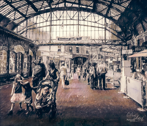
Enjoyed working with this image of a little shopping and restaurant area that led into Windsor Castle in England – lots of different tourists. I find this kind of image totally entertaining! Will just go over the basics as a lot of work went into this image. Mainly did basic adjustments in Lightroom including converting it to black and white. In Photoshop the image was taken into Topaz (see sidebar for website link) Studio where Precision Detail, Color Theme where some color was added back in some different gray color tones, and Impression where the default was used and the Painting Progress slider set to 0.43 – that is why it is not overly painterly. Added a little pink color, a Nik Viveza 2 filter to clean up some of the lighting issues, several Curves Adjustment Layers, and a Color Lookup to add more pink tones in. On a stamped layer applied Topaz ReStyle’s Wedgewood Blue and Tan preset set to Color blend mode and a Levels Adjustment Layer for final adjustment of contrast. It took a lot of tweaking as the people looked too crisp with some of the settings. I just really liked the feel created by the glass dome and all the activity. Lots of fun…..Digital Lady Syd


