
Recently I have been working on my Macro photography, especially since I have had some beautiful flowers on my porch due to the warm winter we are having in Florida this year. One of my favorite blogs is by Mike Moats called Tiny Landscapes where he gives some great advice on taking and processing macro images. A few things I am starting to try and the above chrysanthemums are the result of one of my efforts. A 60 mm Nikkor macro lens was used at F/19 at 1/20 to 1/350 sec. A Bower 0.5 x High Resolution Digital Lens with Macro was added to the lens. I created an HDR image from five shots which is how I got the large dynamic range in the photo. After that the processing was in Nik Color Efex Pro 4 using Tonal Contrast, Detail Extractor and High Key filter effects and Viveza 2. This is the basic workflow Mike Moats uses and it works very well on macro photos. My original shot was taken with a white background but I just did not like the way it looked. Mike says if you do not like the background feel, crop tight, which is what I did. I hope to try out some of his other tips in the near future – it is a lot of fun to take those close up shots…..Digital Lady Syd

Latest
Happy Valentines from Digital Lady Syd

Hope you all have a wonderful day!
A little background information on this Valentine. To create the following card, these steps and resources were used:
1. Started on a New Layer with Spatter Heart Frame from PS Brushes. A Layer Style was added – Outer Glow set to a soft yellow and Linear Dodge (Add) at 75% and a Spread of 21; and a Gradient Overlay adjusting Graphix1 Muted 8 for a gold tone.
2. Next a background was added underneath using Colored Vintage Paper by Ciara Panacchia.
3. Another texture was added above this one – Vintage Valentine Paper by Aramisdream. It was set to 59% and a layer mask was used to brush out the center and to create a vignette effect around the edges.
4. A layer was placed on top that used Obsidian Dawn’s Glitter set-hearts-glitter brush in a soft beige at 43% opacity.
5. Glass Prism’s cupid brush was placed in the center on it’s own layer.
6. The red valentines were placed on their own layer – Hearts by King Billy was used. A Layer Style was added using a red Color Overlay and a small 1 pixel Stroke.
7. Two Text Layers were created using the font Precious, a perfect Valentine font. A Layer Style was added using: Inner Shadow set to Distance of 21 and Size of 21; Outer Glow set to Linear Dodge (Add) at 45% opacity and Size of 24 pixels with a light yellow color; and Bevel and Emboss set to Inner Bevel, Smooth, Depth 103, Size 10 and the rest default settings.
That is how I made my vintage look Valentine. It was a lot of fun to try out the different effects on the brushes – the layer styles really made a difference. When you have a minute, try a layer style on some of your brush strokes – you may get some surprising results!…..Digital Lady Syd
Digital Lady Syd Related Blogs:
Where To Get Those Free Valentine Templates
Create a Valentine
Just a Pretty Red Flower

I really liked how the background blurred in this photograph of a red carnation I took on my back porch. I used a 60 mm AF Nikkor Micro lens at F/3.2, 1/300 second, ISO 200 at -1 Exposure Compensation. It was processed in the new Lightroom 4 Beta version setting (Highlights to -100, Shadows +100, White +27, Blacks -29, and Clarity +100; then the Exposure and Contrast) before taking the photo into Photoshop where a Sharpen Tool layer, Curves Adjustment Layer, and OnOne PhotoFrame acid burn controlled 12 were applied. A Layer Style including a stroke and inner glow in gold was the last step. Very little processing and it turned out beautifully.
It just goes to prove that if you get a good shot, it does not take much post processing – the image looks great to begin with. It also is nice to have a good lens and this is one of my favorites……Digital Lady Syd
Creating Your Own Art (and Cards) While You Are At It!

More Valentine resources if you are feeling in that creative mood and want to make your own. Here is how I created this funny little valentine.
1. I created a New Document and then added a New Layer on top where a red circle was painted and then a yellow circle was painted inside it.
2. Next this layer was taken into Photoshop’s Liquify Filter and where I came up with this funny looking flower. This is a fun filter that can give some really interesting results if you take the time to learn what the various tools do. A Layer Style (double click on the layer in the Layers Palette) was added to create this nifty embossed heart look – by adding a Bevel and Emboss Layer Style and checking Texture. Now the trick is to double click on the word Texture on the left, and you get a new dialog where you can change the Pattern you use for the texture. In this case, the San Valentine Pattern by succo-design was used with the Scale set to 69% and Depth to +6. These are the same patterns you will see in the Pattern Overlay section, except they are embossed and have not color! This is really a great way to use patterns!
3. On a separate layer I painted a stem and a few leaves. Add a Layer Style to this layer and select Pattern Overlay from the left side. To show you the different from step 2, choose a pattern to add some texture to your stem. In this case I choose Obsidian Dawn’s Dirty Patterns-Texture 1 set to Scale 31% and Opacity 36%. Then an Inner Glow was set using a dark green color set to Size 125 pixels to add a little shading to the outside shape of the leaves and stem. You can see how this pattern was applied differently from the pattern in Step 2.
4. I was not really sure what to do next so I decided to add a colored background. I choose ShadowHouse Creations Raised Textured Effect 2 to give some interest to the background. All the textures in this group are beautiful.
5. On a New Layer ShadowHouse Creations Assorted Brush Pack 2 Soft Clouds-NewBrush 18 was used to for a soft white background.
6. On another New Layer, Obsidian Dawns Glitter Set-Random Swirls 2 was used for the slight yellow glow behind the flower.
7. Above that on another New Layer I used SJ Basic Star Scatter Brush to drop some large white flakes on the background for a bit of a wintry addition. (I set up a star scatter brush using the soft brush set to 30 pixels and spacing 1000%. In the Scatter dialog, set the Jitter to 1000% both axis and the Jitter Count to 100. I saved the settings to use the brush again. This brush is used in my Fun Photoshop Blog “Trying Out Topaz Star Effects” but it creates a nice snowing effect also.)
8. Above the flower, a New Layer was created and the little cupid painted in red (click twice to get dark enough) using Glass Prism CupidReq09 brush.
9. Under this layer, create a New Layer and paint all over image with Snow Drops by FrostBo to finish the snowy feel. You do not want snow on the cupid as it will blur the cupid so this is why the layer is under the snow drop one.
10. A Text Layer was created using the font MC Sweetie Hearts and a white Outer Glow Layer Style set to 21 pixels was used to make the letters stand out.
11. On top of the font a New Layer was created and small hearts using the Valentine Brush by digitalTouch with a white as foreground color and red as background color was painted along the bottom leaving a small heart trail along where the ground would be.
12. A composite layer was created on top (CTRL+ALT+SHIFT+E) and a Layer Style was created to frame the image Stroke set to a gray 4 pixels inside stroke, and a Inner Glow style set to light gray and 125 strokes.
Here is what the layer structure looks like in case you got lost.

It sounds like it is hard to do, but I wanted to show how easy it is to construct some very creative cards with nothing but Photoshop and some nice resources. The trick is to add each element on individual layers and make sure they re named so you know what you did. Much of the home art you see in Wal-Mart or TJ Maxx is basically just doing exactly what I did here. Check out my blogs below for other ideas just using Photoshop. Take some time to play around with some of the resources available for download and see if you don’t get some really nice art…..Digital Lady Syd
Digital Lady Syd Related Blogs:
Just Plain Fun Brush Effects!
Tree Brushes with a Little Grunge
Just a Tree
Brushing Up on Circles!
Some of My Favorite Plug-Ins
 |
I am starting to sort through all the plug-ins that are out there and slowly figuring out what really works for my workflow. This is a really hard process since there are so many great plug-ins and some of them give very similar results. I have blogged on this many times showing how the same images look with the various plug-in effects.
I started working on this image – not one I was totally in love with, but the old Flagler Presbyterian Church is so beautiful to look at that I wanted to create that sensation in the image. I began by manipulating the file in Topaz Adjust 5 (see link to website in sidebar) and hit the “Get Lucky” button just for the heck of it – and this really cool illustrated look appeared that I was not sure what to do with it. (Hover over image to see the Topaz 5 illustrated image.) I decided it needed a new sky so I opened up OnOne’s Perfect Mask (see website link in sidebar) and added a sky I had placed below the image. This plug-in is the best one I have found for replacing skies quickly – check out the little holes in the trees where the sky peaks through. Next several different effects were tried but none made me go “Wow” — that is until I decided to go into the Topaz Black and White Effects plug-in (see link to website in sidebar). It took no time at all – in fact I started with the same settings from my “My Office Friend Ted” image which was a totally different type of image. A few things were adjusted but it still was not quite right. Back in Photoshop a Color Balance Adjustment Layer was added to bring out the blues in the sky a bit more to get the right look. Now it looks like I remember it – but it took some effort. Luckily, I had a plug-in that gave me a great start.
I guess I can honestly say I still love both Topaz Adjust and Black and White Effects – they do have that versatility to turn an okay image around. Definitely great plug-ins and reasonably priced too! And OnOne Perfect Mask is the best for skies – still figuring this plug-in out for other types of selections. I hope to have a page set up soon on which plug-ins have made it into my workflow……Digital Lady Syd
Digital Lady Syd Related Blogs:
Topaz Plug-Ins – Same Image Trying Each!
Same Image – Different Plug-In
Another Pseudo HDR from Me!
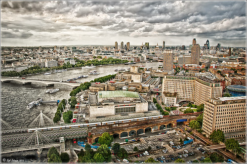 |
I love these photos I got from the London Eye a few years ago – they really look good with the pseudo-HDR look. Here I have applied my SJ-Vivid Drawing Look preset in Lightroom (for here for Adobe Camera Raw preset – note: change file extension to .xmp in zip folder to get file to work). I had to adjust the Exposure a bit after applying the preset. Then it was processed in Nik Color Efex Pro 4 using my SJ-Pseudo HDR1 recipe. NOTE: This download link is broken if you click the Download button, but by right clicking on the button and choosing “Save Link As,” the file will download correctly.” Usually the Detail Extractor slider needs to be adjusted so the image is not overdone. Next it was taken into Viveza 2 to get rid of the muddy color water that is so common in the Thames River pictures. By setting control points in the water areas and adjusting the Hue and Brightness sliders, the color could be changed to more of a blue tone. There was distortion from the movement and the glass of The Eye so I added a layer set to Overlay blend mode and painted with a black brush at 10% opacity over these areas to get it evened out. (Click on the image to see the original – most of the distortion was in the lower front and on the train bridge in the middle.) Finally the Sharpen tool was used on a separate layer along with Curves Adjustment for contrast and Hue/Saturation Adjustment Layers to desaturate a little. Loved the final result. This is very similar to what you would get with the Lucis Arts filter. Overall, loved the results! …..Digital Lady Syd
Digital Lady Syd Related Blogs:
Pseudo HDR Using NIK Color Efex Pro 4
Another Pseudo HDR Image with NIK CEP4 – Got to Love the Effect!
Settings for Vivid Drawing Look ACR/Lightroom Preset and NIK Color Efex Pro 4 Pseudo HDR Recipe
Where Am I?
Combining Plug-ins for More Image Interest

Took this image of a red bloom from the hibiscus tree in my front yard – I love hibiscus flowers! A 60 mm Nikkor macro lens was used at F/6.7 for 1/60 sec. A Bower 0.5 x High Resolution Digital Lens with Macro was added to the lens. The camera raw shot was adjusted in Lightroom and brought into Photoshop. Some of the distracting background was cloned out, the image sharpened a bit, then Nik’s Color Efex Pro 4’s Darken/Lighten Center filter effect was applied. The image was taken into Nik’s Viveza 2 where the structure on the pistil and stamen was increased, and the background softened a little by setting the structure to -100. ShadowHouse Creations texture 5AT-2 was added and set to Soft Light at 62%. Next the new Topaz Star Effects plug-in was applied to the tips of the stigma to make it sparkle and a bit to the yellow anthers (see sidebar for Topaz’s website link). Finally OnOne PhotoFrame’s Taufer Texture 12 was applied to finish off the image (see sidebar for OnOne’s website link).
This is a good example of how several different effects can create more interest – it also helps to have a great color combination to work with too!…..Digital Lady Syd
Digital Lady Syd Related Blogs:
Trying Out Topaz Star Effects
Using NIK’s Color Efex 4 and Viveza Together
Five Image Template Creates Beautiful Collection!

I have not been following all my favorite websites like I should. There is one I had not visited in quite a long time so I checked in. The CoffeeShop Blog was offering this wonderful Web Storyboard 6 for 5 pictures as a free download so I thought I would give it a try. I was really pleased with the final result. Her template is very easy to use – just clip (highlight image and go to Layer -> Create Clipping Mask) the each image you bring into the Photoshop file she provides to the location you want. Use Free Transform to adjust the size to fit. The background color was changed by clicking on the Background Color layer thumbnail and choosing whatever color you want. On the Frames layer, a Gradient Overlay Layer Style was added and reversed using Muted Gradient Muted 5 from Graphix1 set with a Radial Style, angle set to 90 degrees, and Scale set to 149% to get the pretty reddish gold colors on the frames.
Both The CoffeeShop Blog and Graphix1 websites offer some of the best free resources for the Photoshop fanatic like me. Take a minute to check out their websites – both have great blogs too (just click on their Home buttons).
It is really fun to put a collection of your images together! Give it a try!….Digital Lady Syd
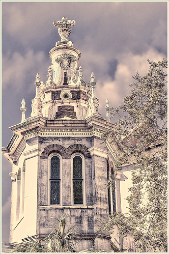
OnOne’s Perfect Mask Works Great!
 |
This image is of the Flagler Presbyterian Church built in 1889 in St. Augustine, Florida, by Henry Flagler as a memorial for his daughter. Hover over image to see the original image that has been adjusted in Lightroom.
To process this image:
1. The power lines first had to be removed. This was done very quickly using the technique shown in my Tidbits Blog “Get Rid of Those Power Lines Fast – with Paths and Spot Healing Tool!”
2, Some of the tree leaves needed to be removed too so the Clone Tool was used for this.
3. Nik Viveza 2 was used to sharpen up the building and get the detail to pop – this plug-in is probably the best one for localizing on an image how you want certain areas to look. The Sharpen Tool in Photoshop could be use instead to bring out the detail.
4. Place a new sky under the top layer. (Highlight the layer under the top layer, go to File -> Place, and Enter. Then right click on thumbnail of sky and choose Rasterize to get rid of the smart object.)
5. In my Fun Photoshop “Using Cloud Images to Fix Up a Sky” blog last I talked about replacing skies and gave several examples how an interesting sky can really add interest to in image. This time I used OnOne Perfect Mask (see website link on sidebar) to see if I like the new sky look. This is first time I tried using the tool and it was quick and accurate. It took about three minutes to add the new sky into the image – it creates a layer mask so it can be adjusted later if not everything is picked up. It has several different types of brushes to select the various areas that need to be covered when you have tricky selections like trees. You just click once in the open area and it picks up all the clear areas, then choose a Refine Brush and paint over the trees and it picks up all the little color openings in the trees. Very quick! Even certain colors can be isolated for selection.
Try downloading OnOne’s Perfect Mask if you do a lot of selecting and see if you are as impressed as me. I plan on trying out some other kinds of selecting in the near future and post again. I also plan on releasing some of the skies I find useful for adding into images very soon. Until then, have fun experimenting!…..Digital Lady Syd
Problems for Big Ben
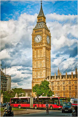 |
It is funny that I had just completed this image of Big Ben a few days ago and then it comes out that is has some tilting issues, 0.26 degrees NW or 18 inches off center at the top of the 314-foot tower. It will be thousands of years before Britain’s iconic landmark that houses the clock gets as bad as the Leaning Tower of Pisa in Italy. The rumor is Members of Parliament are meeting to discuss what to do including these two options: 1) Do costly repairs to both the Parliament Building and Big Ben, or 2) sell the entire complex to a rich foreign developer. Hum! For more information on this, check out The National Post article.
I tried to find an old famous painting of Big Ben but could not find one – can’t believe no one painted this gorgeous landmark in the 1800’s so my search is still on. In the meantime, I did find a site selling some very interesting Big Ben posters at Art.Com that I found very inspirational – give it a look to see some of the creative work others are doing (and for profit!).
How I processed this image? Believe it or not, this is just another pseudo HDR processed just like I do all my pseudo HDR’s. Used my SJ-Vivid Drawing Look preset in Lightroom 3 (download here if using Adobe Camera Raw) (note: change file extension to .xmp in zip folder to get file to work) and adjusted the Exposure, Blacks, Red Saturation (-45), Blue Saturation (+61), and Green Luminance (+3) sliders to make the image colors pop correctly. In fact the red bus was overpowering the image so the red saturation had to be reduced quite a bit. (Hover over image to see how it looked coming out of Lightroom.) I must say there was an amazing sky that day! Some clean up in Photoshop was done and the image was taken into Nik Color Efex Pro 4. All I did was add the SJ Pseudo HDR1 recipe (NOTE: This download link is broken if you click the Download button, but by right clicking on the button and choosing “Save Link As,” the file will download correctly.”) – I had to tone down the Detail Extractor and Contrast a little and change the Effect Radius to Large to get rid of the over-exaggerated HDR look. In Nik’s Viveza 2 I added a point on the clockface to make it really sharp but this could easily have been done with the Sharpen Tool in Photoshop. The last step was to add a Curves Adjustment Layer to brighten the whole image just a little. I was surprised how much detail came in from only applying the Lightroom preset without the Photoshop plug-ins. You could actually see the people riding inside the bus! It’s great when it all comes together with the light and composition to create a great shot!…..Digital Lady Syd
Digital Lady Syd Related Blogs:
Pseudo HDR Using NIK Color Efex Pro 4
Another Pseudo HDR Image with NIK CEP4 – Got to Love the Effect!
Where Am I?
Topaz Labs AI Gigapixel
Check out AI Gigapixel stand-alone software for upsizing your images. It’s incredible! And it can now be used as a plugin when in Photoshop. Also Topaz Labs Photo AI has some great sharpening and denoise tools along with Photo Video AI.

Luminar Neo
Click here to visit Luminar for more info and check out their new AI Filters.

GRUT BRUSHES – Photoshop Brushes for Digital Artists
Click here to visit GrutBrushes.com
And be sure to check out his Free Brush of the Week and Brush Sampler! These are the best brushes you can find!

Topaz Studio 2 and Legacy Topaz Labs Filters
Unfortunately Topaz Studio 2 and other Topaz Lab filters are no longer available for sale as of 2020. If you had bought these filters and would like to put them back on, here is a link to the Legacy Apps where they can be downloaded again. Below is an example of the wonderful Remix AI Filter from Studio 2. The wonderful Impression still works fine in Photoshop right now along with Adjust (all versions), ReStyle, and even PhotoFXLab!

On1 Photo Raw
Wonderful software to use as a substitute for or plugin with Photoshop. Many great filter effects and lots of AI capabilities!
