
Another Pseudo HDR Image with NIK CEP4 – Got to Love the Effect!

I am loving this pseudo HDR effect with NIK Color Efex Pro 4 (CEP4). This image just about represents my look when I am processing a picture – just love the sharpness and color. Before it took a lot more manipulation to get to the same place but with CEP4, it just pops into place. The steps I used to process this image are as follows:
1. In Lightroom, I applied my Vivid Drawing Look ACR/Lightroom Preset (see below for my blog link where you can manually apply the settings or download the presets). The Exposure, Blacks and Fill Light were adjusted just a bit and it was opened up in Photoshop.
2. Open image up as a regular copy and do any clean up using Clone Stamp or Healing Brush.
3. Duplicate cleaned up image layer and Convert to a Smart Object by right clicking on the layer and selecting Convert to a Smart Object.
3. Go into CEP4 and use the following filter effects stacked top to bottom:
- Apply Tonal Contrast, Darken/Lighten Center, Detail Extractor, (these three filters are contained in my Pseudo HDR1 recipe (see Settings for Vivid Drawing Look ACR/Lightroom Preset and NIK’s CEP4 Pseudo HDR Recipe to download or enter slider amounts manually);
- Glamour Glow with 3 control points (each covering 20% of image) to remove most of the effect from clock face and center of porch (Glow 32%, Saturation -100%, and Glow Warmth -47%, Shadows 41%, and Highlights 44%);
- Photo Stylizer adding a plus control point in center of image to place effect just there covering 42% of image (Varitone, Style 6, Strength 67%); and
- Vignette (Vignette Color whitish as sampled from image, Shape 2, Adapt Edges 0%, Transition 80%, Size 0%, and Opacity 43%).
3. After coming out of the plug-in and back into Photoshop, the image was sharpened with the Unsharp Mask filter although I now prefer the more localized use of the Sharpen Tool.
4. Added Inner Glow and Stroke Layer Styles.
5. Added a Curves Adjustment Layer to get that good final contrast.
6. One of the things I did do on this image was double-click on the right side of the Color Efex Pro 4 layer inside the Smart Object and reduced the effect to 75%.
I love the final result – it really looks like the old historic St. Augustine on the day I visited. Try this little recipe on one of your detailed images and see if you like what you see…..Digital Lady Syd
Related Digital Lady Syd blogs:
Pseudo HDR Using NIK Color Efex Pro 4
Where Am I?
With One Good Photo – Try the Pseudo HDR Effect
Why I Love Topaz Adjust!
Using Topaz Adjust 5 and Color Efex Pro 4 with Photoshop Elements
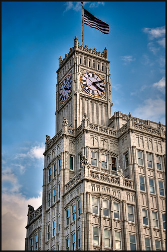
Since I began showing some of the things you can do in Photoshop Elements, I thought I would show how you can get really great results adding plug-ins to the program. They work the same in Photoshop CS5 and Elements. This is a really good deal for Elements users since it gives you some features you cannot do in the program itself. For example, Topaz Adjust 5 has a Curve Tool where tonal contrast can be added to image there is you need it.
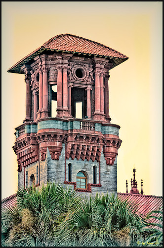 |
The image is one of the towers of the old Hotel Alcazar (now St. Augustine’s City Hall and Lightner Museum). Hover over the picture to see the original shot. To begin with, I was not happy with the washed out sky – not a hint of color in it!
1. Once in Photoshop Elements, you can immediately go into NIK Color Efex Pro 4 because this plug-in creates its own layer to make changes to. Go to Filter -> NIK – > Color Efex Pro 4. After lots of experimentation (which is really nice since if you mess up, there is a History panel on the left so you can go back to where you started), a new Flagler Tower recipe was created stacking these 5 filters: High Key, Film Efex: Vintage (using Film Type 7), Brilliance/Warmth, Vignette, and Detail Extractor in this order. Not a lot of changes were made to the sliders.
2. Duplicate this layer and name Topaz Adjust 5.
3. Open the Filter the same way as above. In Adjust a preset created in an earlier version was applied that was called Sunset on Building. I cannot tell you how it was created since it was done some time ago in an earlier version. Unfortunately it is very hard to tell which preset you started with in Topaz (as opposed to NIK) – you just have to save what you like. I did use the Curve Tool in the Global Adjustments section to make the contrast in the image better.
4. Back in Photoshop the layer was changed to the Darken Blend Mode.
Do take the time to check out these two plug-ins, especially the Topaz Adjust 5 plug-in (see right sidebar for Topaz Adjust 4 to link to website) – it was the first one I bought and I have not regretted it. Topaz is known for their reasonable prices in the plug-in world and once you buy their plug-ins, you get their upgrades for free! No one does that! And NIK’s Color Efex Pro 4 may be the best plug-in ever developed! And do not forget to try the combinations of your plug-ins – sometimes the results are incredible!
I hope this gives everyone an idea on how easy it is to use plug-ins, and most plug-ins compatible with Photoshop CS5 are also compatible with Elements. They usually have reasonable trial periods so you should see if this will take your Photoshop expression to a new level. I know it does for me!…..Digital Lady Syd
Digital Lady Syd’s Related Blogs:
Digital Lady Syd’s Review of Topaz Adjust 5
Topaz Adjust 5 is Here! First Look!
The New Film Efex-Vintage Filter From NIK CEP 4
NIK Color Efex Pro 4 – Digital Lady Syd’s Review!
Combining Plug-ins – Double the Effect!
Psuedo HDR Using NIK Color Efex Pro!
Why I Love Topaz Adjust!
Topaz Adjust 5 Is Here! First Look!
 |
Topaz Adjust 5 was just released and here is my first attempt at using it. Hover over the image to see the original HDR image. (Click on sidebar Topaz 4 to go to website.) The interface has been greatly expanded to look like their very popular new plug-in Topaz Black and White Effects. This is a big improvement and I really enjoyed working with the new version of the plug-in. If you own an earlier version of Topaz Adjust, you are entitled to a free upgrade. If not, try out the trial and see what you think. They have added over 100 new presets and also included all of the ones from Topaz Adjust 4. A histogram has been added along with a really nice new Local Adjustment brush called Brush Out where the effect can be removed and a small mask shows how much is being removed (similar to Adobe Camera Raw or Lightroom’s Adjustment Brush). In the image above, it was created as a Photomatix 4 HDR using 3 images, then brought into Photoshop and processed in Topaz Adjust 5. Just a subtle sunlight feel was placed on the building. (See my blog “Quad Tones in Topaz Black and White Effects Plug-in” for colors used to create the soft sunlight effect in the Tone section.) There are so many choices and the image could be made to look more vivid and moody.
The image above is of the Lamar Life Insurance Building tower with beautiful gargoyles all around it in Jackson, Mississippi. It is a very striking looking building even in this day and age and the clock tower can be seen almost everywhere in the city. Below is a copy of a postcard from 1924 when it was built showing this beautiful building, thanks to Bill Badzo’s Flickr site. He states this about the building “…a close observation reveals it as nothing less than a scaled-down version of New York City’s Woolworth Building.” Interesting observation!

Give this new plug-in a try when you get a chance – you will not be disappointed. Lots of fun ahead of you…..Digital Lady Syd
Digital Lady Syd’s Related Blogs:
Digital Lady Syd’s Review of Topaz Adjust 5!
Little Nighttime Fun from Topaz!
Why I Love Topaz Adjust!
Combining Plug-ins – Double the Effect!
Topaz Lens Effect’s Artistic Flair!

This is a real Tidbit – just playing around in Topaz Lens Effects. I have not used this plug-in as much as I thought I would so I decided to try some things on a so-so image. Overall I am really happy with the results from using this plug-in. Three Lens Effects were applied in this order: Vignette with a lighter dark edge centered on the blue cover over the door; Lens – Motion using Zoom in the Motion Blur section – centered again on the top of the door and the Motion Amount adjusted from there; and Filter – Dual Tone with the Region A having a fairly strong Yellow Cast and Region B using a small Magenta Cast (you can see this in the image), and adjusting the image Contrast and Saturation sliders. Back in Photoshop, a layer mask was added to the Lens Effects layer and black painted in to bring back the clean lines of of the door area – the Sharpen Tool was then applied. The orange brick and blue canvas awning were brought out using a Selective Color Adjustment Layer and a Curves Adjustment Layer. An OnOne PhotoFrame was added (see sidebar for website link). A Shadowhouse Creations Used Canvas 4 texture was added to give it the darker canvas feel (check out the textures at this site – they are all free and great!). A final Curves Adjustment Layer was added and the layer mask converted to black (highlight mask and press CTRL + I) and white painted to increase contrast on the door area.
Here are the layers I used to create this image to help you see how it all goes together.

I really loved the final result – but definitely it has more of an artistic feel than realistic. Try this plug-in and see if you can get some interesting results too……Digital Lady Syd
See related Digital Lady Syd’s blogs on Topaz Lens Effects:
Little Nighttime Fun from Topaz!
Topaz Lens Effects Plug-in
Black and White Photo or Not? Give It a Try on That Difficult Image
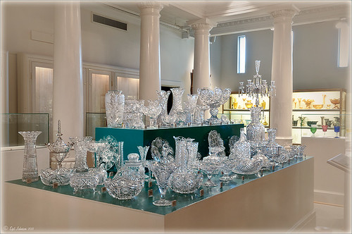 |
This image is of the beautiful cut glass display at the Lightner Museum located in the old Alcazar Hotel in St. Augustine. As you can see it is a very nice collection and I wanted to find out if the color in the image was distracting from actually seeing the ornate cut glass. See the black and white conversion by hovering over the color image. As I discovered, this image turned out to be a difficult choice to process no matter which effect you want.
Color Version
The top image was processed using the NIK Color Efex Pro 4 (CEP4) plug-in on a Smart Object layer (right click image and select “Convert to a Smart Object” since CEP4 will keep your settings and control points in case you want to adjust the results later) and stacking several filters including from top to bottom: Tonal Contrast, Darker/Lighten Center, Vignette, Glamour Glow, and Pro Contrast. Various control points were added to selectively choose areas for some of these effects. In Photoshop the cut glass edges were selectively sharpened using the Sharpen Tool on it own layer, and a final Curves Adjustment layer was added to get the correct contrast. Overall, this image is attractive since the blue-green sets off the glassware nicely.
Since there are some bright colors in the background that might be distracting from the main focus point, and the museum walls and columns have what I consider to be a rather bland creamy color to it, a black and white conversion might be appropriate to tone down some of the distraction and get rid of the creamy tones.
Black and White Version
I duplicated the cleaned up image layer and turned it into a Smart Object as above. Once in the NIK silver Efex Pro 2 (SEP2} plug-in, from the side preset panel the o14 Grad ND (EV -2) preset was selected and it really made the glass pop out clearly. In Photoshop the Sharpen Tool was used to bring out some of the glass edges (again, do this on a New Layer above the image) and the opacity of this layer is reduced so artifacts are not viewed. A final Adjustment Curve is added to give just the right amount of contrast. The items on the back wall initially appear to be more distracting than in the color image but the creamy tones did convert to the white tones nicely.
Conclusion
The image may not work as a black and white and the only way to figure this out is to try it. In this case SEP2 was used to convert the image to black and white, but the conversion can be done in lots of ways – in Adobe Camera Raw or Lightroom using a preset, or in Photoshop using a Black and White Adjustment Layer or Channels, as just a couple examples. NIK’s SEP2 is an excellent way to find out quickly since the presets allow you to glance over many black and white variations – if the image is really not going to look good as a black and white, you will know it.!
I am on the fence about which version I like best. The image was not the best choice to process to begin with and the glass creates a huge challenge just to get enough contrast to make the it stand out. Still it was good practice and I like the picture because I liked the cut glass collection. Just remember sometimes the image you want to process is not that great and does not work – but at least try a couple different effects including black and white and maybe there is a good shot hidden in there!…..Digital Lady Syd
Related Digital Lady Syd Blogs:
NIK’s Champion Plug-in – Silver Efex Pro 2
Topaz B&W Effects vs. Nik’s Silver Efex Pro
Topaz B&W Effects Plug-In – A Real Winner!
Little Nighttime Fun from Topaz!

Just listened to another interesting video from Topaz Labs on “Creating Striking Night Images.” If you are using or trying any of their Photoshop plug-ins, Topaz always has some interesting videos for creative uses at their Topaz Lab site. I followed the referenced video steps for processing this nighttime image taken on the Las Vegas Strip of Margaritaville. The video suggests that you first use their DeNoise Filter (this image did not require it), Topaz Adjust where they suggest using the Photo Pop preset was used with Shadow slider setting changed to 0, contrast slider moved left a little, and checking Process details independent of exposure box; and finally Topaz Lens Effects using the Single Tone – Hint of Blue Light and then adding some yellow cast to the mix. (See sidebar to get to Topaz’s site to download trials of these products.) The video also discussed taking long exposure nighttime photos. Since this was not a true long exposure night image, I used my Rick Sammon Spicify Soft Artsy preset using settings from the Topaz video “Rick Sammon’s Top Topaz Tricks, Tips and Techniques.” An OnOne PhotoFrame was added to finish off the look.
This image was a lot of fun to work on and pretty easy to do! I am looking forward to trying this processing technique on a serious nighttime image. Give this video a listen if you want some great nighttime tips…..Digital Lady Syd
Where Am I?

The above image was processed using the my regular Vivid Drawing Look Lightroom preset and my HDR Recipe for NIK Color Efex Pro 4. (See Fun Photoshop Blog “Pseudo HDR in NIK Color Efex Pro 4” and “Settings for Vivid Drawing Look ACR and Lightroom Preset and NIK Color Efex Pro 4 Pseudo HDR Recipe.”) The pseudo HDR treatment worked very well since the lighting was all over the place.
This is one of the most unusual places I have ever seen – it is in St. Augustine, Florida, and used to be part of the Hotel Alcazar, a Henry Flagler hotel opened in 1887, that was built across the street from the more famous and elegant Ponce de Leon Hotel (now Flagler College). This old hotel currently houses the City Hall, several businesses and shops, and the Lightner Museum. The above image is of the Cafe Alcazar that is located on the floor of the old hotel’s Casino Swimming Pool and gets very good food reviews. The top balcony level is the Old Ballroom that runs around the edge of the hotel and in the warm evenings, the roof was removed to see the night sky for the dancers.

This image shows how the Casino Swimming Pool looked in a by photo by William Henry Jackson in 1889 and is from Shorpy Historical Photo Archive site, a really interesting blog on old images. The water stayed at a steady 80 degrees because it was spring fed but it smelled like rotten eggs due to the sulfur in the water. The pool was 120 feet long and 50 feet wide and was from 3.5 feet to 6 feet deep. The National Women’s Swimming Championship was held here in 1925, and there was evening “pool entertainment” such as high diving, trapeze shows, water polo and swim racing.
To see this restaurant view, you need to pay to enter the Lightner Museum, that contains a very nice collection of paintings, glassware, and other collectibles – mostly from the Victorian era along with the views of the ballroom and pool area. Also there is a Russian steamroom that patrons used when it was still a hotel. Very interesting place to visit and definitely worth the small amount to enter. Check it out if you are in the area!…..Digital Lady Syd
Loving Both Filters!
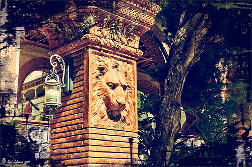 |
The above image is one of the beautiful Lion Posts outside Flagler College in St. Augustine, Florida, which used to be the Ponce de Leon Hotel built in 1887. Absolutely beautiful building. Cannot miss it if you go to this wonderful historic city.
Wow – all I can say is that I cannot decide which program I like best – NIK Color Efex 4 or Topaz Black and White Effects. So different and so much alike! I keep trying the same image in each program and get totally different looks but both are really nice! What to do, what to do!
The top image was processed with NIK Color Efex Pro 4 using the Film Efex: Vintage filter on Film Type 14; Detail Extractor filter; and Brilliance/Warmth filter. I used the Sharpening Tool in Photoshop to sharpen the eyes and mane of the Lion. Then Grunge 03 OnOne PhotoFrame was applied in a dark navy. I loved how it became very artsy and colorful. And the background detail is incredible!
Topaz Black and White Effect produced a very different feel that can be seen by hovering over the image. Same exact image from Lightroom except this time I wanted to see what how this image would look as a black and white. I used the new Platinum Collection – Platinum VI as a starting point. What really improved this image was using the Local Adjustment Dodge brush and Detail brush on the shadows in the face and the lamp. This really brought the eyes out very clearly. Using the Color brush, the lights was added back into the lamp. A black border, dark edge exposure, and dark vignette was added. In Photoshop the Sharpen Tool was used on the eyes a little more and the mane. Overall a very different feel to the same image.
I really love both filters and I do not believe I can recommend one over the other. Both totally great. Give the trials a try and see what you think!…..Digital Lady Syd
Related Digital Lady Syd Blog Links:
Topaz B&W Effects Plug-in – A Real Winner!
NIK Color Efex Pro 4.0 – First Try!
The New Film Efex-Vintage Filter from NIK CEP 4
Quad Tones in Topaz Black and White Effects Plug-in
Sunny Preset for Topaz Black and White Effects
NIK Color Efex Pro 4 – Digital Lady Syd’s Review!
The Art Corner: Painting and Sculpture by Tassaert
Pseudo HDR Using NIK Color Efex Pro 4
Settings for Vivid Drawing Look ACR/Lightroom Preset and NIK Color Efex Pro 4 Pseudo HDR Recipe
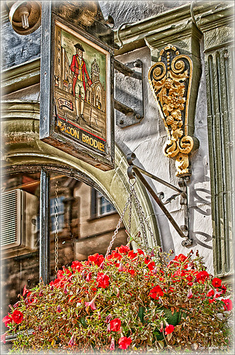 |
The image is from The Royal Mile in Edinburgh, Scotland. Deacon Bodie has a very colorful history and this sign locates a pub named in his honor.
The above image used SJ-Vivid Drawing Look preset as a starting point in Adobe Camera Raw (note: change file extension to .xmp in zip folder to get file to work) and Lightroom. In my Fun Photoshop Blog “Pseudo HDR Using NIK Color Efex Pro 4“, I created a recipe for NIK Color Efex Pro called SJ-Pseudo HDR1. This recipe was applied without any changes to it. Back in Photoshop a Curves Adjustment Layer was added, and a High Pass Filter (radius 9.1) applied to a duplicate layer (set to Soft Blend Mode) was used to sharpen the image. That is it. Hoover over the image to see how it looks with just the Vivid Drawing Look preset applied.
Settings for Presets
For those of you who do not like to download files or might want to tweak what I have created, here are the settings for my favorite HDR feel ACR and Lightroom preset. Also the recipe I put together for NIK Color Efex Pro4 has been provided.
SJ Vivid Drawing Look settings: To make this preset in either Lightroom Develop Panel or Adobe Camera Raw, use these settings: Basic section: Exposure -o.32, Recovery +38, Fill Light +72, Blacks +12, Brightness +52, Contrast +55, Clarity +54, Vibrance 0 and Saturation 0; Tone Curve section: Highlights -30, Lights +16, Darks +23, Shadows -23, and Point Curve Linear; Split Toning Section: Highlights – Hue 50, Saturation 11, Balance 0, Shadows – Hue 50, and Saturation 34; Sharpening section: Amount 48, Radius 1.0, Detail 35, and Masking 69; Noise Reduction section: Luminance 82, Detail 95, Contrast 44, Color 20, and Detail 50; and Post-Crop Vignetting section: Style – Highlight Priority, Amount -18; Midpoint +47, Roundness 0; Feather +57, and Highlights 0.
SJ Pseudo HDR 1: To make this recipe, the filters and settings are as follows: Tonal Contrast (Highlights -37%; Midtones -30%; Shadows -12%; Saturation +5%; Contrast Type set to Standard; and Shadows +58%; Darken/Lighten Center (Use#2 for lighten area; Center Luminosity -10%; Border Luminosity -64%; and Center Size +30%; Place Center in image); and Detail Extractor (Detail Extractor +69%; Contrast +56%; Saturation +16%; Effect Radius – Fine; and Shadows +14%.
I hope you put these presets to good use. I think they are both good starting points to creating that great pseudo HDR effect. Have fun. Have trying these out…..Digital Lady Syd
Where Am I?

What I think turned out kind of nice is the application of the free Adobe Pixel Bender plug-in using the favorite Oil Paint effect. It is very easy to figure out the 5 sliders. I did this awhile ago and thought it shows one of my best results. A layer mask was used to remove the effect from certain parts of the image.
Okay – guess you could tell this was in a beautiful tropical place. This is an image of the Ka’anapali Beach Club in Maui, Hawaii.
Go ahead and download Pixel Bender if you have not tried it already and take a whirl at something quite different and fun to do!…..Digital Lady Syd.
The Art Corner: Painting and Sculpture by Tassaert

The above piece of artwork is found in the East Sculpture Hall of the National Gallery of Art in Washington, DC, and was sculpted in 1774-1778 in Paris by Jean-Pierre-Antoine Tassaert, a lesser-know Flemish sculptor who lived from 1727 to 1788. I found this piece to be very charming once you understand what the head in the artwork represents. The children are so detailed and sweet looking. From the National Gallery of Art’s website: “With Clodion’s Poetry and Music (also located in the same area of the Gallery), this allegory was one of four that were meant to bring to life the abstract concepts of the arts and sciences. They were commissioned by Louis XV’s finance minister Abbé (Joseph-Marie) Terray for his elaborate Paris residence (to decorate the dining room of his Parisian mansion). The subject was an appropriate one for Terray, since he also served briefly as the director of the king’s buildings with overall responsibility for the state of the arts in France. Painting, sculpture, music, and literature are celebrated by the young cupidlike figures in the two works here; other children carved by two other artists represented geometry, geography, architecture, and astronomy.” The last two pieces, Geometry and Architecture by Jean-Jacques Caffieri created in 1776 and Astronomy and Geometry by Felix Lecomte created in 1778 are located at the National Trust, Waddesdon Manor, Buckinghamshire, England. I think Tassaert’s sculpture is the best of the four in the series.
I processed this piece in the Photoshop plug-in Topaz’s Black and White Effects (see sidebar for link) using the Warm Tone I preset as a starting point, then adding a Quad Tone Effect (Color 1 Region was set to black with slider set to 0.oo, Color 2 Region set to R75/G78/B96 with slider at 142.5; Color 3 Region set to R222/G220/B172 with slider at 228.9 and Color 4 Region set to White with slider at 255.0 – these tones made a very nice soft contrast for this type of image). Some Local Adjustments using the Details and Burn Brushes were used on the sculpture itself. Finally a vignette was added and centered on the children to make them appear spotlighted. Be sure to create a preset if you like the results.
If you get a chance, try to go to one of the two places showing the sculptures discussed. They are very interesting pieces. I did not get an image of Poetry and Music so that is on my list for my next trip to the National Gallery of Art!…..Digital Lady Syd
Sunny Preset for Topaz Black and White Effects
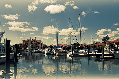 |
This image of Camachee Cove Yacht Harbor in St. Augustine, Florida, was adjusted using Topaz Black and White Effects. I wrote a longer blog on trying to achieve this same effect using other plug-ins on my Fun Photoshop Blog “Same Image – Different Plug-ins.” Hover over the image to see original. It took literally two minute to get this effect. There was just one further adjustment made in Photoshop which, unfortunately when adding most plug-ins, there is some noise created. I took the image back into Adobe Camera Raw (see my blog “Edit Layers with ACR Script“) which I prefer over the other Noise Reduction plug-ins. The Luminance was set to +75, Detail +37 and Contrast +48. I was really pleased with the color and how it looks on the water and the sky, especially around the horizon line. I wanted to share with you how I created this sunny preset in Topaz’s Black and White Effects.
First the Van Dyke Brown Collection was used with the Wenge Dynamic Preset. This gives the correct settings in the Conversion Section on Basic Exposure sliders and the Adaptive Exposure sliders.
In the Finishing Touches Section, Film Grain should be unchecked unless you want some graininess. This image does not use it. Next the Quad Tones needed to be changed for this effect. By clicking on each of the color swatches, the following colors can be changed: Color 1 Region set to R1G1B12 and slider to 9.60; Color 2 Region set to R63 G78 B85 and slider to 95.97; Color 3 Region set to R216G211B129 and slider to 141.2; and Color4 Region set to R255G254B255 and slider set to 237.0. This is the key to the effect and gives the preset the sunny feel.
The Edge Exposure area is optional but the above image used these settings. The Edge Exposure settings should be set to: Top – Edge Size o.26, Edge Exposure (-0.22), and Edge Transition 0.32; Bottom – Edge Size 0.19, Edge Exposure (-0.43), and Edge Transition 0.27; Right and Left set to their defaults since there is no edge on the sides – Edge Size 0.20, Edge Exposure 0.00, and Edge Transition 0.20.
Finally check Transparency and set the Overall Transparency slider to 1.00.
It is important to create a preset now either in My Collection or the individual Effects Presets so it can be reused again and again.
Hope this will give you a chance to try out a new Quad Tone look (see Tidbits Blog “Quad Tones in Topaz Black and White Effects Plug-in“) – I plan on making some more presets in this program soon. Try out this look and see if you like it as much as I do…..Digital Lady Syd
“Perfect” Perfect Layers!
I keep finding excuses to use Perfect Layers, this fairly new plug-in for Lightroom, by OnOne Software. I really did not think that I would use it that much, but then I start playing around with an image, and there I go, back into Perfect Layers! It is so easy to try out the effects of my favorite textures on my images, and it is easy to stack virtual copies (and other textures or images – the layers can be dragged up or down in the stack) to get a totally unexpected look.

For this image of the London Eye, I cropped the original image and then created a Lomographic Preset (follow this very simple video from Michael Rather at the Digital Photography Connection on “Creating a Lomography Image) on a Virtual Copy of the cropped image. Select both the original and virtual copy images and open them up in Perfect Layers to create two layers stacked. A new image, Shadowhouse Creations Oil Painting-5 texture, was then imported and stacked as a layer on top and set to Hard Light. The top two layer’s opacity was adjusted to taste, and voila – a pretty nice texturized image! (By the way, I keep using this set of textures all the time – gives a real painterly canvas look to the image.) Here is a link to Lomo Presets from Matt Kloskowski’s Lightroom Killer Tips that have similar settings but a slightly different color and look. I have actually seen presets with a blue tint instead of green for this effect.
Definitely give this plug-in a try if you have Lightroom. I believe there is room for a lot of creativity and it is much quicker than going into Photoshop to see what results you are getting. Have fun creating!…..Digital Lady Syd
Quad Tones in Topaz Black and White Effects Plug-in
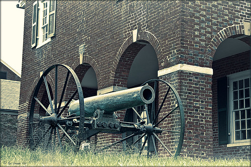 |
This image is of an old cannon on the grounds of the Historic Fairfax County Courthouse in Virginia. I do love NIK’s new Color Efex Pro 4 plug-in, but I keep going back to Topaz’s new Black and White Effects plug-in. (Hover over image to see original shot.)
The Topaz Black and White Effects preset I created gives a really nice sunny vintage feel and I think it is great for that historic look. To create the preset, select the Van Dyke Brown Collection Effect and Chamoisee Cyan preset as a starting point. The trick to getting this look is to set up in Finishing Touches the Quad Tones using these settings: Color 1 Region (R1 G1 B12) – 15.08; Color 2 Region (R63 G78 B85) – 143.9; Color 3 Region (R216 G211 B129) – 227.5; and Color 4 Region (R255 G254 B237) – 225.0. The sliders will need to be adjusted depending upon the image used. The Transparency setting was set to 1.00. For this image a small light Edge was added. Also, I was able to brush away the distortion over the back part of the left wheel using the Burn tool with a large brush and lightly clicking a few times, then using a smaller brush to run over the details just a bit. It totally disappeared! These brushes work wonders! To bring out the cannon a little more, back in Photoshop the image was sharpened using a High Pass Filter set to 9.1 Radius, a black mask was added to cover up the effect, and then by painting just the cannon on the mask, only it becomes sharp.
I really like the Quad Tone effect in this plug-in. Topaz has created a very nice video on how to use this section called “Quick Tip – Quad Toning Explored.” This may be the key to why it is hard to reproduce this look in other plug-ins.
For more information on this plug-in, see these related posts:
Fun Photoshop Blog: “Topaz B&W Effects Plug-In-A Real Winner!”
Tidbits Blog: “Topaz B&W Effects vs. Nik’s Silver Efex Pro”
Tidbits Blog: “Just Another Topaz Black and White Effect Example“
The New Film Efex-Vintage Filter From NIK CEP 4
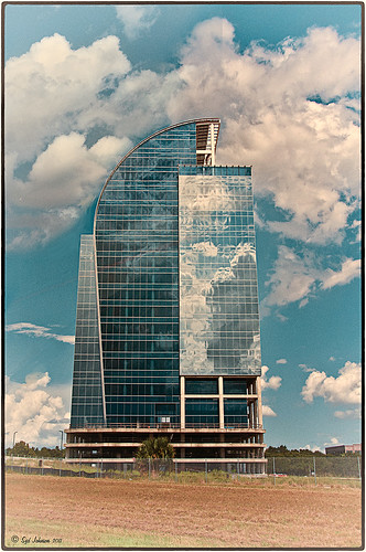 |
I love this image – the clouds reflecting in this building on I-4 in Orlando were beautiful! Hover over image to see original image. The stack contains these filter effects: Darken/Lighten Center, Brilliance/Warmth, Tonal Contrast, Image Borders, Dark Contrasts, and Film Efex: Vintage (another one of the new filters that has so many different film types that it is hard to choose one). Below is what the Film Efex: Vintage screen looks like to give you an idea of how many choices you have just for this one new filter.

In this NIK interface image, you can see how all the filter effects stack. For just this filter there are 29 film types to choose from – the one showing is Type 17 but I actually ended up using Type 11. There are so many sliders to adjust to get just the look you want. (In case you cannot read them, from top to bottom they are: Saturation, Warmth, Vignette, Brightness, Grain per Pixel, Film Strength, Film Type (drop down list) and Opacity. The Opacity slider at the bottom will do a final effect amount so the image does not look overdone. Below is another example of what a nice effect this filter will give. Only this filter with Film Type 16 was applied and it brought out the texture of the wall very nicely.

Just using this one filter and trying out different effects will be a lot of fun! Definitely give this filter a second look – much more than it appears at first glance!…..Digital Lady Syd
PS: Check out my Fun Photoshop Blog “NIK Color Efex Pro – Digital Lady Syd’s Review” and my Tidbit Blog “NIK Color Efex Pro 4 – First Try!” for more information on this great plug-in from NIK.
Tree Brushes and a Little Grunge
Having some Lightroom and Photoshop CS5 interface problems today so I am just going to post a little more tree fun I had a few days ago. I guess with the Fall coming upon us, I think about the trees losing their leaves and winter around the corner.


Both these images use tree brushes from Winter Trees by Melbrushes and Trees from c4grfx brushes. The first image used a texture from Shadow Creations Old Canvas 4 and the Glitter Brush Set by Obsidian Dawn. The bottom background was created using Paper Damaged brushes, Gorguss Grunge Again 3 and 9 (click upper right hand corner for link), my SJ-Basic Soft White Cloud Brush (for dark area behind trees), and the plug-ins: Topaz Effects Black and White plug-in (see sidebar for link) , a Nik Color Efex Pro 3.0 Bi-color filter plug-in, and an OnOne PhotoFrame plug-in (see sidebar for link). Check out my Tidbits blog called “Just a Tree!” for another example.
Hopefully I will be back up and running with both my programs by next week. Until then, try downloading some of these brushes and play around a bit. You can get some pretty interesting looks!…..Digital Lady Syd
NIK Color Efex Pro 4 – First Try!
 |
Well, here is my old standby image from the London Eye used as an example of what the long-awaited NIK Color Efex Pro 4 upgrade will do. Hover over image to see original. I am still sorting through all the new features they have added to this wonderful plug-in. Check out my Fun Photoshop Blog “Nik Color Efex Pro 4 – Digital Lady Syd’s Review” for a more in depth discussion.
One of the major new features allows you to stack any number of filters and save the whole group as a preset to use again. I really stacked up this image just to see what results I could get. The filters in the order they are stacked are: Tonal Contrast, Brilliance/Warmth, Vignette: Lens (a new filter), Contrast Color Range, Remove Color Cast (Plus Control Point set on faded green trees on left – click to see original problem area), Graduated Filter, and Image Borders.
I believe the final result is quite striking. In the meantime I will still be playing with the filters and trying different stacks to see what really looks good. If you get a chance, go download the trial version and see what you think…..Digital Lady Syd
Just Another Topaz Black & White Effect Example

This image was taken at Edinburgh Castle in Scotland. I just keep playing around and finding new looks for images. The cannon and opening were selected and placed on their own layer, then a white layer was added below it, and a texture from ShadowHouse Creations Another Mixed Bag Texture Set (some really beautiful free textures on this site) was added. On several layers above and below using different colors from the image, various brush marks were added using Gorjuss Grunge Again brushes (unfortunately these are no long available), some really nice brushes to add a bit of color and detail. Create a composite and duplicate this layer. Next use the Topaz Black and White plug-in with the Opalotype Collection Effect and Yellow Lilac preset as a start. A lot of changes were made in the Conversion and Finishing Touches panels and Detail and Burn brushes were used to emphasize the stone. (See my Fun Photoshop Blog “Topaz B&W Effects Plug-in – a Real Winner!) and Tidbits Blog “Topaz B&W Effects vs. Nik’s Silver Efex Pro” for more information on this plug-in.) The plug-in layer was set to 52% opacity back in Photoshop. A Curves Adjustment Layer was added and some sharpening applied. It was a really fun image to do.
Hope you got an idea for creating a little different effect with this plug-in…..Digital Lady Syd
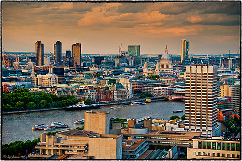
Topaz B&W Effects vs. Nik’s Silver Efex Pro
I did a blog on my Fun Photoshop Blog called “Topaz B&W Effect Plug-in – A Real Winner!” that touched on some of the differences of Topaz’s new plug-in and the great black and white standard plug-in by Nik called Silver Efex Pro 2.0. I thought I would just mention a few other things I noticed that are definitely different about the two programs.
Below is one of my favorite images for trying out new effects (the original has some basic flaws so I can see if the product will correct it) and was taken from the London Eye. Topaz B&W Effects was applied (hover over or click on image to see the Nik version).
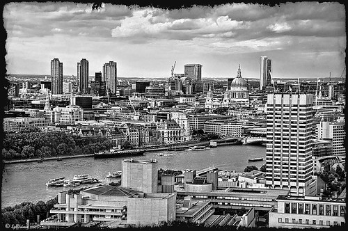 |
This is as close as I could get to making the two plug-ins look alike. The sky and some of the buildings’ contrast and detail are slightly different, but overall the results are pretty much the same. I am not sure which version I like best.
The image below I also used Topaz B&W Effects.

In this case, I could not duplicate the results in either NIK Silver Efex Pro 2.0 or Color Efex Pro 3.0. I liked the results and was surprised how nice the image turned out. By the way, I created for the Topaz plug-in a SJ-Cityscape preset for use in the Traditional Collection for both of the Topaz images – it can be downloaded here.
My final thought is to say that I think there is a place for both black and white plug-ins. Nik’s black and white plug-in is considered the best and I am not sure Topaz has created a better one, but it is very close. Topaz B&W Effects is definitely a great product since it does several things the other plug-in cannot do – and I really like that.
Well I hope you have fun (I sure am) trying out both of these excellent products. I plan on experimenting more with Topaz’s B&W Effects and will post more on it later……Digital Lady Syd
PS. Be sure to download the 30 day trial for Topaz B&W Effects – it is a fully functional trial to try out!
Digital Lady Syd’s Rule No. 1: Take the Time to Experiment!
For my first blog “tidbit,” I thought I would show an example of using in Photoshop the Plugin Galaxy Instant Mirror effect. Sometimes you get some really interesting results using this filter on an image that did not look like much originally.

See my entry on Photoshop Fun blog called “Instant Mirror and Quick Mirror for Photoshop.”
Digital Lady Syd’s Photoshop Rule No. 1:
When stuck and not sure where to go next in Photoshop, EXPERIMENT.


