
St. Michaels Parish Church in Scotland
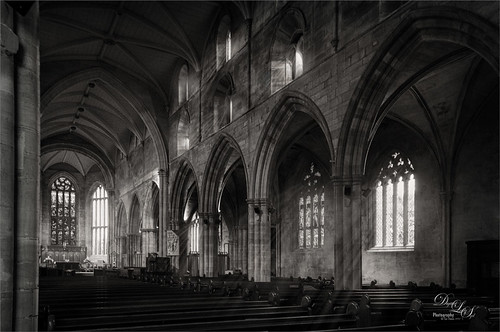
The image above is from the old Parish Church next to Linlithgow Castle, where Mary, Queen of Scotts was born in 1542 and baptized here. Recently I tried out a new technique by Joel Grimes using his YouTube video called How to Use Photoshop Brushes to Build Atmosphere and Drama. The Light Ray brush he used (and can be downloaded there) created the lovely light rays coming through the windows above. To convert to black and white, a stamped layer was taken into my old Nik Silver Efex Pro 2 (here is a link for the newer version) and just applied the Soft Sepia preset. Another stamped layer was added and taken into Luminar Neo (latest Luminar version but the older versions can be used also) using Joel’s settings. Used Kyle’s 100 px Vignette found in Kyle’s Photoshop Action Set for Artists. Last step was to apply Topaz DeNoise as it appeared just a little grainy for my taste (I used an older version and it works fine). Have not done a black and white in a while and it was fun to do…..Digital Lady Syd
Contemplating Life
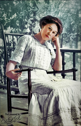
This was a black and white image from one of my favorite websites, Shorpy’s Historic Picture Archive (click on link to see original image). This image just sort of struck me as one I would really like to colorize. The first step was to sharpen up the image using the now free Nik Silver Efex Pro 2 to add some natural contrast to the overall image. Next I used two different methods in this image, although I probably should have stayed with just one, but here are links to my blogs on these techniques: How To Hand Tint a Vintage Image and Create a Brush To Do This blog and How To Colorize an Old Photo blog. A Red Channel Luminosity Curves Adjustment Layer was used to add in more contrast. (See my How To Use a Red Channel To Create a Nice Blended Image Effect blog.) On a stamped layer above (CTRL+ALT+SHIFT+E), opened Topaz (see sidebar for website link) Texture Effects 2. My Crisp Morning Run preset was run (this used the original Topaz Crisp Morning Run preset and switched out the Texture to a bright turquoise one half-way down the list and the Opacity was set to 0.29; also changed Vignette Strength set to 0.60 and Size 0.53.) Then in Light Leaks section, the Enable Masking was turned on. Brush tab was selected, and the woman was painted out with a brush around the head area (brush settings: Radius 0.50, Strength 0.59, and Hardness 0.30). In the Split Tone section, used the Enable Masking feature with the Spot tab to just hide the face area – set sliders to Transition 0.84 and Color Aware 0.86. Nik Viveza 2 (also free) was used to sharpen up the texture on her dress using a Control Point and the Structure slider. Added a Black and White Adjustment Layer set to Luminosity blend mode to balance the contrast. (See my How To Use a Black & White Adjustment Layer To See Contrast in an Image blog.) I just did not like the way her arm and hand on the chair looked too large so the Liquify Filter was used to adjust. Frooze the dress sleeve and chair behind and under the arm, then reduced the size and straightened the arm with Forward Warp Tool set to Size 300, Density 50, Pressure 100, and Rate 0 – just moved a little. Next PS’s Liquify Pucker Tool was set to Size 200, Density 50, Pressure 1 and Rate 80 – dabbed on hand a couple times. To enlarge the eyes just slightly, used the Bloat Tool set to Size 70, Density 50, Pressure 1, and lowered Rate to 32. Clicked once on each eye to just gently enlarge. Now all I could see was the red moire in the shadows of her arm skin and around eyes. Used Topaz DeNoise 6 set to overall Strength of 0.14, adjust Shadow 0.37, and adjust Color Red 0.69 to remove – set this layers opacity to 87%. I could paint these old vintage images all day long – really relaxing to do!…..Digital Lady Syd
Vintage Car
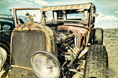
Took this image a while ago at a Turkey Run held in the infield of the Daytona International Speedway (see seats in upper left). Basically just used Lucis Pro (no longer available) set to Detail 65, then opened image in the now free Nik Silver Efex Pro 2 where the High Structure (Smooth) preset was applied. The layer was set to 37% opacity back in PS. Dodged and burned using Curves Adjustment Layers. Used On1 Photo 10 Effects (see sidebar for website link) and stacked these filters: Tone Enhancer, Color Enhancer, Glow, and Split Tone. Topaz (see sidebar for website link) Glow was then applied to a stamped layer above using the Morning Mist preset with some adjustments. It took a while to do this image but it was a lot of fun to try the different combinations of filters!…..Digital Lady Syd
A Palace on Wheels
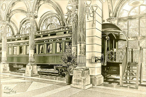
This image is of Henry Flagler’s Railcar No. 91 (see A History of Railcar for No. 91 for an interesting history lesson) or the so-called “Palace on Wheels” from the Guilded Age (CC 1912). It is available to walk through while visiting at the Flagler Museum in Palm Beach, Florida. This image was created using the exact same steps as in my recent Fun Photoshop Blog called How to Get a Great Illustrative Effect with Lucis Pro 6.0.9. First duplicated the background layer and opened up the free Nik Silver Efex Pro 2 using High Structure (Harsh) preset with a few changes for this image. This layer was duplicated and Lucis Pro was applied (Smooth 13/Enhance 97 and Mix with Original Image 81/19) and then duplicate this layer and open up Lucis Pro again with these settings (Split Channels Enhance Detail Red 159, Green 171, and Blue 177 with Smooth at 15). On top a Hue/Saturation Adjustment Layer was added and green color created (Hue 109, Saturation 11, and Lightness -41 with Colorize checked). The layer mask was turned black by CTRL+I in mask and a soft low opacity brush was used to paint back the green in the railcar and set to 44% layer opacity. Another Hue/Saturation Adjustment Layer was added (Hue 187, Saturation 8, and Lightness -7 with Colorize checked). The layer mask from below was copied (ALT+drag) and then invert the layer mask (CTRL+I in the mask). A stamped layer was created on top (CTRL+ALT+SHIFT+E) and Topaz (see sidebar for website link) Glow 2 Auto Shine preset was applied. A Gradient Map was added on the image using a cream to yellow gradient set to Color blend mode at 47% layer opacity. Last step involved another stamped layer and the also free Nik Viveza 2 was applied to adjust where the focal point is. That is it!…..Digital Lady Syd
Sunrays At the Beach
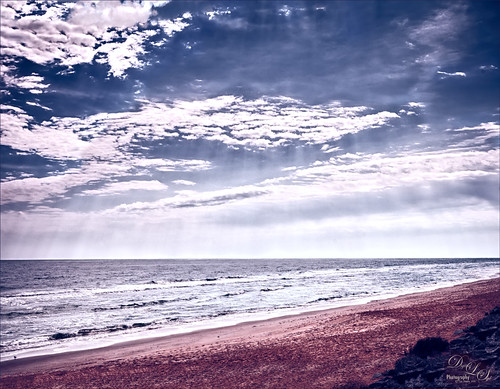
This is an HDR image of Flagler Beach, Florida, taken with 3 bracketed images. The images were taken into the now free HDR Efex Pro 2 plug-in from Photoshop (see my How to Use Google (Nik) HDR Efex Pro 2 blog for instructions on how to do this). The Bright preset was used with some minor changes. Nik Silver Efex Pro 2 (also part of the free Nik Collection) was then used to give a different feel to the image – High Contrast (Harsh) preset was used and the layer was set to Luminosity blend mode at 78% layer opacity. On a stamped layer, Topaz (see sidebar for website link) ReStyle was used to give the beautiful color palette – used my favorite Cream and Plum preset and just adjusted the Color Temperature and Tones a little. That was it. This is really how I see this beach on a beautiful day!…..Digital Lady Syd
What the Worm Saw
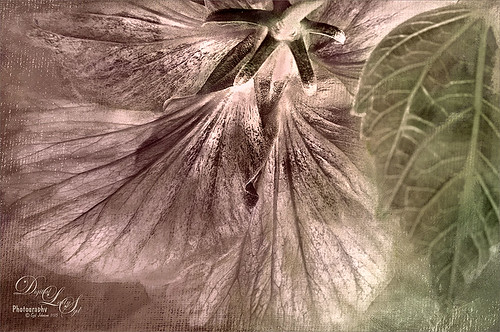
This was a macro image I took for a Photo Club Theme called What the Worm Saw. I did not submit it (got a little over creative actually and tried something not so great). This is the underside of a Red Hibiscus bloom and I just liked the result. Used Topaz (see sidebar for website link) Clarity to sharpen it overall. Used Nik Silver Efex Pro 2 to turn it to black and white. Next a Color Balance Adjustment Layer was used to add a little green in the Midtones. Painted Textures Trees in May texture was added next with a layer mask and the bloom and leaf were painted back in the mask. A Nik Viveza 2 filter was added to emphasize the focal point of the image. To get the pinkish tone on the flower, a light pink gradient layer was placed on top. The last step was a Curves Adjustment Layer to get back a little contrast. Something a little different for me…..Digital Lady Syd
Just a Spot of Color in a B&W to Pop an Image!

Really loved this image taken during the brightest time of day on the Intracoastal Water Way (aka Halafax River) in Ormond Beach – shooting towards Daytona Beach. In Lightroom I did just the basic slider adjustments and removed a little Noise and fringing before opening in Photoshop. Some clean up in the left corner was done to get rid of some out-of-focus greenery and a couple dots on the roof were removed. On a stamped layer (CTRL+ALT+SHIFT+E) that was converted to a Smart Object, Nik’s Silver Efex Pro 2 was opened and the Film Noire 1 preset was applied. The Color Filter was changed to Green. A Control Point was set on the Roof and the Selective Color slider was adjusted to bring back just a hint of the orange color back into the photo. Another Control point was added to the bridge and building in the background to define the lines just a little – they were pretty soft looking in the original. Once in Photoshop again, a Curves Adjustment Layer was added to give an over-exposed look to the water. The Hand Tool in the upper left of the Curves Panel was dragged up on the water in the image to get the look. That is all that was done to get this look. – I really liked how it turned out.
Topaz ReStyle on a Black and White Image

I totally loved how this image turned out. Once again this is the Intracoastal Waterway (ICW) looking back at the Granada Bridge in Ormond Beach, Florida. I had originally did just a black and white image using Nik’s Silver Efex Pro 2 using the High Key 2 preset as a starting point and then changed several sliders – brought the orange roof back on little shop. I just could not get the effect I liked. Then I took the image into Topaz (see sidebar for website link) new ReStyle plug-in and voila! – the totally different feel using the Orange Peel preset. (These are the changes made in the plug-in after applying the preset: Set Texture to -1.00, ReStyle Opacity 77%, and Hard Light Blend Mode; and Tint set to -0.16, Structure -1.00, and Detail -1.00.) This image now has a totally different feel with a color scheme I would never have considered. Check out this plug-in if you want something to give you image a real pop!…..Digital Lady Syd
Digital Lady Syd Related Blogs:
Digital Lady Syd Reviews Topaz ReStyle
Make an Ordinary Image Interesting

This image was one I did not think I would ever use. but once I was able to straighten it correctly in Lightroom with the Lens Correction Upright feature, it started looking pretty nice. So here is the Parliament building and the Thames River. The reason I love this image is the beautiful sky and the way it points to the building towers. After processing in Lightroom, a couple things really contributed to this interesting look. The Background layer was duplicated and then Nik’s HDR Pro 2 was opened (this was not an HDR image) and my favorite preset, Grannys Attic, was applied – no changes. Next the layer was duplicated and Nik’s Silver Efex Pro 2 was opened up in a Smart Object to save the settings. I am not sure which preset I used as a starting point but these are the settings I ended up with (Global Adjustments: Brightness 7%, Highlights -32%, Midtones 11%, Shadows 9%, and Dynamic Brightness 25%; Contrast 15%, Amplify Whites 0%, Amplify Blacks 0%, and Soft Contrast 8%; Structure 10%, Highlights -58%, Midtones 8%, Shadows 53%, and Fine Structure 62%; Selective Adjustments: 6 Control Points were added to add the color back in certain areas; Color Filter: Hue 43 degrees and Strength 114%; Film Types: Custom, Grain – Grain per pixel 500 and Soft to Hard center; Levels and Curves: Just a little contrast with curve lifted up; and Finishing Adjustments Toning was set to 3, Strength 59%, Silver Hue 215 degrees, Silver Toning 59%, Balance 57%, Paper Hue 50 degrees, and Paper Toning 22%. A clean up layer was created, but I just did not like the rough river look. So…. I decided to add Flaming Pear’s Flood Filter, but just to the water. (Here are the settings I used: Horizon 76, Offset 0, Perspective 35, Attitude 84, Waviness 6, Complexity 21, Brilliance 33, Blur 12, Size 12, Height 33, Undulation 40 and Glue Normal.) The building side was masked out so just the water was selected. The Layer was set to 84% opacity. The last step was to match the graininess to the Flood Filter water – Photoshop’s Add Noise set to 8 pixels, Gaussian Blur, and Monochromatic checked. Once again a layer mask was applied so just the water was affected. That was it – I really like what the flood filter did to the water. It added just a bit of the painterly look that the sky already contributed. Hope you enjoy!…..Digital Lady Syd
Digital Lady Syd Related Blogs:
Lightroom 5′s New Upright Adjustment Feature
Hyacinths Deep in Reflection
The Flood Look
Nik HDR Efex Pro Example
Lightroom 5’s New Upright Adjustment Feature
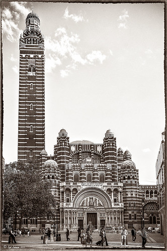
Hover over the above image of Westminster Cathedral to see what the original RAW image looked like or (here to see on flickr)- pretty awful! Wanted to show you what Lightroom 5 did with one click of the Lens Correction section’s new Auto button in the Basic Upright area. I was blown away! I did not adjust it any more – it is not perfect but much faster than anything I could get by using Photoshop’s Puppet Warp or filter tools. Check out a short blog by Julianne Kost, one of the Adobe Photoshop Evangelist, that gives some good info on when to use the Reanalyze button. In Photoshop a couple little items were cloned out on a separate New Layer. Nik’s Sharpener Pro 3’s Raw Presharpener was used at default values on a duplicate layer. A Hue/Saturation Adjustment Layer was added to get rid of a little yellow cast the sharpener filter gave to the top of the tower – used a black layer mask and painted back the correct color where needed in white on the mask. Next Nik Silver Efex Pro 2 was used and the custom preset called Sepia Grain Border was applied. Just a few little changes were done on the sliders to make the image sharper, but that was all that was done. Pretty nice sepia tone image!…..Digital Lady Syd
EPCOT Texturized

Was looking at some of my older work and came across one of my first texture images from three years ago. I really liked the treatment of this image so I thought I would try to reconstruct how I did it. A very different workflow was used. When the Lightroom adjusted image was opened in Photoshop, I did some clean up to remove some tourist heads. Then Topaz (see sidebar for website link) Adjust’s Spicify preset was applied. Next Nik Silver Efex Pro Antique Plate preset (pretty close to SEP2’s Antique Plate II) was added and set to 42% opacity. Ash Texture 25 was added (it’s a shame but they are no longer available, but Isabelle Lafrance free Decemberpack1 texture 1 has a very similar look) and set to Overlay at 100% opacity. Back into Silver Efex Pro where the Neutral preset was applied – layer was set to Screen at 51%. Next a Curves Adjustment Layer was added using a slight S curve to enhance contrast. Topaz Simplify was applied using the basic BuzSim preset. The last step used OnOne’s (see sidebar for website link) PhotoFrame Dave Cross 15 set to 72% opacity – the PhotoFrames are no long available in the newest release but many are incorporated in the new Perfect Effects 4 module. The final result is really nice – I am going to experiment some more using these plug-ins to enhance my texture effects…..Digital Lady Syd
Digital Lady Syd’s Rule No. 8: Get Textures From Objects Inside Your Home!

This image is of the area above an entryway onto a courtyard at Flagler College (it actually was the ladies entryway to the courtyard at the old Ponce de Leon Hotel) in St. Augustine, Florida. In Photoshop I added a texture created from a shot of the corner of a large oil painting of a beautiful white cat in my living room to use on this image. (It can be downloaded here.) It is medium gray with lots of paint stroke texture that I find I am using quite often. Try going around your home to see if you have some interesting textures that could spice up an image. I took some of the lace in my dining room curtains and even my living room couch material. The kitchen countertop also made a nice dark texture.
The bricks throughout the college are colored that beautiful brick red-orange tone. This image definitely needed to be put into a sepia tone to see the detail so it was converted into black and white using Nik’s Silver Efex Pro 2 and the High Structure (Harsh) preset used as a starting point. Back in Photoshop my Cat Painting Canvas texture was applied and the layer set to Color Burn blend mode at 50% opacity. Next a Hue/Saturation Adjustment Layer was added and clipped to the texture (CTRL+Click between the layers to do this) so changes only apply to the texture and not the whole image. Colorize was checked and the Saturation set to 10 which gave a little more of a deep red sepia feel. Next a New Layer was added on top and Nakatoni’s Amazing Texture 2 brush (does not appear to be available anymore but any smooth grunge brush would do) was selected to paint with a dark brown color sampled from the image. By filling this layer with grungy strokes, and then setting the layer to Subtract blend mode at 90% opacity, the bluish almost duotone feel was created and also more texture was added. By double-clicking on the middle of the layer, the Layer Style dialog was opened and the Blend If Gray – This Layer white tab was split (ALT+click and drag to get a smooth transition) and set to 56/89 and the Blend If Red – This Layer white tab was split and set to 91/211 that really changed the red tone. It surprised me how nice it looked! A Curves Adjustment Layer was applied to add a little more blue by adjusting the Blue channel curve. A composite (CTRL+ALT+SHIFT+E) was created on top, and my Thin Double Edge Frame layer style was used (can download here), keeping the default colors. Once again, this produced a totally different image and I created the textures myself very quickly and inexpensively! Have fun exploring!…..Digital Lady Syd
The Art Corner: Poetry and Music by Clodion

This Carrara marble artwork is found in the East Sculpture Hall of the National Gallery of Art in Washington, DC, and was sculpted in 1774-1778 in Paris by Clodion. Metal Chris, a great local DC concert photographer and founder of the DC Heavy Metal website, took all these these images for me recently as I missed it on my last trip to the National Gallery. What I love about this sculpture is that by viewing it from the different angles, which Chris did, you get a very different expression and feel of the art. Poetry definitely takes on a very different look depending on the view.


The Gallery’s site says “Clodion prepared a terracotta model for Poetry and Music, which is in the National Gallery and frequently on view in the ground-floor sculpture galleries. It provides a rare chance to compare an artist’s model with the final version in stone. In this case, Clodion modified the figure of poetry, “correcting” it to adhere to traditional representations: the terracotta figure had rested his head in his hand, but here he holds a writing stylus.” I will try to find this on my next trip to the Gallery – I think it would be fun to see. This is one of four sculptures that were meant to bring to life the abstract concepts of the arts and sciences. I did a previous blog called The Art Corner: Painting and Sculpture by Tassaert if you are interested in more information on both sculpture pieces. The last two pieces, Geometry and Architecture by Jean-Jacques Caffieri created in 1776 and Astronomy and Geography by Felix Lecomte created in 1778 are located at the National Trust, Waddesdon Manor, Buckinghamshire, England.
The first image was processed using Russell Brown’s Paper Texture Panel (see Russell Brown’s Paper Texture Panel Updated! blog to download) and Flypaper Textures Creme Anglais Taster set to Overlay Blend Mode at 93% Opacity and Touchstone Taster set to Overlay Blend Mode at 100% Opacity. Layer masks were added to clean up the faces and shadows a little and a large shadow on the wall was removed as it was very distracting. What really made this image so beautiful was OnOne PhotoFrame (see sidebar for website link) Maivre Background set to Overlay Blend Mode at 80% Opacity while still in the plug-in. It was actually just like adding another layer of texture. Once back in Photoshop, a layer mask was added to softly clear the face area of the texture. The left image of Poetry was converted to a black and white using Nik’s Silver Efex Pro 2 starting with the High Contrast preset. A little localized sharpening was done to the his face using the LAB sharpening method (see my Fun Photoshop blog Unsharp Mask Filter in LAB Mode) and some noise was removed from his body using Imagenomics Noiseware that I am trying out. The right image was hardly touched (only slight noise removal due to the dark lighting effect) – just a beautiful image and very much how the sculpture looks at the Gallery.
If you get a chance to go to this wonderful Art Gallery in DC, you will should try to see one of these beautiful sculptures…..Digital Lady Syd
Magnificent Macros with Nik Plug-Ins

The Jazze Rose Frost Alstroemeria flower is one of the prettiest perennials that you will find. This one resides in my front yard now. The same workflow with Nik products that really make your landscapes pop was applied to this macro. Silver Efex Pro 2 (same High Structure-Harsh preset with Color Filter set to Green), Color Efex Pro 4 (Darken/Lighter Center and Graduated Neutral Density filters stacked), and Viveza 2 to bring out details in the stamen structure were applied. That was it! Check out my Fun Photoshop blog “Use NIK Color Efex Pro 4 and Silver Efex Pro 2 Together to Create Fabulous Landscapes!” for more information.
Give this a try next time you want a different look for your macros!…..Digital Lady Syd
Black and White Photo or Not? Give It a Try on That Difficult Image
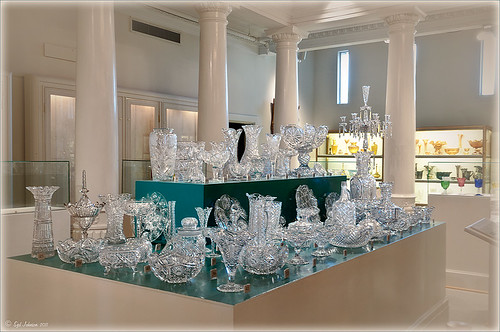 |
This image is of the beautiful cut glass display at the Lightner Museum located in the old Alcazar Hotel in St. Augustine. As you can see it is a very nice collection and I wanted to find out if the color in the image was distracting from actually seeing the ornate cut glass. See the black and white conversion by hovering over the color image. As I discovered, this image turned out to be a difficult choice to process no matter which effect you want.
Color Version
The top image was processed using the NIK Color Efex Pro 4 (CEP4) plug-in on a Smart Object layer (right click image and select “Convert to a Smart Object” since CEP4 will keep your settings and control points in case you want to adjust the results later) and stacking several filters including from top to bottom: Tonal Contrast, Darker/Lighten Center, Vignette, Glamour Glow, and Pro Contrast. Various control points were added to selectively choose areas for some of these effects. In Photoshop the cut glass edges were selectively sharpened using the Sharpen Tool on it own layer, and a final Curves Adjustment layer was added to get the correct contrast. Overall, this image is attractive since the blue-green sets off the glassware nicely.
Since there are some bright colors in the background that might be distracting from the main focus point, and the museum walls and columns have what I consider to be a rather bland creamy color to it, a black and white conversion might be appropriate to tone down some of the distraction and get rid of the creamy tones.
Black and White Version
I duplicated the cleaned up image layer and turned it into a Smart Object as above. Once in the NIK silver Efex Pro 2 (SEP2} plug-in, from the side preset panel the o14 Grad ND (EV -2) preset was selected and it really made the glass pop out clearly. In Photoshop the Sharpen Tool was used to bring out some of the glass edges (again, do this on a New Layer above the image) and the opacity of this layer is reduced so artifacts are not viewed. A final Adjustment Curve is added to give just the right amount of contrast. The items on the back wall initially appear to be more distracting than in the color image but the creamy tones did convert to the white tones nicely.
Conclusion
The image may not work as a black and white and the only way to figure this out is to try it. In this case SEP2 was used to convert the image to black and white, but the conversion can be done in lots of ways – in Adobe Camera Raw or Lightroom using a preset, or in Photoshop using a Black and White Adjustment Layer or Channels, as just a couple examples. NIK’s SEP2 is an excellent way to find out quickly since the presets allow you to glance over many black and white variations – if the image is really not going to look good as a black and white, you will know it.!
I am on the fence about which version I like best. The image was not the best choice to process to begin with and the glass creates a huge challenge just to get enough contrast to make the it stand out. Still it was good practice and I like the picture because I liked the cut glass collection. Just remember sometimes the image you want to process is not that great and does not work – but at least try a couple different effects including black and white and maybe there is a good shot hidden in there!…..Digital Lady Syd
Related Digital Lady Syd Blogs:
NIK’s Champion Plug-in – Silver Efex Pro 2
Topaz B&W Effects vs. Nik’s Silver Efex Pro
Topaz B&W Effects Plug-In – A Real Winner!
Topaz B&W Effects vs. Nik’s Silver Efex Pro
I did a blog on my Fun Photoshop Blog called “Topaz B&W Effect Plug-in – A Real Winner!” that touched on some of the differences of Topaz’s new plug-in and the great black and white standard plug-in by Nik called Silver Efex Pro 2.0. I thought I would just mention a few other things I noticed that are definitely different about the two programs.
Below is one of my favorite images for trying out new effects (the original has some basic flaws so I can see if the product will correct it) and was taken from the London Eye. Topaz B&W Effects was applied (hover over or click on image to see the Nik version).
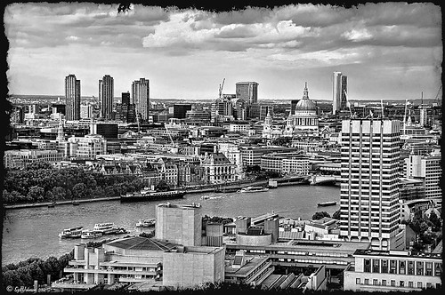 |
This is as close as I could get to making the two plug-ins look alike. The sky and some of the buildings’ contrast and detail are slightly different, but overall the results are pretty much the same. I am not sure which version I like best.
The image below I also used Topaz B&W Effects.

In this case, I could not duplicate the results in either NIK Silver Efex Pro 2.0 or Color Efex Pro 3.0. I liked the results and was surprised how nice the image turned out. By the way, I created for the Topaz plug-in a SJ-Cityscape preset for use in the Traditional Collection for both of the Topaz images – it can be downloaded here.
My final thought is to say that I think there is a place for both black and white plug-ins. Nik’s black and white plug-in is considered the best and I am not sure Topaz has created a better one, but it is very close. Topaz B&W Effects is definitely a great product since it does several things the other plug-in cannot do – and I really like that.
Well I hope you have fun (I sure am) trying out both of these excellent products. I plan on experimenting more with Topaz’s B&W Effects and will post more on it later……Digital Lady Syd
PS. Be sure to download the 30 day trial for Topaz B&W Effects – it is a fully functional trial to try out!


