Anything Photoshop or Photography

Latest

Textured Sky Adds Vintage Feel


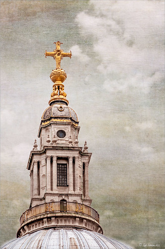
This is another tower image from London. Once again, I have no idea what it is connected to, but it is a beautiful cupola. I really liked the final cloth feel on the texture. This image was straightened and just the Basic Sliders were used in Lightroom. Once in Photoshop, I selected the tower, deleted the background, and tried several different texture backgrounds. I ended up with one of my very favorite Flickr Texture people, Lenabem-Anna Textures, Texture 278 – her textures are incredible! This one gives the cloth appearance with just a touch of clouds – perfect for an original image that had no clouds. For this image a Gaussian Blur was added using a Radius of 5.9 just to smooth out the texture in the background but leave the color in the texture. A Levels Adjustment Layer was added and the Midtones slider adjusted a little for more contrast to the whole image. To add the texture back into the whole image, the same texture was applied again on top. A Hue/Saturation Adjustment Layer was clipped (ALT+click between the layers to clip) to the texture and the Saturation  slider was set to -100. The texture layer was set to Overlay blend mode at 67% layer opacity. A Color Balance Adjustment Layer was added on top to bring out the gold tones more in the tower. That was it. …..Digital Lady Syd

Digital Lady Syd Related Blogs:
Clarity with Texture!
Where Am I? Edinburgh, Scotland
Getting a Nice Painterly Landscape Effect with Topaz Simplify and Texture

Take the Time to Get the Fun Shots!


Going through my older photos I found this crazy image of an ostrich at The Old Village of Ayaymku outside Minsk in Belarus. (At this point I think I am the only person who has posted images on this charming place.) This was a totally fun place to visit – I am not sure they have had too many American tourists, but it is a very popular place for the locals, especial for bridal parties. In fact we saw two brides having photo-shoots while there! Here are a couple links to some of my other images posted on Flicker: The Old Village of Ayaymku and The Old Candy Shop at the Village. This is a replica of an old Belarusian village where there are many beautiful craft and food shops. And then they had this little zoo area with all kinds of animals, including this crazy guy! (Here is another Ostrich image from the Village.) He was mainly retouched in Lightroom 5 where David duChemin’s Toxic Warmth preset was applied. In Photoshop, Nik Viveza 2 was used to emphasize his eyes and tongue and downplay the background. Hope to present some more images from this Village in the future…..Digital Lady Syd

Digital Lady Syd Related Blogs:
Unexpected Humor in an Image

How to Pop a Picture in Lightroom 5


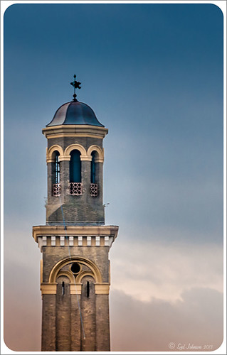
This image of a pretty cupola taken in London uses several of the new Lightroom 5 features. In fact nothing was done in Photoshop to this image. First it was cropped down – only had the very top as shown but it needed to be composed. Then the basic sliders were set just like in previous versions of Photoshop (see my How to Use Adobe Camera Raw (ACR) or Lightroom 4 Quickly blog for tips on this). The HSL panel was used to set the color. Two Graduated Filters were added – one for the blue sky (Temp -22 and Exposure -1.18) and one to bring out the pretty sky and cloud effect (Exposure -0.42, Highlights -60, Shadows 87, Clarity 55 and a light orange color Hue 28/Sat 59). Some Sharpening was done with an Adjustment Brush (Sharpness 100, Shadows -68, and Clarity 100) and the detail painted over. A Radial Filter was applied to just the the cupola – used -1.18 Exposure with the Invert Mask checked. A Post-Crop Vignetting was added using Highlight Priority Style, Amount +100, Midpoint 18, Roundness -100, and Feather 0 – this gives the nice white frame. That was all that was done – a very plain image turned out to be quite striking!…..Digital Lady Syd

Digital Lady Syd Related Blogs:
Lightroom 5′s New Upright Adjustments Section
My Favorite Adobe Lightroom 5 Features

NIK HDR Pro 2 and Topaz Clarity Together?


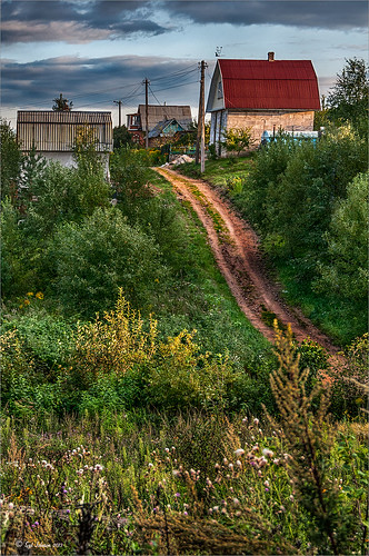
Just thought I would add a photo I took several years ago in the countryside of Belarus outside of Minsk. It was a good image to begin with so it was pretty hard to mess it up, but this time I tried something I had not done before. First I processed this image quite a bit in Lightroom – doing the basic sliders and then sharpening up the road and the foreground plants a little. Then once in Photoshop, I applied Nik’s HDR Pro 2 using the Deep 1 preset – no changes. I wondered how Topaz (see sidebar for website link) Clarity would stack up against the HDR program, so I duplicated the image and added Clarity. A preset I had created called Very Vivid Sharp was selected. (Settings if you want them are as follows:  Clarity: Dynamics – Micro Contrast  0.84, Low Contrast  0.56, Medium Contrast  -0.31, and High Contrast  -0.09; Tone Level – all set to 0; and HSL Filter: Hue – no changes; Sat – Red 0.25, Orange 0.13, Yellow, Green, Aqua, Purple and Magenta all 0, Blue 0.06, and Overall 0.17; and Lum – Red  -0.81, Orange  -0.01, Yellow 0, Green -0.08, Aqua 0, Blue 0.23, Purple 0, Magenta  0.33, and Overall -0.12) Wow – it really popped the image! So now what to do, what to do?

I decided to move the Clarity layer on top and add a black layer mask. Then I selectively painted back areas that needed the extra boost that Clarity added. The results are quite spectacular I believe. Next time you get stuck, try applying a couple different filters to the original image – even ones that do not come together – and stack and mask them to get the best of both. The results can be quite incredible!…..Digital Lady Syd

Digital Lady Syd Related Blogs:
More Clarity on Topaz Clarity
Digital Lady Syd Reviews Topaz Clarity
Digital Lady Syd Reviews Nik HDR Efex Pro 2

Make an Ordinary Image Interesting


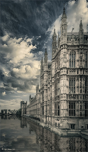
This image was one I did not think I would ever use. but once I was able to straighten it correctly in Lightroom with the Lens Correction Upright feature, it started looking pretty nice. So here is the Parliament building and the Thames River. The reason I love this image is the beautiful sky and the way it points to the building towers. After processing in Lightroom, a couple things really contributed to this interesting look. The Background layer was duplicated and then Nik’s HDR Pro 2 was opened (this was not an HDR image) and my favorite preset, Grannys Attic, was applied – no changes. Next the layer was duplicated and Nik’s Silver Efex Pro 2 was opened up in a Smart Object to save the settings. I am not sure which preset I used as a starting point but these are the settings I ended up with (Global Adjustments:  Brightness 7%, Highlights -32%, Midtones 11%, Shadows 9%, and Dynamic Brightness 25%; Contrast  15%, Amplify Whites 0%, Amplify Blacks 0%, and Soft Contrast 8%; Structure 10%, Highlights -58%, Midtones 8%, Shadows 53%, and Fine Structure 62%; Selective Adjustments:  6 Control Points were added to add the color back in certain areas; Color Filter: Hue 43 degrees and Strength 114%; Film Types: Custom, Grain – Grain per pixel  500 and Soft to Hard center; Levels and Curves: Just a little contrast with curve lifted up; and Finishing Adjustments Toning was set to 3, Strength 59%, Silver Hue 215 degrees, Silver Toning 59%, Balance 57%, Paper Hue 50 degrees, and Paper Toning  22%. A clean up layer was created, but I just did not like the rough river look. So…. I decided to add Flaming Pear’s Flood Filter, but just to the water. (Here are the settings I used: Horizon  76, Offset 0, Perspective  35, Attitude  84, Waviness  6, Complexity  21, Brilliance  33, Blur  12, Size  12,  Height  33, Undulation  40 and Glue Normal.) The building side was masked out so just the water was selected. The Layer was set to 84% opacity. The last step was to match the graininess to the Flood Filter water – Photoshop’s Add Noise set to 8 pixels, Gaussian Blur, and Monochromatic checked. Once again a layer mask was applied so just the water was affected. That was it – I really like what the flood filter did to the water. It added just a bit of the painterly look that the sky already contributed. Hope you enjoy!…..Digital Lady Syd

Digital Lady Syd Related Blogs:
Lightroom 5′s New Upright Adjustment Feature
Hyacinths Deep in Reflection
The Flood Look
Nik HDR Efex Pro Example

Painterly Textures to Create a Beautiful Floral Image


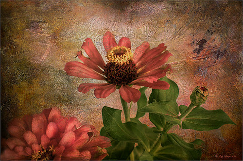
Recently purchased some textures from Distressed Textures so I decided to show them off using a Zinnias image. In Lightroom the basic sliders were adjusted and the David duChemin Milford Greens preset. (See my How to Use Adobe Camera Raw (ACR) or Lightroom 4 Quickly blog.) Then the image was brought into Photoshop where for a very simple workflow. Just some flower clean up. A new darken layer was created above to burn in the edges of the flower petals (see my The Best Dodging and Burning Technique! blog). Then three Distressed Textures were applied: 1) The Artists Palette Lost Canvas set to Darken at 97% layer opacity; 2) The Spring Inspired Cherry Cotton Candy (love the name of this texture!) set to Multiply blend mode at 100% opacity; and 3) The Artist’s Palette I Dream set to Overlay at 70% layer opacity. The first two textures had layers masks applied and the flowers were painted back softly with a largish black brush. The last step was a Curves Adjustment Layer to add contrast back into the photo that the textures tend to remove. That was it – I love the vibrant colors in this combination of textures……Digital Lady Syd

Digital Lady Syd Related Blogs:
Coral Pink Blanket Flowers
Texture Resources – So Many Choices! So Many Choices!

Vintage Roman Bath


Since I have been revisiting my old images from England and Scotland recently, here is one of my latest concoctions! Love how this image turned out very vintage and I can actually visualize being in the water per the Jane Austin book Persuasion description. I have to chuckle as there are at least 5 people in this image talking on their cell phones. Such for the real vintage effect! Anyway, The Roman Baths at Bath, England, are quite interesting to visit and definitely have a real vintage feel to them.

So the steps to getting this effect are pretty easy. First the Basic sliders in Lightroom along with some building straightening using the new Lens Correction Upright feature was applied. In Photoshop, the Background layer was duplicated and added a black layer mask added. Then just the water was painted back – the layer was set to 76% opacity and that was all – just softened the color a little. Next a Curves Adjustment Layer was added and the mask filled with black. This time the heavy building shadow in the water was painted back in white. The Curve was used to lighten the shadow to match the rest of the water’s color. (See my Using Curves Adjustment Layers to Get Rid of Shadows and Highlights blog for info on doing this or could use the How to Use a Selection to Draw Focus in an Image blog using Levels Adjustment Layers.) A stamped composite layer was created (CTRL+ALT+SHIFT+E) on top and duplicated. Next Topaz (see sidebar for website link) Black & White Effects was applied twice. First a Quad Tone preset I had created (see settings below) was applied, and then Topaz’s Classic preset. 2 Lil’s Owls (see sidebar for website link) Enchanted4-3 overlay (from the Texture Workshop Ebook Bundle) was added to give the beautiful linen-like texture to the image, and a Curves Adjustment Layer was used to add back a little contrast. That was it. Black & White Effects really gave this image the vintage feel – it is a great plug-in for this type of effect……Digital Lady Syd

SJ Quad DkB_Gr_Yel_Wh preset settings: Quad Tone: Color 1 Region: Color (R1/G1/B12) and set to 15.08, Color Region 2: Color (R63/G78/B85) and set to 143.9, Color Region 3: Color (R216/G211/B129) and set to 227.5, and Color Region 4: Color (R255/G254/B237) and set to 255.0: and Transparency: Overall Transparency 1.00.

Digital Lady Syd Related Blogs:
Lightroom 5′s New Upright Adjustment Feature
Quad Tones in Topaz Black and White Effects Plug-in
The Art Corner: Painting and Sculpture by Tassaert

If At First You Don’t Succeed, Try Try Again!


Love how this image turned out with a beautiful texture added to it. This is a very sentimental favorite plant for me since it came from my parents home in Indiana many years ago – it loves Florida. It is a Dieffenbachia, which is a poisonous plant around animals and kids so not the plant for everybody, but is very pretty in your home.

This image was processed using my basic Lightroom workflow. (See my How to Use Adobe Camera Raw (ACR) or Lightroom 4 Quickly blog.) Once in Photoshop, Karen Burn’s Day’s End texture was added on top (check out her Flickr account – great textures and images here), flipped (CTRL+T), and set to Normal blend mode at 58% layer opacity. A white layer mask was added and using the Photoshop Charcoal brush set to 250 pixels and a low opacity 12% brush, the leaves were lightly painted back in the mask – this brush gives a bit of a gray rough edge result that blends with the background nicely. I use it a lot for this effect. Just keep painting over the area you want the focus of the image to be. I was not really happy with the overall pastel feel of the image, so a Curves Adjustment Layer was added and the Blue channel and Red channel curves were adjusted to get a better colors. I still was not happy with the color so a Selective Color Adjustment Layer was added on top and in the Reds selected – Cyan was set to -48 and Yellows +46, in the Cyans – Cyan was set to +60, in the Blues – Yellow was set to -46, and in the Neutrals – Black was set to +19. That really made the color sing – sometimes it takes several different methods to get the look you are after. Overall, with just a little effort, this rather average image was turned into something quite stunning!…..Digital Lady Syd

I Didn’t Know That! Use A Pattern Fill Layer to Add a Painted Texture

Love my Day Lilies! This was a yellow lily but using Topaz (see sidebar for website link) Clarity, I was able to turn it to this pretty pink color. (My preset I call Crazy Color Palette settings are: Clarity Section – Dynamics: Micro Contrast -0.36, Low Contrast 0.39, Medium Contrast -0.36, and High Contrast -0.39; no Tone Level settings; HSL Filter Section settings: Hue – Red -1.00, Yellow -1.00, Green +1.00, Blue +1.00, and Magenta -0,52; Sat – Red -.50, Yellow 0.27, Green -0.09, Blue -0.03, and Magenta +0.59; and Lum – Red -0.03, Yellow 0.41, Green -0.23, Blue -0.20. All not mentioned are set to 0. Then I changed to Micro Contrast slider to 0.55.) Apply and then go back to Photoshop and opened Topaz Simplify and apply Oil Paint preset. A layer was added on top and Fay Sirkis’s 03 Palette Brush Blender was used to smooth out the flower rough edges from the Simplify. A old Florabella Action (that is no longer for sale) was run on the flower and and Kim Klassen’s Cloth & Paper Prague texture was also applied at 15% opacity. The flower was painted out so the texture did not affect it, only the background. Created a New Layer using the Sponge Tool to saturate more in the flower itself. A little burning and clean up was done on the flower. A Curves Adjustment layer was added to add back a little contrast. Then a Pattern Fill Layer was added with one of the patterns in Jack Davis’s Wow Patterns (see my blog Can You Get a Painting Look With a Photoshop Action? Jack Davis Can! for download link) and set to Soft Light blend mode at 59% opacity. I have never used the Pattern Fill Layer to add a painterly texture to an image, but it turned out really nice……Digital Lady Syd

Painting a Dragon


This was the head on a wood boat pulled up on the sand in front of the Rainbow Tower at the Hilton Waikoloa Village on Waikiki Beach in Oahu, Hawaii. Recently I did a blog called Can You Get a Painting Look With a Photoshop Action? Jack Davis Can! where his Wow Smart Object Painting1 Action was applied to several images. This image uses the same action to create a nice basic painting. A darken layer was added above to show emphasize the edges for the dragon from the background image (see my The Best Dodging and Burning Technique blog). At this point I thought it looked pretty good, but the background was competing with the dragon in color, so I decided it needed to be pulled back some. Topaz (see sidebar for website link) Black and White Effects was used to soften the background. Several of the presets created really interesting looks due to the canvas effect being applied in the action first. I settled on an old wedding preset I had created back in version 1. (If you are interested, here they are: Conversion – Basic Exposure: Contrast 0.04, Brightness 0.10, Boost Blacks 0.35, and Boost Whites 0.01; and Finishing Touches – Silver and Paper Tones: Tonal Strength  0.44, Balance 0.96, Silver Hue 5.81, Silver Tone Strength 0.85, Paper Hue 77.42, and Paper Tone Strength 0.38; Transparency – Overall Transparency  0.80. A white border was then created around edge using Right Edge Size  0.11/Edge Exposure  -1.00/Edge Transition  0.09; Left Edge Size  0.14/-1.00/0.08; Top  0.20/-1.00/0.09; and  Bottom  0.09/-1.00/0.16.) Back in Photoshop a New Layer was created and the Clone Stamp was used to even out the border just a little around the image. A Curves Adjustment Layer was added to add contrast to the dragon and further separate it from the background – then the layer mask was filled with black (CTRL+I in mask) and just the dragon was painted back in white to reveal it (see my Using Curves Adjustment Layers to Get Rid of Shadows and Highlights blog). The last step was to add a Hue/Saturation Adjustment Layer to further adjust the background saturation (Saturation was set to -41 in Master) – but this time the dragon was painted in black to hide adjustment on it. This really turned out how I remember this image……Digital Lady Syd

Digital Lady Syd Related Blogs:
Digital Lady Syd Reviews Topaz Black & White Effects 2.1