
Vintage Roman Bath

Since I have been revisiting my old images from England and Scotland recently, here is one of my latest concoctions! Love how this image turned out very vintage and I can actually visualize being in the water per the Jane Austin book Persuasion description. I have to chuckle as there are at least 5 people in this image talking on their cell phones. Such for the real vintage effect! Anyway, The Roman Baths at Bath, England, are quite interesting to visit and definitely have a real vintage feel to them.
So the steps to getting this effect are pretty easy. First the Basic sliders in Lightroom along with some building straightening using the new Lens Correction Upright feature was applied. In Photoshop, the Background layer was duplicated and added a black layer mask added. Then just the water was painted back – the layer was set to 76% opacity and that was all – just softened the color a little. Next a Curves Adjustment Layer was added and the mask filled with black. This time the heavy building shadow in the water was painted back in white. The Curve was used to lighten the shadow to match the rest of the water’s color. (See my Using Curves Adjustment Layers to Get Rid of Shadows and Highlights blog for info on doing this or could use the How to Use a Selection to Draw Focus in an Image blog using Levels Adjustment Layers.) A stamped composite layer was created (CTRL+ALT+SHIFT+E) on top and duplicated. Next Topaz (see sidebar for website link) Black & White Effects was applied twice. First a Quad Tone preset I had created (see settings below) was applied, and then Topaz’s Classic preset. 2 Lil’s Owls (see sidebar for website link) Enchanted4-3 overlay (from the Texture Workshop Ebook Bundle) was added to give the beautiful linen-like texture to the image, and a Curves Adjustment Layer was used to add back a little contrast. That was it. Black & White Effects really gave this image the vintage feel – it is a great plug-in for this type of effect……Digital Lady Syd
SJ Quad DkB_Gr_Yel_Wh preset settings: Quad Tone: Color 1 Region: Color (R1/G1/B12) and set to 15.08, Color Region 2: Color (R63/G78/B85) and set to 143.9, Color Region 3: Color (R216/G211/B129) and set to 227.5, and Color Region 4: Color (R255/G254/B237) and set to 255.0: and Transparency: Overall Transparency 1.00.
Digital Lady Syd Related Blogs:
Lightroom 5′s New Upright Adjustment Feature
Quad Tones in Topaz Black and White Effects Plug-in
The Art Corner: Painting and Sculpture by Tassaert
I Didn’t Know That! Use A Pattern Fill Layer to Add a Painted Texture

Love my Day Lilies! This was a yellow lily but using Topaz (see sidebar for website link) Clarity, I was able to turn it to this pretty pink color. (My preset I call Crazy Color Palette settings are: Clarity Section – Dynamics: Micro Contrast -0.36, Low Contrast 0.39, Medium Contrast -0.36, and High Contrast -0.39; no Tone Level settings; HSL Filter Section settings: Hue – Red -1.00, Yellow -1.00, Green +1.00, Blue +1.00, and Magenta -0,52; Sat – Red -.50, Yellow 0.27, Green -0.09, Blue -0.03, and Magenta +0.59; and Lum – Red -0.03, Yellow 0.41, Green -0.23, Blue -0.20. All not mentioned are set to 0. Then I changed to Micro Contrast slider to 0.55.) Apply and then go back to Photoshop and opened Topaz Simplify and apply Oil Paint preset. A layer was added on top and Fay Sirkis’s 03 Palette Brush Blender was used to smooth out the flower rough edges from the Simplify. A old Florabella Action (that is no longer for sale) was run on the flower and and Kim Klassen’s Cloth & Paper Prague texture was also applied at 15% opacity. The flower was painted out so the texture did not affect it, only the background. Created a New Layer using the Sponge Tool to saturate more in the flower itself. A little burning and clean up was done on the flower. A Curves Adjustment layer was added to add back a little contrast. Then a Pattern Fill Layer was added with one of the patterns in Jack Davis’s Wow Patterns (see my blog Can You Get a Painting Look With a Photoshop Action? Jack Davis Can! for download link) and set to Soft Light blend mode at 59% opacity. I have never used the Pattern Fill Layer to add a painterly texture to an image, but it turned out really nice……Digital Lady Syd
Painting a Dragon

This was the head on a wood boat pulled up on the sand in front of the Rainbow Tower at the Hilton Waikoloa Village on Waikiki Beach in Oahu, Hawaii. Recently I did a blog called Can You Get a Painting Look With a Photoshop Action? Jack Davis Can! where his Wow Smart Object Painting1 Action was applied to several images. This image uses the same action to create a nice basic painting. A darken layer was added above to show emphasize the edges for the dragon from the background image (see my The Best Dodging and Burning Technique blog). At this point I thought it looked pretty good, but the background was competing with the dragon in color, so I decided it needed to be pulled back some. Topaz (see sidebar for website link) Black and White Effects was used to soften the background. Several of the presets created really interesting looks due to the canvas effect being applied in the action first. I settled on an old wedding preset I had created back in version 1. (If you are interested, here they are: Conversion – Basic Exposure: Contrast 0.04, Brightness 0.10, Boost Blacks 0.35, and Boost Whites 0.01; and Finishing Touches – Silver and Paper Tones: Tonal Strength 0.44, Balance 0.96, Silver Hue 5.81, Silver Tone Strength 0.85, Paper Hue 77.42, and Paper Tone Strength 0.38; Transparency – Overall Transparency 0.80. A white border was then created around edge using Right Edge Size 0.11/Edge Exposure -1.00/Edge Transition 0.09; Left Edge Size 0.14/-1.00/0.08; Top 0.20/-1.00/0.09; and Bottom 0.09/-1.00/0.16.) Back in Photoshop a New Layer was created and the Clone Stamp was used to even out the border just a little around the image. A Curves Adjustment Layer was added to add contrast to the dragon and further separate it from the background – then the layer mask was filled with black (CTRL+I in mask) and just the dragon was painted back in white to reveal it (see my Using Curves Adjustment Layers to Get Rid of Shadows and Highlights blog). The last step was to add a Hue/Saturation Adjustment Layer to further adjust the background saturation (Saturation was set to -41 in Master) – but this time the dragon was painted in black to hide adjustment on it. This really turned out how I remember this image……Digital Lady Syd
Digital Lady Syd Related Blogs:
Digital Lady Syd Reviews Topaz Black & White Effects 2.1
Clarity with Texture!

I love how this image turned out – totally me! This is a beautiful pink variety of a Day Lily – huge beautiful blooms that I bought at WalMart! Nothing was done in Lightroom other than the checking Enable Lens Profile and Remove Chromatic Aberration, and adjusting the Crop. In Photoshop the layer was duplicated and the new Topaz (see sidebar for website link) Clarity plug-in was applied using the settings shown below. Note that the Red Hue slider was set to -0.59 along with the other settings in the screenshot.

These settings bring out the pink a little more in the flower. A burn layer was created using my The Best Dodging and Burning Technique! blog, and a paint clean up layer to make the stamen stand out more. Now what really made this image pop was using the beautiful Texture 86 by Lenabem-Anna – check out all her fabulous textures on Flickr that can be downloaded for personal use. It was duplicated and on the bottom layer a layer mask was added where the pink flower was lightly painted out. I did not want to completely cover up the background purple flowers in the image so the opacity was set to only 61%. Since I wanted the flower to have some texture but not pick up the color from the it, two steps were performed: 1) the texture layer was duplicated and a black layer mask was added where the flower was lightly painted back. This time the layer as set to Hard Light and the layer opacity was only 35%; and 2) a Hue/Saturation Adjustment layer was clipped to the texture (ALT+click between the layers) and the Saturation slider in Master was set to -100 and Lightness +13. Now the texture color only appears in the background. Totally loved the final result! …..Digital Lady Syd
Digital Lady Syd Related Blogs:
Getting a Nice Painterly Landscape Effect with Topaz Simplify and Texture
Where Am I?
Digital Lady Syd Reviews Topaz Clarity
Pretty in Pink! with Topaz Clarity

I do love to photograph my gerberas – they are always so pretty. This time I really changed them up. I think they are as pretty in pink as they were in yellow! So I was really just playing around in Topaz (see sidebar for website link) photoFXlab just to see if the new Topaz Clarity plug-in would work nicely with it. I didn’t even keep track of the changes I made exactly in Clarity, but I did use the Hue/Sat/Lum section to turn the flowers pink. I just kept fooling around with the sliders until I got a color I liked – used the Overall sliders on each of these sections and also adjusted the Clarity section too. Back in photoFXlab, adjusted the Dynamics slider a little to the right. Created a +From Stack Layer and opened up Topaz Simplify 5 where the Paint 5 preset was applied. Back in photoFXlab, the Mask tab was selected and the centers of the flowers were painted back so the detail from the Clarity layer remained. Exited the plug-in and did some basic flower clean up. Created a couple New Layers and used two of my free Cloud Brushes (Brush 6 and 9) to add some interest to the background. Added a Curves Adjustment Layer and evened out some of the petal color. Then added 2 Lil’ Owls Color Bokeh Grunge Set (see sidebar for website link)-2 overlay to the image (set to Normal at 100% opacity). Next the text was added using the free font Ruthie. Kim Klassen‘s Square 3 border was added last and set to 52%. The last step added another Curves Adjustment Layer to enhance overall contrast. That was it. I just love playing with my flowers in Photoshop!…..Digital Lady Syd
PS: Check out my Fun Photoshop How to Create an Overlay Out of a Texture blog to see the frame it was put in.
Digital Lady Syd Related Blogs:
Digital Lady Syd Reviews Topaz Clarity
Topaz Simplify Artistic Workflow
Digital Lady Syd’s Review of Topaz photoFXlab v1.1
Digital Lady Syd’s Rule No. 10: Use What You Know!

Just thought I would remind everyone that you do not have to keep changing every workflow to incorporate that new technique into it. Sometimes it is better and faster to use what you know, especially if you are just doing a little processing of an image. That is exactly what I did on this image. I like this image of the Tower of London because you can a little boy peaking out at the sidewalk and the Thames River. There is also part of another little boy in the guard house. So much going on in London!
I really wanted to do a black and white, and it looked good with a slight sepia tone on it, but when I took this image into Topaz (see sidebar for website link) Black & White Effects 2, my Sunny preset brought out the colors the way I liked them. In Lightroom there was just the regular slider adjustments going on (see my How to Use Adobe Camera Raw (ACR) or Lightroom 4 Quickly blog) and the Upright Adjustment was also used to straighten the image out (see my Lightroom 5′s New Upright Adjustments Section blog). Once in Photoshop, I went into Black & White Effects and just applied my preset, that’s all – for all the settings for this preset, see my Sunny Preset for Topaz Black and White Effects blog. (This is one of my favorite presets for the program.) Did some clean up on a New Layer. Then created two New Layers, a Darken and a Lighten layer, set to Overlay for dodging and burning (see my The Best Dodging and Burning Technique! blog link). That was it.
As you can see, I really do use the techniques I present. Everything in this blog is what I normally look at when post-processing an image. Hope it gives you ideas on how to do your images too!…..Digital Lady Syd
Bleach Bypass Look on a Landscape Image

This may be the most beautiful and interesting library ever made. I posted a couple times on Flickr with other images (see Minsk Library, Inside Minsk Library, and Minsk Library at Night) but this time I decided to process the inside ceiling which is all glass – totally breathtaking! As you can see, I caught the eye of the guard down below, but he lends a wonderful scale to the image. I had a hard time deciding what to do with the image as the original was not that bad but I wanted to enhance the light and airy feel in the image. So I tried everything I could think of and this is what I got!
First applied Topaz (see sidebar for website link) DeNoise 5 – the image was shot at ISO 1600 so it had some issues. Used the Overall Strength set to .17 and set the Shadows to .82. The layer was copied and Topaz Detail 3 was applied using the Architectural Detail II preset – this image was perfect for this preset. Next Black & White Effects was applied where I mainly applied a regular black and white preset and started moving sliders. What I think really made the image pop was the application of the Creative Effects Diffusion effect where the Softness was set to 0.10, but the Diffusion slider was set high at .91 and Diffusion Transition set to 0.61. This really made the roof lines pop without being too sketchy looking. Then Kim Klassen’s Cloth & Paper Reign texture was applied and set to Soft Light blend mode to lighten the image and add some blue tones back into the image. It was duplicated and this time set to Multiply at 24% layer opacity. Next a Levels Adjustment Layer was added to lighten the image more by moving the Output Levels to 23/255 and the midtone slider to 1.39. Next a Curves Adjustment Layer was added to lighten it even, and a bit of a vignette was painted around the edges of the layer mask. It still did not look quite right – almost blown out. That is when I tried a Color Lookup Adjustment Layer and clipped (ALT+click between the layers) it to the top texture layer. The 3DLUT File was set to Bleach Bypass.look in the drop-down, although several look rather nice. The last step involved creating a composite (CTRL+ALT+SHIFT+E) on top and adding my SJ B&W Border Frame. I really like how the diffused settings made the ceiling lines look. Anyway, it was once again a lot of fun to experiment!…..Digital Lady Syd
Some Vintage Zinnias

Just playing with my Zinnias. I was trying to a vintage, wallpaper feel behind them. I actually opened Topaz (see sidebar for website link) photoFXlab from Lightroom. Here are the steps completed: Applied Topaz Clarity – SJ Illustrative Look – with a few adjustments, duplicated layer, set Dynamics slider to 9 and Saturation -17, duplicated layer, enter Topaz Adjust and apply my Rick Sammon Spicify Soft Artsy, back in photoFXlab the Adjustments settings stayed on this layer, duplicated layer, duplicate layer, in B&W Effects applied SJ_Quad_DkB_GR_Yel_Wh preset, an exited the plug-in to Photoshop. Just a few steps here. Guess what I am trying to show is that there is a lot of versatility here with photoFXlab. Once in Photoshop some clean up was done and French Kiss Studio Selections 3 White Wash texture was applied (I use this texture a lot and it is in a very reasonably priced set). On the white was I used Brush Lovers Art Flowers 2000 (liked the brush best when applied directly to the French Kiss WhiteWash texture – just looked better). This brush was set up as a preset – had to select the dark red color 4e322e and dark green color 3c3e38. In the Brush Panel I turned on Shape Dynamics, Scattering and Smoothing, Size 394 px, Spacing 434% and then Color Dynamics was added and size changed to 201 px. A layer mask was added to the layer to lightly brush out texture from the flower, but leaving a little to keep the grain intact. A Curves Adjustment Layer was clipped to the texture to bring out the cool texture a little bit more. 2 Lil’ Owls Studio Color Bokeh Grunge Set 4 (see sidebar for website link) was applied at 50% opacity and in the layer style, the Blend If This Layer’s white tab was set to 164. The last step involved adding two New Layers where just a couple strokes were applied, one layer using green and one the dark red color to add a little grunge feel to the image. The brush used was Nakatoni Custom Brushes texture brush (does not appear to be available anymore but any soft grunge brush would do). The preset settings are listed below. ….Digital Lady Syd
Here are the plug-in preset settings used if you are interested:
Topaz Clarity SJ Illustrative Look settings: If you would like the illustrative look, here are settings: in Clarity Section – Dynamics: Micro Contrast 1.00, Low Contrast 0.28, Medium Contrast -0.50, and High Contrast 0.06; Tone Level: Black Level 0.61, Midtones 0.14, and White Level 0.72; and in Hue/Sat/Lum Section – Hue: Only Red 0.16, Yellow -0.05, and Green -0.17 were adjusted; Sat: only Green -0.22 and Overall -0.45 were adjusted; and Lum: Only Orange 0.36, Yellow 0.89, Green -0.91, Aqua 0.30, and Blue -0.09 were adjusted.
Topaz Adjust Rick Sammon Spicify Soft Artsy settings: Adaptive Exposure section: Adaptive Exposure 0.50, Regions 25, Contrast -0.56, Brightness -0.13, Protect Highlights 0.03, and Protect Shadows 0.03; Details section: Strength 0.87, Detail Boost 1.15, Threshold 0.12, Radius 25.00, and Sharpen 1.01; Color section: Adaptive Saturation 0.33, Color Regions 10, Saturation 1.00, Saturation Boost 1.00, and Hue 0.00; and Noise section: Suppression 3.24, Amount 0.51, and check Use Topaz DeNoise.
Topaz B&W Effects SJ Quad DkB_Gr_Yel_Wh settings: Quad Tone: Color 1 Region: Color (R1/G1/B12) and set to 15.08, Color Region 2: Color (R63/G78/B85) and set to 143.9, Color Region 3: Color (R216/G211/B129) and set to 227.5, and Color Region 4: Color (R255/G254/B237) and set to 255.0: and Transparency: Overall Transparency 1.00.
Where Am I?
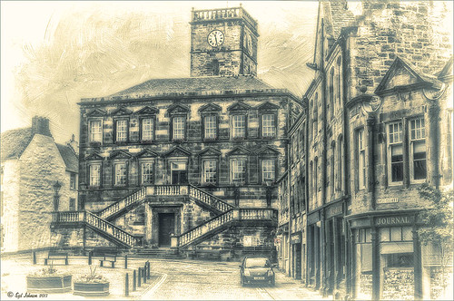
This is a tough one since this image is not of the main attraction in the area. This is the Burgh Hall Tourist Information Center (check out link for live webcams of area) that resides in the center of the town of Linlithgow, Scotland, just outside of Edinburgh. Linlithgow Palace (the birthplace of Mary Queen of Scots) ruins are just behind this building along with a beautiful old church, St. Michael’s Parish Church, next to it. If you are in Edinburgh, it is a wonderful day trip as it is only a half-hour train ride to get there.
The image was processed using Topaz (see sidebar for website link) Black and White Effects 2 three times! The first application used just the Traditional Collection Warm Tone preset set to an Overall Transparency of .90. Next, the same preset was selected, but the Diffusion Section with Softness slider set to .85, Diffusion to .65, and Diffusion Transition to .50, and the Overall Transparency set to 1.00 was applied. The the windows, steps and clock face were painted out using the Localized Adjustments section. The third time a Quad Tone preset I made was applied using Navy Blue, Green, Yellow and White tones . (Quad Tone settings are: Color 1 Region set to Red 1/Green 1/Blue 12 and slider set to 15.08, Color 2 Region Red 63/Green 78/Blue 84 and slider set to 143.9, Color 3 Region set to Red 216/Green 211/Blue 129 and slider set to 227.5, and Color 4 Region was set to white with slider set to 255.0.) Some Border Edging in white was added. French Kiss L’Artiste Dove Wings texture was added and the center of the image was lightly painted back in a white layer mask using a soft low opacity black brush. A Curves Adjustment Layer was added for contrast. Puppet Warp was used to slightly straighten out the buildings – this old building just did not have any straight lines! I totally love the slight diffused look on this image – definitely getting to be a favorite effect for me and I am seeing it a lot more in images now……Digital Lady Syd
Digital Lady Syd Related Blogs:
Straightening with Puppet Warp!
Zinnias Ready for Springtime!

Love my Zinnias! This image was first processed in Lightroom before going to Photoshop for an overhaul. Topaz (see sidebar for website link) Detail 3’s Overall Detail Med II preset was applied. A black mask was added and just the flowers were painted back to be nice and sharp. Lightened the image with a Levels Adjustment Layer. Used Kim Klassen‘s Sunkissed texture set to Soft Light blend mode at 100% layer opacity, and then Julytrio ToBe texture set to Soft Light at 47% opacity. For the wallpaper effect, a New Layer was created and Brush Lovers Art Flowers brush 2000 (these used to be posted at BrushLovers.com but they do not appear to be available anymore-they have a lot of other nice little flowers brushes that would work) was selected – in Brush panel the Shape Dynamics, Scattering and Smoothing sections were turned on at default settings, and the Brush Tip Shape settings were Size 394 pixels and Spacing 434% before painting in light brown background effect. The layer opacity was then set to 41%. The font is a really old one from Cosmi named 31. A Curves Adjustment Layer was applied to add a little contrast back in the image after adding all the texture. Last a little brownish tinge of grunge was brushed in using Kim Klassen cloth and paper extras brush 2188 on the upper corners…..Digital Lady Syd
Turtle Talk

We appear to have a group of large turtles that like to meet on the fountain structure before it turns on every day. Sometimes there are five and sometimes there is one that is larger than all the others. It appears to me that they are gossiping in the sunshine before the day begins. All have their heads stretched way up.
Not much in the way of processing. First cropped in Lightroom and did a few color and tone adjustments. Added just a little sharpening and exposure to make the turtles pop out from the dark background using the Adjustment Brush. In Photoshop added Topaz (see sidebar for website link) Detail and then filled a layer mask with black and just painted back the turtles. Applied Nik Color Efex Pro filters: Darken/Lighten Center centering on the turtles, and then Monday Morning in the Neutral color set. Control Points were placed on the turtles and the opacity set to 41%. Back in Photoshop the brown text was added using the Regular Batik font. A Stroke layer style was added to a composite layer (CTRL+ALT+SHIFT+E) on top and instead of a color, a pattern was added to the at a Scale of 13% and a Size of 21 pixels. I used a pattern that had some of the natural brown tones for the frame. That was it. Totally easy. I hope to be able to get some more images of my new turtle friends. Seems like we have a whole group in our little lake…..Digital Lady Syd
Infinity Light Fun!

The beautiful colored “Infinity Lights” were on display at the local St. Augustine Outlet Mall in Florida. You can actually check them out at Facebook@Happy Pappys Glowing Balls. They are quite striking at night!
This was really easy to process – actually took the image with my little point and shoot camera. Just did regular adjustments in Lightroom before going into Photoshop. First Topaz (see sidebar for website link) Detail 3 was used – applied Overall Detail Medium II with a Lt. Blue Sky Tone filter selected. (Did you know that Detail now has filters for each section? If you click on the upper right corner of each section, there is a drop-down with all kinds of presets for all the sections. For example, the Tone section has presets for Lt. Blue Sky, Lt. Contrast, Lt. Foliage, Dk. Bl. Sky, Dk. Foliage, Brighter I and II, Darker I and II, Med Contrast, High Contrast, and Skin Brightening I and II. This was added to their recent 3.1 upgrade – definitely download this if you have the plug-in and did not do this.) A New Layer was created and a stop sign removed in the background. A composite of the image was created (CTRL+ALT+SHIFT+E) was placed on top and a Gaussian Blur filter set to a Radius of 22 applied. A black layer mask was added and the background area was painted in white to keep the blur in those areas. The last step involved adding OnOne’s (see sidebar for website link) Perfect Effects 4 PhotoTone Cooler preset was applied, which added a little bit of a bluish tone to the total image. This preset was part of free download from OnOne if you own Perfect Effects 4 – they are from their original PhotoTunes program from many years ago. The last step involved adding my free SJ Thin Double Edged Frame with colors from image. I wish I had a good place to put a few of these really interesting lights. They are so pretty!…..Digital Lady Syd
InstaTone Sunset

Wanted to change up the look of all the 24th Annual Native American Festival images I took so using Topaz (see sidebar for website link) photoFXlab’s InstaTone feature, I got this beautiful sunset look. Basically I went into the InstaTone tab’s 500 px website and applied a beautiful yellow and gold tone from Men on Fire image by Uwe Braun at 68% layer opacity. Then a preset I created using Topaz Adjust’s Spicify was applied that gives a slight illustrated look. (Here are the settings if you want them: Adapt exp +.30/25/-0.71/-0.76/0.02/0.04; Details +1.24/1.15/ 0.12/24.67/1.98; Color +0.33/10/0.89/1.92/0.00; and Noise +1.47/0.22.) Next I cleaned up signs and spots in the image (should have done this first but oh well!). 2 Lil’ Owls Enchanted texture 4 (see sidebar for website link) was added from their Texture Workshop E-Book bundle was applied as a PNG file frame next and a dark brown Color Adjustment Layer was clipped to the frame to apply it. I had to paint in a few areas around the trees that were too light on a separate layer using a low opacity brush and sampling from the near colors. Took awhile to complete but really like the changed look. I can imagine this image at an Indian campsite in the past…..Digital Lady Syd
Digital Lady Syd’s Related Blogs:
InstaTone in photoFXlabs – Great Fun and Great Results!
Topaz DeNoise 5 and InstaTone
Lightroom 5’s New Upright Adjustment Feature
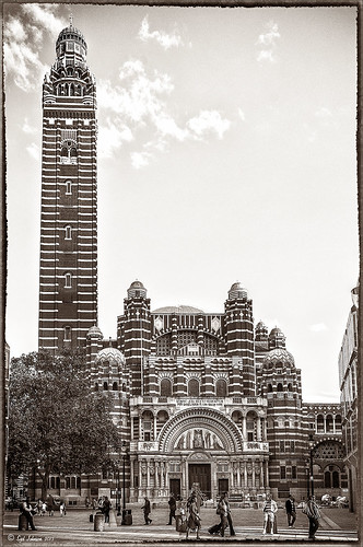
Hover over the above image of Westminster Cathedral to see what the original RAW image looked like or (here to see on flickr)- pretty awful! Wanted to show you what Lightroom 5 did with one click of the Lens Correction section’s new Auto button in the Basic Upright area. I was blown away! I did not adjust it any more – it is not perfect but much faster than anything I could get by using Photoshop’s Puppet Warp or filter tools. Check out a short blog by Julianne Kost, one of the Adobe Photoshop Evangelist, that gives some good info on when to use the Reanalyze button. In Photoshop a couple little items were cloned out on a separate New Layer. Nik’s Sharpener Pro 3’s Raw Presharpener was used at default values on a duplicate layer. A Hue/Saturation Adjustment Layer was added to get rid of a little yellow cast the sharpener filter gave to the top of the tower – used a black layer mask and painted back the correct color where needed in white on the mask. Next Nik Silver Efex Pro 2 was used and the custom preset called Sepia Grain Border was applied. Just a few little changes were done on the sliders to make the image sharper, but that was all that was done. Pretty nice sepia tone image!…..Digital Lady Syd
Eastern Swallowtail Butterfly

Just had to display this beautiful butterfly that appeared on my Bottle Brush bush recently. This is a female Eastern Tiger Swallowtail and had at least a 4-inch wide wing span. I did basic processing in Lightroom and then opened it in Photoshop. Just did a clean up layer and a Topaz (see website link in sidebar) Detail filter using the Overall Medium Detail II preset. I tried several different textures and nothing seemed to look right. So the layer was duplicated and the image was opened in Nik Color Efex Pro 4. These filters were stacked: Detail Extractor, Monday Morning using the Neutral color set and an opacity of 58%, Film Efex Vintage set to Film Type 13, and Vignette using a white color. These are all favorite filters of mine in this plug-in. Next OnOne’s (see website link in sidebar) old PhotoFrame 4.6 filter was applied using Kevin Kubota’s preset Kinky set to 63% opacity and a size increase of 7% and using a creamy color sampled from the image. Back in Photoshop a Hue/Saturation Adjustment Layer was added and the Reds Saturation was set to -58 to tone down the bottle brush color. I love the vintage feel of this image. I am sorry that OnOne is not longer releasing PhotoFrames – I am having trouble duplicating these effects in their new suite……Digital Lady Syd
Windsor Castle
Here is another example of an image that used a Curves Adjustment Layer to adjust the color of the stone in this image of Windsor Castle in England. It turned too brown due to a filter treatment applied to the total image – Topaz (see sidebar for website link) Adjust 5’s French Countryside preset was applied to the image once it was brought into Photoshop – this preset is one of my very favorites but it definitely has a very brown tone to it. Nik Viveza 2 was applied next to selectively sharpen parts of the image. A regular Curves Adjustment Layer was added to increase the contrast in the image. Next another Curves Adjustment Layer was added and this time the Blue Channel Curve was adjusted to get rid of some of the yellow tones in the stone. The Layer Mask was filled with black and just the castle stonework was painted back in with a low opacity soft white brush. That is it! I love the final result – it really gives a different perspective on how large this castle really is!…..Digital Lady Syd
Digital Lady Syd’s Related Blogs:
Using Curves Adjustment Layers to Get Rid of Shadows and Highlights
I Didn’t Know That! Curves Adjustment Layers
A Vintage Landscape Look on a Scottish Monument

I loved the way this image turned out – never expected it to be this pretty considering it was an image I snapped while standing on the street in front of our hotel. It is Nelson Monument (in center) and Acropolis (aka National Monument of Scotland on left corner) on Calton Hill – I did not get to visit this site but wish I had. This was not difficult to process once I got going. After cleaning up a rather boring image, Topaz (see sidebar for website link) Simplify 4 was opened and a preset I call the John Barclay BuzSim Setting preset was used, (The settings are: Simplify: Colorspace RGB, Simplify Size 0.19, Details Boost 1.00, and Details Size 0.20; Adjust: Brightness 0.01, Contrast 1.08, Saturation 1.03, Saturation Boost 1.15, Structure 1.00, and Structure Boost 1.00; and Edges: Edge Type – Color Edge Normal, Edge Strength 0.00, Simplify Edge 0.30, Reduce Weak 10.00, Reduce Small 0.20 and Flatten Edge 0.00.) I listened to one of John’s excellent videos on Topaz Labs and created this preset which has a very subtle result. Next I added 2 lil Owls (see sidebar for website link) Workshop 6 – Texture 1 which has the beautiful turquoise and light yellow sky color – the layer was set to Overlay Blend Mode. The beautiful text was supplied by my favorite Shadowhouse Creations – his Text Brush 5. I actually clipped a bright green Color Fill Adjustment Layer to the text (to clip just ALT+click between the two layers and the color fill adjustment layer will only affect the layer below) – then the text layer was set to 55% opacity. Another 2 Lil’ Owls Texture – texture 4 was used as an overlay frame (follow the steps in my blog How To Make Frames or Borders – scroll down to the section called “To save the frame you created as an overlay to use again”). A light yellow Color Fill Adjustment Layer was clipped to the texture file. A Curves Adjustment Layer where the red, green and blue channels were adjusted to get this slight vintage feel. The last thing done was to add a Color Fill Adjustment Layer to the whole image using a soft cream color (#c6c3bd) and then Nelson Monument was painted out in the layer mask so the eye is drawn to that area of the image. Had a lot of fun as usual – never get tired of this!…..Digital Lady Syd
Winter Violets

Just liked the way my purple-blue violets turned out so I decided to post them. When I took this image, I held an old Cokin Gradual Blue Filter 122 B1 in front of my macro lens. In Lightroom David duChemin’s Iceland Split Greens preset (from his newest book The Print and the Process: Taking Compelling Photographs from Vision to Expression) was applied and then the Basic Panel sliders were tweaked. Topaz Detail 3’s (for website link see sidebar) Overall Detail Light I preset was applied. Next a Levels Adjustment Layer was applied and the mid point was moved to the left (2.57) to really lighten the image. The layer mask was filled with black (CTRL+I) and just some of the purple edges were painted back so the purple was not so bright. Next 2 Lil Owls (see sidebar for website link) Scripted Brush 34 at 2500 pixels was painted in upper right area – a layer mask was applied and any brush color was painted off the flowers. The layer was set to 68% opacity. A green Color Fill Adjustment Layer was clipped (ALT+click between layers) to change brush strokes to green. Kim Klassen’s Unleashed (a beautiful texture that was free by signing up for her newsletter) that I converted to a PNG texture was applied and a light purple Color Fill Adjustment Layer was clipped to the layer. The texture was set to 62% opacity. Another Levels Adjustment Layer was placed on top and the black Output Levels tab was set to 38 to soften and lighten the whole image. In the layer mask, the two main flowers were lightly painted out to sharpen just a bit. That was it. I really enjoyed just doing a fun image…..Digital Lady Syd
The London Eye Looking Up

I was just playing around in Lightroom today and found this old image of The London Eye that was a very different type shot. Decided to process it first using NAPP‘s Lightroom preset Summer Day. It created a very yellow image, totally different from what I ended up with, but I thought I would try it. Once opened in Photoshop, Topaz (see sidebar for website link) Detail 3, my “go-to” filter where I actually tried the “I Feel Lucky” button. The image above is basically what I ended up with. (These are the settings if you are interested: Detail: Overall details set to Small Details -.094 Small Details Boost 0.84, Medium Details 0.87, Medium Details Boost 0.53, Large Details -0.92, and Large Details Boost 0.95; Tone: Exposure 0.81, Contrast -0.53, Highlights 0.70, Shadows 0.81, Whites -0.81, Blacks 0.82, Cyan-Red 0.63, Magenta-Green 0.51, Yellow-Blue -.86, and Add Grain 0; Color: Temperature -0.70, Tint 0.75, Saturation -0.84, and Saturation Boost 0.57; and Effect Mask: Overall Opacity 0.37.) The last step was to add a Curves Adjustment Layer and putting a little less blue in the Blue Channel. This really looks like how I remember the sky that evening. The London Eye was one of my very favorite things I did on my trip to England……Digital Lady Syd
Digital Lady Syd Related Blogs:
“Perfect” Perfect Layers!
Beautiful Feathers!
Painterly Red Berries

These little red berries were growing in my neighbors yard – I really did not think they would look that great but I took a photo anyway. By adding the soft painterly texture, they turned into something quite beautiful. In Lightroom the basic panel sliders were manipulated and an adjustment brush was set to increased clarity and sharpening to paint around the edges of the front berries. The image was then opened in Photoshop where Topaz (see sidebar for website link) Detail 3 was opened and the Desaturated Blush I preset was applied. Painted Textures Creamsicle texture was set to Linear Burn at 100% opacity. A Levels Adjustment Layer was added and the Output level was changed to 54 to add a slight light haze to the image. The berries in front were painted out in the adjustment layer mask so they would appear slightly sharper. That is it! I love this texture – gives a real painterly look!…..Digital Lady Syd
Digital Lady Syd’s Related Blogs:
Beautiful Christmas Flowers
The Kiddie Tractor Revived!

Riding my toy tractor may be the first recollection I have. Since I grew up practically in the middle of a corn field (although my parents were not farmers), my first ride-on toy was a tractor exactly like this one. It was my favorite toy and I put miles on it! I did not have a tricycle, just a tractor. I had to get a picture when I went to the 39th Annual Turkey Run in Daytona Beach, Florida, last fall. Looks like we are missing a pedal here.
Used my basic Camera Raw steps (see How to Use Adobe Camera Raw (ACR) or Lightroom 4 Quickly) in Lightroom 4. Next Topaz (see sidebar for website link) Detail 3 was applied using Overall Detail Medium II preset first, and then the Soft and Dreamy II preset was applied. The tractor was painted back in a layer mask so just the background was softened. On a duplicated layer Topaz Adjust 5’s Low Key II preset with Transparency slider set to .28 was applied to the layer. A Hue/Saturation Adjustment Layer was used to desaturate the greens and yellows. 2 Lil’ Owls (see sidebar for website link) Workbook Bonus Texture 16 was added at 85% opacity. A High Pass Sharpening effect set to 8 pixels was applied and a final Curves Adjustment Layer for added contrast and give a nice orange color to the tractor was added. Lots of fun to work on something from your childhood……Digital Lady Syd
Snowy Butterfly with Akvis Sketch

This is a female Palamedes Swallowtail Butterfly (the males are smaller and blacker in color) that was so much fun to photograph – my favorite type of butterfly to photography as they as not so skiddish to shoot. I decided to try out the Akvis Sketch plug-in that I recently reviewed. (See Digital Lady Syd Reviews Akvis Sketch Plug-in for Photoshop.) To get this image, first I opened up the image in Photoshop. To sharpen the image Calvin Hollywood’s Freaky Amazing Details action was applied – see my Tidbits Blog A Little Hollywood for My Butterfly Model to get information on how to do this and the action download link. A composite was created on top (CTRL+ALT+SHIFT+E) and Akvis Sketch was opened – a preset I created before was applied, (Used the Classic style, Strokes section Color Pencil was set to 63, Edge section Edge Width was set to 56 and a Good Colored Sketch preset was created.) Next a Shadowhouse Creations Vintage Soft Grunge V27b texture was applied. A New Layer was added on top where French Kiss Spatter4 Brush 22 was set to 5000 px at 30% brush opacity to create the soft purple splotchy layer. Next Shadowhouse Creations free Cabin/Trees brush was applied at 49% layer opacity. The top layer used my free SJ Snow2 Overlay slight blur at 100% layer opacity. Anyway just another way to have fun with Akvis Sketch…..Digital Lady Syd
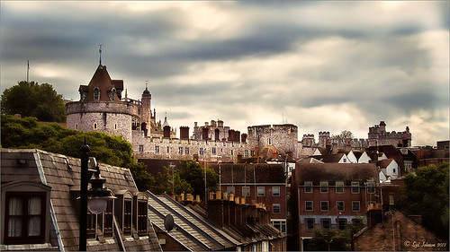
A Fairytale Gazebo

As promised, here is a totally different rendition of the same image I posted earlier. (See Where Am I?) This was just plain fun to do. Below are the boring details – it actually took me along time and a lot of manipulating to get this result but I really love how it turned out. The soft diffused look really adds the fairytale quality to the image. Bottom line, just keep playing with an image and you can come up with some surprising results…..Digital Lady Syd
Basically I got the crazy pastel colors by applying Nik Viveza 2 (here are the settings which produced a rather green and pinkish layer: Brightness 86%, Contrast 100%, Saturation 86%, Structure 100%, Shadow Adjustments -100, Warmth -2%, Red 17%, Green -9%, Blue 22%, and Hue 39 degrees). Then Control Points were added in various areas to adjust tweak the color. A composite layer was created (CTRL+ALT+SHIFT+E) as the top layer. This layer was duplicated and Topaz (see sidebar for website link) photoFXlab was opened. What I listed in my Photoshop note attached to the image is in parentheses. (Duplicate layer. Plug-ins Tab was selected and Black & White Effects was opened. Used my SJ White Flower settings preset which has these settings: Basic Exposure – Contrast 0.16, Brightness -.04, Boost Blacks -.12, and Boost Whites .20; Adaptive Exposure – Adaptive Exposure 0.26, Regions 8, Protect Highlights .06, Protect Shadows .02, Detail 1.80, and Detail Boost .96; Color Sensitivity – Yellow .22, Green -.04, Cyan .01, and Blue .01; Quad Tone – Color Region 1 Black and slider at 0.00, Color Region 2 Red 23/Green 25/Blue 86 at 119.4, Color Region 3 Red 113/Green 150/Blue 170 at 187.8, and Color Region 4 White at 255.0; and Transparency 1.00. Diffusion section was checked and Softness was set to .75, Diffusion to .60, and Diffusion Transition to .50. Local Adjustments mask was set to Detail brush and the gazebo and columns were painted over. Then the B&W Effects plug-in was exited. Stamp From Stack button was pressed and in the Adjustments tab Dynamics slider was set to 29. Another From Stack button was created and from the Plug-ins Tab, Topaz Adjust 5 was opened where Painting Venice preset was applied with no changes. Once back in photoFXlab the Mask tab was opened and the effect was painted out once again from the gazebo and columns.) The changes were applied and the image was back in Photoshop. The yellows in the front bushes and trees was too bright, so a Image -> Adjustments -> Replace Color was selected using a light purple color. A Color Balance Adjustment Layer was clipped to the Replace Color layer and the purple colors were further enhanced. Next a brush was created to make purple to pink sparkles for the bushes and trees. (Brush settings were: Hard Round Brush – Size 20 px, Spacing 141, Shape Dynamics Size Jitter 25, Scattering 944%, and Color Dynamics Brightness Jitter 50%.) Used a light color (#917eb5) color and a darker color (#5e5098) of purple and painted around trees and bushes – then added a layer mask to remove from areas the lights got scattered over. A clean up layer was created to clean up some of the harsh that showed up in unexpected places. My SJ Snow1 Overlay was applied at 61% opacity. A composite layer was added on top and duplicated. The top layer was changed to Multiply. A layer mask was added and the cupola was painted back in white for emphasis. A Curves Adjustment Layer was added to add contrast to the cupola. The sky was selected and put on its own layer and converted to a bluish purple sky by clipping a light purple Color Fill Adjustment Layer to it. Next a Grunge Border line was applied around the image in a dark purple color.
Where Am I?

May have figured this out already since I have posted very similar photos – but this is at Fortunato Park in Ormond Beach, Florida – and is one of my favorite places. The above is the rooftop cupola from the old Hotel Ormond – the only remaining part from a beautiful old hotel that was torn down in 1992. It was in such a bad condition that it could be restored – what a shame!
Okay – I am a huge Photoshop plug-in fan – I love to be able to do something with a photo that I could not do just in Photoshop or Lightroom alone. Nik plug-ins really made this image! Basically Nik’s Viveza 2 (my very FAVORITE plug-in – can’t beat it for fixing any problem in an image) was applied to the image to add detail and contrast to localized areas of the image (detail in the orange roof, saturation and color to sky in middle of cupola, and detail to the interesting lines on the building). That in itself added a huge improvement to the image. Next Nik’s Color Efex Pro 4 was added and three filters stacked: Bleach Bypass, Detail Extractor, and Film Efex Vintage using Method 14 and setting the Overall Opacity slider to 52% – did not want to overdo the vintage feel. I use the Film Efex Vintage often – lots of versatility in just this one filter! (See related blog links below for other examples.) Next Shadowhouse Creations Scratch Box frame layer was applied – this is from the Scratch & Frame Box Overlay.PSD file he supplies. (Check these out – some great borders just in the PSD file!) I created a PNG file of just the frame by following the steps in my blog How To Make Frames or Borders – scroll down to the section called “To save the frame you created as an overlay to use again” and follow steps. I used an off white color sampled from the image in a Color Adjustment Layer clipped (ALT+click between layers) for the frame. That was all I did and I love the slightly vintage effect – goes nice with historic buildings. Next time I will show you a totally different look for this same image (see A Fairytale Gazebo)……Digital Lady Syd
Digital Lady Syd Related Blogs:
Digital Lady Syd Reviews Nik HDR Efex Pro 2
Little Red Corvette
Yellow Dogface Butterfly in her Glory!
The New Film Efex-Vintage Filter From NIK CEP 4


