
Corel Painter and Photoshop Together to Create a Pastel Painting

I just finished my first attempt at creating a pastel in Corel Painter 11. I tried to create one in Photoshop using pastel brushes, and just could not get the hang of it. Painter is great for converting your digital images into beautiful works of art. I have found the best book to use if you are just learning is Martin Addison’s Painter 11 for Photographers (if you are using or trying out Corel Painter 12, check Amazon for the updated version of this book).
The image was created by first using the Auto Painting part of the program (this is explained in his book) and a brush from the Smart Stroke Brushes category called Pastel Tapered using the brush default settings. My computer took forever to do the auto-painting – this program is a real memory hog! After getting almost all the painting covered using this technique, I created a New Layer in Painter and used a smaller brush (17.2 pixels) at 54% opacity to fill in the white holes and some of the details I wanted brought back into the image. The layer was set to 78% opacity after finishing. Saved the image as a PSD file and opened it up in Photoshop where I could clean it up more. The first thing I did was create a New Layer and used the Clone Stamp Tool at 70% opacity to clean up some of the ragged looking strokes – it did not need a lot of touch up. Next I added a Curves Adjustment Layer to lighten up the front door texture since it came out very dark in the Painter rendition – the layer mask was filled with black and only the door was painted back in at 60% opacity. I had put a large white edge around the image in Painter so it could have a soft painted framing – I did not like the look of it. In Photoshop on a composite layer (CTRL+ALT-SHIFT+E) and using the Quick Selection Tool, the white frame was selected and a layer mask added. The layer mask had to be inverted (CTRL+I on mask) so the frame was turned black to conceal. Next a texture, in this case a free one by Sarah Gardner called Blush Ginger (it is no longer available but there are many free texture resources – click on my Textures category on right for other blogs with links) was added below the image and set to 50%. It matched the image very nicely and has a great texture to it. Finally the top image was highlighted and a Inner Glow Layer Style was added to soften the edges of the image to match the texture underneath – the Color was changed by sampling the texture color and setting the Blend Mode to Normal and the Opacity to 88%.
Corel Painter is an expensive program but they do have great Education discounts if you are a student. I love the program but find I do not use it that much, especially since Photoshop CS6 has made some great strides towards achieving some of these same painterly effects. On the other hand, the Auto Painting function is very realistic and the program has so many more choices for brushes and styles of painting that I do not believe Photoshop will ever be able to completely compete in this area. Painter is definitely for those with the artistic flair……Digital Lady Syd
Digital Lady Syd Related Blogs:
Adobe Photoshop CS5′s Mixer Brushes
Digital Lady Syd’s Rule No. 6 – Try Something New!
Blue Flowers and Layer Style Frame

This image is actually of my pink and white Jazze Rose Frost Alestroemeria (see my blog Magnificent Macros with Nik Plug-Ins) but the colors were changed to purple and blue. I first tried this in a blog called Purple Lily Pads! using a slightly different technique with similar results. Just couldn’t resist posting again how easy it was to do this. First I applied the Topaz (see website link in sidebar) Simplify filter to get the soft petal look. I used a Simplify Size of .85 and Feature Boost of .78 to get a really painterly feel. In Nik’s Viveza (my favorite overall plug-in), the color sliders were changed to get the blue and purple colors. Control Points were added to adjust the background and parts of the flowers to get good detailed structure. The frame was created by just making a Photoshop Layer Style. In the Stroke tab the Size was set to 54 pixels, Inside Position, and Fill Type Pattern – just select any pattern that fits your image colors. I am using a pattern from Victorian Dreams by Princess of Shadows – texture 10 at a Scale of 1000. In the Inner Shadow tab set the Size t0 70. It is very easy to make frames for your images this way since there are so many patterns available to use. Anyway, it was a lot of fun to do!…..Digital Lady Syd
Some Beach Fun!

Thought I would put up an image I created a couple years ago of Ormond Beach, Florida, where Granada Boulevard runs into the Atlantic Ocean – it is a beautiful stretch of beach if you are in the area. The old Hotel Ormond, a large 300-bed hotel that was built in 1887, was located near this beach. This was one of my first attempts at adding a texture to an image – not sure what texture this is, but it definitely is a watercolor texture that goes from a yellow tone on top to blues on the bottom – the layer was set to a Color Dodge Blend Mode at 30% opacity.
The image below is also of the same stretch of beach but from 1903 – there were beautiful houses instead of high-rises overlooking the ocean. In this winter image, the sails helped move the bikes on the hard sand beach coasting at up to speeds of 20-25 mph. The image is from Shorpy Historical Photo Archive – a great site to follow on a daily basis if you love American history like me as they post a new image every day from the past. To see this image in high resolution on their site, just click on it – and click here for a similar lower resolution shot of the same bikes racing a car. This beach is where the first official automobile race was held in 1903 and the town of Ormond Beach is still known as the “Birthplace of Speed.”

I hope to shoot more local images in the near future – it is fun to live in an area that has some great local historical interest. In the meantime, try out some textures to add a little interest and fun to your own images……Digital Lady Syd
Digital Lady Syd’s Related Blogs:
Where Am I?
Getting That Vintage Look!
Russell Brown’s Paper Texture Panel Updated!
Purple Lily Pads!

Here is one of my first attempts at creating an image using a color palette I liked and not the one in the image. I just finished John Paul Caponigro‘s tutorial on Photoshop Color Strategies at Kelby Training where he teaches you how to change hues naturally to give a very believable feel to an image. He is one of my very favorite Photoshop gurus and he does beautiful fine art photography. This image actually contains: three Hue/Sat Adjustment Layers each addressing a different area of the image, a Color Balance Adjustment Layer, a Gaussian Blur filter applied to the image and selectively painted out, a Curves Adjustment Layer, a Replace Color layer, a Topaz Simplify 3 plug-in using the BuzSim preset set to a low Simplify Size, and a Wow-Frame 10 layer style. I was really pleased how the purple colors and cool tones could replace the greens and yellows and give such a wonder effect!…..Digital Lady Syd
Soft Bokeh Texture for a Flower Image

This image of pink orchids in Hawaii had a background layer showing the flowers against a clear blue sky – perfect for adding textures. I really love the bokeh texture used in this image. As many of you know who follow me, I am a big fan of Shadowhouse Creations textures. This image stacked three of his beautiful textures to get this wonderful soft look: Oil Painting 5 set to Color Blend Mode at 100% opacity – a white layer mask was added and the flowers and part of the stems were painted in black lightly to bring back a little bit of the green and pink color; Gorgeous Tones Texture 3 (third one down) set to Screen Blend Mode at 32% opacity; and Bokeh Texture 4 set to Darken Blend Mode at 28% opacity. If you like the bokeh effect, this texture is one of the best…..Digital Lady Syd
Digital Lady Syd Related Blogs:
Russell Brown’s Paper Texture Panel Updated!
Soft-Look Flowers Using Textures
Tips for Flower Textures
Digital Lady Syd’s Rule No. 6: Try Something New!

I have not done a Digital Lady Syd’s Rule recently so here is one – Try something new! This is my first attempt at creating a Monet impressionistic type painting. I used a photo from my trip to the Big Island and really cropped it down since I am still learning all the strokes and blending needed for a larger image. I followed a couple tutorials by Fay Sirkis that are now available on the NAPP website (see Painting With Your Camera and A Stroke of Genius-Photoshop Art Studio with Fay Sirkis under the Webinar link). If you want to try to paint like the famous painters of past generations, Fay Sirkis is the one who teaches it best. Can’t say enough good things about Fay – she is a great teacher, fun to listen to, and very knowledgeable about all the techniques of many famous artists. The nice thing about Fay is she provides you with all the Photoshop brushes, mainly Mixer brushes, to create the painter’s style you want to try. Therefore, when trying to do a Monet painting, you have Monet Impressionist brushes for blending, adding highlights, underpainting, etc., at your disposal, and she teaches you how she made them and how to use them. This article from Professional Photographer is a good example of her teaching method – Fay Sirkis: Painting Magic, Adobe Photoshop CS5. She also teaches classes at Photoshop World and on Kelby Training, and is one of the Corel Painter Masters.
I may not be Monet but this image was definitely a lot of fun to do – I have never tried anything like this, and it has given me a new appreciation for the type of art that Monet and the Impressionists created. I hope to try some other Master’s styles and brushes from Fay soon. So do like me and try something new!…..Digital Lady Syd
For my other Rules, click on sidebar entry called Digital Lady Syd’s Photoshop Rules.
Hibiscus Flowers – I Love to Photograph Them!

These beautiful Red Chinese Hibiscus blooms appeared on Mothers Day last week so I had to take their picture! Used my favorite artistic plug-in – Topaz Black and White Effects (see sidebar for website link) – and applied a preset I had created earlier called Water Landscape Sunny (Adaptive Exposure section – Adaptive Exposure 0.18, Region as 26.10, Detail 1.11, and Detail Boost 1.09; Quad Tones which creates the interesting effect used Color 1 Region set to R1G1B12 and 9.60, Color 2 Region set to R63G78B85 and 95.97, Color 3 Region set to R216G211B129 at 141.2, and Color 4 Region set to R255G254B237 and 255.0; Edge Exposure set to Edge Size 0.19, Edge Exposure -0.43, and Edge Transition 0.27 for all sides; and Transparency set to 1.00.) While in the plug-in, the Detail brush was used to sharpen the center of the flowers and to go around the petal edges where they overlap each other. Next ShadowHouse Creations Marshmellow Skies texture set to Overlay at 100% opacity was added to give the soft green-turquoise feel to the background – a white layer mask and a soft black brush was used to take the texture effect off the flowers. A Curves Adjustment Layer was added and OnOne PhotoFrame (see sidebar for website link) grunge 04 set to 75% opacity was also added. Not hard and once again a really beautiful effect. I love Black and White Effects! I could do this all day! As you can see by the number of related blogs below, this is definitely one of my favorite plug-ins – check them out for several other examples on how to use it!…..Digital Lady Syd
Digital Lady Syd Related Blogs:
Black and White Effects on Outside Art
Cleaning Up a Messed Up Photo
Topaz Black and White Effects Quad Tones Are Great!
Sunny Preset for Topaz Black and White Effects
My Office Friend Ted
Loving Both Filters!
The Art Corner: Painting and Sculpture by Tassaert
Quad Tones in Topaz Black and White Effects Plug-in
Get Rid of Those Power Lines Fast – with Paths and Spot Healing Tool!
Topaz B&W Effects vs. Nik’s Silver Efex Pro
Just Another Topaz Black and White Effect Example
Topaz B&W Effects Plug-In-A Real Winner!
Cleaning Up a Messed Up Photo
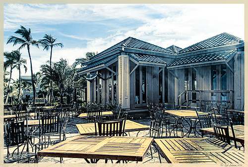 |
Here is another before and after for you. The image of the KPC Seafood Restaurant at the Hilton Waikoloa Village on the Big Island in Hawaii. At night it was wonderful to eat outside under the dark starlit sky with the ocean waves in the background. I wanted to add this image to a Hawaiian slideshow I am creating in Lightroom 4 and was really disappointed at how bad the original image appeared. I liked the tone in the wood and the sky was rally nice but otherwise, it was not too good an image. I tried several techniques, walked away from it for a day, and came back to it. I finally got the nice result shown above (hover over image to see the original). To get this result, I removed the palm tree going straight up to nowhere. Next I went into Nik’s Viveza 2 to get rid of the hazy feeling. I usually use this filter later in my workflow, but this image needed a quick tune-up before I could do anything else. Then I went into Topaz’s Black and White Effects (see sidebar for website link) and by playing with the Quad Tones, got this really nice result. (For settings, see below.) A Curves Adjustment Layer was added to enhance the contrast of the building, but the blue in the sky was painted black in the mask to keep it from being affected by the curve change – the blue of the sky competed too much with the blue tones in the restaurant. Noise was removed from the whole image (see Russell Brown ACR blog below to do this). Localized sharpening was done and Puppet Warp was used to straighten the vertical lines of the restaurant. I feel like I was able to save an otherwise very bad image by using these two plug-in filters, and I might add two of my very favorites. For information on how to do some of my workflow steps, see my blog links below. …..Digital Lady Syd
Digital Lady Syd Related Blogs:
Nik’s Viveza 2 Plug-In – A Hidden Gem!
Quad Tones in Topaz Black and White Effects Plug-in
I Didn’t Know That! Curves Adjustment Layers
Edit Layers with ACR (Adobe Camera Raw) Script
Straightening with Puppet Warp!
A preset was created in Topaz Black and White Effects using these settings as shown on the final version of image above: Conversion: Basic Exposure settings – Contrast 0.08, Brightness 0.05, Boost Blacks 0, and Boost Whites 0; Adaptive Exposure settings – Adaptive Exposure 0.56, Regions 7.06, Protect Highlights 0, Protect Shadows 0, Detail 2.17, and Detail Boost 1.04; and Color Sensitivity settings – Red (-0.15), Yellow (0.38), Green (-0.42), Cyan (0), Blue (-0.09), and Magenta (0). Finishing Touches: Silver and Paper Tone settings – Tonal Strength 0.63, Balance 0, Silver 32.00, Silver Tone Strength 0.50, Paper Tone 32.00, and Paper Tone Strength 0; Quad Tone settings: Color 1 Region (Color R0G0B0), 24.68, Color 2 Region (Color R86G102B136) 69.92, Color 3 Region (Color R229G223B164) 154.9, and Color 4 Region (Color R255G252B206) 255.0; Vignette settings – Center (2796,1607), Vignette Strength (-0.09), Vignette Size 0.53, Vignette Transition (0.63), and Vignette Curvature 0.75; and Transparency settings – Overall Transparency 0.59)
Free Timeline Cover Template for Seven of Your Images

It has come to my attention that Facebook is changing everyone over to using the Timeline feature for their profile page. Therefore I have created this free template you can use in the top portion of your profile page to show off your favorite images. The openings are set for a 4″ X 6″ size image. The resolution of the template is 72 ppi so you do not have to use a very high resolution of your image since they will be seen on low resolution monitors or phone/Ipad devices. This template can also be used as a blog header.

Steps to Add Photos for Photoshop/Elements Users: Download template here (scroll to bottom of page for download button) and open in Photoshop. Highlight each layer that says “PLACE IMAGE # HERE” and go to File -> Place. Navigate to your image and Place. You can now adjust the image to the opening since the image comes in as a Smart Object. If you Rasterize the layer (right click to choose Rasterize in Photoshop or Simplify in Elements) the layer to make file smaller, you can still adjust position of image later using a Free Transform (CTRL+T). Hold SHIFT key to constrain size of image. When finished, save your Photoshop Template file as a PSD file so you can update with different photos easily. Then do a File -> Save As and save the file as a jpg to be uploaded to Facebook using the steps below. It is easy to change the look of the template.
- The template is set to White but if you want the Facebook Blue color, just click the turned off top Facebook Blue layer eyeball and it will match Facebook.
- If you want to change the template color, pattern and stroke type, just double-click on the White Template layer to open up the Layer Style Blending Options for this layer. (For Elements Users, go to Layer -> Layer Style where you can adjust the Stroke and the Inner Glow – there is no Pattern Overlay style.) For the flower template example, Pattern Overlay was selected and Color Paper Pattern Blue Crepe from Photoshop’s canned patterns was chosen. (To load new patterns, click on the down arrow by the default pattern, and then open up the fly-out menu to load new pattern groups.)
- To just change the template color, go to Inner Glow Blending Option and change Blend Mode to Normal. Select the color you want and adjust the Size slider to fill the template – voila! New color!
- Select Stroke in Layer Styles to change the size and color of the stroke surrounding each image. The first example used Black set to Inside at a size of 2 pixels and White was used on the Facebook Blue example.
- To add a regular texture to the template, highlight the Template Layer and Place the texture (just like the images). Adjust to fit and then clip the texture layer to the Template Layer by going to Layer -> Create Clipping Mask so the openings for the images appear.
Steps to Load Cover to Profile Page: Go to Profile Page and hover cursor over the top area to the right of your image. The words “Change Cover” appear. Click on the words and select “Upload a Photo…” and navigate to the template image just created. The template will appear as the cover on the top without your image. Click Save Changes and your image will appear.
I hope you like using this template. Enjoy!…Digital Lady Syd
Russell Brown Texture Panel Landscape Image

I call this photo Hawaiian Horses Chatting – they look deep in conversation. Hum?? Anyway, this weekend I did a Fun Photoshop Blog called “Russell Brown’s Paper Texture Panel – A Real Winner!” (I seem to like real winners!) This is another one of his great free Photoshop panels that creates texturized images very quickly and allows you to experiment easily to get an interesting effect. Check out my other blog for the download links and details on how this panel works. I will say that Flypaper Textures has given you several beautiful textures to play with in the panel until Russell gets an update to include other textures. This image used three Flypaper textures stacked: Texture Aquarius set to Soft Light Blend Mode at 84% layer opacity, Texture Creme Anglaise set to Multiply Blend Mode at 100%, and Texture Colosseum Sienna set to Vivid Light Blend Mode at 46%. I had been having a hard time getting a look I liked for this image until I tried the texture panel – it really surprised me how beautiful the effect ended up. Give this panel a try if you have Photoshop CS5 or CS6 and you love textures like I do. Definitely worth the effort!…..Digital Lady Syd
Soft-Look Flowers Using Textures

These beautiful dahlia flowers are now planted in a flower bed in my front yard. To get this effect, it was a pretty simple process. I sharpened the center and darkened the green stems first. Next ShadowHouse Creations Subtle Tones ST-8 texture was set to Color Blend Mode. With a layer mask I painted out the texture over the flowers very lightly using a soft 13% opacity brush and building up the effect until it looked the way I liked it. Next ShadowHouse Creations 3 Assorted Texture Set T 2 texture was set to Hard Light Blend Mode to add a very feminine look – also a layer mask was used to clear the lacy texture from on top of the flowers. A Hue/Saturation Adjustment Layer was added on top to select the correct texture color by adjusting the Hue slider. The last step added OnOnePhotoFrames toner scratch 21 (see sidebar for website) with a very light purple-pink color. That was it. I loved the final result. I hope you will try using some of the beautiful textures from ShadowHouse Creations website where there is a huge selection of textures that can be downloaded for free. Major thanks for what he does to help us budget-minded Photoshoppers!…..Digital Lady Syd
The flowers were photographed on a table with a science fair 3-sided white board behind them and natural light from a window – shot with a Nikkor 60 mm Macro Lens set to F/3.2, 1/15 sec at ISO 400 with an attached Bower 0.5 x High Resolution Digital Lens with Macro lens, which gives the large depth-of-field effect.
Scanning a Bloom for a Different Look

This is a blossom from my new Ballerina Blue Fuchsia plant. I got an idea from reading The Photoshop Darkroom by Harold Davis and Phyllis Davis to scan my flower into the computer using a black box. I actually used a black sunglasses case to cover the plant while I scanned it with my Epson Perfection 3200. I used VueScan Scanner Software (my scanner is so old that Epson would not support it in Windows 7, but this relatively inexpensive software will) set to 3200 dpi, print quality, output tiff as a camera raw file, opens in Adobe Camera Raw in Photoshop CS5. The black background needed a little cloning clean up first, then the flower had a few bad spots on the leaves to clean up, Nik Viveza 2 was used to even out the purple color evenly, and finally the Sharpen Tool was used on a few of the flower veins. That was it. I was surprised how easy and different the flower looks scanned in. If you have a scanner, give it a try for a change…..Digital Lady Syd
More Texture Fun!
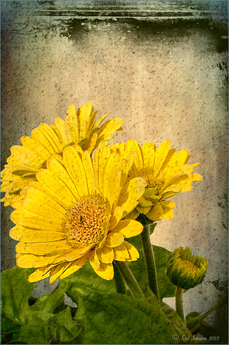 |
I did a Fun Photoshop Blog called Tips for Flower Textures last week and I thought I would show another example. Yellow is a very powerful color and it is not different for this image. Once again the texture opacities and blend modes are varied to get this effect. Hover over the image to see how the photo looks with just a few Lightroom adjustments applied. To create this look, the following steps were followed:
1. Duplicate the original layer.
2. Select the background with the Quick Selection Tool and then click the layer mask icon to create a mask that will remove the background.
3. Next a texture by ShadowHouse Creations called In the Beginning was copies and placed under the selected flower layer to create a new background set to Normal Blend Mode at 100% opacity.
4. ShadowHouse Creations texture Photo-Tints Orange Overlay was moved on top of the flowers and was set to Vivid Light Blend Mode and 52% opacity. A Layer Mask was added and the center of the yellow flowers was softly painted out so the orange color is only on the tips.
5. A Hue/Saturation Adjustment Layer was clipped (3rd icon at bottom of adjustment layer) to the layer and Master was set to Hue +22, Saturation -26 and Lightness +35 to soften the redness.
6. ShadowHouse Creations texture You’d Be Surprised was applied next and set to Color Dodge Blend Mode at 35% opacity. A Layer Mask was applied to the center of the front flower.
7. Sharpen Tool was used on the flowers only.
8. To get the grunge spots, Florabella’s Snow 3 (the link is to her Facebook page with the free download on the left side)was applied and set to Subtract Blend Mode at 37% opacity.
9. The last step involves adding OnOne’s PhotoFrame Taufer Texture 10 – link to OnOne software is on the right. They simply have the best frames!
I hope you will try to add some textures to your photos. As you can see, the original photo was not anything really exceptional, but with a few free downloadable textures, the whole look changes. And do not be afraid to try different blend modes – I love the way the snow texture turns into a more grunge look with the Subtract Blend Mode. Check out my related blogs below for more beautiful textures to download…..Digital Lady Syd
Digital Lady Syd Related Blogs:
Tips for Flower Textures
Adding a Texture for Flair
Elements & CS5 Friday: Adding a Texture for a Totally New Look to an Image
Fixing Up a Boring Picture
Happy Valentines from Digital Lady Syd

Hope you all have a wonderful day!
A little background information on this Valentine. To create the following card, these steps and resources were used:
1. Started on a New Layer with Spatter Heart Frame from PS Brushes. A Layer Style was added – Outer Glow set to a soft yellow and Linear Dodge (Add) at 75% and a Spread of 21; and a Gradient Overlay adjusting Graphix1 Muted 8 for a gold tone.
2. Next a background was added underneath using Colored Vintage Paper by Ciara Panacchia.
3. Another texture was added above this one – Vintage Valentine Paper by Aramisdream. It was set to 59% and a layer mask was used to brush out the center and to create a vignette effect around the edges.
4. A layer was placed on top that used Obsidian Dawn’s Glitter set-hearts-glitter brush in a soft beige at 43% opacity.
5. Glass Prism’s cupid brush was placed in the center on it’s own layer.
6. The red valentines were placed on their own layer – Hearts by King Billy was used. A Layer Style was added using a red Color Overlay and a small 1 pixel Stroke.
7. Two Text Layers were created using the font Precious, a perfect Valentine font. A Layer Style was added using: Inner Shadow set to Distance of 21 and Size of 21; Outer Glow set to Linear Dodge (Add) at 45% opacity and Size of 24 pixels with a light yellow color; and Bevel and Emboss set to Inner Bevel, Smooth, Depth 103, Size 10 and the rest default settings.
That is how I made my vintage look Valentine. It was a lot of fun to try out the different effects on the brushes – the layer styles really made a difference. When you have a minute, try a layer style on some of your brush strokes – you may get some surprising results!…..Digital Lady Syd
Digital Lady Syd Related Blogs:
Where To Get Those Free Valentine Templates
Create a Valentine
Creating Your Own Art (and Cards) While You Are At It!

More Valentine resources if you are feeling in that creative mood and want to make your own. Here is how I created this funny little valentine.
1. I created a New Document and then added a New Layer on top where a red circle was painted and then a yellow circle was painted inside it.
2. Next this layer was taken into Photoshop’s Liquify Filter and where I came up with this funny looking flower. This is a fun filter that can give some really interesting results if you take the time to learn what the various tools do. A Layer Style (double click on the layer in the Layers Palette) was added to create this nifty embossed heart look – by adding a Bevel and Emboss Layer Style and checking Texture. Now the trick is to double click on the word Texture on the left, and you get a new dialog where you can change the Pattern you use for the texture. In this case, the San Valentine Pattern by succo-design was used with the Scale set to 69% and Depth to +6. These are the same patterns you will see in the Pattern Overlay section, except they are embossed and have not color! This is really a great way to use patterns!
3. On a separate layer I painted a stem and a few leaves. Add a Layer Style to this layer and select Pattern Overlay from the left side. To show you the different from step 2, choose a pattern to add some texture to your stem. In this case I choose Obsidian Dawn’s Dirty Patterns-Texture 1 set to Scale 31% and Opacity 36%. Then an Inner Glow was set using a dark green color set to Size 125 pixels to add a little shading to the outside shape of the leaves and stem. You can see how this pattern was applied differently from the pattern in Step 2.
4. I was not really sure what to do next so I decided to add a colored background. I choose ShadowHouse Creations Raised Textured Effect 2 to give some interest to the background. All the textures in this group are beautiful.
5. On a New Layer ShadowHouse Creations Assorted Brush Pack 2 Soft Clouds-NewBrush 18 was used to for a soft white background.
6. On another New Layer, Obsidian Dawns Glitter Set-Random Swirls 2 was used for the slight yellow glow behind the flower.
7. Above that on another New Layer I used SJ Basic Star Scatter Brush to drop some large white flakes on the background for a bit of a wintry addition. (I set up a star scatter brush using the soft brush set to 30 pixels and spacing 1000%. In the Scatter dialog, set the Jitter to 1000% both axis and the Jitter Count to 100. I saved the settings to use the brush again. This brush is used in my Fun Photoshop Blog “Trying Out Topaz Star Effects” but it creates a nice snowing effect also.)
8. Above the flower, a New Layer was created and the little cupid painted in red (click twice to get dark enough) using Glass Prism CupidReq09 brush.
9. Under this layer, create a New Layer and paint all over image with Snow Drops by FrostBo to finish the snowy feel. You do not want snow on the cupid as it will blur the cupid so this is why the layer is under the snow drop one.
10. A Text Layer was created using the font MC Sweetie Hearts and a white Outer Glow Layer Style set to 21 pixels was used to make the letters stand out.
11. On top of the font a New Layer was created and small hearts using the Valentine Brush by digitalTouch with a white as foreground color and red as background color was painted along the bottom leaving a small heart trail along where the ground would be.
12. A composite layer was created on top (CTRL+ALT+SHIFT+E) and a Layer Style was created to frame the image Stroke set to a gray 4 pixels inside stroke, and a Inner Glow style set to light gray and 125 strokes.
Here is what the layer structure looks like in case you got lost.

It sounds like it is hard to do, but I wanted to show how easy it is to construct some very creative cards with nothing but Photoshop and some nice resources. The trick is to add each element on individual layers and make sure they re named so you know what you did. Much of the home art you see in Wal-Mart or TJ Maxx is basically just doing exactly what I did here. Check out my blogs below for other ideas just using Photoshop. Take some time to play around with some of the resources available for download and see if you don’t get some really nice art…..Digital Lady Syd
Digital Lady Syd Related Blogs:
Just Plain Fun Brush Effects!
Tree Brushes with a Little Grunge
Just a Tree
Brushing Up on Circles!
Five Image Template Creates Beautiful Collection!

I have not been following all my favorite websites like I should. There is one I had not visited in quite a long time so I checked in. The CoffeeShop Blog was offering this wonderful Web Storyboard 6 for 5 pictures as a free download so I thought I would give it a try. I was really pleased with the final result. Her template is very easy to use – just clip (highlight image and go to Layer -> Create Clipping Mask) the each image you bring into the Photoshop file she provides to the location you want. Use Free Transform to adjust the size to fit. The background color was changed by clicking on the Background Color layer thumbnail and choosing whatever color you want. On the Frames layer, a Gradient Overlay Layer Style was added and reversed using Muted Gradient Muted 5 from Graphix1 set with a Radial Style, angle set to 90 degrees, and Scale set to 149% to get the pretty reddish gold colors on the frames.
Both The CoffeeShop Blog and Graphix1 websites offer some of the best free resources for the Photoshop fanatic like me. Take a minute to check out their websites – both have great blogs too (just click on their Home buttons).
It is really fun to put a collection of your images together! Give it a try!….Digital Lady Syd
My Office Friend Ted

This bear now sits in my office but I was never sure why I got him. Last week there was an interesting post by Ian Summers called “3 Exercises to Keep Creative Imagery Flowing” which gave me an insight to this conundrum. One of his generic creative exercises is called “Create a Giant Love Nest,” an environment that involves surrounding your work/creative area with many of the things you liked as a kid to help feed your creativity. I guess that is how Ted arrived – I found him at a bargain price in Cracker Barrel and had to have him. I am not even sure I had a Teddy Bear as a child but I liked his happy look (he never complains) and he is very soft and big (31 1/2″ tall). What’s not to like? So in honor of using childhood (and adult) toys and collectibles as a way to increase your creativity (and a good excuse to keep some of those things you just can’t part with), I am presenting my office friend “Ted.”…..Digital Lady Syd
PS. Ted was processed in Lightroom Beta 4 (see my Tidbits Blog “Trying Out Lightroom Beta 4“) and Photoshop using Topaz Black and White Effect (see my Fun Photoshop Blog “Topaz B&W Effects Plug-In-A Real Winner” and click on sidebar for website link). I started with the Opalotype Collection Flavescent preset and essentially adapted it by cranking up the transparency to 100, and adjusting the strength and placement of the vignette. A little localized face detail and burning on his mouth was added. That’s all.
Blue Orchids?

Yep – that’s what you see. I snapped this jpeg with my little Canon Power Shot camera while shopping in the grocery store for final holiday goodies a couple weeks ago. Wow! I guess the soil has been treated to make the color in the orchids turn blue. I had to grab a few shots!
To process this image, I first lightened it as the colors were so blue the detail was totally missing. Then I added a free Florabella Snow Texture (the link is to her Facebook page with the free download on the left side) to give it that nice winter feel. Next Nik Color Efex Pro 4 was applied using the Bleach Bypass, Darken/Lighten Center, Tonal Contrast, and Vignette filters to get this effect. Finally OnOne’s PhotoFrame acid burned controlled 13 (see sidebar for website link) was added. Enjoy!…..Digital Lady Syd
A Little After-Holiday Cheer!

With the holidays winding down, I thought I would post one of the shots I took with my little point and shoot Canon 1000 camera of a friend’s Dickens Village set up in her living room. I can’t say enough about how beautiful it looked, especially in the evening when the houses were all lit up. Absolutely Amazing!
The image was processed in Lightroom just a bit – the colors were so strong it did not need much adjustment. Next NIK’s Color Efex Pro 4 was applied using the Detail Extractor filter and setting points so the snow was not affected as much, and a slight darkening Vignette filter. Back in Photoshop the Sharpen Tool was used on some of the figure’s faces and back edges to make them stand out a little more and that was it.
Hope you had a great holiday – I know I did……Digital Lady Syd
Digital Lady Syd Related Blogs:
NIK Color Efex Pro 4 – Digital Lady Syd’s Review!
Pseudo HDR Using NIK Color Efex Pro 4
NIK Color Efex Pro 4 – First Try!
More Holiday Card Fun!

Just a final card I thought I would share that was constructed completely in Elements with a little help from Topaz Adjust 5. I seem to be using the same holiday resources over and over – guess I have found the ones I like. This card started with three different layers of snowflakes – I created brushes from the custom shapes provided with the Shape Tool, but you can download them in lots of places (try these from Obsidian Dawn), and used layer styles and blend modes to get the various effects; the font is Fantaisie Artistique (my favorite) doubled up for each line of text and the bottom filled with black, then dragged out to form a sharp shadow edge; Snow Drops brush by Frostbo for small flake layer – adjust size to get different effects; Santa sleigh in Christmas Brushes by Fina with Outer Glow layer style; and finally Topaz Adjust 5 (see sidebar for link to website) using the Film Collection – Vintage Grunge III preset. This was very easy to create and pretty fast.
I hope you have Happy Holidays and enjoy!…..Digital Lady Syd
Christmas Card from Digital Lady Syd!

Thought I would post this card I did today which follows a really interesting tutorial called “Fun & Exciting Text Effect in Photoshop” where patterns were inserted onto each letter to create this interesting effect. The basic tutorial steps were OK but they forgot to mention that each letter has to be on an individual text layer so a different pattern Layer Style can be applied for each layer. This was a fun project and I like the way it turned out.
There were many resources in this card that I will mention in one lump group. Please check out their sites, these people generously give their expertise away for free so they deserve some recognition! Resources are as follows: Grunge brushes were from Websoulz Super Grunge set; yellow (#3) and green (#1) lines from Swirls by Rocked Out set-these apparently are no long available but try this set of Flowing Line Brushes by Thurgood; background snow brushes are Snow Drop brush by Frostbo and Snow White brush #36 from Supreme-neko; the font is 02 from a Cosmi font set I bought years ago and is not longer available as far as I can tell, but go to daFont.com and look for a larger fat font – there should be several available; the bottom font is my favorite Fantaisie Artistique; Patterns were from Grungy Dirty Patterns from Obsidian Dawn, Free Christmas Patterns, Christmas Patterns by Peter Plastic, Free Christmas Patterns by Succo Design, and Christmas Patterns by slave to fashion 69; Sleigh brush from Obsidian Dawn’s Holiday set; and Dave Cross _01 OnOne PhotoFrame (see sidebar for link to website).
Hope everyone has a wonderful holiday and try out this text effect – great effect for any occasion……Digital Lady Syd
Digital Lady Syd Related Blogs:
How to Add Images to Text
Playing in Photoshop
How to Create Photoshop Brushes from Objects or Text
Free Christmas Card Templates-Part 2
Digital Lady Syd’s Free Christmas Card Template Using Photoshop Elements
Digital Lady Syd’s Free Christmas Card Template
Free Christmas Card Vectors and Brushes
Some Holiday Cheer
Free Calendar Template for Use with Elements

For my Elements friends, here is the same template following basically the exact same instructions as noted in my blog “Free Calendar Template” from last year. The template opens up great in Elements and the same steps to placing the items is totally the same. The only difference is that the step that it in the layer mask for the Gradient Layer. In this case, to copy the layer mask on the Color Fill 2 layer, you must: 1) click on the Color Fill 2 layer mask, 2) CTRL+A to select the whole mask, 3) CTRL+C to copy the whole mask, and 4) highlight the top layer and CTRL+V to paste the layer mask into this layer. A New Layer was created on top and snow was sprinkled around the edges. That’s it! Very simple.
The image is the top of the Standard Life building in Jackson, Mississippi. The gradient used is from Gorgeous Gradients – PrimaveraII, and the snow is a very useful snow brush called Snow Drop by Frostbo. The lettering on the building is called Kingsthings Christmas font, the Flying Santa Sleigh is by Fina, the fog was created using Sampled Brush #3 and #12 from Brushes Fogs and Mists, the green Christmas Tree and Icicles are in Obisian Dawn’s Holiday set, and the icy edges are an OnOne PhotoFrame Taufer Texture 08 frame (see sidebar for OnOne Perfect Photo Suite 6.0 for website). I have to admit this image was a bit of a challenge but I really liked the final effect.
Well, once again, it just goes to show that lots of what can be done in Photoshop can be done in Elements – sometimes with just a few workarounds. Try putting some of your new photos together and make a calendar for a family keepsake! Enjoy!…..Digital Lady Syd
Digital Lady Syd Related Blogs:
Free Calendar Template
Calendar Template for 2012
Create Calendar Photoshop Templates
Colorful Blown Out Look Lightroom and Adobe Camera Raw Preset
Digital Lady Syd’s Free Christmas Card Template Using Photoshop Elements

This template was processed completely in Photoshop Elements. Same steps as with the regular Photoshop program. Open up your other image(s), CTRL+A to select the whole image, and CTRL+C to copy the image. (These are both images I took last Christmas.) Switch to the template file, highlight the layer(s) that indicates where the photo(s) should be placed, and press CTRL+V to place the image above that layer. Then use the Move Tool to scale, rotate, and move the image(s) to place it. The Background Image layer was changed to 73% opacity. That’s it. Below is an image of the layers as they appear in the finished image above.

Note the Text Layer has a 1 pixel Stroke layer style set to Black and Outside. The Frame Layer has an Outer Glow layer style set to Blend Mode Screen at 75% opacity and Size 16 pixels to make the frame stand out a little. To find the Layer Styles in Elements, highlight your layer to add effect to, go to Menu -> Layer -> Layer Style -> Style Settings. I painted a little beige color over the white flakes to make the lettering stand out better. The white snowflakes and frame snowflakes brushes are Design by Firgs Snowflake Brush 6. (Firg’s Snowflake Shape Pack is not free but now are for sale. To try a different option download Obsidian Dawn’s free Snowflakes Photoshop Custom Shapes.)Font is Fantaisie Artistique – if you do not have it on your computer, your computer will substitute a different font or you can download it (right click on it after downloading to add to font list) and it will appear correct.
****DOWNLOAD LINK TO MY BASIC HOLIDAY CARD TEMPLATE****
This is pretty simple and you should be able to get lots of different looks. See my blog for other examples on how to use this template. Have a good time and enjoy!…..Digital Lady Syd
Digital Lady Syd’s Related Blogs:
Digital Lady Syd’s Free Christmas Card Template
Free Christmas Card Templates-Part 2
Free Christmas Card Vectors and Brushes
Some Holiday Cheer
Elements or CS5: Stacking the Same Image for Effect

This image was created in Photoshop Elements 10 – it is of an old abandoned gas station not too far from the airport in Jackson, Mississippi. I am still figuring out this program so this was definitely just playing around and getting used to what the program can do. To create this optical illusion, follow these steps.
1. Open up image into Elements (or CS) and duplicate the layer (click OK in the dialog that opens).
2. In this case the top layer was taken into Nik Color Efex Pro 4 and an HDR preset was added to create the HDR effect. (If you have the plug-in or are using it as a trial version, my blog “Settings for Vivid Drawing Look ACR/Lightroom Preset and NIK Color Efex Pro 4 Pseudo HDR Recipe” has the preset settings you can enter manually or download already as a preset.) Any effect can be applied here.
3. After coming back into Elements (or CS), add a Layer Style was added – used an inner Glow using the default color at 114 pixels and opacity at 75%, and a black Stroke set to 18 pixels at 100% opacity. At this point the image can be transformed and rotated like the image above.
4. Next the bottom layer was highlighted and a New Layer was added below (ALT+click on the New Layer Icon) and filled with a beige color (CTRL+Backspace).
5. Set the image layer to Multiply blend mode at 88% opacity to make the bottom image much softer.
6. Go to the Adjustment Layers (third icon at bottom of Layers Palette) and select Gradient Map – the Light Brown gradient was chosen and the Layer was set to Soft Light blend mode to make image even softer.
7. Finally add a Levels Adjustment Layer to bring back a little contrast of the whole image.
8. The Sharpen Tool or Unsharp Mask filter can be added at this point if you want to sharpen the top layer image but since the Pseudo HDR preset was applied in NIK, it oversharpened the above image.
9. I created a Text Layer with my name and the copyright symbol was added using the Custom Shape Tool.
I was really pleased with the results and it gives an interesting effect. Try experimenting with the different layer combinations and see what you can get. It could turn out to be unexpectedly interesting!…..Digital Lady Syd


