
On Being Nine
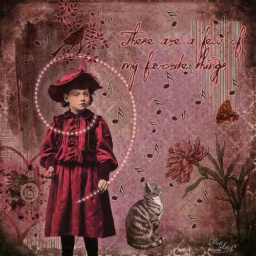
Great way to entertain myself on a very overcast wintry day. I have to honest and say I was watching on Creative Live a very good class called Advanced Digital Scrapbooking: Design Layouts in Photoshop by Traci Reed. I am not a scrapbooker, but I love to watch what they are teaching since it is a very good way to express yourself and your art. She was showing how to use templates and I remembered I had downloaded one a while back – that is how this little girl found a life of her own!
This image was started by adding the little girl that from Mary Bailey Vintage called Amelia. Next Anna Aspnes Inspired Edge Template 3-3 was added under the little girl – this acts as placeholders for the various items added in this image. 2 Lil’ Owls (see sidebar for website link) texture Vintique 42 was placed as the bottom layer and her Vintage Papers 20 was set on top using the Layer Style Blend If This Layer black tab split and set to 151/178 so some of the texture below showed through. I was unable to find download links for any of these scrapbook-like items. Paper was clipped to the different blocks in the template and clip art added to get all the elements into the image. The font is one I bought called Quilted Butterfly. The musical notes are from a brush I downloaded and set the size jitter and angle jitter to get the different directions. All in all it took several hours to finish this image, but it was so much fun to do something totally different……Digital Lady Syd
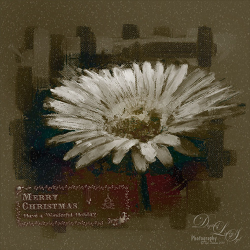
Merry Christmas from Digital Lady Syd

Happy Holidays to all my blog buddies! I so enjoy the people I have made friends with on the Internet and through blogging. I hope everyone is having a great time and is totally enjoying this time of year.
Just a few for those who wonder – how did I make this card? Well, this all started in Photoshop where I began with the cool Ink 3 png file that is in the Christmas Poster Freebies from Design Cuts (by Vintage Design Company). It was free transformed and flipped. A Solid Color Fill Layer using a brownish-beige color was clipped (ALT+click between the layers to clip) to the Ink 3 layer. The text was added. Then this file was taken into Corel Painter where the wonderful Karen Bonaker‘s Christmas brushes were used. The deer were added and the trees were added on separate layers. Then the file was brought back into Photoshop where a layer mask on the text layer was used to make the deer look like they are walking through the text. An Inner Shadow Layer Style was added to the tree layer (Distance 17, Choke 0, Size 17). On the deer layer a Stroke set to 5 pixels, inside, normal blend mode, and a light beige color was added. The Text used an Outer Glow set to the default yellow, but Size 17. The last step was my free Snow1-Overlay set to 43% layer opacity. Basically that was it. I so enjoy making cards!…..Digital Lady Syd
More Holiday Cheer!

Just another Merry Christmas Card – hope all are enjoying the season. I was just adding different filters to layers to see what happens and this is what I got! Hum….. Anyway, this is what I did. Topaz (see sidebar for website link) Clarity was used to sharpen up the original tree ornament image. On a duplicate layer above, Topaz Glow’s Fur & Feather I preset was applied. Next Topaz Impression’s Abstract I preset was applied and I adjusted a couple sliders. In Photoshop the layer was set to Soft Light. Then the layer was duplicated and set to Normal blend mode at 77% layer opacity. A layer mask was added and some of the ornaments was painted back. I painted the text in Painter and placed it in as a layer with an Inner Glow layer style. On a stamped layer (CTRL+ALT+SHIFT+E) was created and taken into Smart Photo Editor. (Photo-art at a click 050; Changed Master fade to left just a little; Hue -0.298; and 2nd Hue 0.369. When brought into PS, it turned the color scheme very different but workable. Used Selective Color Adjustment Layers to get the color tweaked to where I wanted it.) The last step involved adding Nik’s Viveza 2 and adding focus on the ornaments. Just a lot of fun……Digital Lady Syd
Season’s Greetings!
Really enjoying creating holiday items this year. This flower was painted in Corel Painter. Then brought into Photoshop where Painted Textures Winter Storm texture was added and set to Saturation blend mode. I am not sure I have ever used this one before, but by setting the Blend If Underlying Layer split black tab to 48/114 (ALT+click on tab and drag), some of the color came back – the blues and oranges mainly. A Selective Color Adjustment Layer was added. Next Nik Viveza 2 was used to pop the center where my focal point and reduce the background which pulls the eye a lot. Some clean up was done and my free Snow1-Overlay was applied and set to 14% layer opacity. Next my Merry Christmas PNG Overlay-01 (in same download link as above) was added. A Pattern Fill Adjustment Layer was clipped to the PNG layer (ALT+click between the layers to clip) and set to a beige colored pattern. Then in the layer style of the PNG layer, Bevel & Emboss effect was checked; an Inner Shadow was set to Blend Mode Normal and a deep gold color, and an Outer Glow set to Blend Mode Normal, Opacity 63%, black color, Spread 4 and Size 21 was set. I had to fiddle around with these settings to get a look I liked. But that was it. Have a Happy Holiday Season!…..Digital Lady Syd
Just Playing!
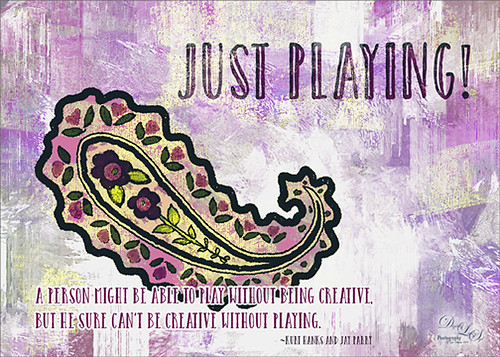
Just having some fun here. Did a wonderful tutorial by the great brush guru Obsidian Dawn called Multiple Colors (and Removing Transparency) with Photoshop Brushes Tutorial that explained how to colorize the brushes that she offers for free, I might add. I just sort of took the tutorial to a different level and ended up with this colorful final image. She included some very interesting info on selecting and adding the paint to the brushes so I would recommend checking it out if you like to use different types of brushes. I used Brush 19 in her Paisley Sketches Brush set. Since this required using several layers for the colors, they were put in a Group. Two textures, both by one of my very favorite texture sites, Painted Textures were used to finish up. Under the group the May Garden texture was applied and in the layer style, the Blend If This Layer black tab was split (ALT+click and drag on tab) and set to 189/196 and the split white tab set to 198/216. This gave the layer a lighter feel. A Hue/Saturation Adjustment Layer was added to give the texture more purple and pink colors. Added the Winter Storm texture set to Lighter Color blend mode and once again the layer style was opened and the Blend If Underlying Layer black tab was split and set to 84/139. Three Text layers were applied using the Catalina fonts that were bought in a Design Cuts package I bought recently. Love this font! The layer style for the longer lines of text once again used the Blend If Underlying Layers black tab split and set to 37/85. Also an Outer Glow was applied by setting the Opacity to Blend Mode Normal, Opacity 100%, White color swatch, Spread 67% and Size 10 px. This way the letters stood out but you could still see the design a little bit behind the lettering. For the larger top lettering, the layer style was opened and Blend If Underlying Layer white tab split and set to 242/255 and an Inner Shadow set to Normal Blend Mode using a sampled color from the green in the paisley brush, Opacity 100%, Distance 21 px., and Size 18 px. Just experimented to get the right look. But you can see some of the beautiful texture coming through the lettering by using the Blend If sliders. The last step was to add a Curves Adjustment Layer to pop the contrast and color. This was so much fun!…..Digital Lady Syd
Digital Lady Syd Related Blogs:
How to Use Those Handy Blend-If Sliders!
How to Get Blend If Slider Settings to Apply to a Layer
Happy Halloween!
 It seems like I always have to do a Halloween image every year – they are so much fun to do! This year was no exception. The background on this image was a totally blown image taken on one of the rides at Epcot but the colors were so striking, I kept it. Perfect for a Halloween creation! I just listened to Terry White’s video called Check Out 3 New Filters in Adobe Photoshop CC and applied a couple of his clever techniques. That is why there is a Tree in the image and some flames around my type layer of lettering – had to rasterize the lettering to get it line up right though, then added the Pen Path and Flames. I started my Halloween theme starting with my friend Carol at Graphix1’s Halloween Clipart PSD – these are really nice objects that can be moved into your document (check out her blog too – lots of nice free goodies there!) Lots of layer styles and some painting were added to image along with French Kiss’s (see sidebar for website link) Spatter 4-14 brush and 2 Lil’ Owls (see sidebar for website link) Texture called Sweet Musing 11 set to Color Dodge blend mode. The frame is from a new Photoshop plug-in I just got called Smart Photo Editor that does some very interesting things to an image beside making great borders! Happy Halloween everybody!…..Digital Lady Syd
Venetian Dreaming…..
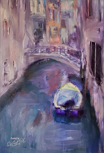
Just another Corel Painter image created following Melissa Gallo’s terrific Painter for Photographers instructions. Not exactly like Melissa’s beautiful images, but I think I am starting to get a style. Since I have not been to Venice in a long time, a free image from Free Images (used to be Stock.Xchng and image is linked) was selected to paint. The original colors were totally different to what is shown, but that is half the fun of painting! While in Painter I actually used Topaz (see sidebar for website link) ReStyle’s Cool and Clear preset with a few changes to get a different color scheme before painting the image. I will say that there were 13 iterative saves before I got to this final image. I am finding the Iterative saves are actually handy to have since I needed to go back to one due to some painting mistakes. The Painter image was saved as a psd file and taken into Photoshop where another Topaz ReStyle preset – my favorite Cream and Plum (you can really see the tones in this image) – was used along with Nik Viveza 2 to emphasize the boat a little more to finish up. Anyway, totally fun but it did take a little time to get it right.
Check out my Fun Photoshop blog this weekend for the same image but done totally with Topaz plug-ins in Photoshop…..Digital Lady Syd
Leaking Some Light on Calton Hall in Scotland
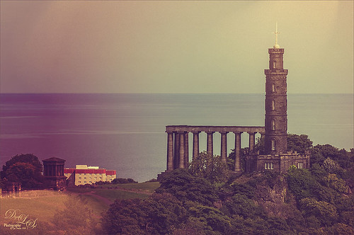 Not sure how I missed processing this image in my Scotland shots, but I really like the light leak effect on Calton Hall as taken from Edinburgh Castle in Scotland. First used Seim’s Power 4 Workflow (see sidebar for website link) Lightroom preset Harsh Sun Fixer. In Photoshop applied both Topaz (see sidebar for website link) Detail 3 and Topaz DeNoise before adding the light leak. Learned a little technique this week from a very nice website called FX-Ray -there are some wonderful light leak jpg’s that can be downloaded for free (this image used Light Leak 03) along with a short video tutorial that explains how to use them. Really loved the results!…..Digital Lady Syd
Digital Lady Syd Related Blogs:
How to Create/Use a Light Leak
A Little Layer Style Fun
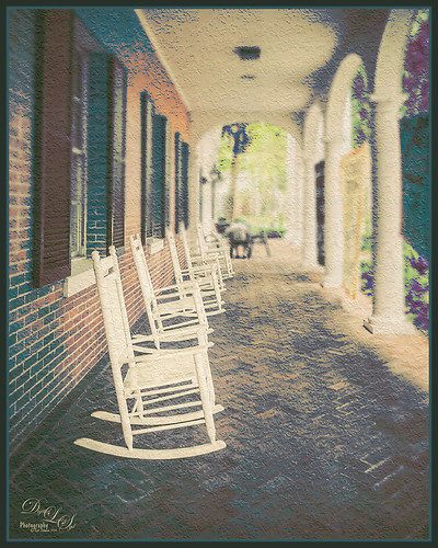
These are some of the rocking chairs that Stetson University in DeLand, Florida, offers students to use for resting or studying on the campus. I really liked the way they have them located throughout this small beautiful campus. One effect I did use on this image was the Blur Gallery in Photoshop so that the end of the walkway was definitely not too clear but the rockers up front are seen clearly. The other was to use Jack Davis’ Layer Styles called Stucco which adds a Pattern Overlay using one of his patterns to give a very textured surface. I changed the opacity from 25% to 19% and the scale to 203% from 61% which gave a very different look. Try playing around with this layer style using one of your favorite textured patterns and see what you get. Lots of fun!…..Digital Lady Syd
Dainty Little Violet
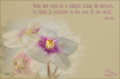 Just playing in Photoshop. This was a photo I took of my blooming violets a while back. Mainly just a little mixer brushing and the Texturizer Filter in Photoshop. The font is Batik Regular. This is just too much fun!…..Digital Lady Syd
Digital Lady Syd Related Blogs:
Learning to Paint in Photoshop
Four Picture Triptych with Topaz ReStyle
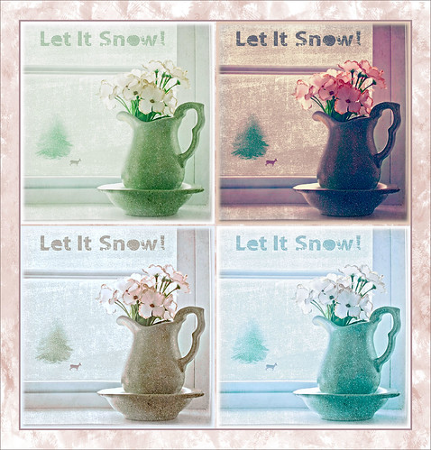
Well everyone probably knows by now that I love this little Photoshop plug-in from Topaz (see sidebar for website link). The original image was a low resolution Shutterstock stock photo (I could not find it on the website anymore) from Advanced Photoshop Magazine No. 25 CD from many years ago (not one to use stock photos but I loved this pitcher and flowers image). I actually did quite a bit to the original image – expanded it using Content-Aware Scale so there was more space on the left side, added my little tree I created in Corel Painter (it is getting a lot of use this season) and set it to Darken so the white background did not show up, added Shadowhouse Creations Tree Brushes Set #2 deer, and added Kim Klassen‘s beautiful Maybe and Peace Textures both set to Soft Light. My free SJ Snow 2 Overlay slight blur was applied at 79% opacity to just the pitcher to give it a ceramic dotted look. Next Kim’s Overlay 1 brush was used so it could be seen only in the window panes by using a layer mask. The font was Tramyad set to 40% layer opacity with an Inner Glow layer style added. Next a Levels Adjustment Layer was added to bring back contrast to the image and a High Pass Filter was used to add localized sharpening to the flowers only in a black layer mask. That was when the upper left green image was saved. The next three images all used different presets in Topaz ReStyle with some minor changes. I would list the presets, but two of them are from presets I used on other images. The frame texture is one I created in Corel Painter and added a Hue/Sat Adjustment Layer to it for the soft tan color. I love all four image effects! This is the biggest problem I have with ReStyle! Decisions, decisions! If you have not tried out this wonderful plug-in, download the trial and see what you think! Lots of fun!…..Digital Lady Syd
Digital Lady Syd Related Blogs:
Digital Lady Syd Reviews Topaz ReStyle
Using a Tych Panel to Show Off Your Images
Snowmen Passing Through!

I guess I just like to make holiday cards – they are so much fun to do. These three snowmen are one of my favorite holiday brushes from Christmas Brushes by Flina. I actually painted the background in Corel Painter using various Karen Bonaker brushes (her Painter brushes are some of the best and she gives many away) – just playing around and it turned out nice and wintry. In Photoshop Painted Textures Thanksgiving Winter Marsh texture was added and set to Linear Light at 55% layer opacity. My free SJ Holiday Greeting PNG Overlay was used for the greetings and set to a darkish turquoise color. The snowmen were added and then on a layer underneath, I painted in the color. On separate layers footsteps were created and snow was stacked. The lights on the tree were from Dirt2 Fantasy Light brushes. My SJ Snow2 Overlay slight blur (in with Overlay set above) was added and set to 30% opacity. This is way too much fun! Happy Holidays!…..Digital Lady Syd
Some Floral Holiday Cheer!

Happy Holidays to everyone! Had to post my beautiful gerberas that look so Christmasy (is that a word?). This was so easy to do. Started with my flowers in Lightroom – just the basic slider changes were done. In Photoshop the first step was to add Isabelle Lafrance‘s Fairytale Winter 2 overlay (apparently this overlay is no longer available which is a shame since it is so pretty) – she makes some of the best overlays available. A layer mask was added and the flowers were gently painted back. A stamped layer (CTRL+ALT+SHIFT+E) was created on top and desaturated (CTRL+SHIFT+U). To sharpen the image the layer was changed to Overlay blend mode and the Filter -> Other -> High Pass was opened using a setting of 7, just until I started seeing a little crispness without haloing. Now the Aaron Nace trick is to add a black layer mask and just paint back where the sharpening should be applied – just the parts of the flowers closest to the viewer. On a new layer Kim Klassen’s free Mini Sampler Holiday Brush holiday 10 was applied – I love everything Kim creates – textures, brushes, videos. I added my own text layer using the Bambino font. Then I remember I had been playing around in Corel Painter and created this little fur tree that looks like it was blowing in the wind on a white canvas. Therefore I added to my image and set it to Linear Burn blend mode at 61% – loved the final look. I am still loving Painter! Hope you have a wonderful Holiday Season!…..Digital Lady Syd
Digital Lady Syd Related Blogs:
Trying Out Some Aaron Nace Techniques
Happy Halloween!

Well, Happy Halloween from Digital Lady Syd! Got a little carried away with this one but it was so much fun to do! These beautiful Wizard of Oz dolls were in a window of a gift shop in Savannah, Georgia. Unfortunately there were huge reflections coming from everywhere, so it would not process cleanly – but it was not a total loss for some crazy Halloween effects! I was actually pretty upset as I had completed this image and Photoshop CC crashed and did not save my image which I had been working a couple of hours – first time that has happened and made me nervous to do it over, but here it is, all 25 layers. I will just give you a quick recap. Lots of cloning in Photoshop to get rid of a lot of the reflection. Then the image was taken into Alien Skin Snap Art 3 just to give the colors a smoother feel. Back in Photoshop many layers were used to add Halloween object using brushes from : Obsidian Dawn and her free Cobwebs and her Halloween Vector brushes, Anodyne Halloween Skull and Pumpkin Face brushes, and my favorite Cat brush from Altergromit. Different layer styles and opacities were added to get the final grouping. The bat layer was set to Exclusion blend mode to get the weird ghost effect. I love the Halloween Spider font! Overall it was pretty easy to do. Got to love these holiday images!…..Digital Lady Syd
Where Am I?

Had the opportunity to visit the beautiful historic city of Savannah in Georgia, USA. This image of an older house is enhanced, but I just felt like adding some yellow and fall colors to a rather overwhelmingly green and boring image in the original. Everything but the kitchen sink went into this image (it felt that way) but finally I got the look I really liked. So here were the steps in a nutshell:
1. Applied Richard Hale’s Sunnyday preset in Lightroom (see A Summery Lightroom Preset for more info on creating it and free download link).
2. Opened Topaz (see sidebar for website link) Clarity’s Landscape Beach Shore I preset and used as is.
3. Back in Photoshop the ACR filter was opened and just the HSL sliders adjusted to get more of a yellow feel.
4. Used Color Range (How To Use the Color Range Command with CS4 Through CC 14.1 blog) to select the sky and added a small amount of aqua color to it.
5. Added Alien Skin’s Snap Art 3.0 using just the Factory Default setting and Photorealism slider set to 100%.
6. Cropped to straighten a little more.
7. Added Levels to enhance the contrast a little.
It took a long time to post-process this image and get it tweaked the way I liked it, but I love the final product. Lots of fun here!…..Digital Lady Syd
Daisy Poetry

I am a big fan of Gerbera Daisies and since I had this little beauty popping up in a pot on my back porch, I decided to photograph it. (I also discovered while processing this image that my plant has bugs! Ugh!) I wanted to add a little text to it so I had to isolate the daisy from the background – used my new learned tricks from my How To Use the Color Range Command with CS4 Through CC 14.1 blog. On a duplicated background layer the Sampled Colors eyedroppers were used to sample the yellow flower and as much of the center as possible. (Localized Color Clusters checked, Fuzziness set to 19, and Range 100%.) Then back in Photoshop used the Lasso Tool – pressed the ALT key to remove the little flashing spots in the middle – pretty fast process. Since now the flower was selected and I wanted the background selected, the whole selection had to be inverted by going to Select -> Inverse. Next a Layer Mask was added to the duplicated flower layer where the selection was turned into the layer mask of. A New Layer was placed underneath this layer and filled with a nice Fall brown color. The Layer Mask of the flower was now applied to the layer by right-clicking on the Layer Mask and selecting Apply Layer Mask. Now the brown background shows up. For the text I found this cute poem by Leanne Wildermuth, a pet portrait artist photographer and web developer, that had just the right sentiment. To find this humorous poem, click on Ode to a Gerbera Daisy. Text was placed in a text bounding box created by selecting the Text Tool and dragging out a box that fit the size needed. An Inner Glow Layer Style was added for the vignetting using a Blend Mode of Normal, Opacity of 30%, White color and Size of 250; and a Stroke was set around the outside using black at 3 pixels Inside. Had total fun creating this image. Hope you enjoy it!…..Digital Lady Syd
Digital Lady Syd Related Blogs:
Pretty in Pink! with Topaz Clarity
More Clarity on Topaz Clarity
Pretty in Pink! with Topaz Clarity

I do love to photograph my gerberas – they are always so pretty. This time I really changed them up. I think they are as pretty in pink as they were in yellow! So I was really just playing around in Topaz (see sidebar for website link) photoFXlab just to see if the new Topaz Clarity plug-in would work nicely with it. I didn’t even keep track of the changes I made exactly in Clarity, but I did use the Hue/Sat/Lum section to turn the flowers pink. I just kept fooling around with the sliders until I got a color I liked – used the Overall sliders on each of these sections and also adjusted the Clarity section too. Back in photoFXlab, adjusted the Dynamics slider a little to the right. Created a +From Stack Layer and opened up Topaz Simplify 5 where the Paint 5 preset was applied. Back in photoFXlab, the Mask tab was selected and the centers of the flowers were painted back so the detail from the Clarity layer remained. Exited the plug-in and did some basic flower clean up. Created a couple New Layers and used two of my free Cloud Brushes (Brush 6 and 9) to add some interest to the background. Added a Curves Adjustment Layer and evened out some of the petal color. Then added 2 Lil’ Owls Color Bokeh Grunge Set (see sidebar for website link)-2 overlay to the image (set to Normal at 100% opacity). Next the text was added using the free font Ruthie. Kim Klassen‘s Square 3 border was added last and set to 52%. The last step added another Curves Adjustment Layer to enhance overall contrast. That was it. I just love playing with my flowers in Photoshop!…..Digital Lady Syd
PS: Check out my Fun Photoshop How to Create an Overlay Out of a Texture blog to see the frame it was put in.
Digital Lady Syd Related Blogs:
Digital Lady Syd Reviews Topaz Clarity
Topaz Simplify Artistic Workflow
Digital Lady Syd’s Review of Topaz photoFXlab v1.1
Bleach Bypass Look on a Landscape Image

This may be the most beautiful and interesting library ever made. I posted a couple times on Flickr with other images (see Minsk Library, Inside Minsk Library, and Minsk Library at Night) but this time I decided to process the inside ceiling which is all glass – totally breathtaking! As you can see, I caught the eye of the guard down below, but he lends a wonderful scale to the image. I had a hard time deciding what to do with the image as the original was not that bad but I wanted to enhance the light and airy feel in the image. So I tried everything I could think of and this is what I got!
First applied Topaz (see sidebar for website link) DeNoise 5 – the image was shot at ISO 1600 so it had some issues. Used the Overall Strength set to .17 and set the Shadows to .82. The layer was copied and Topaz Detail 3 was applied using the Architectural Detail II preset – this image was perfect for this preset. Next Black & White Effects was applied where I mainly applied a regular black and white preset and started moving sliders. What I think really made the image pop was the application of the Creative Effects Diffusion effect where the Softness was set to 0.10, but the Diffusion slider was set high at .91 and Diffusion Transition set to 0.61. This really made the roof lines pop without being too sketchy looking. Then Kim Klassen’s Cloth & Paper Reign texture was applied and set to Soft Light blend mode to lighten the image and add some blue tones back into the image. It was duplicated and this time set to Multiply at 24% layer opacity. Next a Levels Adjustment Layer was added to lighten the image more by moving the Output Levels to 23/255 and the midtone slider to 1.39. Next a Curves Adjustment Layer was added to lighten it even, and a bit of a vignette was painted around the edges of the layer mask. It still did not look quite right – almost blown out. That is when I tried a Color Lookup Adjustment Layer and clipped (ALT+click between the layers) it to the top texture layer. The 3DLUT File was set to Bleach Bypass.look in the drop-down, although several look rather nice. The last step involved creating a composite (CTRL+ALT+SHIFT+E) on top and adding my SJ B&W Border Frame. I really like how the diffused settings made the ceiling lines look. Anyway, it was once again a lot of fun to experiment!…..Digital Lady Syd
Painterly Effect using Topaz Detail and Simplify
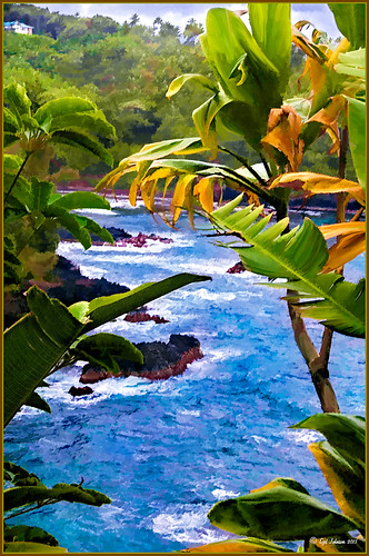 |
I was looking through my notes from last year and came across some nice info on using Topaz (see sidebar for website link) Simplify and Detail together to create an oil painting look. (See Creating an Oil Painting Effect from Topaz Labs.) My Hawaiian image from the east coast of the Big Island was one I had not originally processed as it really did not catch my eye – hoover over image to toggle to original. While doing a little Hawaii dreaming, I came across it again and thought it might look good using some of the settings from this video. (I really was thinking about how it would be to live in the house up in the top left – hum!) I actually did not follow the exact video workflow, but it did get me thinking about how to do this. Now that both Simplify and Detail have been updated, it was easier to get some different looks. Here are the steps I followed:
1. Duplicated the Background layer (CTRL+J). Topaz Detail 3 was opened and the settings from the second example in the video were applied: Small Detail .53, Medium Detail .46, and Large Detail .44.
2. Duplicated the Detail layer. Next Topaz Simplify 4 was opened and the Painting IV preset was applied. The only change to it is that the Edges section was turned off as it made the trees in the background stand out.
3. A Layer Mask was applied to the top Simplify layer. Some of the Detail Layer was brought back in by painting black on the mask on the foreground leaves. Also some detail in the little rock island was painted back.
4. What I did different was to add a New Layer and paint over the foreground leaves and trees in the midground to give a more painterly look and smoothing out some of the rough edges and colors that Simplify can bring into an image. A wet mixer brush was used for this.
5. Next a general Curves Adjustment Layer was added to bring in some contrast.
6. The sky was really blown out, so I added another Curves Adjustment Layer that brought back the natural clouds from the original image into the sky. The Layer Mask was filled with black and just the sky area was painted back with a soft black low opacity brush.
7. The water was way too cyan for my taste, so another Curves Adjustment Layer was added and the different color channels were adjusted to get a better color for the water.
8. I felt like the eye was not guided with a strong enough element to get you through the image. Therefore, a New Layer that was set to Overlay Blend Mode was added. With a large black brush set to 15% opacity, the edge of the bay was lightly painted on the water all the way to the back center. This burned in a slight contrast in the water for the eye to follow. Much better overall impact for the image.
9. The last step involved adding my SJ Thin Double Edge Frame layer style left at the default colors.
That is how I got this very Hawaiian Oil Paint feeling. Give these two plug ins a try and see what you think…..Digital Lady Syd
Digital Lady Syd Related Blogs:
Topaz Simplify and Topaz Detail Together
EPCOT Texturized

Was looking at some of my older work and came across one of my first texture images from three years ago. I really liked the treatment of this image so I thought I would try to reconstruct how I did it. A very different workflow was used. When the Lightroom adjusted image was opened in Photoshop, I did some clean up to remove some tourist heads. Then Topaz (see sidebar for website link) Adjust’s Spicify preset was applied. Next Nik Silver Efex Pro Antique Plate preset (pretty close to SEP2’s Antique Plate II) was added and set to 42% opacity. Ash Texture 25 was added (it’s a shame but they are no longer available, but Isabelle Lafrance free Decemberpack1 texture 1 has a very similar look) and set to Overlay at 100% opacity. Back into Silver Efex Pro where the Neutral preset was applied – layer was set to Screen at 51%. Next a Curves Adjustment Layer was added using a slight S curve to enhance contrast. Topaz Simplify was applied using the basic BuzSim preset. The last step used OnOne’s (see sidebar for website link) PhotoFrame Dave Cross 15 set to 72% opacity – the PhotoFrames are no long available in the newest release but many are incorporated in the new Perfect Effects 4 module. The final result is really nice – I am going to experiment some more using these plug-ins to enhance my texture effects…..Digital Lady Syd
Hyacinths Deep in Reflection

Recently I posted a blog using this image called Take the Time to Experiment! where a Mirror Effect filter from The Plugin Galaxy was used. This time the Flood Filter from Flaming Pear was applied. I love this filter. It is the only one that gives a really realistic look to a water reflection. Before applying the filter, the canvas had to be increased to add the reflection under the image. (Here are the Flood filter settings used so you can see all the sliders that can be manipulated: Horizon 60, Offset 0, Perspective 68, Altitude 6, Waviness 17, Complexity 17, Brilliance 28, Blur 15, Size 0, Height 23, Undulation 46, and Glue Normal.) See my Fun Photoshop Blog The Flood Look for tips on how to apply this filter. Nik Color Efex Pro 4‘s Midnight, Polaroid Transfer, and Detail Extractor filters were applied to just the hyacinths to add back some color to the flowers, especially in the reflection. In Photoshop the layer was then set to 69% opacity. That was it. Really fun effect!…..Digital Lady Syd
Happy New Years!

Happy New Years to everyone. I posted this image earlier today and thought I would give you the info on how to create it. The flowers are two of my red gerberas from my back porch that decided to burst forward on the New Years weekend. They are a little crazy looking as I keep moving them into the house when it gets cold and outside again when it warms up! Anyway, here are the steps in a nutshell! After initial processing and cropping in Lightroom, Topaz (see sidebar for website link) Detail 3’s Medium Detail II preset was applied. Next Isabelle Lafrance free Christmas Lights overlay was applied for the bokeh effect. I just used a soft black brush on a layer mask to bring the red gerberas back into the image. Next I applied my free SJ Snow 2 Slight Blur Overlay and added a Pattern Overlay. In another document I opened up my free Smudge Texture and changed the colors to reds, greens and yellows – saved it down as a new pattern (Edit -> Define as a Pattern). Then on the Snow Overlay layer, I created a layer style using the Pattern Overlay and selected my new pattern set to 33% scale – this gives the colored confetti look. I duplicated the layer and Free Transformed it (CTRL+T) – selected Flip Vertical so the colored snow on this layer lines up differently. The bottle is from Mel’s Happy New Years Brushes with a Bevel & Emboss layer style applied along with the fizz. The font is Orial with a Stroke, Inner Glow and Outer Glow layer style added. The last step was a Curves Adjustment Layer to add some contrast. Lots of fun to play with all these effects! Hope everyone has a chance to play in Photoshop and try out some of these fun techniques!…..Digital Lady Syd
Which Tool to Use – Smudge or Mixer Brush?

I ran across an old tutorial that was in the very first Photoshop Creative magazine back in 2006. It was on how to create a digital painting by using the Smudge Tool. Well that was something I had to try out – couldn’t believe I had not tried this before! I really like the Mixer Brushes, which is what I usually use (see my blog Adobe Photoshop CS5’s Mixer Brushes). Once I started playing around with the Smudge Tool using different brushes and sizes and opacities, it was actually fun. My curiosity got the best of me and now I needed to know what IS the difference between the two tools – they create very similar results? I was able to find a reasonable answer on the Internet at Model Mayhem.com. Here is what they said:
“The Smudge Tool simulates the effect you see when you drag a finger through wet paint. The tool picks up color where the stroke begins and pushes it in the direction you drag……The Mixer Brush simulates realistic painting techniques such as mixing colors on the canvas, combining colors on a brush, and varying paint wetness across a stroke.”
I think this is a nice short explanation of what is happening. For my Peach Dahlia I found it was nice to use both tools. It seemed it was easier to blend colors with the Mixer Brush and then smooth edges and shape color using the Smudge Tool. The Photoshop Wow Book for CS3 and CS4 (still my favorite Photoshop book) had a nice section on painting with the Smudge Tool. They recommended using the Natural Brushes that come with Photoshop and start by using short strokes, which samples the color underneath more frequently. Then use a small brush size for detail.
To create this image, first a blank layer was placed on top. Then these two brushes were used to paint: Mixer Brush – created tool preset brush with these settings: Stipple Dense 26 pixels from Natural Brushes set (Options Bar: No Current Brush Load, Load the Brush After Each Stroke, Wet 100%, Load 1%, Mix 91%, Flow 100%, Check Sample All Layers). Smudge Brush Tool Preset created using Stipple 54 pixels from Natural Brushes preset with Options Bar set to Mode Normal, Strength 78%, and Checked Sample All Layers. Be sure to save these brushes as Tool Presets so the Options Bar settings are retained – if just saved as brushes, the settings might not be correct. Also, note that if the Finger Painting box is checked in the Smudge Tool options bar, the smear stroke will start with the Foreground color. If turned off, the color under the cursor is sampled first. At 100% Strength, only the first color sampled is applied – at lower settings it fades out the first color and picks up the new one. Then I just alternated mixing and smudging until I liked what I saw. The last step involved adding three textures to the image to give a real painting look: the first one is a light gray canvas texture (I created it by taking a picture of a portion of the canvas on a large oil painting in my dining room – try this – you might really like the results) set to Soft Light at 53% opacity; next ShadowHouse Creations Old Photo 2 set to Overlay at 100% opacity – it provides the interesting edging on the image; and Flypaper Textures Aquaflora taster set to Overlay at 80% opacity. I painted out a little bit of the texture on the top two textures just to direct the eye to the center of the flower. A Curves Adjustment layer was added on top to give just a small contrast boost. Overall it was really fun to try out a new tool and learn something about it!…..Digital Lady Syd
InstaTone in photoFXlabs – Great Fun and Great Results!
 |
Loved how this image turned out with just a click in Topaz photoFXlab’s InstaTone tab (see sidebar for Topaz website). I do not know which image I sampled the tones from, but it sure made a very plain image look like it has some texture and interest. The image is of a small solar light and statue on my back porch. (Hover over image to see original image.) This is one of the best parts of this new plug-in from Topaz and I can’t seem to get enough of trying it out on almost all my images. Once the tones were applied, in the Adjustments tab the Dynamics slider was set up a little higher and the Contrast a little lower to give this beautiful final image. If you want to learn more about how to use the InstaTone effect, see Topaz Lab’s short video Quick Tips Thursday – Exploring InstaTone for some great tips. If you already own some Topaz plug-ins, definitely try out the photoFXlab interface – it adds a lot of new features including this one…..Digital Lady Syd
Digital Lady Syd Related Blogs:
Digital Lady Syd’s Review of Topaz photoFXlab v1.1
Using photoFXlabs v1.1
Using Topaz photoFXlab to Replace Skies


