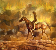
Anything Photoshop or Photography

Latest

I Didn’t Know That! Comparing History States

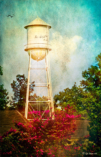
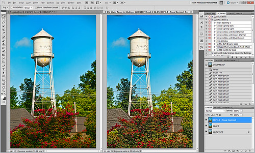
Well once again I learned another little tidbit this week that really surprised me because basically I had never thought about it! Photoshop allows you to create a document from an earlier History State by just clicking a state you want to look at again, and dragging it down to the bottom of the History Panel’s left icon called “Create New Document from current State.” It will open up another window with the image as it appears in the older state. Below is an example of a photo I am currently adjusting where a Topaz Adjust Portrait Drama preset was applied (I know it is a landscape type image but it works!) and then a Nik Color Efex Pro Tonal Contrast filter was applied next. I wanted to compare the later combined filter state to the earlier Topaz Adjust only state. Pretty cool, huh?

There are those times when you just need to compare something you did before and this is perfect! Remember though, that you lose your History States when you close out of Photoshop so save that extra window if you want to keep the image for comparison. Later….Digital Lady Syd

Complimenting Those Complementary Colors

Have you ever started an image and thought – what color will really make my image pop with the color I am using?

I found this tip in a wonderful book (which it and its latest version are chocked full of tidbits and, no, they are not the same as some on Amazon have said) called “The Photoshop WOW! Book for CS/CS2” by Linnea Dayton and Cristen Gillespie. Remember, in this case complementary colors are based upon the “RGB Color Wheel.” (The “Artist Color Wheel” does not use the same complementary colors but here is a quick link that explains the basic difference.)

The very basic steps are as follows:

  1. It is easiest to convert your image to Black and White first. Use the Channel Mixer Adjustment Layer (click the Monochromatic box) or the Black and White Adjustment Layer – they can easily be deleted after you get your colors set up.
  2. Click on the Foreground swatch in the Toolbar to bring up the Color Picker. Move the vertical slider to pick a Color Family and choose a precise color in the large box.
  3. Create a New Layer above your current layer and fill with this Foreground Color (CTRL+BACKSPACE or COM+DELETE). Can now save color to Color Swatches by going to the Swatches Panel and clicking the “Create New Swatch of Foreground Color” icon to save.
  4. Now change the Layer Blend Mode to Difference – you will see the original Foreground color appear over the black areas, and the complementary color appear over the white.
  5. Exchange the Foreground and Background colors on the Toolbar swatch and sample the opposite color in the image for use on your image. Save new foreground color to the Swatches Panel to retain.
  6. Can now delete the adjustment layer converting the image to Black and White.

That’s it. In the photo below, I used a Channel Mixer Adjustment Layer with Monochromatic checked to make a black and white of my original image. Then I followed the above steps getting a brownish red as a complement to the light blue color.
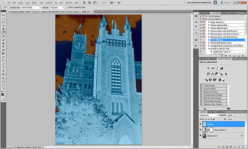
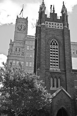
I posted the black and white image so you can see that the original Foreground color which is a fairly light blue color (in the black area of the image like the foreground trees and top of the church door) created a fairly light brown complementary color (in the white of the clouds – sample in the white cloud to get the exact complementary color). The book noted that if the original color is dark, the complement will be the opposite tonality and the same goes for light colors. Both colors will be equally saturated or neutral.

Well I hope this little tidbit will help you get that perfect color to really make your images pop. ……Digital Lady Syd

Digital Lady Syd’s Rule No. 2: Take the Time to Have Fun!

Well, I am not sure if this is really my first rule or second since experimenting and having fun are both important elements as to why I love Photoshop.

If you are not having fun, I can’t see that it’s worth taking the time to do – I would go do something else I really have fun doing!

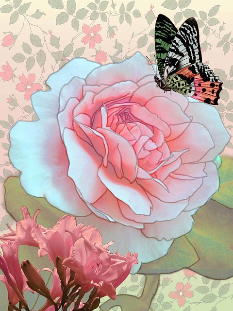
That said, here is an example of something I did when I was first learning how to have fun in Photoshop and I still love this effect.

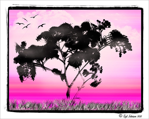
In case you are wondering what I was doing (as I am), I was big into making selections from my images to combine with clip art I had bought. Wish I could remember how I got that great outline from my beautiful Tamora Rose  image. If I figure it out again, I will let everyone know.

Digital Lady Syd’s Rule No. 2:  Have FUN!

Now go have some fun!…….Digital Lady Syd

I Didn’t Know That! Curves Adjustment Layers

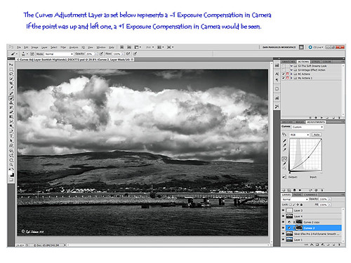
Every now and then I find something that makes me go – “Wow – I didn’t know that!” Last week I watched a video by Moose Peterson, one of the very best wildlife photographers, called “Finishing Techniques using Nik Software.” Listen to this video if you have time – some very interesting images and processing tips are included.


In the image above of the Scottish Highlands, I used the Curves Adjustment Layer set to -1 Exposure Compensation so I could darken the foreground a bit and some parts of the clouds – the image was overall much brighter. The layer mask was then filled with black.  With a white soft paintbrush set to 20% opacity, I painted over any areas that needed to be darkened slightly. The Curves Adjustment Layer was duplicated because I liked the vignette effect it was creating.

This tip could become very useful, if for example, you discover an image you really like is just a bit over-exposed.  In Photoshop a Curves Adjustment Layer set as shown above could bring just a bit of contrast back into the image, as if you had adjusted the shot when taking the picture. Try using a +1 Exposure Compensation Curves Adjustment Layer if parts of an image need to be lightened a bit.

It had never occurred to me what I was really doing with the Curves Adjustment Layer. Thank you Moose! Hope this tip helped you a bit…..Digital Lady Syd

The Ruler Tool Rules in Photoshop CS5!

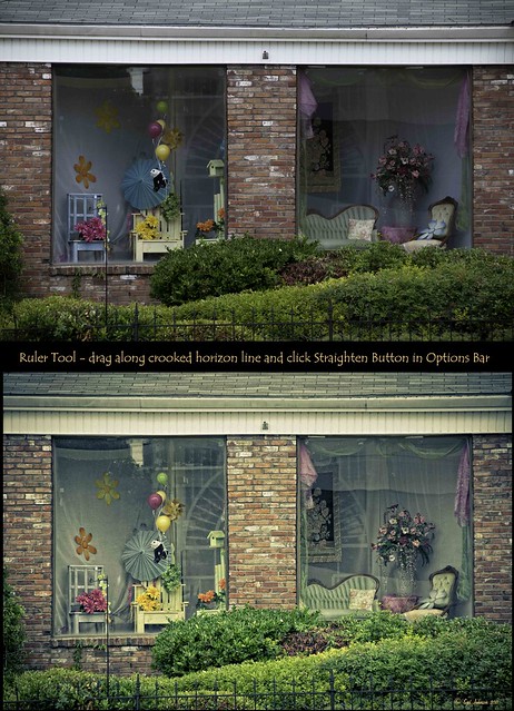
Have you ever gotten all the way through an image and suddenly realized that your horizon line is off just a tad and it starts driving you crazy? I try to straighten my images in Adobe Lightroom as a first step before I do anything, but there are times the horizon just gets messed up. I personally have never liked fixing horizons in Photoshop – I thought it was very cumbersome. Along comes CS5 with little known enhancement.

  1. First go to the Eyedropper Tool and select the Ruler Tool in the fly-out menu.
  2. Click and drag a line along the crooked horizon.
  3. Go to Options Bar and select the Straighten Button.

Voila, your horizon is straightened and cropped in one big swoop!  By the way, if you do not want the image cropped, just straightened, hold down the ALT key when clicking the Straighten Button.

Sometimes it is not so obvious which is the horizon line as in the image above – it is easy to line up with the wrong horizontal or vertical line. Above is a before and after I used the Ruler Tool – it is a subtle but important difference. (Applied a Vintage preset in Adobe Lightroom to get the nostalgic look.) Hope this was helpful!…..Digital Lady Syd

Digital Lady Syd’s Rule No. 1: Take the Time to Experiment!

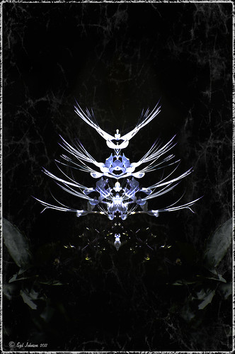
For my first blog “tidbit,” I thought I would show an example of using in Photoshop the Plugin Galaxy Instant Mirror effect. Sometimes you get some really interesting results using this filter on an image that did not look like much originally.

See my entry on Photoshop Fun blog called “Instant Mirror and Quick Mirror for Photoshop.”


Digital Lady Syd’s Photoshop Rule No. 1:

When stuck and not sure where to go next in Photoshop, EXPERIMENT.