EPCOT Texturized
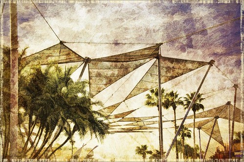
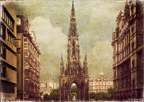
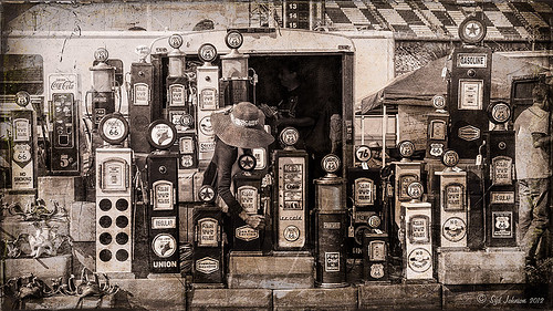
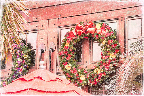
Was looking at some of my older work and came across one of my first texture images from three years ago. I really liked the treatment of this image so I thought I would try to reconstruct how I did it. A very different workflow was used. When the Lightroom adjusted image was opened in Photoshop, I did some clean up to remove some tourist heads. Then Topaz (see sidebar for website link) Adjust’s Spicify preset was applied. Next Nik Silver Efex Pro Antique Plate preset (pretty close to SEP2’s Antique Plate II) was added and set to 42% opacity. Ash Texture 25 was added (it’s a shame but they are no longer available, but Isabelle Lafrance free Decemberpack1 texture 1 has a very similar look) and set to Overlay at 100% opacity. Back into Silver Efex Pro where the Neutral preset was applied – layer was set to Screen at 51%. Next a Curves Adjustment Layer was added using a slight S curve to enhance contrast. Topaz Simplify was applied using the basic BuzSim preset. The last step used OnOne’s (see sidebar for website link) PhotoFrame Dave Cross 15 set to 72% opacity – the PhotoFrames are no long available in the newest release but many are incorporated in the new Perfect Effects 4 module. The final result is really nice – I am going to experiment some more using these plug-ins to enhance my texture effects…..Digital Lady Syd
Adding Texture to a Landscape
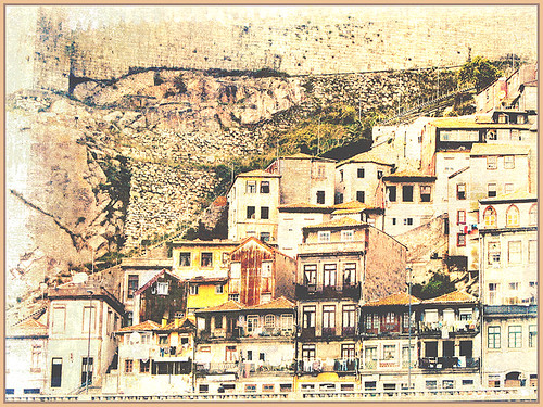
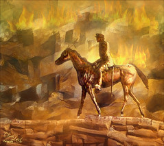
Usually I use my own images to alter, but I found this beautiful texture image of old buildings in Porto, Portugal, from Mayang’s Free Textures (scroll down a ways in link to see original) and it seemed like a good candidate to see what I could do with some more textures to enhance it some. Click their link to see the original image and lots of others that can be used for personal use.
This image was first processed using Topaz (see sidebar for website link) photoFXlab. First duplicated the layer. On top layer the Black & White Effects plug-in was opened and Hand Tinted Chiffon was selected with Transparency set to 1.00 and Vignette Strength to .45. After applying the plug-in, back in photoFXlab this layer was set to Linear Light at 100%. A +From Stamp layer was created and these Adjustment tab sliders set: Tint -8, Saturation 17, and Dynamics -28. Next exited to Photoshop where some clean up was done and French Kiss Artiste Collection Fantasie texture was applied. Two Hue/Saturation Adjustments Layers were added with black filled layer masks – the red-orange color needed to be adjusted and the greens above the buildings were off. These areas were painted back in the masks to create the correct tone in the image. An Ash texture (no long available – but Shadowhouse Creations has a very similar texture called ArtGrunge 5 which would give a very similar effect) and it was set to Hard Light blend mode at 45%. A hazy feel was added to the image by adding a Levels Adjustment Layer and just moving the Output Level black tab to 80. A Curves Adjustment Layer was added next to just slightly add contrast. This image had a very low resolution on it so I created a composite layer on top (CTRL+ALT+SHIFT+E) and went to Image -> Image Size and checked the Resample Image box and set the resolution to 240, leaving the size alone. The last step was adding my Mid Size Double Edge Frame layer style – sampled colors in the image for frame colors. I was really pleased with how painterly this image turned out. It is a little different from creating a flower type texture image, but you can really add some creative aspects with a little experimenting. And thank you Mayang.com for supplying such a interesting image to work with!….Digital Lady Syd
Digital Lady Syd’s Rule No. 9: Get the Shot!
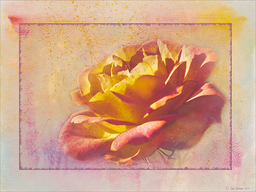
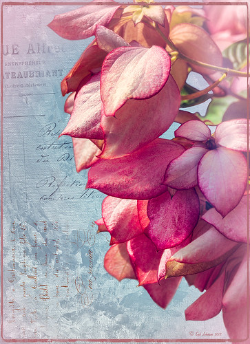
I took this beautiful little rose at Lowe’s with my inexpensive Kodak C1450 14-mp point-and-shoot camera and it turned out very nice! These little cameras really do a great job for those unexpected shots! Since most people have decent cameras on their phones (mine is still a 2 megapixel so I carry this camera), there really is no reason not to get the shot. It just may not be quite as sharp or colorful as your good camera, but at least you get the shot, the memory, and something you can work with in Photoshop. That is what I did with this rose – it was a little soft except where it was focused, but the colors were still beautiful and overall, not that bad an image.
One of the issues I had with this image is that it is a JPG and there was a lot of Chromatic Aberration in the image – I tried to remove it in Lightroom, but it still looked rather bad so I treated it with a soft texture treatment to blend in the petals where the bleeding was bad. Some noiseware was also applied. Two gorgeous textures were stacked from French Kiss Textures – Artiste Fantasie at 80% opacity and Artiste LaDanse set to 68% opacity and her Spatter Brushes were used over the rose. Following Dave Cross’s path tutorial from his Photoshop CS5 Finishing Touches for Photographers class at Kelby Training (but it is also in his really good Photoshop Finishing Touches book), I created a fancy edge around the flower. Dave’s book was published a while back, but most of the tutorials work fine in CS6.
So get the shot, even if you do not have your best equipment with you – it may be a great image anyway!…..Digital Lady Syd
Beautiful Christmas Flowers
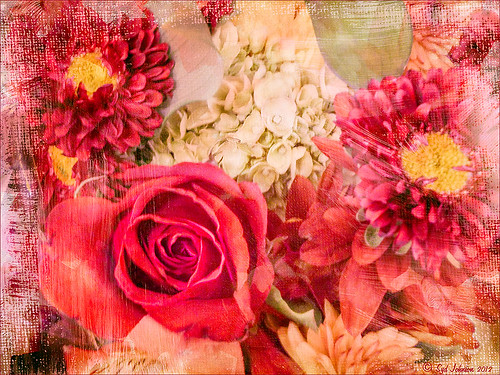
These flowers were once again taken at the local grocery store with my little Kodak Point-and-Shoot camera. I bought four textures from Melissa Gallo’s Painted Textures website on Black Friday and love them. These are very painterly textures and create a different look! She also has some very interesting tutorial videos on how to apply a texture – keeping the texture on an image and painting in color to remove texture from parts of the image, which is what was done here. Check out her website if you enjoy textures as much as I do.
The biggest change I did on this image was in Lightroom where the White Balance eyedropper was sampled throughout the image until I found something different that I liked – it turned a rather dark fall colored image into a bright red and pink image. Totally awesome! I also used a Lightroom Adjustment Brush to sharpen the yellow centers of the flowers and some of the rose petal edges. Now following Melissa’s tutorial, Shadowhouse Creations Vintage Soft Grunge texture V32b texture in Set 3 was applied using the Multiply blend mode at 84% opacity, along with Painted Textures Taupe Canva using Hard Light blend mode at 35% and Pink Impasto using Hard Light blend mode at 67%. A Color Balance Adjustment Layer was added to increase the red color a little in the Highlights and greens in the Shadows. A Curves Adjustment Layer was added to lighten the overall contrast of the image.
Totally loved the result!…..Digital Lady Syd
Digital Lady Syd Related Blogs:
For Tidbit Blogs, click on the Texture Category to get several more.
Where to Find Those Cool Free Christmas Card Templates?
How to Create Unique Textured Backgrounds
How to Create Unique Watercolor Background Texture
Creating That Vintage Texture Feel
Russell Brown’s Paper Texture Panel Updated!
Tips for Flower Textures
Some Free Christmas Overlays to Spice Up Your Christmas Cards
Just Bloomin’ Beautiful!
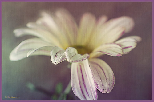
This miniature mum was in bloom again for the fall season. Just beautiful! This image was taken with my Micro Nikkor 60 mm f/2.8 macro lens set to Manual mode, 1/90 sec, F/5.6 and ISO 200. Very little processing but did use Flypaper Texture Rainbow Trout Taster and my Double Edge Frame Layer Style sampling the Inner Shadow color from the image. Enjoy!…..Digital Lady Syd
Digital Lady Syd Related Blogs:
The Macro Shot
Beautiful Soft Flowers
Displacing an Overlay
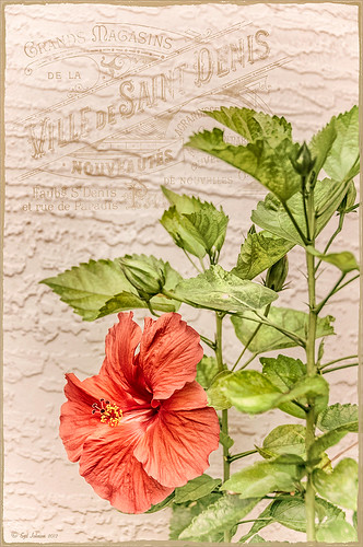
Since I have been posting a lot on overlays recently, I wanted to show how you can get a really authentic look to overlays by displacing them onto a textured background. In this image the lettering looks like it has been on the wall in the background all the time. This is pretty neat trick Photoshop can accomplish but I personally find it hard to do. Corey Barker, of The Photoshop Guys fame, gave a nice quick tutorial on his Planet Photoshop website called Graphic Texture. The process involves creating a displacement map psd file that is applied to the overlay layer. The steps are as follows:
1. Open image and make sure it is in 8 bit mode. To find out, go to Image -> Mode -> 8-bit. At this point I created a Stamped Composite layer of all the work I have done to have a clean layer to start this process on – go to CTRL+ALT+SHIFT+E.
2. Create duplicate copy of image by going to Image -> Duplicate Image and click OK. This will be your Displacement Map image. Convert this image to black and white image by going to Image -> Mode -> Grayscale. Save the Displacement Map as a psd on your desktop so you can get to it easily.
3. In your regular image, do corrections and add your overlay were you want it. Be sure to Rasterize (right click and select) your overlay if it is a Smart Object.
4. With overlay layer selected, go to Filter -> Distort -> Displace and in the dialog box, set Horizontal and Vertical to 5 for small displacement or 10 or larger – the image above used 5. You are then directed to find your grayscale image on your desktop. Once done, the overlay will distort by the amount of your settings.
5. CTRL+click on overlay layer thumbnail to select your graphic.
6. Highlight your layer underneath your overlay layer, and CTRL+J to copy to a New Layer. Turn off your old overlay layer. The lettering may totally disappear now. Desaturate the new displaced overlay layer by pressing CTRL+SHIFT+U. Go to Layer -> New Fill Layer -> Solid Color and check Use Previous Layer to Create Clipping Mask and OK. Change to any color – try sampling in your image when you hover your mouse over it. You do not need to turn on the original displaced lettering layer.
7. Try changing the layer blend modes and opacity of your overlay layer. Add a Levels Adjustment Layer to increase contrast if needed.
That is it. It is not that difficult but does take a little manipulation to get to work. If you do get it right though, a beautiful result will occur…..Digital Lady Syd.
Digital Lady Syd Related Blogs:
How to Create Personal Overlays for Your Images
Artistic Daisy!

This yellow daisy has a very interesting texture by French Kiss Textures called Lakeside – she actually offers it for free at her website (she also has some great tutorials on how to use textures on her site). I was not that familiar with her textures until recently – she has some beautiful textures that have more of an artistic flair to them than most sites. This texture was actually placed behind my daisy. A Hue/Saturation Adjustment Layer was placed above the texture and the colors were changed from the blue-yellow-green to the green-purple tones by setting Hue to -117, Saturation to -41 and Lightness to -8. The daisy had been cut out as an object using Select -> Color Range and selecting just the flower and stem. The flower was processed in Topaz (see sidebar for website link) Simplify 4 using the Oil Paint Toned V preset – the Tone and Edge Sections were turned off and the color space set to RGB. The layer was set to 75% opacity to tone it down a little. A pink textured border (see my SJ PNG Borders) was placed round the image and the color was changed to light brown using another Hue/Saturation Adjustment Layer set to Hue +48, Saturation -3, and Lightness 0. A Curves Adjustment Layer was added to get the final contrast in the image. That was it. Try downloading her free texture package and see if you like them as much as I do!….Digital Lady Syd
Digital Lady Syd Related Posts:
Getting a Nice Painterly Landscape Effect with Topaz Simplify and Texture
A Little Hollywood for My Butterfly Model
Digital Lady Syd Reviews Topaz Simplify 4
A Little Hollywood for My Butterfly Model
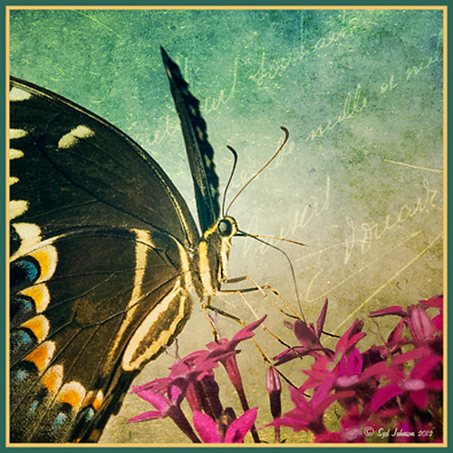
If you have ever tried Kelby Training, then you know how good it is. I just finished a short video class on Quick Composite From Photo to Finish by Calvin Hollywood, a wonderful Photoshop guru from Germany. He was shooting a lovely model but I like my lovely model above more. She spent quite a long time flitting around me and my bright pink penta flowers posing along the way. (She is using her proboscis to feed by sucking out the fluid of the flower, not unlike the trunk of an elephant.) I did a previous blog called Butterfly Beauty! a while back, where several different textures were applied. Also Mike Hardisty Photography recently posted a pretty white butterfly in his blog.
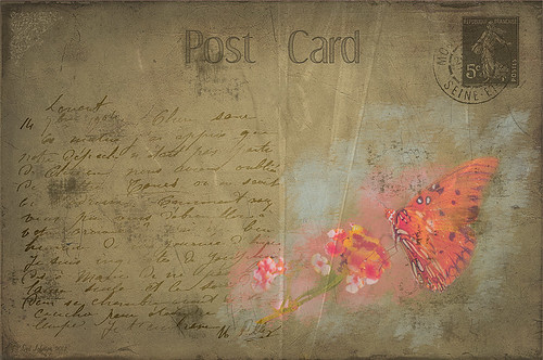
Calvin’s sharpening technique was used to sharpen the butterfly and it did do an amazing job! See Scott Kelby’s Guest Blog featuring Calvin with a short video on creating Freaky Amazing Details. An action for this can be downloaded here. His vignette technique was also used to spotlight my model and a couple of his color manipulation tricks were used to add some artistic flair. Overall, Calvin had a very good tutorial. The textures used in this image were ShadowHouse Creations Mixed Bag 2 set to Darker Color blend mode and Scratch Box 4 set to Overlay blend mode. The beautiful French writing in the background is French Kiss’s Script brushes that are for sale very inexpensively. ….Digital Lady Syd
Digital Lady Syd Related Blogs:
Spotlight Effect With the New Subtract Blend Mode
Orange Flower Fun!
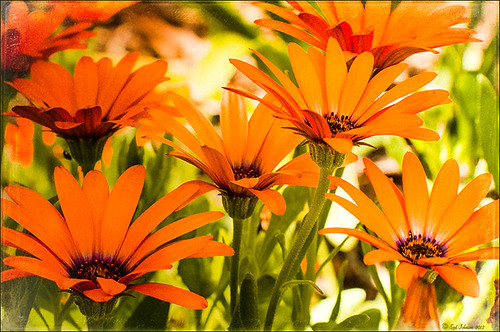
Just felt like posting a pretty autumn looking flower – these are called Orange Spark Symphony (Osteospermum hybrid) which are also called Mimosa Sunset – very confusing and very unusual! Topaz (see sidebar for website link) Adjust 5 was used with the Retro IV preset applied. ShadowHouse Creations OldPhoto2 texture was used and set to Soft Light Blend Mode. That is it! I love these daisies!…..Digital Lady Syd
Digital Lady Syd’s Related Blogs:
Digital Lady Syd’s Review of Topaz Adjust 5!
Cafe Alcazar and Vintage Topaz Adjust
Digital Lady Syd’s Rule No. 8: Get Textures From Objects Inside Your Home!
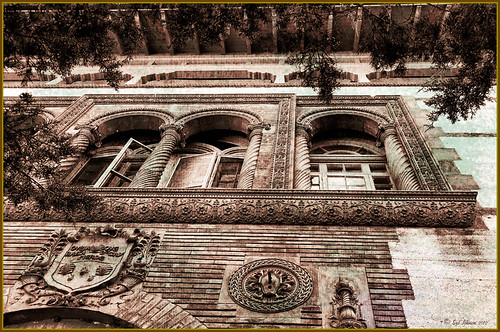
This image is of the area above an entryway onto a courtyard at Flagler College (it actually was the ladies entryway to the courtyard at the old Ponce de Leon Hotel) in St. Augustine, Florida. In Photoshop I added a texture created from a shot of the corner of a large oil painting of a beautiful white cat in my living room to use on this image. (It can be downloaded here.) It is medium gray with lots of paint stroke texture that I find I am using quite often. Try going around your home to see if you have some interesting textures that could spice up an image. I took some of the lace in my dining room curtains and even my living room couch material. The kitchen countertop also made a nice dark texture.
The bricks throughout the college are colored that beautiful brick red-orange tone. This image definitely needed to be put into a sepia tone to see the detail so it was converted into black and white using Nik’s Silver Efex Pro 2 and the High Structure (Harsh) preset used as a starting point. Back in Photoshop my Cat Painting Canvas texture was applied and the layer set to Color Burn blend mode at 50% opacity. Next a Hue/Saturation Adjustment Layer was added and clipped to the texture (CTRL+Click between the layers to do this) so changes only apply to the texture and not the whole image. Colorize was checked and the Saturation set to 10 which gave a little more of a deep red sepia feel. Next a New Layer was added on top and Nakatoni’s Amazing Texture 2 brush (does not appear to be available anymore but any smooth grunge brush would do) was selected to paint with a dark brown color sampled from the image. By filling this layer with grungy strokes, and then setting the layer to Subtract blend mode at 90% opacity, the bluish almost duotone feel was created and also more texture was added. By double-clicking on the middle of the layer, the Layer Style dialog was opened and the Blend If Gray – This Layer white tab was split (ALT+click and drag to get a smooth transition) and set to 56/89 and the Blend If Red – This Layer white tab was split and set to 91/211 that really changed the red tone. It surprised me how nice it looked! A Curves Adjustment Layer was applied to add a little more blue by adjusting the Blue channel curve. A composite (CTRL+ALT+SHIFT+E) was created on top, and my Thin Double Edge Frame layer style was used (can download here), keeping the default colors. Once again, this produced a totally different image and I created the textures myself very quickly and inexpensively! Have fun exploring!…..Digital Lady Syd
Cold Dolphin Fountain in Florida
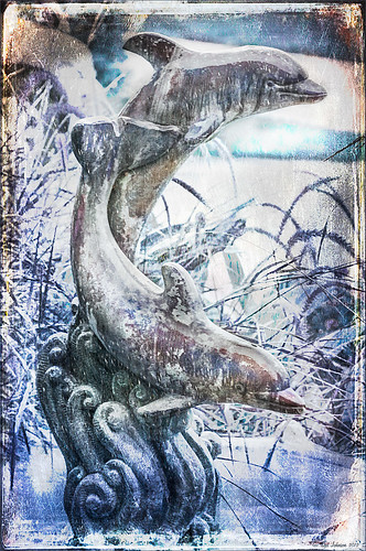
Sometimes I find I just need to do something sort of funny and just play around in Photoshop. That is how I got this crazy image of my cold dolphins instead of the warm Florida dolphin fountain in my front yard – actually it really was raining at the time I took this picture from the front porch. Essentially this image was just color corrected in Lightroom and brought into Photoshop where four textures were stacked using Dr. Brown’s Paper Texture panel (Ash texture 30, a bluish texture which is no long available, set to Hue at 74%; Bittbox Grunge Ice Texture set to Linear Dodge at 15%; Florabella Snow 3 texture, which may not be available anymore, set to Lighten at 15%; and ShadowHouse Creations Old Photo 6 texture set to Hard Light at 100% (see sidebar for blog link) – all are free except the Ash texture). Several Curves Layers were created to isolate and enhance parts of the image by filling the layer mask with black (CTRL+I on mask) and painting back using a low opacity brush. Not sure it is something I would put up on my wall, but it was a lot of fun to do!…..Digital Lady Syd
Digital Lady Syd Related Blogs:
Russell Brown’s Paper Texture Panel Updated!
Creating That Vintage Texture Feel
Click on Textures on right in Categories for more blogs
Butterfly Beauty!
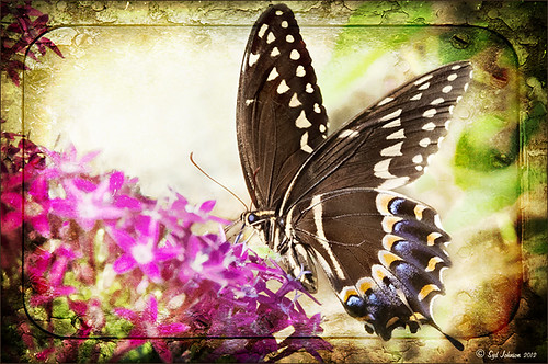
Today I had a chance to get some wonderful shots of one of the beautiful butterflies that are flying all around my neighborhood. This is a female Palamedes Swallowtail Butterfly and she is loving the pink pentas in my front yard (the males are smaller and more black in color). I was so surprised that she stayed around while I shot several pictures. The trick to getting the shot since her wings are flapping like crazy – set your ISO to 1600 and shot at F11 and higher. I was able to get many very clear shots. Three textures were applied using Russell Brown’s Paper Texture Panel: ShadowHouse Creations Scratched Overlay set to Hard Light blend mode at 100% layer opacity and Softly Blurred Edges set to Overlayat 100% opacity (see sidebar for website link), and Gavin Hoey’s Grunge Border set to Overlay at 100%. All had layer mask applied and the butterfly was painted out completely using a black brush in the mask. A Curves Adjustment Layer was created to adjust just the blue channel curve to bring out her blue spots, then the mask was filled with black (with white Foreground color, CTRL+BACKSPACE to fill with mask with black). Just painted back in the blue dots in the Curves Layer Mask with a white brush. That is all that was done to the image – what a showgirl!……Digital Lady Syd
Digital Lady Syd’s Related Blogs:
Digital Lady Syd’s Rule No. 5: Just Step Outside and Look Around!
Digital Lady Syd’s Free Layer Style Frames
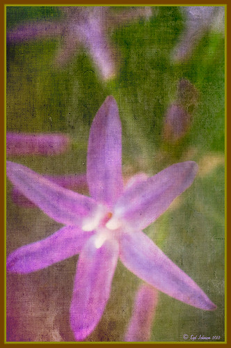
To download the free layer style frame above, a thinner version of it, and a nice black and white double edged frame, go to my Deviant Art site and click on the SJ Double Edge Frame Styles Download File button in upper right corner. To load into Photoshop, the Style Panel needs to be open (Windows -> Styles) – click on the upper right corner icon on panel to open pop-out menu and select Load Styles – navigate to folder where the file was downloaded and click Load. (To add them to listed styles in pop-out, load the style manually. If using Windows 7, go to Local C Drive/Users/user name/AppData/Roaming/Adobe/Adobe Photoshop CS6/Presets/Styles and move downloaded .asl file here – this adds file to Photoshop internal settings.) When using these styles, be sure the top layer is a complete layer (see Step 1 below) or it will not apply correctly.
TIP: If you want to use the colors from your image, just double click on the effect in the Layers Panel which brings up the dialog box for that effect. Click on the color swatch in the effect and when the Color Picker opens, sample image using the eyedropper that appears when hovering in your image – click to add that color into the frame. For the Inner Shadow effect, if you are not seeing any color update when sampling, change the Blend Mode to Normal from Multiply. Note that the next time you use the Layer Style, it will return to whatever colors you set originally, so save it as a New Layer Style if you want to keep the new color settings (see Step 5 below). Sampling colors from the image can often frame it beautifully!
Below are the steps on how to create my layer styles. I am using the frame colors seen above as they seem to look nice on many of my images.
1. Need to have an image layer on top for the layer style to work correctly. To do this, highlight the top layer in the Layers Panel and press CTRL+ALT+SHIFT+E to create a layer that combines all the active layers (eyeballs showing on left edge) in the image. Need to remember this shortcut as it is very useful when doing a lot of things in Photoshop!
2. Double-click on the top layer and the Blending Options dialog box appears. Be sure Blending Options: Default is highlighted on left side.
3. Check and click on Inner Shadow effect and change just these settings: Blend Mode to Multiply, Color Swatch set to brownish color (R165/G120/B0), Opacity 100, Distance 0, Choke 83, and Size 15 pixels.
4. Check and click on Inner Glow effect and change just these settings: Blend Mode Normal, Opacity 100, Color Swatch to greenish color (R115/G121/B42), Technique Softer, Source Edge, Choke 90%, and Size 19 pixels.
5. To save these settings as a Layer Style preset for using on other images, click the New Style button and name it and leave checked Include Layer Effects. Now click on Styles at top left in dialog box or open the Style Panel (Window -> Styles), and it will appear at bottom of the listed styles.
To create the little thinner frame around your image, in Step 3 set Size to 21 and in Step 4 set Size to 29. (For example, see my blog 32-Bit HDR Using Lightroom and CS6.) To create a nice Black and White framing, set Inner Shadow to Normal Blend Mode and Color Swatch to Black – still using Size 51 pixels, and Inner Glow to a White Color Swatch and Size 62 pixels. Of course you can adjust the sizes to look good on your image if they need it. If you do not like the way the style looks after applying, just CTRL+Z to delete and try another one. Try adjusting all the sliders and seeing if you can get an even nicer look.
This image of my pretty little purple Agapanthus bloom was processed using Nik Color Efex Pro 4 – BiColor User Defined filter set to white and light pink colors, Darken/Lighten Center centered on the flower center, and Glamour Glow filters. Two textures were added using Dr. Brown’s Paper Texture Panel (see my blog Russell Brown’s Paper Texture Panel Updated!) and Flypaper’s Apple Blush taster texture using Linear Light at 39% opacity and Creme Anglaise taster texture set to Overlay at 100 opacity. The last step was clicking on my SJ Double Edge Frame layer style in Styles Panel to apply.
Try using these layer styles – I think you will like them. The framing gives a clean sharp edge to an image, especially for posting on the internet……Digital Lady Syd

