
View from The London Eye
Just thought this image from the London Eye looked nice with a black and white treatment. This time in Lightroom used one of Sergei Ramelli‘s preset called AA Drama Gradient Filter (subscribe to Serge’s newsletter to get the preset and lots of others) and then went in and tweaked the settings – added some Radial Filters also to emphasize the setting sun on the buildings. Did a crop of the image before taking into Photoshop. On a duplicate layer used Topaz (see sidebar for website link) AI Clear Adjustment, applied it, and opened up Topaz Black and White Effects plug-in from the top drop-down. This time selected from the Traditional Collection the Classic with Grain preset – but turned off the Basic section and used mainly the Adaptive Exposure, Regions, Detail, and Detail boost sliders. In the Finishing Touches selected the Silver and Paper Tone and adjusted to get a nice off-black, almost purple color. Back in Photoshop added a Curves Adjustment Layer. Not much too it…..Digital Lady Syd
A Nice Illustrative Look

Another image that required a lot of adjustments but lots of fun to post-process. These Savannah homes had cars and trees and all sorts of things in the way so it is amazing that it turned out looking as good as has. I guess that is why I love Lightroom and Photoshop – it is so fun to see what you can do to an image!
Nothing special in Lightroom – just the basics. Next used Topaz (see sidebar for website link) Black & White Effects 2 to give a bit of an illustrative look to the image and to add a pretty vignette and border. Alien Skin Snap Art 4‘s Pastel Portrait – soft preset was applied and set to 60% layer opacity. Used a Selective Color Adjustment Layer to get the color adjusted. The Puppet Warp Tool was used to slightly spread the roof from the bottom on the right side as it was a little distorted. That was it but it seemed to take a while. Still, the final result turned out so nice…..Digital Lady Syd
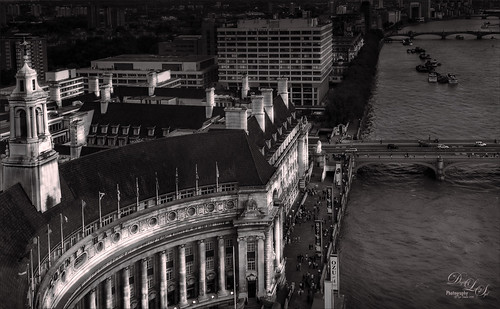
Vintage Roman Bath

Since I have been revisiting my old images from England and Scotland recently, here is one of my latest concoctions! Love how this image turned out very vintage and I can actually visualize being in the water per the Jane Austin book Persuasion description. I have to chuckle as there are at least 5 people in this image talking on their cell phones. Such for the real vintage effect! Anyway, The Roman Baths at Bath, England, are quite interesting to visit and definitely have a real vintage feel to them.
So the steps to getting this effect are pretty easy. First the Basic sliders in Lightroom along with some building straightening using the new Lens Correction Upright feature was applied. In Photoshop, the Background layer was duplicated and added a black layer mask added. Then just the water was painted back – the layer was set to 76% opacity and that was all – just softened the color a little. Next a Curves Adjustment Layer was added and the mask filled with black. This time the heavy building shadow in the water was painted back in white. The Curve was used to lighten the shadow to match the rest of the water’s color. (See my Using Curves Adjustment Layers to Get Rid of Shadows and Highlights blog for info on doing this or could use the How to Use a Selection to Draw Focus in an Image blog using Levels Adjustment Layers.) A stamped composite layer was created (CTRL+ALT+SHIFT+E) on top and duplicated. Next Topaz (see sidebar for website link) Black & White Effects was applied twice. First a Quad Tone preset I had created (see settings below) was applied, and then Topaz’s Classic preset. 2 Lil’s Owls (see sidebar for website link) Enchanted4-3 overlay (from the Texture Workshop Ebook Bundle) was added to give the beautiful linen-like texture to the image, and a Curves Adjustment Layer was used to add back a little contrast. That was it. Black & White Effects really gave this image the vintage feel – it is a great plug-in for this type of effect……Digital Lady Syd
SJ Quad DkB_Gr_Yel_Wh preset settings: Quad Tone: Color 1 Region: Color (R1/G1/B12) and set to 15.08, Color Region 2: Color (R63/G78/B85) and set to 143.9, Color Region 3: Color (R216/G211/B129) and set to 227.5, and Color Region 4: Color (R255/G254/B237) and set to 255.0: and Transparency: Overall Transparency 1.00.
Digital Lady Syd Related Blogs:
Lightroom 5′s New Upright Adjustment Feature
Quad Tones in Topaz Black and White Effects Plug-in
The Art Corner: Painting and Sculpture by Tassaert
Painting a Dragon

This was the head on a wood boat pulled up on the sand in front of the Rainbow Tower at the Hilton Waikoloa Village on Waikiki Beach in Oahu, Hawaii. Recently I did a blog called Can You Get a Painting Look With a Photoshop Action? Jack Davis Can! where his Wow Smart Object Painting1 Action was applied to several images. This image uses the same action to create a nice basic painting. A darken layer was added above to show emphasize the edges for the dragon from the background image (see my The Best Dodging and Burning Technique blog). At this point I thought it looked pretty good, but the background was competing with the dragon in color, so I decided it needed to be pulled back some. Topaz (see sidebar for website link) Black and White Effects was used to soften the background. Several of the presets created really interesting looks due to the canvas effect being applied in the action first. I settled on an old wedding preset I had created back in version 1. (If you are interested, here they are: Conversion – Basic Exposure: Contrast 0.04, Brightness 0.10, Boost Blacks 0.35, and Boost Whites 0.01; and Finishing Touches – Silver and Paper Tones: Tonal Strength 0.44, Balance 0.96, Silver Hue 5.81, Silver Tone Strength 0.85, Paper Hue 77.42, and Paper Tone Strength 0.38; Transparency – Overall Transparency 0.80. A white border was then created around edge using Right Edge Size 0.11/Edge Exposure -1.00/Edge Transition 0.09; Left Edge Size 0.14/-1.00/0.08; Top 0.20/-1.00/0.09; and Bottom 0.09/-1.00/0.16.) Back in Photoshop a New Layer was created and the Clone Stamp was used to even out the border just a little around the image. A Curves Adjustment Layer was added to add contrast to the dragon and further separate it from the background – then the layer mask was filled with black (CTRL+I in mask) and just the dragon was painted back in white to reveal it (see my Using Curves Adjustment Layers to Get Rid of Shadows and Highlights blog). The last step was to add a Hue/Saturation Adjustment Layer to further adjust the background saturation (Saturation was set to -41 in Master) – but this time the dragon was painted in black to hide adjustment on it. This really turned out how I remember this image……Digital Lady Syd
Digital Lady Syd Related Blogs:
Digital Lady Syd Reviews Topaz Black & White Effects 2.1
Digital Lady Syd’s Rule No. 10: Use What You Know!

Just thought I would remind everyone that you do not have to keep changing every workflow to incorporate that new technique into it. Sometimes it is better and faster to use what you know, especially if you are just doing a little processing of an image. That is exactly what I did on this image. I like this image of the Tower of London because you can a little boy peaking out at the sidewalk and the Thames River. There is also part of another little boy in the guard house. So much going on in London!
I really wanted to do a black and white, and it looked good with a slight sepia tone on it, but when I took this image into Topaz (see sidebar for website link) Black & White Effects 2, my Sunny preset brought out the colors the way I liked them. In Lightroom there was just the regular slider adjustments going on (see my How to Use Adobe Camera Raw (ACR) or Lightroom 4 Quickly blog) and the Upright Adjustment was also used to straighten the image out (see my Lightroom 5′s New Upright Adjustments Section blog). Once in Photoshop, I went into Black & White Effects and just applied my preset, that’s all – for all the settings for this preset, see my Sunny Preset for Topaz Black and White Effects blog. (This is one of my favorite presets for the program.) Did some clean up on a New Layer. Then created two New Layers, a Darken and a Lighten layer, set to Overlay for dodging and burning (see my The Best Dodging and Burning Technique! blog link). That was it.
As you can see, I really do use the techniques I present. Everything in this blog is what I normally look at when post-processing an image. Hope it gives you ideas on how to do your images too!…..Digital Lady Syd
Bleach Bypass Look on a Landscape Image

This may be the most beautiful and interesting library ever made. I posted a couple times on Flickr with other images (see Minsk Library, Inside Minsk Library, and Minsk Library at Night) but this time I decided to process the inside ceiling which is all glass – totally breathtaking! As you can see, I caught the eye of the guard down below, but he lends a wonderful scale to the image. I had a hard time deciding what to do with the image as the original was not that bad but I wanted to enhance the light and airy feel in the image. So I tried everything I could think of and this is what I got!
First applied Topaz (see sidebar for website link) DeNoise 5 – the image was shot at ISO 1600 so it had some issues. Used the Overall Strength set to .17 and set the Shadows to .82. The layer was copied and Topaz Detail 3 was applied using the Architectural Detail II preset – this image was perfect for this preset. Next Black & White Effects was applied where I mainly applied a regular black and white preset and started moving sliders. What I think really made the image pop was the application of the Creative Effects Diffusion effect where the Softness was set to 0.10, but the Diffusion slider was set high at .91 and Diffusion Transition set to 0.61. This really made the roof lines pop without being too sketchy looking. Then Kim Klassen’s Cloth & Paper Reign texture was applied and set to Soft Light blend mode to lighten the image and add some blue tones back into the image. It was duplicated and this time set to Multiply at 24% layer opacity. Next a Levels Adjustment Layer was added to lighten the image more by moving the Output Levels to 23/255 and the midtone slider to 1.39. Next a Curves Adjustment Layer was added to lighten it even, and a bit of a vignette was painted around the edges of the layer mask. It still did not look quite right – almost blown out. That is when I tried a Color Lookup Adjustment Layer and clipped (ALT+click between the layers) it to the top texture layer. The 3DLUT File was set to Bleach Bypass.look in the drop-down, although several look rather nice. The last step involved creating a composite (CTRL+ALT+SHIFT+E) on top and adding my SJ B&W Border Frame. I really like how the diffused settings made the ceiling lines look. Anyway, it was once again a lot of fun to experiment!…..Digital Lady Syd
A Fairytale Gazebo

As promised, here is a totally different rendition of the same image I posted earlier. (See Where Am I?) This was just plain fun to do. Below are the boring details – it actually took me along time and a lot of manipulating to get this result but I really love how it turned out. The soft diffused look really adds the fairytale quality to the image. Bottom line, just keep playing with an image and you can come up with some surprising results…..Digital Lady Syd
Basically I got the crazy pastel colors by applying Nik Viveza 2 (here are the settings which produced a rather green and pinkish layer: Brightness 86%, Contrast 100%, Saturation 86%, Structure 100%, Shadow Adjustments -100, Warmth -2%, Red 17%, Green -9%, Blue 22%, and Hue 39 degrees). Then Control Points were added in various areas to adjust tweak the color. A composite layer was created (CTRL+ALT+SHIFT+E) as the top layer. This layer was duplicated and Topaz (see sidebar for website link) photoFXlab was opened. What I listed in my Photoshop note attached to the image is in parentheses. (Duplicate layer. Plug-ins Tab was selected and Black & White Effects was opened. Used my SJ White Flower settings preset which has these settings: Basic Exposure – Contrast 0.16, Brightness -.04, Boost Blacks -.12, and Boost Whites .20; Adaptive Exposure – Adaptive Exposure 0.26, Regions 8, Protect Highlights .06, Protect Shadows .02, Detail 1.80, and Detail Boost .96; Color Sensitivity – Yellow .22, Green -.04, Cyan .01, and Blue .01; Quad Tone – Color Region 1 Black and slider at 0.00, Color Region 2 Red 23/Green 25/Blue 86 at 119.4, Color Region 3 Red 113/Green 150/Blue 170 at 187.8, and Color Region 4 White at 255.0; and Transparency 1.00. Diffusion section was checked and Softness was set to .75, Diffusion to .60, and Diffusion Transition to .50. Local Adjustments mask was set to Detail brush and the gazebo and columns were painted over. Then the B&W Effects plug-in was exited. Stamp From Stack button was pressed and in the Adjustments tab Dynamics slider was set to 29. Another From Stack button was created and from the Plug-ins Tab, Topaz Adjust 5 was opened where Painting Venice preset was applied with no changes. Once back in photoFXlab the Mask tab was opened and the effect was painted out once again from the gazebo and columns.) The changes were applied and the image was back in Photoshop. The yellows in the front bushes and trees was too bright, so a Image -> Adjustments -> Replace Color was selected using a light purple color. A Color Balance Adjustment Layer was clipped to the Replace Color layer and the purple colors were further enhanced. Next a brush was created to make purple to pink sparkles for the bushes and trees. (Brush settings were: Hard Round Brush – Size 20 px, Spacing 141, Shape Dynamics Size Jitter 25, Scattering 944%, and Color Dynamics Brightness Jitter 50%.) Used a light color (#917eb5) color and a darker color (#5e5098) of purple and painted around trees and bushes – then added a layer mask to remove from areas the lights got scattered over. A clean up layer was created to clean up some of the harsh that showed up in unexpected places. My SJ Snow1 Overlay was applied at 61% opacity. A composite layer was added on top and duplicated. The top layer was changed to Multiply. A layer mask was added and the cupola was painted back in white for emphasis. A Curves Adjustment Layer was added to add contrast to the cupola. The sky was selected and put on its own layer and converted to a bluish purple sky by clipping a light purple Color Fill Adjustment Layer to it. Next a Grunge Border line was applied around the image in a dark purple color.


