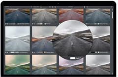
A Little OnOne Perfect Effects Vintage Look
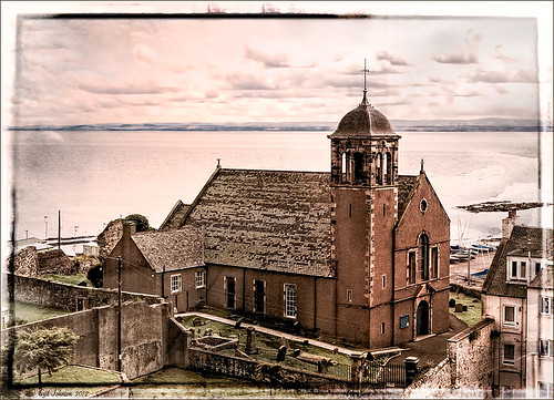
This beautiful Scottish Church was taken from a train going from Edinburgh to St. Andrews. This is a wonderful way to capture some of the countryside. I am surprised how sharp this image was since the train was moving – my settings using a 18-200mm Nikon lens were F/13, 1/200 sec, ISO 400 using a 45 mm lens. For post-processing, the first thing done was to create three Virtual Copies in Lightroom and set them at different exposure settings – one to about -2, one using the original, and one set to +1. This is a way to get an HDR look using a single image. The first two where then taken individually into Topaz DeNoise 5 (see sidebar for website link) and adjusted for noise issues. The +1 just used a little adjustment in Lightroom since the over-exposed image did not have a lot of noise. All three images were then selected in Lightroom and right-clicked to get menu – Open In -> Merge to HDR in Photoshop. That is how the bottom layer was created. Next by applying OnOne Perfect Effects (see sidebar for website link), the image took on a great look. This plug-in can do interesting things to images – usually when I just can’t put my finger on what I need for a photo, Perfect Effects has a solution. This image uses these filters presets stacked: Black and White->Warm Gray with colors swapped in Effects Options, Detail->Texture Booster, and Borders->Russell with Scale set to 4 in Effect Options. Back in Photoshop Nik’s Viveza 2 was applied to add a little soft color in the sky, sharpen the cupola, and add a little brightness to the front of the church. Then Topaz DeNoise 5 was applied one more time to get rid of some noise created by the plug-in application – this time it was targeted to the sky and water using an Overall Strength setting of .11, and for the lighter areas, Adjust Highlights set to .28. Recover Detail was set to .30 and Reduced Blur to .13. This sounds like it was a lot of effort, but it really was very quick to apply. The hardest part was adjusting the noise in the three virtual copies in Lightroom. …..Digital Lady Syd
Digital Lady Syd Related Blogs:
Can a Pseudo HDR Image be as Good as the Real Thing? (Part One)
Can a Pseudo HDR Image be as Good as the Real Thing? (Part Two)
A Little Hollywood for My Butterfly Model
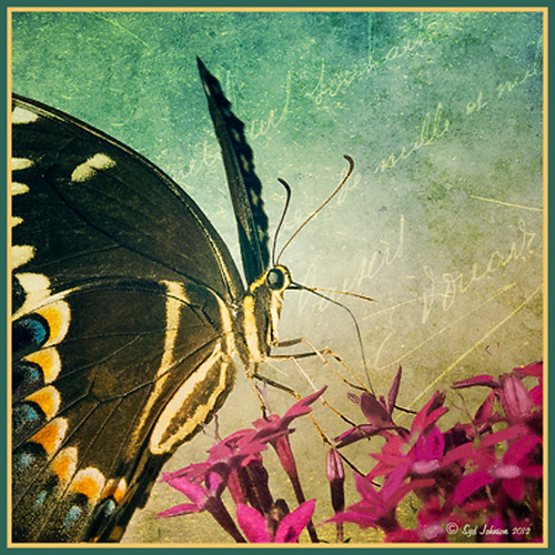
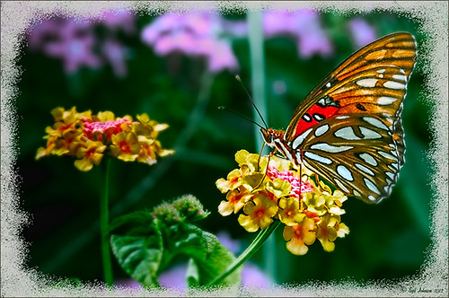
If you have ever tried Kelby Training, then you know how good it is. I just finished a short video class on Quick Composite From Photo to Finish by Calvin Hollywood, a wonderful Photoshop guru from Germany. He was shooting a lovely model but I like my lovely model above more. She spent quite a long time flitting around me and my bright pink penta flowers posing along the way. (She is using her proboscis to feed by sucking out the fluid of the flower, not unlike the trunk of an elephant.) I did a previous blog called Butterfly Beauty! a while back, where several different textures were applied. Also Mike Hardisty Photography recently posted a pretty white butterfly in his blog.
Calvin’s sharpening technique was used to sharpen the butterfly and it did do an amazing job! See Scott Kelby’s Guest Blog featuring Calvin with a short video on creating Freaky Amazing Details. An action for this can be downloaded here. His vignette technique was also used to spotlight my model and a couple of his color manipulation tricks were used to add some artistic flair. Overall, Calvin had a very good tutorial. The textures used in this image were ShadowHouse Creations Mixed Bag 2 set to Darker Color blend mode and Scratch Box 4 set to Overlay blend mode. The beautiful French writing in the background is French Kiss’s Script brushes that are for sale very inexpensively. ….Digital Lady Syd
Digital Lady Syd Related Blogs:
Spotlight Effect With the New Subtract Blend Mode
Loving SeaWorld!
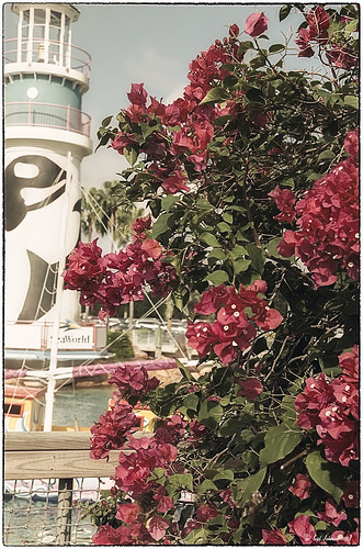
Just a great start to a fun day at SeaWorld-Orlando. This is what you see right after entering the theme park. The lovely red flowers are red Bougainvilleas. In Lightroom three images were used in PhotoMatix’s Merge to 32-bit HDR program. Then the resulting TIFF image also was processed in Lightroom 4.2 before it was opened up in Photoshop CS6. Nik Color Efex Pro 4 plug-in was applied stacking these filters: Film Efex: Vintage using Film Type 4, Glamour Glow, Midnight using an overall Opacity of 40%, and Image Border Type 4. A Curves Adjustment Layer was added to adjust contrast and the Sharpen Tool was used on the blooms. I really love the lighthouse with the whale image……Digital Lady Syd
Digital Lady Syd Related Blogs:
Digital Lady Syd Reviews Topaz DeNoise 5
Orange Flower Fun!
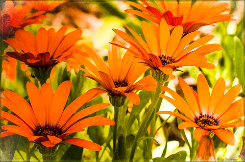
Just felt like posting a pretty autumn looking flower – these are called Orange Spark Symphony (Osteospermum hybrid) which are also called Mimosa Sunset – very confusing and very unusual! Topaz (see sidebar for website link) Adjust 5 was used with the Retro IV preset applied. ShadowHouse Creations OldPhoto2 texture was used and set to Soft Light Blend Mode. That is it! I love these daisies!…..Digital Lady Syd
Digital Lady Syd’s Related Blogs:
Digital Lady Syd’s Review of Topaz Adjust 5!
Cafe Alcazar and Vintage Topaz Adjust
Trying Out Some New Techniques!

Just thought I would try out a couple new tricks. The image was a JPG shot with my little point-and-shoot Kodak camera at Flagler Beach on a beautiful early evening. A short Lightroom video called True Grit by Michael Rather was followed to create a nice gritty effect preset. I tried it on this landscape image (he used an image of a boy’s face) and really liked the effect. Next Topaz released Simplify 4 (see sidebar for website link) so I applied this plug-in to the photo in Photoshop. This is a free upgrade for anyone that has the bundle or has bought the Simpify plug-in previously. Lots of fun here. This was basically just playing around with the settings to get to know the program and getting a nice look. In Photoshop a Hue/Saturation Adjustment Layer was added where the Red Hue slider was moved so it was not so bright. I also added a layer mask to the Simplify layer and painted back in just a little of the white wave detail using a soft, low opacity black brush in the mask. The last step is my Black and White Layer Style. …..Digital Lady Syd
Digital Lady Syd Related Blogs:
Using Topaz Simplify for That Artistic Feel!
Blue Flowers and Layer Style Frame
I Didn’t Know That! Converting Lightroom Preset to Adobe Camera Raw Preset
Digital Lady Syd’s Rule No. 8: Get Textures From Objects Inside Your Home!
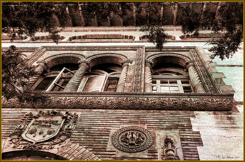
This image is of the area above an entryway onto a courtyard at Flagler College (it actually was the ladies entryway to the courtyard at the old Ponce de Leon Hotel) in St. Augustine, Florida. In Photoshop I added a texture created from a shot of the corner of a large oil painting of a beautiful white cat in my living room to use on this image. (It can be downloaded here.) It is medium gray with lots of paint stroke texture that I find I am using quite often. Try going around your home to see if you have some interesting textures that could spice up an image. I took some of the lace in my dining room curtains and even my living room couch material. The kitchen countertop also made a nice dark texture.
The bricks throughout the college are colored that beautiful brick red-orange tone. This image definitely needed to be put into a sepia tone to see the detail so it was converted into black and white using Nik’s Silver Efex Pro 2 and the High Structure (Harsh) preset used as a starting point. Back in Photoshop my Cat Painting Canvas texture was applied and the layer set to Color Burn blend mode at 50% opacity. Next a Hue/Saturation Adjustment Layer was added and clipped to the texture (CTRL+Click between the layers to do this) so changes only apply to the texture and not the whole image. Colorize was checked and the Saturation set to 10 which gave a little more of a deep red sepia feel. Next a New Layer was added on top and Nakatoni’s Amazing Texture 2 brush (does not appear to be available anymore but any smooth grunge brush would do) was selected to paint with a dark brown color sampled from the image. By filling this layer with grungy strokes, and then setting the layer to Subtract blend mode at 90% opacity, the bluish almost duotone feel was created and also more texture was added. By double-clicking on the middle of the layer, the Layer Style dialog was opened and the Blend If Gray – This Layer white tab was split (ALT+click and drag to get a smooth transition) and set to 56/89 and the Blend If Red – This Layer white tab was split and set to 91/211 that really changed the red tone. It surprised me how nice it looked! A Curves Adjustment Layer was applied to add a little more blue by adjusting the Blue channel curve. A composite (CTRL+ALT+SHIFT+E) was created on top, and my Thin Double Edge Frame layer style was used (can download here), keeping the default colors. Once again, this produced a totally different image and I created the textures myself very quickly and inexpensively! Have fun exploring!…..Digital Lady Syd
Topaz DeNoise 5 and InstaTone
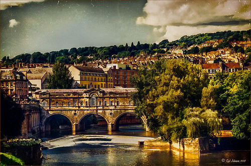
This image had an ISO of 2500 – that is really high for me but I actually took this shot from a moving tour bus – it is the Pulteney Bridge over the Avon River near Bath in England. The basic workflow involved running Topaz (see sidebar for website link) DeNoise first – must be sure that the Sharpening and Noise Reduction sliders are set to 0 in Lightroom or Adobe Camera Raw so you are not applying noise correction twice. I usually apply DeNoise on it’s own layer – that way it can be selectively removed if it is too soft in some places. The Overall Strength was set to 17. Topaz cautions about overdoing this or it will lose detail and edges will be soft. The Detail Recovery slider was set to 19. That was all that was needed. In Topaz photoFXlab, the new plug-in interface, the InstaTone tab was selected and the tones from a 500 px image called Nobody by shachar levcovich turned this image into an old English look. Topaz Simplify 4 was added and my BuzSim Modified preset was applied – this is one I had created in Simplify 3 but I still love it. (Selected BuzSim and changed: Simplify panel – Simplify Size to .15, and Edges panel: Edge Type Color Edge Fine and Edge Strength to 1.50.) Back in Photoshop a vignette was added to focus on the bridge and ShadowHouse Creations Scratch Overlay Texture set to Overlay with the center painted out in black in the layer mask so the texture basically frames the image. Now I have a beautiful vintage feel but not overly painterly. I can imagine the beautiful bridge looking like this a long time ago. Beautiful place!…..Digital Lady Syd
Digital Lady Syd Related Blogs:
Digital Lady Syd Reviews Topaz DeNoise 5
InstaTone in photoFXlabs – Great Fun and Great Results!
Digital Lady Syd’s Review of Topaz photoFXlab v1.1
Digital Lady Syd Reviews Topaz Simplify 4

