
Surprising Results with Nik Analog Efex Pro

I really love how the light was playing through these beautiful huge philodendron leaves – bright sunlight was shining on them near a pond at the Ormond Memorial Art Museum and Gardens in Ormond Beach, Florida. By applying Nik’s new Analog Efex Pro Photoshop plug-in to the image, I was able to make the background slightly blurred while maintaining the striking light on the leaves. I really like this plug-in as it can be used without getting too much of that vintage effect on the image but yet you can still use some of the tools that can really localize an effect in an image. I think what really added to the image is that there are some unusual patterns in the leaves the misty water effect is interesting. Anyway, turned out to be a surprise which is what is so much fun about Photoshop and all the plug-ins available for it!…..Digital Lady Syd
Rural Church in Belarus

Just another pretty picture of a church in the Belarusian countryside. I wish we had stopped so I could set up the picture, but the trees are so pretty it does not seem to matter that the church is partially hidden from view. Once again in Lightroom I started with a Trey Radcliff preset – this time I used . In Photoshop Nik’s Analog Efex Pro was applied – it really lightened up the image. Therefore a Curves Adjustment Layer was added above the plug-in layer to add back just a little bit more contrast. That was it! I really like what the Nik plug-in does on images – it takes a while to work with the settings, but once you figure them out, it can add interesting and beautiful effects…..Digital Lady Syd
Mossy Turtle

This turtle is carrying a lot of moss on his shell – didn’t realize this until I downloaded the image. Really funny looking but he does not seem to mind and the little fish seem to think it is cool! This image was taken during the brightest part of the day in a pond at Ormond Memorial Art Museum and Gardens in Ormond Beach, FL. Used a little split toning in Lightroom on this image, then in Photoshop added some sharpening using Topaz (see sidebar for website link) Detail 3. Filled a layer mask with black and painted the sharpening back in the mask just were I wanted it. Added a Brightness/Contrast Adjustment Layer with no changes but set to Soft Light at 45% layer opacity to brighten the image a little. (See my How to Use an Adjustment Layer to Localize Light and/or Dark in Image blog for more info on this.) I actually revised this image as I downloaded some really nice Nik Color Efex Pro presets from Flypaper Textures – ended using one of my own recipes but I really liked some of the results with the other presets. My preset used the Pro Contrast filter and Balance/Warmth filter to warm of the image just a little more. The last step was to add my SJ Thin Double Edge Frame to the image.
Let’s Hear It for the Graphophone

This image of a Columbia Grand Graphophone built in 1901 in France was taken at the Lightner Museum in St. Augustine, Florida. Really catches you eye when at the museum. Sears was selling it for $50.00 – it used 5-inch cylinder records and could also be used as a recorder. Apparently it came with different horns depending upon what you were doing. Just had fun playing with this image. In Lightroom the basic sliders were adjusted and some pretty crazy spit toning applied where a really pink tone was created. In Photoshop applied Topaz (see sidebar for website link) ReStyle’s Cream and Plum preset (only changes were to Black Level -0.22, Midtones 0.11, and White Level -0.73; and Detail Structure 0.44 and Sharpness 0.75). A Levels Adjustment Layer was added and all the tabs were adjusted (Black 3/Midtone 0.70/White 196) which created quite a bit of clipping in the image. It seemed to help with the reflections of glass. A little clean up and that was it. I love working on the old items – the materials and color are so nice……Digital Lady Syd
Keeping Time

Just loved how this image turned out. I liked the fact that the dining room was light and bright and slightly out-of-focus and the clock and plant looked pretty nice when put together. The little philodendron was rooted from a clipping of a plant I have had 20 years – amazing! The original image was processed in Lightroom using just the Basic Sliders and Dave Delnea’s Backlight Vertical Right preset. Once opened in Photoshop Topaz (see sidebar for website link) Detail 3’s Shadow Relief III preset was applied to sharpen up the image little. Nik’s Analog Efex Pro‘s plug-in was applied – it is turning into one of my very favorite plug-ins! Basic Adjustments, Bokeh, Light Leaks, Dirt & Scratches, Lens Vignette, Film Type, Frames, and Level & Curves tabs were used. I have created a favorite look preset and just keep modifying it – I think that is the easiest way to use this plug-in. A Curves Adjustment Layer was added to increase contrast and that was it. This is just too much fun to do!…..Digital Lady Syd
Digital Lady Syd Related Blogs:
Digital Lady Syd Reviews Nik Analog Efex Pro
Using Nik’s Analog Efex Pro on a Historic Statue
Using Nik’s Analog Efex Pro on a Historic Statue
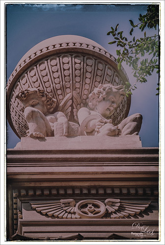
I really like what Nik’s Analog Efex Pro plug-in does for statues and historic images. At first I did not like this image of the Gordon Monument in Wright Square in Savannah, but since it had that historic look to it, it seemed like a great fit with this new plug-in. Sure enough, it really created a beautiful image and has a feel to it that suits the image. I believe I used the Vintage Camera 4 preset as a starting point, but changed everything up so it is really hard to tell. I always start with the Basic Adjustments tab. Light Leaks was changed (third down, second over) and the Strength set to 67% – the On Image Control was moved towards the bottom. In Lens Vignette the control was set on the figures and the size and amount adjusted. The Film Type was Subtle (second down, first one) and the fading was increased.I changed the Frame – really liked this one in Whites (third row, second over). Back in Photoshop I did add a Curves Adjustment Layer just to pop the colors a little more. I find it a rather charming picture! See my Fun Photoshop Blog Digital Lady Syd Reviews Nik Analog Efex Pro for more information on this new plug-in from Nik. Personally, I love it!…..Digital Lady Syd
Happy Veterans Day!

Happy Veterans Day to all who served! While visiting Savannah, Georgia, recently, I was impressed by how patriotic the city is – US flags were everywhere. I found this image to be quite pretty on a beautiful Sunday morning! In Lightroom the NAPP preset called Hang Ten (the preset is referenced in Scott Kelby’s The Adobe Photoshop Lightroom 5 Book for Digital Photographers) and Dave Delnea’s Backlight 002 Vertical preset (which creates the beautiful lighting effect) were applied along with the basic sliders. This image used Topaz (see right side for website link) Simplify and Alien Skin’s Snap Art 3 in Photoshop. A couple Curves Adjustment Layers were used, one for targeting the flag and the other creating a light vignette effect…..Digital Lady Syd
A Day in the Sun!

I love how this image turned out! This is from a wonderful day in Savannah, Georgia, at the Gulfstream Family Day in October. I wanted to go up in that Ferris Wheel, but did not get a chance to. I used a Lightroom preset on this image called Hang Ten from NAPP (the preset is referenced in Scott Kelby’s The Adobe Photoshop Lightroom 5 Book for Digital Photographers) – gives a real soft vintage feel and then Backlight Horizontal Left from Dave Delnea’s presets, some of my very favorites! In Photoshop two of my favorite plug-ins were used: Alien Skin’s Snap Art 3 was applied using just the Factory Default and adding three layers to bring in some more details; next Topaz (see sidebar for website link) ReStyle was applied using Silver and Ivory Cloak preset and then changing: Texture Strength -100; Temperature 0.14, Saturation 0.05, Black Level 0.38, Midtones 0.06, White Level 0.19, and Structure 0.27. A Curves Adjustment Layer and Levels Adjustment Layer were added to get the contrast just right. That was it – very simple. It really has that old County Fair feel to it!…..Digital Lady Syd
Just a Spot of Color in a B&W to Pop an Image!

Really loved this image taken during the brightest time of day on the Intracoastal Water Way (aka Halafax River) in Ormond Beach – shooting towards Daytona Beach. In Lightroom I did just the basic slider adjustments and removed a little Noise and fringing before opening in Photoshop. Some clean up in the left corner was done to get rid of some out-of-focus greenery and a couple dots on the roof were removed. On a stamped layer (CTRL+ALT+SHIFT+E) that was converted to a Smart Object, Nik’s Silver Efex Pro 2 was opened and the Film Noire 1 preset was applied. The Color Filter was changed to Green. A Control Point was set on the Roof and the Selective Color slider was adjusted to bring back just a hint of the orange color back into the photo. Another Control point was added to the bridge and building in the background to define the lines just a little – they were pretty soft looking in the original. Once in Photoshop again, a Curves Adjustment Layer was added to give an over-exposed look to the water. The Hand Tool in the upper left of the Curves Panel was dragged up on the water in the image to get the look. That is all that was done to get this look. – I really liked how it turned out.
Who’s Watching Who?

Got inspired recently after attending my first Photography Club of Flagler County meeting. They had a wonderful guest presenter, Joe Campanellie, who is a portrait and nature and wildlife photographer. His business is called Campanellie’s Portraits of Palm Coast, Florida – check out the icon under his Home button to see some of the beautiful wildlife images he has created. His eagle images are incredible!
The presentation got me thinking about wildlife photography so I decided to process one of my older images from the St. Augustine Alligator Farm. (Here are a couple links from my Flickr site showing a few more of my images: Snowy Egret Chicks, Cattle Egret, and The Birds of the Rookery.) This egret above was cropped in Lightroom to get the head shot. In Photoshop I added a Curves Adjustment Layer to get rid of some shadows on his face I did not like. (See my Using Curves Adjustment Layers to Get Rid of Shadows and Highlights blog for more info on this.) Nik Viveza 2 was used to soften the background a little and sharpen his face. Then Alien Skin’s Snap Art 3 was applied to give a little different effect to this image. The Oil Paint (dry brush) preset was applied with three layers – one to sharpen the face, one for the hair, and one to darken some of the bright highlights in the background. Another Curves Adjustment Layer was added to give a warmer feel to the image. Topaz (see sidebar for website link) Detail 3’s Micro Contrast II preset was applied to just sharpen the eyes and some of the feathers. A dark Inner Glow Layer Style was added. Since the image was very small due to the large crop, the image was taken into Perfect Resize (see sidebar for website link) and set to 200%. This program does a great job increasing image size without losing quality of the image. I am now wishing I had gotten back to the Alligator Farm this year – great place to watch the birds!….Digital Lady Syd
Digital Lady Syd Related Blog:
Making An Ordinary Image Your Own
Calendar Template for 2012
Feeling Like a Walk on the Island

Really loved how this image turned out – this is what the Bahamas (Great Guana Cay in this case) looked like to me when just walking around on some of the more deserted areas of the islands. This image was not that great to begin with, even with adjustments in Lightroom, but by adding Alien Skin’s Snap Art 3 Photoshop plug-in, it turned into a nice painterly effect. The Factory default preset was applied – I find I like it on many of my images. Using two layers in the plug-in, the focal point at the end of the path was painted with a more photorealistic slider detail and a few items in the foreground were slightly blurred. To finish up I used my free SJ Painter Oil Frame and painted around the edges with Fay Sirkis’s Mixer Brushes (used her Palette Knife Tap n Blend brush and Signature Palette Blender brush – brushes can be downloaded from her Four Seasons painting on-line training classes on NAPP – I think her brushes are the best out there!) to smooth the framing into the image a little more realistically. That was all that I did, but I think I might print this one for my wall……Digital Lady Syd
Soft Painterly Effect

This pretty Red Chinese Hibiscus Flower was basking in the sun one morning when I decided to snap it. This was a very simple image to post-process – just used Alien Skin’s Snap Art 3 and the Factory Default – no changes. A Color Balance Adjustment Layer was added to get the color right – only the Yellow to Blue slider was adjusted in all three Tone areas. A Curves Adjustment Layer was used to adjust a little shadow tone. The Frame is one that I created following one of Dave Cross’s Kelby Training Photoshop CS5 Finishing Touches for Photographers videos. That was it! Very simple, but very pretty!…..Digital Lady Syd
Mushroom to “Mission Control”

Recently a few Meadow Mushrooms grew to a large size very quickly in my yard. (Here’s is another mushroom image I took.) They actually were quite pretty, especially when the morning dew was on them. It really reminded me of a strange moon’s terrestrial surface. This image used very little processing to get this final look. In Lightroom the most important step was the crop to bring in all the interesting dew drops – the image was cropped quite drastically! The White Balance was adjusted and it was opened in Photoshop. Next Nik’s Viveza 2 was selected from the Filters list and three control points were placed to emphasize the structure of the larger drops and also to brighten up the center of the mushroom. Back in Photoshop a Curves Adjustment Layer was added on top and a couple points added to the curve to get the contrast needed. The last step involved adding a Stroke Layer Style – used the Fill Type Gradient set to an angle of -60 degrees and Photoshop’s Rainforest gradient. The Size was set to 21 pixels. That was all the processing done. Love the results! (I guess it is a good thing that I like own work – LOL)…..Digital Lady Syd
Never Thought I Would Use a Wax Crayon Effect!
 |
Yep, this image was processed using the wax crayon brush in Snap Art 3. I totally love the vintage feel to this image. I am adding the Lightroom image as brought into Photoshop so you can see the difference – just click on the image. I really liked the before image as it was processed using one of my favorite presets, GA B&W Infrared 01 preset which gave it a little bit of a blown out look. Jack Davis’s Bluish Split Toning preset was applied after this (the presets use different settings so both can be applied – Jack’s preset can be downloaded from his Facebook Freebies section and selecting his Lightroom Wow 4 Presets.) White rounded corners were created in the Post-Crop Vignetting section using Style: Highlight Priority, Amount +100, Midpoint 32, Roundness -93 and Feather 0. Once in Photoshop the background layer was duplicated and made into a Smart Object. Alien Skin’s Snap Art 3 was opened and the Pastel (sketch) preset was selected. Three layers were used to adjust the parameters for the Wax Crayon I was using on the image – just basically played around with the settings until I liked them. Since it is a Smart Object, I can always go back and change anything I don’t like. Next 2 Lil’ Owls Studio Color Bokeh Grunge (see sidebar for website link) Sweetness overlay was added using the Subtract blend mode at 58% layer opacity. Curves, Levels and Hue/Sat Adjustment Layers were added to add more contrast and color into the image. The last step used Nik Viveza 2 with a control point on the front of the building to draw attention to this area. That was it – I really like the final result! Not at all what I had in mind, but love it just the same!…..Digital Lady Syd
Digital Lady Syd Related Blogs:
Digital Lady Syd Reviews Alien Skin Snap Art 3
Get Great Results with Alien Skin Snap Art 3 and Topaz ReStyle Together!!
Snap Art and Simplify – Now That’s Painterly!
Snap Art and Simplify – Now That’s Painterly!

Just a pretty tulip that cannot decide if it wants to be open or closed. (This link shows some of these beauties in their glory!) This image was converted to a Smart Object and taken into Alien Skin Snap Art 3 and the Oil Paint (dry brush) preset was applied with some adjustments. A stamped layer (CTRL+ALT+SHIFT+E) was created on top and the layer was opened up in Topaz (see sidebar for website link) Simplify 4 and the Oil Painting Toned IV preset applied. Back in Photoshop a black layer mask was added (ALT+click on layer mask icon to make it black), and just the forward leaves were painted back to add the Simplify filter effect. A Curves Adjustment Layer was added to increase contrast and my SJ Painter Oil Frame was added to give it a canvas feel. You can CTRL+T the frame to get just the amount of brushed effect to add. That was it. Fun to do!…..Digital Lady Syd
Butterfly Season is Here!

The butterflies are going crazy around my house this week! They love all the penta flowers and Bottle Brush bushes I have. This beautiful little Monarch was very busy totally enjoying all the different flowers to try out – there was some sharing going on with a huge beautiful Swallowtail butterfly and several varieties of bees! Very busy place today. This image used Matt Kloskowski’s That 70’s Look preset (in NAPP Lightroom presets – not sure when I got these) in Lightroom, which gave a very pretty look. But I decided to go into Topaz (see sidebar for website link) ReStyle just to see what would happen. I had created a preset on a Scottish image done earlier that worked very nicely. Got a little more of a colorful result. Nik Viveza 2 plug-in was then added on another layer and some of the color was adjusted using a few control points. A Curves Adjustment Layer was added on top for contrast. The text is a really old font called Abigail. That was it and I really liked the results…..Digital Lady Syd
Just a Simple Picture?????

This image definitely uses the colors I just love! Took a red spica and turned it into this gorgeous pink and turquoise rendition. What I did! Just regular Lightroom slider tone work before going into Photoshop. The image needed to be widened so the Canvas was extended on the left side to make room for the objects and text. Topaz (see sidebar for website link) Detail 3 was added using little medium detail and large detail settings and the Dark Foliage tone preset from drop-down in that section. I decided to select the spica using a layer mask and then applied it to make it an object. It needed Topaz DeNoise 5, so it was applied with just an Overall Strength setting set to 0.29. Topaz Simplify was added using the Oil Paint II preset. Then French Kiss Collections Tableaux Mirage texture was placed underneath the single spica object as a background texture and left at Normal at 100% opacity. A Hue/Saturation Adjustment Layer was placed above the texture and set Master to Hue -14, Saturation +48 and Lightness -22. At this point I did not realize I was going with the bluish color palette – I thought I was using the orange and yellow colors. I did a little clean up on the spica and then added a New Layer and added Diamond Head volcano as an object. Added some reddish clouds on a New Layer using my Clouds 5 brush at 54% and added an Inner Shadow, Color Overlay and Drop Shadow to them in brown and pink colors. Next French Kiss Collections Studio 3 White Wash texture (probably my most used texture) was set to Overlay blend mode at 100% opacity. Still had a brilliant yellow background so a Hue/Saturation Adjustment Layer was added on top. The Master was chosen and set to Hue +100, Saturation -35, and Lightness +22. Now I had this beautiful blue and turquoise color that really calmed the image down. On top of that a Photo Filter Adjustment Layer was added and set to Warming Filter 81 and Density 25%. Text was added using the Angelic War font and two layer styles added to it – Outer Glow and Drop Shadow. Next an overlay was added using 2 Lil’ Owls The Artisan Collection Big Set (see sidebar for website link) 2-2 texture. To turn textures into overlays check out my How to Create an Overlay Out of a Texture blog. Added a Layer Style by clicking on the FX at the bottom and moved the Underlying Layer black tab to 117/200 (this gives priority to the shadows of the underlying layer instead of the top one). See my How to Use Those Handy Blend-If Sliders! blog for more on this. Finally a Color Fill Adjustment Layer was clipped to the texture-overlay (ALT+click between the layers) and changed to a sampled color from the spica. Now I am done. Whew! Unfortunately this is how my brain works sometimes, but I really love the final result. I think it looks very Hawaiian and I could see this image on my wall!…..Digital Lady Syd
Topaz ReStyle on a Black and White Image

I totally loved how this image turned out. Once again this is the Intracoastal Waterway (ICW) looking back at the Granada Bridge in Ormond Beach, Florida. I had originally did just a black and white image using Nik’s Silver Efex Pro 2 using the High Key 2 preset as a starting point and then changed several sliders – brought the orange roof back on little shop. I just could not get the effect I liked. Then I took the image into Topaz (see sidebar for website link) new ReStyle plug-in and voila! – the totally different feel using the Orange Peel preset. (These are the changes made in the plug-in after applying the preset: Set Texture to -1.00, ReStyle Opacity 77%, and Hard Light Blend Mode; and Tint set to -0.16, Structure -1.00, and Detail -1.00.) This image now has a totally different feel with a color scheme I would never have considered. Check out this plug-in if you want something to give you image a real pop!…..Digital Lady Syd
Digital Lady Syd Related Blogs:
Digital Lady Syd Reviews Topaz ReStyle
Using a Natural Texture for an Image

This little Hognose Snake fell out of a Palm Tree frond after my tree was trimmed recently and ended up on my porch. I love the natural texture of the stucco of the wall – this is the easiest way to apply a texture! This little guy was first processed in Topaz (see sidebar for website link) Clarity using the Natural Boost III preset. Then on a duplicate image, Nik Viveza 2 was used to sharpen his body and accentuate his face. There also is a rather ugly looking spider near the bend of his body that was also sharpened. The last step applied Kim Klassen’s Cloth & Paper Touch Texture that was turned into an overlay frame and set to Linear Dodge blend Mode at 61% layer opacity. (See my How to Create an Overlay Out of a Texture blog link.) A Layer Mask was added to paint out areas over the snake to make sure he was clear of texture from the overlay framing. Loved how this image turned out!…..Digital Lady Syd
Viveza 2 Does It Again!

This huge Barking Treefrog got thrown out of a Palm Tree frond that was being trimmed and ended up in my Cardboard Palm. The blooming plant in upper right is a Queen Emma Lily Crinum . The lawn guys said he was the biggest frog they had seen in Florida (he was at least 4 inches long). Anyway, the frong was gorgeous and very calm and let me take his photo. This image was processed a lot in Lightroom using a Jack Davis Bluish Split Toning preset. The frog was sharpened slightly using the Adjustment Brush. A Radial Gradient was added to darken down the outside edge and give a slight vignette. It was taken into Photoshop and a New Layer was created to clean up the leaves with the Spot Healing Tool. A Curves Adjustment Layer was added to add some tone to the image. The layer was duplicated and converted to a Smart Object. My favorite filter was applied – Nik Viveza 2 – to add highlights to the frog and the plant by adding control points to these areas. This really gave the image the final look it needed. In this case Viveza 2 really popped this image!…..Digital Lady Syd
Who’s Hiding in the Cabbage Patch?

Just a quick blog on this little guy who looks so much like a wonderful cat I had many years ago named Bobbin. He lives in Belarus, apparently at a cabbage patch. Very simple processing here. Initial processing was done in Lightroom. Some spot removal and clean up on a little bit of the image was done next in Photoshop. Then Topaz (see sidebar for website link) Detail 3 was used just to sharpen the cat’s face. To really enhance the eyes, a New Layer was added and the Sharpen Tool was used – 20% Strength and Sample All Layers checked. The last step involved adding a lovely Isabelle Lafrance Diaphanous Overlay called Ethereal. A Color Fill Adjustment was clipped (ALT+Click between the layers) to change to color to a dark blue. The Overlay layer was set to Multiply blend mode at 79% opacity. Another New Layer was added and the dark color was sampled – then the edges were painted darker to draw more focus on the cat and to get rid of a few extraneous items. I loved the way it turned out – wish I could have brought the cat home with me!…..Digital Lady Syd
Digital Lady Syd Related Blogs:
Using a Color Fill Adjustment Layer as a Spotlight
Keeping Focus Where You Want It Using Focal Point 2 and Color Fill Adjustment Layer
Spotlight Effect With the New Subtract Blend Mode
Image Saved With Shake Reduction Filter

Since horse images seem to be all the rage, I decided to post another one taken in Belarus at the Old Village of Ayaymku. This gal looks pretty scared as she was just caught after going for a romp around the place. See another image of the Horse I took on Flickr. If you like horse stories, you should check Shanna Rae’s (of Florabella Collection) personal blog called Velvet Willow – beautiful story and images of her horses.
In Lightroom the preset called GA B&W Infrared 01 was applied before bringing it into Photoshop. Since I wanted to try out the new Shake Reduction Filter in Photoshop CC, this filter was applied first. Wow – totally saved this image. It was soft and just a little off. Just one sample spot in a bad area and it was cleared up pretty nicely. Then just some clean up and eye sharpening using the Sharpen Tool was used. The last step added the Blending Frame from Tim in Ohio texture set to Linear Dodge at 100% layer opacity. That was all that was done. I think the black and white treatment really enhanced the mood of this image……Digital Lady Syd
NIK HDR Pro 2 and Topaz Clarity Together?

Just thought I would add a photo I took several years ago in the countryside of Belarus outside of Minsk. It was a good image to begin with so it was pretty hard to mess it up, but this time I tried something I had not done before. First I processed this image quite a bit in Lightroom – doing the basic sliders and then sharpening up the road and the foreground plants a little. Then once in Photoshop, I applied Nik’s HDR Pro 2 using the Deep 1 preset – no changes. I wondered how Topaz (see sidebar for website link) Clarity would stack up against the HDR program, so I duplicated the image and added Clarity. A preset I had created called Very Vivid Sharp was selected. (Settings if you want them are as follows: Clarity: Dynamics – Micro Contrast 0.84, Low Contrast 0.56, Medium Contrast -0.31, and High Contrast -0.09; Tone Level – all set to 0; and HSL Filter: Hue – no changes; Sat – Red 0.25, Orange 0.13, Yellow, Green, Aqua, Purple and Magenta all 0, Blue 0.06, and Overall 0.17; and Lum – Red -0.81, Orange -0.01, Yellow 0, Green -0.08, Aqua 0, Blue 0.23, Purple 0, Magenta 0.33, and Overall -0.12) Wow – it really popped the image! So now what to do, what to do?
I decided to move the Clarity layer on top and add a black layer mask. Then I selectively painted back areas that needed the extra boost that Clarity added. The results are quite spectacular I believe. Next time you get stuck, try applying a couple different filters to the original image – even ones that do not come together – and stack and mask them to get the best of both. The results can be quite incredible!…..Digital Lady Syd
Digital Lady Syd Related Blogs:
More Clarity on Topaz Clarity
Digital Lady Syd Reviews Topaz Clarity
Digital Lady Syd Reviews Nik HDR Efex Pro 2
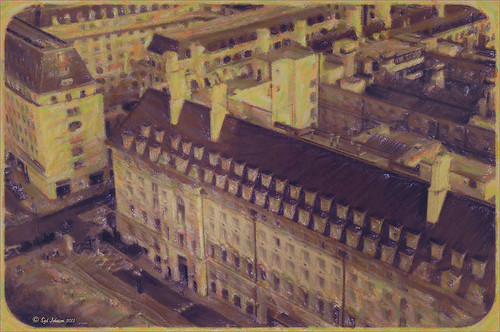
Make an Ordinary Image Interesting

This image was one I did not think I would ever use. but once I was able to straighten it correctly in Lightroom with the Lens Correction Upright feature, it started looking pretty nice. So here is the Parliament building and the Thames River. The reason I love this image is the beautiful sky and the way it points to the building towers. After processing in Lightroom, a couple things really contributed to this interesting look. The Background layer was duplicated and then Nik’s HDR Pro 2 was opened (this was not an HDR image) and my favorite preset, Grannys Attic, was applied – no changes. Next the layer was duplicated and Nik’s Silver Efex Pro 2 was opened up in a Smart Object to save the settings. I am not sure which preset I used as a starting point but these are the settings I ended up with (Global Adjustments: Brightness 7%, Highlights -32%, Midtones 11%, Shadows 9%, and Dynamic Brightness 25%; Contrast 15%, Amplify Whites 0%, Amplify Blacks 0%, and Soft Contrast 8%; Structure 10%, Highlights -58%, Midtones 8%, Shadows 53%, and Fine Structure 62%; Selective Adjustments: 6 Control Points were added to add the color back in certain areas; Color Filter: Hue 43 degrees and Strength 114%; Film Types: Custom, Grain – Grain per pixel 500 and Soft to Hard center; Levels and Curves: Just a little contrast with curve lifted up; and Finishing Adjustments Toning was set to 3, Strength 59%, Silver Hue 215 degrees, Silver Toning 59%, Balance 57%, Paper Hue 50 degrees, and Paper Toning 22%. A clean up layer was created, but I just did not like the rough river look. So…. I decided to add Flaming Pear’s Flood Filter, but just to the water. (Here are the settings I used: Horizon 76, Offset 0, Perspective 35, Attitude 84, Waviness 6, Complexity 21, Brilliance 33, Blur 12, Size 12, Height 33, Undulation 40 and Glue Normal.) The building side was masked out so just the water was selected. The Layer was set to 84% opacity. The last step was to match the graininess to the Flood Filter water – Photoshop’s Add Noise set to 8 pixels, Gaussian Blur, and Monochromatic checked. Once again a layer mask was applied so just the water was affected. That was it – I really like what the flood filter did to the water. It added just a bit of the painterly look that the sky already contributed. Hope you enjoy!…..Digital Lady Syd
Digital Lady Syd Related Blogs:
Lightroom 5′s New Upright Adjustment Feature
Hyacinths Deep in Reflection
The Flood Look
Nik HDR Efex Pro Example


