
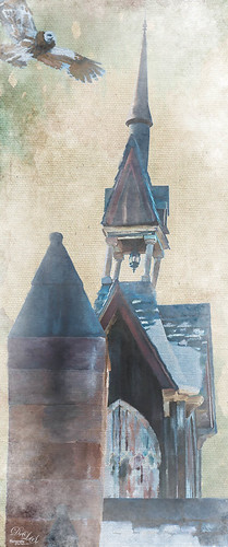
Hiding Out in the Wetlands
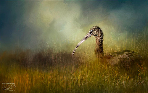
Took this image of a Limpkin bird a while back when photographing at the Ritch Grissom Memorial Wetlands in Brevard, Florida (also known as the Viera Wetlands) with my photo club. This was not actually how the bird appeared – he was trying to hide from all the tourists taking his picture by standing in a batch of grass and reeds. That was the challenge. I had heard that CC2015 had updated their Spot Healing Brush and it worked nicely on this image. I tried it in CS6 first and got marginal results. I have heard that a lot of people are having trouble with the update Healing Brush and Adobe is looking into it. So do watch the results if you are using it. Like I said, I had no problems in this image. Otherwise on a New Layer just added in some of my favorite and free Frostbo Set 2 Grass brushes 009 and 005 strokes to fill in some grass – need to lock the layer and paint over with Color Dodge and Multiply to get the natural feel. Set layer opacity to Color Dodge, duplicated layer, and adjusted opacities of both layers. Jai Johnson’s beautiful Clouds Over the Pasture texture was used and Nik Viveza 2 to add sharpness to the birds eye and beak. That was it. Love playing in Photoshop!…..Digital Lady Syd
Adding Some Background Texture
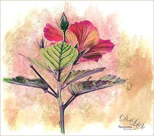
Just used my red hibiscus object image again to try out some texture effects with the background. I really liked the results. The flower was brought in and it was duplicated. Topaz (see sidebar for website link) ReStyle’s Cream and Plum preset was applied to the duplicated layer and set to Darken blend mode at 66% layer opacity. A texture that was made in Corel Painter using the Coarse Smear Blender Jitter brush (a FB friend used this brush quite effectively on an image) in a brownish beige color was added underneath the flower. It was also duplicated, Free Transformed (CTRL+T) where it was reduced and flipped horizontally, and lined up under the flower. A Levels Adjustment Layer and a Hue/Saturation Adjustment Layer were clipped (ALT+click between the layers to clip) to the top texture layer to get the pinkish color. The last texture added just below the flower was made in Corel Painter using the Gravity Bristle Particle Brush (learned how to do this at the end of Commercial Packaging Illustration with Michael Bast Corel video where he shows the technique – I really liked it! Saved it as a PSD to open in Photoshop as a texture.) It was set to Multiply blend mode and an olive green Solid Color Adjustment Layer was clipped to this texture to make it a soft olive green. A stamped version was created on top and Blend If sliders applied before some clean up work was done. A final Levels Adjustment Layer was used to get the effect. Loved creating the textures for this!…..Digital Lady Syd
Young Warrior

I loved how this image turned out. The original was taken at the Native American Festival in Ormond Beach, Florida. Not going to go into all the details as it was a huge process – 27 layers and lots of hours but I will say it was all done in Photoshop, mainly with a Flat Fan Oil Brush I created. Must give a shout out to Melissa Gallo, a Corel Master, for her wonderful textures and her techniques in teaching how to do this type of image, including creating your own brushes! Check out her website and get the Painting in Photoshop Workshop if you want to learn some fabulous techniques and tips. (She also has a new one being released shortly called Painter for Photographers that I am so looking forward to taking!) This texture is her April Pastel texture. Also used Topaz (see sidebar for website link) ReStyle to get the color in the image exactly right. This plug-in is in my top three! Totally fabulous what it can do to an image!…..Digital Lady Syd
Digital Lady Syd Related Blogs:
Digital Lady Syd Reviews Topaz ReStyle
The Archaeologist
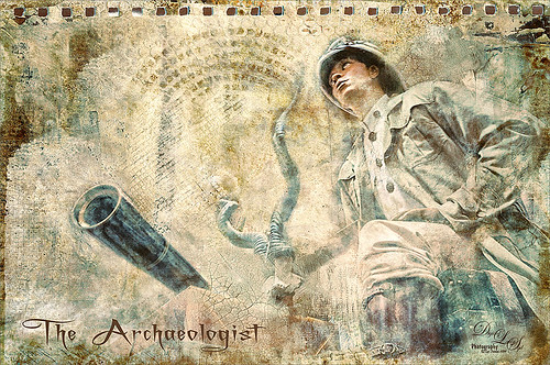
This is part of a really interesting display in one of the gift shops at Universal Studios Orlando. I shot the image up at a rather life-like mannequin and really liked the results. Seims (see sidebar for website link) Power Workflow 4 Magic Flat Light Fixer preset was used in Lightroom. In Photoshop the Shake Reduction Filter and Topaz (see sidebar for website link) Detail 3 was used to sharpen up the whole image. Kim Klassen‘s Autumn Burst was applied on top and a layer mask was added. Using my Chalk 60 brush in the mask at 30% brush opacity, the man and objects were lightly painted back so they show through the texture. Kim’s 1402 magic texture was placed on top and set to Soft Light at 32% layer opacity. Next 2 Lil’ Owls (see sidebar for website link) Ultimate Texture Collection’s Jewel Chalks was set to Divide at 33% layer opacity – this gives the bluish colors in the image. Next a Text layer was added using the font called A Charming Font Superexpanded at 70 pt. On a New Layer the Sharpen Tool was used on the person’s face. Nik’s Viveza 2 was used to sharpen up the face even a little more and to add a slight vignette effect in the corners of the image. That was about it. It turned out to be a really different image and the Difference blend mode turned an ordinary image into something quite interesting……Digital Lady Sydf
Red Carnations on a Bright Sunny Texture
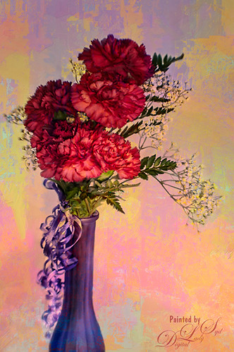
Just doing a little painting on some beautiful red carnations my daughter-in-law got for her birthday. Used Topaz (see sidebar for website link) Detail 3 to do an overall sharpening up of the image. Used Photoshop’s default brush Pastel Medium Tip as both a mixer and regular brush on this image and loved the brush strokes. Stacked two of Melissa Gallo of Painted Textures textures – August Copper set to Hard Light at 76% layer opacity and Spring Sky at Hard Light 78%. Last step was using Nik Viveza 2 to highlight the flowers in the center where I wanted the focus to be. It is a little bright, but I kind of like it – that is what is fun about stacking textures, you get some unexpected results! …..Digital Lady Syd
A Little More Painting with a Texture Brush from Your Image
Wanted to show you how I completed the image that I began in my You Tube Texture Video for my Fun Photoshop Blog How to Paint with a Texture Brush from Your Image. By creating a different brush and changing up my technique just a little, a totally different feel was given to the same image. So what did I do to get this totally different result from the same image?
The brush I created in the video I did save down as a “New with my settings” brush – I forgot to remind everyone of this rather vital step. You need to resave and rename your brush to keep the additional slider changes made from the initial brush created. A New Layer was added above and this time it was converted to a Mixer Brush – in the Options Bar turn off the “Load the brush after each stroke” icon and in the drop down, choose Very Wet, Heavy Mix. Now just make sure Sample All Layers is checked and you are ready to paint using this same brush as a Mixer “Blender” brush (see my Photoshop Blog How to Easily Create a Photoshop Brush for Painting for more info on this.) On a couple of layers, I just smoothed out edges and dabbed and then would go back to the regular brush with the same settings. Just went back and forth smoothing and adding a little texture and color. By doing that on this brush, the texture effect is not so over-the-top as it looked in the video and the rough edges were softened with the Mixer Brush. A Curves Adjustment Layer was added to increase the brightness since the painting darkened it down some. If you look closely, the pattern is over the objects just like the background – by adding the Pattern Fill Adjustment Layer on top and choosing this same texture set to 60% Scale, it blended beautifully with the texture – the layer opacity was set to just 26% for the blend. Then a Levels Adjustment Layer was added and the in the Output Levels, set the first number to 24 to take out the total black pixels which often darkens an image too much in paintings. I thought I was done but I tried a layer style called BMU_SSStyles_UltArtist_Watercolor-Dark from Scrap Girls packet which added a Pattern Overlay that resulted in the rather foggy spooky feel on the whole image – it felt so Harry Potterish! (See my Fun Photoshop Blog How to Get Painting Effects from Actions-Part 2 for info on this.) I was thinking I could have just used a fog brush at a low opacity and painted on a New Layer to get the same effect. I really liked how this version turned out – love the triangular shapes and still like my owl! Anyway wanted to show you how using this different texture, crop, and brush gives a totally different result! Hope you give this a try!…..Digital Lady Syd
Texturizing at The Lost Continent

This is an eatery sign at The Lost Continent in Universal Studios-Orlando. Since there was building scaffolding in the background, it looked like a great choice to try out my new textures from Denise Love at 2 Lil’ Owls Studio (see sidebar for website link). This one used is called Sublime 11, which I consider is one of her best textures and I have most of them, and The Grey Collection 11 set to Overlay at 11% opacity. Layer masks were added to both textures to bring back the detail I wanted to use and my Chalk Brush (Adobe Chalk Brush 60 with a Shape Dynamics Angle Jitter set to 19% in Brush Panel) was used to do this. I like the way it gives a more painterly edge to the strokes. Next her Delicate Paints 10 texture was added to warm up the image and was set to Vivid Light blend mode at 65% layer opacity. A Curves Adjustment Layer was used to add a little contrast back into the image since textures tend to remove contrast. On a stamped layer above (CTRL+ALT+SHIFT+E) Topaz (see sidebar for website link) ReStyle was used – not sure how I got the effect but just went through several of their presets until I found one that I liked – then I adjust the sliders to make it work. On a New Layer on top, the focal area was sharpened up by adding a little white paint and painting in darker paint for distracting areas. Really loved the final result – this is so much fun and thank you 2 Lil’ Owls for these wonderful texture you have been selling!…..Digital Lady Syd
Where Am I?
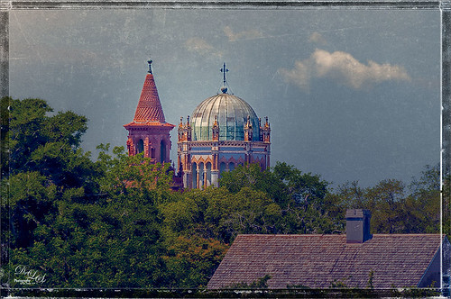
This beautiful skyline image was taken from the Castillo de San Marcos National Monument in St. Augustine, Florida. This is a spire from Flagler College (the old Ponce de Leon Hotel) and the cupola on the Flagler Memorial Presbyterian Church. In Lightroom did just basic changes and sharpened up the spire and cupola slightly. In Photoshop the first thing I did, and do a lot, is go into Topaz (see sidebar for website link) Detail 3- this time applied the Soft and Dreamy III preset to smooth out the leaves that were overly sharp and to reduce the detail in the close up roof. I changed the Cyan-Red, Magenta-Green and Yellow-Blue sliders (similar to the Color Balance Adjustment Layer) to get better colors. Some of my clouds (see my free Cloud Brushes) were added softly in the sky at 69% layer opacity. Kim Klassen Cloth & Paper Reign texture was used to add interest in the sky. Next Topaz ReStyle’s Warm Sand Dune Wash preset was applied to pop the colors a little. On a stamped layer (CTLR+ALT+SHIFT+E) the Camera Raw filter ‘s Radial Filter was applied to focus in on the spire and cupola. On another stamped layer OnOne (see sidebar for website link) Perfect Effects 8 was opened and a Blue-Yellow Split Tone set to a Balance of 81 was added, some detail painted back on the spire and cupola, and the Martha Border was the last step before saving back in Photoshop. I love beautiful St. Augustine!…..Digital Lady Syd
Digital Lady Syd Related Blogs:
OnOne’s Perfect Mask Works Great!
Some of My Favorite Plug-Ins
Loving Both Filters!
Dahlia Flowers Chatting with the New BLooms

Just a couple of pretty dahlias growing in my front yard. I really loved the nice spring colors. This time I created a selection of the flowers and added French Kiss Tableaux Madeleine texture behind them. French Kiss Tableaux Halcyon was added on top and the flowers painted back with a large soft brush so most of the image was revealed – just the edges and some of the stems were not completely revealed. A new layer was placed on top and the Mixer Brush was used to blend the flower petals to give a slightly painterly feel to them. French Kiss Studio 3 White Wash texture was added on top and set to 13% opacity. A layer mask was added and the darker flower was painted back very softly to help draw the eye there subtly. On a composite layer on top (CTRL+ALT+SHIFT+E) Topaz (see sidebar for website link) ReStyle’s Cream and Plum preset (one of my favorites in the filter) was applied to give a little more purple color to the image. This filter can really give a better color palette and there are so many choices it was heard to choose one. A frame I had created in Corel Painter was placed on top as a last step. Lots of fun to created!…..Digital Lady Syd
Soft Pink Calla Lilies!
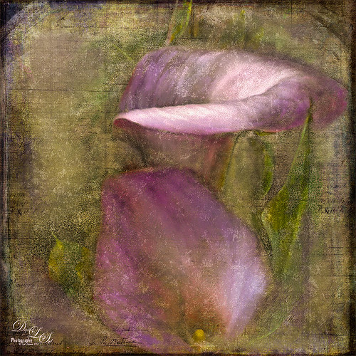
Just wanted to play with this beautiful image of soft pink calla lilies – love their color! Took them with my Android phone in the grocery and loved the result. Did nothing special to them in Lightroom – just the basics, then did a little clean up on the image in Photoshop before adding 2 Lil’ Owls (see sidebar for website link) Carnavale texture. Painted back the flowers in a layers mask attached to the texture and topped it off with Kim Klassen‘s Cloth & Paper Collection’s Magicfilm set to Soft Light blend mode at 45% layer opacity. This completed the vintage feel. The colors just did not look quite right to me and I had a hard time figuring out what to do to get the final look I liked. Then it hit me – go to my favorite plug-in – Nik’s Viveza 2 – and sure enough, with just two control points on the flower petals, I got just the color effect I wanted. Once again, lots of fun to do on boring Monday!…..Digital Lady Syd
Lantern at Stetson
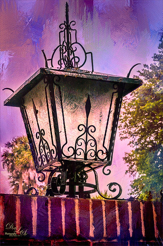
This beautiful large lantern was sitting on top of a large brick wall introducing Stetson University in DeLand, Florida, where my son goes to school. This was an easy image to post-process – just a little detail sharpening using Topaz (see sidebar for website link) Detail 3 so the glass etching could be seen better. Used a black layer mask and just painted back the glass areas. Next I used Mellisa Gallo (one of my favorite texture people) of Painted Textures November Twilight texture set to Linear Light blend mode at 100% layer opacity and April Impasto texture set to Multiply at 52% layer opacity – these were both from great deals she runs on her website each month. The lantern was painted back softly in a layer mask on each texture so the etchings still show up nicely. Now to get the lantern to light up just a little, I tried several different things and it just did not look right. My last attempt was using Nik’s Viveza 2 and setting a Control Point in the lantern. Then the Warmth was set to 44%, Brightness 36%, Contrast -32%, Saturation 52%, and Shadow Adjustments 100% to get the soft glow in the lantern. This filter never lets me down! Anyway, this image is just the way I wanted it!…..Digital Lady Syd
A Splash of Color
Love the texture on this flower. Lightroom basic changes, Topaz (see sidebar for website link) Detail 3 for sharpening the focal point, Mixer Brush painting on flower – Fays Signature Pastel Blender 02 on image above, Curves Adjust Layer for contrast, Painted Texture‘s Dark Naples Yellow texture twice using Linear Light and Multiply blend modes. A composite layer (CTRL+SHIFTS+ALT+E) was created and turned into a Smart Object. In the Smart Object the blend if This Layer dark tab was adjusted so I could let a little color through. A turquoise blue Color Fill Layer was added underneath the Smart Object so the color shows through. High Pass Sharpening was the last step. I love the colors in this texture!….Digital Lady Syd
Swan Fountain
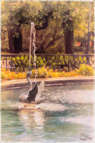
Loved the Forsyth Fountain in Forsyth Park in historic Savannah, Georgia. The whole fountain is rather magnificent! This image is just of one of the little swans spewing water around the main fountain. Just the basic slider changes were done in Lightroom. Once brought into Photoshop, the image was processed using the modified Factory Setting from Snap Art 3 – for Snap Art 4 I created a matching preset so I could continue using it. There were three layers selecting different parts of the image in Snap Art. Some clean up and sharpening was done and a Curves Adjustment Layer was added for contrast. Kim Klassen’s Cloth & Paper Reign texture was set to Multiply blend mode at 100% and the old OnOne PhotoFrame grunge 13 was added as a last step. Very easy to do and very pretty result!…..Digital Lady Syd
A Little Painting Action

Here is another example of Jack Davis’s Mixer Painting SetUp-BETA action. Just a lot of fun to do. It is not as clear a result as with Alien Skin’s Snap Art 3, but there is more individual interpretation when creating the painterly look. Check out my Can You Get a Painting Look With a Photoshop Action? Jack Davis Can! blog to learn how to do each of the steps and for info on how to download the action. What made this image look nice was adding Painted Textures Parisian Pool to the image just above Pattern Fill 1. In the Layer Style dialog, the This Layer black tab was split and set to 108/155 (ALT+click on tab and drag to split) and the white tab set to 139/209. I would encourage to download this action and give it a go!…..Digital Lady Syd
Discumbuberated!

This little pink gerbera flower that is trying desperately to get herself straightened out was taken on my back porch. Very little processing on this image in Lightroom – just some cropping, basic slider adjustments, and Dave Delnea’s custom tone 002 preset. Topaz (see sidebar for website link) DeNoise 5 – the best noise reduction plug-in around – was applied (Overall at 0.19 and Shadows at 0.39). Painted Textures new October Sky texture was applied at Normal blend mode at 64% layer opacity. In a Layer Mask, the flower was gently painted black with a soft low opacity black brush. The font is Marcelle Script from DaFont. The border is one I created in my More Border Fun! blog with a cream Color Fill Layer clipped to the frame (ALT+click between the layer to clip). That was all. I love Melissa Gallo’s new texture effect on this image!…..Digital Lady Syd
Zebra Butterfly Showing Off

I found this beautiful Zebra Longwing Butterfly on my Lantana flowers in my front yard. She did not like having her picture taken – was very skiddish! Still got a couple nice ones of her. Apparently this is the Florida State Butterfly – who knew we had a State Butterfly? There is a very nice short video at the Florida State site showing the butterfly in action. I think my butterfly looks nicer than the ones in the video. In Lightroom a preset I created using Allen Mowery’s free preset was applied (see my Fun Photoshop Blog How to Add a Little Retro to Your Shot – 2nd paragraph has the settings used in my preset.) In Photoshop first Topaz (see sidebar for website link) Detail 3’s Overall Detail II preset was applied. On a duplicated layer Nik’s Viveza 2 was applied and 12 control points were added to make the butterfly and flower she was standing on pop forward. A little vignetting was added and a free texture from Wustenhagen Imagery Texture Green Pastel Brush was added twice, once set to Color Burn blend mode at 47% layer opacity and then Vivid Light blend mode at 17% layer opacity. This great texture really gives the painterly look to the image. He has some really nice textures for sale also. Really liked the final result!…..Digital Lady Syd
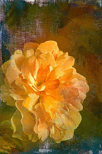
Flower with a Shadow

This beautiful hibiscus bloom was sitting just right to throw a shadow on a textured wall behind it. I bought some really beautiful Lightroom presets at Craft and Vision by Dave Delnea and applied his Washed Tropics Look 3 to this image. I have used it on a couple other images and really like the effect. The flower and stem were sharpened using an Adjustment Brush. Once opened in Photoshop Kim Klassen’s January Set 0801 texture was applied to add a little more texture to the image – it was set to Soft Light blend mode at 63% layer opacity. A Levels Adjustment Layer was added and the Midtone slider was set to 1.11 and the black tab moved to the edge of the histogram. The Output Levels slider was set to 19. A line grunge border was added to the edge. The image is now beige and light pink with a greenish shadow. It was taken into Topaz (see sidebar for website link) ReStyle and the Tiara Frost Preset was applied. A few changes were made to the Luminosity and Saturation of the colors and some Structure and Sharpness was added. These settings were applied and back in Photoshop the layer was set to 64% layer opacity. That is all that was done. I think the shadow looks fabulous in the background!…..Digital Lady Syd
Just a Simple Picture?????

This image definitely uses the colors I just love! Took a red spica and turned it into this gorgeous pink and turquoise rendition. What I did! Just regular Lightroom slider tone work before going into Photoshop. The image needed to be widened so the Canvas was extended on the left side to make room for the objects and text. Topaz (see sidebar for website link) Detail 3 was added using little medium detail and large detail settings and the Dark Foliage tone preset from drop-down in that section. I decided to select the spica using a layer mask and then applied it to make it an object. It needed Topaz DeNoise 5, so it was applied with just an Overall Strength setting set to 0.29. Topaz Simplify was added using the Oil Paint II preset. Then French Kiss Collections Tableaux Mirage texture was placed underneath the single spica object as a background texture and left at Normal at 100% opacity. A Hue/Saturation Adjustment Layer was placed above the texture and set Master to Hue -14, Saturation +48 and Lightness -22. At this point I did not realize I was going with the bluish color palette – I thought I was using the orange and yellow colors. I did a little clean up on the spica and then added a New Layer and added Diamond Head volcano as an object. Added some reddish clouds on a New Layer using my Clouds 5 brush at 54% and added an Inner Shadow, Color Overlay and Drop Shadow to them in brown and pink colors. Next French Kiss Collections Studio 3 White Wash texture (probably my most used texture) was set to Overlay blend mode at 100% opacity. Still had a brilliant yellow background so a Hue/Saturation Adjustment Layer was added on top. The Master was chosen and set to Hue +100, Saturation -35, and Lightness +22. Now I had this beautiful blue and turquoise color that really calmed the image down. On top of that a Photo Filter Adjustment Layer was added and set to Warming Filter 81 and Density 25%. Text was added using the Angelic War font and two layer styles added to it – Outer Glow and Drop Shadow. Next an overlay was added using 2 Lil’ Owls The Artisan Collection Big Set (see sidebar for website link) 2-2 texture. To turn textures into overlays check out my How to Create an Overlay Out of a Texture blog. Added a Layer Style by clicking on the FX at the bottom and moved the Underlying Layer black tab to 117/200 (this gives priority to the shadows of the underlying layer instead of the top one). See my How to Use Those Handy Blend-If Sliders! blog for more on this. Finally a Color Fill Adjustment Layer was clipped to the texture-overlay (ALT+click between the layers) and changed to a sampled color from the spica. Now I am done. Whew! Unfortunately this is how my brain works sometimes, but I really love the final result. I think it looks very Hawaiian and I could see this image on my wall!…..Digital Lady Syd
Using a Natural Texture for an Image

This little Hognose Snake fell out of a Palm Tree frond after my tree was trimmed recently and ended up on my porch. I love the natural texture of the stucco of the wall – this is the easiest way to apply a texture! This little guy was first processed in Topaz (see sidebar for website link) Clarity using the Natural Boost III preset. Then on a duplicate image, Nik Viveza 2 was used to sharpen his body and accentuate his face. There also is a rather ugly looking spider near the bend of his body that was also sharpened. The last step applied Kim Klassen’s Cloth & Paper Touch Texture that was turned into an overlay frame and set to Linear Dodge blend Mode at 61% layer opacity. (See my How to Create an Overlay Out of a Texture blog link.) A Layer Mask was added to paint out areas over the snake to make sure he was clear of texture from the overlay framing. Loved how this image turned out!…..Digital Lady Syd
Boring Image to Fabulous Image!

As you can see, this little pink flowers pix taken at the ICW (Halifax River) in Ormond Beach, Florida, was not that great to begin with, but by adding this gorgeous texture from Painted Textures, the image was totally turned around. In Lightroom 5, the image was desaturated using an Adjustment Brush and just leaving the flowers pink. Two Radial Gradients were applied – one for the outside where the Exposure slider was further darkened, and one for the inside area where the Clarity and Sharpness sliders were reduced to make the flowers appear softer and Shadows increased to 20 to give just a glimpse of the background details. Screenshot shows how image looked as a RAW file, and then after Lightroom adjustments right before taking it into Photoshop.

The image was taken into Photoshop CC where a clean up layer was added to get rid of the spots on the flower petals. Next Painted Texture’s beautiful August Sand Texture was added and set to Linear Light at 77% layer opacity. A Hue Saturation Adjustment Layer was clipped (ALT+Click between the layers) and the Hue was set to -4 and Saturation -23. Then a Curves Adjustment Layer was added to increase contrast, which adding textures often requires, by dragging in the image with the little hand icon tool from the top of the panel and pulling down. A New Layer was added on top and set to Overlay – a burn layer was created using a black brush at 12% and following down the stems. (See my The Best Dodging and Burning Technique! blog ). It was also set to 44% layer opacity to keep it from being overdone. No layer masks or fancy selections or filters were used on this one – the texture totally made this image!……Digital Lady Syd
Flower Power!

This image was created from a single white daisy shot taken in my front yard. The flower was cut out of this image by selecting the flower using a layer mask and then applying the layer mask. The flower color was changed using a Hue/Saturation Adjustment Layer clipped to the flower layer (CTRL+ALT between the layers to clip). French Kiss Bohemian texture was placed underneath the flower and the color changed to the violet colors. Distressed Textures HR Strawberry Juice On My Finger was added on top and set to 52% opacity. Only the center of the flower was painted out using a layer mask. The flower was duplicated two more times and Free Transformed (CTRL+T) and rotated – different colors were chosen for the other flowers using Hue/Saturation Adjustment Layers clipped to the flowers. Kim Klassen‘s Unleashed texture was added as an overlay (see my How to Create an Overlay Out of a Texture blog.) A Hue/Saturation Adjustment Layer was clipped to the texture and set to a violet color. Some text was added using Rough Typewriter font. A New Layer was added on top and a grunge brush I had created a long time ago was added in pinks and violets and set to 66% layer opacity. A Curves Adjustment Layer was added as a last step. I just love to play with textures and make textures…..Digital Lady Syd
Digital Lady Syd Related Blogs:
Texture Resources – So Many Choices! So Many Choices!
Painterly Textures to Create a Beautiful Floral Image
Who’s Hiding in the Cabbage Patch?

Just a quick blog on this little guy who looks so much like a wonderful cat I had many years ago named Bobbin. He lives in Belarus, apparently at a cabbage patch. Very simple processing here. Initial processing was done in Lightroom. Some spot removal and clean up on a little bit of the image was done next in Photoshop. Then Topaz (see sidebar for website link) Detail 3 was used just to sharpen the cat’s face. To really enhance the eyes, a New Layer was added and the Sharpen Tool was used – 20% Strength and Sample All Layers checked. The last step involved adding a lovely Isabelle Lafrance Diaphanous Overlay called Ethereal. A Color Fill Adjustment was clipped (ALT+Click between the layers) to change to color to a dark blue. The Overlay layer was set to Multiply blend mode at 79% opacity. Another New Layer was added and the dark color was sampled – then the edges were painted darker to draw more focus on the cat and to get rid of a few extraneous items. I loved the way it turned out – wish I could have brought the cat home with me!…..Digital Lady Syd
Digital Lady Syd Related Blogs:
Using a Color Fill Adjustment Layer as a Spotlight
Keeping Focus Where You Want It Using Focal Point 2 and Color Fill Adjustment Layer
Spotlight Effect With the New Subtract Blend Mode
Textured Sky Adds Vintage Feel

This is another tower image from London. Once again, I have no idea what it is connected to, but it is a beautiful cupola. I really liked the final cloth feel on the texture. This image was straightened and just the Basic Sliders were used in Lightroom. Once in Photoshop, I selected the tower, deleted the background, and tried several different texture backgrounds. I ended up with one of my very favorite Flickr Texture people, Lenabem-Anna Textures, Texture 278 – her textures are incredible! This one gives the cloth appearance with just a touch of clouds – perfect for an original image that had no clouds. For this image a Gaussian Blur was added using a Radius of 5.9 just to smooth out the texture in the background but leave the color in the texture. A Levels Adjustment Layer was added and the Midtones slider adjusted a little for more contrast to the whole image. To add the texture back into the whole image, the same texture was applied again on top. A Hue/Saturation Adjustment Layer was clipped (ALT+click between the layers to clip) to the texture and the Saturation slider was set to -100. The texture layer was set to Overlay blend mode at 67% layer opacity. A Color Balance Adjustment Layer was added on top to bring out the gold tones more in the tower. That was it. …..Digital Lady Syd
Digital Lady Syd Related Blogs:
Clarity with Texture!
Where Am I? Edinburgh, Scotland
Getting a Nice Painterly Landscape Effect with Topaz Simplify and Texture
Painterly Textures to Create a Beautiful Floral Image

Recently purchased some textures from Distressed Textures so I decided to show them off using a Zinnias image. In Lightroom the basic sliders were adjusted and the David duChemin Milford Greens preset. (See my How to Use Adobe Camera Raw (ACR) or Lightroom 4 Quickly blog.) Then the image was brought into Photoshop where for a very simple workflow. Just some flower clean up. A new darken layer was created above to burn in the edges of the flower petals (see my The Best Dodging and Burning Technique! blog). Then three Distressed Textures were applied: 1) The Artists Palette Lost Canvas set to Darken at 97% layer opacity; 2) The Spring Inspired Cherry Cotton Candy (love the name of this texture!) set to Multiply blend mode at 100% opacity; and 3) The Artist’s Palette I Dream set to Overlay at 70% layer opacity. The first two textures had layers masks applied and the flowers were painted back softly with a largish black brush. The last step was a Curves Adjustment Layer to add contrast back into the photo that the textures tend to remove. That was it – I love the vibrant colors in this combination of textures……Digital Lady Syd
Digital Lady Syd Related Blogs:
Coral Pink Blanket Flowers
Texture Resources – So Many Choices! So Many Choices!


