
AI Painted Image of Natural Bridge

Here is another AI generated Oil painted image using the same Natural Bridge photo but has a totally different feel to it. To see how this was created and what the original image looked like, check out my AI Digital Oil Painting – How To Do This Fun Photoshop Blog. The post-processing for this image was pretty simple after the AI Generated Fill background was selected (used the prompt “river and flowers oil painting”).
Started with a Color Lookup Adjustment Layer with bluish tones in it and set to 79% layer opacity (see Sparkle Stock’s free Bleak – Trellick 01 preset); a Curves Adjustment Layer for tone (see Denny Tang’s site with a Tone Chart Photoshop Action to download for doing this – have been using this technique as an action for over 5 years – it’s the best way to do this and use it on almost every image); a Levels Adjustment Layer to adjust the Blue color (followed Aaron Nace’s video called Make Amazing Photoshop Composites Quickly-part 1 at the 22-minute point – really interesting technique); a Black and White Adjustment Layer set to Luminosity blend mode (because it always looks good – see my How to Use a Black & White Adjustment Layer to See Contrast in a Layer Fun Photoshop Blog); Lighten and Darken layers using Pratik Naik’s technique (see How to Create a Fun Cartoon Tip 2 Fun Photoshop Blog – on a layer above set to Overlay blend mode – use at least a 100 px soft round brush set to Airbrush in the Options Bar and Flow at 9% and use white or light color to lighten image or black or darker – different colors give some great results – use layer opacity to lower effect) which was used especially where the light is coming into the image; and finished with a Remove Tool layer for smoothing out a couple tiny water issues. In other words most of my basic workflow – now you know what I do! Quite a difference from the original image!…Digital Lady Syd
Blowing a Kiss
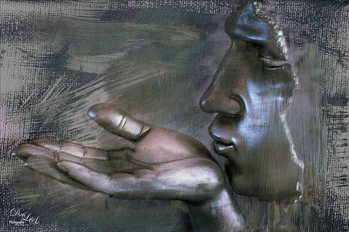
On my Fun Photoshop blog (see my Using a 50 mm Lens as a Macro Lens – Really? blog) recently I had two image taken as macro’s on the face of the above sculptor. Thought I would do another macro image, this time using my regular lens and not a flipped 50 mm lens, and get a little creative with the RAW file. This image was just basically post-processed in Lightroom using mainly the Basic Panel. Then in Photoshop Melissa Gallo’s Taupe Canvas (no longer available) was placed on the bottom, then a black layer mask was placed on the LR image on top. Just painted back in what I wanted to see using a couple different brushes at different brush opacities. Created a Darken Layer to outlines the focal point lines and a New Layer for a white Spotlight Effect on the face and hand. A Black and White Adjustment Layer set to Luminosity blend mode to adjust the colors. Then Blake Rudis’s action called 5 Tone Heat Map was used to add some more subtle color to the image – set to 88% layer opacity. I sort of like the feel of the image…..Digital Lady Syd
Where Am I?

This is an image of San Francisco taken at night in February in a brisk and cold breeze. I just listened to another interesting webinar by Nichole Paschale from Topaz (see sidebar for website link) called Night Photography Enhanced with Adjust, Black and White Effects and Star Effects. I am always surprised how much I learn from these short videos – there were several good tips in this one, even though I know these programs pretty well. My image was not that great, but I needed a nighttime image to try some of the techniques on. Now I rather like the effect. Of course it uses one of my favorite plug-ins, Black and White Effects, so I am not surprised I like the results. The preset was set to my Old Vintage Effect (see Quad Tones in Topaz Black and White Effects Plug-in to create), one I use on a lot of my images. Next the Star Effects plug-in was used to enhance the streetlight using Sun Flare 1 preset. A Flypaper Texture Lemoncello Taster texture layer was added using the Multiply blend mode at 35% opacity. It still did not have the feel I wanted, so I added a Black and White Adjustment layer and mainly lowered the yellow and added some reds and greens and blues. The opacity was set to 26%. A layer style was added to frame the image. I can honestly say this is exactly how the street looked to me as I was walking to dinner on that cold dark night. If you have not tried out some of Topaz’s videos, give them a listen. Lots of cool things to try in them!…..Digital Lady Syd
Photoshop CS5 and Elements: Hand-Tinting the Easy Way
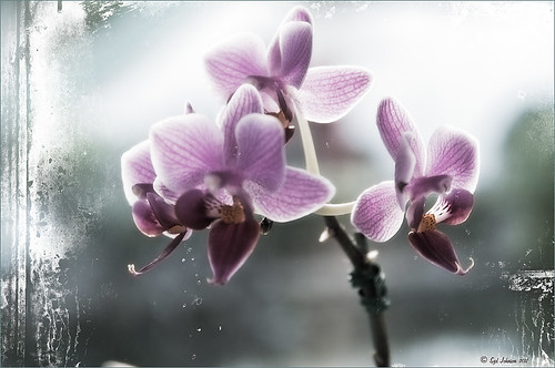 |
The above purple orchard was on the table at the Ming Court Restaurant in Orlando, Florida (one of our favorite restaurant in Orlando). I was not really happy with the original image (hover over image to see) – the flowers came out a little soft to my liking. I was pleased to see this hand-painting technique saved a beautiful flower image and gave it a soft painterly feel.
The steps to create this look are easy and could probably be put in an action. The process was taken from an article in Mastering Digital Photo Processing Magazine from the Fall 2008 issue. Here are the basic steps to creating this image:
1. Do any exposure adjusting in Lightroom or Adobe Camera Raw.
2. In Photoshop, create two copies of the original layer and turn off the top layer.
3. On middle layer convert image to black and white – I used the Black and White Adjustment Layer to get a nice conversion. There are so many ways to do this – choose your favorite. For Elements users, go to Enhance -> Convert to Black and White and select one of the canned styles as a starting point – then adjust the sliders, especially the contrast slider.
4. Turn on the top layer and add a Gaussian Blur filter with a Radius set to 18. Change blend mode to Overlay (or try others if you do not like the effect) and lower the opacity to get the pleasing hand-painted look. The opacity for the above was 61%.
Optional Step – Can add a Photo Filter Adjustment Layer. Choose a color using the Color swatch and adjust the Density slider. The magazine suggested this can “increase the sense of oils being applied over a black-and-white print.” I did not do this here, but it did give an interesting look with the default Warming Filter (85) color.
5. At this point a New Layer was created and the Sharpen Tool was used to show definition more clearly between the flower petals.
6. A Curves Adjustment Layer was added for contrast. Elements users add Levels Adjustment Layer.
7. To add a border or layer style, create a Composite Layer on top (CTRL+ALT+SHIFT+E). OnOne’s PhotoFrame Taufer_Texture_10 was added to give the frosted window effect – one of my favorite looks. (See sidebar for OnOne’s website link.)
That’s it! A pretty easy workflow and it gives a beautiful soft look. Hope you enjoy trying this short and sweet workflow – until next time…..Digital Lady Syd


