
Never Thought I Would Use a Wax Crayon Effect!
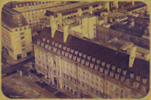 |
Yep, this image was processed using the wax crayon brush in Snap Art 3. I totally love the vintage feel to this image. I am adding the Lightroom image as brought into Photoshop so you can see the difference – just click on the image. I really liked the before image as it was processed using one of my favorite presets, GA B&W Infrared 01 preset which gave it a little bit of a blown out look. Jack Davis’s Bluish Split Toning preset was applied after this (the presets use different settings so both can be applied – Jack’s preset can be downloaded from his Facebook Freebies section and selecting his Lightroom Wow 4 Presets.) White rounded corners were created in the Post-Crop Vignetting section using Style: Highlight Priority, Amount +100, Midpoint 32, Roundness -93 and Feather 0. Once in Photoshop the background layer was duplicated and made into a Smart Object. Alien Skin’s Snap Art 3 was opened and the Pastel (sketch) preset was selected. Three layers were used to adjust the parameters for the Wax Crayon I was using on the image – just basically played around with the settings until I liked them. Since it is a Smart Object, I can always go back and change anything I don’t like. Next 2 Lil’ Owls Studio Color Bokeh Grunge (see sidebar for website link) Sweetness overlay was added using the Subtract blend mode at 58% layer opacity. Curves, Levels and Hue/Sat Adjustment Layers were added to add more contrast and color into the image. The last step used Nik Viveza 2 with a control point on the front of the building to draw attention to this area. That was it – I really like the final result! Not at all what I had in mind, but love it just the same!…..Digital Lady Syd
Digital Lady Syd Related Blogs:
Digital Lady Syd Reviews Alien Skin Snap Art 3
Get Great Results with Alien Skin Snap Art 3 and Topaz ReStyle Together!!
Snap Art and Simplify – Now That’s Painterly!
Snap Art and Simplify – Now That’s Painterly!

Just a pretty tulip that cannot decide if it wants to be open or closed. (This link shows some of these beauties in their glory!) This image was converted to a Smart Object and taken into Alien Skin Snap Art 3 and the Oil Paint (dry brush) preset was applied with some adjustments. A stamped layer (CTRL+ALT+SHIFT+E) was created on top and the layer was opened up in Topaz (see sidebar for website link) Simplify 4 and the Oil Painting Toned IV preset applied. Back in Photoshop a black layer mask was added (ALT+click on layer mask icon to make it black), and just the forward leaves were painted back to add the Simplify filter effect. A Curves Adjustment Layer was added to increase contrast and my SJ Painter Oil Frame was added to give it a canvas feel. You can CTRL+T the frame to get just the amount of brushed effect to add. That was it. Fun to do!…..Digital Lady Syd
Butterfly Season is Here!

The butterflies are going crazy around my house this week! They love all the penta flowers and Bottle Brush bushes I have. This beautiful little Monarch was very busy totally enjoying all the different flowers to try out – there was some sharing going on with a huge beautiful Swallowtail butterfly and several varieties of bees! Very busy place today. This image used Matt Kloskowski’s That 70’s Look preset (in NAPP Lightroom presets – not sure when I got these) in Lightroom, which gave a very pretty look. But I decided to go into Topaz (see sidebar for website link) ReStyle just to see what would happen. I had created a preset on a Scottish image done earlier that worked very nicely. Got a little more of a colorful result. Nik Viveza 2 plug-in was then added on another layer and some of the color was adjusted using a few control points. A Curves Adjustment Layer was added on top for contrast. The text is a really old font called Abigail. That was it and I really liked the results…..Digital Lady Syd
Just a Simple Picture?????

This image definitely uses the colors I just love! Took a red spica and turned it into this gorgeous pink and turquoise rendition. What I did! Just regular Lightroom slider tone work before going into Photoshop. The image needed to be widened so the Canvas was extended on the left side to make room for the objects and text. Topaz (see sidebar for website link) Detail 3 was added using little medium detail and large detail settings and the Dark Foliage tone preset from drop-down in that section. I decided to select the spica using a layer mask and then applied it to make it an object. It needed Topaz DeNoise 5, so it was applied with just an Overall Strength setting set to 0.29. Topaz Simplify was added using the Oil Paint II preset. Then French Kiss Collections Tableaux Mirage texture was placed underneath the single spica object as a background texture and left at Normal at 100% opacity. A Hue/Saturation Adjustment Layer was placed above the texture and set Master to Hue -14, Saturation +48 and Lightness -22. At this point I did not realize I was going with the bluish color palette – I thought I was using the orange and yellow colors. I did a little clean up on the spica and then added a New Layer and added Diamond Head volcano as an object. Added some reddish clouds on a New Layer using my Clouds 5 brush at 54% and added an Inner Shadow, Color Overlay and Drop Shadow to them in brown and pink colors. Next French Kiss Collections Studio 3 White Wash texture (probably my most used texture) was set to Overlay blend mode at 100% opacity. Still had a brilliant yellow background so a Hue/Saturation Adjustment Layer was added on top. The Master was chosen and set to Hue +100, Saturation -35, and Lightness +22. Now I had this beautiful blue and turquoise color that really calmed the image down. On top of that a Photo Filter Adjustment Layer was added and set to Warming Filter 81 and Density 25%. Text was added using the Angelic War font and two layer styles added to it – Outer Glow and Drop Shadow. Next an overlay was added using 2 Lil’ Owls The Artisan Collection Big Set (see sidebar for website link) 2-2 texture. To turn textures into overlays check out my How to Create an Overlay Out of a Texture blog. Added a Layer Style by clicking on the FX at the bottom and moved the Underlying Layer black tab to 117/200 (this gives priority to the shadows of the underlying layer instead of the top one). See my How to Use Those Handy Blend-If Sliders! blog for more on this. Finally a Color Fill Adjustment Layer was clipped to the texture-overlay (ALT+click between the layers) and changed to a sampled color from the spica. Now I am done. Whew! Unfortunately this is how my brain works sometimes, but I really love the final result. I think it looks very Hawaiian and I could see this image on my wall!…..Digital Lady Syd
Topaz ReStyle on a Black and White Image

I totally loved how this image turned out. Once again this is the Intracoastal Waterway (ICW) looking back at the Granada Bridge in Ormond Beach, Florida. I had originally did just a black and white image using Nik’s Silver Efex Pro 2 using the High Key 2 preset as a starting point and then changed several sliders – brought the orange roof back on little shop. I just could not get the effect I liked. Then I took the image into Topaz (see sidebar for website link) new ReStyle plug-in and voila! – the totally different feel using the Orange Peel preset. (These are the changes made in the plug-in after applying the preset: Set Texture to -1.00, ReStyle Opacity 77%, and Hard Light Blend Mode; and Tint set to -0.16, Structure -1.00, and Detail -1.00.) This image now has a totally different feel with a color scheme I would never have considered. Check out this plug-in if you want something to give you image a real pop!…..Digital Lady Syd
Digital Lady Syd Related Blogs:
Digital Lady Syd Reviews Topaz ReStyle
Using a Natural Texture for an Image

This little Hognose Snake fell out of a Palm Tree frond after my tree was trimmed recently and ended up on my porch. I love the natural texture of the stucco of the wall – this is the easiest way to apply a texture! This little guy was first processed in Topaz (see sidebar for website link) Clarity using the Natural Boost III preset. Then on a duplicate image, Nik Viveza 2 was used to sharpen his body and accentuate his face. There also is a rather ugly looking spider near the bend of his body that was also sharpened. The last step applied Kim Klassen’s Cloth & Paper Touch Texture that was turned into an overlay frame and set to Linear Dodge blend Mode at 61% layer opacity. (See my How to Create an Overlay Out of a Texture blog link.) A Layer Mask was added to paint out areas over the snake to make sure he was clear of texture from the overlay framing. Loved how this image turned out!…..Digital Lady Syd
Viveza 2 Does It Again!

This huge Barking Treefrog got thrown out of a Palm Tree frond that was being trimmed and ended up in my Cardboard Palm. The blooming plant in upper right is a Queen Emma Lily Crinum . The lawn guys said he was the biggest frog they had seen in Florida (he was at least 4 inches long). Anyway, the frong was gorgeous and very calm and let me take his photo. This image was processed a lot in Lightroom using a Jack Davis Bluish Split Toning preset. The frog was sharpened slightly using the Adjustment Brush. A Radial Gradient was added to darken down the outside edge and give a slight vignette. It was taken into Photoshop and a New Layer was created to clean up the leaves with the Spot Healing Tool. A Curves Adjustment Layer was added to add some tone to the image. The layer was duplicated and converted to a Smart Object. My favorite filter was applied – Nik Viveza 2 – to add highlights to the frog and the plant by adding control points to these areas. This really gave the image the final look it needed. In this case Viveza 2 really popped this image!…..Digital Lady Syd
Boring Image to Fabulous Image!

As you can see, this little pink flowers pix taken at the ICW (Halifax River) in Ormond Beach, Florida, was not that great to begin with, but by adding this gorgeous texture from Painted Textures, the image was totally turned around. In Lightroom 5, the image was desaturated using an Adjustment Brush and just leaving the flowers pink. Two Radial Gradients were applied – one for the outside where the Exposure slider was further darkened, and one for the inside area where the Clarity and Sharpness sliders were reduced to make the flowers appear softer and Shadows increased to 20 to give just a glimpse of the background details. Screenshot shows how image looked as a RAW file, and then after Lightroom adjustments right before taking it into Photoshop.

The image was taken into Photoshop CC where a clean up layer was added to get rid of the spots on the flower petals. Next Painted Texture’s beautiful August Sand Texture was added and set to Linear Light at 77% layer opacity. A Hue Saturation Adjustment Layer was clipped (ALT+Click between the layers) and the Hue was set to -4 and Saturation -23. Then a Curves Adjustment Layer was added to increase contrast, which adding textures often requires, by dragging in the image with the little hand icon tool from the top of the panel and pulling down. A New Layer was added on top and set to Overlay – a burn layer was created using a black brush at 12% and following down the stems. (See my The Best Dodging and Burning Technique! blog ). It was also set to 44% layer opacity to keep it from being overdone. No layer masks or fancy selections or filters were used on this one – the texture totally made this image!……Digital Lady Syd
Flower Power!

This image was created from a single white daisy shot taken in my front yard. The flower was cut out of this image by selecting the flower using a layer mask and then applying the layer mask. The flower color was changed using a Hue/Saturation Adjustment Layer clipped to the flower layer (CTRL+ALT between the layers to clip). French Kiss Bohemian texture was placed underneath the flower and the color changed to the violet colors. Distressed Textures HR Strawberry Juice On My Finger was added on top and set to 52% opacity. Only the center of the flower was painted out using a layer mask. The flower was duplicated two more times and Free Transformed (CTRL+T) and rotated – different colors were chosen for the other flowers using Hue/Saturation Adjustment Layers clipped to the flowers. Kim Klassen‘s Unleashed texture was added as an overlay (see my How to Create an Overlay Out of a Texture blog.) A Hue/Saturation Adjustment Layer was clipped to the texture and set to a violet color. Some text was added using Rough Typewriter font. A New Layer was added on top and a grunge brush I had created a long time ago was added in pinks and violets and set to 66% layer opacity. A Curves Adjustment Layer was added as a last step. I just love to play with textures and make textures…..Digital Lady Syd
Digital Lady Syd Related Blogs:
Texture Resources – So Many Choices! So Many Choices!
Painterly Textures to Create a Beautiful Floral Image


