
Never Thought I Would Use a Wax Crayon Effect!
 |
Yep, this image was processed using the wax crayon brush in Snap Art 3. I totally love the vintage feel to this image. I am adding the Lightroom image as brought into Photoshop so you can see the difference – just click on the image. I really liked the before image as it was processed using one of my favorite presets, GA B&W Infrared 01 preset which gave it a little bit of a blown out look. Jack Davis’s Bluish Split Toning preset was applied after this (the presets use different settings so both can be applied – Jack’s preset can be downloaded from his Facebook Freebies section and selecting his Lightroom Wow 4 Presets.) White rounded corners were created in the Post-Crop Vignetting section using Style: Highlight Priority, Amount +100, Midpoint 32, Roundness -93 and Feather 0. Once in Photoshop the background layer was duplicated and made into a Smart Object. Alien Skin’s Snap Art 3 was opened and the Pastel (sketch) preset was selected. Three layers were used to adjust the parameters for the Wax Crayon I was using on the image – just basically played around with the settings until I liked them. Since it is a Smart Object, I can always go back and change anything I don’t like. Next 2 Lil’ Owls Studio Color Bokeh Grunge (see sidebar for website link) Sweetness overlay was added using the Subtract blend mode at 58% layer opacity. Curves, Levels and Hue/Sat Adjustment Layers were added to add more contrast and color into the image. The last step used Nik Viveza 2 with a control point on the front of the building to draw attention to this area. That was it – I really like the final result! Not at all what I had in mind, but love it just the same!…..Digital Lady Syd
Digital Lady Syd Related Blogs:
Digital Lady Syd Reviews Alien Skin Snap Art 3
Get Great Results with Alien Skin Snap Art 3 and Topaz ReStyle Together!!
Snap Art and Simplify – Now That’s Painterly!
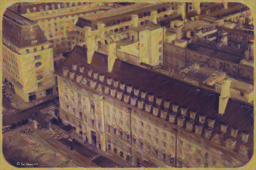
Using Old Wallpaper for a Vintage Look

Just another pretty image of my zinnias growing in my front yard. In Lightroom a preset I created from Jack Davis’ video (see my Can You Get a Painting Look With a Photoshop Action? Jack Davis Can! blog for link) – this was another part of the video where he shows you how to make an Antique Looking preset in ACR, but it can be done as easily in Lightroom. (It is also in his Facebook link for Lightroom presets download.) Once brought into Photoshop, a New Layer was created and the Mixer Brush was pulled out to define the leaves more, especially the ones in front. Fay Sirkis Four Season Classic FX Highlilghts #1 was used along with her 03 Palette Knife Blender brush, downloaded from her webinars on the NAPP website. She just completed a series of four videos where she goes over each season – wonderful videos if you want to learn to paint! Eventually this layer was set to 82%. On top of the Mixer Brush layer, Caleb Kimbrough vintage wallpaper2 was added (he has several free wallpapers to download) and set to Darker Color blend mode at 39% opacity. A layer mask was added and the flowers painted back into the image. Next an Overlay created from Kim Klassen’s Cloth & Paper texture Touch was applied and set to Multiply blend mode. A medium green Color Fill Layer was added, clipped to the overlay, and set to 70% opacity to add a little green tint to the edges. A Selective Color Adjustment Layer was added to get just the right color of red/magenta in the image. Then a Vibrance Adjustment Layer was added and set to +100 to add back a little color. The last step involved sharpening using a High Pass Filter, setting the mask to black, and painting back just the center of the flower and little bit of the wallpaper. Really loved the final vintage feel to the image……Digital Lady Syd
A Vintage Landscape Look on a Scottish Monument

I loved the way this image turned out – never expected it to be this pretty considering it was an image I snapped while standing on the street in front of our hotel. It is Nelson Monument (in center) and Acropolis (aka National Monument of Scotland on left corner) on Calton Hill – I did not get to visit this site but wish I had. This was not difficult to process once I got going. After cleaning up a rather boring image, Topaz (see sidebar for website link) Simplify 4 was opened and a preset I call the John Barclay BuzSim Setting preset was used, (The settings are: Simplify: Colorspace RGB, Simplify Size 0.19, Details Boost 1.00, and Details Size 0.20; Adjust: Brightness 0.01, Contrast 1.08, Saturation 1.03, Saturation Boost 1.15, Structure 1.00, and Structure Boost 1.00; and Edges: Edge Type – Color Edge Normal, Edge Strength 0.00, Simplify Edge 0.30, Reduce Weak 10.00, Reduce Small 0.20 and Flatten Edge 0.00.) I listened to one of John’s excellent videos on Topaz Labs and created this preset which has a very subtle result. Next I added 2 lil Owls (see sidebar for website link) Workshop 6 – Texture 1 which has the beautiful turquoise and light yellow sky color – the layer was set to Overlay Blend Mode. The beautiful text was supplied by my favorite Shadowhouse Creations – his Text Brush 5. I actually clipped a bright green Color Fill Adjustment Layer to the text (to clip just ALT+click between the two layers and the color fill adjustment layer will only affect the layer below) – then the text layer was set to 55% opacity. Another 2 Lil’ Owls Texture – texture 4 was used as an overlay frame (follow the steps in my blog How To Make Frames or Borders – scroll down to the section called “To save the frame you created as an overlay to use again”). A light yellow Color Fill Adjustment Layer was clipped to the texture file. A Curves Adjustment Layer where the red, green and blue channels were adjusted to get this slight vintage feel. The last thing done was to add a Color Fill Adjustment Layer to the whole image using a soft cream color (#c6c3bd) and then Nelson Monument was painted out in the layer mask so the eye is drawn to that area of the image. Had a lot of fun as usual – never get tired of this!…..Digital Lady Syd
Vintage Effect on Hanging Pots

The image was taken at the 24th Annual Native American Festival in Ormond Beach, Florida recently. I just loved the way this image turned out since it started out with a very cluttered background. It was an three image HDR image that was processed using Photomatix Pro’s Merge to 32-bit HDR in Lightroom. The resulting TIFF file was adjusted and Matt’s 70’s preset was applied before taking the image into Photoshop. Some background clean-up was done and the Kim Klassen cafe simplicity texture (sign up to get several beautiful free textures including this one) at 55% opacity was added to the image – really gives it that vintage feel. The pots were painted out with a low opacity black brush on a white layer mask. A Curves Adjustment Layer was added to give just a little more contrast in the image. That was it – very simple processing but one of my favorite images from the event.
It is amazing how pretty the results can be by trying different textures on an image. Really loved this one….Digital Lady Syd
Digital Lady Syd Related Blogs:
Check out my Textures category in the sidebar for more Tidbits Blogs
Check out my Fun Photoshop Blog (link at top of page) and click Textures category in the sidebar
Where Am I?

This is the beautiful Scott Monument in Edinburgh, Scotland. There is an excellent tutorial called Processing with Textures by Colleen of Chasing Dreams Photography that shows you how to create a vintage feel that looks somewhat like this. After doing basic processing in Lightroom, the image was brought into Photoshop where Lenabem-Anna Texture – 208 was added and set to Overlay blend mode at 17%. She has such beautiful textures that can be downloaded from FlickR – see her Use Information before downloading. This texture was chosen to lighten the dark image in the center. The texture was removed by painting a sampled color from the texture over the building areas using a low opacity brush. Next her beautiful vintage sky Texture – 230 was applied and set to Darken at 100% – a layer mask was used to remove texture from the parts of the image where the texture should not be covering. A vintage action was run on the background layer to add more of the effect and the layer was set to 49% opacity. On top Flypaper Elysium Copy Taster Texture was added but a Hue/Saturation Adjustment Layer was added with Saturation set to -100 so no color but just the scratches were seen. The texture was set Overlay blend mode at 45% opacity. French Kiss free Glorious Grunge Edging Overlay was added and a Solid Color Adjustment Layer using a cream color for the edging. A dark vignette was applied at 54%. To get a better feel for all these steps, check out the video. This image was a lot of fun to do and I really like the vintage look!…..Digital Lady Syd
Red Hibiscus + Textures = Beautiful Picture!

Since I did a recent Fun Photoshop Blog on Creating That Vintage Texture Feel, I thought I would display another one of my compositions using Sarah Gardner’s pointers from her new book Art Beyond the Lens: Working with Digital Textures. This red hibiscus from my front yard was first taken into Topaz photoFXlabs (see sidebar for website link) and on a duplicate layer inside the plug-in, the InstaTone tab using 500 px “Bright Spot” photo was used for the tonal effect. Adjustment tab settings of Exposure -.21, Contrast 4, and Dynamics 35 were applied to the layer. While in this interface, ShadowHouse Creations Entropy 2 texture was added as a new layer and set to Linear Light at 94% opacity, and these settings were applied from the Adjustment Tab to get the beautiful color in the texture: Temp 0, Tint 15, Sat 0, Dynamics 22, Sharpness -9, and Shadows 1. Back in Photoshop, ShadowHouse Creations Vintage Film 6 texture (gives the great framing edge) was applied using Hard Light blend mode at 100% opacity. The last step was to add a Curves Adjustment Layer to increase the contrast a little and that was it. Textures and flowers look so great together!…..Digital Lady Syd
Digital Lady Syd’s Related Blogs:
InstaTone in photoFXlabs – Great Fun and Great Results!
Using photoFXlab v1.1
Using Topaz photoFXlab to Replace Skies
Digital Lady Syd’s Review of Topaz photoFXlab v1.1
Getting That Vintage Look!

I had not done an HDR image or post in a long time so I pulled out NIK’s HDR Efex Pro, which usually gives me the look I want. Personally, I think it is a little harder to use than Photomatix Pro and Photoshop CS5’s Merge to HDR, but the results can be spectacular if done correctly. This image is of an Ice Cream Shop on St. George Street in St. Augustine, Florida. This is a great example of the typical Spanish home that was built back in the early 1800’s. The texture in the building came out really nice. What I like about this program is on the right side of the program, there is a drop-down menu called HDR Method where a lot of different looks can be tried out. The basic global adjustment sliders and the U-Point controls are still available so control points can be placed where needed and the strength adjusted to fit the location. In this case, the Fresco method was chosen at 70% strength. I did bring the image into Photoshop to clean up some of the distracting items and to sharpen the lettering in the signage with the Sharpen Tool. The edges were treated with OnOne’s PhotoFrame Taufer Texture 12 in dark black (see sidebar for link to website). Overall it gives a pretty convincing vintage look.
Another great program from NIK!…..Digital Lady Syd
Digital Lady Syd Related Posts:
Different Images-Same Look Using HDR!
Where Am I?


