Where Am I?
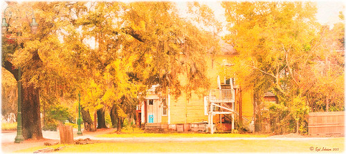
Had the opportunity to visit the beautiful historic city of Savannah in Georgia, USA. This image of an older house is enhanced, but I just felt like adding some yellow and fall colors to a rather overwhelmingly green and boring image in the original. Everything but the kitchen sink went into this image (it felt that way) but finally I got the look I really liked. So here were the steps in a nutshell:
1. Applied Richard Hale’s Sunnyday preset in Lightroom (see A Summery Lightroom Preset for more info on creating it and free download link).
2. Opened Topaz (see sidebar for website link) Clarity’s Landscape Beach Shore I preset and used as is.
3. Back in Photoshop the ACR filter was opened and just the HSL sliders adjusted to get more of a yellow feel.
4. Used Color Range (How To Use the Color Range Command with CS4 Through CC 14.1 blog) to select the sky and added a small amount of aqua color to it.
5. Added Alien Skin’s Snap Art 3.0 using just the Factory Default setting and Photorealism slider set to 100%.
6. Cropped to straighten a little more.
7. Added Levels to enhance the contrast a little.
It took a long time to post-process this image and get it tweaked the way I liked it, but I love the final product. Lots of fun here!…..Digital Lady Syd
Using a Natural Texture for an Image
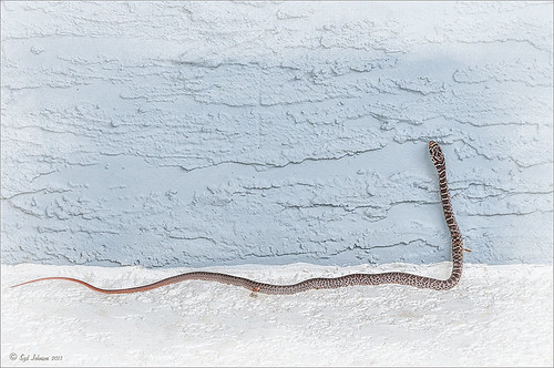
This little Hognose Snake fell out of a Palm Tree frond after my tree was trimmed recently and ended up on my porch. I love the natural texture of the stucco of the wall – this is the easiest way to apply a texture! This little guy was first processed in Topaz (see sidebar for website link) Clarity using the Natural Boost III preset. Then on a duplicate image, Nik Viveza 2 was used to sharpen his body and accentuate his face. There also is a rather ugly looking spider near the bend of his body that was also sharpened. The last step applied Kim Klassen’s Cloth & Paper Touch Texture that was turned into an overlay frame and set to Linear Dodge blend Mode at 61% layer opacity. (See my How to Create an Overlay Out of a Texture blog link.) A Layer Mask was added to paint out areas over the snake to make sure he was clear of texture from the overlay framing. Loved how this image turned out!…..Digital Lady Syd
NIK HDR Pro 2 and Topaz Clarity Together?
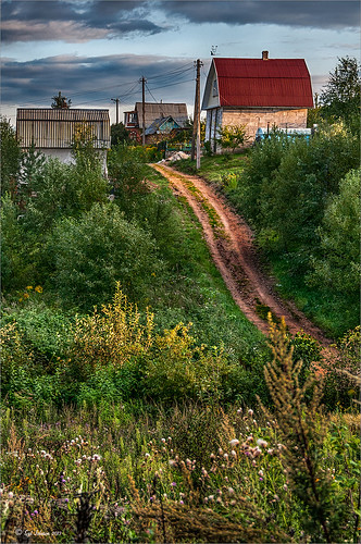
Just thought I would add a photo I took several years ago in the countryside of Belarus outside of Minsk. It was a good image to begin with so it was pretty hard to mess it up, but this time I tried something I had not done before. First I processed this image quite a bit in Lightroom – doing the basic sliders and then sharpening up the road and the foreground plants a little. Then once in Photoshop, I applied Nik’s HDR Pro 2 using the Deep 1 preset – no changes. I wondered how Topaz (see sidebar for website link) Clarity would stack up against the HDR program, so I duplicated the image and added Clarity. A preset I had created called Very Vivid Sharp was selected. (Settings if you want them are as follows: Clarity: Dynamics – Micro Contrast 0.84, Low Contrast 0.56, Medium Contrast -0.31, and High Contrast -0.09; Tone Level – all set to 0; and HSL Filter: Hue – no changes; Sat – Red 0.25, Orange 0.13, Yellow, Green, Aqua, Purple and Magenta all 0, Blue 0.06, and Overall 0.17; and Lum – Red -0.81, Orange -0.01, Yellow 0, Green -0.08, Aqua 0, Blue 0.23, Purple 0, Magenta 0.33, and Overall -0.12) Wow – it really popped the image! So now what to do, what to do?
I decided to move the Clarity layer on top and add a black layer mask. Then I selectively painted back areas that needed the extra boost that Clarity added. The results are quite spectacular I believe. Next time you get stuck, try applying a couple different filters to the original image – even ones that do not come together – and stack and mask them to get the best of both. The results can be quite incredible!…..Digital Lady Syd
Digital Lady Syd Related Blogs:
More Clarity on Topaz Clarity
Digital Lady Syd Reviews Topaz Clarity
Digital Lady Syd Reviews Nik HDR Efex Pro 2
I Didn’t Know That! Use A Pattern Fill Layer to Add a Painted Texture
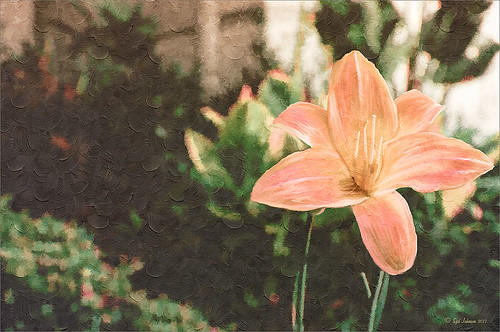
Love my Day Lilies! This was a yellow lily but using Topaz (see sidebar for website link) Clarity, I was able to turn it to this pretty pink color. (My preset I call Crazy Color Palette settings are: Clarity Section – Dynamics: Micro Contrast -0.36, Low Contrast 0.39, Medium Contrast -0.36, and High Contrast -0.39; no Tone Level settings; HSL Filter Section settings: Hue – Red -1.00, Yellow -1.00, Green +1.00, Blue +1.00, and Magenta -0,52; Sat – Red -.50, Yellow 0.27, Green -0.09, Blue -0.03, and Magenta +0.59; and Lum – Red -0.03, Yellow 0.41, Green -0.23, Blue -0.20. All not mentioned are set to 0. Then I changed to Micro Contrast slider to 0.55.) Apply and then go back to Photoshop and opened Topaz Simplify and apply Oil Paint preset. A layer was added on top and Fay Sirkis’s 03 Palette Brush Blender was used to smooth out the flower rough edges from the Simplify. A old Florabella Action (that is no longer for sale) was run on the flower and and Kim Klassen’s Cloth & Paper Prague texture was also applied at 15% opacity. The flower was painted out so the texture did not affect it, only the background. Created a New Layer using the Sponge Tool to saturate more in the flower itself. A little burning and clean up was done on the flower. A Curves Adjustment layer was added to add back a little contrast. Then a Pattern Fill Layer was added with one of the patterns in Jack Davis’s Wow Patterns (see my blog Can You Get a Painting Look With a Photoshop Action? Jack Davis Can! for download link) and set to Soft Light blend mode at 59% opacity. I have never used the Pattern Fill Layer to add a painterly texture to an image, but it turned out really nice……Digital Lady Syd
Clarity with Texture!
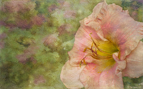
I love how this image turned out – totally me! This is a beautiful pink variety of a Day Lily – huge beautiful blooms that I bought at WalMart! Nothing was done in Lightroom other than the checking Enable Lens Profile and Remove Chromatic Aberration, and adjusting the Crop. In Photoshop the layer was duplicated and the new Topaz (see sidebar for website link) Clarity plug-in was applied using the settings shown below. Note that the Red Hue slider was set to -0.59 along with the other settings in the screenshot.
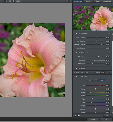
These settings bring out the pink a little more in the flower. A burn layer was created using my The Best Dodging and Burning Technique! blog, and a paint clean up layer to make the stamen stand out more. Now what really made this image pop was using the beautiful Texture 86 by Lenabem-Anna – check out all her fabulous textures on Flickr that can be downloaded for personal use. It was duplicated and on the bottom layer a layer mask was added where the pink flower was lightly painted out. I did not want to completely cover up the background purple flowers in the image so the opacity was set to only 61%. Since I wanted the flower to have some texture but not pick up the color from the it, two steps were performed: 1) the texture layer was duplicated and a black layer mask was added where the flower was lightly painted back. This time the layer as set to Hard Light and the layer opacity was only 35%; and 2) a Hue/Saturation Adjustment layer was clipped to the texture (ALT+click between the layers) and the Saturation slider in Master was set to -100 and Lightness +13. Now the texture color only appears in the background. Totally loved the final result! …..Digital Lady Syd
Digital Lady Syd Related Blogs:
Getting a Nice Painterly Landscape Effect with Topaz Simplify and Texture
Where Am I?
Digital Lady Syd Reviews Topaz Clarity
Pretty in Pink! with Topaz Clarity
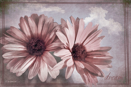
I do love to photograph my gerberas – they are always so pretty. This time I really changed them up. I think they are as pretty in pink as they were in yellow! So I was really just playing around in Topaz (see sidebar for website link) photoFXlab just to see if the new Topaz Clarity plug-in would work nicely with it. I didn’t even keep track of the changes I made exactly in Clarity, but I did use the Hue/Sat/Lum section to turn the flowers pink. I just kept fooling around with the sliders until I got a color I liked – used the Overall sliders on each of these sections and also adjusted the Clarity section too. Back in photoFXlab, adjusted the Dynamics slider a little to the right. Created a +From Stack Layer and opened up Topaz Simplify 5 where the Paint 5 preset was applied. Back in photoFXlab, the Mask tab was selected and the centers of the flowers were painted back so the detail from the Clarity layer remained. Exited the plug-in and did some basic flower clean up. Created a couple New Layers and used two of my free Cloud Brushes (Brush 6 and 9) to add some interest to the background. Added a Curves Adjustment Layer and evened out some of the petal color. Then added 2 Lil’ Owls Color Bokeh Grunge Set (see sidebar for website link)-2 overlay to the image (set to Normal at 100% opacity). Next the text was added using the free font Ruthie. Kim Klassen‘s Square 3 border was added last and set to 52%. The last step added another Curves Adjustment Layer to enhance overall contrast. That was it. I just love playing with my flowers in Photoshop!…..Digital Lady Syd
PS: Check out my Fun Photoshop How to Create an Overlay Out of a Texture blog to see the frame it was put in.
Digital Lady Syd Related Blogs:
Digital Lady Syd Reviews Topaz Clarity
Topaz Simplify Artistic Workflow
Digital Lady Syd’s Review of Topaz photoFXlab v1.1
Some Vintage Zinnias
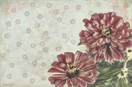
Just playing with my Zinnias. I was trying to a vintage, wallpaper feel behind them. I actually opened Topaz (see sidebar for website link) photoFXlab from Lightroom. Here are the steps completed: Applied Topaz Clarity – SJ Illustrative Look – with a few adjustments, duplicated layer, set Dynamics slider to 9 and Saturation -17, duplicated layer, enter Topaz Adjust and apply my Rick Sammon Spicify Soft Artsy, back in photoFXlab the Adjustments settings stayed on this layer, duplicated layer, duplicate layer, in B&W Effects applied SJ_Quad_DkB_GR_Yel_Wh preset, an exited the plug-in to Photoshop. Just a few steps here. Guess what I am trying to show is that there is a lot of versatility here with photoFXlab. Once in Photoshop some clean up was done and French Kiss Studio Selections 3 White Wash texture was applied (I use this texture a lot and it is in a very reasonably priced set). On the white was I used Brush Lovers Art Flowers 2000 (liked the brush best when applied directly to the French Kiss WhiteWash texture – just looked better). This brush was set up as a preset – had to select the dark red color 4e322e and dark green color 3c3e38. In the Brush Panel I turned on Shape Dynamics, Scattering and Smoothing, Size 394 px, Spacing 434% and then Color Dynamics was added and size changed to 201 px. A layer mask was added to the layer to lightly brush out texture from the flower, but leaving a little to keep the grain intact. A Curves Adjustment Layer was clipped to the texture to bring out the cool texture a little bit more. 2 Lil’ Owls Studio Color Bokeh Grunge Set 4 (see sidebar for website link) was applied at 50% opacity and in the layer style, the Blend If This Layer’s white tab was set to 164. The last step involved adding two New Layers where just a couple strokes were applied, one layer using green and one the dark red color to add a little grunge feel to the image. The brush used was Nakatoni Custom Brushes texture brush (does not appear to be available anymore but any soft grunge brush would do). The preset settings are listed below. ….Digital Lady Syd
Here are the plug-in preset settings used if you are interested:
Topaz Clarity SJ Illustrative Look settings: If you would like the illustrative look, here are settings: in Clarity Section – Dynamics: Micro Contrast 1.00, Low Contrast 0.28, Medium Contrast -0.50, and High Contrast 0.06; Tone Level: Black Level 0.61, Midtones 0.14, and White Level 0.72; and in Hue/Sat/Lum Section – Hue: Only Red 0.16, Yellow -0.05, and Green -0.17 were adjusted; Sat: only Green -0.22 and Overall -0.45 were adjusted; and Lum: Only Orange 0.36, Yellow 0.89, Green -0.91, Aqua 0.30, and Blue -0.09 were adjusted.
Topaz Adjust Rick Sammon Spicify Soft Artsy settings: Adaptive Exposure section: Adaptive Exposure 0.50, Regions 25, Contrast -0.56, Brightness -0.13, Protect Highlights 0.03, and Protect Shadows 0.03; Details section: Strength 0.87, Detail Boost 1.15, Threshold 0.12, Radius 25.00, and Sharpen 1.01; Color section: Adaptive Saturation 0.33, Color Regions 10, Saturation 1.00, Saturation Boost 1.00, and Hue 0.00; and Noise section: Suppression 3.24, Amount 0.51, and check Use Topaz DeNoise.
Topaz B&W Effects SJ Quad DkB_Gr_Yel_Wh settings: Quad Tone: Color 1 Region: Color (R1/G1/B12) and set to 15.08, Color Region 2: Color (R63/G78/B85) and set to 143.9, Color Region 3: Color (R216/G211/B129) and set to 227.5, and Color Region 4: Color (R255/G254/B237) and set to 255.0: and Transparency: Overall Transparency 1.00.

