
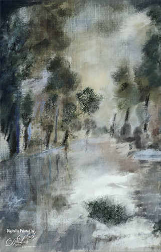
Uber Driver in Venice

Just had fun with this one mainly trying out different brushes to see what would happen. The really cool texture effect for the orange buildings came from Kyle T. Webster’s Winter 2022 set – using the Winter BG Variant on the orange buildings. In the Spring 2022 set from Kyle, The Marshall was used to create the bridge and The Marshall Var was used to create the white church building. The Tilty Pencil Soft and the Tilty Pencil Variant were used to create a few of the black sketch lines in the image. In the 2022 Spring Set Tree Leaf Mess Alt and Fresh Leaf were used to create the leaves in the tree and plant. Just used a pencil brush I created to paint the Boat and Gondolier – pretty rough sketching here. Three textures were used: Kim Klasson’s Womandweathered (Soft Light blend mode at 50% opacity), 2 Lil’ Owls Mosaic Set Celeste (Linear Burn blend mode at 23% opacity), and Adobe Paper Texture Pro Villa Adriana (Overlay blend mode at 40% opacity). Had to blend out some of the shadows with a Mixer blender brush. That meant I had to go into the Camera Raw Filter and add some grain in so it did not look too smooth. Overall it was cool to try out some of the new brushes. ….. Digital Lady Syd
First Signs of Winter
Totally enjoyed myself painting this little wintry scene. I think the recent hot weather in Florida has gotten to me! Used a very textured paper in Corel Painter 15 and mainly an Oil Brush and Blender that smeared some of the edges. In Photoshop used some of Grut’s brushes (these are a fabulous collection of brushes) to fill in where the trees did not look quite right. A texture was applied with no color (used a Hue/Saturation Adjustment Layer clipped to it and set Saturation slider to -100) to get even more texture. Last step was to add Topaz (see sidebar for website link) ReStyle Desaturated Warm III preset for the final color effect. It really is fun just to paint!…..Digital Lady Syd
A Tricolored Heron That Fell in a Painting!
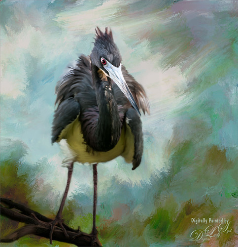
I seem to have an endless supply of these bird images from the St. Augustine Alligator Farm Rookery. It is such an incredible place to get bird images in the Spring. This is just another example of one of the magnificent birds hanging out looking for a mate. This time I actually used a layer mask to separate most of the bird from the tree limbs behind him. Since I was going to paint him, it did not have to be perfect. The bird was painted using Fay Sirkis’s (from KelbyOne) Precious Diamond Blender brush (her Mixer brushes are wonderful), then changing to it to add color when needed. This is my favorite brush for painting birds and has been used on most of my bird paintings. The texture is made up of two textures I created in Corel Painter 2015. Both textures used Quick Fix Color Brushes from Karen Sperling’s Artistry Quick Fix Video (#4 in this case) Series (check them out-and inexpensive way to learn Painter and she provides some of the best Painter brushes!), and the second also used a blender I created, and the other used Karen’s . They were placed underneath the bird and on a New Layer on top, the edges of the bird were blended into the texture. An Exposure Adjustment Layer (see my How To Do a Quick Eye Sharpening in Photoshop blog) was used to sharpen the eye. On a stamped layer on top, PS Camera Raw’s Radial Filter was used to add focus to the face and beak – painted out with the brush parts of body not to be emphasized. A Selective Color Adjustment Layer’s White Color was selected to make the white color behind the bird stand out just a little more – set Black slider to -37. That was it. I was pleased how the texture fits with the bird……Digital Lady Syd
Textured Sky Adds Vintage Feel

This is another tower image from London. Once again, I have no idea what it is connected to, but it is a beautiful cupola. I really liked the final cloth feel on the texture. This image was straightened and just the Basic Sliders were used in Lightroom. Once in Photoshop, I selected the tower, deleted the background, and tried several different texture backgrounds. I ended up with one of my very favorite Flickr Texture people, Lenabem-Anna Textures, Texture 278 – her textures are incredible! This one gives the cloth appearance with just a touch of clouds – perfect for an original image that had no clouds. For this image a Gaussian Blur was added using a Radius of 5.9 just to smooth out the texture in the background but leave the color in the texture. A Levels Adjustment Layer was added and the Midtones slider adjusted a little for more contrast to the whole image. To add the texture back into the whole image, the same texture was applied again on top. A Hue/Saturation Adjustment Layer was clipped (ALT+click between the layers to clip) to the texture and the Saturation slider was set to -100. The texture layer was set to Overlay blend mode at 67% layer opacity. A Color Balance Adjustment Layer was added on top to bring out the gold tones more in the tower. That was it. …..Digital Lady Syd
Digital Lady Syd Related Blogs:
Clarity with Texture!
Where Am I? Edinburgh, Scotland
Getting a Nice Painterly Landscape Effect with Topaz Simplify and Texture
Painterly Textures to Create a Beautiful Floral Image

Recently purchased some textures from Distressed Textures so I decided to show them off using a Zinnias image. In Lightroom the basic sliders were adjusted and the David duChemin Milford Greens preset. (See my How to Use Adobe Camera Raw (ACR) or Lightroom 4 Quickly blog.) Then the image was brought into Photoshop where for a very simple workflow. Just some flower clean up. A new darken layer was created above to burn in the edges of the flower petals (see my The Best Dodging and Burning Technique! blog). Then three Distressed Textures were applied: 1) The Artists Palette Lost Canvas set to Darken at 97% layer opacity; 2) The Spring Inspired Cherry Cotton Candy (love the name of this texture!) set to Multiply blend mode at 100% opacity; and 3) The Artist’s Palette I Dream set to Overlay at 70% layer opacity. The first two textures had layers masks applied and the flowers were painted back softly with a largish black brush. The last step was a Curves Adjustment Layer to add contrast back into the photo that the textures tend to remove. That was it – I love the vibrant colors in this combination of textures……Digital Lady Syd
Digital Lady Syd Related Blogs:
Coral Pink Blanket Flowers
Texture Resources – So Many Choices! So Many Choices!
If At First You Don’t Succeed, Try Try Again!

Love how this image turned out with a beautiful texture added to it. This is a very sentimental favorite plant for me since it came from my parents home in Indiana many years ago – it loves Florida. It is a Dieffenbachia, which is a poisonous plant around animals and kids so not the plant for everybody, but is very pretty in your home.
This image was processed using my basic Lightroom workflow. (See my How to Use Adobe Camera Raw (ACR) or Lightroom 4 Quickly blog.) Once in Photoshop, Karen Burn’s Day’s End texture was added on top (check out her Flickr account – great textures and images here), flipped (CTRL+T), and set to Normal blend mode at 58% layer opacity. A white layer mask was added and using the Photoshop Charcoal brush set to 250 pixels and a low opacity 12% brush, the leaves were lightly painted back in the mask – this brush gives a bit of a gray rough edge result that blends with the background nicely. I use it a lot for this effect. Just keep painting over the area you want the focus of the image to be. I was not really happy with the overall pastel feel of the image, so a Curves Adjustment Layer was added and the Blue channel and Red channel curves were adjusted to get a better colors. I still was not happy with the color so a Selective Color Adjustment Layer was added on top and in the Reds selected – Cyan was set to -48 and Yellows +46, in the Cyans – Cyan was set to +60, in the Blues – Yellow was set to -46, and in the Neutrals – Black was set to +19. That really made the color sing – sometimes it takes several different methods to get the look you are after. Overall, with just a little effort, this rather average image was turned into something quite stunning!…..Digital Lady Syd
Clarity with Texture!

I love how this image turned out – totally me! This is a beautiful pink variety of a Day Lily – huge beautiful blooms that I bought at WalMart! Nothing was done in Lightroom other than the checking Enable Lens Profile and Remove Chromatic Aberration, and adjusting the Crop. In Photoshop the layer was duplicated and the new Topaz (see sidebar for website link) Clarity plug-in was applied using the settings shown below. Note that the Red Hue slider was set to -0.59 along with the other settings in the screenshot.

These settings bring out the pink a little more in the flower. A burn layer was created using my The Best Dodging and Burning Technique! blog, and a paint clean up layer to make the stamen stand out more. Now what really made this image pop was using the beautiful Texture 86 by Lenabem-Anna – check out all her fabulous textures on Flickr that can be downloaded for personal use. It was duplicated and on the bottom layer a layer mask was added where the pink flower was lightly painted out. I did not want to completely cover up the background purple flowers in the image so the opacity was set to only 61%. Since I wanted the flower to have some texture but not pick up the color from the it, two steps were performed: 1) the texture layer was duplicated and a black layer mask was added where the flower was lightly painted back. This time the layer as set to Hard Light and the layer opacity was only 35%; and 2) a Hue/Saturation Adjustment layer was clipped to the texture (ALT+click between the layers) and the Saturation slider in Master was set to -100 and Lightness +13. Now the texture color only appears in the background. Totally loved the final result! …..Digital Lady Syd
Digital Lady Syd Related Blogs:
Getting a Nice Painterly Landscape Effect with Topaz Simplify and Texture
Where Am I?
Digital Lady Syd Reviews Topaz Clarity
I Must Have Flowers!

Here is another example of some of the beautiful flowers that people grow around their dacha’s outside of Minsk in Belarus. I saw so many unusual and gorgeous flowers when visiting there a few years ago. In Photoshop, Topaz (see sidebar for website link) Detail 3 and Simplify (Watercolor II preset) were applied first. Kim Klassen‘s 1612 texture was added on top at the Normal blend mode. A layer mask was added and the flowers were painted back in with a soft edged, low opacity black brush. A pink to white to pink diagonal Gradient Fill Adjustment Layer came next and set to 40% opacity. Kim Klassen’s Cloth & Paper texture Touch (one of my very favorite textures) was set to Soft Light at 64% opacity. The last major step included adding 2 Lil’ Owls Studios (see sidebar for website link) Dream Freebie 1 texture set to Soft Light at 100% opacity, where the layer mask from the first texture was copied and added to this texture (ALT+drag the mask to new layer to copy). A Levels Adjustment Layer’s Midtone slider was adjusted to bring back some contrast to the image. Text was added using the free fonts Ruthie and Batik Regular. That was it. I love the soft feel to the image and the little bug in the flower…..Digital Lady Syd
Zinnias Ready for Springtime!

Love my Zinnias! This image was first processed in Lightroom before going to Photoshop for an overhaul. Topaz (see sidebar for website link) Detail 3’s Overall Detail Med II preset was applied. A black mask was added and just the flowers were painted back to be nice and sharp. Lightened the image with a Levels Adjustment Layer. Used Kim Klassen‘s Sunkissed texture set to Soft Light blend mode at 100% layer opacity, and then Julytrio ToBe texture set to Soft Light at 47% opacity. For the wallpaper effect, a New Layer was created and Brush Lovers Art Flowers brush 2000 (these used to be posted at BrushLovers.com but they do not appear to be available anymore-they have a lot of other nice little flowers brushes that would work) was selected – in Brush panel the Shape Dynamics, Scattering and Smoothing sections were turned on at default settings, and the Brush Tip Shape settings were Size 394 pixels and Spacing 434% before painting in light brown background effect. The layer opacity was then set to 41%. The font is a really old one from Cosmi named 31. A Curves Adjustment Layer was applied to add a little contrast back in the image after adding all the texture. Last a little brownish tinge of grunge was brushed in using Kim Klassen cloth and paper extras brush 2188 on the upper corners…..Digital Lady Syd
The Polaroid Photo Look

I really researched for what kind of flowers these are and could not figure it out – the image was taken while at the Hawaiian Tropical Botanical Garden on the Big Island in Hawaii. In Lightroom the image was processed using the standard sliders to get a nice image. Once in Photoshop, the image was set to a square size with a blank area created on the right side using the Crop Tool (or Canvas Size command). The flowers were selected, the selection inverted (CTRL+SHIFT+I), and in the Channels Panel, the New Channel icon was selected to make a new Alpha Channel. Now back in the Layers Panel, Content-Aware Scale was applied. First check Protect Alpha 1 channel in Options Bar before dragging the right side handle out – this keeps the flower from distorting, but just the background area. Topaz (see sidebar for website link) Detail 3 was used to sharpen the flowers a little. Next three of Kim Klassen‘s textures were added: Cloth & Paper Venice Texture at Soft Light at 100%, same texture set to Multiply at 27%, and UggLove Texture set to Soft Light at 75%. A Hue/Saturation Adjustment Layer was used to desaturate the background just a little and the flower and stem were painted back in a layer mask. A Levels Adjustment Layer was also applied using the same flower layer mask used. A composite was made. The frame used above is one Kim suggested using from fuzzimo, but there are numerous other free downloads if you do a search for Polaroid templates. Once the frame was opened, the center was selected and put on its own layer (CTRL+J) A composite of the image was brought into the frame and clipped (ALT+click between the layers to clip) to the center area of the frame. With a little adjusting and adding some text and it was finished. This image used Quilted Butterfly and Batik Regular fonts. Really nice vintage feel to the image…..Digital Lady Syd
Digital Lady Syd Related Blogs:
Using a Template to Create Your Own Unique Valentine
Five Image Template Creates Beautiful Collection!
Hibiscus Beauty

Love my beautiful hibiscus plants blooming on my back porch. This one has particularly lovely blooms. It was very quick and easy to process. Just processed a little in Lightroom and then in Photoshop applied my old standard Topaz (see sidebar for website link) Detail 3 using the Overall Medium Detail I preset. Painted over where the petals were blown out (see my Getting Rid of Those Blown Out Areas blog) on a separate layer. Than added French Kiss Tableaux Collection Creation texture and added a layer mask. Just painted back the flower – that is all it needed! It seems that if you have a really strong texture, it sometimes works best not to change blend modes but leave it set to Normal. Last step was to add the text using a really nice font called Quilted Butterfly at 78.01 points. (This font does require a $2 donation to use.) I loved the final effect!…..Digital Lady Syd
InstaTone Sunset

Wanted to change up the look of all the 24th Annual Native American Festival images I took so using Topaz (see sidebar for website link) photoFXlab’s InstaTone feature, I got this beautiful sunset look. Basically I went into the InstaTone tab’s 500 px website and applied a beautiful yellow and gold tone from Men on Fire image by Uwe Braun at 68% layer opacity. Then a preset I created using Topaz Adjust’s Spicify was applied that gives a slight illustrated look. (Here are the settings if you want them: Adapt exp +.30/25/-0.71/-0.76/0.02/0.04; Details +1.24/1.15/ 0.12/24.67/1.98; Color +0.33/10/0.89/1.92/0.00; and Noise +1.47/0.22.) Next I cleaned up signs and spots in the image (should have done this first but oh well!). 2 Lil’ Owls Enchanted texture 4 (see sidebar for website link) was added from their Texture Workshop E-Book bundle was applied as a PNG file frame next and a dark brown Color Adjustment Layer was clipped to the frame to apply it. I had to paint in a few areas around the trees that were too light on a separate layer using a low opacity brush and sampling from the near colors. Took awhile to complete but really like the changed look. I can imagine this image at an Indian campsite in the past…..Digital Lady Syd
Digital Lady Syd’s Related Blogs:
InstaTone in photoFXlabs – Great Fun and Great Results!
Topaz DeNoise 5 and InstaTone
Coral Pink Blanket Flowers

Just bought some beautiful textures from Distressed Textures and had to try one out. This is just a point and shoot image from my little Kodak camera that I used to take these pretty pink flowers called Gallardia Galya Coral Spark or common name Blanket Flower. Just did the regular adjustments in Lightroom and then opened it up in Photoshop. The background was duplicated and this new layer was opened in Topaz (see sidebar for website link) Detail 3 and set to Medium Details 0.38, Large Details 0.16, and Contrast 0.30 was applied. A New Layer was created above and the Mixer Brush was selected. Fay Sirkis‘s Signature Watercolor Smooth Blender brush was used to smooth out and sharpen the edges of the flower in the front since the low end camera does not always give sharp edges. Next I added Distressed Textures The Artist’s Palette Museum Canvas texture. A layer mask was added and the flower painted out softly. French Kiss Savoire Faire Overlay was added and set to Color Dodge at 100%. A layer mask was added and the writing was painted off the flowers. The last step was to add a Curves Adjustment Layer to increase the contrast of the image just a little. I wish I had had my better camera with me, but at least I got the shot – some beautiful pink flowers!…..Digital Lady Syd
Macro Magic

I just love Melissa Gallo’s textures – they are so soft and beautiful and they never cease to surprise me how pretty they look on an image. The macro shot above is of my Painted Lady Hibiscus Tree that is growing on my back porch. She blooms year round for me with these huge soft pink blossoms! Basically all I did was a little noise removal and then applied Topaz (see sidebar for website link) Simplify 4 using a preset I created called Hawaii Landscape. (Settings are Simplify Section: Simplify Size 0.20, Feature Boost 0, Details Strength 0.66, Details Boost 1.00, Details Size 0.27, Remove Small 0.06, and Remove Weak 0.10; Adjust Section: Brightness 0, Contrast 1.00, Saturation 1.04, Saturation Boost 1.32, Dynamics 0, Structure 1.00, and Structure Boost 1.00; and Edges Section: Color Edge – Normal, Edge Strength 1.89, Simplify Edge 0.58, Reduce Weak 33.33, Reduce Small 0.20, and Fatten Edge 0.) Next Melissa Gallo’s Painted Textures Winter Wheat from her Cyber Monday Set 1 was set to Linear Light blend mode at 100% layer opacity, and Seafoam from her 2 for Friday Set 2 was left at Normal blend mode and 67% opacity. A layer mask was added to Seafoam and the pistil and stamen were softly painted out to remove the texture and color on these parts. Kim Klassen’s Cloth & Paper Magicfilm 3 texture was added on top and set to Linear Dodge blend mode at 79% opacity. This one gets a little tricky as I used the Blending Options dialog in its Layer Style – turned off the B Channel and set the Underlying Layer right white tab to 197/255 (split the tab by pressing ALT and sliding). This gives the pretty yellow glow grunge effect throughout the image. French Kiss’s Tour Eiffel 1903 overlay was added and set to 25% opacity. A Linear Gradient Fill Adjustment Layer was clipped to the overlay layer using a free colorful gradient called Picasso-16 from Graphix1 Picasso Inspired Gradients set. (To clip to a layer, ALT+click between the layers so only the top layer will affect the layer below.) French Kiss’s free Glorious Grunge Edging was added on top as a border and set to an aqua color. Try the Layer Style trick for an added dimension to your images…..Digital Lady Syd
My Parisian Violets!

These beautiful violets I recently bought at Wal-Mart and they are so pretty. They really like the filtered light from my south facing window in my kitchen. I used my handy, dandy 60 mm Nikkor macro lens at F/4.8, 1/90 sec, and ISO 200. A Bower 0.5 x High Resolution Digital Lens with Macro was added to the lens. In Lightroom 4 I just followed my workflow in my blog How to Use Adobe Camera Raw (ACR) or Lightroom 4 Quickly. I painted over the center of the flower using an Adjustment Brush set to a high sharpening and just a little Clarity. In Photoshop a Curves Adjustment Layer was used to selectively remove a shadow behind the front flower (see my Using Curves Adjustment Layers to Get Rid of Shadows and Highlights blog). Painted Textures Seafoam textures was added and just the flower lightly painted back using a white layer mask and painting in black. Next 2 Lil’ Owls Affetto Grunge Mosaic texture (see sidebar for website link) was added and the center painted out so only the darkened edges remained on most of the image. French Kiss’s Vintage French Brush No. 2 set -Dec 1924 was placed on the left side of the image and set to 89% opacity. A Layer Style was opened on this overlay layer. A dark Stroke set to 3 pixels inside was added, a Pattern Overlay using that wonderful default Photoshop pattern Bubbles was checked to add some variation in the text (I think this is the first time I have ever used it!), and an Outer Glow at 39% opacity was used. A Color Fill Adjustment Layer was clipped to the overlay and set to a light blue color. On the upper right French Kiss’s Vintage French Brush 1903 (same link as above) writing was applied and another Color Fill Adjustment Layer was clipped using the purple color from the flower. That was it! Lots of fun to do!…..Digital Lady Syd
Painterly Red Berries

These little red berries were growing in my neighbors yard – I really did not think they would look that great but I took a photo anyway. By adding the soft painterly texture, they turned into something quite beautiful. In Lightroom the basic panel sliders were manipulated and an adjustment brush was set to increased clarity and sharpening to paint around the edges of the front berries. The image was then opened in Photoshop where Topaz (see sidebar for website link) Detail 3 was opened and the Desaturated Blush I preset was applied. Painted Textures Creamsicle texture was set to Linear Burn at 100% opacity. A Levels Adjustment Layer was added and the Output level was changed to 54 to add a slight light haze to the image. The berries in front were painted out in the adjustment layer mask so they would appear slightly sharper. That is it! I love this texture – gives a real painterly look!…..Digital Lady Syd
Digital Lady Syd’s Related Blogs:
Beautiful Christmas Flowers
The Kiddie Tractor Revived!

Riding my toy tractor may be the first recollection I have. Since I grew up practically in the middle of a corn field (although my parents were not farmers), my first ride-on toy was a tractor exactly like this one. It was my favorite toy and I put miles on it! I did not have a tricycle, just a tractor. I had to get a picture when I went to the 39th Annual Turkey Run in Daytona Beach, Florida, last fall. Looks like we are missing a pedal here.
Used my basic Camera Raw steps (see How to Use Adobe Camera Raw (ACR) or Lightroom 4 Quickly) in Lightroom 4. Next Topaz (see sidebar for website link) Detail 3 was applied using Overall Detail Medium II preset first, and then the Soft and Dreamy II preset was applied. The tractor was painted back in a layer mask so just the background was softened. On a duplicated layer Topaz Adjust 5’s Low Key II preset with Transparency slider set to .28 was applied to the layer. A Hue/Saturation Adjustment Layer was used to desaturate the greens and yellows. 2 Lil’ Owls (see sidebar for website link) Workbook Bonus Texture 16 was added at 85% opacity. A High Pass Sharpening effect set to 8 pixels was applied and a final Curves Adjustment Layer for added contrast and give a nice orange color to the tractor was added. Lots of fun to work on something from your childhood……Digital Lady Syd
Snowy Butterfly with Akvis Sketch

This is a female Palamedes Swallowtail Butterfly (the males are smaller and blacker in color) that was so much fun to photograph – my favorite type of butterfly to photography as they as not so skiddish to shoot. I decided to try out the Akvis Sketch plug-in that I recently reviewed. (See Digital Lady Syd Reviews Akvis Sketch Plug-in for Photoshop.) To get this image, first I opened up the image in Photoshop. To sharpen the image Calvin Hollywood’s Freaky Amazing Details action was applied – see my Tidbits Blog A Little Hollywood for My Butterfly Model to get information on how to do this and the action download link. A composite was created on top (CTRL+ALT+SHIFT+E) and Akvis Sketch was opened – a preset I created before was applied, (Used the Classic style, Strokes section Color Pencil was set to 63, Edge section Edge Width was set to 56 and a Good Colored Sketch preset was created.) Next a Shadowhouse Creations Vintage Soft Grunge V27b texture was applied. A New Layer was added on top where French Kiss Spatter4 Brush 22 was set to 5000 px at 30% brush opacity to create the soft purple splotchy layer. Next Shadowhouse Creations free Cabin/Trees brush was applied at 49% layer opacity. The top layer used my free SJ Snow2 Overlay slight blur at 100% layer opacity. Anyway just another way to have fun with Akvis Sketch…..Digital Lady Syd
Red Flowers in the Snow

Once again here is an image I never thought I would process, but thanks to all the beautiful textures out there, the flowers end up looking like I remember them – well sort of – minus the snow. These Celosia flowers were taken in the courtyard at Flagler College (the old Ponce de Leon Hotel) in St. Augustine, Florida. This image was first processed in Lightroom where cropping and Basic Panel sliders were adjusted. An Adjustment Brush was applied to sharpen some of the foreground flower tips. In Photoshop Melissa Gallo of Painted Textures in her tutorial video Turn Your Photo into a Pastel Painting, Pencil Drawing or Pen and Ink, the second example, was followed. First the background was duplicated and the top row was set to Screen Blend Mode. A black layer mask was applied and with a white brush, the dark areas of the flower was painted in white to lighten the color on the mask. A Levels Adjustment Layer was applied the Midtones set to .78 to increase contrast just a little. A composite was created on top (CTRL+SHIFT+ALT+E). Next 2 Lil’ Owls Mosaic Set’s Claude texture (see sidebar for website link) was added and a layer mask added where the flower was painted back into the image using a soft 30% opacity black brush. A text layer was added showing the name of the flower using Flakes font at 131 pt size and a brown color. Another line of text was created using a quotation from Emily Dickinson using Chopin Script font and set to a grayish brown color. My free SJ Snow Overlay-slight blur was duplicated several times, merged, and set to 75% opacity. A Curves Adjustment Layer was the last step to add a little contrast. I loved the final result, and for some reason the snow just added a special effect to a red flower look…..Digital Lady Syd
Happy Valentines Day!

These flowers were growing in the countryside in Belarus several years ago. I am not sure what kind they are, but the blooms were huge! And the colors are incredible! Not a lot of processing here. After some basic slider adjustments in Lightroom 4, the image was opened up in Photoshop and three inches were added the left side of the image to create an area to add type by going to Image -> Canvas Size. The image was sharpened using Topaz (see sidebar for website link) Detail 3 and the Feature Contrast II preset. Some of the contrast was removed from the image by duplicating the top layer and setting it to Screen blend mode. A black layer mask was added and the high contrast areas were painted back in so they were not so obvious. (See a wonderful video by Melissa Gallo of Painted Textures called Turn Your Photo into a Pastel Painting, Pencil Drawing or Pen and Ink on how to do this.) A New Layer was created and some of the too bright highlights on the pink and purple flowers were lightly painted out. (See my Tidbits Blog Getting Rid of Those Blown Out Areas in Your Image.) Added a Levels Adjustment Layer per Melissa’s suggestion and then Topaz Simplify 4 was opened and the Painting II preset applied. The centers of the large blooms were brushed out to bring back the detail a little using a brush set to 33% opacity in the Local Adjustments section, the Dynamics slider in the Adjust section was set to 0.38, and Tone in Finishing Touches was checked. Back in Photoshop Kim Klassen’s Reentry Texture was added – beautiful texture that was free by signing up for her newsletter. On a white layer mask the flowers were lightly painted out to reveal the flowers just enough. Next on another New Layer some pink hearts were added to the background using Obsidian Dawn’s hearts-glitter brush set’s Glitter Brush set to 4100 px. Once again a white layer mask was added and the flower painted out so the hearts do not cover them. This layer was set to 68% opacity. The text was added using my favorite Freehand575 BT font set to a default setting of the Bevel & Emboss layer style. A basic texture image turned into a Valentine for you!…..Digital Lady Syd
EPCOT Texturized

Was looking at some of my older work and came across one of my first texture images from three years ago. I really liked the treatment of this image so I thought I would try to reconstruct how I did it. A very different workflow was used. When the Lightroom adjusted image was opened in Photoshop, I did some clean up to remove some tourist heads. Then Topaz (see sidebar for website link) Adjust’s Spicify preset was applied. Next Nik Silver Efex Pro Antique Plate preset (pretty close to SEP2’s Antique Plate II) was added and set to 42% opacity. Ash Texture 25 was added (it’s a shame but they are no longer available, but Isabelle Lafrance free Decemberpack1 texture 1 has a very similar look) and set to Overlay at 100% opacity. Back into Silver Efex Pro where the Neutral preset was applied – layer was set to Screen at 51%. Next a Curves Adjustment Layer was added using a slight S curve to enhance contrast. Topaz Simplify was applied using the basic BuzSim preset. The last step used OnOne’s (see sidebar for website link) PhotoFrame Dave Cross 15 set to 72% opacity – the PhotoFrames are no long available in the newest release but many are incorporated in the new Perfect Effects 4 module. The final result is really nice – I am going to experiment some more using these plug-ins to enhance my texture effects…..Digital Lady Syd
Musical Daisies

My musical flower image basically started out by my experimenting with some inexpensive French Kiss Brushes I recently bought. The background is from Shadowhouse Creations – Old Paper Texture 4. My flower image was added and a layer mask applied so that only a few daisies were showing. Once done, the layer mask was applied to the image (right click on layer mask and choose Apply Mask). A Color Balance Adjustment Layer was added and sliders in the Midtones (0, +13, -18), Highlights (), +11, -12), and Shadows (-31, +4, _32) were set to change the flower color somewhat. (I am listing the settings just to give you a feel for how these can be adjusted.) All the following brush layers were added underneath the image but above the texture layer – that way the brush strokes look like they are part of the texture and do not cover the image. It is also now easier to adjust the layer opacity and color. French Kiss Watercolor Spots 1_14 PNG brush file was applied on a New Layer and a bright pink Color Fill Adjustment Layer was clipped to it (ALT+click between the two layers to clip). Next a layer with one French Kiss Spatter4_14 brush PNG file stroke was applied and a purplish Color Fill Adjustment Layer was clipped to it. Another new layer and French Kiss Spatter 2_04 was applied with a deeper purple and set to 51% opacity. I seem to like adjusting a PNG file over the actual painted stroke – it seems easier to me but I am not sure it makes that much difference whether you actually stroke the image or use an overlay PNG stroke. French Kiss Vintage French Music in a set called French Kiss Vintage French Brushes 2 was added on top at 82% opacity, and a brown Color Fill Adjustment Layer was clipped to the layer. The music was painted off the flowers by using a layer mask. (Not sure why I placed it above the image – it would have been easier below.) The last step was a Curves Adjustment Layer to lighten up the image overall. This actually was not as hard as it sounds. Mainly just a lot of paint being spattered! What fun!…..Digital Lady Syd
Where Am I?

This is the beautiful Scott Monument in Edinburgh, Scotland. There is an excellent tutorial called Processing with Textures by Colleen of Chasing Dreams Photography that shows you how to create a vintage feel that looks somewhat like this. After doing basic processing in Lightroom, the image was brought into Photoshop where Lenabem-Anna Texture – 208 was added and set to Overlay blend mode at 17%. She has such beautiful textures that can be downloaded from FlickR – see her Use Information before downloading. This texture was chosen to lighten the dark image in the center. The texture was removed by painting a sampled color from the texture over the building areas using a low opacity brush. Next her beautiful vintage sky Texture – 230 was applied and set to Darken at 100% – a layer mask was used to remove texture from the parts of the image where the texture should not be covering. A vintage action was run on the background layer to add more of the effect and the layer was set to 49% opacity. On top Flypaper Elysium Copy Taster Texture was added but a Hue/Saturation Adjustment Layer was added with Saturation set to -100 so no color but just the scratches were seen. The texture was set Overlay blend mode at 45% opacity. French Kiss free Glorious Grunge Edging Overlay was added and a Solid Color Adjustment Layer using a cream color for the edging. A dark vignette was applied at 54%. To get a better feel for all these steps, check out the video. This image was a lot of fun to do and I really like the vintage look!…..Digital Lady Syd
Beautiful Christmas Flowers

These flowers were once again taken at the local grocery store with my little Kodak Point-and-Shoot camera. I bought four textures from Melissa Gallo’s Painted Textures website on Black Friday and love them. These are very painterly textures and create a different look! She also has some very interesting tutorial videos on how to apply a texture – keeping the texture on an image and painting in color to remove texture from parts of the image, which is what was done here. Check out her website if you enjoy textures as much as I do.
The biggest change I did on this image was in Lightroom where the White Balance eyedropper was sampled throughout the image until I found something different that I liked – it turned a rather dark fall colored image into a bright red and pink image. Totally awesome! I also used a Lightroom Adjustment Brush to sharpen the yellow centers of the flowers and some of the rose petal edges. Now following Melissa’s tutorial, Shadowhouse Creations Vintage Soft Grunge texture V32b texture in Set 3 was applied using the Multiply blend mode at 84% opacity, along with Painted Textures Taupe Canva using Hard Light blend mode at 35% and Pink Impasto using Hard Light blend mode at 67%. A Color Balance Adjustment Layer was added to increase the red color a little in the Highlights and greens in the Shadows. A Curves Adjustment Layer was added to lighten the overall contrast of the image.
Totally loved the result!…..Digital Lady Syd
Digital Lady Syd Related Blogs:
For Tidbit Blogs, click on the Texture Category to get several more.
Where to Find Those Cool Free Christmas Card Templates?
How to Create Unique Textured Backgrounds
How to Create Unique Watercolor Background Texture
Creating That Vintage Texture Feel
Russell Brown’s Paper Texture Panel Updated!
Tips for Flower Textures
Some Free Christmas Overlays to Spice Up Your Christmas Cards


