
Light Dawning in the Forest
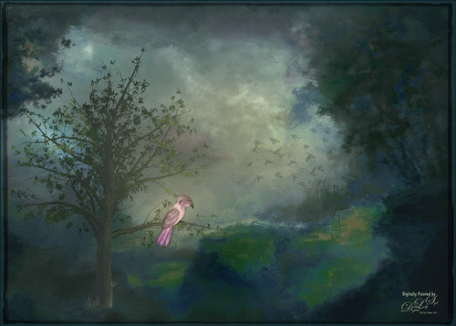
Just created this little image for fun. I started image by opening up the Tree Generator in Photoshop (Filter -> Render -> Tree – not available in CS6 unfortunately) and created a 16 Young Robina tree and just playing with all the fun sliders. If you have not tried out this fun little sub-program inside PS, you should give it a spin – lots of fun! Behind the tree one of my Corel Painter textures was placed and the Hue adjusted with a Hue/Saturation Adjustment Layer. The bird is from some clip art that I had and it was painted and liquified. The flying birds in the background are a free download from Jai Johnson. Not much to this image. I liked the colors that resulted…..Digital Lady Syd
Boring Image to Fabulous Image!

As you can see, this little pink flowers pix taken at the ICW (Halifax River) in Ormond Beach, Florida, was not that great to begin with, but by adding this gorgeous texture from Painted Textures, the image was totally turned around. In Lightroom 5, the image was desaturated using an Adjustment Brush and just leaving the flowers pink. Two Radial Gradients were applied – one for the outside where the Exposure slider was further darkened, and one for the inside area where the Clarity and Sharpness sliders were reduced to make the flowers appear softer and Shadows increased to 20 to give just a glimpse of the background details. Screenshot shows how image looked as a RAW file, and then after Lightroom adjustments right before taking it into Photoshop.

The image was taken into Photoshop CC where a clean up layer was added to get rid of the spots on the flower petals. Next Painted Texture’s beautiful August Sand Texture was added and set to Linear Light at 77% layer opacity. A Hue Saturation Adjustment Layer was clipped (ALT+Click between the layers) and the Hue was set to -4 and Saturation -23. Then a Curves Adjustment Layer was added to increase contrast, which adding textures often requires, by dragging in the image with the little hand icon tool from the top of the panel and pulling down. A New Layer was added on top and set to Overlay – a burn layer was created using a black brush at 12% and following down the stems. (See my The Best Dodging and Burning Technique! blog ). It was also set to 44% layer opacity to keep it from being overdone. No layer masks or fancy selections or filters were used on this one – the texture totally made this image!……Digital Lady Syd
Vintage Roman Bath

Since I have been revisiting my old images from England and Scotland recently, here is one of my latest concoctions! Love how this image turned out very vintage and I can actually visualize being in the water per the Jane Austin book Persuasion description. I have to chuckle as there are at least 5 people in this image talking on their cell phones. Such for the real vintage effect! Anyway, The Roman Baths at Bath, England, are quite interesting to visit and definitely have a real vintage feel to them.
So the steps to getting this effect are pretty easy. First the Basic sliders in Lightroom along with some building straightening using the new Lens Correction Upright feature was applied. In Photoshop, the Background layer was duplicated and added a black layer mask added. Then just the water was painted back – the layer was set to 76% opacity and that was all – just softened the color a little. Next a Curves Adjustment Layer was added and the mask filled with black. This time the heavy building shadow in the water was painted back in white. The Curve was used to lighten the shadow to match the rest of the water’s color. (See my Using Curves Adjustment Layers to Get Rid of Shadows and Highlights blog for info on doing this or could use the How to Use a Selection to Draw Focus in an Image blog using Levels Adjustment Layers.) A stamped composite layer was created (CTRL+ALT+SHIFT+E) on top and duplicated. Next Topaz (see sidebar for website link) Black & White Effects was applied twice. First a Quad Tone preset I had created (see settings below) was applied, and then Topaz’s Classic preset. 2 Lil’s Owls (see sidebar for website link) Enchanted4-3 overlay (from the Texture Workshop Ebook Bundle) was added to give the beautiful linen-like texture to the image, and a Curves Adjustment Layer was used to add back a little contrast. That was it. Black & White Effects really gave this image the vintage feel – it is a great plug-in for this type of effect……Digital Lady Syd
SJ Quad DkB_Gr_Yel_Wh preset settings: Quad Tone: Color 1 Region: Color (R1/G1/B12) and set to 15.08, Color Region 2: Color (R63/G78/B85) and set to 143.9, Color Region 3: Color (R216/G211/B129) and set to 227.5, and Color Region 4: Color (R255/G254/B237) and set to 255.0: and Transparency: Overall Transparency 1.00.
Digital Lady Syd Related Blogs:
Lightroom 5′s New Upright Adjustment Feature
Quad Tones in Topaz Black and White Effects Plug-in
The Art Corner: Painting and Sculpture by Tassaert
I Didn’t Know That! Use A Pattern Fill Layer to Add a Painted Texture

Love my Day Lilies! This was a yellow lily but using Topaz (see sidebar for website link) Clarity, I was able to turn it to this pretty pink color. (My preset I call Crazy Color Palette settings are: Clarity Section – Dynamics: Micro Contrast -0.36, Low Contrast 0.39, Medium Contrast -0.36, and High Contrast -0.39; no Tone Level settings; HSL Filter Section settings: Hue – Red -1.00, Yellow -1.00, Green +1.00, Blue +1.00, and Magenta -0,52; Sat – Red -.50, Yellow 0.27, Green -0.09, Blue -0.03, and Magenta +0.59; and Lum – Red -0.03, Yellow 0.41, Green -0.23, Blue -0.20. All not mentioned are set to 0. Then I changed to Micro Contrast slider to 0.55.) Apply and then go back to Photoshop and opened Topaz Simplify and apply Oil Paint preset. A layer was added on top and Fay Sirkis’s 03 Palette Brush Blender was used to smooth out the flower rough edges from the Simplify. A old Florabella Action (that is no longer for sale) was run on the flower and and Kim Klassen’s Cloth & Paper Prague texture was also applied at 15% opacity. The flower was painted out so the texture did not affect it, only the background. Created a New Layer using the Sponge Tool to saturate more in the flower itself. A little burning and clean up was done on the flower. A Curves Adjustment layer was added to add back a little contrast. Then a Pattern Fill Layer was added with one of the patterns in Jack Davis’s Wow Patterns (see my blog Can You Get a Painting Look With a Photoshop Action? Jack Davis Can! for download link) and set to Soft Light blend mode at 59% opacity. I have never used the Pattern Fill Layer to add a painterly texture to an image, but it turned out really nice……Digital Lady Syd
Using Old Wallpaper for a Vintage Look

Just another pretty image of my zinnias growing in my front yard. In Lightroom a preset I created from Jack Davis’ video (see my Can You Get a Painting Look With a Photoshop Action? Jack Davis Can! blog for link) – this was another part of the video where he shows you how to make an Antique Looking preset in ACR, but it can be done as easily in Lightroom. (It is also in his Facebook link for Lightroom presets download.) Once brought into Photoshop, a New Layer was created and the Mixer Brush was pulled out to define the leaves more, especially the ones in front. Fay Sirkis Four Season Classic FX Highlilghts #1 was used along with her 03 Palette Knife Blender brush, downloaded from her webinars on the NAPP website. She just completed a series of four videos where she goes over each season – wonderful videos if you want to learn to paint! Eventually this layer was set to 82%. On top of the Mixer Brush layer, Caleb Kimbrough vintage wallpaper2 was added (he has several free wallpapers to download) and set to Darker Color blend mode at 39% opacity. A layer mask was added and the flowers painted back into the image. Next an Overlay created from Kim Klassen’s Cloth & Paper texture Touch was applied and set to Multiply blend mode. A medium green Color Fill Layer was added, clipped to the overlay, and set to 70% opacity to add a little green tint to the edges. A Selective Color Adjustment Layer was added to get just the right color of red/magenta in the image. Then a Vibrance Adjustment Layer was added and set to +100 to add back a little color. The last step involved sharpening using a High Pass Filter, setting the mask to black, and painting back just the center of the flower and little bit of the wallpaper. Really loved the final vintage feel to the image……Digital Lady Syd
I Must Have Flowers!

Here is another example of some of the beautiful flowers that people grow around their dacha’s outside of Minsk in Belarus. I saw so many unusual and gorgeous flowers when visiting there a few years ago. In Photoshop, Topaz (see sidebar for website link) Detail 3 and Simplify (Watercolor II preset) were applied first. Kim Klassen‘s 1612 texture was added on top at the Normal blend mode. A layer mask was added and the flowers were painted back in with a soft edged, low opacity black brush. A pink to white to pink diagonal Gradient Fill Adjustment Layer came next and set to 40% opacity. Kim Klassen’s Cloth & Paper texture Touch (one of my very favorite textures) was set to Soft Light at 64% opacity. The last major step included adding 2 Lil’ Owls Studios (see sidebar for website link) Dream Freebie 1 texture set to Soft Light at 100% opacity, where the layer mask from the first texture was copied and added to this texture (ALT+drag the mask to new layer to copy). A Levels Adjustment Layer’s Midtone slider was adjusted to bring back some contrast to the image. Text was added using the free fonts Ruthie and Batik Regular. That was it. I love the soft feel to the image and the little bug in the flower…..Digital Lady Syd
Red Flower-Blue Bokeh

This Canna Lily flower is similar to a bright orange variety I have growing in my front year but this one was at the Hawaii Botanical Tropical Gardens on the Big Island. To post-process, the flower and plant were selected from the background which had lots of shadows and highlights from other leaves nearby that was very distracting. Topaz (for website link see sidebar) Detail 3 Overall Medium Detail II was applied to this layer. Jill Wellington’s Bokeh free 94 textures – texture 24 was added behind the flowers. Once placed above the light blue texture, several rough edges appeared – the flower and plant were selected (CTRL+click on the thumbnail), then Select -> Refine Mask was chosen where Feather was set to .5 and the Shift Edge set to -40. A Hue/Saturation Adjustment Layer was clipped to the flower layer (ALT+click between the layers so only flower layer is affected) and the bottom leaves’ color was adjusted from bright green to darker tones – the layer was mask was turned to black by clicking CTRL+I in the mask. The last step involved using a Levels Adjustment Layer to increase the contrast just a little and to soften the whole look (Output was set to 60 and flower painted back gently in layer mask to bring out color a little)…..Digital Lady Syd
Digital Lady Syd Related Blogs:
Soft Bokeh Texture for a Flower Image
Happy New Years!
Textured Pink Orchids

Just loved the way these beautiful orchids look with this luscious texture applied to them. These orchids were growing at the Hawaii Tropical Botanical Garden on the Big Island in Hawaii. Just did my basic image adjustments in Lightroom – used the Adjustment Brush to add some Clarity and Sharpening to the foreground flowers, and another one to smooth out the highlights and soften the background which was pretty harsh. Once in Photoshop, the background image was duplicated (CTRL+J). Next the texture Winter Wheat from Painted Textures Cyber Monday set was added between the two layers. A layer mask was added to the top orchid layer and the background was painted out with a soft black brush to cover up most of the background color. A Curves Adjustment Layer was added using a slight S-curve to add a little contrast to the image. The last step involved a black vignette set to 59% opacity so it barely is noticeable. Very simple processing and I loved the results. Melissa Gallo’s textures are so pretty!…..Digital Lady Syd
Digital Lady Syd Related Blogs:
Painterly Red Berries
Red Flowers in the Snow
Beautiful Christmas Flowers
Vintage Effect on Hanging Pots

The image was taken at the 24th Annual Native American Festival in Ormond Beach, Florida recently. I just loved the way this image turned out since it started out with a very cluttered background. It was an three image HDR image that was processed using Photomatix Pro’s Merge to 32-bit HDR in Lightroom. The resulting TIFF file was adjusted and Matt’s 70’s preset was applied before taking the image into Photoshop. Some background clean-up was done and the Kim Klassen cafe simplicity texture (sign up to get several beautiful free textures including this one) at 55% opacity was added to the image – really gives it that vintage feel. The pots were painted out with a low opacity black brush on a white layer mask. A Curves Adjustment Layer was added to give just a little more contrast in the image. That was it – very simple processing but one of my favorite images from the event.
It is amazing how pretty the results can be by trying different textures on an image. Really loved this one….Digital Lady Syd
Digital Lady Syd Related Blogs:
Check out my Textures category in the sidebar for more Tidbits Blogs
Check out my Fun Photoshop Blog (link at top of page) and click Textures category in the sidebar
Some French Tulips!

Love this image of my beautiful red tulips I got from the grocery a few weeks ago. I was experimenting with different settings and this one turned out perfect in my mind! It was shot with my 60 mm Nikon Macro Lens set at F/2.8, 1/3000, and ISO 400. Very little was done in Lightroom other then a little Basic slider adjustments following the workflow in my blog How to Use Adobe Camera Raw (ACR) or Lightroom 4 Quickly. I added a pretty texture (1) from 2 Lil’ Owls Studio textures (a free one from the site – see sidebar for website link) that I had first opened in Nik Color Efex Pro 4 and applied BiColor Filters using 40% opacity and Darken Center Filter to the texture. It gives more of a colorful look than the original texture. The beautiful French text is from French Kiss Glorious Grunge Letter 2 (a free download) – a brown colored Color Fill Adjustment Layer was clipped to the text (to clip just hold down ALT+click between the two layers in the Layers Panel, and the Adjustment Layer will attach to just the text). The text layer was set to 66% opacity. To keep the text from covering the flower, a Layer Mask was added to the text layer – with a black brush at 100% opacity, the text was removed from the flower itself. Next French Kiss Artiste Gateaux was added, set to Overlay blend mode and 28% Opacity. This makes the image look like a canvas – love this texture! The last step was a Curves Adjustment Layer added to the whole image to add some contrast. Sometimes it is just fun to play with an image you just like!…..Digital Lady Syd
Digital Lady Syd Related Blogs:
Check out my Textures category in the sidebar for more Tidbits Blogs
Check out my Fun Photoshop Blog (link at top of page) and click Textures category in the sidebar
Musical Daisies

My musical flower image basically started out by my experimenting with some inexpensive French Kiss Brushes I recently bought. The background is from Shadowhouse Creations – Old Paper Texture 4. My flower image was added and a layer mask applied so that only a few daisies were showing. Once done, the layer mask was applied to the image (right click on layer mask and choose Apply Mask). A Color Balance Adjustment Layer was added and sliders in the Midtones (0, +13, -18), Highlights (), +11, -12), and Shadows (-31, +4, _32) were set to change the flower color somewhat. (I am listing the settings just to give you a feel for how these can be adjusted.) All the following brush layers were added underneath the image but above the texture layer – that way the brush strokes look like they are part of the texture and do not cover the image. It is also now easier to adjust the layer opacity and color. French Kiss Watercolor Spots 1_14 PNG brush file was applied on a New Layer and a bright pink Color Fill Adjustment Layer was clipped to it (ALT+click between the two layers to clip). Next a layer with one French Kiss Spatter4_14 brush PNG file stroke was applied and a purplish Color Fill Adjustment Layer was clipped to it. Another new layer and French Kiss Spatter 2_04 was applied with a deeper purple and set to 51% opacity. I seem to like adjusting a PNG file over the actual painted stroke – it seems easier to me but I am not sure it makes that much difference whether you actually stroke the image or use an overlay PNG stroke. French Kiss Vintage French Music in a set called French Kiss Vintage French Brushes 2 was added on top at 82% opacity, and a brown Color Fill Adjustment Layer was clipped to the layer. The music was painted off the flowers by using a layer mask. (Not sure why I placed it above the image – it would have been easier below.) The last step was a Curves Adjustment Layer to lighten up the image overall. This actually was not as hard as it sounds. Mainly just a lot of paint being spattered! What fun!…..Digital Lady Syd
Where Am I?

This is the beautiful Scott Monument in Edinburgh, Scotland. There is an excellent tutorial called Processing with Textures by Colleen of Chasing Dreams Photography that shows you how to create a vintage feel that looks somewhat like this. After doing basic processing in Lightroom, the image was brought into Photoshop where Lenabem-Anna Texture – 208 was added and set to Overlay blend mode at 17%. She has such beautiful textures that can be downloaded from FlickR – see her Use Information before downloading. This texture was chosen to lighten the dark image in the center. The texture was removed by painting a sampled color from the texture over the building areas using a low opacity brush. Next her beautiful vintage sky Texture – 230 was applied and set to Darken at 100% – a layer mask was used to remove texture from the parts of the image where the texture should not be covering. A vintage action was run on the background layer to add more of the effect and the layer was set to 49% opacity. On top Flypaper Elysium Copy Taster Texture was added but a Hue/Saturation Adjustment Layer was added with Saturation set to -100 so no color but just the scratches were seen. The texture was set Overlay blend mode at 45% opacity. French Kiss free Glorious Grunge Edging Overlay was added and a Solid Color Adjustment Layer using a cream color for the edging. A dark vignette was applied at 54%. To get a better feel for all these steps, check out the video. This image was a lot of fun to do and I really like the vintage look!…..Digital Lady Syd
Digital Lady Syd’s Rule No. 9: Get the Shot!

I took this beautiful little rose at Lowe’s with my inexpensive Kodak C1450 14-mp point-and-shoot camera and it turned out very nice! These little cameras really do a great job for those unexpected shots! Since most people have decent cameras on their phones (mine is still a 2 megapixel so I carry this camera), there really is no reason not to get the shot. It just may not be quite as sharp or colorful as your good camera, but at least you get the shot, the memory, and something you can work with in Photoshop. That is what I did with this rose – it was a little soft except where it was focused, but the colors were still beautiful and overall, not that bad an image.
One of the issues I had with this image is that it is a JPG and there was a lot of Chromatic Aberration in the image – I tried to remove it in Lightroom, but it still looked rather bad so I treated it with a soft texture treatment to blend in the petals where the bleeding was bad. Some noiseware was also applied. Two gorgeous textures were stacked from French Kiss Textures – Artiste Fantasie at 80% opacity and Artiste LaDanse set to 68% opacity and her Spatter Brushes were used over the rose. Following Dave Cross’s path tutorial from his Photoshop CS5 Finishing Touches for Photographers class at Kelby Training (but it is also in his really good Photoshop Finishing Touches book), I created a fancy edge around the flower. Dave’s book was published a while back, but most of the tutorials work fine in CS6.
So get the shot, even if you do not have your best equipment with you – it may be a great image anyway!…..Digital Lady Syd
Using a Couple of My Textures

Just thought I would post a little link to how my textures can work together. These are my miniature mums on my back porch – they were processed in Lightroom using my workflow (see How to Use Adobe Camera Raw (ACR) or Lightroom 4 Quickly). Once in Photoshop clean up was done first on some of the petals, and a High Pass Filter set to radius 8 and Soft Light blend mode to sharpen the flowers. Next my free Pastel Watercolor Texture set to Hard Light, and Cat Painting Texture set to Hard Light at 40% opacity. Last a couple of French Kiss Splatter brushes were added and my French Photography Overlay I created (see How to Create Personal Overlays for Your Images). That is all that was involved. Enjoy!…..Digital Lady Syd
The Textured Flower Look!

Really enjoying processing the beautiful little white mums still blooming on my back porch. I recently found yet another wonderful texture site and decided to give it a try. The flower image was first processed in Lightroom – a preset called Summer Haze by Matt Kloskowski (one of the Photoshop guys at NAPP) was first applied and it turned everything into this soft warm summery feeling. With the Basic sliders a few tweaks were added to increase Exposure and open up the Shadows a little, and then a couple adjustment brushes were created to add sharpening and clarity to the flower centers. Once in Photoshop some blown out highlights were softened (see Getting Rid of Those Blown Out Areas in Your Image and a little Burning was done to bring out some of the flower lines. Next a beautiful Kim Klassen Texture called Organic was added and set to Hard Light blend mode at 92%. (Join her site and get lots of her beautiful textures for free including this one!) A Levels Adjustment Layer was added to increase the contrast a little. Next I added one of my own overlays I created (see How to Create Personal Overlays for Your Images) and used a layer mask to remove part of it – just wanted a little showing. I also used a small splatter brush at 15% opacity to reduce parts of the lettering without reducing all of it. The last step involved adding my favorite French Kiss Glorious Grunge Edging Overlay – a free overlay that can be downloaded at her site. That was it!…..Digital Lady Syd
Just Bloomin’ Beautiful!

This miniature mum was in bloom again for the fall season. Just beautiful! This image was taken with my Micro Nikkor 60 mm f/2.8 macro lens set to Manual mode, 1/90 sec, F/5.6 and ISO 200. Very little processing but did use Flypaper Texture Rainbow Trout Taster and my Double Edge Frame Layer Style sampling the Inner Shadow color from the image. Enjoy!…..Digital Lady Syd
Digital Lady Syd Related Blogs:
The Macro Shot
Beautiful Soft Flowers
Getting a Nice Painterly Landscape Effect with Topaz Simplify and Texture

An easy way to get a painterly look. This image is at the entrance to SeaWorld in Orlando, Florida, and is a great place to take a shot – very Disneyland-like colors! This look was created by doing these things:
1. Applied Topaz (see sidebar for website link) Simplify 4 using the Painting V preset set to transparency to .28
2. Next French Kisses Artiste Fauve Rainbow texture was added – although any painted texture you like could be used. A Hue/Saturation Adjustment Level was clipped to the texture layer (by ALT+clicking between the layers) and Saturation was set to -100 to desaturate the texture so it can be layered on top of the image so the color in the texture does not show up on the image. The texture blend mode was then set to Hard Light at 34%. (Try different blend modes to see which looks best on your image.)
3. A Levels Adjustment Layer was added to brighten the image as the texture tends to darken the midtones.
4. Topaz Detail 2 was applied to sharpen the image using the Creative Detail Accent preset with some adjustments to the three color sliders and the saturation slider.
That was it and you get this nice painterly effect!…..Digital Lady Syd
Digital Lady Syd’s Related Blogs:
Topaz Simplify and Lens Effects Saves an Image!
Digital Lady Syd Reviews Topaz Simplify 4
Using Topaz Simplify for That Artistic Feel!
A Little Hollywood for My Butterfly Model

If you have ever tried Kelby Training, then you know how good it is. I just finished a short video class on Quick Composite From Photo to Finish by Calvin Hollywood, a wonderful Photoshop guru from Germany. He was shooting a lovely model but I like my lovely model above more. She spent quite a long time flitting around me and my bright pink penta flowers posing along the way. (She is using her proboscis to feed by sucking out the fluid of the flower, not unlike the trunk of an elephant.) I did a previous blog called Butterfly Beauty! a while back, where several different textures were applied. Also Mike Hardisty Photography recently posted a pretty white butterfly in his blog.
Calvin’s sharpening technique was used to sharpen the butterfly and it did do an amazing job! See Scott Kelby’s Guest Blog featuring Calvin with a short video on creating Freaky Amazing Details. An action for this can be downloaded here. His vignette technique was also used to spotlight my model and a couple of his color manipulation tricks were used to add some artistic flair. Overall, Calvin had a very good tutorial. The textures used in this image were ShadowHouse Creations Mixed Bag 2 set to Darker Color blend mode and Scratch Box 4 set to Overlay blend mode. The beautiful French writing in the background is French Kiss’s Script brushes that are for sale very inexpensively. ….Digital Lady Syd
Digital Lady Syd Related Blogs:
Spotlight Effect With the New Subtract Blend Mode
Orange Flower Fun!

Just felt like posting a pretty autumn looking flower – these are called Orange Spark Symphony (Osteospermum hybrid) which are also called Mimosa Sunset – very confusing and very unusual! Topaz (see sidebar for website link) Adjust 5 was used with the Retro IV preset applied. ShadowHouse Creations OldPhoto2 texture was used and set to Soft Light Blend Mode. That is it! I love these daisies!…..Digital Lady Syd
Digital Lady Syd’s Related Blogs:
Digital Lady Syd’s Review of Topaz Adjust 5!
Cafe Alcazar and Vintage Topaz Adjust
Butterfly Beauty!

Today I had a chance to get some wonderful shots of one of the beautiful butterflies that are flying all around my neighborhood. This is a female Palamedes Swallowtail Butterfly and she is loving the pink pentas in my front yard (the males are smaller and more black in color). I was so surprised that she stayed around while I shot several pictures. The trick to getting the shot since her wings are flapping like crazy – set your ISO to 1600 and shot at F11 and higher. I was able to get many very clear shots. Three textures were applied using Russell Brown’s Paper Texture Panel: ShadowHouse Creations Scratched Overlay set to Hard Light blend mode at 100% layer opacity and Softly Blurred Edges set to Overlayat 100% opacity (see sidebar for website link), and Gavin Hoey’s Grunge Border set to Overlay at 100%. All had layer mask applied and the butterfly was painted out completely using a black brush in the mask. A Curves Adjustment Layer was created to adjust just the blue channel curve to bring out her blue spots, then the mask was filled with black (with white Foreground color, CTRL+BACKSPACE to fill with mask with black). Just painted back in the blue dots in the Curves Layer Mask with a white brush. That is all that was done to the image – what a showgirl!……Digital Lady Syd
Digital Lady Syd’s Related Blogs:
Digital Lady Syd’s Rule No. 5: Just Step Outside and Look Around!
Red Hibiscus + Textures = Beautiful Picture!

Since I did a recent Fun Photoshop Blog on Creating That Vintage Texture Feel, I thought I would display another one of my compositions using Sarah Gardner’s pointers from her new book Art Beyond the Lens: Working with Digital Textures. This red hibiscus from my front yard was first taken into Topaz photoFXlabs (see sidebar for website link) and on a duplicate layer inside the plug-in, the InstaTone tab using 500 px “Bright Spot” photo was used for the tonal effect. Adjustment tab settings of Exposure -.21, Contrast 4, and Dynamics 35 were applied to the layer. While in this interface, ShadowHouse Creations Entropy 2 texture was added as a new layer and set to Linear Light at 94% opacity, and these settings were applied from the Adjustment Tab to get the beautiful color in the texture: Temp 0, Tint 15, Sat 0, Dynamics 22, Sharpness -9, and Shadows 1. Back in Photoshop, ShadowHouse Creations Vintage Film 6 texture (gives the great framing edge) was applied using Hard Light blend mode at 100% opacity. The last step was to add a Curves Adjustment Layer to increase the contrast a little and that was it. Textures and flowers look so great together!…..Digital Lady Syd
Digital Lady Syd’s Related Blogs:
InstaTone in photoFXlabs – Great Fun and Great Results!
Using photoFXlab v1.1
Using Topaz photoFXlab to Replace Skies
Digital Lady Syd’s Review of Topaz photoFXlab v1.1
Some Beach Fun!

Thought I would put up an image I created a couple years ago of Ormond Beach, Florida, where Granada Boulevard runs into the Atlantic Ocean – it is a beautiful stretch of beach if you are in the area. The old Hotel Ormond, a large 300-bed hotel that was built in 1887, was located near this beach. This was one of my first attempts at adding a texture to an image – not sure what texture this is, but it definitely is a watercolor texture that goes from a yellow tone on top to blues on the bottom – the layer was set to a Color Dodge Blend Mode at 30% opacity.
The image below is also of the same stretch of beach but from 1903 – there were beautiful houses instead of high-rises overlooking the ocean. In this winter image, the sails helped move the bikes on the hard sand beach coasting at up to speeds of 20-25 mph. The image is from Shorpy Historical Photo Archive – a great site to follow on a daily basis if you love American history like me as they post a new image every day from the past. To see this image in high resolution on their site, just click on it – and click here for a similar lower resolution shot of the same bikes racing a car. This beach is where the first official automobile race was held in 1903 and the town of Ormond Beach is still known as the “Birthplace of Speed.”

I hope to shoot more local images in the near future – it is fun to live in an area that has some great local historical interest. In the meantime, try out some textures to add a little interest and fun to your own images……Digital Lady Syd
Digital Lady Syd’s Related Blogs:
Where Am I?
Getting That Vintage Look!
Russell Brown’s Paper Texture Panel Updated!
Using a Color Fill Adjustment Layer as a Spotlight

This image is of the Philippine Ground Orchid, a very dainty small pink flower. I am using this image as an example of how you can use a Color Fill Adjustment Layer as a subtle spotlight to direct the eye in the image but with a color vignette feel. I processed this image using Russell Brown’s Paper Texture Panel (I just love this panel and these textures – check out my blog Russell Brown’s Paper Texture Panel – A Real Winner! to download and use for free). Flypaper’s Apple Blush Texture was set to Hard Light Blend Mode at 71% Opacity and gave the image a very greenish look but with that great canvas texture. The Muscatel Texture was added next and set to Overlay Blend Mode at 29% Opacity to slightly darken the image and add some orange tones. Since I felt like the green was still a little overwhelming, a Color Fill Adjustment Layer was added – a royal blue color was selected and set to 54% Opacity. In the Color Fill Adjustment Layer’s white Layer Mask, a very soft large brush was set to 15% opacity and with black set as the color, the blue color was gently painted out to give the subtle spotlight effect from the light green tones underneath that will direct the eye. This is a great little trick if you need to draw the eye into a certain part of an image and works very well with flower images. I also like adding my own colors into an image. Have fun experimenting…..Digital Lady Syd
Digital Lady Syd’s Related Blogs:
That Soft, Dreamy Look
Russell Brown Texture Panel Landscape Image
Adding a Texture for Flair!
Keeping Focus Where You Want It Using Focal Point 2 and Color Fill Adjustment Layer
Topaz Lens Effect’s Artistic Flair!

This is a real Tidbit – just playing around in Topaz Lens Effects. I have not used this plug-in as much as I thought I would so I decided to try some things on a so-so image. Overall I am really happy with the results from using this plug-in. Three Lens Effects were applied in this order: Vignette with a lighter dark edge centered on the blue cover over the door; Lens – Motion using Zoom in the Motion Blur section – centered again on the top of the door and the Motion Amount adjusted from there; and Filter – Dual Tone with the Region A having a fairly strong Yellow Cast and Region B using a small Magenta Cast (you can see this in the image), and adjusting the image Contrast and Saturation sliders. Back in Photoshop, a layer mask was added to the Lens Effects layer and black painted in to bring back the clean lines of of the door area – the Sharpen Tool was then applied. The orange brick and blue canvas awning were brought out using a Selective Color Adjustment Layer and a Curves Adjustment Layer. An OnOne PhotoFrame was added (see sidebar for website link). A Shadowhouse Creations Used Canvas 4 texture was added to give it the darker canvas feel (check out the textures at this site – they are all free and great!). A final Curves Adjustment Layer was added and the layer mask converted to black (highlight mask and press CTRL + I) and white painted to increase contrast on the door area.
Here are the layers I used to create this image to help you see how it all goes together.

I really loved the final result – but definitely it has more of an artistic feel than realistic. Try this plug-in and see if you can get some interesting results too……Digital Lady Syd
See related Digital Lady Syd’s blogs on Topaz Lens Effects:
Little Nighttime Fun from Topaz!
Topaz Lens Effects Plug-in


