
Painterly Effect using Topaz Detail and Simplify
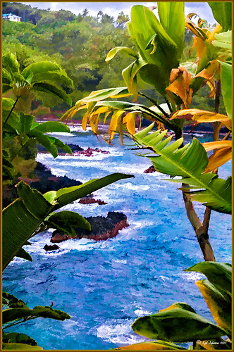 |
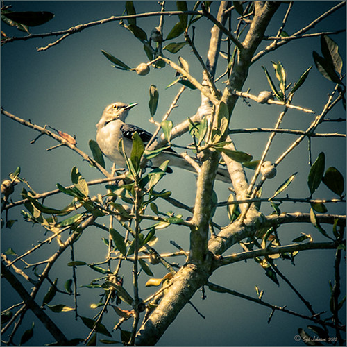
I was looking through my notes from last year and came across some nice info on using Topaz (see sidebar for website link) Simplify and Detail together to create an oil painting look. (See Creating an Oil Painting Effect from Topaz Labs.) My Hawaiian image from the east coast of the Big Island was one I had not originally processed as it really did not catch my eye – hoover over image to toggle to original. While doing a little Hawaii dreaming, I came across it again and thought it might look good using some of the settings from this video. (I really was thinking about how it would be to live in the house up in the top left – hum!) I actually did not follow the exact video workflow, but it did get me thinking about how to do this. Now that both Simplify and Detail have been updated, it was easier to get some different looks. Here are the steps I followed:
1. Duplicated the Background layer (CTRL+J). Topaz Detail 3 was opened and the settings from the second example in the video were applied: Small Detail .53, Medium Detail .46, and Large Detail .44.
2. Duplicated the Detail layer. Next Topaz Simplify 4 was opened and the Painting IV preset was applied. The only change to it is that the Edges section was turned off as it made the trees in the background stand out.
3. A Layer Mask was applied to the top Simplify layer. Some of the Detail Layer was brought back in by painting black on the mask on the foreground leaves. Also some detail in the little rock island was painted back.
4. What I did different was to add a New Layer and paint over the foreground leaves and trees in the midground to give a more painterly look and smoothing out some of the rough edges and colors that Simplify can bring into an image. A wet mixer brush was used for this.
5. Next a general Curves Adjustment Layer was added to bring in some contrast.
6. The sky was really blown out, so I added another Curves Adjustment Layer that brought back the natural clouds from the original image into the sky. The Layer Mask was filled with black and just the sky area was painted back with a soft black low opacity brush.
7. The water was way too cyan for my taste, so another Curves Adjustment Layer was added and the different color channels were adjusted to get a better color for the water.
8. I felt like the eye was not guided with a strong enough element to get you through the image. Therefore, a New Layer that was set to Overlay Blend Mode was added. With a large black brush set to 15% opacity, the edge of the bay was lightly painted on the water all the way to the back center. This burned in a slight contrast in the water for the eye to follow. Much better overall impact for the image.
9. The last step involved adding my SJ Thin Double Edge Frame layer style left at the default colors.
That is how I got this very Hawaiian Oil Paint feeling. Give these two plug ins a try and see what you think…..Digital Lady Syd
Digital Lady Syd Related Blogs:
Topaz Simplify and Topaz Detail Together
Little Red Corvette

Just felt like using a couple of my old standby favorite plug-ins to create a vintage feel to this image. This old red corvette image was taken at the 39th Annual Daytona Turkey Run at the Daytona International Speedway infield. I love the way the raceway seats are in the background – it just seems to the be the right setting for this old girl – I love corvettes! It was processed first in Lightroom starting out with cropping and applying one of David duChemin’s Lightroom 4 presets called Warmer Sunset -.66 Grad – I was surprised it gave such a nice vintage feel for starting post-processing of the image. From there several adjustments basic Lightroom adjustments were done and the chrome was sharpened using an Adjustment Brush. In Photoshop Nik Viveza 2 was used with control points placed on the windshield to clean up some window glare (this plug-in does an amazing job with window glare) and on the detailing on the car. Then Nik Color Efex Pro 4 was applied and several of my favorite filters were stacked – Darken/Lighten Center, Detail Extractor, and my favorite for getting this vintage feel, Film Efex Vintage set to Film Type 14 with an overall opacity of 56%. A Curves Adjustment Layer was added and French Kiss free Glorious Grunge Edging Overlay with the lines inside removed was applied and set to a tan color. I wish I could fix up this car – she really was a beauty!…..Digital Lady Syd
Digital Lady Syd Related Blogs:
Yellow Dogface Butterfly in her Glory!
Soft and Sharp Image at the Same Time!
Christmas at SeaWorld Orlando

These “floating” trees were in the pond area at SeaWorld Orlando in October and they looked really strange. I decided to spruce them up a bit and give them that holiday feel – these must have been the first decorations they put up. I have said it before and I will say it again – whenever I cannot figure out something interesting to do with an image, OnOne’s (see website link on sidebar) Perfect Effects usually has the answer. In this case two effects were stacked: Nicely Toasted preset from the Vintage group – set to Hard Light at 74% opacity and Warm Vintage also from the Vintage Group with a few changes to Brightness (-45), Contrast (-40), and Darken Blend Mode with Strength 58. A Composite Channel Curve was set (In157/Out 138). My free Snow1 Overlay was added along with my free Merry Christmas PNG Overlay using an Outer Glow layer style set to a bluish color (Blend Mode Normal, Opacity 39%, Spread 8%, and Size 215 px) – use this trick to to make your text and overlays stand out if on a busy background. Added text layer for my name, and added French Kiss Glorious Grunge Edging Only with the grunge erased from the middle. All of these overlays used a Solid Color Adjustment Layer set to a soft cream color sampled from the roof of the building. (Layer -> New Fill Color -> Solid Color and check Use Previous Layer to Create Clipping Mask for each overlay). The text layer used the same color. A Curves Adjustment Layer was added and the mask filled with black – with a 30% opacity white soft brush, the areas I wanted affected were painted back in the mask. That was it. Hope you can use a few of these tricks to make some nice cards…..Digital Lady Syd
Digital Lady Syd Related Blogs:
Where to Find Those Cool Free Christmas Card Templates?
Free Christmas Card Vectors and Brushes
Beautiful Christmas Flowers
Some Free Christmas Overlays to Spice Up Your Christmas Cards
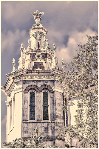
Topaz Adjust’s French Countryside Preset – Beautiful!
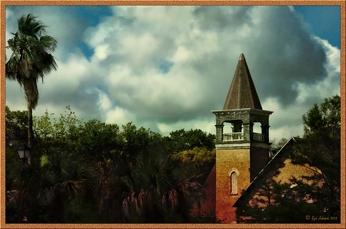 |
Thought I would do another Before and After where I show what one of my favorite presets in Topaz Adjust 5 (see sidebar for website link) looks like when applied. This image was taken in full light and I really took the image as a test shot before visiting some of the wonderful historic sites in St. Augustine, Florida. I really love steeples and cupolas on buildings. I had a hard time deciding what to do with it – it was a hand-held three HDR image. I processed it in Photoshop’s Merge to HDR Pro, only checking the Remove ghosts box before exiting to Photoshop (hover over image to see the tone-mapped image). Some image clean up was done, and two curves adjustment layers, one for contrast and one for color tone, were added since the image was not processed in Lightroom or Camera Raw. After much experimentation, I finally settled on using Topaz Adjust 5 and the French Countryside preset. It seems to soften the image just enough, yet retains some detail in the image – the trick is to adjust the Detail tab’s Threshold slider to bring back some of the details. Then I added Caleb Kimbrough Summer 4 Texture – one of my favorite textures to add the red and green tones into the image for that warm feel. (Also check out his site for many other wonderful textures.) The image took on a totally different feel. Try this preset if you have Adjust…..Digital Lady Syd
Digital Lady Syd Related Blogs:
Why I Love Topaz Adjust!
Topaz Adjust 5 Is Here! First Look!
Making An Ordinary Image Your Own
Whale Watching with Nik’s Color Efex Pro 4 & Viveza 2

One of the many photos of a great whale watching trip on the Big Island in Hawaii. (See Hawaii Ocean Sports for information on whale watching boat trip.) This image used one of the workflows I like to use for quick processing of my images. The RAW file was adjusted in Lightroom where the Highlights, Shadows, Whites and Blacks sliders were moved. Next the Exposure and Contrast sliders were adjusted, and finally it was straightened and cropped. The image was brought into Photoshop and opened in Nik’s Color Efex Pro where five filters were added in this stack order: B&W Conversion (Dynamic Contrast), Photo Stylizer (Cool Silver – Style 1), Low Key, Darken/Lighten Center, and Detail Extractor applied just to background area with Control Points. Not sure how I came up with this combination, but I really liked the final result. Nik’s Viveza 2 was used to sharpen up the whale and water blowing up behind him. OnOne PhotoFrame acid controlled 12 (see sidebar for website link) was added using a matching color from image. That was it!
The combination of Color Efex Pro and Viveza is a pretty powerful combination. I do not process any image now without at least going into Viveza – it is a fabulous finishing plug-in…..Digital Lady Syd
Digital Lady Syd Related Blogs:
Nik’s Viveza 2 Plug-In – A Hidden Gem!
Detail Pop Using Nik Color Efex Pro and Viveza
Using NIK’s Color Efex Pro 4 and Viveza Together
Nik Color Efex Pro 4 Just Does It Right!

Loved the beautiful old puppets on display in one of the walkways at the Hilton Waikoloa Village on the Big Island in Hawaii. It seemed like a perfect time to once again add the Nik Color Efex Pro 4’s new Film Efex – Vintage filter. The Colorize Filter, Midnight Filter, and Image Border were then stacked on top. Finally a little Nik Viveza 2 to sharpen the elephant a bit and that was it! Love the results!…..Digital Lady Syd
Digital Lady Syd Related Blogs:
The New Film Efex-Vintage Filter From NIK CEP 4
Beautiful Daisies with Film Efex: Vintage in Nik Color Efex Pro 4
Unsharp Mask Filter In LAB Mode
(Here are my settings for the filters: Film Efex-Vintage – Saturation 10%, Warmth 79, Vignette 63, Brightness -2, Grains per pixel 500, Film Strength 80%, and Film Type 13; Colorize – Method 6, Color R143G209B219, Strength 5%; Midnight – Color Set Neutral, Blur 0, Contrast 30, Brightness 60, Color 57, Shadows 20, and Overall 78%; and Image Border – Type 3, Size 60%, and Spread 98%.)
Another Soft Hawaiian Landscape

Image was taken at Lapakahi Historical State Park of one of the homes the early Hawaiians lived in roughly 600 years ago on the western side of the Big Island.
For this image, the steps used were from my my blog Using Color Efex Pro and Texture for a Warm Hawaiian Landscape Effect for the second image. Same Lightroom preset, same textures (using Russell Brown’s Texture Panel (see my blog Russell Brown’s Paper Texture Panel Updated!), and same adjustment layers. Image was sharpened and a New Layer was added on top where a paint brush set to yellow at 20% opacity was used to paint in the blown out highlights on the roof of the house. (See my blog Getting Rid of Those Blown Out Areas in Your Image on how to do this.) A different OnOne PhotoFrame was added – Taufer_Texture_12. (See sidebar for website link.)
Not very realistic but definitely has that Hawaiian feel and that is okay!…..Digital Lady Syd
Beautiful Soft Flowers

Just loved the pink hyacinths I bought – hope they will come back next year! This image was taken with my Micro Nikkor 60 mm f/2.8 lens at f/9.5. Used Mike Moats workflow (see info on this in related blogs below) with Color Efex Pro 4 (stacking Tonal Contrast, Darken/Lighten Center, and Vignette filters) added first and then Viveza 2 to make the details sharp. OnOne PhotoFrame napp_frame_12 (see website link in sidebar) was added. Final result – beautiful!…..Digital Lady Syd
Digital Lady Syd Related Blogs:
Using NIK’s Color Efex Pro 4 and Viveza Together
Nik’s Viveza 2 Plug-In – A Hidden Gem!
The Macro Shot
Cleaning Up a Messed Up Photo
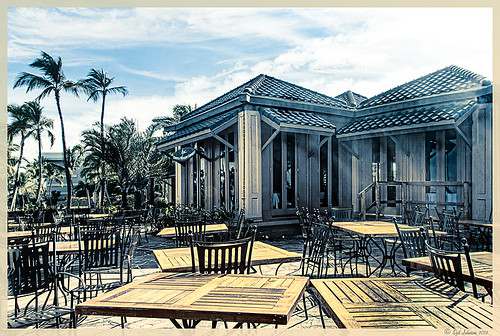 |
Here is another before and after for you. The image of the KPC Seafood Restaurant at the Hilton Waikoloa Village on the Big Island in Hawaii. At night it was wonderful to eat outside under the dark starlit sky with the ocean waves in the background. I wanted to add this image to a Hawaiian slideshow I am creating in Lightroom 4 and was really disappointed at how bad the original image appeared. I liked the tone in the wood and the sky was rally nice but otherwise, it was not too good an image. I tried several techniques, walked away from it for a day, and came back to it. I finally got the nice result shown above (hover over image to see the original). To get this result, I removed the palm tree going straight up to nowhere. Next I went into Nik’s Viveza 2 to get rid of the hazy feeling. I usually use this filter later in my workflow, but this image needed a quick tune-up before I could do anything else. Then I went into Topaz’s Black and White Effects (see sidebar for website link) and by playing with the Quad Tones, got this really nice result. (For settings, see below.) A Curves Adjustment Layer was added to enhance the contrast of the building, but the blue in the sky was painted black in the mask to keep it from being affected by the curve change – the blue of the sky competed too much with the blue tones in the restaurant. Noise was removed from the whole image (see Russell Brown ACR blog below to do this). Localized sharpening was done and Puppet Warp was used to straighten the vertical lines of the restaurant. I feel like I was able to save an otherwise very bad image by using these two plug-in filters, and I might add two of my very favorites. For information on how to do some of my workflow steps, see my blog links below. …..Digital Lady Syd
Digital Lady Syd Related Blogs:
Nik’s Viveza 2 Plug-In – A Hidden Gem!
Quad Tones in Topaz Black and White Effects Plug-in
I Didn’t Know That! Curves Adjustment Layers
Edit Layers with ACR (Adobe Camera Raw) Script
Straightening with Puppet Warp!
A preset was created in Topaz Black and White Effects using these settings as shown on the final version of image above: Conversion: Basic Exposure settings – Contrast 0.08, Brightness 0.05, Boost Blacks 0, and Boost Whites 0; Adaptive Exposure settings – Adaptive Exposure 0.56, Regions 7.06, Protect Highlights 0, Protect Shadows 0, Detail 2.17, and Detail Boost 1.04; and Color Sensitivity settings – Red (-0.15), Yellow (0.38), Green (-0.42), Cyan (0), Blue (-0.09), and Magenta (0). Finishing Touches: Silver and Paper Tone settings – Tonal Strength 0.63, Balance 0, Silver 32.00, Silver Tone Strength 0.50, Paper Tone 32.00, and Paper Tone Strength 0; Quad Tone settings: Color 1 Region (Color R0G0B0), 24.68, Color 2 Region (Color R86G102B136) 69.92, Color 3 Region (Color R229G223B164) 154.9, and Color 4 Region (Color R255G252B206) 255.0; Vignette settings – Center (2796,1607), Vignette Strength (-0.09), Vignette Size 0.53, Vignette Transition (0.63), and Vignette Curvature 0.75; and Transparency settings – Overall Transparency 0.59)
Topaz Lens Effect Tilt & Shift with a Zoom!

These are a few of the kayaks that can be rented at the Waikoloa Beach Marriott Resort and Spa on the Big Island in Hawaii. I was listening to a webinar presented by Nicole Paschal at Topaz Labs called “Isolating Subjects with Lens Effects” – this webinar should be posted soon at Topaz Labs-YouTube. She presented six or seven different ways to use selective focus on your images using this plug-in.
For this image Topaz Adjust (see sidebar for website link) was first applied just to brighten up the image a little – added the Spicify preset. Next Topaz Lens Effects was opened. Nicole really likes to use the Camera Tilt & Shift effect to selectively isolate her subjects. That is what is applied here. The Tilt Shift Adjustment were set to: Focus Area Width to 0.20, Transition to 0.59, Blur Amount to 0.08 and Angle to 0.89 so that the blur runs across the back of the kayaks. The Image Adjustments were set to Brightness 0.11, Contrast 0.15 and Saturation to 0.03. In the Distortion Adjustments section, Tangential was clicked, and a 1.89 Distortion Scale was applied – this cropped the image centering it on the Tilt Shift Adjustments Blur point in Focus Area section. Each time the blur point is moved, you get a different result. This image ended up with the Effect Position at 560, 612.
There are several other effects discussed in this webinar which are fun to try. Listen to the webinar for more good tips. The above effect may give some very interesting results on different types of images. I will definitely be checking this out…..Digital Lady Syd
Digital Lady Syd Related Blogs:
Topaz Lens Effects Plug-In
Topaz Simplify and Lens Effects Saves an Image!
Combining Plug-ins – Double the Effect!
Topaz Lens Effect’s Artistic Flair!
Topaz Simplify and Lens Effects Saves an Image!
 |
The catamaran is one of the whale watching boats you can take while on the Big Island in Hawaii (see Hawaii Ocean Sports for more information on this). This image was taken the day before my adventure and it was not a good at all (hover over image to see original RAW image) – but I really wanted a shot of the boat on the water. Therefore some improvisation had to be employed. After cropping and doing some RAW adjustments in Lightroom, Topaz (see sidebar for website link) came to the rescue. Topaz Simplify 3 was applied first to get rid of the focus issue – the BuzzSim preset was used as a starting point with these changes: Simplify Size slider was changed to 0.15, Brightness slider changed to 0.08, Saturation slider to 1.27, Edges: Color Edge Fine, and Edge Strength slider 1.50. Next Topaz Lens Effects was applied using the Filter Dual Tone Effect to create the warm feel in the sky with a preset I previously created called Sunrise Effect. (See below if you would like the settings for the preset.) Next Flypaper’s Paper Texture Creme Anglaise (one gorgeous texture!) was used via Russell Brown’s Paper Texture Panel for Photoshop CS5 and CS6 (see my blog Russell Brown’s Paper Texture Panel – A Real Winner!) and set to Divide Blend Mode at 100% opacity. A Curves Adjustment Layer was added to fix the contrast. Finally OnOne’s Photoframe grunge 09 was added (see sidebar for link). An image I would normally have trashed has now been turned into a beautiful picture that I really love. Give this technique a try if you own the Topaz plug-ins. The combination works great together, especially if you want to save an image!…..Digital Lady Syd
My Topaz Lens Effects Sunrise Preset contains these settings: Transition Adjustments – Region Size 0.45, Transition 0.35, and Angle 149.7; Region A Adjustments – Cyan Cast 0, Red Cast 0.20, Magenta Cast 0.01, Green Cast 0.03, Yellow Cast 0.70, and Blue Cast 0.24; Region B Adjustments – Cyan Cast 0.15, Red Cast 0.10, Magenta Cast 0.15, Green Cast 0.05, Yellow Cast 0, and Blue Cast 0.05; and Image Adjustments – Brightness 0.05, Contrast 0.08, and Saturation 0.07.
Digital Lady Syd Related Blogs:
Topaz Simplify and Topaz Detail Together
Simplifier and Simplify Filters
Russell Brown Texture Panel Landscape Image
Topaz Simplify and Topaz Detail Together

Recently I watched a video, this time for Topaz plug-ins (see sidebar for Topaz website and more blog links below), and learned a couple new things I thought I would share. If you have read my blogs before you know that I am a big fan of Topaz products – they may not be the most sophisticated, but they do some very cool effects the other major companies can’t achieve. Scott Stulberg did a lengthy video called “Memorable Travel and Stock Photography” where he covers Topaz Adjust, Detail and Simplify. I tried to incorporate a few of these tips in this image of sun-lighted grass growing on the road to Waipi’o Valley on the Big Island in Hawaii. Gosh it is hard to take a bad picture in Hawaii!
To begin with, Topaz Simplify was used. Scott suggested this plug-in is great to use on a shot that is a bit soft from a gentle breeze or a not-so-great lens – this effect can save an image and turn it into something very nice. There are two color space choices – RGB (more vivid colors) or YCbCr color space (more muted colors). This image used the YCbCr color space. Scott mainly uses the BuzSim preset – the trick is to move the Simplify Size slider to the left from the default setting (0.33) and you will see the detail return but the color stays saturated. On this image the Simplify Size slider was set to 0.05, Details Boost slider set to 0.79 (default is 1.00), and Details Size set to 0.13 (default is 0.20). It is a very similar result to using Vibrance in Photoshop but Simplify has much better color saturation. In the Adjust section, the Saturation was toned down a bit to 0.96 (default 1.31) and Saturation Boost set to 1.00 (default 1.15). He is basically lowering or turning off all the artistic settings and leaving the saturation turned on. One small problem I seem to have with Topaz products is that sometimes I have trouble retrieving the settings when using a Smart Object layer, which is supposed to retrieve the plug-in settings used on the image. Therefore, create a preset and name it something that will remind you of the image if you liked the result.
Next Topaz Detail was used. Scott feels that this plug-in makes it appear you were using a better lens than you really were. Basically you want to move the Medium Detail slider, then the Small Detail and Large Detail sliders until you get a sharper feeling image. He does very little sharpening to his photos but uses Detail to do the sharpening – it is like using the Clarity slider in a realistic way. That is how the plug-in was used for this image.
The final touch I added was a Hue/Saturation slider boosting the yellow saturation up quite a bit. Then I filled the layer mask with black (CTRL+Backspace) and painted with a very low opacity soft brush in to give just a soft yellow tone. OnOne’s Dave Cross 14 frame (see sidebar for website link) was added using a color sampled from the shot.
Sometimes it feels like I harp on all these these plug-ins, but they really are fun to use and they can take your images to a new level…..Digital Lady Syd
Digital Lady Syd Related Posts:
Simplifier and Simplify Filters
Topaz Plug-Ins – Same Image Trying Each! – this blog has many of my Topaz blog links at the bottom if you would like more information on any Topaz products
Topaz Star Effects on a Nature Scene
 |
A warm glow feel was created in Topaz Star Effects (see sidebar for website link) to give a very nice soft brightening in your image. If you hover over the image, you can see the difference adding the plug-in at these settings. Very subtle but nice. In this case the sun was setting and there was a soft glow on the tree and bird already but the Star Effects emphasized it by the star placement in the plug-in. A preset was created (I named it SJ Softening Effect) using these settings for this effect: Star Settings – Traditional Star; Main Adjustments – Threshold 0, Luminosity 0, Size 0.12, Angle 75.00, Number of Points 12, and Spread 0.20; Color Adjustments – Saturation 0.80, Temperature 0.69, Rainbow Strength 0, and Rainbow Frequency 0; and Additional Effects – Secondary Points 0, Glow 0.64 and Ring Flare 0. If the effect seems too strong, adjust the Size down and be sure to brush out any stars that appear in the wrong places. A soft vignette was placed around the final image.
Give this new plug-in a try – it can give a nice soft feel to an image……Digital Lady Syd
Digital Lady Syd Related Blogs:
Trying Out Topaz Star Effects
Combining Plug-ins for More Image Interest
Some of My Favorite Plug-Ins
 |
I am starting to sort through all the plug-ins that are out there and slowly figuring out what really works for my workflow. This is a really hard process since there are so many great plug-ins and some of them give very similar results. I have blogged on this many times showing how the same images look with the various plug-in effects.
I started working on this image – not one I was totally in love with, but the old Flagler Presbyterian Church is so beautiful to look at that I wanted to create that sensation in the image. I began by manipulating the file in Topaz Adjust 5 (see link to website in sidebar) and hit the “Get Lucky” button just for the heck of it – and this really cool illustrated look appeared that I was not sure what to do with it. (Hover over image to see the Topaz 5 illustrated image.) I decided it needed a new sky so I opened up OnOne’s Perfect Mask (see website link in sidebar) and added a sky I had placed below the image. This plug-in is the best one I have found for replacing skies quickly – check out the little holes in the trees where the sky peaks through. Next several different effects were tried but none made me go “Wow” — that is until I decided to go into the Topaz Black and White Effects plug-in (see link to website in sidebar). It took no time at all – in fact I started with the same settings from my “My Office Friend Ted” image which was a totally different type of image. A few things were adjusted but it still was not quite right. Back in Photoshop a Color Balance Adjustment Layer was added to bring out the blues in the sky a bit more to get the right look. Now it looks like I remember it – but it took some effort. Luckily, I had a plug-in that gave me a great start.
I guess I can honestly say I still love both Topaz Adjust and Black and White Effects – they do have that versatility to turn an okay image around. Definitely great plug-ins and reasonably priced too! And OnOne Perfect Mask is the best for skies – still figuring this plug-in out for other types of selections. I hope to have a page set up soon on which plug-ins have made it into my workflow……Digital Lady Syd
Digital Lady Syd Related Blogs:
Topaz Plug-Ins – Same Image Trying Each!
Same Image – Different Plug-In
My Office Friend Ted

This bear now sits in my office but I was never sure why I got him. Last week there was an interesting post by Ian Summers called “3 Exercises to Keep Creative Imagery Flowing” which gave me an insight to this conundrum. One of his generic creative exercises is called “Create a Giant Love Nest,” an environment that involves surrounding your work/creative area with many of the things you liked as a kid to help feed your creativity. I guess that is how Ted arrived – I found him at a bargain price in Cracker Barrel and had to have him. I am not even sure I had a Teddy Bear as a child but I liked his happy look (he never complains) and he is very soft and big (31 1/2″ tall). What’s not to like? So in honor of using childhood (and adult) toys and collectibles as a way to increase your creativity (and a good excuse to keep some of those things you just can’t part with), I am presenting my office friend “Ted.”…..Digital Lady Syd
PS. Ted was processed in Lightroom Beta 4 (see my Tidbits Blog “Trying Out Lightroom Beta 4“) and Photoshop using Topaz Black and White Effect (see my Fun Photoshop Blog “Topaz B&W Effects Plug-In-A Real Winner” and click on sidebar for website link). I started with the Opalotype Collection Flavescent preset and essentially adapted it by cranking up the transparency to 100, and adjusting the strength and placement of the vignette. A little localized face detail and burning on his mouth was added. That’s all.
Daisies are Everywhere!

I wrote a Fun Photoshop Blog called “Using NIK’s Color Efex Pro 4 and Viveza Together” showing a great workflow using these plug-ins on the same Smart Object layer. Here are my daisies again shot at a different angle. (They were shot using my 18-200 mm zoom lens at 75 mm, F5.0, 1/60 sec, and ISO 400.) Different CEP4 filters were stacked to give a totally different result. (See settings below.) I really liked the way the color of the flower was altered to give this softer feel. Lightroom and ACR will give a fairly close look as to what Viveza achieves, but not exactly the same as discussed in the other blog. Give this workflow a try – download the trials and see what you get if you do not already own the plug-ins. This can be very addictive! Have fun…..Digital Lady Syd
Plug-in Settings for this image: CEP4 filters: Cross Processing (Method T04, Strength 86%, three controls in the background to remove the effect), Tonal Contrast (Highlights -80%, Midtones -80%, Shadows -80%, Saturation 20%, Contrast Type Fine, one control point on pink background flower, and Opacity Slider set to 62%), Darken/Lighten Center (#1, Center Luminosity -36%, Border Luminosity -2%, and Center Size 57%), and Vignette (Vignette Color set to light yellow, Shape 2, Adapt Edges 0%, Transition 84%, Size 46%, Opacity 38%, and one control point set on pink background flower to remove effect). Viveza used seven control points to adjust background and bring out the center of the flower.
Pseudo HDR in OnOne Perfect Effects
Since I have tried this in other plug-ins, I thought I would give it a shot in OnOne’s new Perfect Effects plug-in (see sidebar for link to OnOne’s website) to see if I could get a similar effect. Just as I thought – no problemo!
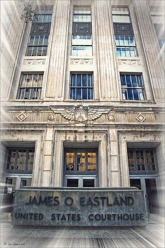 |
This is a rather unremarkable image except I liked the carved eagle engraved on the building. Hover over the image to see the original. By using Perfect Effects, I was able to get that pseudo HDR effect easily. These are the effects used in this image stacked bottom to top: Black and White preset set to Roadie in Multiply Blend Mode at Strength 100; Color Enhancer (Open up Effect Options and select Color Enhancer) and Color Range Orange was chosen to bring out the Orange color by adjusting the Hue set to 37, Saturation set to 77 and Lightness set to 94 sliders; another Color Enhancer layer was added to adjust the Blue Color Range – Saturation to 92 and Lightness to -35; and another Color Enhancer layer set to Aqua Color Range – Saturation 46 and Lightness 18; next the Golden Hour Enhancer preset in the Landscape section at Strength 63; Vignette created in the Blending Options drop-down with Brightness set to -68, Midpoint 58, Feather 80 and Roundness 5 and Normal Mode; and finally Katy preset in Vintage section set to Strength 100. It sounds hard, but once done, just create a preset to recreate it anytime – very easy to apply. To finish up the image in Photoshop, on a New Layer the Sharpen Tool was used to selectively sharpen the Eagle and some of the window lines. Finally the OnOne’s PhotoFrames zoom_19 frame was applied.
NOTE: After applying each layer preset or effects settings, be sure to click the Add button under the Strength slider to set the changes. To toggle the original and current views, press CTRL+P.
Well once again this was lots of fun and pretty easy to do. Give it a try and see if you like what you see. If you are interested in the pseudo HDR look, check some of my related posts below……Digital Lady Syd
Digital Lady Syd’s Related Blogs:
Digital Lady Syd’s Review of OnOne Perfect Effects
First Try – OnOne’s Perfect Effects 3!
Pseudo HDR Using NIK Color Efex Pro 4
Another Pseudo HDR Image with NIK CEP4 – Got to Love the Effect!
With One Good Photo – Try the Pseudo HDR Effect
Topaz Adjust 5 Is Here! First Look!
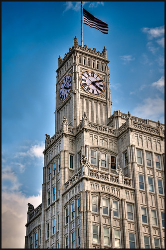 |
Topaz Adjust 5 was just released and here is my first attempt at using it. Hover over the image to see the original HDR image. (Click on sidebar Topaz 4 to go to website.) The interface has been greatly expanded to look like their very popular new plug-in Topaz Black and White Effects. This is a big improvement and I really enjoyed working with the new version of the plug-in. If you own an earlier version of Topaz Adjust, you are entitled to a free upgrade. If not, try out the trial and see what you think. They have added over 100 new presets and also included all of the ones from Topaz Adjust 4. A histogram has been added along with a really nice new Local Adjustment brush called Brush Out where the effect can be removed and a small mask shows how much is being removed (similar to Adobe Camera Raw or Lightroom’s Adjustment Brush). In the image above, it was created as a Photomatix 4 HDR using 3 images, then brought into Photoshop and processed in Topaz Adjust 5. Just a subtle sunlight feel was placed on the building. (See my blog “Quad Tones in Topaz Black and White Effects Plug-in” for colors used to create the soft sunlight effect in the Tone section.) There are so many choices and the image could be made to look more vivid and moody.
The image above is of the Lamar Life Insurance Building tower with beautiful gargoyles all around it in Jackson, Mississippi. It is a very striking looking building even in this day and age and the clock tower can be seen almost everywhere in the city. Below is a copy of a postcard from 1924 when it was built showing this beautiful building, thanks to Bill Badzo’s Flickr site. He states this about the building “…a close observation reveals it as nothing less than a scaled-down version of New York City’s Woolworth Building.” Interesting observation!

Give this new plug-in a try when you get a chance – you will not be disappointed. Lots of fun ahead of you…..Digital Lady Syd
Digital Lady Syd’s Related Blogs:
Digital Lady Syd’s Review of Topaz Adjust 5!
Little Nighttime Fun from Topaz!
Why I Love Topaz Adjust!
Combining Plug-ins – Double the Effect!
Topaz Lens Effect’s Artistic Flair!

This is a real Tidbit – just playing around in Topaz Lens Effects. I have not used this plug-in as much as I thought I would so I decided to try some things on a so-so image. Overall I am really happy with the results from using this plug-in. Three Lens Effects were applied in this order: Vignette with a lighter dark edge centered on the blue cover over the door; Lens – Motion using Zoom in the Motion Blur section – centered again on the top of the door and the Motion Amount adjusted from there; and Filter – Dual Tone with the Region A having a fairly strong Yellow Cast and Region B using a small Magenta Cast (you can see this in the image), and adjusting the image Contrast and Saturation sliders. Back in Photoshop, a layer mask was added to the Lens Effects layer and black painted in to bring back the clean lines of of the door area – the Sharpen Tool was then applied. The orange brick and blue canvas awning were brought out using a Selective Color Adjustment Layer and a Curves Adjustment Layer. An OnOne PhotoFrame was added (see sidebar for website link). A Shadowhouse Creations Used Canvas 4 texture was added to give it the darker canvas feel (check out the textures at this site – they are all free and great!). A final Curves Adjustment Layer was added and the layer mask converted to black (highlight mask and press CTRL + I) and white painted to increase contrast on the door area.
Here are the layers I used to create this image to help you see how it all goes together.

I really loved the final result – but definitely it has more of an artistic feel than realistic. Try this plug-in and see if you can get some interesting results too……Digital Lady Syd
See related Digital Lady Syd’s blogs on Topaz Lens Effects:
Little Nighttime Fun from Topaz!
Topaz Lens Effects Plug-in
Black and White Photo or Not? Give It a Try on That Difficult Image
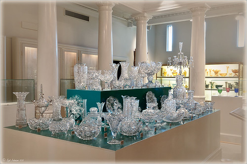 |
This image is of the beautiful cut glass display at the Lightner Museum located in the old Alcazar Hotel in St. Augustine. As you can see it is a very nice collection and I wanted to find out if the color in the image was distracting from actually seeing the ornate cut glass. See the black and white conversion by hovering over the color image. As I discovered, this image turned out to be a difficult choice to process no matter which effect you want.
Color Version
The top image was processed using the NIK Color Efex Pro 4 (CEP4) plug-in on a Smart Object layer (right click image and select “Convert to a Smart Object” since CEP4 will keep your settings and control points in case you want to adjust the results later) and stacking several filters including from top to bottom: Tonal Contrast, Darker/Lighten Center, Vignette, Glamour Glow, and Pro Contrast. Various control points were added to selectively choose areas for some of these effects. In Photoshop the cut glass edges were selectively sharpened using the Sharpen Tool on it own layer, and a final Curves Adjustment layer was added to get the correct contrast. Overall, this image is attractive since the blue-green sets off the glassware nicely.
Since there are some bright colors in the background that might be distracting from the main focus point, and the museum walls and columns have what I consider to be a rather bland creamy color to it, a black and white conversion might be appropriate to tone down some of the distraction and get rid of the creamy tones.
Black and White Version
I duplicated the cleaned up image layer and turned it into a Smart Object as above. Once in the NIK silver Efex Pro 2 (SEP2} plug-in, from the side preset panel the o14 Grad ND (EV -2) preset was selected and it really made the glass pop out clearly. In Photoshop the Sharpen Tool was used to bring out some of the glass edges (again, do this on a New Layer above the image) and the opacity of this layer is reduced so artifacts are not viewed. A final Adjustment Curve is added to give just the right amount of contrast. The items on the back wall initially appear to be more distracting than in the color image but the creamy tones did convert to the white tones nicely.
Conclusion
The image may not work as a black and white and the only way to figure this out is to try it. In this case SEP2 was used to convert the image to black and white, but the conversion can be done in lots of ways – in Adobe Camera Raw or Lightroom using a preset, or in Photoshop using a Black and White Adjustment Layer or Channels, as just a couple examples. NIK’s SEP2 is an excellent way to find out quickly since the presets allow you to glance over many black and white variations – if the image is really not going to look good as a black and white, you will know it.!
I am on the fence about which version I like best. The image was not the best choice to process to begin with and the glass creates a huge challenge just to get enough contrast to make the it stand out. Still it was good practice and I like the picture because I liked the cut glass collection. Just remember sometimes the image you want to process is not that great and does not work – but at least try a couple different effects including black and white and maybe there is a good shot hidden in there!…..Digital Lady Syd
Related Digital Lady Syd Blogs:
NIK’s Champion Plug-in – Silver Efex Pro 2
Topaz B&W Effects vs. Nik’s Silver Efex Pro
Topaz B&W Effects Plug-In – A Real Winner!
Little Nighttime Fun from Topaz!

Just listened to another interesting video from Topaz Labs on “Creating Striking Night Images.” If you are using or trying any of their Photoshop plug-ins, Topaz always has some interesting videos for creative uses at their Topaz Lab site. I followed the referenced video steps for processing this nighttime image taken on the Las Vegas Strip of Margaritaville. The video suggests that you first use their DeNoise Filter (this image did not require it), Topaz Adjust where they suggest using the Photo Pop preset was used with Shadow slider setting changed to 0, contrast slider moved left a little, and checking Process details independent of exposure box; and finally Topaz Lens Effects using the Single Tone – Hint of Blue Light and then adding some yellow cast to the mix. (See sidebar to get to Topaz’s site to download trials of these products.) The video also discussed taking long exposure nighttime photos. Since this was not a true long exposure night image, I used my Rick Sammon Spicify Soft Artsy preset using settings from the Topaz video “Rick Sammon’s Top Topaz Tricks, Tips and Techniques.” An OnOne PhotoFrame was added to finish off the look.
This image was a lot of fun to work on and pretty easy to do! I am looking forward to trying this processing technique on a serious nighttime image. Give this video a listen if you want some great nighttime tips…..Digital Lady Syd
Loving Both Filters!
 |
The above image is one of the beautiful Lion Posts outside Flagler College in St. Augustine, Florida, which used to be the Ponce de Leon Hotel built in 1887. Absolutely beautiful building. Cannot miss it if you go to this wonderful historic city.
Wow – all I can say is that I cannot decide which program I like best – NIK Color Efex 4 or Topaz Black and White Effects. So different and so much alike! I keep trying the same image in each program and get totally different looks but both are really nice! What to do, what to do!
The top image was processed with NIK Color Efex Pro 4 using the Film Efex: Vintage filter on Film Type 14; Detail Extractor filter; and Brilliance/Warmth filter. I used the Sharpening Tool in Photoshop to sharpen the eyes and mane of the Lion. Then Grunge 03 OnOne PhotoFrame was applied in a dark navy. I loved how it became very artsy and colorful. And the background detail is incredible!
Topaz Black and White Effect produced a very different feel that can be seen by hovering over the image. Same exact image from Lightroom except this time I wanted to see what how this image would look as a black and white. I used the new Platinum Collection – Platinum VI as a starting point. What really improved this image was using the Local Adjustment Dodge brush and Detail brush on the shadows in the face and the lamp. This really brought the eyes out very clearly. Using the Color brush, the lights was added back into the lamp. A black border, dark edge exposure, and dark vignette was added. In Photoshop the Sharpen Tool was used on the eyes a little more and the mane. Overall a very different feel to the same image.
I really love both filters and I do not believe I can recommend one over the other. Both totally great. Give the trials a try and see what you think!…..Digital Lady Syd
Related Digital Lady Syd Blog Links:
Topaz B&W Effects Plug-in – A Real Winner!
NIK Color Efex Pro 4.0 – First Try!
The New Film Efex-Vintage Filter from NIK CEP 4
Quad Tones in Topaz Black and White Effects Plug-in
Sunny Preset for Topaz Black and White Effects
NIK Color Efex Pro 4 – Digital Lady Syd’s Review!
The Art Corner: Painting and Sculpture by Tassaert
Pseudo HDR Using NIK Color Efex Pro 4
Sunny Preset for Topaz Black and White Effects
 |
This image of Camachee Cove Yacht Harbor in St. Augustine, Florida, was adjusted using Topaz Black and White Effects. I wrote a longer blog on trying to achieve this same effect using other plug-ins on my Fun Photoshop Blog “Same Image – Different Plug-ins.” Hover over the image to see original. It took literally two minute to get this effect. There was just one further adjustment made in Photoshop which, unfortunately when adding most plug-ins, there is some noise created. I took the image back into Adobe Camera Raw (see my blog “Edit Layers with ACR Script“) which I prefer over the other Noise Reduction plug-ins. The Luminance was set to +75, Detail +37 and Contrast +48. I was really pleased with the color and how it looks on the water and the sky, especially around the horizon line. I wanted to share with you how I created this sunny preset in Topaz’s Black and White Effects.
First the Van Dyke Brown Collection was used with the Wenge Dynamic Preset. This gives the correct settings in the Conversion Section on Basic Exposure sliders and the Adaptive Exposure sliders.
In the Finishing Touches Section, Film Grain should be unchecked unless you want some graininess. This image does not use it. Next the Quad Tones needed to be changed for this effect. By clicking on each of the color swatches, the following colors can be changed: Color 1 Region set to R1G1B12 and slider to 9.60; Color 2 Region set to R63 G78 B85 and slider to 95.97; Color 3 Region set to R216G211B129 and slider to 141.2; and Color4 Region set to R255G254B255 and slider set to 237.0. This is the key to the effect and gives the preset the sunny feel.
The Edge Exposure area is optional but the above image used these settings. The Edge Exposure settings should be set to: Top – Edge Size o.26, Edge Exposure (-0.22), and Edge Transition 0.32; Bottom – Edge Size 0.19, Edge Exposure (-0.43), and Edge Transition 0.27; Right and Left set to their defaults since there is no edge on the sides – Edge Size 0.20, Edge Exposure 0.00, and Edge Transition 0.20.
Finally check Transparency and set the Overall Transparency slider to 1.00.
It is important to create a preset now either in My Collection or the individual Effects Presets so it can be reused again and again.
Hope this will give you a chance to try out a new Quad Tone look (see Tidbits Blog “Quad Tones in Topaz Black and White Effects Plug-in“) – I plan on making some more presets in this program soon. Try out this look and see if you like it as much as I do…..Digital Lady Syd
Quad Tones in Topaz Black and White Effects Plug-in
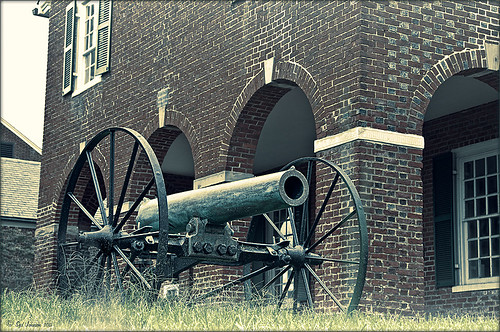 |
This image is of an old cannon on the grounds of the Historic Fairfax County Courthouse in Virginia. I do love NIK’s new Color Efex Pro 4 plug-in, but I keep going back to Topaz’s new Black and White Effects plug-in. (Hover over image to see original shot.)
The Topaz Black and White Effects preset I created gives a really nice sunny vintage feel and I think it is great for that historic look. To create the preset, select the Van Dyke Brown Collection Effect and Chamoisee Cyan preset as a starting point. The trick to getting this look is to set up in Finishing Touches the Quad Tones using these settings: Color 1 Region (R1 G1 B12) – 15.08; Color 2 Region (R63 G78 B85) – 143.9; Color 3 Region (R216 G211 B129) – 227.5; and Color 4 Region (R255 G254 B237) – 225.0. The sliders will need to be adjusted depending upon the image used. The Transparency setting was set to 1.00. For this image a small light Edge was added. Also, I was able to brush away the distortion over the back part of the left wheel using the Burn tool with a large brush and lightly clicking a few times, then using a smaller brush to run over the details just a bit. It totally disappeared! These brushes work wonders! To bring out the cannon a little more, back in Photoshop the image was sharpened using a High Pass Filter set to 9.1 Radius, a black mask was added to cover up the effect, and then by painting just the cannon on the mask, only it becomes sharp.
I really like the Quad Tone effect in this plug-in. Topaz has created a very nice video on how to use this section called “Quick Tip – Quad Toning Explored.” This may be the key to why it is hard to reproduce this look in other plug-ins.
For more information on this plug-in, see these related posts:
Fun Photoshop Blog: “Topaz B&W Effects Plug-In-A Real Winner!”
Tidbits Blog: “Topaz B&W Effects vs. Nik’s Silver Efex Pro”
Tidbits Blog: “Just Another Topaz Black and White Effect Example“


