
AI Selfie Enjoying the Winter Wonderland
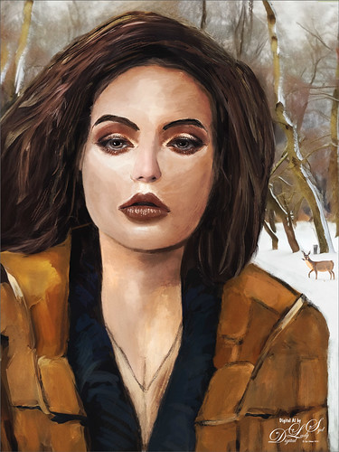
My AI Generated selfie has found herself surrounded by snow and wildlife creatures in her own winter wonderland. For this image I wanted more of a painterly effect, so mainly painted with Kyle’s Thinner Oil brush from his Winter 2024 set. Since I have covered just about everything I do with my selfies, I will only add a couple new tips. First off, on this image an Airbrush set to Opacity 100%, but Flow at only 18% was selected – softens a lot of the hard edges that the Thinner Oil brush left on her skin. Can use any brush tip for this brush (set Size Jitter Control to Pen Pressure, Transfer Opacity Jitter to 92% and Control to Pen Pressure, and Build-up and Smoothing checked on). The other tip I thought I would mention is that it helps a lot to do some screen shots of faces that have make up applied and would look good on AI the face. If you have used the AI Generative command at all, you know there are always bad variations created. Many of them are created and deleted to get something as nice as this variation, and then it can take several hours to get the painterly effect wanted, as in this case. The background was created by selecting the Selfie and inverting the selection, then in the Generative Fill prompt type “digital oil painting of wintry park scene.” The deer was taken from a different variation in the group (just used the old Apply Image Trick; selected the deer and copied it onto its own layer, and then moved into this image – see my Fun Photoshop Blog Placing Any Photoshop Generative Fill Variation on a Layer Easily). The other brushes used were the Painterly Smudge Brush and the 36% Blender for face from Grut’s watercolor Late Never brush. For settings on these brushes, see the bottom of my Fun Photoshop Blog A Few Selfie AI Tricks.) Hope you enjoy her!…..Digital Lady Syd
Being One with Nature
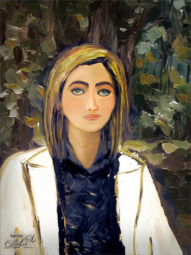
Above is another of my variations from my selfie image. These AI variations all turn out so different although in most cases the person is looking in the direction I was and the coat is somewhat similar, mine being light beige. I find that when having a problem with a face feature looking right, going back to the original selfie and copying that part onto it own layer. Then moving the layer above the variation layer and free transforming if needed works nice for getting a more accurate look – then blend into the face with a brush. My original nose is appearing in many of these AI images! In this case, the Liquify Tool was used along with Viveza and Topaz Lens Effects Reflector filter to lighten the left side of the image – it gaves the background some depth difference. For tree background, used Generative Fill prompt of “Oil painting outdoor background with trees.” Otherwise using all the same brushes as in my other blogs. It is fun to do these, and I am hoping I am getting better at drawing and painting faces!…..Digital Lady Syd
Masked
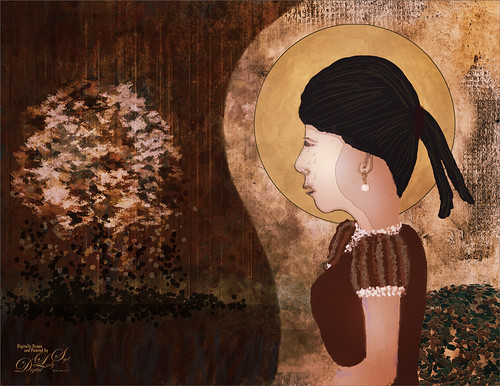
Kyle T. Webster, the Photoshop Evangelist at Adobe, recently did two Masterclass YouTube videos called Learn from Greats – Mark English – Part One and Part Two. In Part One many of the Mark’s various pieces of art and how he created the images were discussed, and in the other Kyle created an image showing how to use some of these same techniques. That is what was attempted with this image, but it is a lot less abstract than most of Mark’s images. 26 different PS brushes were used – some created on the fly. Several layer styles were added and even PS’s Craquelure filter was used (lower right bush). Three Color Lookup Adjustment Layers and three Texture Layers were used. Lots going on here, but it was a lot of fun to try and get some of the expression that Mark English had in his paintings. I am going to try and get a better example using his techniques soon!…..Digital Lady Syd
Early Morning Tree Jumping

This image was taken at the St. Augustine Alligator Farm. The sky was bright and clear so I decided to try adding some fog into the image. It was actually a lot of fun – just followed Glen Dewis’s video called Try This for Adding Smoke, Fog, Mist and Clouds into Your Pictures Using Photoshop. It is a pretty simple technique. Also, to get the color I wanted, a Color Lookup Adjustment Layer using the Late Sunset preset set 88% layer opacity was used. On some of the areas that did not have blur on them, a large soft Mixer Blender brush was used (could have used a Smudge Tool instead) to paint over, and then immediately after stroking, went to Edit -> Fade to bring back some of the detail from underneath. Really helped balance out the fog spots. The font is Argentina Script…..Digital Lady Syd
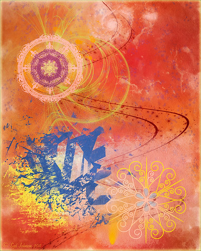
Living in the Abstract

Just a short blog – I thought I would show you the results using this drawing I created of a lioness turned into a painted image using Kyle T. Webster’s Spring 2022 brush set. The drawing is one I did following Aaron Blaise’s Digital Painting for Photoshop – Getting Started-Sketching in Photoshop video. (See my recent Fun Photoshop A Little Aaron Blaise Digital Drawing Practice blog for more info on this.) I used one of Aaron’s resource images – it is not an exact representation but I felt he should get credit for the original drawing idea. Then, just following Kyle T. Webster’s YouTube called Illustration Masterclass: Draw Stylized Portraits with Custom Brushes to paint the lioness. This video used many of his newly released Spring 2022 brushes, which can be found in PS by clicking on the Hamburger icon in the top right corner of the Brushes Panel and clicking “Get More Brushes” – if you have any recent version of PS and are on a monthly plan, it will be listed at the top of the page, after logging if needed. There appear to be 37 brushes in this set. If you want to see how each works, watch his Brush Hour with Kyle T. Webster: Check Out the Spring 2022 Brush Set! video. This image mainly used his Woodchuck Joey, Pellets and Old Blue brushes with a few other ones thrown in. I actually changed the Pellets-Alt brush to a Spacing of 98 and a smaller size of 45 pixels to get a really nice texture effect when the stylus is pressed lightly and really smooth when pressed hard. To select the colors, a color palette layer was created by following Kyle’s video called Illustration Masterclass: Choosing the Right Colors for Your Digital Illustrations which is very helpful when trying to get colors that blend nicely. The splatter effect is a PNG overlay file that was downloaded from Creative Market in a set called 48 Subtle Grunge Textures Vector by Anastasia Autumn. It has PNGs, JPGs, ABRs PS brushes, and Vector AI files with the 48 textures in each file format. By adding a layer style to the PNG texture 01 layer and in Layer Styles selecting the Gradient Overlay, all these colors would be added (not sure which gradient, but it had a lot of horizontal gradient colors in it). It was set to 59% layer opacity. Major Cool! Viveza was used to fine tune the final image. Overall, this was just major fun to do!…..Digital Lady Syd
The Mighty Dragonfly

Had some fun giving this guy new background. The original background e was pretty much out of focus the image was shot at F5/6, and so a splash brush was used on a layer above to add some texture over the original background. (See my recent How to Use a Spatter Brush for a Background Effect blog for how to do this.) Topaz (see sidebar for website link) Sharpen AI was used to sharpen just the dragonfly. Some Dodging and Burning and Spotlight Effect was used on him. Last step was a Gradient Map Adjustment Layer using just reds and warm cream color. ….. Digital Lady Syd
Just Gulliver Saying Hi

Gulliver is a Coquerel’s Sifaka, a medium-sized Lemur. What a character – I could hang out with Gulliver all day at the Jacksonville Zoo. Not a lot was done to the image – it just looked better in black and white to me. Used Topaz (see sidebar for website link) Sharpen AI first, then painted some of his hairs a little darker using some of the brushes noted in my recent blog called Getting the Joel Sartore Look on Your Zoo Images. Little bit of Spotlight Effect on his face and that was about it. He is so photogenic and seems to love to have his picture taken. Go visit him if you get a chance to go the Jacksonville Zoo – he will put on a little show for you……Digital Lady Syd
Posing for a Portrait

This Ring-Tailed Lemur looks like he has been posing for portraits before – he does have a bit of that Star Wars Yoda look going for him. Biggest problem I had with this image was a really large black fence across his body. Had to get a little creative but it was not really that hard. Mainly used the Clone Stamp Brush and Spot Healing Brush to paint over the bars and remove any patterning. In a couple places some new hair needed to be added so using an older free Wildlife Texture Brush Pack by Coyote Mange, several fur brushes were used to add it in – these are terrific brushes so if you do need animal hair brushes in PS, try them out. Otherwise just the basic PS workflow to get the final result. Really love this image…..Digital Lady Syd
Happy Halloween!
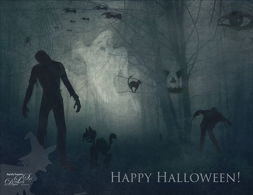
Happy Halloween! Had to do my annual post – they are so much fun to create! And had to do a post to thank all the various people who take the effort to create these wonderful Halloween objects. I would never be able to do these images without them!
So the create this image the base image is from a Creative Market Mysterious Forest Halloween Pack-01. The zombies are vector elements from Ben Blogged Zombieai – even though they are vectors, they will opened in PS – were copied over into the image on their own layers. The cats are all different: I love the foreground scary cat – he is a Halloween_Cat__s_Brush_by_altergromit, the cat in the tree is from a shape set of Halloween items, and the little cat way in the background is a brush from pureanodyne halloween-ciruelo cabral blackcat. Several cobweb and bat layers from the same set were also created. More spider and web layers, and a witch layer, were created using Obsidian Dawn’s Halloween brushes. The ghost was from Creative Market’s Halloween Illustrations – an Inner Glow layer style was used to give the transparent look. Two 2 Lil’ Owls Studio (see sidebar for website link) textures were used: Crackle 13 set to Hard Light at 81% layer opacity and texture 4 from the Artisan Collection Big Set 2, which was set to Linear Burn blend mode and 23% layer opacity. PS’s Foggy Night Color Lookup preset was set to 74% layer opacity to further darken down the image. The eye is one of I created in Photoshop. On another layer Function Subtle Grunge 6 brush by Liam McKay was added. The font is Trajan Pro 3, always a favorite. That was it. Lots of fun and lots of references – thanks creators for sharing!…..Digital Lady Syd
Painting the Town
Just having some fun painting and seeing what effects I can achieve. Following Lori Jill’s Photoshop technique on Udemy. Used some of her brushes to do the underpainting and painting in some of the details. I decided it needed a little more of a painterly look, so a brush I created using my Pastel 3 brush and adding the Gauze texture to it to get the nice soft cross hatching brush effect to paint on the image. (See my How to Use Photoshop’s Brush Texture Section for Painting Clean-up to create basic brush – then change Texture to Gauze, Scale 123%, Brightness -75, Contrast 50, Mode Multiply, Depth 86%, Min Depth 100%, and Depth Jitter 50%.) A Bevel and Emboss layer style was added to the whole image and the Texture was also set to Gauze, Scale 221% and Depth +51 to get the same effect on the whole image. That was basically it. It is fun to try and paint different types of images. Last 3 Lil’ Owls (see sidebar for website link) overlay called Color Bokeh Grunge Set – #5 was added on top and set to Overlay blend mode. Still learning, but it is coming along…..Digital Lady Syd
A Tricolored Heron That Fell in a Painting!
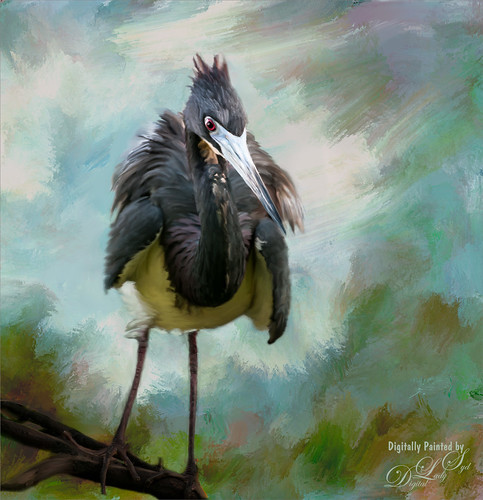
I seem to have an endless supply of these bird images from the St. Augustine Alligator Farm Rookery. It is such an incredible place to get bird images in the Spring. This is just another example of one of the magnificent birds hanging out looking for a mate. This time I actually used a layer mask to separate most of the bird from the tree limbs behind him. Since I was going to paint him, it did not have to be perfect. The bird was painted using Fay Sirkis’s (from KelbyOne) Precious Diamond Blender brush (her Mixer brushes are wonderful), then changing to it to add color when needed. This is my favorite brush for painting birds and has been used on most of my bird paintings. The texture is made up of two textures I created in Corel Painter 2015. Both textures used Quick Fix Color Brushes from Karen Sperling’s Artistry Quick Fix Video (#4 in this case) Series (check them out-and inexpensive way to learn Painter and she provides some of the best Painter brushes!), and the second also used a blender I created, and the other used Karen’s . They were placed underneath the bird and on a New Layer on top, the edges of the bird were blended into the texture. An Exposure Adjustment Layer (see my How To Do a Quick Eye Sharpening in Photoshop blog) was used to sharpen the eye. On a stamped layer on top, PS Camera Raw’s Radial Filter was used to add focus to the face and beak – painted out with the brush parts of body not to be emphasized. A Selective Color Adjustment Layer’s White Color was selected to make the white color behind the bird stand out just a little more – set Black slider to -37. That was it. I was pleased how the texture fits with the bird……Digital Lady Syd
Springtime Wishes from Betsy
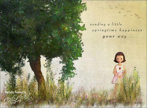
Was organizing the wonderful Photoshop Foliage Brushes from Aaron Blaise I recently purchased. I came up with this tree while checking out the different brushes and looked who popped up in the image! Why that is Betsy McCall of paper doll fame from 1958. She just looked like she belonged in this image. Basically just followed Aaron’s workflow and used his brushes to created the tree, reeds and flowers. Also added Frostbo Set 2 Grass (brush 010) for the front smaller grass. Used Kim Klassen’s December Collection Unexpected texture set to Multiply blend mode and 51% layer opacity. Used Bird Brushes II bylpdragonfly-brush bb114s2220.jpg and the was expression was included in a Design Cuts package (ldavi-sendingalittlehappinessyourway-wordarttitle1). Downloaded Betsy from the Betsy McCall website called Download and Print Vintage Betsy McCall Paper Dolls. Selected one of her dresses to pretty up the image. I am enjoying using these brushes so much!…..Digital Lady Syd
Just Playing!
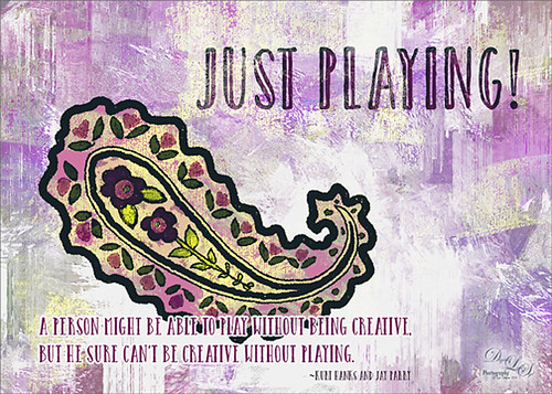
Just having some fun here. Did a wonderful tutorial by the great brush guru Obsidian Dawn called Multiple Colors (and Removing Transparency) with Photoshop Brushes Tutorial that explained how to colorize the brushes that she offers for free, I might add. I just sort of took the tutorial to a different level and ended up with this colorful final image. She included some very interesting info on selecting and adding the paint to the brushes so I would recommend checking it out if you like to use different types of brushes. I used Brush 19 in her Paisley Sketches Brush set. Since this required using several layers for the colors, they were put in a Group. Two textures, both by one of my very favorite texture sites, Painted Textures were used to finish up. Under the group the May Garden texture was applied and in the layer style, the Blend If This Layer black tab was split (ALT+click and drag on tab) and set to 189/196 and the split white tab set to 198/216. This gave the layer a lighter feel. A Hue/Saturation Adjustment Layer was added to give the texture more purple and pink colors. Added the Winter Storm texture set to Lighter Color blend mode and once again the layer style was opened and the Blend If Underlying Layer black tab was split and set to 84/139. Three Text layers were applied using the Catalina fonts that were bought in a Design Cuts package I bought recently. Love this font! The layer style for the longer lines of text once again used the Blend If Underlying Layers black tab split and set to 37/85. Also an Outer Glow was applied by setting the Opacity to Blend Mode Normal, Opacity 100%, White color swatch, Spread 67% and Size 10 px. This way the letters stood out but you could still see the design a little bit behind the lettering. For the larger top lettering, the layer style was opened and Blend If Underlying Layer white tab split and set to 242/255 and an Inner Shadow set to Normal Blend Mode using a sampled color from the green in the paisley brush, Opacity 100%, Distance 21 px., and Size 18 px. Just experimented to get the right look. But you can see some of the beautiful texture coming through the lettering by using the Blend If sliders. The last step was to add a Curves Adjustment Layer to pop the contrast and color. This was so much fun!…..Digital Lady Syd
Digital Lady Syd Related Blogs:
How to Use Those Handy Blend-If Sliders!
How to Get Blend If Slider Settings to Apply to a Layer
Fall Is In the Sky!
This is an oldie-but-goodie created in 2011 but I like the fall colors. Since I am into so much painting, this one was done with 11 layers using different brushes, one free texture, Shadowhouse Creations Oil Painting 5, one of my favorite textures, set to Overlay at 59% layer opacity just below a Nik Color Efex Pro Graduated Neutral Filter layer (don’t have settings – before I was saving that info). First a new document was created at 8 inches x 10 inches at 240 pp. Here are all the free brushes (thanks to the wonderful Deviant Art artists) used in this image, each on a different layer. On New Layer it looks like a large soft round brush was used to created the strong orange and reddish effect for the background just painting over the image at a lower opacity and building up a little. Glitter & Lines by Madeliniz gr set to 31% layer opacity; Glitter & Lines by Mandeliniz-g1 warped – brown lines; Texturemate swirls 35 png – green circles; grunge brushes by lydia -bright yellow on lower left; Another layer of grunge brushes by lydia – pink splotch lower right and set to 62% layer opacity; yet another layer of grunge brushes by lydia – blue object; Dollfie-Chan snowflake; Arsgrafik Snowflake Brushes 364 snowflake lower right yellow; another of the same brush that used pink and the Color Replacement Tool to add the color; Space by JaneDoeStock Space#2 – upper white galaxy spiral; and Space #4 – lower orange comet. Looks like a little white grunge was spread around to look outer spacey but not sure what brush. These type of images are so much fun to create. Give it a try if you get bored and want a change!…..Digital Lady Syd
A Little More Painting with a Texture Brush from Your Image
Wanted to show you how I completed the image that I began in my You Tube Texture Video for my Fun Photoshop Blog How to Paint with a Texture Brush from Your Image. By creating a different brush and changing up my technique just a little, a totally different feel was given to the same image. So what did I do to get this totally different result from the same image?
The brush I created in the video I did save down as a “New with my settings” brush – I forgot to remind everyone of this rather vital step. You need to resave and rename your brush to keep the additional slider changes made from the initial brush created. A New Layer was added above and this time it was converted to a Mixer Brush – in the Options Bar turn off the “Load the brush after each stroke” icon and in the drop down, choose Very Wet, Heavy Mix. Now just make sure Sample All Layers is checked and you are ready to paint using this same brush as a Mixer “Blender” brush (see my Photoshop Blog How to Easily Create a Photoshop Brush for Painting for more info on this.) On a couple of layers, I just smoothed out edges and dabbed and then would go back to the regular brush with the same settings. Just went back and forth smoothing and adding a little texture and color. By doing that on this brush, the texture effect is not so over-the-top as it looked in the video and the rough edges were softened with the Mixer Brush. A Curves Adjustment Layer was added to increase the brightness since the painting darkened it down some. If you look closely, the pattern is over the objects just like the background – by adding the Pattern Fill Adjustment Layer on top and choosing this same texture set to 60% Scale, it blended beautifully with the texture – the layer opacity was set to just 26% for the blend. Then a Levels Adjustment Layer was added and the in the Output Levels, set the first number to 24 to take out the total black pixels which often darkens an image too much in paintings. I thought I was done but I tried a layer style called BMU_SSStyles_UltArtist_Watercolor-Dark from Scrap Girls packet which added a Pattern Overlay that resulted in the rather foggy spooky feel on the whole image – it felt so Harry Potterish! (See my Fun Photoshop Blog How to Get Painting Effects from Actions-Part 2 for info on this.) I was thinking I could have just used a fog brush at a low opacity and painted on a New Layer to get the same effect. I really liked how this version turned out – love the triangular shapes and still like my owl! Anyway wanted to show you how using this different texture, crop, and brush gives a totally different result! Hope you give this a try!…..Digital Lady Syd
Painting Away in Photoshop!
Can you believe this started out as a scratch pad for the new brushes I made for my How to Easily Create a Photoshop Brush for Painting blog, and came up with this? That’s how much fun it can be playing around with brushes in Photoshop. Five New Layers were created with different colors and brush strokes on each – I was just dabbing away trying to get some nice results when creating my brushes. Noticed immediately when done that these were some of my favorite colors. Hum… Anyway, on one of the Facebook groups I follow, someone started talking about these triptych actions they bought and it started me thinking that this might look kind of cool with that effect. I have no idea where I got this particular triptych but it was created in 2007 and I downloaded it in 2011. Here is a link to Gavin Hoey’s (one of my favorite British Photoshop gurus) free Instant Tryptych Action and the set he has for sale. Anyway, the basic steps included adding a layer style to both the original image and the triptych using Pattern Overlays in both cases. Oh well, hope you enjoy the results – keep experimenting with those brushes – never know what you will get!…..Digital Lady Syd
Musical Daisies

My musical flower image basically started out by my experimenting with some inexpensive French Kiss Brushes I recently bought. The background is from Shadowhouse Creations – Old Paper Texture 4. My flower image was added and a layer mask applied so that only a few daisies were showing. Once done, the layer mask was applied to the image (right click on layer mask and choose Apply Mask). A Color Balance Adjustment Layer was added and sliders in the Midtones (0, +13, -18), Highlights (), +11, -12), and Shadows (-31, +4, _32) were set to change the flower color somewhat. (I am listing the settings just to give you a feel for how these can be adjusted.) All the following brush layers were added underneath the image but above the texture layer – that way the brush strokes look like they are part of the texture and do not cover the image. It is also now easier to adjust the layer opacity and color. French Kiss Watercolor Spots 1_14 PNG brush file was applied on a New Layer and a bright pink Color Fill Adjustment Layer was clipped to it (ALT+click between the two layers to clip). Next a layer with one French Kiss Spatter4_14 brush PNG file stroke was applied and a purplish Color Fill Adjustment Layer was clipped to it. Another new layer and French Kiss Spatter 2_04 was applied with a deeper purple and set to 51% opacity. I seem to like adjusting a PNG file over the actual painted stroke – it seems easier to me but I am not sure it makes that much difference whether you actually stroke the image or use an overlay PNG stroke. French Kiss Vintage French Music in a set called French Kiss Vintage French Brushes 2 was added on top at 82% opacity, and a brown Color Fill Adjustment Layer was clipped to the layer. The music was painted off the flowers by using a layer mask. (Not sure why I placed it above the image – it would have been easier below.) The last step was a Curves Adjustment Layer to lighten up the image overall. This actually was not as hard as it sounds. Mainly just a lot of paint being spattered! What fun!…..Digital Lady Syd
Happy Valentines from Digital Lady Syd

Hope you all have a wonderful day!
A little background information on this Valentine. To create the following card, these steps and resources were used:
1. Started on a New Layer with Spatter Heart Frame from PS Brushes. A Layer Style was added – Outer Glow set to a soft yellow and Linear Dodge (Add) at 75% and a Spread of 21; and a Gradient Overlay adjusting Graphix1 Muted 8 for a gold tone.
2. Next a background was added underneath using Colored Vintage Paper by Ciara Panacchia.
3. Another texture was added above this one – Vintage Valentine Paper by Aramisdream. It was set to 59% and a layer mask was used to brush out the center and to create a vignette effect around the edges.
4. A layer was placed on top that used Obsidian Dawn’s Glitter set-hearts-glitter brush in a soft beige at 43% opacity.
5. Glass Prism’s cupid brush was placed in the center on it’s own layer.
6. The red valentines were placed on their own layer – Hearts by King Billy was used. A Layer Style was added using a red Color Overlay and a small 1 pixel Stroke.
7. Two Text Layers were created using the font Precious, a perfect Valentine font. A Layer Style was added using: Inner Shadow set to Distance of 21 and Size of 21; Outer Glow set to Linear Dodge (Add) at 45% opacity and Size of 24 pixels with a light yellow color; and Bevel and Emboss set to Inner Bevel, Smooth, Depth 103, Size 10 and the rest default settings.
That is how I made my vintage look Valentine. It was a lot of fun to try out the different effects on the brushes – the layer styles really made a difference. When you have a minute, try a layer style on some of your brush strokes – you may get some surprising results!…..Digital Lady Syd
Digital Lady Syd Related Blogs:
Where To Get Those Free Valentine Templates
Create a Valentine
Creating Your Own Art (and Cards) While You Are At It!

More Valentine resources if you are feeling in that creative mood and want to make your own. Here is how I created this funny little valentine.
1. I created a New Document and then added a New Layer on top where a red circle was painted and then a yellow circle was painted inside it.
2. Next this layer was taken into Photoshop’s Liquify Filter and where I came up with this funny looking flower. This is a fun filter that can give some really interesting results if you take the time to learn what the various tools do. A Layer Style (double click on the layer in the Layers Palette) was added to create this nifty embossed heart look – by adding a Bevel and Emboss Layer Style and checking Texture. Now the trick is to double click on the word Texture on the left, and you get a new dialog where you can change the Pattern you use for the texture. In this case, the San Valentine Pattern by succo-design was used with the Scale set to 69% and Depth to +6. These are the same patterns you will see in the Pattern Overlay section, except they are embossed and have not color! This is really a great way to use patterns!
3. On a separate layer I painted a stem and a few leaves. Add a Layer Style to this layer and select Pattern Overlay from the left side. To show you the different from step 2, choose a pattern to add some texture to your stem. In this case I choose Obsidian Dawn’s Dirty Patterns-Texture 1 set to Scale 31% and Opacity 36%. Then an Inner Glow was set using a dark green color set to Size 125 pixels to add a little shading to the outside shape of the leaves and stem. You can see how this pattern was applied differently from the pattern in Step 2.
4. I was not really sure what to do next so I decided to add a colored background. I choose ShadowHouse Creations Raised Textured Effect 2 to give some interest to the background. All the textures in this group are beautiful.
5. On a New Layer ShadowHouse Creations Assorted Brush Pack 2 Soft Clouds-NewBrush 18 was used to for a soft white background.
6. On another New Layer, Obsidian Dawns Glitter Set-Random Swirls 2 was used for the slight yellow glow behind the flower.
7. Above that on another New Layer I used SJ Basic Star Scatter Brush to drop some large white flakes on the background for a bit of a wintry addition. (I set up a star scatter brush using the soft brush set to 30 pixels and spacing 1000%. In the Scatter dialog, set the Jitter to 1000% both axis and the Jitter Count to 100. I saved the settings to use the brush again. This brush is used in my Fun Photoshop Blog “Trying Out Topaz Star Effects” but it creates a nice snowing effect also.)
8. Above the flower, a New Layer was created and the little cupid painted in red (click twice to get dark enough) using Glass Prism CupidReq09 brush.
9. Under this layer, create a New Layer and paint all over image with Snow Drops by FrostBo to finish the snowy feel. You do not want snow on the cupid as it will blur the cupid so this is why the layer is under the snow drop one.
10. A Text Layer was created using the font MC Sweetie Hearts and a white Outer Glow Layer Style set to 21 pixels was used to make the letters stand out.
11. On top of the font a New Layer was created and small hearts using the Valentine Brush by digitalTouch with a white as foreground color and red as background color was painted along the bottom leaving a small heart trail along where the ground would be.
12. A composite layer was created on top (CTRL+ALT+SHIFT+E) and a Layer Style was created to frame the image Stroke set to a gray 4 pixels inside stroke, and a Inner Glow style set to light gray and 125 strokes.
Here is what the layer structure looks like in case you got lost.

It sounds like it is hard to do, but I wanted to show how easy it is to construct some very creative cards with nothing but Photoshop and some nice resources. The trick is to add each element on individual layers and make sure they re named so you know what you did. Much of the home art you see in Wal-Mart or TJ Maxx is basically just doing exactly what I did here. Check out my blogs below for other ideas just using Photoshop. Take some time to play around with some of the resources available for download and see if you don’t get some really nice art…..Digital Lady Syd
Digital Lady Syd Related Blogs:
Just Plain Fun Brush Effects!
Tree Brushes with a Little Grunge
Just a Tree
Brushing Up on Circles!
Adding Copyright Information to Your Image
Well since it is that time of year when everything that has a date in it has to be updated, I am going to review with you how to put a copyright symbol and name on an image. This is pretty basic, but it is easy to forget how to do since you only have to do it once a year. This can be done in both Photoshop CS5/CS6 and Elements. And the time-savings by having it handy definitely makes it worth creating!

Simple steps:
1. Start a new document in Photoshop, set the foreground color to black, and Create a New Layer on top. For CS5/CS6 users, make sure the Image -> Mode is set to 8 bit.
2. It used to be that you could get a copyright symbol to appear with CTRL+ALT+C, but in CS5 on and Elements, the Canvas Size dialog box opens up so this does not work anymore. To find the copyright symbol, the work around is to select the Custom Shape Tool. For Photoshop users, in the Options bar set the tool to Fill Pixels (4th icon for over CS5 and 2nd icon over for CS6) and then select Shape from drop-down menu – highlight the copyright symbol from the default shape list in the drop-down menu (I like the one included in the Symbols set that can be loaded from the fly out menu in the Shape field). For Elements users, click the Shape drop-down menu, click the double arrow fly-out menu, and select Symbols – then select the copyright symbol. Drag out a Copyright symbol in black but do not make it too big. Hold SHIFT while doing this to keep the constrain and keep the symbol round.
3. Select the Text Tool and create a text layer with your signature in a font you use. Line it up with the Copyright Symbol and adjust text size to line up with the copyright symbol. I had to make my numbers smaller as they appear bigger than the letters when typed. The font I use is Freehand 575, a font I bought a while ago but there are many places to download free ones.
4. With the Rectangular Marquee Tool create a selection around both the symbol and the text. Make this a pretty tight rectangular – you do not need a lot of space around it.
5. Go to Edit -> Define Brush and name it – I called mine 2012 Copyright so that in Photoshop it will appear at the top of my Tool Picker Preset brush list in Step 8 and click OK. Deselect the Marquee Selection (CTRL+D).
6. Select the Brush Tool. In Photoshop the new brush will appear at the end of the Brush Presets Panel list. In Elements the brush will be at the end of the brush list in the brush drop-down menu (2nd arrow pointing down) at the top left Options Bar.
7. Now test out the brush and see what size you want as a default – I set mine at 367 which seems to work pretty well on 12 megapixel images.
8. The last step in crucial so that if you accidentally delete your brush or change the ones load, you can add it in easily.
Elements folks need to go to Edit -> Preset Manager and choose Save Set – then save the brush in the brushes preset file for the program (in Windows 7, go to (User Name) -> AppData -> Roaming -> Adobe -> Photoshop Elements -> 10.0 -> Presets -> Brushes) – I called mine SJ-Copyright Brush. Now anytime you need to add it to the brush group you are using, your Brush Preset Manager will go to this file so it can be reloaded.
Photoshop users, go up to the Tool Picker Preset, top left icon in the Options Bar, and open up the drop-down list. This contains the Preset List for the Brush Tool which means every time the Brush Tool is chosen, this group is available for quick access. Be sure the Current Tool Only box is checked or else a huge list shows up. Click on the bottom icon on the right side that says Create New Tool Preset. Keep the same name using a number first. This saves time by putting your brush at the top of the list since the Brush Tool Preset Picker has many Photoshop brushes in this list, and it is handy to keep the ones you use all time here also. Be sure to save this down as a set in the Preset Manager (2nd icon over at the bottom of the Brush Panel and then select Preset Type Tools – highlight the ones you created, drag to set up a different order if you want, and save. I usually make it a date like 010113 SJ – can back up all your created presets here) so that it is saved on your computer. If you load other people’s tools and lose yours, you can easily add them back in. See Step 8 in my Fun Photoshop How to Create Photoshop Brushes from Objects or Text blog for more info on how to do this.
That’s it! Now it is available every time you finish an image. Just add a New Layer on the top of your image, open the Tool Preset Picker for Photoshop or choose your brush in the brush drop-down list for Elements, select a nice color, and click once to paint in. The size of the brush can be changed – just CTRL+X to delete and change the size and click again. Sometimes it is helpful to adjust the opacity when the copyright becomes distracting in the image. Very handy…..Digital Lady Syd
Spooky Halloween Fun!

A little Halloween fun here. Basically using the Halloween brushes I listed in my “Halloween Resources – Time to Go Batty!” blog of a few days ago. The same two sets of Halloween brushes were used (Obsidian Dawn’s Halloween Vector Photoshop brushes and Halloween Brush Set by anodyne at Deviant Art), the orange sky was Obsidian Dawn’s Clouds 16 and 17, the beige background texture is from ShadowHouse Creation – Assorted Paper TS-P-6, my favorite font Fantaisie Artistique font, and a grunge background (acid burn controlled 11) from OnOne PhotoFrames (see sidebar for link to OnOne Software website) was used. Some background grunge was added and that is about it.
It is pretty easy to get a nice effect – just use lots of layer masks and brushes – it really is fun to put it all together.
Hope everyone has a great Halloween! …… Digital Lady Syd
Think Pink! Rally for the Cure Pink Rose
 |
Since October is Breast Cancer Awareness month in the United States, last week I participated in a “Rally for the Cure” golf tournament. This beautiful pink rose came from this event. I am really pleased with the results for the above image that used the new Mixer Brush panel from one of my favorite Photoshop gurus, Russell Brown. Hover over the image to see the before photograph used to create this painterly effect.
One of the best new features in Adobe Photoshop CS5 are the Mixer Brushes. (See my Fun Photoshop Blog “Adobe Photoshop CS5’s Mixer Brushes” where I talk about how to use and create your own Mixer Brushes.) Dr. Brown created a new panel to load into Photoshop called the Painting Assistant that makes the whole painter process much simpler. I was able to create the above in very little time using this new panel. Basically it contains six button steps with very clear instructions listed – just click each button after you finish each step. This is pretty ingenious in my mind, but then that is what Dr. Brown is known for! To download the panel and a video, click here and scroll down to the 6th item. A text layer using the “Old Script” font was created and set on a slant using Free Transform – then a layer mask was used to paint out the lettering from the rose.
Give this technique a try, especially if you like the painterly look. It is very easy to do since the Mixer Brushes are already set up for your use. And if you get a chance to participate in a “Rally for the Cure” event, please do – they are always lots of fun and the proceeds could not go to a better cause!…..Digital Lady Syd
Tree Brushes and a Little Grunge
Having some Lightroom and Photoshop CS5 interface problems today so I am just going to post a little more tree fun I had a few days ago. I guess with the Fall coming upon us, I think about the trees losing their leaves and winter around the corner.


Both these images use tree brushes from Winter Trees by Melbrushes and Trees from c4grfx brushes. The first image used a texture from Shadow Creations Old Canvas 4 and the Glitter Brush Set by Obsidian Dawn. The bottom background was created using Paper Damaged brushes, Gorguss Grunge Again 3 and 9 (click upper right hand corner for link), my SJ-Basic Soft White Cloud Brush (for dark area behind trees), and the plug-ins: Topaz Effects Black and White plug-in (see sidebar for link) , a Nik Color Efex Pro 3.0 Bi-color filter plug-in, and an OnOne PhotoFrame plug-in (see sidebar for link). Check out my Tidbits blog called “Just a Tree!” for another example.
Hopefully I will be back up and running with both my programs by next week. Until then, try downloading some of these brushes and play around a bit. You can get some pretty interesting looks!…..Digital Lady Syd
Just a Tree!
Sometimes I find that combining recent effects I have learned in Photoshop can create something that is quite unique. Obviously not all things I create are that great, but even so, I am learning something about how all the different elements go together. This image is an example of this type of creativity. Just had fun putting together some of my favorite brushes and filters and came up with this tree.

The tree is one of Mels Winter Tree Brushes placed on a layer above the background, and on the next layer foliage was added using several of Gorguss Grunge Again (click on upper right – Photoshop Brushes) brushes. Both brush sets are favorites of mine. Two of ShadowHouse Creation Textures (5 Assorted Textures Set and Vintage Oil Painting Texture Set-2) were stacked underneath. A composite layer was made (CTRL+SHIFT+ALT+E) and opened up in Topaz B&W Effects plug-in (see sidebar for link) – a Cyanotype Collection preset was used to get the bluish appearance, and the Transparency was lowered so some of the colors showed through. Back in Photoshop a new layer was created on top and using Texturemate’s Rough Sand Texture brush 9 in blue on top at 70% opacity. That was it. I really like the effect.
It can really be a lot of fun to mix and match – give it a try!…..Digital Lady Syd


