
An Oldie but Goodie!
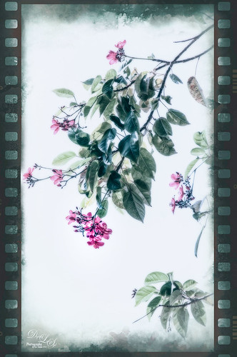
Doing an oldie but goodie of some flowers taken in Hawaii. Image was opened in Nik Color Efex Pro 4 where three different filters were used – Bleach Bypass (Brightness 19%, Sat -41%, Contrast 48%, Local Contrast 62%, Shadows to 2/3 right, and Highlights 1/3 right); Pastel which turned the photo from the yellowish tone to this palette (Method 1, Diffusion 20%, Sat 62%, Contrast 31%, Shadows under d, and Highlights under i); and my favorite Color Efex Pro filter Midnight – Color Set Neutral, Blur 28%, Contrast 40%, Brightness 50%, Color 60%, Shadows 3/4 right), which gives the soft inky feel to the image. The really cool frame is from the now defunct OnOne PhotoFrames called film_35_emulsion_cool_decay_r2_3X5, just in case you still have it loaded – I can’t keep it going on Photoshop CS5 since I have their newer suite. OnOne (see sidebar for website link) Photo Effects 8.5 does still have many of the frames from PhotosFrames, but it is not the same. The last step was to open up the Camera Raw filter and created a Radial Filter around the just the lower tip of the pink flowers (settings Exposure +0.40, Contrast +44, Shadows +34, Clarity +35, Sat +100, and Sharpness +7)……Digital Lady Syd
I Didn’t Know That! Converting Lightroom Preset to Adobe Camera Raw Preset
 |
I occasionally come across a need to take a Lightroom preset and use it as a preset in Adobe Camera Raw. This is not as complicated as it seems. Below are the steps required to accomplish this task.
1. Apply the preset in Lightroom and make sure you know which panels and sliders you used. (If preset not already created, to save preset in Lightroom, on left side of Presets line, click (+) for “Create New Preset.” Name preset.)
2. Right click on image in Lightroom and select Edit in -> Open as Smart Object in Photoshop. The image is opened in Photoshop with the Smart Object icon on bottom right of thumbnail in Layers Panel.
3. Double click on thumbnail and it opens up into Adobe Camera Raw. Go to Presets panel (9th icon over on righthand side under the histogram) and the click folder icon at the bottom of the panel to open the New Preset dialog. Name and click the items you want included in the preset, then click OK. Your new preset shows up in the Presets panel.
You can now use your Lightroom preset anytime you want in Adobe Camera Raw also. I usually start my personal preset names off with an SJ so I know they are mine. It is easy to get presets from many different sources as time goes on so it helps to know which are yours.
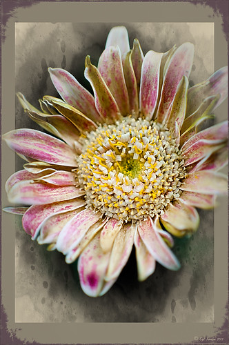
The image above is of a miniature mum in my yard. Hover over the image to see how the image looked with just a Lightroom preset I created called Dark Vignette – it makes the background very dark behind the flower. For information on how to create this preset and how the image was finished, see bottom of blog for details.
Hope this helped you get a little more organized…..Digital Lady Syd
To create this preset, changes were made to: the Tone Curve set to Highlights -24, Lights +41, Darks -56, and Shadows -54; HSL – Luminance sliders set to Red -41, Orange -9, Purple -2, Magenta -50 and all others 0, and Saturation sliders set to Red -2, Purple +32, Magenta +59 and all others set to 0; Effects Post-Crop Vignetting Style set to Highlight Priority with Amount -61, Midpoint 33 Feather 0 and others set to 0. To finish, image was sharpened and OnOne PhotoFrames (see sidebar for website link) acid burn controlled 15 was added and reduced in size in the plug in, and then grunge 12 was added on top – in Photoshop petals were painted over frame edge using a layer mask on first acid burn frame.
Digital Lady Syd Related Blogs:
Colorful Blown Out Look Lightroom and Adobe Camera Raw Preset
Settings for Vivid Drawing Look ACR/Lightroom Preset and NIK Color Efex Pro 4 Pseudo HDR Recipe
Whale Watching with Nik’s Color Efex Pro 4 & Viveza 2

One of the many photos of a great whale watching trip on the Big Island in Hawaii. (See Hawaii Ocean Sports for information on whale watching boat trip.) This image used one of the workflows I like to use for quick processing of my images. The RAW file was adjusted in Lightroom where the Highlights, Shadows, Whites and Blacks sliders were moved. Next the Exposure and Contrast sliders were adjusted, and finally it was straightened and cropped. The image was brought into Photoshop and opened in Nik’s Color Efex Pro where five filters were added in this stack order: B&W Conversion (Dynamic Contrast), Photo Stylizer (Cool Silver – Style 1), Low Key, Darken/Lighten Center, and Detail Extractor applied just to background area with Control Points. Not sure how I came up with this combination, but I really liked the final result. Nik’s Viveza 2 was used to sharpen up the whale and water blowing up behind him. OnOne PhotoFrame acid controlled 12 (see sidebar for website link) was added using a matching color from image. That was it!
The combination of Color Efex Pro and Viveza is a pretty powerful combination. I do not process any image now without at least going into Viveza – it is a fabulous finishing plug-in…..Digital Lady Syd
Digital Lady Syd Related Blogs:
Nik’s Viveza 2 Plug-In – A Hidden Gem!
Detail Pop Using Nik Color Efex Pro and Viveza
Using NIK’s Color Efex Pro 4 and Viveza Together
Beautiful Soft Flowers

Just loved the pink hyacinths I bought – hope they will come back next year! This image was taken with my Micro Nikkor 60 mm f/2.8 lens at f/9.5. Used Mike Moats workflow (see info on this in related blogs below) with Color Efex Pro 4 (stacking Tonal Contrast, Darken/Lighten Center, and Vignette filters) added first and then Viveza 2 to make the details sharp. OnOne PhotoFrame napp_frame_12 (see website link in sidebar) was added. Final result – beautiful!…..Digital Lady Syd
Digital Lady Syd Related Blogs:
Using NIK’s Color Efex Pro 4 and Viveza Together
Nik’s Viveza 2 Plug-In – A Hidden Gem!
The Macro Shot
Getting Rid of Those Blown Out Areas in Your Image
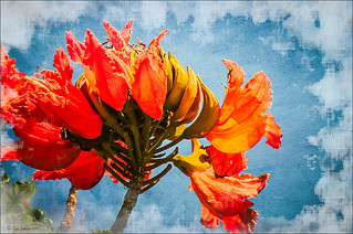 |
I thought I would give you a quick tip on how to get rid of those awful eye-drawing highlights on outdoor shots where you cannot control the light. Above are some beautiful African Tulip Tree flowers that I shot during the brightest time of day in Hawaii. It was so windy I felt lucky to get a fairly sharp shot much less control the light. Therefore, when the photo was opened up in Lightroom (or ACR), it became quickly apparent that there were several bright highlight areas that needed to be tamed. Hover over image to see original as brought into Photoshop. All my RAW adjustments were made before taking the image into Photoshop. (I used My Vivid Drawing Look preset which still works with Lightroom4 or ACR/Photoshop CS6 (note: change file extension to .xmp in zip folder to get file to work) – just be sure to adjust your new Highlights and Shadows sliders and the old Exposure slider-all other settings are the same.)
TIP: A New Layer was created right above the Background layer. Using a very soft round brush set to no more than 20% opacity, sample (ALT-Clicking the color right next to the blown out areas) and then gently paint over the white parts. Build up the color – if you overdo it, the layer opacity can be lowered or just add a Layer Mask to your painting layer and paint in white to remove or adjust the paint strokes.
Next Russell Brown’s Paper Texture Panel was opened and Flypaper Texture Dawn Grunge was added as a layer in Overlay Blend Mode at 100% opacity to give a very painterly feel to the image background. (See my Fun Photoshop Blog Russell Brown’s Paper Texture Panel – A Real Winner! for information on how to add this free panel to your program.) The turquoise and orange always makes a great combination for flower shots. Next a Curves Adjustment Layer was added to make the blue color pop in the background – by painting in the layer mask, the yellow fruit and green stalk color was brought back as it had become too dark. Finally OnOne PhotoFrame “napp frame 14” was added.
This is a great technique when you have a few distracting highlights and I find I use it a lot, but it won’t fix an overexposed image. Hope this helps you out a little…..Digital Lady Syd
Topaz Simplify and Topaz Detail Together

Recently I watched a video, this time for Topaz plug-ins (see sidebar for Topaz website and more blog links below), and learned a couple new things I thought I would share. If you have read my blogs before you know that I am a big fan of Topaz products – they may not be the most sophisticated, but they do some very cool effects the other major companies can’t achieve. Scott Stulberg did a lengthy video called “Memorable Travel and Stock Photography” where he covers Topaz Adjust, Detail and Simplify. I tried to incorporate a few of these tips in this image of sun-lighted grass growing on the road to Waipi’o Valley on the Big Island in Hawaii. Gosh it is hard to take a bad picture in Hawaii!
To begin with, Topaz Simplify was used. Scott suggested this plug-in is great to use on a shot that is a bit soft from a gentle breeze or a not-so-great lens – this effect can save an image and turn it into something very nice. There are two color space choices – RGB (more vivid colors) or YCbCr color space (more muted colors). This image used the YCbCr color space. Scott mainly uses the BuzSim preset – the trick is to move the Simplify Size slider to the left from the default setting (0.33) and you will see the detail return but the color stays saturated. On this image the Simplify Size slider was set to 0.05, Details Boost slider set to 0.79 (default is 1.00), and Details Size set to 0.13 (default is 0.20). It is a very similar result to using Vibrance in Photoshop but Simplify has much better color saturation. In the Adjust section, the Saturation was toned down a bit to 0.96 (default 1.31) and Saturation Boost set to 1.00 (default 1.15). He is basically lowering or turning off all the artistic settings and leaving the saturation turned on. One small problem I seem to have with Topaz products is that sometimes I have trouble retrieving the settings when using a Smart Object layer, which is supposed to retrieve the plug-in settings used on the image. Therefore, create a preset and name it something that will remind you of the image if you liked the result.
Next Topaz Detail was used. Scott feels that this plug-in makes it appear you were using a better lens than you really were. Basically you want to move the Medium Detail slider, then the Small Detail and Large Detail sliders until you get a sharper feeling image. He does very little sharpening to his photos but uses Detail to do the sharpening – it is like using the Clarity slider in a realistic way. That is how the plug-in was used for this image.
The final touch I added was a Hue/Saturation slider boosting the yellow saturation up quite a bit. Then I filled the layer mask with black (CTRL+Backspace) and painted with a very low opacity soft brush in to give just a soft yellow tone. OnOne’s Dave Cross 14 frame (see sidebar for website link) was added using a color sampled from the shot.
Sometimes it feels like I harp on all these these plug-ins, but they really are fun to use and they can take your images to a new level…..Digital Lady Syd
Digital Lady Syd Related Posts:
Simplifier and Simplify Filters
Topaz Plug-Ins – Same Image Trying Each! – this blog has many of my Topaz blog links at the bottom if you would like more information on any Topaz products
Topaz Black and White Effects Quad Tones Are Great!

Just another day in paradise! This is beach front at the Waikoloa Beach Marriott Resort and Spa on the Big Island in Hawaii. I was having trouble finding some way to make the image really pop and look like it looked to me when I was there. I ended up going into Topaz’s Black and White Effects (see sidebar for website link) thinking it might look good as a black and white image. In Topaz plug-ins, you have to reset your settings or the last one used shows up on the image. Well the last effect I had used was my Old Vintage Effect Preset and it gave this image exactly what it needed. To create this preset, see my blog “Quad Tones in Topaz Black and White Effects Plug-in” to get the basic information to create the quad tone colors required for this warm sunny feel. I did increase the Adaptive Exposure slider from 0.18 to 0.41 to get more of an HDR look, checked Process Details Independently because of a little haloing around the tree trunks, and selected a light Vignette for this image instead of a Border. In Photoshop I had to remove a little noise. No sharpening or curve adjustments were needed. OnOne (see sidebar for website link) PhotoFrame Taufer Texture 12 was added. I really like this combination of colors and have used it many times. Try the settings if you want to get that warm feel…..Digital Lady Syd
Digital Lady Syd Related Blogs:
Sunny Preset for Topaz Black and White Effects
The Art Corner: Painting and Sculpture by Tassaert
Topaz Plug-Ins – Same Image Trying Each!
Topaz B&W Effects Plug-In – A Real Winner!
Soft-Look Flowers Using Textures

These beautiful dahlia flowers are now planted in a flower bed in my front yard. To get this effect, it was a pretty simple process. I sharpened the center and darkened the green stems first. Next ShadowHouse Creations Subtle Tones ST-8 texture was set to Color Blend Mode. With a layer mask I painted out the texture over the flowers very lightly using a soft 13% opacity brush and building up the effect until it looked the way I liked it. Next ShadowHouse Creations 3 Assorted Texture Set T 2 texture was set to Hard Light Blend Mode to add a very feminine look – also a layer mask was used to clear the lacy texture from on top of the flowers. A Hue/Saturation Adjustment Layer was added on top to select the correct texture color by adjusting the Hue slider. The last step added OnOnePhotoFrames toner scratch 21 (see sidebar for website) with a very light purple-pink color. That was it. I loved the final result. I hope you will try using some of the beautiful textures from ShadowHouse Creations website where there is a huge selection of textures that can be downloaded for free. Major thanks for what he does to help us budget-minded Photoshoppers!…..Digital Lady Syd
The flowers were photographed on a table with a science fair 3-sided white board behind them and natural light from a window – shot with a Nikkor 60 mm Macro Lens set to F/3.2, 1/15 sec at ISO 400 with an attached Bower 0.5 x High Resolution Digital Lens with Macro lens, which gives the large depth-of-field effect.
Why I Love OnOne’s Perfect Layers!

OnOne’s Perfect Layers plug-in was used to add the texture to this image. It could have been done in Photoshop just as easily (and a lot of people say this), but the reasons I like Perfect Layers is that:
(1) you just have to click a button to get rid of a texture you are trying and do not like;
(2) just load a new texture to apply and add several others if you want. Much easier that placing a texture from Bridge and then going to the Layers Panel to try different blend modes.
(3) can create several virtual copies with different effects in Lightroom and bring them all into Perfect Layers as one file with lined up layers where the blend modes can be changed, textures added, and areas masked out. Major cool!
(4) even though it is not a Smart Object, when you open the PSD file in Photoshop, all the layers created in Perfect Layers are in place and reconstructed right there.
I am all for doing things faster and better and Perfect Layers does just that. I am not sure I have created a bad texturized image since getting this program. And that is why I Love Perfect Layers!
The image is of a building in Stirling, Scotland. The beautiful texture is provided free by ShadowHouse Creations and is called Oil Painting One (it has a nice short tutorial with the download that is very good also.) An OnOne PhotoFrame called acid burned controlled 05 was added and the image sampled to get a matching frame color.
Give Perfect Layers a try if you use Adobe Lightroom – can download a trial of Perfect Layers by clicking on the OnOne Perfect Photo Suite link on the side. Until Later…..Digital Lady Syd
Digital Lady Syd’s Related Posts:
“Perfect” Perfect Layers
Clarifying Clarity! Adobe Camera Raw and Lightroom Quick Trick
New Plug-In for Lightroom
Spooky Halloween Fun!

A little Halloween fun here. Basically using the Halloween brushes I listed in my “Halloween Resources – Time to Go Batty!” blog of a few days ago. The same two sets of Halloween brushes were used (Obsidian Dawn’s Halloween Vector Photoshop brushes and Halloween Brush Set by anodyne at Deviant Art), the orange sky was Obsidian Dawn’s Clouds 16 and 17, the beige background texture is from ShadowHouse Creation – Assorted Paper TS-P-6, my favorite font Fantaisie Artistique font, and a grunge background (acid burn controlled 11) from OnOne PhotoFrames (see sidebar for link to OnOne Software website) was used. Some background grunge was added and that is about it.
It is pretty easy to get a nice effect – just use lots of layer masks and brushes – it really is fun to put it all together.
Hope everyone has a great Halloween! …… Digital Lady Syd


