
A Little Layer Style Fun
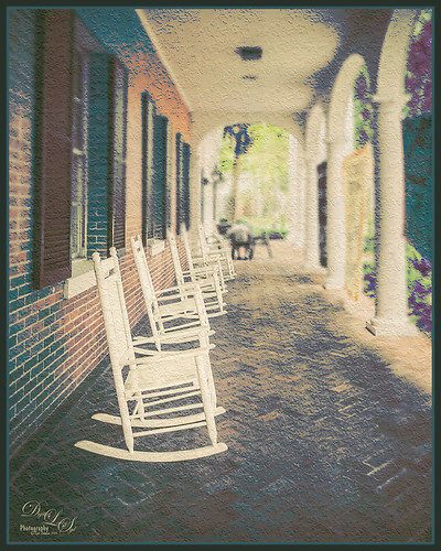
These are some of the rocking chairs that Stetson University in DeLand, Florida, offers students to use for resting or studying on the campus. I really liked the way they have them located throughout this small beautiful campus. One effect I did use on this image was the Blur Gallery in Photoshop so that the end of the walkway was definitely not too clear but the rockers up front are seen clearly. The other was to use Jack Davis’ Layer Styles called Stucco which adds a Pattern Overlay using one of his patterns to give a very textured surface. I changed the opacity from 25% to 19% and the scale to 203% from 61% which gave a very different look. Try playing around with this layer style using one of your favorite textured patterns and see what you get. Lots of fun!…..Digital Lady Syd
Using Pattern Overlay Layer Style to Get a Retro Feel

Had to visit Kokomo Cafe on Flagler Beach in Florida since I grew up in Kokomo, Indiana. Wonderful little place to get a nice breakfast (the pastries are to die for) or lunch and only a block off the beach. Did the regular processing in Lightroom before opening up in Photoshop. Painted Textures Mist was added and the Layer Style was opened. A Gradient Overlay using a Linear Dodge (Added) at 24% opacity and using Grad 2 gradient and a Pattern Overlay was added using the original image turned into a pattern (on background layer go to Edit -> Define Pattern – it appears at bottom of list) and set to blend mode Hard Light at 54% opacity and Scale to 120%. Now you can actually turn off the bottom layer and image shows up in the texture. Pretty cool! A Levels Adjustment Layer was added with black tab setting of 14 and Midtone setting of 0.71 to add contrast back into the image. Topaz (see sidebar for website link) ReStyle was added using the Hanging Orangutan preset. (Plug-ing settings were: ReStyle Opacity to 76%, Color Restyle changes: Sat Third (-0.41) and Fourth (-0.39); and Texture Strength 0.73; Basic Tone Midtones (-0.23); and Detail Structure (-0.67) and Sharpness 0.81.) Nik Viveza 2 was added using three control points to direct attention into the center of the image. The last step involved adding my free SJ Thin Double Edge Frame, sampling the Inner Glow color from the image. Once again there is a nice retro feel to this image, which so fits the area…..Digital Lady Syd
Digital Lady Syd Related Blogs:
How to Add a Little Retro to Your Shots
Mossy Turtle

This turtle is carrying a lot of moss on his shell – didn’t realize this until I downloaded the image. Really funny looking but he does not seem to mind and the little fish seem to think it is cool! This image was taken during the brightest part of the day in a pond at Ormond Memorial Art Museum and Gardens in Ormond Beach, FL. Used a little split toning in Lightroom on this image, then in Photoshop added some sharpening using Topaz (see sidebar for website link) Detail 3. Filled a layer mask with black and painted the sharpening back in the mask just were I wanted it. Added a Brightness/Contrast Adjustment Layer with no changes but set to Soft Light at 45% layer opacity to brighten the image a little. (See my How to Use an Adjustment Layer to Localize Light and/or Dark in Image blog for more info on this.) I actually revised this image as I downloaded some really nice Nik Color Efex Pro presets from Flypaper Textures – ended using one of my own recipes but I really liked some of the results with the other presets. My preset used the Pro Contrast filter and Balance/Warmth filter to warm of the image just a little more. The last step was to add my SJ Thin Double Edge Frame to the image.
Just a Little Flowing Water

This is not a traditional image for me – I usually do not shoot flowing water, especially in close-ups, but with a little Photoshop help, I got a really nice look. The rock was in a stream at Iao Valley in Maui, Hawaii. Very little was done to this image – just basic changes in Lightroom which included using an Adjustment Brush set to 100 Clarity to smooth out the water areas. The thing that really made this image pop was opening up the Topaz (see sidebar for website link) ReStyle and selecting the Blue Dreams preset. The color combinations really changed a boring image into a beautiful image. I am amazed by what this plug-in can do! The Structure and Detail were increased on just the rocks and flowers using a Mask for this section inside the plug-in. I wanted the water to still look soft. Back in Photoshop a Levels Adjustment Layer was added where the Midtones tab was set to 0.82 and the Output Levels were set to 7/255. The last step was adding a Layer Style by double clicking a composite layer (CTRL+ALT+SHIFT+E) that I created on top. A Pattern Overlay was added using Photoshop’s pattern called Dark Coarse Weave set to Overlay blend mode, 65% opacity and a Scale of 128%. These settings can change depending upon the size and resolution of your image. Anyway, pretty easy to do and I love the result!…..Digital Lady Syd
Bleach Bypass Look on a Landscape Image

This may be the most beautiful and interesting library ever made. I posted a couple times on Flickr with other images (see Minsk Library, Inside Minsk Library, and Minsk Library at Night) but this time I decided to process the inside ceiling which is all glass – totally breathtaking! As you can see, I caught the eye of the guard down below, but he lends a wonderful scale to the image. I had a hard time deciding what to do with the image as the original was not that bad but I wanted to enhance the light and airy feel in the image. So I tried everything I could think of and this is what I got!
First applied Topaz (see sidebar for website link) DeNoise 5 – the image was shot at ISO 1600 so it had some issues. Used the Overall Strength set to .17 and set the Shadows to .82. The layer was copied and Topaz Detail 3 was applied using the Architectural Detail II preset – this image was perfect for this preset. Next Black & White Effects was applied where I mainly applied a regular black and white preset and started moving sliders. What I think really made the image pop was the application of the Creative Effects Diffusion effect where the Softness was set to 0.10, but the Diffusion slider was set high at .91 and Diffusion Transition set to 0.61. This really made the roof lines pop without being too sketchy looking. Then Kim Klassen’s Cloth & Paper Reign texture was applied and set to Soft Light blend mode to lighten the image and add some blue tones back into the image. It was duplicated and this time set to Multiply at 24% layer opacity. Next a Levels Adjustment Layer was added to lighten the image more by moving the Output Levels to 23/255 and the midtone slider to 1.39. Next a Curves Adjustment Layer was added to lighten it even, and a bit of a vignette was painted around the edges of the layer mask. It still did not look quite right – almost blown out. That is when I tried a Color Lookup Adjustment Layer and clipped (ALT+click between the layers) it to the top texture layer. The 3DLUT File was set to Bleach Bypass.look in the drop-down, although several look rather nice. The last step involved creating a composite (CTRL+ALT+SHIFT+E) on top and adding my SJ B&W Border Frame. I really like how the diffused settings made the ceiling lines look. Anyway, it was once again a lot of fun to experiment!…..Digital Lady Syd
What a Cute Little Alligator!

Thought I would post my wonderful recent golf experience – we were almost done playing – hole 18 – and then I shot the ball in the water. (That’s how good I am!) Almost clobbered this little sunning alligator, but he did not even move when we pulled the ball out of the water. First alligator I have seen this year, and I would not have gotten the shot if I did not have my cheap Kodak point-and-shoot camera. The image was processed very simply. First I used a Lightroom preset created a while back from a video called True Grit by Michael Rather. (Since I keep referencing it, here are the settings from the short video: Basic Panel – Contrast +100, Highlights -80, Shadows +100, Whites and Blacks sliders to taste, Clarity +100, Vibrance -82, and Saturation -7; and Lens Correction Panel – in Manual tab set Lens Vignetting Amount to -76 and the Midpoint to +19. Use these settings as a starting point and adjust them to taste. My preset actually is set to Clarity of +67 and Vibrance of -82 and were used in the image above.) Next my favorite sharpening plug-in, Topaz (see sidebar for website link) Detail 3, was applied using the Soft and Dreamy II preset. In the Effect Mask section, the effect was removed from the alligator using the brush strength set to 1.00 and partially on the golf clubs and cart canvas top using a o.21 brush strength. The Overall Opacity was set to 0.87. Back in Photoshop a Levels Adjustment Layer was added setting the middle tab to 0.86. Next a Darken/Lighten layer was created (see my Best Dodging and Burning Technique! blog for info on how to do this). The last step involved adding my free SJ B&W Border Frame Layer Style – changed the black color to a sampled green color from the image. It was great to get outside after a pretty cold and ugly winter/early spring and it was fun to see this little guy, even though he was a little scary. …..Digital Lady Syd
Digital Lady Syd Related Blogs:
Trying Out Some New Techniques!
Vintage Toy Processing
More Border Fun!
 Creating the Border: Completed this border using a tutorial I learned from PhotoshopLayers.com called Photographic Edges in Photoshop. It is basically a very simple process and uses the Photoshop Sprayed Strokes Brush Stroke Filter to create the border. I changed the settings and maxed out the Stroke Length to 20, the Spray Radius to 25, and Stroke Direction to Horizontal to get a more pronounced edge. Then the frame was saved down as png file. This was done using my the little known Script called Save Layers to File. (See my blog How To Make Frames or Borders on how to do this.) To use this new border easily on other pictures, just drag it into your document. Use a Solid Color Adjustment Layer to change the color of the frame. In this case, I changed it to a light pink, then used a Layer Style to add a soft gradient, a white texture, and Outer Glow. Using a Layer Style on borders can create a very subtle but nice effect.
Creating the Image: These Alestroemeria flowers were actually captured at the local grocery store with my little point-and-shoot Kodak camera. Not much processing was required. I followed the Lightroom processing steps from my blog How to Use Adobe Camera Raw (ACR) or Lightroom 4 Quickly. In Photoshop I applied OnOne Perfect Effects (see sidebar for website link) stacking Tonal Contrast, Rice Paper Light Texture, and Hollywood Glow at 50% opacity. A Curves Adjustment Layer was added to add back just a little overall contrast. A composite was created on top (CTRL+ALT+SHIFT+E) and duplicated. The top layer was set to Multiply Blend Mode and on a layer mask using a large soft black brush at 100% opacity, one dot was placed on where I wanted people to look first. Next the border .png was placed on top with a Solid Color Adjustment Layer set to light pink. Finally a Layer Style was added to the border using a light pink to pink Gradient Overlay (Blend Mode Normal, Opacity 48%, Linear Style, Angle 81 degrees, and Scale of 150%), Pattern Overlay (Blend Mode Normal, Opacity 66%, Pattern set to Normal Blend Mode, Opacity 66%, Pattern from Photoshop’s Watercolor Patterns – bockingford_rough at Scale 55%), and an Outer Glow set to its default settings.
Try creating this border – it really easy and fun to make!…..Digital Lady Syd
Yellow Dogface Butterfly in her Glory!

This Southern Dogface Butterflies (named for their heads that look like French poodles) visited my purple pentas this fall. They are very skiddish butterflies and are hard to photograph. I used my 60 mm Nikon Macro Lens to catch the shot at F/3.2, 1/2000, and ISO 200. The image was processed first in Lightroom 4 using the workflow from my How to Use Adobe Camera Raw (ACR) or Lightroom 4 Quickly blog. To create the soft effect, Nik Color Efex Pro 4 was applied with several filters stacked: Midnight using Neutral Color Set, Glamour Glow with Glow set to 90%, Vignette, and Film Efex Vintage set to Film Type 2 and an Overall Opacity of 40%. The Sharpen Tool was applied to the face. Nik Viveza 2 was applied to soften the bright tones in the background and to sharpen the head a little more. My Mid Size Double Edged Frame was added to the image to finish up. I really enjoyed working on this image – it has a different feel to what I normally do……Digital Lady Syd
Just Bloomin’ Beautiful!

This miniature mum was in bloom again for the fall season. Just beautiful! This image was taken with my Micro Nikkor 60 mm f/2.8 macro lens set to Manual mode, 1/90 sec, F/5.6 and ISO 200. Very little processing but did use Flypaper Texture Rainbow Trout Taster and my Double Edge Frame Layer Style sampling the Inner Shadow color from the image. Enjoy!…..Digital Lady Syd
Digital Lady Syd Related Blogs:
The Macro Shot
Beautiful Soft Flowers
Spotlight on the Pink Spica!

Just another example of the wonderful Camera Raw sliders now updated with Adobe Photoshop CS6 and Lightroom 4. This beautiful pink spica was taken at the Hawaii Botanical Tropical Garden and was first processed in Lightroom 4 by following Scott Kelby’s workflow in my How to Use Adobe Camera Raw (ACR) or Lightroom 4 Quickly blog. The White Balance was left as shot, Exposure set to -0.10, Contrast +24, Highlights -100, Shadows +100, Whites +10, Black -6, and no Clarity or Vibrance were used. The Green slider was set to -30 in the HSL Saturation section to reduce the color just a little. Noise reduction Luminance was set to 22, the Lens Correction profile was set to my camera lens, and in Effects a Highlight Priority Style Post-Crop Vignetting Amount set to -41.
In Photoshop a lot of clean up was done on the leaves – they had spots everywhere but the Spot Healing Brush worked wonders on most of it – just set to Content Aware in the Options Bar and swipe away. Scott’s Highlight Effect was applied to spotlight the flower (duplicate the layer and set it to Multiply blend mode, then add a layer mask and paint back in your object with a big soft black brush). Topaz (see sidebar for website link) Simplify 4’s Watercolor II preset was applied to soften the flower a little. A black layer mask was added and the flower was painted back with a low opacity brush in white to give just a hint of the painterly look. My Thin Double Edge Frame layer style was applied with colors sampled from the image. Very quick and very easy. Love the final look…..Digital Lady Syd
Digital Lady Syd Related Blogs:
Spotlight Effect With the New Subtract Blend Mode
Digital Lady Syd’s Free Layer Style Frames

To download the free layer style frame above, a thinner version of it, and a nice black and white double edged frame, go to my Deviant Art site and click on the SJ Double Edge Frame Styles Download File button in upper right corner. To load into Photoshop, the Style Panel needs to be open (Windows -> Styles) – click on the upper right corner icon on panel to open pop-out menu and select Load Styles – navigate to folder where the file was downloaded and click Load. (To add them to listed styles in pop-out, load the style manually. If using Windows 7, go to Local C Drive/Users/user name/AppData/Roaming/Adobe/Adobe Photoshop CS6/Presets/Styles and move downloaded .asl file here – this adds file to Photoshop internal settings.) When using these styles, be sure the top layer is a complete layer (see Step 1 below) or it will not apply correctly.
TIP: If you want to use the colors from your image, just double click on the effect in the Layers Panel which brings up the dialog box for that effect. Click on the color swatch in the effect and when the Color Picker opens, sample image using the eyedropper that appears when hovering in your image – click to add that color into the frame. For the Inner Shadow effect, if you are not seeing any color update when sampling, change the Blend Mode to Normal from Multiply. Note that the next time you use the Layer Style, it will return to whatever colors you set originally, so save it as a New Layer Style if you want to keep the new color settings (see Step 5 below). Sampling colors from the image can often frame it beautifully!
Below are the steps on how to create my layer styles. I am using the frame colors seen above as they seem to look nice on many of my images.
1. Need to have an image layer on top for the layer style to work correctly. To do this, highlight the top layer in the Layers Panel and press CTRL+ALT+SHIFT+E to create a layer that combines all the active layers (eyeballs showing on left edge) in the image. Need to remember this shortcut as it is very useful when doing a lot of things in Photoshop!
2. Double-click on the top layer and the Blending Options dialog box appears. Be sure Blending Options: Default is highlighted on left side.
3. Check and click on Inner Shadow effect and change just these settings: Blend Mode to Multiply, Color Swatch set to brownish color (R165/G120/B0), Opacity 100, Distance 0, Choke 83, and Size 15 pixels.
4. Check and click on Inner Glow effect and change just these settings: Blend Mode Normal, Opacity 100, Color Swatch to greenish color (R115/G121/B42), Technique Softer, Source Edge, Choke 90%, and Size 19 pixels.
5. To save these settings as a Layer Style preset for using on other images, click the New Style button and name it and leave checked Include Layer Effects. Now click on Styles at top left in dialog box or open the Style Panel (Window -> Styles), and it will appear at bottom of the listed styles.
To create the little thinner frame around your image, in Step 3 set Size to 21 and in Step 4 set Size to 29. (For example, see my blog 32-Bit HDR Using Lightroom and CS6.) To create a nice Black and White framing, set Inner Shadow to Normal Blend Mode and Color Swatch to Black – still using Size 51 pixels, and Inner Glow to a White Color Swatch and Size 62 pixels. Of course you can adjust the sizes to look good on your image if they need it. If you do not like the way the style looks after applying, just CTRL+Z to delete and try another one. Try adjusting all the sliders and seeing if you can get an even nicer look.
This image of my pretty little purple Agapanthus bloom was processed using Nik Color Efex Pro 4 – BiColor User Defined filter set to white and light pink colors, Darken/Lighten Center centered on the flower center, and Glamour Glow filters. Two textures were added using Dr. Brown’s Paper Texture Panel (see my blog Russell Brown’s Paper Texture Panel Updated!) and Flypaper’s Apple Blush taster texture using Linear Light at 39% opacity and Creme Anglaise taster texture set to Overlay at 100 opacity. The last step was clicking on my SJ Double Edge Frame layer style in Styles Panel to apply.
Try using these layer styles – I think you will like them. The framing gives a clean sharp edge to an image, especially for posting on the internet……Digital Lady Syd
Let’s Focus on OnOne’s Focus Point 2 – Nice Little Plug-in!

These beautiful pink and white orchids were captured at the Hawaii Tropical Botanical Garden on the Big Island in Hawaii – they had a huge assortment of orchids in their Orchid Island exhibit, many varieties I had never seen before! If you look closely, you will see a tiny white spider web connecting the blossoms.
On this image I used OnOne’s Focal Point 2 – a really wonderful plug-in that is part of the OnOne Perfect Photo Suite 6.0 (see sidebar for website link). I had not used it before but after listening to OnOne’s short video called “Selectively Draw the Viewer’s Eyes Where You Want It To Go” (scroll down to 1/9/12), it proved to be very easy to apply and quite effective. It uses the Focus Bug technology like its other products, and the effect can be painted in or out with the Focus Brush. A soft blurred vignette can easily be added also. ShadowHouse Creations Pseudo Film Scratches Texture Heavily Scratched 2 was added with the layer set to Divide which gave the bright splotches of color throughout the image. The Sharpen Tool was used to selectively sharpen the forward edges of the flowers, and a composite layer (CTRL+SHIFT+ALT+E) was created on top to add a Layer Style. In this case, an oldie but goodie layer style from a book I bought years ago called “Adobe Photoshop 7 One-Click Wow!” by Jack Davis and Linnea Dayton was added using Wow Frame 09. The cool thing about this little book is that is shows what all the styles look like when applied. These styles are also included on the accompanying DVD to my favorite Photoshop Book “Photoshop CS3/CS4 WOW! Book” by Linnea Dayton and Christen Gillespie, where the original book is basically reproduced in the Appendices. Give Focal Point a try if you like this type of effect – very easy to use and gives very dramatic portrait or landscape effects also…..Digital Lady Syd
Creating Your Own Art (and Cards) While You Are At It!

More Valentine resources if you are feeling in that creative mood and want to make your own. Here is how I created this funny little valentine.
1. I created a New Document and then added a New Layer on top where a red circle was painted and then a yellow circle was painted inside it.
2. Next this layer was taken into Photoshop’s Liquify Filter and where I came up with this funny looking flower. This is a fun filter that can give some really interesting results if you take the time to learn what the various tools do. A Layer Style (double click on the layer in the Layers Palette) was added to create this nifty embossed heart look – by adding a Bevel and Emboss Layer Style and checking Texture. Now the trick is to double click on the word Texture on the left, and you get a new dialog where you can change the Pattern you use for the texture. In this case, the San Valentine Pattern by succo-design was used with the Scale set to 69% and Depth to +6. These are the same patterns you will see in the Pattern Overlay section, except they are embossed and have not color! This is really a great way to use patterns!
3. On a separate layer I painted a stem and a few leaves. Add a Layer Style to this layer and select Pattern Overlay from the left side. To show you the different from step 2, choose a pattern to add some texture to your stem. In this case I choose Obsidian Dawn’s Dirty Patterns-Texture 1 set to Scale 31% and Opacity 36%. Then an Inner Glow was set using a dark green color set to Size 125 pixels to add a little shading to the outside shape of the leaves and stem. You can see how this pattern was applied differently from the pattern in Step 2.
4. I was not really sure what to do next so I decided to add a colored background. I choose ShadowHouse Creations Raised Textured Effect 2 to give some interest to the background. All the textures in this group are beautiful.
5. On a New Layer ShadowHouse Creations Assorted Brush Pack 2 Soft Clouds-NewBrush 18 was used to for a soft white background.
6. On another New Layer, Obsidian Dawns Glitter Set-Random Swirls 2 was used for the slight yellow glow behind the flower.
7. Above that on another New Layer I used SJ Basic Star Scatter Brush to drop some large white flakes on the background for a bit of a wintry addition. (I set up a star scatter brush using the soft brush set to 30 pixels and spacing 1000%. In the Scatter dialog, set the Jitter to 1000% both axis and the Jitter Count to 100. I saved the settings to use the brush again. This brush is used in my Fun Photoshop Blog “Trying Out Topaz Star Effects” but it creates a nice snowing effect also.)
8. Above the flower, a New Layer was created and the little cupid painted in red (click twice to get dark enough) using Glass Prism CupidReq09 brush.
9. Under this layer, create a New Layer and paint all over image with Snow Drops by FrostBo to finish the snowy feel. You do not want snow on the cupid as it will blur the cupid so this is why the layer is under the snow drop one.
10. A Text Layer was created using the font MC Sweetie Hearts and a white Outer Glow Layer Style set to 21 pixels was used to make the letters stand out.
11. On top of the font a New Layer was created and small hearts using the Valentine Brush by digitalTouch with a white as foreground color and red as background color was painted along the bottom leaving a small heart trail along where the ground would be.
12. A composite layer was created on top (CTRL+ALT+SHIFT+E) and a Layer Style was created to frame the image Stroke set to a gray 4 pixels inside stroke, and a Inner Glow style set to light gray and 125 strokes.
Here is what the layer structure looks like in case you got lost.

It sounds like it is hard to do, but I wanted to show how easy it is to construct some very creative cards with nothing but Photoshop and some nice resources. The trick is to add each element on individual layers and make sure they re named so you know what you did. Much of the home art you see in Wal-Mart or TJ Maxx is basically just doing exactly what I did here. Check out my blogs below for other ideas just using Photoshop. Take some time to play around with some of the resources available for download and see if you don’t get some really nice art…..Digital Lady Syd
Digital Lady Syd Related Blogs:
Just Plain Fun Brush Effects!
Tree Brushes with a Little Grunge
Just a Tree
Brushing Up on Circles!


