
Soft Pink Calla Lilies!
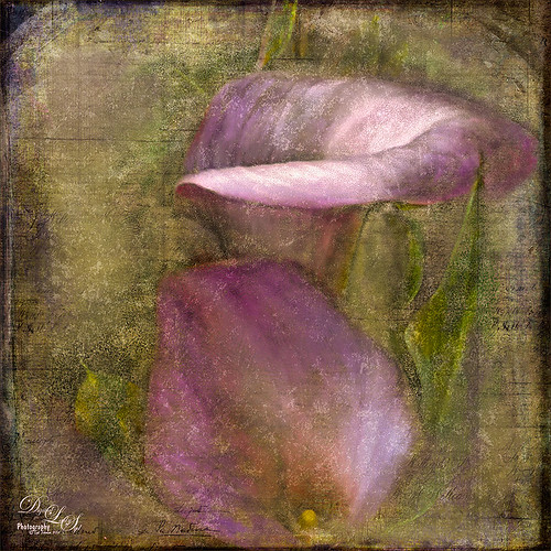
Just wanted to play with this beautiful image of soft pink calla lilies – love their color! Took them with my Android phone in the grocery and loved the result. Did nothing special to them in Lightroom – just the basics, then did a little clean up on the image in Photoshop before adding 2 Lil’ Owls (see sidebar for website link) Carnavale texture. Painted back the flowers in a layers mask attached to the texture and topped it off with Kim Klassen‘s Cloth & Paper Collection’s Magicfilm set to Soft Light blend mode at 45% layer opacity. This completed the vintage feel. The colors just did not look quite right to me and I had a hard time figuring out what to do to get the final look I liked. Then it hit me – go to my favorite plug-in – Nik’s Viveza 2 – and sure enough, with just two control points on the flower petals, I got just the color effect I wanted. Once again, lots of fun to do on boring Monday!…..Digital Lady Syd
Flower Power!

This image was created from a single white daisy shot taken in my front yard. The flower was cut out of this image by selecting the flower using a layer mask and then applying the layer mask. The flower color was changed using a Hue/Saturation Adjustment Layer clipped to the flower layer (CTRL+ALT between the layers to clip). French Kiss Bohemian texture was placed underneath the flower and the color changed to the violet colors. Distressed Textures HR Strawberry Juice On My Finger was added on top and set to 52% opacity. Only the center of the flower was painted out using a layer mask. The flower was duplicated two more times and Free Transformed (CTRL+T) and rotated – different colors were chosen for the other flowers using Hue/Saturation Adjustment Layers clipped to the flowers. Kim Klassen‘s Unleashed texture was added as an overlay (see my How to Create an Overlay Out of a Texture blog.) A Hue/Saturation Adjustment Layer was clipped to the texture and set to a violet color. Some text was added using Rough Typewriter font. A New Layer was added on top and a grunge brush I had created a long time ago was added in pinks and violets and set to 66% layer opacity. A Curves Adjustment Layer was added as a last step. I just love to play with textures and make textures…..Digital Lady Syd
Digital Lady Syd Related Blogs:
Texture Resources – So Many Choices! So Many Choices!
Painterly Textures to Create a Beautiful Floral Image
I Didn’t Know That! Use A Pattern Fill Layer to Add a Painted Texture

Love my Day Lilies! This was a yellow lily but using Topaz (see sidebar for website link) Clarity, I was able to turn it to this pretty pink color. (My preset I call Crazy Color Palette settings are: Clarity Section – Dynamics: Micro Contrast -0.36, Low Contrast 0.39, Medium Contrast -0.36, and High Contrast -0.39; no Tone Level settings; HSL Filter Section settings: Hue – Red -1.00, Yellow -1.00, Green +1.00, Blue +1.00, and Magenta -0,52; Sat – Red -.50, Yellow 0.27, Green -0.09, Blue -0.03, and Magenta +0.59; and Lum – Red -0.03, Yellow 0.41, Green -0.23, Blue -0.20. All not mentioned are set to 0. Then I changed to Micro Contrast slider to 0.55.) Apply and then go back to Photoshop and opened Topaz Simplify and apply Oil Paint preset. A layer was added on top and Fay Sirkis’s 03 Palette Brush Blender was used to smooth out the flower rough edges from the Simplify. A old Florabella Action (that is no longer for sale) was run on the flower and and Kim Klassen’s Cloth & Paper Prague texture was also applied at 15% opacity. The flower was painted out so the texture did not affect it, only the background. Created a New Layer using the Sponge Tool to saturate more in the flower itself. A little burning and clean up was done on the flower. A Curves Adjustment layer was added to add back a little contrast. Then a Pattern Fill Layer was added with one of the patterns in Jack Davis’s Wow Patterns (see my blog Can You Get a Painting Look With a Photoshop Action? Jack Davis Can! for download link) and set to Soft Light blend mode at 59% opacity. I have never used the Pattern Fill Layer to add a painterly texture to an image, but it turned out really nice……Digital Lady Syd
Pretty in Pink! with Topaz Clarity

I do love to photograph my gerberas – they are always so pretty. This time I really changed them up. I think they are as pretty in pink as they were in yellow! So I was really just playing around in Topaz (see sidebar for website link) photoFXlab just to see if the new Topaz Clarity plug-in would work nicely with it. I didn’t even keep track of the changes I made exactly in Clarity, but I did use the Hue/Sat/Lum section to turn the flowers pink. I just kept fooling around with the sliders until I got a color I liked – used the Overall sliders on each of these sections and also adjusted the Clarity section too. Back in photoFXlab, adjusted the Dynamics slider a little to the right. Created a +From Stack Layer and opened up Topaz Simplify 5 where the Paint 5 preset was applied. Back in photoFXlab, the Mask tab was selected and the centers of the flowers were painted back so the detail from the Clarity layer remained. Exited the plug-in and did some basic flower clean up. Created a couple New Layers and used two of my free Cloud Brushes (Brush 6 and 9) to add some interest to the background. Added a Curves Adjustment Layer and evened out some of the petal color. Then added 2 Lil’ Owls Color Bokeh Grunge Set (see sidebar for website link)-2 overlay to the image (set to Normal at 100% opacity). Next the text was added using the free font Ruthie. Kim Klassen‘s Square 3 border was added last and set to 52%. The last step added another Curves Adjustment Layer to enhance overall contrast. That was it. I just love playing with my flowers in Photoshop!…..Digital Lady Syd
PS: Check out my Fun Photoshop How to Create an Overlay Out of a Texture blog to see the frame it was put in.
Digital Lady Syd Related Blogs:
Digital Lady Syd Reviews Topaz Clarity
Topaz Simplify Artistic Workflow
Digital Lady Syd’s Review of Topaz photoFXlab v1.1
Bleach Bypass Look on a Landscape Image

This may be the most beautiful and interesting library ever made. I posted a couple times on Flickr with other images (see Minsk Library, Inside Minsk Library, and Minsk Library at Night) but this time I decided to process the inside ceiling which is all glass – totally breathtaking! As you can see, I caught the eye of the guard down below, but he lends a wonderful scale to the image. I had a hard time deciding what to do with the image as the original was not that bad but I wanted to enhance the light and airy feel in the image. So I tried everything I could think of and this is what I got!
First applied Topaz (see sidebar for website link) DeNoise 5 – the image was shot at ISO 1600 so it had some issues. Used the Overall Strength set to .17 and set the Shadows to .82. The layer was copied and Topaz Detail 3 was applied using the Architectural Detail II preset – this image was perfect for this preset. Next Black & White Effects was applied where I mainly applied a regular black and white preset and started moving sliders. What I think really made the image pop was the application of the Creative Effects Diffusion effect where the Softness was set to 0.10, but the Diffusion slider was set high at .91 and Diffusion Transition set to 0.61. This really made the roof lines pop without being too sketchy looking. Then Kim Klassen’s Cloth & Paper Reign texture was applied and set to Soft Light blend mode to lighten the image and add some blue tones back into the image. It was duplicated and this time set to Multiply at 24% layer opacity. Next a Levels Adjustment Layer was added to lighten the image more by moving the Output Levels to 23/255 and the midtone slider to 1.39. Next a Curves Adjustment Layer was added to lighten it even, and a bit of a vignette was painted around the edges of the layer mask. It still did not look quite right – almost blown out. That is when I tried a Color Lookup Adjustment Layer and clipped (ALT+click between the layers) it to the top texture layer. The 3DLUT File was set to Bleach Bypass.look in the drop-down, although several look rather nice. The last step involved creating a composite (CTRL+ALT+SHIFT+E) on top and adding my SJ B&W Border Frame. I really like how the diffused settings made the ceiling lines look. Anyway, it was once again a lot of fun to experiment!…..Digital Lady Syd
I Must Have Flowers!

Here is another example of some of the beautiful flowers that people grow around their dacha’s outside of Minsk in Belarus. I saw so many unusual and gorgeous flowers when visiting there a few years ago. In Photoshop, Topaz (see sidebar for website link) Detail 3 and Simplify (Watercolor II preset) were applied first. Kim Klassen‘s 1612 texture was added on top at the Normal blend mode. A layer mask was added and the flowers were painted back in with a soft edged, low opacity black brush. A pink to white to pink diagonal Gradient Fill Adjustment Layer came next and set to 40% opacity. Kim Klassen’s Cloth & Paper texture Touch (one of my very favorite textures) was set to Soft Light at 64% opacity. The last major step included adding 2 Lil’ Owls Studios (see sidebar for website link) Dream Freebie 1 texture set to Soft Light at 100% opacity, where the layer mask from the first texture was copied and added to this texture (ALT+drag the mask to new layer to copy). A Levels Adjustment Layer’s Midtone slider was adjusted to bring back some contrast to the image. Text was added using the free fonts Ruthie and Batik Regular. That was it. I love the soft feel to the image and the little bug in the flower…..Digital Lady Syd
Zinnias Ready for Springtime!

Love my Zinnias! This image was first processed in Lightroom before going to Photoshop for an overhaul. Topaz (see sidebar for website link) Detail 3’s Overall Detail Med II preset was applied. A black mask was added and just the flowers were painted back to be nice and sharp. Lightened the image with a Levels Adjustment Layer. Used Kim Klassen‘s Sunkissed texture set to Soft Light blend mode at 100% layer opacity, and then Julytrio ToBe texture set to Soft Light at 47% opacity. For the wallpaper effect, a New Layer was created and Brush Lovers Art Flowers brush 2000 (these used to be posted at BrushLovers.com but they do not appear to be available anymore-they have a lot of other nice little flowers brushes that would work) was selected – in Brush panel the Shape Dynamics, Scattering and Smoothing sections were turned on at default settings, and the Brush Tip Shape settings were Size 394 pixels and Spacing 434% before painting in light brown background effect. The layer opacity was then set to 41%. The font is a really old one from Cosmi named 31. A Curves Adjustment Layer was applied to add a little contrast back in the image after adding all the texture. Last a little brownish tinge of grunge was brushed in using Kim Klassen cloth and paper extras brush 2188 on the upper corners…..Digital Lady Syd
The Polaroid Photo Look

I really researched for what kind of flowers these are and could not figure it out – the image was taken while at the Hawaiian Tropical Botanical Garden on the Big Island in Hawaii. In Lightroom the image was processed using the standard sliders to get a nice image. Once in Photoshop, the image was set to a square size with a blank area created on the right side using the Crop Tool (or Canvas Size command). The flowers were selected, the selection inverted (CTRL+SHIFT+I), and in the Channels Panel, the New Channel icon was selected to make a new Alpha Channel. Now back in the Layers Panel, Content-Aware Scale was applied. First check Protect Alpha 1 channel in Options Bar before dragging the right side handle out – this keeps the flower from distorting, but just the background area. Topaz (see sidebar for website link) Detail 3 was used to sharpen the flowers a little. Next three of Kim Klassen‘s textures were added: Cloth & Paper Venice Texture at Soft Light at 100%, same texture set to Multiply at 27%, and UggLove Texture set to Soft Light at 75%. A Hue/Saturation Adjustment Layer was used to desaturate the background just a little and the flower and stem were painted back in a layer mask. A Levels Adjustment Layer was also applied using the same flower layer mask used. A composite was made. The frame used above is one Kim suggested using from fuzzimo, but there are numerous other free downloads if you do a search for Polaroid templates. Once the frame was opened, the center was selected and put on its own layer (CTRL+J) A composite of the image was brought into the frame and clipped (ALT+click between the layers to clip) to the center area of the frame. With a little adjusting and adding some text and it was finished. This image used Quilted Butterfly and Batik Regular fonts. Really nice vintage feel to the image…..Digital Lady Syd
Digital Lady Syd Related Blogs:
Using a Template to Create Your Own Unique Valentine
Five Image Template Creates Beautiful Collection!
Macro Magic

I just love Melissa Gallo’s textures – they are so soft and beautiful and they never cease to surprise me how pretty they look on an image. The macro shot above is of my Painted Lady Hibiscus Tree that is growing on my back porch. She blooms year round for me with these huge soft pink blossoms! Basically all I did was a little noise removal and then applied Topaz (see sidebar for website link) Simplify 4 using a preset I created called Hawaii Landscape. (Settings are Simplify Section: Simplify Size 0.20, Feature Boost 0, Details Strength 0.66, Details Boost 1.00, Details Size 0.27, Remove Small 0.06, and Remove Weak 0.10; Adjust Section: Brightness 0, Contrast 1.00, Saturation 1.04, Saturation Boost 1.32, Dynamics 0, Structure 1.00, and Structure Boost 1.00; and Edges Section: Color Edge – Normal, Edge Strength 1.89, Simplify Edge 0.58, Reduce Weak 33.33, Reduce Small 0.20, and Fatten Edge 0.) Next Melissa Gallo’s Painted Textures Winter Wheat from her Cyber Monday Set 1 was set to Linear Light blend mode at 100% layer opacity, and Seafoam from her 2 for Friday Set 2 was left at Normal blend mode and 67% opacity. A layer mask was added to Seafoam and the pistil and stamen were softly painted out to remove the texture and color on these parts. Kim Klassen’s Cloth & Paper Magicfilm 3 texture was added on top and set to Linear Dodge blend mode at 79% opacity. This one gets a little tricky as I used the Blending Options dialog in its Layer Style – turned off the B Channel and set the Underlying Layer right white tab to 197/255 (split the tab by pressing ALT and sliding). This gives the pretty yellow glow grunge effect throughout the image. French Kiss’s Tour Eiffel 1903 overlay was added and set to 25% opacity. A Linear Gradient Fill Adjustment Layer was clipped to the overlay layer using a free colorful gradient called Picasso-16 from Graphix1 Picasso Inspired Gradients set. (To clip to a layer, ALT+click between the layers so only the top layer will affect the layer below.) French Kiss’s free Glorious Grunge Edging was added on top as a border and set to an aqua color. Try the Layer Style trick for an added dimension to your images…..Digital Lady Syd
Winter Violets

Just liked the way my purple-blue violets turned out so I decided to post them. When I took this image, I held an old Cokin Gradual Blue Filter 122 B1 in front of my macro lens. In Lightroom David duChemin’s Iceland Split Greens preset (from his newest book The Print and the Process: Taking Compelling Photographs from Vision to Expression) was applied and then the Basic Panel sliders were tweaked. Topaz Detail 3’s (for website link see sidebar) Overall Detail Light I preset was applied. Next a Levels Adjustment Layer was applied and the mid point was moved to the left (2.57) to really lighten the image. The layer mask was filled with black (CTRL+I) and just some of the purple edges were painted back so the purple was not so bright. Next 2 Lil Owls (see sidebar for website link) Scripted Brush 34 at 2500 pixels was painted in upper right area – a layer mask was applied and any brush color was painted off the flowers. The layer was set to 68% opacity. A green Color Fill Adjustment Layer was clipped (ALT+click between layers) to change brush strokes to green. Kim Klassen’s Unleashed (a beautiful texture that was free by signing up for her newsletter) that I converted to a PNG texture was applied and a light purple Color Fill Adjustment Layer was clipped to the layer. The texture was set to 62% opacity. Another Levels Adjustment Layer was placed on top and the black Output Levels tab was set to 38 to soften and lighten the whole image. In the layer mask, the two main flowers were lightly painted out to sharpen just a bit. That was it. I really enjoyed just doing a fun image…..Digital Lady Syd
Happy Valentines Day!

These flowers were growing in the countryside in Belarus several years ago. I am not sure what kind they are, but the blooms were huge! And the colors are incredible! Not a lot of processing here. After some basic slider adjustments in Lightroom 4, the image was opened up in Photoshop and three inches were added the left side of the image to create an area to add type by going to Image -> Canvas Size. The image was sharpened using Topaz (see sidebar for website link) Detail 3 and the Feature Contrast II preset. Some of the contrast was removed from the image by duplicating the top layer and setting it to Screen blend mode. A black layer mask was added and the high contrast areas were painted back in so they were not so obvious. (See a wonderful video by Melissa Gallo of Painted Textures called Turn Your Photo into a Pastel Painting, Pencil Drawing or Pen and Ink on how to do this.) A New Layer was created and some of the too bright highlights on the pink and purple flowers were lightly painted out. (See my Tidbits Blog Getting Rid of Those Blown Out Areas in Your Image.) Added a Levels Adjustment Layer per Melissa’s suggestion and then Topaz Simplify 4 was opened and the Painting II preset applied. The centers of the large blooms were brushed out to bring back the detail a little using a brush set to 33% opacity in the Local Adjustments section, the Dynamics slider in the Adjust section was set to 0.38, and Tone in Finishing Touches was checked. Back in Photoshop Kim Klassen’s Reentry Texture was added – beautiful texture that was free by signing up for her newsletter. On a white layer mask the flowers were lightly painted out to reveal the flowers just enough. Next on another New Layer some pink hearts were added to the background using Obsidian Dawn’s hearts-glitter brush set’s Glitter Brush set to 4100 px. Once again a white layer mask was added and the flower painted out so the hearts do not cover them. This layer was set to 68% opacity. The text was added using my favorite Freehand575 BT font set to a default setting of the Bevel & Emboss layer style. A basic texture image turned into a Valentine for you!…..Digital Lady Syd
The Textured Flower Look!

Really enjoying processing the beautiful little white mums still blooming on my back porch. I recently found yet another wonderful texture site and decided to give it a try. The flower image was first processed in Lightroom – a preset called Summer Haze by Matt Kloskowski (one of the Photoshop guys at NAPP) was first applied and it turned everything into this soft warm summery feeling. With the Basic sliders a few tweaks were added to increase Exposure and open up the Shadows a little, and then a couple adjustment brushes were created to add sharpening and clarity to the flower centers. Once in Photoshop some blown out highlights were softened (see Getting Rid of Those Blown Out Areas in Your Image and a little Burning was done to bring out some of the flower lines. Next a beautiful Kim Klassen Texture called Organic was added and set to Hard Light blend mode at 92%. (Join her site and get lots of her beautiful textures for free including this one!) A Levels Adjustment Layer was added to increase the contrast a little. Next I added one of my own overlays I created (see How to Create Personal Overlays for Your Images) and used a layer mask to remove part of it – just wanted a little showing. I also used a small splatter brush at 15% opacity to reduce parts of the lettering without reducing all of it. The last step involved adding my favorite French Kiss Glorious Grunge Edging Overlay – a free overlay that can be downloaded at her site. That was it!…..Digital Lady Syd


