
Purple Lily Pads!

Here is one of my first attempts at creating an image using a color palette I liked and not the one in the image. I just finished John Paul Caponigro‘s tutorial on Photoshop Color Strategies at Kelby Training where he teaches you how to change hues naturally to give a very believable feel to an image. He is one of my very favorite Photoshop gurus and he does beautiful fine art photography. This image actually contains: three Hue/Sat Adjustment Layers each addressing a different area of the image, a Color Balance Adjustment Layer, a Gaussian Blur filter applied to the image and selectively painted out, a Curves Adjustment Layer, a Replace Color layer, a Topaz Simplify 3 plug-in using the BuzSim preset set to a low Simplify Size, and a Wow-Frame 10 layer style. I was really pleased how the purple colors and cool tones could replace the greens and yellows and give such a wonder effect!…..Digital Lady Syd
Using the Hue/Saturation Adjustment Layer Temperature Slider for Color Change
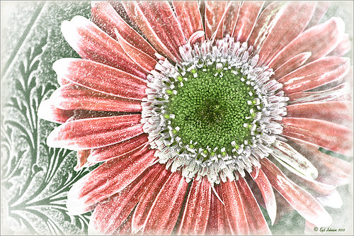 |
I tend to shoot HDR when I am at home photographing my flowers. I like having the different exposure options to choose from even if I do not create an HDR image. In this case an AF Micro Nikkor 60 mm lens at F/3.2, 180 sec, ISO 200 with a Bower 0.5 x High Resolution Digital Lens with Macro was used to shoot 5 exposures set to exposure compensations of -2, -1, 0, +1, +2. These five images were processed in CS5 using Photoshop’s Merge to HDR program – click on the image to see the original Photoshop HDR composite. (Here are the HDR settings used: Radius 350, Strength 1.86, Gamma 2.03, Exposure -0.45, Details 228, Shadow 100, Highlight -86, Vibrance 75, and Saturation -26 – a curve was created with points at Input 25 Output 43 and Input 58 and Output 65. I saved this down as a preset to use again.)
To get a little different look, I decided to use the red-green dynamic color combination. A Hue/Saturation Adjustment Layer was used to change the Reds to Hue +32, Saturation +33 and Lightness -7. To get the center green, while still in the Reds, I moved the temperature tabs on the slider at the bottom of the adjustment layer – see settings below. The center color totally popped! In Magentas the Saturation was set to +14. That was all it took change the colors to something really dynamic!

The final steps involved adding a few control points in Nik’s Viveza 2 for contrast and detail and a Sharpen Tool layer to emphasize the center. OnOne PhotoFrame Taufer Texture 07 was applied (see sidebar for website link). The background was changed to a darkish green to give more color contrast.
Once again, by just playing around in Photoshop and trying a few filters and different colors, you can make an ordinary image into something quite spectacular. Go try out the Hue/Saturation Adjustment Layer temperature slider too – it gives some very interesting results…..Digital Lady Syd
Defringe that Nasty Blue Edge from Trees On a Bright Blue Sky!
 |
This is a short but sweet way to get rid of most of those blue and cyan edges on trees shot in bright light against a blue sky. There are just times you have to take that image in the bright light of day and the fringe occurs frequently. These tips also work when you have a horizon line in a landscape shot that has similar issues.
Hue/Saturation Adjustment Layer: The image above has that very problem and this method was used to get rid of most of the fringe. Hover the above image to see the before defringing image.
1. Simply add a Hue/Sat Adjustment Layer in Photoshop and in the Master field drop-down, adjust the Saturation slider left quite a bit and possibly the Hue slider a little until the blue edging disappears. For the above both Blue (Saturation set to -50 and Hue set to -8) and Cyan (Saturation set to -64).
2. Then Fill the attached adjustment layer mask with black (click on mask and CTRL+Backspace).
3. Click on the black layer mask and use a white brush to paint around the edges at roughly 40% opacity to remove the fringe color. You may have to go over it a couple of times but it will look more natural than setting the brush to 100% and painting over just once. You may need to adjust the opacity of the brush down more so the desaturation is not so noticeable.
Sponge Tool Method: Perhaps the easiest way to get rid of any extra fringe that might still be lurking in the image is to select the Sponge Tool and set it to Mode Desaturate. Turn off Vibrance in the Options Bar since that will only work on the more or less saturated colors and not the already saturated colors which we want to get rid of. Brushed over the fringe areas but try not to discolor too much of the neighboring sky also – it will look white and not the natural blue sky color.
Camera Raw Method: Open image in Lightroom or ACR and go to the Lens Correction Panel Manual Tab in the Chromatic Aberration section, set the Defringe to All Edges and adjust the Red/Cyan slider to the left and Blue/Yellow slider to the right to get the best result. This may take a bit of adjusting to get the right balance and watch out for any color shifts in the sky area around the leaves. There is no way to use a Saturation Adjustment Brush effectively to paint out the fringe as it does not have the choice of colors to remove – it desaturates everything you paint over – and it is hard to just pinpoint the fringe.
Saturation Layer: Digital Lady Syd’s Favorite way to eliminate a slight fringe edge is with a tip I presented a while back in a Tidbits Blog called “Selective Desaturation – the Easy Way!” This is a very simple technique – simply add a New Layer on top of your image and set the blend mode to Saturation, select the Brush Tool, set color to black (white or gray will also work) and 15% opacity in the Options Bar. Paint over the area you want to desaturate several times until you get the look you are after. If too much desaturation occurs, add a layer mask back and use a black brush to paint back any areas that you did not mean to desaturate. I think this gives as good a result as the first method so give it a try if you do not like the results using any of the other methods. I would post the image again but it is very similar to after image above.
Here are four options to try: Bottom line, try it and if you don’t like the results, don’t use it and try something else!
The final thought is a great quote I found from TWCDM’s Blog: “While these tricks are fine and dandy the best way to fix purple fringing to is avoid it in the first place. You can prevent purple fringing by using high quality lenses, stopping down your lens (shooting at an aperature of f8-f22), and if you are using a zoom lens avoid using the maximum and minimum focal range. A lenses “sweet spot” is usually somewhere in the middle focal lengths.” If you shoot it right to begin with you will not have this problem. (That apparently is my problem – hum!)
Hope these tips help you on those bright outdoor daytime images…..Digital Lady Syd


