
Who’s Hiding in the Cabbage Patch?

Just a quick blog on this little guy who looks so much like a wonderful cat I had many years ago named Bobbin. He lives in Belarus, apparently at a cabbage patch. Very simple processing here. Initial processing was done in Lightroom. Some spot removal and clean up on a little bit of the image was done next in Photoshop. Then Topaz (see sidebar for website link) Detail 3 was used just to sharpen the cat’s face. To really enhance the eyes, a New Layer was added and the Sharpen Tool was used – 20% Strength and Sample All Layers checked. The last step involved adding a lovely Isabelle Lafrance Diaphanous Overlay called Ethereal. A Color Fill Adjustment was clipped (ALT+Click between the layers) to change to color to a dark blue. The Overlay layer was set to Multiply blend mode at 79% opacity. Another New Layer was added and the dark color was sampled – then the edges were painted darker to draw more focus on the cat and to get rid of a few extraneous items. I loved the way it turned out – wish I could have brought the cat home with me!…..Digital Lady Syd
Digital Lady Syd Related Blogs:
Using a Color Fill Adjustment Layer as a Spotlight
Keeping Focus Where You Want It Using Focal Point 2 and Color Fill Adjustment Layer
Spotlight Effect With the New Subtract Blend Mode
Bleach Bypass Look on a Landscape Image

This may be the most beautiful and interesting library ever made. I posted a couple times on Flickr with other images (see Minsk Library, Inside Minsk Library, and Minsk Library at Night) but this time I decided to process the inside ceiling which is all glass – totally breathtaking! As you can see, I caught the eye of the guard down below, but he lends a wonderful scale to the image. I had a hard time deciding what to do with the image as the original was not that bad but I wanted to enhance the light and airy feel in the image. So I tried everything I could think of and this is what I got!
First applied Topaz (see sidebar for website link) DeNoise 5 – the image was shot at ISO 1600 so it had some issues. Used the Overall Strength set to .17 and set the Shadows to .82. The layer was copied and Topaz Detail 3 was applied using the Architectural Detail II preset – this image was perfect for this preset. Next Black & White Effects was applied where I mainly applied a regular black and white preset and started moving sliders. What I think really made the image pop was the application of the Creative Effects Diffusion effect where the Softness was set to 0.10, but the Diffusion slider was set high at .91 and Diffusion Transition set to 0.61. This really made the roof lines pop without being too sketchy looking. Then Kim Klassen’s Cloth & Paper Reign texture was applied and set to Soft Light blend mode to lighten the image and add some blue tones back into the image. It was duplicated and this time set to Multiply at 24% layer opacity. Next a Levels Adjustment Layer was added to lighten the image more by moving the Output Levels to 23/255 and the midtone slider to 1.39. Next a Curves Adjustment Layer was added to lighten it even, and a bit of a vignette was painted around the edges of the layer mask. It still did not look quite right – almost blown out. That is when I tried a Color Lookup Adjustment Layer and clipped (ALT+click between the layers) it to the top texture layer. The 3DLUT File was set to Bleach Bypass.look in the drop-down, although several look rather nice. The last step involved creating a composite (CTRL+ALT+SHIFT+E) on top and adding my SJ B&W Border Frame. I really like how the diffused settings made the ceiling lines look. Anyway, it was once again a lot of fun to experiment!…..Digital Lady Syd
Zinnias Ready for Springtime!

Love my Zinnias! This image was first processed in Lightroom before going to Photoshop for an overhaul. Topaz (see sidebar for website link) Detail 3’s Overall Detail Med II preset was applied. A black mask was added and just the flowers were painted back to be nice and sharp. Lightened the image with a Levels Adjustment Layer. Used Kim Klassen‘s Sunkissed texture set to Soft Light blend mode at 100% layer opacity, and then Julytrio ToBe texture set to Soft Light at 47% opacity. For the wallpaper effect, a New Layer was created and Brush Lovers Art Flowers brush 2000 (these used to be posted at BrushLovers.com but they do not appear to be available anymore-they have a lot of other nice little flowers brushes that would work) was selected – in Brush panel the Shape Dynamics, Scattering and Smoothing sections were turned on at default settings, and the Brush Tip Shape settings were Size 394 pixels and Spacing 434% before painting in light brown background effect. The layer opacity was then set to 41%. The font is a really old one from Cosmi named 31. A Curves Adjustment Layer was applied to add a little contrast back in the image after adding all the texture. Last a little brownish tinge of grunge was brushed in using Kim Klassen cloth and paper extras brush 2188 on the upper corners…..Digital Lady Syd
Turtle Talk

We appear to have a group of large turtles that like to meet on the fountain structure before it turns on every day. Sometimes there are five and sometimes there is one that is larger than all the others. It appears to me that they are gossiping in the sunshine before the day begins. All have their heads stretched way up.
Not much in the way of processing. First cropped in Lightroom and did a few color and tone adjustments. Added just a little sharpening and exposure to make the turtles pop out from the dark background using the Adjustment Brush. In Photoshop added Topaz (see sidebar for website link) Detail and then filled a layer mask with black and just painted back the turtles. Applied Nik Color Efex Pro filters: Darken/Lighten Center centering on the turtles, and then Monday Morning in the Neutral color set. Control Points were placed on the turtles and the opacity set to 41%. Back in Photoshop the brown text was added using the Regular Batik font. A Stroke layer style was added to a composite layer (CTRL+ALT+SHIFT+E) on top and instead of a color, a pattern was added to the at a Scale of 13% and a Size of 21 pixels. I used a pattern that had some of the natural brown tones for the frame. That was it. Totally easy. I hope to be able to get some more images of my new turtle friends. Seems like we have a whole group in our little lake…..Digital Lady Syd
The Polaroid Photo Look

I really researched for what kind of flowers these are and could not figure it out – the image was taken while at the Hawaiian Tropical Botanical Garden on the Big Island in Hawaii. In Lightroom the image was processed using the standard sliders to get a nice image. Once in Photoshop, the image was set to a square size with a blank area created on the right side using the Crop Tool (or Canvas Size command). The flowers were selected, the selection inverted (CTRL+SHIFT+I), and in the Channels Panel, the New Channel icon was selected to make a new Alpha Channel. Now back in the Layers Panel, Content-Aware Scale was applied. First check Protect Alpha 1 channel in Options Bar before dragging the right side handle out – this keeps the flower from distorting, but just the background area. Topaz (see sidebar for website link) Detail 3 was used to sharpen the flowers a little. Next three of Kim Klassen‘s textures were added: Cloth & Paper Venice Texture at Soft Light at 100%, same texture set to Multiply at 27%, and UggLove Texture set to Soft Light at 75%. A Hue/Saturation Adjustment Layer was used to desaturate the background just a little and the flower and stem were painted back in a layer mask. A Levels Adjustment Layer was also applied using the same flower layer mask used. A composite was made. The frame used above is one Kim suggested using from fuzzimo, but there are numerous other free downloads if you do a search for Polaroid templates. Once the frame was opened, the center was selected and put on its own layer (CTRL+J) A composite of the image was brought into the frame and clipped (ALT+click between the layers to clip) to the center area of the frame. With a little adjusting and adding some text and it was finished. This image used Quilted Butterfly and Batik Regular fonts. Really nice vintage feel to the image…..Digital Lady Syd
Digital Lady Syd Related Blogs:
Using a Template to Create Your Own Unique Valentine
Five Image Template Creates Beautiful Collection!
Infinity Light Fun!

The beautiful colored “Infinity Lights” were on display at the local St. Augustine Outlet Mall in Florida. You can actually check them out at Facebook@Happy Pappys Glowing Balls. They are quite striking at night!
This was really easy to process – actually took the image with my little point and shoot camera. Just did regular adjustments in Lightroom before going into Photoshop. First Topaz (see sidebar for website link) Detail 3 was used – applied Overall Detail Medium II with a Lt. Blue Sky Tone filter selected. (Did you know that Detail now has filters for each section? If you click on the upper right corner of each section, there is a drop-down with all kinds of presets for all the sections. For example, the Tone section has presets for Lt. Blue Sky, Lt. Contrast, Lt. Foliage, Dk. Bl. Sky, Dk. Foliage, Brighter I and II, Darker I and II, Med Contrast, High Contrast, and Skin Brightening I and II. This was added to their recent 3.1 upgrade – definitely download this if you have the plug-in and did not do this.) A New Layer was created and a stop sign removed in the background. A composite of the image was created (CTRL+ALT+SHIFT+E) was placed on top and a Gaussian Blur filter set to a Radius of 22 applied. A black layer mask was added and the background area was painted in white to keep the blur in those areas. The last step involved adding OnOne’s (see sidebar for website link) Perfect Effects 4 PhotoTone Cooler preset was applied, which added a little bit of a bluish tone to the total image. This preset was part of free download from OnOne if you own Perfect Effects 4 – they are from their original PhotoTunes program from many years ago. The last step involved adding my free SJ Thin Double Edged Frame with colors from image. I wish I had a good place to put a few of these really interesting lights. They are so pretty!…..Digital Lady Syd
Hibiscus Beauty

Love my beautiful hibiscus plants blooming on my back porch. This one has particularly lovely blooms. It was very quick and easy to process. Just processed a little in Lightroom and then in Photoshop applied my old standard Topaz (see sidebar for website link) Detail 3 using the Overall Medium Detail I preset. Painted over where the petals were blown out (see my Getting Rid of Those Blown Out Areas blog) on a separate layer. Than added French Kiss Tableaux Collection Creation texture and added a layer mask. Just painted back the flower – that is all it needed! It seems that if you have a really strong texture, it sometimes works best not to change blend modes but leave it set to Normal. Last step was to add the text using a really nice font called Quilted Butterfly at 78.01 points. (This font does require a $2 donation to use.) I loved the final effect!…..Digital Lady Syd
Coral Pink Blanket Flowers

Just bought some beautiful textures from Distressed Textures and had to try one out. This is just a point and shoot image from my little Kodak camera that I used to take these pretty pink flowers called Gallardia Galya Coral Spark or common name Blanket Flower. Just did the regular adjustments in Lightroom and then opened it up in Photoshop. The background was duplicated and this new layer was opened in Topaz (see sidebar for website link) Detail 3 and set to Medium Details 0.38, Large Details 0.16, and Contrast 0.30 was applied. A New Layer was created above and the Mixer Brush was selected. Fay Sirkis‘s Signature Watercolor Smooth Blender brush was used to smooth out and sharpen the edges of the flower in the front since the low end camera does not always give sharp edges. Next I added Distressed Textures The Artist’s Palette Museum Canvas texture. A layer mask was added and the flower painted out softly. French Kiss Savoire Faire Overlay was added and set to Color Dodge at 100%. A layer mask was added and the writing was painted off the flowers. The last step was to add a Curves Adjustment Layer to increase the contrast of the image just a little. I wish I had had my better camera with me, but at least I got the shot – some beautiful pink flowers!…..Digital Lady Syd
What a Cute Little Alligator!

Thought I would post my wonderful recent golf experience – we were almost done playing – hole 18 – and then I shot the ball in the water. (That’s how good I am!) Almost clobbered this little sunning alligator, but he did not even move when we pulled the ball out of the water. First alligator I have seen this year, and I would not have gotten the shot if I did not have my cheap Kodak point-and-shoot camera. The image was processed very simply. First I used a Lightroom preset created a while back from a video called True Grit by Michael Rather. (Since I keep referencing it, here are the settings from the short video: Basic Panel – Contrast +100, Highlights -80, Shadows +100, Whites and Blacks sliders to taste, Clarity +100, Vibrance -82, and Saturation -7; and Lens Correction Panel – in Manual tab set Lens Vignetting Amount to -76 and the Midpoint to +19. Use these settings as a starting point and adjust them to taste. My preset actually is set to Clarity of +67 and Vibrance of -82 and were used in the image above.) Next my favorite sharpening plug-in, Topaz (see sidebar for website link) Detail 3, was applied using the Soft and Dreamy II preset. In the Effect Mask section, the effect was removed from the alligator using the brush strength set to 1.00 and partially on the golf clubs and cart canvas top using a o.21 brush strength. The Overall Opacity was set to 0.87. Back in Photoshop a Levels Adjustment Layer was added setting the middle tab to 0.86. Next a Darken/Lighten layer was created (see my Best Dodging and Burning Technique! blog for info on how to do this). The last step involved adding my free SJ B&W Border Frame Layer Style – changed the black color to a sampled green color from the image. It was great to get outside after a pretty cold and ugly winter/early spring and it was fun to see this little guy, even though he was a little scary. …..Digital Lady Syd
Digital Lady Syd Related Blogs:
Trying Out Some New Techniques!
Vintage Toy Processing
Eastern Swallowtail Butterfly

Just had to display this beautiful butterfly that appeared on my Bottle Brush bush recently. This is a female Eastern Tiger Swallowtail and had at least a 4-inch wide wing span. I did basic processing in Lightroom and then opened it in Photoshop. Just did a clean up layer and a Topaz (see website link in sidebar) Detail filter using the Overall Medium Detail II preset. I tried several different textures and nothing seemed to look right. So the layer was duplicated and the image was opened in Nik Color Efex Pro 4. These filters were stacked: Detail Extractor, Monday Morning using the Neutral color set and an opacity of 58%, Film Efex Vintage set to Film Type 13, and Vignette using a white color. These are all favorite filters of mine in this plug-in. Next OnOne’s (see website link in sidebar) old PhotoFrame 4.6 filter was applied using Kevin Kubota’s preset Kinky set to 63% opacity and a size increase of 7% and using a creamy color sampled from the image. Back in Photoshop a Hue/Saturation Adjustment Layer was added and the Reds Saturation was set to -58 to tone down the bottle brush color. I love the vintage feel of this image. I am sorry that OnOne is not longer releasing PhotoFrames – I am having trouble duplicating these effects in their new suite……Digital Lady Syd
Red Flower-Blue Bokeh

This Canna Lily flower is similar to a bright orange variety I have growing in my front year but this one was at the Hawaii Botanical Tropical Gardens on the Big Island. To post-process, the flower and plant were selected from the background which had lots of shadows and highlights from other leaves nearby that was very distracting. Topaz (for website link see sidebar) Detail 3 Overall Medium Detail II was applied to this layer. Jill Wellington’s Bokeh free 94 textures – texture 24 was added behind the flowers. Once placed above the light blue texture, several rough edges appeared – the flower and plant were selected (CTRL+click on the thumbnail), then Select -> Refine Mask was chosen where Feather was set to .5 and the Shift Edge set to -40. A Hue/Saturation Adjustment Layer was clipped to the flower layer (ALT+click between the layers so only flower layer is affected) and the bottom leaves’ color was adjusted from bright green to darker tones – the layer was mask was turned to black by clicking CTRL+I in the mask. The last step involved using a Levels Adjustment Layer to increase the contrast just a little and to soften the whole look (Output was set to 60 and flower painted back gently in layer mask to bring out color a little)…..Digital Lady Syd
Digital Lady Syd Related Blogs:
Soft Bokeh Texture for a Flower Image
Happy New Years!
Winter Violets

Just liked the way my purple-blue violets turned out so I decided to post them. When I took this image, I held an old Cokin Gradual Blue Filter 122 B1 in front of my macro lens. In Lightroom David duChemin’s Iceland Split Greens preset (from his newest book The Print and the Process: Taking Compelling Photographs from Vision to Expression) was applied and then the Basic Panel sliders were tweaked. Topaz Detail 3’s (for website link see sidebar) Overall Detail Light I preset was applied. Next a Levels Adjustment Layer was applied and the mid point was moved to the left (2.57) to really lighten the image. The layer mask was filled with black (CTRL+I) and just some of the purple edges were painted back so the purple was not so bright. Next 2 Lil Owls (see sidebar for website link) Scripted Brush 34 at 2500 pixels was painted in upper right area – a layer mask was applied and any brush color was painted off the flowers. The layer was set to 68% opacity. A green Color Fill Adjustment Layer was clipped (ALT+click between layers) to change brush strokes to green. Kim Klassen’s Unleashed (a beautiful texture that was free by signing up for her newsletter) that I converted to a PNG texture was applied and a light purple Color Fill Adjustment Layer was clipped to the layer. The texture was set to 62% opacity. Another Levels Adjustment Layer was placed on top and the black Output Levels tab was set to 38 to soften and lighten the whole image. In the layer mask, the two main flowers were lightly painted out to sharpen just a bit. That was it. I really enjoyed just doing a fun image…..Digital Lady Syd
The London Eye Looking Up

I was just playing around in Lightroom today and found this old image of The London Eye that was a very different type shot. Decided to process it first using NAPP‘s Lightroom preset Summer Day. It created a very yellow image, totally different from what I ended up with, but I thought I would try it. Once opened in Photoshop, Topaz (see sidebar for website link) Detail 3, my “go-to” filter where I actually tried the “I Feel Lucky” button. The image above is basically what I ended up with. (These are the settings if you are interested: Detail: Overall details set to Small Details -.094 Small Details Boost 0.84, Medium Details 0.87, Medium Details Boost 0.53, Large Details -0.92, and Large Details Boost 0.95; Tone: Exposure 0.81, Contrast -0.53, Highlights 0.70, Shadows 0.81, Whites -0.81, Blacks 0.82, Cyan-Red 0.63, Magenta-Green 0.51, Yellow-Blue -.86, and Add Grain 0; Color: Temperature -0.70, Tint 0.75, Saturation -0.84, and Saturation Boost 0.57; and Effect Mask: Overall Opacity 0.37.) The last step was to add a Curves Adjustment Layer and putting a little less blue in the Blue Channel. This really looks like how I remember the sky that evening. The London Eye was one of my very favorite things I did on my trip to England……Digital Lady Syd
Digital Lady Syd Related Blogs:
“Perfect” Perfect Layers!
Beautiful Feathers!
Painterly Red Berries

These little red berries were growing in my neighbors yard – I really did not think they would look that great but I took a photo anyway. By adding the soft painterly texture, they turned into something quite beautiful. In Lightroom the basic panel sliders were manipulated and an adjustment brush was set to increased clarity and sharpening to paint around the edges of the front berries. The image was then opened in Photoshop where Topaz (see sidebar for website link) Detail 3 was opened and the Desaturated Blush I preset was applied. Painted Textures Creamsicle texture was set to Linear Burn at 100% opacity. A Levels Adjustment Layer was added and the Output level was changed to 54 to add a slight light haze to the image. The berries in front were painted out in the adjustment layer mask so they would appear slightly sharper. That is it! I love this texture – gives a real painterly look!…..Digital Lady Syd
Digital Lady Syd’s Related Blogs:
Beautiful Christmas Flowers
The Kiddie Tractor Revived!

Riding my toy tractor may be the first recollection I have. Since I grew up practically in the middle of a corn field (although my parents were not farmers), my first ride-on toy was a tractor exactly like this one. It was my favorite toy and I put miles on it! I did not have a tricycle, just a tractor. I had to get a picture when I went to the 39th Annual Turkey Run in Daytona Beach, Florida, last fall. Looks like we are missing a pedal here.
Used my basic Camera Raw steps (see How to Use Adobe Camera Raw (ACR) or Lightroom 4 Quickly) in Lightroom 4. Next Topaz (see sidebar for website link) Detail 3 was applied using Overall Detail Medium II preset first, and then the Soft and Dreamy II preset was applied. The tractor was painted back in a layer mask so just the background was softened. On a duplicated layer Topaz Adjust 5’s Low Key II preset with Transparency slider set to .28 was applied to the layer. A Hue/Saturation Adjustment Layer was used to desaturate the greens and yellows. 2 Lil’ Owls (see sidebar for website link) Workbook Bonus Texture 16 was added at 85% opacity. A High Pass Sharpening effect set to 8 pixels was applied and a final Curves Adjustment Layer for added contrast and give a nice orange color to the tractor was added. Lots of fun to work on something from your childhood……Digital Lady Syd
Happy Valentines Day!

These flowers were growing in the countryside in Belarus several years ago. I am not sure what kind they are, but the blooms were huge! And the colors are incredible! Not a lot of processing here. After some basic slider adjustments in Lightroom 4, the image was opened up in Photoshop and three inches were added the left side of the image to create an area to add type by going to Image -> Canvas Size. The image was sharpened using Topaz (see sidebar for website link) Detail 3 and the Feature Contrast II preset. Some of the contrast was removed from the image by duplicating the top layer and setting it to Screen blend mode. A black layer mask was added and the high contrast areas were painted back in so they were not so obvious. (See a wonderful video by Melissa Gallo of Painted Textures called Turn Your Photo into a Pastel Painting, Pencil Drawing or Pen and Ink on how to do this.) A New Layer was created and some of the too bright highlights on the pink and purple flowers were lightly painted out. (See my Tidbits Blog Getting Rid of Those Blown Out Areas in Your Image.) Added a Levels Adjustment Layer per Melissa’s suggestion and then Topaz Simplify 4 was opened and the Painting II preset applied. The centers of the large blooms were brushed out to bring back the detail a little using a brush set to 33% opacity in the Local Adjustments section, the Dynamics slider in the Adjust section was set to 0.38, and Tone in Finishing Touches was checked. Back in Photoshop Kim Klassen’s Reentry Texture was added – beautiful texture that was free by signing up for her newsletter. On a white layer mask the flowers were lightly painted out to reveal the flowers just enough. Next on another New Layer some pink hearts were added to the background using Obsidian Dawn’s hearts-glitter brush set’s Glitter Brush set to 4100 px. Once again a white layer mask was added and the flower painted out so the hearts do not cover them. This layer was set to 68% opacity. The text was added using my favorite Freehand575 BT font set to a default setting of the Bevel & Emboss layer style. A basic texture image turned into a Valentine for you!…..Digital Lady Syd
Painterly Effect using Topaz Detail and Simplify
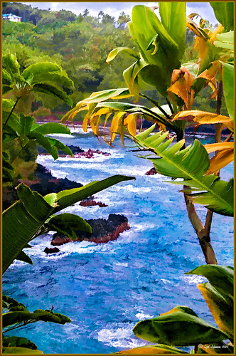 |
I was looking through my notes from last year and came across some nice info on using Topaz (see sidebar for website link) Simplify and Detail together to create an oil painting look. (See Creating an Oil Painting Effect from Topaz Labs.) My Hawaiian image from the east coast of the Big Island was one I had not originally processed as it really did not catch my eye – hoover over image to toggle to original. While doing a little Hawaii dreaming, I came across it again and thought it might look good using some of the settings from this video. (I really was thinking about how it would be to live in the house up in the top left – hum!) I actually did not follow the exact video workflow, but it did get me thinking about how to do this. Now that both Simplify and Detail have been updated, it was easier to get some different looks. Here are the steps I followed:
1. Duplicated the Background layer (CTRL+J). Topaz Detail 3 was opened and the settings from the second example in the video were applied: Small Detail .53, Medium Detail .46, and Large Detail .44.
2. Duplicated the Detail layer. Next Topaz Simplify 4 was opened and the Painting IV preset was applied. The only change to it is that the Edges section was turned off as it made the trees in the background stand out.
3. A Layer Mask was applied to the top Simplify layer. Some of the Detail Layer was brought back in by painting black on the mask on the foreground leaves. Also some detail in the little rock island was painted back.
4. What I did different was to add a New Layer and paint over the foreground leaves and trees in the midground to give a more painterly look and smoothing out some of the rough edges and colors that Simplify can bring into an image. A wet mixer brush was used for this.
5. Next a general Curves Adjustment Layer was added to bring in some contrast.
6. The sky was really blown out, so I added another Curves Adjustment Layer that brought back the natural clouds from the original image into the sky. The Layer Mask was filled with black and just the sky area was painted back with a soft black low opacity brush.
7. The water was way too cyan for my taste, so another Curves Adjustment Layer was added and the different color channels were adjusted to get a better color for the water.
8. I felt like the eye was not guided with a strong enough element to get you through the image. Therefore, a New Layer that was set to Overlay Blend Mode was added. With a large black brush set to 15% opacity, the edge of the bay was lightly painted on the water all the way to the back center. This burned in a slight contrast in the water for the eye to follow. Much better overall impact for the image.
9. The last step involved adding my SJ Thin Double Edge Frame layer style left at the default colors.
That is how I got this very Hawaiian Oil Paint feeling. Give these two plug ins a try and see what you think…..Digital Lady Syd
Digital Lady Syd Related Blogs:
Topaz Simplify and Topaz Detail Together
Beautiful Feathers!

These beautiful feathers were from the 24th Annual Native American Festival held in Ormond Beach, Florida. Totally enjoyed looking at the many exhibits and vendor tents, and the shows were very entertaining. This image is of a display of feather hair bungies that was in a vendor tent. Very little treatment was done to the image. The biggest change in Lightroom was changing the aspect ratio to a square crop. A few Basic sliders were adjusted before opening Photoshop. First the image was taken into Topaz (see sidebar for website link) photoFXlab where the layer was duplicated and in the Effects tab, Black and White Albumen – Chocolate was applied (this is actually a preset in the Black and White Effects plug-in). Next in the Adjustment Tab, Saturation was set to 2, Exposure to -0.05, Contrast to -5, and Dynamics 25. The top layer was set to 52% opacity and a Color Blend Mode. Once back in Photoshop, Topaz Detail 3 was opened and the Overall Medium Detail preset applied. A black layer mask was added and with a soft white low opacity brush, only areas I wanted really sharpened were painted back in. Then a little clean up to smooth the background was done. I really like the soft looking feathers in this image. What a fun place to take pictures – and not much processing needed afterwards!…..Digital Lady Syd
Happy New Years!

Happy New Years to everyone. I posted this image earlier today and thought I would give you the info on how to create it. The flowers are two of my red gerberas from my back porch that decided to burst forward on the New Years weekend. They are a little crazy looking as I keep moving them into the house when it gets cold and outside again when it warms up! Anyway, here are the steps in a nutshell! After initial processing and cropping in Lightroom, Topaz (see sidebar for website link) Detail 3’s Medium Detail II preset was applied. Next Isabelle Lafrance free Christmas Lights overlay was applied for the bokeh effect. I just used a soft black brush on a layer mask to bring the red gerberas back into the image. Next I applied my free SJ Snow 2 Slight Blur Overlay and added a Pattern Overlay. In another document I opened up my free Smudge Texture and changed the colors to reds, greens and yellows – saved it down as a new pattern (Edit -> Define as a Pattern). Then on the Snow Overlay layer, I created a layer style using the Pattern Overlay and selected my new pattern set to 33% scale – this gives the colored confetti look. I duplicated the layer and Free Transformed it (CTRL+T) – selected Flip Vertical so the colored snow on this layer lines up differently. The bottle is from Mel’s Happy New Years Brushes with a Bevel & Emboss layer style applied along with the fizz. The font is Orial with a Stroke, Inner Glow and Outer Glow layer style added. The last step was a Curves Adjustment Layer to add some contrast. Lots of fun to play with all these effects! Hope everyone has a chance to play in Photoshop and try out some of these fun techniques!…..Digital Lady Syd
Christmas Wreaths at SeaWorld

For this wonderful holiday, thought I would show this pretty image of wreaths from SeaWorld Orlando. Just a little basic processing in Lightroom before taking the image into Photoshop. Topaz (see sidebar for website link) Adjust 5’s High Key preset was applied with the Overall Transparency set to .24. Next Topaz Detail 3 was applied using the HDR Enhancement II preset. French Kiss’s Artiste Chamante texture was applied and set to Overlay at 100% opacity. My free Snow1 Overlay was next applied and set to 75% opacity. French Kiss’s Glorious Grunge Edging Overlay was applied next and a Solid Color Adjustment Layer set to a light pink was added. Since the edging did not seem to show up real well, it was duplicated along with the Adjustment Layer. That was all that was done and I love the final effect – the umbrella really added to the shot. Hope all are having a wonderful week!…..Digital Lady Syd
Getting a Nice Painterly Landscape Effect with Topaz Simplify and Texture

An easy way to get a painterly look. This image is at the entrance to SeaWorld in Orlando, Florida, and is a great place to take a shot – very Disneyland-like colors! This look was created by doing these things:
1. Applied Topaz (see sidebar for website link) Simplify 4 using the Painting V preset set to transparency to .28
2. Next French Kisses Artiste Fauve Rainbow texture was added – although any painted texture you like could be used. A Hue/Saturation Adjustment Level was clipped to the texture layer (by ALT+clicking between the layers) and Saturation was set to -100 to desaturate the texture so it can be layered on top of the image so the color in the texture does not show up on the image. The texture blend mode was then set to Hard Light at 34%. (Try different blend modes to see which looks best on your image.)
3. A Levels Adjustment Layer was added to brighten the image as the texture tends to darken the midtones.
4. Topaz Detail 2 was applied to sharpen the image using the Creative Detail Accent preset with some adjustments to the three color sliders and the saturation slider.
That was it and you get this nice painterly effect!…..Digital Lady Syd
Digital Lady Syd’s Related Blogs:
Topaz Simplify and Lens Effects Saves an Image!
Digital Lady Syd Reviews Topaz Simplify 4
Using Topaz Simplify for That Artistic Feel!
Feeling Butterflies!

Really liked the way this image turned out and it was a fairly simple process. After setting the Lens Correction panel and Cropping the image, a Blue Sky-Heavy Green preset created from Dave duChemin’s Lightroom 3 book (the preset contains only Split Toning panel – Highlights Hue 220 and Saturation 25, Balance -15, and Shadows Hue 120 and Saturation 20) and Matt Kloskowski’s preset Focal Point (Portrait – Bottom Right) were applied. Since the first preset only affected the Split Toning panel and the Focal Point preset did not change this panel, both could be applied in Lightroom without a problem. The image was brought into Photoshop and first Topaz (see sidebar for website link) Detail was applied (Detail Setting used: Small Detail .5, Medium Detail .3, and Large Detail .3; and Tone: Brightness .03, Contrast -.16, Cyan-Red .26, Magenta-Green -.37, and Yellow-Blue .44) and Topaz DeNoise 5 (Noise Reduction slider .42 and Recover Detail slider .36).

Now the out-of-focus pink flowers looked bad, so a New Layer was created to paint in the over-exposed white spots to keep the eye from wandering to those areas. On another New Layer using a 15% opacity soft edge brush the straight green stem was painted darker sampling in the image to add a slightly darker green. Another Hue/Saturation Adjustment Layer was added and the Yellow Saturation set to +40. It took a while to settle on a final result but since the Adjustment Layers are all non-destructive, it was easy to try different effects. A Gaussian Blur was applied to a Composite Layer (CTRL+SHIFT+ALT+E) created on top and using a Radius of 6.6. On a layer mask, the butterfly and foreground flowers were painted back in black on the mask. A lower 30% opacity brush was used to slightly paint back the flowers in the mid-ground left side. Next my Soft Sparkle Overlay Frame was applied but since it is a deep reddish brown, a Solid Color Adjustment Layer (Clip it to the layer by clicking ALT+Click between the frame layer and the adjustment layer) set to an off-white was used. Finally a Curves Adjustment was added contrast. Just Fun!……Digital Lady Syd
Digital Lady Syd Related Blogs:
How To Make Frames or Borders
Getting Rid of Those Blown Out Areas in Your Image
Topaz Simplify and Topaz Detail Together

Recently I watched a video, this time for Topaz plug-ins (see sidebar for Topaz website and more blog links below), and learned a couple new things I thought I would share. If you have read my blogs before you know that I am a big fan of Topaz products – they may not be the most sophisticated, but they do some very cool effects the other major companies can’t achieve. Scott Stulberg did a lengthy video called “Memorable Travel and Stock Photography” where he covers Topaz Adjust, Detail and Simplify. I tried to incorporate a few of these tips in this image of sun-lighted grass growing on the road to Waipi’o Valley on the Big Island in Hawaii. Gosh it is hard to take a bad picture in Hawaii!
To begin with, Topaz Simplify was used. Scott suggested this plug-in is great to use on a shot that is a bit soft from a gentle breeze or a not-so-great lens – this effect can save an image and turn it into something very nice. There are two color space choices – RGB (more vivid colors) or YCbCr color space (more muted colors). This image used the YCbCr color space. Scott mainly uses the BuzSim preset – the trick is to move the Simplify Size slider to the left from the default setting (0.33) and you will see the detail return but the color stays saturated. On this image the Simplify Size slider was set to 0.05, Details Boost slider set to 0.79 (default is 1.00), and Details Size set to 0.13 (default is 0.20). It is a very similar result to using Vibrance in Photoshop but Simplify has much better color saturation. In the Adjust section, the Saturation was toned down a bit to 0.96 (default 1.31) and Saturation Boost set to 1.00 (default 1.15). He is basically lowering or turning off all the artistic settings and leaving the saturation turned on. One small problem I seem to have with Topaz products is that sometimes I have trouble retrieving the settings when using a Smart Object layer, which is supposed to retrieve the plug-in settings used on the image. Therefore, create a preset and name it something that will remind you of the image if you liked the result.
Next Topaz Detail was used. Scott feels that this plug-in makes it appear you were using a better lens than you really were. Basically you want to move the Medium Detail slider, then the Small Detail and Large Detail sliders until you get a sharper feeling image. He does very little sharpening to his photos but uses Detail to do the sharpening – it is like using the Clarity slider in a realistic way. That is how the plug-in was used for this image.
The final touch I added was a Hue/Saturation slider boosting the yellow saturation up quite a bit. Then I filled the layer mask with black (CTRL+Backspace) and painted with a very low opacity soft brush in to give just a soft yellow tone. OnOne’s Dave Cross 14 frame (see sidebar for website link) was added using a color sampled from the shot.
Sometimes it feels like I harp on all these these plug-ins, but they really are fun to use and they can take your images to a new level…..Digital Lady Syd
Digital Lady Syd Related Posts:
Simplifier and Simplify Filters
Topaz Plug-Ins – Same Image Trying Each! – this blog has many of my Topaz blog links at the bottom if you would like more information on any Topaz products


