
Masked
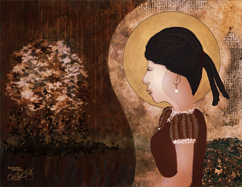
Kyle T. Webster, the Photoshop Evangelist at Adobe, recently did two Masterclass YouTube videos called Learn from Greats – Mark English – Part One and Part Two. In Part One many of the Mark’s various pieces of art and how he created the images were discussed, and in the other Kyle created an image showing how to use some of these same techniques. That is what was attempted with this image, but it is a lot less abstract than most of Mark’s images. 26 different PS brushes were used – some created on the fly. Several layer styles were added and even PS’s Craquelure filter was used (lower right bush). Three Color Lookup Adjustment Layers and three Texture Layers were used. Lots going on here, but it was a lot of fun to try and get some of the expression that Mark English had in his paintings. I am going to try and get a better example using his techniques soon!…..Digital Lady Syd
Butterflies

Ended 2019 with a butterfly graphic image. Had fun just trying some of the new techniques from this year. Mainly trying out a little blend if technique to remove the backgrounds from the butterflies. A couple Color Lookup Adjustments Layers and a Gradient Map Adjustment Layer were used to add in a little more effect. The original background texture is called Butterfly Flutters by French Kiss and the font is one of my favorites, Argentina Script. There is so much that can be practiced with Photoshop……Digital Lady Syd
Thistles at the Zoo?
It is amazing the things you can find at the zoo. There was a large blooming thistle bush growing along one of paths so I had to take a few shots. In Lightroom used Serge Ramelli’s Tone Bleak Mountains preset (a freebie from Kelby One) and added a couple radial filters to light up the plants. In PS, not much was done but a Center Spotlight Background was added – I used one I created in a recent Design Cuts tutorial on How to Create an Epic Poster Design in Photoshop – the tutorial was actually a little hard to follow but at the beginning a nice background effect was created. I just saved it down as a file to be used again. Shapes by amber & ink Floral Shadow 11 was used in the background – did a Free Transform and warped the shadow to fit. Last step used On1’s Color Lookup Table Moody 5 (part of owning On1 Photo Raw software) and was set to 43% layer opacity. Last step added a Curves Adjustment Layer and that was it……Digital Lady Syd
Bleach Bypass Look on a Landscape Image

This may be the most beautiful and interesting library ever made. I posted a couple times on Flickr with other images (see Minsk Library, Inside Minsk Library, and Minsk Library at Night) but this time I decided to process the inside ceiling which is all glass – totally breathtaking! As you can see, I caught the eye of the guard down below, but he lends a wonderful scale to the image. I had a hard time deciding what to do with the image as the original was not that bad but I wanted to enhance the light and airy feel in the image. So I tried everything I could think of and this is what I got!
First applied Topaz (see sidebar for website link) DeNoise 5 – the image was shot at ISO 1600 so it had some issues. Used the Overall Strength set to .17 and set the Shadows to .82. The layer was copied and Topaz Detail 3 was applied using the Architectural Detail II preset – this image was perfect for this preset. Next Black & White Effects was applied where I mainly applied a regular black and white preset and started moving sliders. What I think really made the image pop was the application of the Creative Effects Diffusion effect where the Softness was set to 0.10, but the Diffusion slider was set high at .91 and Diffusion Transition set to 0.61. This really made the roof lines pop without being too sketchy looking. Then Kim Klassen’s Cloth & Paper Reign texture was applied and set to Soft Light blend mode to lighten the image and add some blue tones back into the image. It was duplicated and this time set to Multiply at 24% layer opacity. Next a Levels Adjustment Layer was added to lighten the image more by moving the Output Levels to 23/255 and the midtone slider to 1.39. Next a Curves Adjustment Layer was added to lighten it even, and a bit of a vignette was painted around the edges of the layer mask. It still did not look quite right – almost blown out. That is when I tried a Color Lookup Adjustment Layer and clipped (ALT+click between the layers) it to the top texture layer. The 3DLUT File was set to Bleach Bypass.look in the drop-down, although several look rather nice. The last step involved creating a composite (CTRL+ALT+SHIFT+E) on top and adding my SJ B&W Border Frame. I really like how the diffused settings made the ceiling lines look. Anyway, it was once again a lot of fun to experiment!…..Digital Lady Syd
Big Sky Preset for Lightroom 4.1

This is my “big sky” view above my little lake and what I have been seeing every afternoon this summer in Florida. Beautiful but very scarey! I wanted to try out Matt Kloskowski‘s (one of the Photoshop Guys from NAPP) new free Lightroom presets called Big Sky as a starting point – Strong in this case. After making adjustments in Lightroom, the image was taken into Photoshop and first Nik’s Color Efex Pro 4 was applied stacking these filters: Brilliance/Warmth with Sat at 32%, Warmth 49%, and Perceptual Sat 40%; High Key With Dynamic High Key set to 61%; and Pastel Using Method 2. Next two Selective Color Adjustment Layers were created with black filled into their layer masks. One Adjustment layer was for the green grass so in the layer mask I painted back just the green area for that layer and the other targeted for the slight reddish color in the roofs. Next the new Color Lookup Adjustment Layer set to 3DLUT DropBlues.3DL was added – the sky was then painted over with a light gray to soften the change. (To learn more about Color Lookup, see TipsSquirrel’s Richard Hoffman’s short video here.) Next Nik Viveza 2 was used to smooth out the clouds and sharpen the house lines. Finally Imagenomics Noiseware was set to Full Stronger Noise preset. The last steps created a Curves Adjustment Layer for a little more blue using just the Blue Channel to increase the color and set to 70% opacity. Finally my Layer Style frame was used sampling the colors from the image (see DLS Free Layer Style Frames). I liked the way the preset worked – it looks very similar to how it appeared originally in Lightroom without all the adjustments and blue cast. The final result looks a bit like an architectural rendering seen in house brochures. And you got to love the clouds!…..Digital Lady Syd


