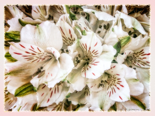
 Creating the Border: Completed this border using a tutorial I learned from PhotoshopLayers.com called Photographic Edges in Photoshop. It is basically a very simple process and uses the Photoshop Sprayed Strokes Brush Stroke Filter to create the border. I changed the settings and maxed out the Stroke Length to 20, the Spray Radius to 25, and Stroke Direction to Horizontal to get a more pronounced edge. Then the frame was saved down as png file. This was done using my the little known Script called Save Layers to File. (See my blog How To Make Frames or Borders on how to do this.) To use this new border easily on other pictures, just drag it into your document. Use a Solid Color Adjustment Layer to change the color of the frame. In this case, I changed it to a light pink, then used a Layer Style to add a soft gradient, a white texture, and Outer Glow. Using a Layer Style on borders can create a very subtle but nice effect.
Creating the Image: These Alestroemeria flowers were actually captured at the local grocery store with my little point-and-shoot Kodak camera. Not much processing was required. I followed the Lightroom processing steps from my blog How to Use Adobe Camera Raw (ACR) or Lightroom 4 Quickly. In Photoshop I applied OnOne Perfect Effects (see sidebar for website link) stacking Tonal Contrast, Rice Paper Light Texture, and Hollywood Glow at 50% opacity. A Curves Adjustment Layer was added to add back just a little overall contrast. A composite was created on top (CTRL+ALT+SHIFT+E) and duplicated. The top layer was set to Multiply Blend Mode and on a layer mask using a large soft black brush at 100% opacity, one dot was placed on where I wanted people to look first. Next the border .png was placed on top with a Solid Color Adjustment Layer set to light pink. Finally a Layer Style was added to the border using a light pink to pink Gradient Overlay (Blend Mode Normal, Opacity 48%, Linear Style, Angle 81 degrees, and Scale of 150%), Pattern Overlay (Blend Mode Normal, Opacity 66%, Pattern set to Normal Blend Mode, Opacity 66%, Pattern from Photoshop’s Watercolor Patterns – bockingford_rough at Scale 55%), and an Outer Glow set to its default settings.
Try creating this border – it really easy and fun to make!…..Digital Lady Syd
03/05/2013 | Categories: Borders and Frames | Tags: borders, edges, frame, Layer Styles, OnOne, OnOne Perfect Effects, Perfect Effects | Leave A Comment »

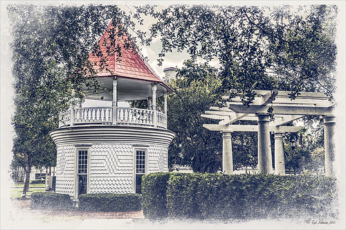
May have figured this out already since I have posted very similar photos – but this is at Fortunato Park in Ormond Beach, Florida – and is one of my favorite places. The above is the rooftop cupola from the old Hotel Ormond – the only remaining part from a beautiful old hotel that was torn down in 1992. It was in such a bad condition that it could be restored – what a shame!
Okay – I am a huge Photoshop plug-in fan – I love to be able to do something with a photo that I could not do just in Photoshop or Lightroom alone. Nik plug-ins really made this image! Basically Nik’s Viveza 2 (my very FAVORITE plug-in – can’t beat it for fixing any problem in an image) was applied to the image to add detail and contrast to localized areas of the image (detail in the orange roof, saturation and color to sky in middle of cupola, and detail to the interesting lines on the building). That in itself added a huge improvement to the image. Next Nik’s Color Efex Pro 4 was added and three filters stacked: Bleach Bypass, Detail Extractor, and Film Efex Vintage using Method 14 and setting the Overall Opacity slider to 52% – did not want to overdo the vintage feel. I use the Film Efex Vintage often – lots of versatility in just this one filter! (See related blog links below for other examples.) Next Shadowhouse Creations Scratch Box frame layer was applied – this is from the Scratch & Frame Box Overlay.PSD file he supplies. (Check these out – some great borders just in the PSD file!) I created a PNG file of just the frame by following the steps in my blog How To Make Frames or Borders – scroll down to the section called “To save the frame you created as an overlay to use again” and follow steps. I used an off white color sampled from the image in a Color Adjustment Layer clipped (ALT+click between layers) for the frame. That was all I did and I love the slightly vintage effect – goes nice with historic buildings. Next time I will show you a totally different look for this same image (see A Fairytale Gazebo)……Digital Lady Syd
Digital Lady Syd Related Blogs:
Digital Lady Syd Reviews Nik HDR Efex Pro 2
Little Red Corvette
Yellow Dogface Butterfly in her Glory!
The New Film Efex-Vintage Filter From NIK CEP 4
02/21/2013 | Categories: Historical Info, Photoshop Filters, Where Am I? | Tags: borders, Color Efex Pro, Film Efex Vintage Filter, Historical, NIK Color Efex Pro 4, Nik Viveza 2, overlays, vintage, Viveza | Leave A Comment »

This yellow daisy has a very interesting texture by French Kiss Textures called Lakeside – she actually offers it for free at her website (she also has some great tutorials on how to use textures on her site). I was not that familiar with her textures until recently – she has some beautiful textures that have more of an artistic flair to them than most sites. This texture was actually placed behind my daisy. A Hue/Saturation Adjustment Layer was placed above the texture and the colors were changed from the blue-yellow-green to the green-purple tones by setting Hue to -117, Saturation to -41 and Lightness to -8. The daisy had been cut out as an object using Select -> Color Range and selecting just the flower and stem. The flower was processed in Topaz (see sidebar for website link) Simplify 4 using the Oil Paint Toned V preset – the Tone and Edge Sections were turned off and the color space set to RGB. The layer was set to 75% opacity to tone it down a little. A pink textured border (see my SJ PNG Borders) was placed round the image and the color was changed to light brown using another Hue/Saturation Adjustment Layer set to Hue +48, Saturation -3, and Lightness 0. A Curves Adjustment Layer was added to get the final contrast in the image. That was it. Try downloading her free texture package and see if you like them as much as I do!….Digital Lady Syd
Digital Lady Syd Related Posts:
Getting a Nice Painterly Landscape Effect with Topaz Simplify and Texture
A Little Hollywood for My Butterfly Model
Digital Lady Syd Reviews Topaz Simplify 4
11/06/2012 | Categories: Photoshop Filters, Textures | Tags: adjustment layer, borders, Free PNG Borders, French Kiss Textures, PNG border, Simplify, Textures, Topaz Simplify 4 | Leave A Comment »

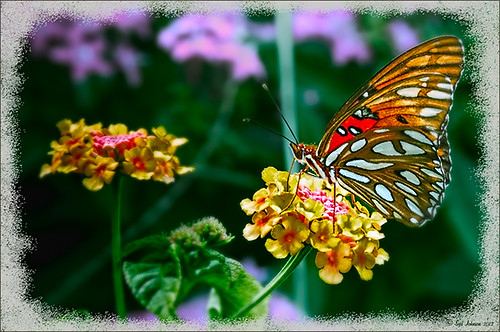
Really liked the way this image turned out and it was a fairly simple process. After setting the Lens Correction panel and Cropping the image, a Blue Sky-Heavy Green preset created from Dave duChemin’s Lightroom 3 book (the preset contains only Split Toning panel – Highlights Hue 220 and Saturation 25, Balance -15, and Shadows Hue 120 and Saturation 20) and Matt Kloskowski’s preset Focal Point (Portrait – Bottom Right) were applied. Since the first preset only affected the Split Toning panel and the Focal Point preset did not change this panel, both could be applied in Lightroom without a problem. The image was brought into Photoshop and first Topaz (see sidebar for website link) Detail was applied (Detail Setting used: Small Detail .5, Medium Detail .3, and Large Detail .3; and Tone: Brightness .03, Contrast -.16, Cyan-Red .26, Magenta-Green -.37, and Yellow-Blue .44) and Topaz DeNoise 5 (Noise Reduction slider .42 and Recover Detail slider .36).

Now the out-of-focus pink flowers looked bad, so a New Layer was created to paint in the over-exposed white spots to keep the eye from wandering to those areas. On another New Layer using a 15% opacity soft edge brush the straight green stem was painted darker sampling in the image to add a slightly darker green. Another Hue/Saturation Adjustment Layer was added and the Yellow Saturation set to +40. It took a while to settle on a final result but since the Adjustment Layers are all non-destructive, it was easy to try different effects. A Gaussian Blur was applied to a Composite Layer (CTRL+SHIFT+ALT+E) created on top and using a Radius of 6.6. On a layer mask, the butterfly and foreground flowers were painted back in black on the mask. A lower 30% opacity brush was used to slightly paint back the flowers in the mid-ground left side. Next my Soft Sparkle Overlay Frame was applied but since it is a deep reddish brown, a Solid Color Adjustment Layer (Clip it to the layer by clicking ALT+Click between the frame layer and the adjustment layer) set to an off-white was used. Finally a Curves Adjustment was added contrast. Just Fun!……Digital Lady Syd
Digital Lady Syd Related Blogs:
How To Make Frames or Borders
Getting Rid of Those Blown Out Areas in Your Image
10/30/2012 | Categories: Lightroom, Photoshop Filters | Tags: adjustment layers, borders, DeNoise, Detail, focus, frames, Free PNG border, Free PNG Frames, Lightroom, Lightroom preset, Overlay Mask, PNG border, Topaz DeNoise 5, Topaz Detail 2 | Leave A Comment »
 Creating the Border: Completed this border using a tutorial I learned from PhotoshopLayers.com called Photographic Edges in Photoshop. It is basically a very simple process and uses the Photoshop Sprayed Strokes Brush Stroke Filter to create the border. I changed the settings and maxed out the Stroke Length to 20, the Spray Radius to 25, and Stroke Direction to Horizontal to get a more pronounced edge. Then the frame was saved down as png file. This was done using my the little known Script called Save Layers to File. (See my blog How To Make Frames or Borders on how to do this.) To use this new border easily on other pictures, just drag it into your document. Use a Solid Color Adjustment Layer to change the color of the frame. In this case, I changed it to a light pink, then used a Layer Style to add a soft gradient, a white texture, and Outer Glow. Using a Layer Style on borders can create a very subtle but nice effect.

