
Settings for Vivid Drawing Look ACR/Lightroom Preset and NIK Color Efex Pro 4 Pseudo HDR Recipe
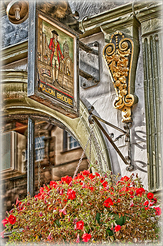 |
The image is from The Royal Mile in Edinburgh, Scotland. Deacon Bodie has a very colorful history and this sign locates a pub named in his honor.
The above image used SJ-Vivid Drawing Look preset as a starting point in Adobe Camera Raw (note: change file extension to .xmp in zip folder to get file to work) and Lightroom. In my Fun Photoshop Blog “Pseudo HDR Using NIK Color Efex Pro 4“, I created a recipe for NIK Color Efex Pro called SJ-Pseudo HDR1. This recipe was applied without any changes to it. Back in Photoshop a Curves Adjustment Layer was added, and a High Pass Filter (radius 9.1) applied to a duplicate layer (set to Soft Blend Mode) was used to sharpen the image. That is it. Hoover over the image to see how it looks with just the Vivid Drawing Look preset applied.
Settings for Presets
For those of you who do not like to download files or might want to tweak what I have created, here are the settings for my favorite HDR feel ACR and Lightroom preset. Also the recipe I put together for NIK Color Efex Pro4 has been provided.
SJ Vivid Drawing Look settings: To make this preset in either Lightroom Develop Panel or Adobe Camera Raw, use these settings: Basic section: Exposure -o.32, Recovery +38, Fill Light +72, Blacks +12, Brightness +52, Contrast +55, Clarity +54, Vibrance 0 and Saturation 0; Tone Curve section: Highlights -30, Lights +16, Darks +23, Shadows -23, and Point Curve Linear; Split Toning Section: Highlights – Hue 50, Saturation 11, Balance 0, Shadows – Hue 50, and Saturation 34; Sharpening section: Amount 48, Radius 1.0, Detail 35, and Masking 69; Noise Reduction section: Luminance 82, Detail 95, Contrast 44, Color 20, and Detail 50; and Post-Crop Vignetting section: Style – Highlight Priority, Amount -18; Midpoint +47, Roundness 0; Feather +57, and Highlights 0.
SJ Pseudo HDR 1: To make this recipe, the filters and settings are as follows: Tonal Contrast (Highlights -37%; Midtones -30%; Shadows -12%; Saturation +5%; Contrast Type set to Standard; and Shadows +58%; Darken/Lighten Center (Use#2 for lighten area; Center Luminosity -10%; Border Luminosity -64%; and Center Size +30%; Place Center in image); and Detail Extractor (Detail Extractor +69%; Contrast +56%; Saturation +16%; Effect Radius – Fine; and Shadows +14%.
I hope you put these presets to good use. I think they are both good starting points to creating that great pseudo HDR effect. Have fun. Have trying these out…..Digital Lady Syd
Colorful Blown Out Look Lightroom and Adobe Camera Raw Preset
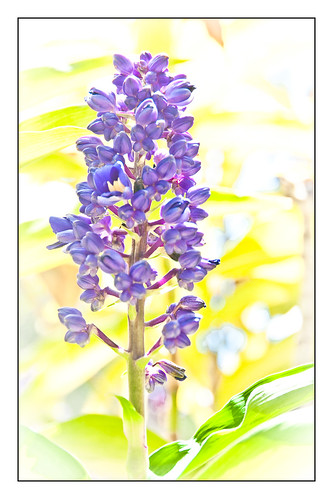 |
While in Hawaii, after taking a lot of beautiful flower images, I created the above effect as a Lightroom preset that I have used many times. It looks especially nice for a calendar image. Hover over image above to see the original.

This preset I call “Colorful Blown Out” and mainly has Basic and Luminance settings. You can download the free Lightroom preset here and the Adobe Camera Raw preset here. For a softer look, try increasing the Recovery slider and the Brightness slider. It is a good starting point for a very nice flower look. For information on where to download the calendar template and how to apply it, see my Photoshop Fun Blog Free Calendar Template for instructions.
Give it a try on other types of images too. Hope you enjoy!…..Digital Lady Syd
Selective Desaturation – the Easy Way!
I came across this technique from John Paul Caponigro – absolutely the best when it comes to color and artistic applications of Photoshop. Check out his website if you have not already – it is full of useful information and articles and is very inspirational.
This is a very simple technique – simply add a New Layer on top of your image and set the blend mode to Saturation, select the Brush Tool, set color to black (white or gray will also work) and 15% opacity in the Options Bar. Paint over the area you want several times to building up the desaturated effect until you get the look you are after.
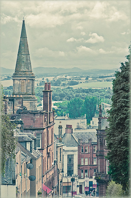 |
I have a few favorite images that I like to use for new techniques and this one of a street in Edinburgh, Scotland is one of them. The image was processed in Lightroom using one of my favorite presets, Matt’s 70’s Look preset (here is the ACR preset), applied (without the vignetting), and then it was brought into Photoshop. The green trees and the bright green bush in the right front were way too saturated for this vintage look. Therefore, the colors were slowly desaturated until they matched the image. Hover over the image as it came in from Lightroom and see the original bright green colors.
After each brush stroke, you can Edit -> Fade Effect if it was too much of a change – this can only be done immediately after applying the stroke. The layer opacity can also be reduced for overall reduction of the effect or a layer mask can be applied and paint in just specific areas. Very flexible way of localizing a change.
This technique can be very useful when you want to just de-emphasize something that is too bright in the image, especially on small areas. Also, green foliage tends to be over-bright as in this picture and it can be toned down just a small amount very easily.
Hope you find the tip useful – it is just one of those little things that help make or break a picture. Until next time…..Digital Lady Syd


