
Bleach Bypass Look on a Landscape Image

This may be the most beautiful and interesting library ever made. I posted a couple times on Flickr with other images (see Minsk Library, Inside Minsk Library, and Minsk Library at Night) but this time I decided to process the inside ceiling which is all glass – totally breathtaking! As you can see, I caught the eye of the guard down below, but he lends a wonderful scale to the image. I had a hard time deciding what to do with the image as the original was not that bad but I wanted to enhance the light and airy feel in the image. So I tried everything I could think of and this is what I got!
First applied Topaz (see sidebar for website link) DeNoise 5 – the image was shot at ISO 1600 so it had some issues. Used the Overall Strength set to .17 and set the Shadows to .82. The layer was copied and Topaz Detail 3 was applied using the Architectural Detail II preset – this image was perfect for this preset. Next Black & White Effects was applied where I mainly applied a regular black and white preset and started moving sliders. What I think really made the image pop was the application of the Creative Effects Diffusion effect where the Softness was set to 0.10, but the Diffusion slider was set high at .91 and Diffusion Transition set to 0.61. This really made the roof lines pop without being too sketchy looking. Then Kim Klassen’s Cloth & Paper Reign texture was applied and set to Soft Light blend mode to lighten the image and add some blue tones back into the image. It was duplicated and this time set to Multiply at 24% layer opacity. Next a Levels Adjustment Layer was added to lighten the image more by moving the Output Levels to 23/255 and the midtone slider to 1.39. Next a Curves Adjustment Layer was added to lighten it even, and a bit of a vignette was painted around the edges of the layer mask. It still did not look quite right – almost blown out. That is when I tried a Color Lookup Adjustment Layer and clipped (ALT+click between the layers) it to the top texture layer. The 3DLUT File was set to Bleach Bypass.look in the drop-down, although several look rather nice. The last step involved creating a composite (CTRL+ALT+SHIFT+E) on top and adding my SJ B&W Border Frame. I really like how the diffused settings made the ceiling lines look. Anyway, it was once again a lot of fun to experiment!…..Digital Lady Syd
Some Vintage Zinnias

Just playing with my Zinnias. I was trying to a vintage, wallpaper feel behind them. I actually opened Topaz (see sidebar for website link) photoFXlab from Lightroom. Here are the steps completed: Applied Topaz Clarity – SJ Illustrative Look – with a few adjustments, duplicated layer, set Dynamics slider to 9 and Saturation -17, duplicated layer, enter Topaz Adjust and apply my Rick Sammon Spicify Soft Artsy, back in photoFXlab the Adjustments settings stayed on this layer, duplicated layer, duplicate layer, in B&W Effects applied SJ_Quad_DkB_GR_Yel_Wh preset, an exited the plug-in to Photoshop. Just a few steps here. Guess what I am trying to show is that there is a lot of versatility here with photoFXlab. Once in Photoshop some clean up was done and French Kiss Studio Selections 3 White Wash texture was applied (I use this texture a lot and it is in a very reasonably priced set). On the white was I used Brush Lovers Art Flowers 2000 (liked the brush best when applied directly to the French Kiss WhiteWash texture – just looked better). This brush was set up as a preset – had to select the dark red color 4e322e and dark green color 3c3e38. In the Brush Panel I turned on Shape Dynamics, Scattering and Smoothing, Size 394 px, Spacing 434% and then Color Dynamics was added and size changed to 201 px. A layer mask was added to the layer to lightly brush out texture from the flower, but leaving a little to keep the grain intact. A Curves Adjustment Layer was clipped to the texture to bring out the cool texture a little bit more. 2 Lil’ Owls Studio Color Bokeh Grunge Set 4 (see sidebar for website link) was applied at 50% opacity and in the layer style, the Blend If This Layer’s white tab was set to 164. The last step involved adding two New Layers where just a couple strokes were applied, one layer using green and one the dark red color to add a little grunge feel to the image. The brush used was Nakatoni Custom Brushes texture brush (does not appear to be available anymore but any soft grunge brush would do). The preset settings are listed below. ….Digital Lady Syd
Here are the plug-in preset settings used if you are interested:
Topaz Clarity SJ Illustrative Look settings: If you would like the illustrative look, here are settings: in Clarity Section – Dynamics: Micro Contrast 1.00, Low Contrast 0.28, Medium Contrast -0.50, and High Contrast 0.06; Tone Level: Black Level 0.61, Midtones 0.14, and White Level 0.72; and in Hue/Sat/Lum Section – Hue: Only Red 0.16, Yellow -0.05, and Green -0.17 were adjusted; Sat: only Green -0.22 and Overall -0.45 were adjusted; and Lum: Only Orange 0.36, Yellow 0.89, Green -0.91, Aqua 0.30, and Blue -0.09 were adjusted.
Topaz Adjust Rick Sammon Spicify Soft Artsy settings: Adaptive Exposure section: Adaptive Exposure 0.50, Regions 25, Contrast -0.56, Brightness -0.13, Protect Highlights 0.03, and Protect Shadows 0.03; Details section: Strength 0.87, Detail Boost 1.15, Threshold 0.12, Radius 25.00, and Sharpen 1.01; Color section: Adaptive Saturation 0.33, Color Regions 10, Saturation 1.00, Saturation Boost 1.00, and Hue 0.00; and Noise section: Suppression 3.24, Amount 0.51, and check Use Topaz DeNoise.
Topaz B&W Effects SJ Quad DkB_Gr_Yel_Wh settings: Quad Tone: Color 1 Region: Color (R1/G1/B12) and set to 15.08, Color Region 2: Color (R63/G78/B85) and set to 143.9, Color Region 3: Color (R216/G211/B129) and set to 227.5, and Color Region 4: Color (R255/G254/B237) and set to 255.0: and Transparency: Overall Transparency 1.00.
I Must Have Flowers!

Here is another example of some of the beautiful flowers that people grow around their dacha’s outside of Minsk in Belarus. I saw so many unusual and gorgeous flowers when visiting there a few years ago. In Photoshop, Topaz (see sidebar for website link) Detail 3 and Simplify (Watercolor II preset) were applied first. Kim Klassen‘s 1612 texture was added on top at the Normal blend mode. A layer mask was added and the flowers were painted back in with a soft edged, low opacity black brush. A pink to white to pink diagonal Gradient Fill Adjustment Layer came next and set to 40% opacity. Kim Klassen’s Cloth & Paper texture Touch (one of my very favorite textures) was set to Soft Light at 64% opacity. The last major step included adding 2 Lil’ Owls Studios (see sidebar for website link) Dream Freebie 1 texture set to Soft Light at 100% opacity, where the layer mask from the first texture was copied and added to this texture (ALT+drag the mask to new layer to copy). A Levels Adjustment Layer’s Midtone slider was adjusted to bring back some contrast to the image. Text was added using the free fonts Ruthie and Batik Regular. That was it. I love the soft feel to the image and the little bug in the flower…..Digital Lady Syd
Where Am I?
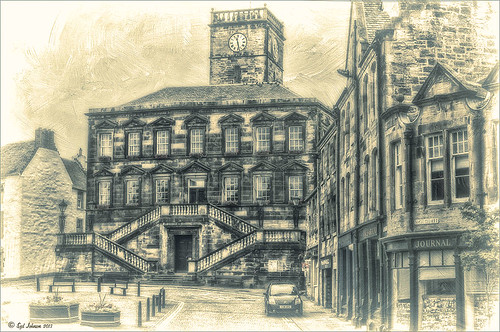
This is a tough one since this image is not of the main attraction in the area. This is the Burgh Hall Tourist Information Center (check out link for live webcams of area) that resides in the center of the town of Linlithgow, Scotland, just outside of Edinburgh. Linlithgow Palace (the birthplace of Mary Queen of Scots) ruins are just behind this building along with a beautiful old church, St. Michael’s Parish Church, next to it. If you are in Edinburgh, it is a wonderful day trip as it is only a half-hour train ride to get there.
The image was processed using Topaz (see sidebar for website link) Black and White Effects 2 three times! The first application used just the Traditional Collection Warm Tone preset set to an Overall Transparency of .90. Next, the same preset was selected, but the Diffusion Section with Softness slider set to .85, Diffusion to .65, and Diffusion Transition to .50, and the Overall Transparency set to 1.00 was applied. The the windows, steps and clock face were painted out using the Localized Adjustments section. The third time a Quad Tone preset I made was applied using Navy Blue, Green, Yellow and White tones . (Quad Tone settings are: Color 1 Region set to Red 1/Green 1/Blue 12 and slider set to 15.08, Color 2 Region Red 63/Green 78/Blue 84 and slider set to 143.9, Color 3 Region set to Red 216/Green 211/Blue 129 and slider set to 227.5, and Color 4 Region was set to white with slider set to 255.0.) Some Border Edging in white was added. French Kiss L’Artiste Dove Wings texture was added and the center of the image was lightly painted back in a white layer mask using a soft low opacity black brush. A Curves Adjustment Layer was added for contrast. Puppet Warp was used to slightly straighten out the buildings – this old building just did not have any straight lines! I totally love the slight diffused look on this image – definitely getting to be a favorite effect for me and I am seeing it a lot more in images now……Digital Lady Syd
Digital Lady Syd Related Blogs:
Straightening with Puppet Warp!
Zinnias Ready for Springtime!

Love my Zinnias! This image was first processed in Lightroom before going to Photoshop for an overhaul. Topaz (see sidebar for website link) Detail 3’s Overall Detail Med II preset was applied. A black mask was added and just the flowers were painted back to be nice and sharp. Lightened the image with a Levels Adjustment Layer. Used Kim Klassen‘s Sunkissed texture set to Soft Light blend mode at 100% layer opacity, and then Julytrio ToBe texture set to Soft Light at 47% opacity. For the wallpaper effect, a New Layer was created and Brush Lovers Art Flowers brush 2000 (these used to be posted at BrushLovers.com but they do not appear to be available anymore-they have a lot of other nice little flowers brushes that would work) was selected – in Brush panel the Shape Dynamics, Scattering and Smoothing sections were turned on at default settings, and the Brush Tip Shape settings were Size 394 pixels and Spacing 434% before painting in light brown background effect. The layer opacity was then set to 41%. The font is a really old one from Cosmi named 31. A Curves Adjustment Layer was applied to add a little contrast back in the image after adding all the texture. Last a little brownish tinge of grunge was brushed in using Kim Klassen cloth and paper extras brush 2188 on the upper corners…..Digital Lady Syd
Turtle Talk

We appear to have a group of large turtles that like to meet on the fountain structure before it turns on every day. Sometimes there are five and sometimes there is one that is larger than all the others. It appears to me that they are gossiping in the sunshine before the day begins. All have their heads stretched way up.
Not much in the way of processing. First cropped in Lightroom and did a few color and tone adjustments. Added just a little sharpening and exposure to make the turtles pop out from the dark background using the Adjustment Brush. In Photoshop added Topaz (see sidebar for website link) Detail and then filled a layer mask with black and just painted back the turtles. Applied Nik Color Efex Pro filters: Darken/Lighten Center centering on the turtles, and then Monday Morning in the Neutral color set. Control Points were placed on the turtles and the opacity set to 41%. Back in Photoshop the brown text was added using the Regular Batik font. A Stroke layer style was added to a composite layer (CTRL+ALT+SHIFT+E) on top and instead of a color, a pattern was added to the at a Scale of 13% and a Size of 21 pixels. I used a pattern that had some of the natural brown tones for the frame. That was it. Totally easy. I hope to be able to get some more images of my new turtle friends. Seems like we have a whole group in our little lake…..Digital Lady Syd
The Polaroid Photo Look

I really researched for what kind of flowers these are and could not figure it out – the image was taken while at the Hawaiian Tropical Botanical Garden on the Big Island in Hawaii. In Lightroom the image was processed using the standard sliders to get a nice image. Once in Photoshop, the image was set to a square size with a blank area created on the right side using the Crop Tool (or Canvas Size command). The flowers were selected, the selection inverted (CTRL+SHIFT+I), and in the Channels Panel, the New Channel icon was selected to make a new Alpha Channel. Now back in the Layers Panel, Content-Aware Scale was applied. First check Protect Alpha 1 channel in Options Bar before dragging the right side handle out – this keeps the flower from distorting, but just the background area. Topaz (see sidebar for website link) Detail 3 was used to sharpen the flowers a little. Next three of Kim Klassen‘s textures were added: Cloth & Paper Venice Texture at Soft Light at 100%, same texture set to Multiply at 27%, and UggLove Texture set to Soft Light at 75%. A Hue/Saturation Adjustment Layer was used to desaturate the background just a little and the flower and stem were painted back in a layer mask. A Levels Adjustment Layer was also applied using the same flower layer mask used. A composite was made. The frame used above is one Kim suggested using from fuzzimo, but there are numerous other free downloads if you do a search for Polaroid templates. Once the frame was opened, the center was selected and put on its own layer (CTRL+J) A composite of the image was brought into the frame and clipped (ALT+click between the layers to clip) to the center area of the frame. With a little adjusting and adding some text and it was finished. This image used Quilted Butterfly and Batik Regular fonts. Really nice vintage feel to the image…..Digital Lady Syd
Digital Lady Syd Related Blogs:
Using a Template to Create Your Own Unique Valentine
Five Image Template Creates Beautiful Collection!
Infinity Light Fun!

The beautiful colored “Infinity Lights” were on display at the local St. Augustine Outlet Mall in Florida. You can actually check them out at Facebook@Happy Pappys Glowing Balls. They are quite striking at night!
This was really easy to process – actually took the image with my little point and shoot camera. Just did regular adjustments in Lightroom before going into Photoshop. First Topaz (see sidebar for website link) Detail 3 was used – applied Overall Detail Medium II with a Lt. Blue Sky Tone filter selected. (Did you know that Detail now has filters for each section? If you click on the upper right corner of each section, there is a drop-down with all kinds of presets for all the sections. For example, the Tone section has presets for Lt. Blue Sky, Lt. Contrast, Lt. Foliage, Dk. Bl. Sky, Dk. Foliage, Brighter I and II, Darker I and II, Med Contrast, High Contrast, and Skin Brightening I and II. This was added to their recent 3.1 upgrade – definitely download this if you have the plug-in and did not do this.) A New Layer was created and a stop sign removed in the background. A composite of the image was created (CTRL+ALT+SHIFT+E) was placed on top and a Gaussian Blur filter set to a Radius of 22 applied. A black layer mask was added and the background area was painted in white to keep the blur in those areas. The last step involved adding OnOne’s (see sidebar for website link) Perfect Effects 4 PhotoTone Cooler preset was applied, which added a little bit of a bluish tone to the total image. This preset was part of free download from OnOne if you own Perfect Effects 4 – they are from their original PhotoTunes program from many years ago. The last step involved adding my free SJ Thin Double Edged Frame with colors from image. I wish I had a good place to put a few of these really interesting lights. They are so pretty!…..Digital Lady Syd
Aliona’s Birthday

Thought I would do a quick Lightroom post of an image I did of my very photogenic daughter-in-law on her birthday. She does not love this image, but I really love the vintage treatment. To begin the process, Matt Kloskowsky’s That 70’s Look preset was applied (the new version for Lightroom 4 is in the NAPP preset group but I am not sure where I found it). Three Adjustment Brushes were used on her face: 1) on eye iris the Exposure, Clarity and Sharpness were increased to make them pop a little; 2) the whites of her eyes were painted and the Saturation set to -52 to whiten a little; and 3) her lip color was changed to match her dress by using a little clarity and sharpness and a sampled pink color. In Photoshop all that was done was a little Liquify filter was used to adjust the dress folds. That was it – quick and easy and a beautiful look!…..Digital Lady Syd


