
Hibiscus Beauty

Love my beautiful hibiscus plants blooming on my back porch. This one has particularly lovely blooms. It was very quick and easy to process. Just processed a little in Lightroom and then in Photoshop applied my old standard Topaz (see sidebar for website link) Detail 3 using the Overall Medium Detail I preset. Painted over where the petals were blown out (see my Getting Rid of Those Blown Out Areas blog) on a separate layer. Than added French Kiss Tableaux Collection Creation texture and added a layer mask. Just painted back the flower – that is all it needed! It seems that if you have a really strong texture, it sometimes works best not to change blend modes but leave it set to Normal. Last step was to add the text using a really nice font called Quilted Butterfly at 78.01 points. (This font does require a $2 donation to use.) I loved the final effect!…..Digital Lady Syd
InstaTone Sunset

Wanted to change up the look of all the 24th Annual Native American Festival images I took so using Topaz (see sidebar for website link) photoFXlab’s InstaTone feature, I got this beautiful sunset look. Basically I went into the InstaTone tab’s 500 px website and applied a beautiful yellow and gold tone from Men on Fire image by Uwe Braun at 68% layer opacity. Then a preset I created using Topaz Adjust’s Spicify was applied that gives a slight illustrated look. (Here are the settings if you want them: Adapt exp +.30/25/-0.71/-0.76/0.02/0.04; Details +1.24/1.15/ 0.12/24.67/1.98; Color +0.33/10/0.89/1.92/0.00; and Noise +1.47/0.22.) Next I cleaned up signs and spots in the image (should have done this first but oh well!). 2 Lil’ Owls Enchanted texture 4 (see sidebar for website link) was added from their Texture Workshop E-Book bundle was applied as a PNG file frame next and a dark brown Color Adjustment Layer was clipped to the frame to apply it. I had to paint in a few areas around the trees that were too light on a separate layer using a low opacity brush and sampling from the near colors. Took awhile to complete but really like the changed look. I can imagine this image at an Indian campsite in the past…..Digital Lady Syd
Digital Lady Syd’s Related Blogs:
InstaTone in photoFXlabs – Great Fun and Great Results!
Topaz DeNoise 5 and InstaTone
Lightroom 5’s New Upright Adjustment Feature
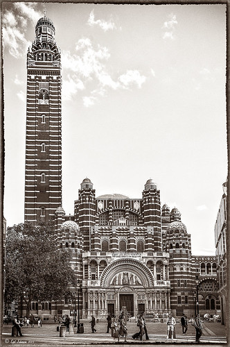
Hover over the above image of Westminster Cathedral to see what the original RAW image looked like or (here to see on flickr)- pretty awful! Wanted to show you what Lightroom 5 did with one click of the Lens Correction section’s new Auto button in the Basic Upright area. I was blown away! I did not adjust it any more – it is not perfect but much faster than anything I could get by using Photoshop’s Puppet Warp or filter tools. Check out a short blog by Julianne Kost, one of the Adobe Photoshop Evangelist, that gives some good info on when to use the Reanalyze button. In Photoshop a couple little items were cloned out on a separate New Layer. Nik’s Sharpener Pro 3’s Raw Presharpener was used at default values on a duplicate layer. A Hue/Saturation Adjustment Layer was added to get rid of a little yellow cast the sharpener filter gave to the top of the tower – used a black layer mask and painted back the correct color where needed in white on the mask. Next Nik Silver Efex Pro 2 was used and the custom preset called Sepia Grain Border was applied. Just a few little changes were done on the sliders to make the image sharper, but that was all that was done. Pretty nice sepia tone image!…..Digital Lady Syd
Coral Pink Blanket Flowers

Just bought some beautiful textures from Distressed Textures and had to try one out. This is just a point and shoot image from my little Kodak camera that I used to take these pretty pink flowers called Gallardia Galya Coral Spark or common name Blanket Flower. Just did the regular adjustments in Lightroom and then opened it up in Photoshop. The background was duplicated and this new layer was opened in Topaz (see sidebar for website link) Detail 3 and set to Medium Details 0.38, Large Details 0.16, and Contrast 0.30 was applied. A New Layer was created above and the Mixer Brush was selected. Fay Sirkis‘s Signature Watercolor Smooth Blender brush was used to smooth out and sharpen the edges of the flower in the front since the low end camera does not always give sharp edges. Next I added Distressed Textures The Artist’s Palette Museum Canvas texture. A layer mask was added and the flower painted out softly. French Kiss Savoire Faire Overlay was added and set to Color Dodge at 100%. A layer mask was added and the writing was painted off the flowers. The last step was to add a Curves Adjustment Layer to increase the contrast of the image just a little. I wish I had had my better camera with me, but at least I got the shot – some beautiful pink flowers!…..Digital Lady Syd
Macro Magic

I just love Melissa Gallo’s textures – they are so soft and beautiful and they never cease to surprise me how pretty they look on an image. The macro shot above is of my Painted Lady Hibiscus Tree that is growing on my back porch. She blooms year round for me with these huge soft pink blossoms! Basically all I did was a little noise removal and then applied Topaz (see sidebar for website link) Simplify 4 using a preset I created called Hawaii Landscape. (Settings are Simplify Section: Simplify Size 0.20, Feature Boost 0, Details Strength 0.66, Details Boost 1.00, Details Size 0.27, Remove Small 0.06, and Remove Weak 0.10; Adjust Section: Brightness 0, Contrast 1.00, Saturation 1.04, Saturation Boost 1.32, Dynamics 0, Structure 1.00, and Structure Boost 1.00; and Edges Section: Color Edge – Normal, Edge Strength 1.89, Simplify Edge 0.58, Reduce Weak 33.33, Reduce Small 0.20, and Fatten Edge 0.) Next Melissa Gallo’s Painted Textures Winter Wheat from her Cyber Monday Set 1 was set to Linear Light blend mode at 100% layer opacity, and Seafoam from her 2 for Friday Set 2 was left at Normal blend mode and 67% opacity. A layer mask was added to Seafoam and the pistil and stamen were softly painted out to remove the texture and color on these parts. Kim Klassen’s Cloth & Paper Magicfilm 3 texture was added on top and set to Linear Dodge blend mode at 79% opacity. This one gets a little tricky as I used the Blending Options dialog in its Layer Style – turned off the B Channel and set the Underlying Layer right white tab to 197/255 (split the tab by pressing ALT and sliding). This gives the pretty yellow glow grunge effect throughout the image. French Kiss’s Tour Eiffel 1903 overlay was added and set to 25% opacity. A Linear Gradient Fill Adjustment Layer was clipped to the overlay layer using a free colorful gradient called Picasso-16 from Graphix1 Picasso Inspired Gradients set. (To clip to a layer, ALT+click between the layers so only the top layer will affect the layer below.) French Kiss’s free Glorious Grunge Edging was added on top as a border and set to an aqua color. Try the Layer Style trick for an added dimension to your images…..Digital Lady Syd
My Parisian Violets!

These beautiful violets I recently bought at Wal-Mart and they are so pretty. They really like the filtered light from my south facing window in my kitchen. I used my handy, dandy 60 mm Nikkor macro lens at F/4.8, 1/90 sec, and ISO 200. A Bower 0.5 x High Resolution Digital Lens with Macro was added to the lens. In Lightroom 4 I just followed my workflow in my blog How to Use Adobe Camera Raw (ACR) or Lightroom 4 Quickly. I painted over the center of the flower using an Adjustment Brush set to a high sharpening and just a little Clarity. In Photoshop a Curves Adjustment Layer was used to selectively remove a shadow behind the front flower (see my Using Curves Adjustment Layers to Get Rid of Shadows and Highlights blog). Painted Textures Seafoam textures was added and just the flower lightly painted back using a white layer mask and painting in black. Next 2 Lil’ Owls Affetto Grunge Mosaic texture (see sidebar for website link) was added and the center painted out so only the darkened edges remained on most of the image. French Kiss’s Vintage French Brush No. 2 set -Dec 1924 was placed on the left side of the image and set to 89% opacity. A Layer Style was opened on this overlay layer. A dark Stroke set to 3 pixels inside was added, a Pattern Overlay using that wonderful default Photoshop pattern Bubbles was checked to add some variation in the text (I think this is the first time I have ever used it!), and an Outer Glow at 39% opacity was used. A Color Fill Adjustment Layer was clipped to the overlay and set to a light blue color. On the upper right French Kiss’s Vintage French Brush 1903 (same link as above) writing was applied and another Color Fill Adjustment Layer was clipped using the purple color from the flower. That was it! Lots of fun to do!…..Digital Lady Syd
What a Cute Little Alligator!

Thought I would post my wonderful recent golf experience – we were almost done playing – hole 18 – and then I shot the ball in the water. (That’s how good I am!) Almost clobbered this little sunning alligator, but he did not even move when we pulled the ball out of the water. First alligator I have seen this year, and I would not have gotten the shot if I did not have my cheap Kodak point-and-shoot camera. The image was processed very simply. First I used a Lightroom preset created a while back from a video called True Grit by Michael Rather. (Since I keep referencing it, here are the settings from the short video: Basic Panel – Contrast +100, Highlights -80, Shadows +100, Whites and Blacks sliders to taste, Clarity +100, Vibrance -82, and Saturation -7; and Lens Correction Panel – in Manual tab set Lens Vignetting Amount to -76 and the Midpoint to +19. Use these settings as a starting point and adjust them to taste. My preset actually is set to Clarity of +67 and Vibrance of -82 and were used in the image above.) Next my favorite sharpening plug-in, Topaz (see sidebar for website link) Detail 3, was applied using the Soft and Dreamy II preset. In the Effect Mask section, the effect was removed from the alligator using the brush strength set to 1.00 and partially on the golf clubs and cart canvas top using a o.21 brush strength. The Overall Opacity was set to 0.87. Back in Photoshop a Levels Adjustment Layer was added setting the middle tab to 0.86. Next a Darken/Lighten layer was created (see my Best Dodging and Burning Technique! blog for info on how to do this). The last step involved adding my free SJ B&W Border Frame Layer Style – changed the black color to a sampled green color from the image. It was great to get outside after a pretty cold and ugly winter/early spring and it was fun to see this little guy, even though he was a little scary. …..Digital Lady Syd
Digital Lady Syd Related Blogs:
Trying Out Some New Techniques!
Vintage Toy Processing
Eastern Swallowtail Butterfly

Just had to display this beautiful butterfly that appeared on my Bottle Brush bush recently. This is a female Eastern Tiger Swallowtail and had at least a 4-inch wide wing span. I did basic processing in Lightroom and then opened it in Photoshop. Just did a clean up layer and a Topaz (see website link in sidebar) Detail filter using the Overall Medium Detail II preset. I tried several different textures and nothing seemed to look right. So the layer was duplicated and the image was opened in Nik Color Efex Pro 4. These filters were stacked: Detail Extractor, Monday Morning using the Neutral color set and an opacity of 58%, Film Efex Vintage set to Film Type 13, and Vignette using a white color. These are all favorite filters of mine in this plug-in. Next OnOne’s (see website link in sidebar) old PhotoFrame 4.6 filter was applied using Kevin Kubota’s preset Kinky set to 63% opacity and a size increase of 7% and using a creamy color sampled from the image. Back in Photoshop a Hue/Saturation Adjustment Layer was added and the Reds Saturation was set to -58 to tone down the bottle brush color. I love the vintage feel of this image. I am sorry that OnOne is not longer releasing PhotoFrames – I am having trouble duplicating these effects in their new suite……Digital Lady Syd
Red Flower-Blue Bokeh

This Canna Lily flower is similar to a bright orange variety I have growing in my front year but this one was at the Hawaii Botanical Tropical Gardens on the Big Island. To post-process, the flower and plant were selected from the background which had lots of shadows and highlights from other leaves nearby that was very distracting. Topaz (for website link see sidebar) Detail 3 Overall Medium Detail II was applied to this layer. Jill Wellington’s Bokeh free 94 textures – texture 24 was added behind the flowers. Once placed above the light blue texture, several rough edges appeared – the flower and plant were selected (CTRL+click on the thumbnail), then Select -> Refine Mask was chosen where Feather was set to .5 and the Shift Edge set to -40. A Hue/Saturation Adjustment Layer was clipped to the flower layer (ALT+click between the layers so only flower layer is affected) and the bottom leaves’ color was adjusted from bright green to darker tones – the layer was mask was turned to black by clicking CTRL+I in the mask. The last step involved using a Levels Adjustment Layer to increase the contrast just a little and to soften the whole look (Output was set to 60 and flower painted back gently in layer mask to bring out color a little)…..Digital Lady Syd
Digital Lady Syd Related Blogs:
Soft Bokeh Texture for a Flower Image
Happy New Years!


