
Snowy Butterfly with Akvis Sketch

This is a female Palamedes Swallowtail Butterfly (the males are smaller and blacker in color) that was so much fun to photograph – my favorite type of butterfly to photography as they as not so skiddish to shoot. I decided to try out the Akvis Sketch plug-in that I recently reviewed. (See Digital Lady Syd Reviews Akvis Sketch Plug-in for Photoshop.) To get this image, first I opened up the image in Photoshop. To sharpen the image Calvin Hollywood’s Freaky Amazing Details action was applied – see my Tidbits Blog A Little Hollywood for My Butterfly Model to get information on how to do this and the action download link. A composite was created on top (CTRL+ALT+SHIFT+E) and Akvis Sketch was opened – a preset I created before was applied, (Used the Classic style, Strokes section Color Pencil was set to 63, Edge section Edge Width was set to 56 and a Good Colored Sketch preset was created.) Next a Shadowhouse Creations Vintage Soft Grunge V27b texture was applied. A New Layer was added on top where French Kiss Spatter4 Brush 22 was set to 5000 px at 30% brush opacity to create the soft purple splotchy layer. Next Shadowhouse Creations free Cabin/Trees brush was applied at 49% layer opacity. The top layer used my free SJ Snow2 Overlay slight blur at 100% layer opacity. Anyway just another way to have fun with Akvis Sketch…..Digital Lady Syd
A Fairytale Gazebo

As promised, here is a totally different rendition of the same image I posted earlier. (See Where Am I?) This was just plain fun to do. Below are the boring details – it actually took me along time and a lot of manipulating to get this result but I really love how it turned out. The soft diffused look really adds the fairytale quality to the image. Bottom line, just keep playing with an image and you can come up with some surprising results…..Digital Lady Syd
Basically I got the crazy pastel colors by applying Nik Viveza 2 (here are the settings which produced a rather green and pinkish layer: Brightness 86%, Contrast 100%, Saturation 86%, Structure 100%, Shadow Adjustments -100, Warmth -2%, Red 17%, Green -9%, Blue 22%, and Hue 39 degrees). Then Control Points were added in various areas to adjust tweak the color. A composite layer was created (CTRL+ALT+SHIFT+E) as the top layer. This layer was duplicated and Topaz (see sidebar for website link) photoFXlab was opened. What I listed in my Photoshop note attached to the image is in parentheses. (Duplicate layer. Plug-ins Tab was selected and Black & White Effects was opened. Used my SJ White Flower settings preset which has these settings: Basic Exposure – Contrast 0.16, Brightness -.04, Boost Blacks -.12, and Boost Whites .20; Adaptive Exposure – Adaptive Exposure 0.26, Regions 8, Protect Highlights .06, Protect Shadows .02, Detail 1.80, and Detail Boost .96; Color Sensitivity – Yellow .22, Green -.04, Cyan .01, and Blue .01; Quad Tone – Color Region 1 Black and slider at 0.00, Color Region 2 Red 23/Green 25/Blue 86 at 119.4, Color Region 3 Red 113/Green 150/Blue 170 at 187.8, and Color Region 4 White at 255.0; and Transparency 1.00. Diffusion section was checked and Softness was set to .75, Diffusion to .60, and Diffusion Transition to .50. Local Adjustments mask was set to Detail brush and the gazebo and columns were painted over. Then the B&W Effects plug-in was exited. Stamp From Stack button was pressed and in the Adjustments tab Dynamics slider was set to 29. Another From Stack button was created and from the Plug-ins Tab, Topaz Adjust 5 was opened where Painting Venice preset was applied with no changes. Once back in photoFXlab the Mask tab was opened and the effect was painted out once again from the gazebo and columns.) The changes were applied and the image was back in Photoshop. The yellows in the front bushes and trees was too bright, so a Image -> Adjustments -> Replace Color was selected using a light purple color. A Color Balance Adjustment Layer was clipped to the Replace Color layer and the purple colors were further enhanced. Next a brush was created to make purple to pink sparkles for the bushes and trees. (Brush settings were: Hard Round Brush – Size 20 px, Spacing 141, Shape Dynamics Size Jitter 25, Scattering 944%, and Color Dynamics Brightness Jitter 50%.) Used a light color (#917eb5) color and a darker color (#5e5098) of purple and painted around trees and bushes – then added a layer mask to remove from areas the lights got scattered over. A clean up layer was created to clean up some of the harsh that showed up in unexpected places. My SJ Snow1 Overlay was applied at 61% opacity. A composite layer was added on top and duplicated. The top layer was changed to Multiply. A layer mask was added and the cupola was painted back in white for emphasis. A Curves Adjustment Layer was added to add contrast to the cupola. The sky was selected and put on its own layer and converted to a bluish purple sky by clipping a light purple Color Fill Adjustment Layer to it. Next a Grunge Border line was applied around the image in a dark purple color.
Where Am I?

May have figured this out already since I have posted very similar photos – but this is at Fortunato Park in Ormond Beach, Florida – and is one of my favorite places. The above is the rooftop cupola from the old Hotel Ormond – the only remaining part from a beautiful old hotel that was torn down in 1992. It was in such a bad condition that it could be restored – what a shame!
Okay – I am a huge Photoshop plug-in fan – I love to be able to do something with a photo that I could not do just in Photoshop or Lightroom alone. Nik plug-ins really made this image! Basically Nik’s Viveza 2 (my very FAVORITE plug-in – can’t beat it for fixing any problem in an image) was applied to the image to add detail and contrast to localized areas of the image (detail in the orange roof, saturation and color to sky in middle of cupola, and detail to the interesting lines on the building). That in itself added a huge improvement to the image. Next Nik’s Color Efex Pro 4 was added and three filters stacked: Bleach Bypass, Detail Extractor, and Film Efex Vintage using Method 14 and setting the Overall Opacity slider to 52% – did not want to overdo the vintage feel. I use the Film Efex Vintage often – lots of versatility in just this one filter! (See related blog links below for other examples.) Next Shadowhouse Creations Scratch Box frame layer was applied – this is from the Scratch & Frame Box Overlay.PSD file he supplies. (Check these out – some great borders just in the PSD file!) I created a PNG file of just the frame by following the steps in my blog How To Make Frames or Borders – scroll down to the section called “To save the frame you created as an overlay to use again” and follow steps. I used an off white color sampled from the image in a Color Adjustment Layer clipped (ALT+click between layers) for the frame. That was all I did and I love the slightly vintage effect – goes nice with historic buildings. Next time I will show you a totally different look for this same image (see A Fairytale Gazebo)……Digital Lady Syd
Digital Lady Syd Related Blogs:
Digital Lady Syd Reviews Nik HDR Efex Pro 2
Little Red Corvette
Yellow Dogface Butterfly in her Glory!
The New Film Efex-Vintage Filter From NIK CEP 4
Red Flowers in the Snow

Once again here is an image I never thought I would process, but thanks to all the beautiful textures out there, the flowers end up looking like I remember them – well sort of – minus the snow. These Celosia flowers were taken in the courtyard at Flagler College (the old Ponce de Leon Hotel) in St. Augustine, Florida. This image was first processed in Lightroom where cropping and Basic Panel sliders were adjusted. An Adjustment Brush was applied to sharpen some of the foreground flower tips. In Photoshop Melissa Gallo of Painted Textures in her tutorial video Turn Your Photo into a Pastel Painting, Pencil Drawing or Pen and Ink, the second example, was followed. First the background was duplicated and the top row was set to Screen Blend Mode. A black layer mask was applied and with a white brush, the dark areas of the flower was painted in white to lighten the color on the mask. A Levels Adjustment Layer was applied the Midtones set to .78 to increase contrast just a little. A composite was created on top (CTRL+SHIFT+ALT+E). Next 2 Lil’ Owls Mosaic Set’s Claude texture (see sidebar for website link) was added and a layer mask added where the flower was painted back into the image using a soft 30% opacity black brush. A text layer was added showing the name of the flower using Flakes font at 131 pt size and a brown color. Another line of text was created using a quotation from Emily Dickinson using Chopin Script font and set to a grayish brown color. My free SJ Snow Overlay-slight blur was duplicated several times, merged, and set to 75% opacity. A Curves Adjustment Layer was the last step to add a little contrast. I loved the final result, and for some reason the snow just added a special effect to a red flower look…..Digital Lady Syd
Happy Valentines Day!

These flowers were growing in the countryside in Belarus several years ago. I am not sure what kind they are, but the blooms were huge! And the colors are incredible! Not a lot of processing here. After some basic slider adjustments in Lightroom 4, the image was opened up in Photoshop and three inches were added the left side of the image to create an area to add type by going to Image -> Canvas Size. The image was sharpened using Topaz (see sidebar for website link) Detail 3 and the Feature Contrast II preset. Some of the contrast was removed from the image by duplicating the top layer and setting it to Screen blend mode. A black layer mask was added and the high contrast areas were painted back in so they were not so obvious. (See a wonderful video by Melissa Gallo of Painted Textures called Turn Your Photo into a Pastel Painting, Pencil Drawing or Pen and Ink on how to do this.) A New Layer was created and some of the too bright highlights on the pink and purple flowers were lightly painted out. (See my Tidbits Blog Getting Rid of Those Blown Out Areas in Your Image.) Added a Levels Adjustment Layer per Melissa’s suggestion and then Topaz Simplify 4 was opened and the Painting II preset applied. The centers of the large blooms were brushed out to bring back the detail a little using a brush set to 33% opacity in the Local Adjustments section, the Dynamics slider in the Adjust section was set to 0.38, and Tone in Finishing Touches was checked. Back in Photoshop Kim Klassen’s Reentry Texture was added – beautiful texture that was free by signing up for her newsletter. On a white layer mask the flowers were lightly painted out to reveal the flowers just enough. Next on another New Layer some pink hearts were added to the background using Obsidian Dawn’s hearts-glitter brush set’s Glitter Brush set to 4100 px. Once again a white layer mask was added and the flower painted out so the hearts do not cover them. This layer was set to 68% opacity. The text was added using my favorite Freehand575 BT font set to a default setting of the Bevel & Emboss layer style. A basic texture image turned into a Valentine for you!…..Digital Lady Syd
Painterly Effect using Topaz Detail and Simplify
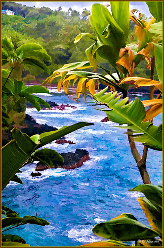 |
I was looking through my notes from last year and came across some nice info on using Topaz (see sidebar for website link) Simplify and Detail together to create an oil painting look. (See Creating an Oil Painting Effect from Topaz Labs.) My Hawaiian image from the east coast of the Big Island was one I had not originally processed as it really did not catch my eye – hoover over image to toggle to original. While doing a little Hawaii dreaming, I came across it again and thought it might look good using some of the settings from this video. (I really was thinking about how it would be to live in the house up in the top left – hum!) I actually did not follow the exact video workflow, but it did get me thinking about how to do this. Now that both Simplify and Detail have been updated, it was easier to get some different looks. Here are the steps I followed:
1. Duplicated the Background layer (CTRL+J). Topaz Detail 3 was opened and the settings from the second example in the video were applied: Small Detail .53, Medium Detail .46, and Large Detail .44.
2. Duplicated the Detail layer. Next Topaz Simplify 4 was opened and the Painting IV preset was applied. The only change to it is that the Edges section was turned off as it made the trees in the background stand out.
3. A Layer Mask was applied to the top Simplify layer. Some of the Detail Layer was brought back in by painting black on the mask on the foreground leaves. Also some detail in the little rock island was painted back.
4. What I did different was to add a New Layer and paint over the foreground leaves and trees in the midground to give a more painterly look and smoothing out some of the rough edges and colors that Simplify can bring into an image. A wet mixer brush was used for this.
5. Next a general Curves Adjustment Layer was added to bring in some contrast.
6. The sky was really blown out, so I added another Curves Adjustment Layer that brought back the natural clouds from the original image into the sky. The Layer Mask was filled with black and just the sky area was painted back with a soft black low opacity brush.
7. The water was way too cyan for my taste, so another Curves Adjustment Layer was added and the different color channels were adjusted to get a better color for the water.
8. I felt like the eye was not guided with a strong enough element to get you through the image. Therefore, a New Layer that was set to Overlay Blend Mode was added. With a large black brush set to 15% opacity, the edge of the bay was lightly painted on the water all the way to the back center. This burned in a slight contrast in the water for the eye to follow. Much better overall impact for the image.
9. The last step involved adding my SJ Thin Double Edge Frame layer style left at the default colors.
That is how I got this very Hawaiian Oil Paint feeling. Give these two plug ins a try and see what you think…..Digital Lady Syd
Digital Lady Syd Related Blogs:
Topaz Simplify and Topaz Detail Together
Vintage Effect on Hanging Pots

The image was taken at the 24th Annual Native American Festival in Ormond Beach, Florida recently. I just loved the way this image turned out since it started out with a very cluttered background. It was an three image HDR image that was processed using Photomatix Pro’s Merge to 32-bit HDR in Lightroom. The resulting TIFF file was adjusted and Matt’s 70’s preset was applied before taking the image into Photoshop. Some background clean-up was done and the Kim Klassen cafe simplicity texture (sign up to get several beautiful free textures including this one) at 55% opacity was added to the image – really gives it that vintage feel. The pots were painted out with a low opacity black brush on a white layer mask. A Curves Adjustment Layer was added to give just a little more contrast in the image. That was it – very simple processing but one of my favorite images from the event.
It is amazing how pretty the results can be by trying different textures on an image. Really loved this one….Digital Lady Syd
Digital Lady Syd Related Blogs:
Check out my Textures category in the sidebar for more Tidbits Blogs
Check out my Fun Photoshop Blog (link at top of page) and click Textures category in the sidebar
EPCOT Texturized

Was looking at some of my older work and came across one of my first texture images from three years ago. I really liked the treatment of this image so I thought I would try to reconstruct how I did it. A very different workflow was used. When the Lightroom adjusted image was opened in Photoshop, I did some clean up to remove some tourist heads. Then Topaz (see sidebar for website link) Adjust’s Spicify preset was applied. Next Nik Silver Efex Pro Antique Plate preset (pretty close to SEP2’s Antique Plate II) was added and set to 42% opacity. Ash Texture 25 was added (it’s a shame but they are no longer available, but Isabelle Lafrance free Decemberpack1 texture 1 has a very similar look) and set to Overlay at 100% opacity. Back into Silver Efex Pro where the Neutral preset was applied – layer was set to Screen at 51%. Next a Curves Adjustment Layer was added using a slight S curve to enhance contrast. Topaz Simplify was applied using the basic BuzSim preset. The last step used OnOne’s (see sidebar for website link) PhotoFrame Dave Cross 15 set to 72% opacity – the PhotoFrames are no long available in the newest release but many are incorporated in the new Perfect Effects 4 module. The final result is really nice – I am going to experiment some more using these plug-ins to enhance my texture effects…..Digital Lady Syd


