Which Tool to Use – Smudge or Mixer Brush?
I ran across an old tutorial that was in the very first Photoshop Creative magazine back in 2006. It was on how to create a digital painting by using the Smudge Tool. Well that was something I had to try out – couldn’t believe I had not tried this before! I really like the Mixer Brushes, which is what I usually use (see my blog Adobe Photoshop CS5’s Mixer Brushes). Once I started playing around with the Smudge Tool using different brushes and sizes and opacities, it was actually fun. My curiosity got the best of me and now I needed to know what IS the difference between the two tools – they create very similar results? I was able to find a reasonable answer on the Internet at Model Mayhem.com. Here is what they said:
“The Smudge Tool simulates the effect you see when you drag a finger through wet paint. The tool picks up color where the stroke begins and pushes it in the direction you drag……The Mixer Brush simulates realistic painting techniques such as mixing colors on the canvas, combining colors on a brush, and varying paint wetness across a stroke.”
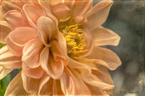
I think this is a nice short explanation of what is happening. For my Peach Dahlia I found it was nice to use both tools. It seemed it was easier to blend colors with the Mixer Brush and then smooth edges and shape color using the Smudge Tool. The Photoshop Wow Book for CS3 and CS4 (still my favorite Photoshop book) had a nice section on painting with the Smudge Tool. They recommended using the Natural Brushes that come with Photoshop and start by using short strokes, which samples the color underneath more frequently. Then use a small brush size for detail.
To create this image, first a blank layer was placed on top. Then these two brushes were used to paint: Mixer Brush – created tool preset brush with these settings: Stipple Dense 26 pixels from Natural Brushes set (Options Bar: No Current Brush Load, Load the Brush After Each Stroke, Wet 100%, Load 1%, Mix 91%, Flow 100%, Check Sample All Layers). Smudge Brush Tool Preset created using Stipple 54 pixels from Natural Brushes preset with Options Bar set to Mode Normal, Strength 78%, and Checked Sample All Layers. Be sure to save these brushes as Tool Presets so the Options Bar settings are retained – if just saved as brushes, the settings might not be correct. Also, note that if the Finger Painting box is checked in the Smudge Tool options bar, the smear stroke will start with the Foreground color. If turned off, the color under the cursor is sampled first. At 100% Strength, only the first color sampled is applied – at lower settings it fades out the first color and picks up the new one. Then I just alternated mixing and smudging until I liked what I saw. The last step involved adding three textures to the image to give a real painting look: the first one is a light gray canvas texture (I created it by taking a picture of a portion of the canvas on a large oil painting in my dining room – try this – you might really like the results) set to Soft Light at 53% opacity; next ShadowHouse Creations Old Photo 2 set to Overlay at 100% opacity – it provides the interesting edging on the image; and Flypaper Textures Aquaflora taster set to Overlay at 80% opacity. I painted out a little bit of the texture on the top two textures just to direct the eye to the center of the flower. A Curves Adjustment layer was added on top to give just a small contrast boost. Overall it was really fun to try out a new tool and learn something about it!…..Digital Lady Syd
Unknown Little Girl Statue
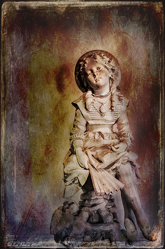
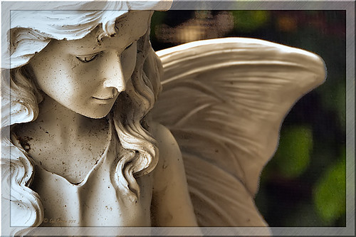
Here is another beautiful little girl statue from an unknown sculptor at the Lightner Museum (old Hotel Alcazar) in St. Augustine, Florida. I decided to use several of my own textures on this image. First it was cropped, processed a little in Lightroom, brought into Photoshop CS6 where Nik Viveza 2 was used to sharpen only the statue. Nik Color Efex Pro was opened and Dark Contrast Filter and Glamour Glow filters were stacked. I then used four layers of my own textures that I created (two were made by painting on a white background with soft colors using a large Mixer Brush and one is of my lace curtains) and finally finished off with ShadowHouse Creations Old Photo 6 texture used twice – once as a Color Dodge layer at 43% and one as a Linear Burn at 88% on the background only. I loved the way it has an old Western look – she reminds me of Rebecca of Sunnybrook Farm. Textures are so much fun!…..Digital Lady Syd
Big Sky Preset for Lightroom 4.1

This is my “big sky” view above my little lake and what I have been seeing every afternoon this summer in Florida. Beautiful but very scarey! I wanted to try out Matt Kloskowski‘s (one of the Photoshop Guys from NAPP) new free Lightroom presets called Big Sky as a starting point – Strong in this case. After making adjustments in Lightroom, the image was taken into Photoshop and first Nik’s Color Efex Pro 4 was applied stacking these filters: Brilliance/Warmth with Sat at 32%, Warmth 49%, and Perceptual Sat 40%; High Key With Dynamic High Key set to 61%; and Pastel Using Method 2. Next two Selective Color Adjustment Layers were created with black filled into their layer masks. One Adjustment layer was for the green grass so in the layer mask I painted back just the green area for that layer and the other targeted for the slight reddish color in the roofs. Next the new Color Lookup Adjustment Layer set to 3DLUT DropBlues.3DL was added – the sky was then painted over with a light gray to soften the change. (To learn more about Color Lookup, see TipsSquirrel’s Richard Hoffman’s short video here.) Next Nik Viveza 2 was used to smooth out the clouds and sharpen the house lines. Finally Imagenomics Noiseware was set to Full Stronger Noise preset. The last steps created a Curves Adjustment Layer for a little more blue using just the Blue Channel to increase the color and set to 70% opacity. Finally my Layer Style frame was used sampling the colors from the image (see DLS Free Layer Style Frames). I liked the way the preset worked – it looks very similar to how it appeared originally in Lightroom without all the adjustments and blue cast. The final result looks a bit like an architectural rendering seen in house brochures. And you got to love the clouds!…..Digital Lady Syd
Red Hibiscus + Textures = Beautiful Picture!
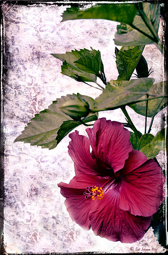
Since I did a recent Fun Photoshop Blog on Creating That Vintage Texture Feel, I thought I would display another one of my compositions using Sarah Gardner’s pointers from her new book Art Beyond the Lens: Working with Digital Textures. This red hibiscus from my front yard was first taken into Topaz photoFXlabs (see sidebar for website link) and on a duplicate layer inside the plug-in, the InstaTone tab using 500 px “Bright Spot” photo was used for the tonal effect. Adjustment tab settings of Exposure -.21, Contrast 4, and Dynamics 35 were applied to the layer. While in this interface, ShadowHouse Creations Entropy 2 texture was added as a new layer and set to Linear Light at 94% opacity, and these settings were applied from the Adjustment Tab to get the beautiful color in the texture: Temp 0, Tint 15, Sat 0, Dynamics 22, Sharpness -9, and Shadows 1. Back in Photoshop, ShadowHouse Creations Vintage Film 6 texture (gives the great framing edge) was applied using Hard Light blend mode at 100% opacity. The last step was to add a Curves Adjustment Layer to increase the contrast a little and that was it. Textures and flowers look so great together!…..Digital Lady Syd
Digital Lady Syd’s Related Blogs:
InstaTone in photoFXlabs – Great Fun and Great Results!
Using photoFXlab v1.1
Using Topaz photoFXlab to Replace Skies
Digital Lady Syd’s Review of Topaz photoFXlab v1.1
Soft and Sharp Image at the Same Time!
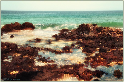
Holoholkai Beach, a lava filled beach, on the Big Island in Hawaii. I just really like this image. It was a 3-shot HDR image processed in Photoshop CS6 Merge to HDR. This was done before the Lightroom upgrade to allow 32-bit processed Tiff images for processing. This image actually has 13 control points in my favorite plug-in ever, Nik’s Viveza 2, that sharpened some of the Lava rock and smoothed out the rough water to lead the eye through the image. Next Nik’s Color Efex Pro 4 was used stacking Film Efex: Nostalgic filter using Film Type 4, Brilliance and Warmth using 34% warmth to warm up the image, and Glamour Glow which gives the image that soft look – a control point was placed at the focus point of the image to keep it sharp in that area. A Curves Adjustment Layer was used to for contrast and my Thin Layer Frame was applied (see DLS Free Layer Style Frames). Love the final result!…..Digital Lady Syd
Lightner Museum’s Unusual Chandelier

Sometimes you just like an image and that is what this is. The shot was taken at the Lightner Museum in St. Augustine, Florida and I am having trouble finding any information about the chandelier. Very simple processing using Nik Color Efex Pro 4 filters stacking Tonal Contrast, Darken/Lighten Center, Detail Extractor, and Vignette. Next Nik Viveza 2 was applied to bring out the color a little more on the green grapes and a couple of the glass flowers. Imagenomics Noiseware was applied at Full Noise Reduction preset as the image was quite noisy due to the high 1250 ISO value needed to shoot in the museum. The last step added the OnOne PhotoFrame Vincent Versace photo wide frame (see sidebar for website link). I got a chance to play around with some of my favorite plug-ins!…..Digital Lady Syd
Digital Lady Syd Related Blogs:
Little Girl Statue at Lightner Museum – contains all my other Lightner links at bottom of blog
Lightroom 4’s Graduated Filter – Check it Out for Landscapes!
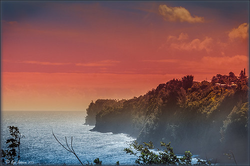
I have never used Lightroom’s Graduated Filter much as I usually do that kind of adjustment in Photoshop with the Gradient Tool on a mask. Recently I came upon a very interesting blog/videos, Adobe Photoshop Lightroom 4’s Graduated Filter Controls by David Marx, that discussed how much improved the Graduated Filter is and how to use it get some great landscape effects.
The image above is on the way to Hilo from Waipi’o Valley and shot through a car window???? Still thought it would be a good opportunity to see what I could do with it using this technique since the valley and water were so pretty and the clouds in the sky were a nice addition. This image was first tweaked in Lightroom globally, then 5 graduated filters were added, four for the sky colors and one for the water color coming up from below. I used the Color Wash technique on all four sky filters created, making some quite small to give a nice sunrise feel to the image. Finally it was taken into Photoshop where a layer using BBs Fogs and Mists Brushes were used to create an early morning foggy feel was added (and to cover up some uneven lighting on the valley walls) and for some noise reduction using Imagenomics Noiseware‘s Default setting (you could use Lightroom Noise Removal for a pretty nice result). Here is a small image of the original so you can see what the Camera Raw file looked like:

Once again, a pretty bad image was turned into something that really reminds me of my trip to the Big Island, even though it is not exactly as I shot it???? If you own Lightroom 4, definitely take a look at these very easy to follow videos – the results are quite amazing…..Digital Lady Syd
32-Bit HDR Using Lightroom and CS6
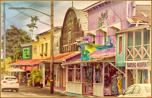
This is a beautiful little town called Honomu is on the road to Akaka Falls on the Hilo side of the Big Island. I love how this image turned out – the original tonemapped file was totally flat. This image was processed as a 32-bit HDR image in Photoshop CS6’s Merge to HDR program, then brought back into Lightroom 4.1 as a TIFF file where it was adjusted using mainly the Basic sliders, then edited back in Photoshop CS6 as a 16-bit PSD file. From there, Nik’s Color Efex Pro 4‘s was opened and these filters stacked: Detail Extractor at 68%, Graduated Filters using Blue No.1 as the sky was an ugly gray color, and finally the Film Efex Vintage set to Film Type 21. Next Nik’s Viveza 2 was added and that is what really made the difference in this image – the detail was popped in the signage areas but smoothed in the sky. Imagenomics Noiseware was added to smooth out the roughness of the whole image. The frame I used is called SJ Thin Double Edge Frame and can be downloaded at my Tidbits Blog DLS Free Layer Style Frames. The colors for frame were sampled from the image. Once again an image that did not have too much going for it turned out really nice……Digital Lady Syd
Digital Lady Syd Related Blogs:
New Lightroom and Photoshop 32-bit Processing Capability

