
Five Image Template Creates Beautiful Collection!

I have not been following all my favorite websites like I should. There is one I had not visited in quite a long time so I checked in. The CoffeeShop Blog was offering this wonderful Web Storyboard 6 for 5 pictures as a free download so I thought I would give it a try. I was really pleased with the final result. Her template is very easy to use – just clip (highlight image and go to Layer -> Create Clipping Mask) the each image you bring into the Photoshop file she provides to the location you want. Use Free Transform to adjust the size to fit. The background color was changed by clicking on the Background Color layer thumbnail and choosing whatever color you want. On the Frames layer, a Gradient Overlay Layer Style was added and reversed using Muted Gradient Muted 5 from Graphix1 set with a Radial Style, angle set to 90 degrees, and Scale set to 149% to get the pretty reddish gold colors on the frames.
Both The CoffeeShop Blog and Graphix1 websites offer some of the best free resources for the Photoshop fanatic like me. Take a minute to check out their websites – both have great blogs too (just click on their Home buttons).
It is really fun to put a collection of your images together! Give it a try!….Digital Lady Syd
OnOne’s Perfect Mask Works Great!
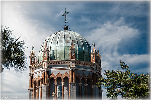 |
This image is of the Flagler Presbyterian Church built in 1889 in St. Augustine, Florida, by Henry Flagler as a memorial for his daughter. Hover over image to see the original image that has been adjusted in Lightroom.
To process this image:
1. The power lines first had to be removed. This was done very quickly using the technique shown in my Tidbits Blog “Get Rid of Those Power Lines Fast – with Paths and Spot Healing Tool!”
2, Some of the tree leaves needed to be removed too so the Clone Tool was used for this.
3. Nik Viveza 2 was used to sharpen up the building and get the detail to pop – this plug-in is probably the best one for localizing on an image how you want certain areas to look. The Sharpen Tool in Photoshop could be use instead to bring out the detail.
4. Place a new sky under the top layer. (Highlight the layer under the top layer, go to File -> Place, and Enter. Then right click on thumbnail of sky and choose Rasterize to get rid of the smart object.)
5. In my Fun Photoshop “Using Cloud Images to Fix Up a Sky” blog last I talked about replacing skies and gave several examples how an interesting sky can really add interest to in image. This time I used OnOne Perfect Mask (see website link on sidebar) to see if I like the new sky look. This is first time I tried using the tool and it was quick and accurate. It took about three minutes to add the new sky into the image – it creates a layer mask so it can be adjusted later if not everything is picked up. It has several different types of brushes to select the various areas that need to be covered when you have tricky selections like trees. You just click once in the open area and it picks up all the clear areas, then choose a Refine Brush and paint over the trees and it picks up all the little color openings in the trees. Very quick! Even certain colors can be isolated for selection.
Try downloading OnOne’s Perfect Mask if you do a lot of selecting and see if you are as impressed as me. I plan on trying out some other kinds of selecting in the near future and post again. I also plan on releasing some of the skies I find useful for adding into images very soon. Until then, have fun experimenting!…..Digital Lady Syd
Problems for Big Ben
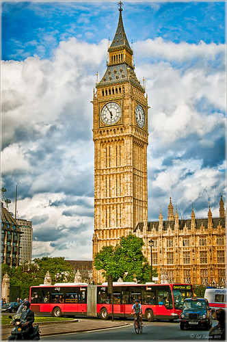 |
It is funny that I had just completed this image of Big Ben a few days ago and then it comes out that is has some tilting issues, 0.26 degrees NW or 18 inches off center at the top of the 314-foot tower. It will be thousands of years before Britain’s iconic landmark that houses the clock gets as bad as the Leaning Tower of Pisa in Italy. The rumor is Members of Parliament are meeting to discuss what to do including these two options: 1) Do costly repairs to both the Parliament Building and Big Ben, or 2) sell the entire complex to a rich foreign developer. Hum! For more information on this, check out The National Post article.
I tried to find an old famous painting of Big Ben but could not find one – can’t believe no one painted this gorgeous landmark in the 1800’s so my search is still on. In the meantime, I did find a site selling some very interesting Big Ben posters at Art.Com that I found very inspirational – give it a look to see some of the creative work others are doing (and for profit!).
How I processed this image? Believe it or not, this is just another pseudo HDR processed just like I do all my pseudo HDR’s. Used my SJ-Vivid Drawing Look preset in Lightroom 3 (download here if using Adobe Camera Raw) (note: change file extension to .xmp in zip folder to get file to work) and adjusted the Exposure, Blacks, Red Saturation (-45), Blue Saturation (+61), and Green Luminance (+3) sliders to make the image colors pop correctly. In fact the red bus was overpowering the image so the red saturation had to be reduced quite a bit. (Hover over image to see how it looked coming out of Lightroom.) I must say there was an amazing sky that day! Some clean up in Photoshop was done and the image was taken into Nik Color Efex Pro 4. All I did was add the SJ Pseudo HDR1 recipe (NOTE: This download link is broken if you click the Download button, but by right clicking on the button and choosing “Save Link As,” the file will download correctly.”) – I had to tone down the Detail Extractor and Contrast a little and change the Effect Radius to Large to get rid of the over-exaggerated HDR look. In Nik’s Viveza 2 I added a point on the clockface to make it really sharp but this could easily have been done with the Sharpen Tool in Photoshop. The last step was to add a Curves Adjustment Layer to brighten the whole image just a little. I was surprised how much detail came in from only applying the Lightroom preset without the Photoshop plug-ins. You could actually see the people riding inside the bus! It’s great when it all comes together with the light and composition to create a great shot!…..Digital Lady Syd
Digital Lady Syd Related Blogs:
Pseudo HDR Using NIK Color Efex Pro 4
Another Pseudo HDR Image with NIK CEP4 – Got to Love the Effect!
Where Am I?
My Office Friend Ted

This bear now sits in my office but I was never sure why I got him. Last week there was an interesting post by Ian Summers called “3 Exercises to Keep Creative Imagery Flowing” which gave me an insight to this conundrum. One of his generic creative exercises is called “Create a Giant Love Nest,” an environment that involves surrounding your work/creative area with many of the things you liked as a kid to help feed your creativity. I guess that is how Ted arrived – I found him at a bargain price in Cracker Barrel and had to have him. I am not even sure I had a Teddy Bear as a child but I liked his happy look (he never complains) and he is very soft and big (31 1/2″ tall). What’s not to like? So in honor of using childhood (and adult) toys and collectibles as a way to increase your creativity (and a good excuse to keep some of those things you just can’t part with), I am presenting my office friend “Ted.”…..Digital Lady Syd
PS. Ted was processed in Lightroom Beta 4 (see my Tidbits Blog “Trying Out Lightroom Beta 4“) and Photoshop using Topaz Black and White Effect (see my Fun Photoshop Blog “Topaz B&W Effects Plug-In-A Real Winner” and click on sidebar for website link). I started with the Opalotype Collection Flavescent preset and essentially adapted it by cranking up the transparency to 100, and adjusting the strength and placement of the vignette. A little localized face detail and burning on his mouth was added. That’s all.
Photoshop CS5 and Elements: Hand-Tinting the Easy Way
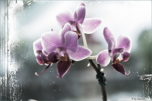 |
The above purple orchard was on the table at the Ming Court Restaurant in Orlando, Florida (one of our favorite restaurant in Orlando). I was not really happy with the original image (hover over image to see) – the flowers came out a little soft to my liking. I was pleased to see this hand-painting technique saved a beautiful flower image and gave it a soft painterly feel.
The steps to create this look are easy and could probably be put in an action. The process was taken from an article in Mastering Digital Photo Processing Magazine from the Fall 2008 issue. Here are the basic steps to creating this image:
1. Do any exposure adjusting in Lightroom or Adobe Camera Raw.
2. In Photoshop, create two copies of the original layer and turn off the top layer.
3. On middle layer convert image to black and white – I used the Black and White Adjustment Layer to get a nice conversion. There are so many ways to do this – choose your favorite. For Elements users, go to Enhance -> Convert to Black and White and select one of the canned styles as a starting point – then adjust the sliders, especially the contrast slider.
4. Turn on the top layer and add a Gaussian Blur filter with a Radius set to 18. Change blend mode to Overlay (or try others if you do not like the effect) and lower the opacity to get the pleasing hand-painted look. The opacity for the above was 61%.
Optional Step – Can add a Photo Filter Adjustment Layer. Choose a color using the Color swatch and adjust the Density slider. The magazine suggested this can “increase the sense of oils being applied over a black-and-white print.” I did not do this here, but it did give an interesting look with the default Warming Filter (85) color.
5. At this point a New Layer was created and the Sharpen Tool was used to show definition more clearly between the flower petals.
6. A Curves Adjustment Layer was added for contrast. Elements users add Levels Adjustment Layer.
7. To add a border or layer style, create a Composite Layer on top (CTRL+ALT+SHIFT+E). OnOne’s PhotoFrame Taufer_Texture_10 was added to give the frosted window effect – one of my favorite looks. (See sidebar for OnOne’s website link.)
That’s it! A pretty easy workflow and it gives a beautiful soft look. Hope you enjoy trying this short and sweet workflow – until next time…..Digital Lady Syd
Using the Hue/Saturation Adjustment Layer Temperature Slider for Color Change
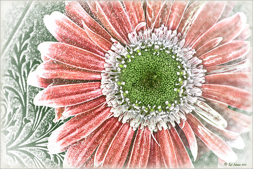 |
I tend to shoot HDR when I am at home photographing my flowers. I like having the different exposure options to choose from even if I do not create an HDR image. In this case an AF Micro Nikkor 60 mm lens at F/3.2, 180 sec, ISO 200 with a Bower 0.5 x High Resolution Digital Lens with Macro was used to shoot 5 exposures set to exposure compensations of -2, -1, 0, +1, +2. These five images were processed in CS5 using Photoshop’s Merge to HDR program – click on the image to see the original Photoshop HDR composite. (Here are the HDR settings used: Radius 350, Strength 1.86, Gamma 2.03, Exposure -0.45, Details 228, Shadow 100, Highlight -86, Vibrance 75, and Saturation -26 – a curve was created with points at Input 25 Output 43 and Input 58 and Output 65. I saved this down as a preset to use again.)
To get a little different look, I decided to use the red-green dynamic color combination. A Hue/Saturation Adjustment Layer was used to change the Reds to Hue +32, Saturation +33 and Lightness -7. To get the center green, while still in the Reds, I moved the temperature tabs on the slider at the bottom of the adjustment layer – see settings below. The center color totally popped! In Magentas the Saturation was set to +14. That was all it took change the colors to something really dynamic!

The final steps involved adding a few control points in Nik’s Viveza 2 for contrast and detail and a Sharpen Tool layer to emphasize the center. OnOne PhotoFrame Taufer Texture 07 was applied (see sidebar for website link). The background was changed to a darkish green to give more color contrast.
Once again, by just playing around in Photoshop and trying a few filters and different colors, you can make an ordinary image into something quite spectacular. Go try out the Hue/Saturation Adjustment Layer temperature slider too – it gives some very interesting results…..Digital Lady Syd
Farewell to Helen Frankenthaler

Helen Frankenthaler died December 27th, 2011 at age 83 in Connecticut. The above painting titled “Mountains and Sea” is considered her most famous piece painted in 1952, oil and charcoal on canvas. 86 5/8 x 117 1/4 in. (220 x 297.8 cm). It is on extended loan to the National Gallery of Art, Washington, D.C. The Daytona Beach News-Journal stated she was “an abstract painter known for her bold, lyrical use of color who led a postwar art movement that would later be termed Color Field Painting…” The National Gallery of Art has another beautiful example of her art titled “Nature Abhors a Vacuum” from 1973. The New York Times has a nice image and write up about this wonderful painter. She will be missed in the painter community……Digital Lady Syd
Where Am I?

This image was taken in London a few years back of The Royal Horseguards Hotel, a 5 star hotel that overlooks the River Thames near the London Eye. It is a beautiful old building that stands out from the treetops. Check out this virtual tour of the outside to see the size of the immense building!
The image was processed using OnOne’s Perfect Effects plug-in (see sidebar for website link) where a light blue-dark blue cross-processed layer was created. Next Nik’s Viveza was added to add more detail to the buildings since I cropped in pretty close from a much larger image. In Photoshop a Selective Color Adjustment Layer was next using only the Whites and adjusting the Yellow to +21 and the Black to -5 – this adds the sunny feel to the image. The Sharpen Tool was applied to the building tops and Curves Adjustment Layer to add contrast. Finally, one Florabella’s Snow Texture 3 (the link is to her Facebook page with the free download on the left side) was applied on top – the layer was set to Screen at 73% opacity. I am having so much fun playing with all the different looks you can get with the different plug-ins applied together. Try combining some of your plug-ins and see what great results you can get!…..Digital Lady Syd
Digital Lady Syd Related Blogs:
Digital Lady Syd’s Review of OnOne Perfect Effects
Another OnOne Perfect Effects Pix – Got To Love It!
Pseudo HDR in OnOne Perfect Effects
Using Nik’s Color Efex Pro 4 and Viveza Together
Digital Landscape Effects with Nik Software
Trying Out Lightroom 4 Beta

Well it is here – it’s been almost two years since Lightroom 3 came out so the new version is ready for testing. Anyone can download it to beta test and it will be available for use until March 31, 2012. So give it a try – it now edits video. Adobe has replaced the Recover and Fill Light with Shadows and Whites sliders giving a much improved result. The Adjustment Brush and Gradient now have the same choices as the Basic Panel sliders so you can localize changes to particular parts of the image – this is a big upgrade IMHO. Clarity slider no long gives halos when set over 80 – another great enhancement. They now have a Book module where you can design your own photo books and a Map module to help with CPS classifying. There is soft-proofing for your images before printing to see how they will look when printed, and in the Print module, there are Brightness and Contrast sliders to help with the conversion from monitor to print media. Guess there are lots of other little things going on in the new version, but I have not had time to do a complete run through. The biggest drawback as far as I can tell is that the presets do now work great from Lightroom 3 because of the slider changes in the Basic Panel – this will take a while to adjust your old ones over to the new version. Otherwise it seems to be a great new upgrade. So far plug-ins seem to working – the image of above used OnOne’s Perfect Layers plug-in and it ran fine in Lightroom 4 beta. (The texture is Shadowhouse Creations Oil Painting 3.)
Download the beta version of Adobe Lightroom 4
Two great resources for information about the new features are :
Launch Center – Lightroom 4 from NAPP featuring Scott Kelby and Matt Kloskowski (Owner of Killer Lightroom Tips blog)
Introduction to Lightroom 4 Beta from Adobe featuring Julieanne Kost (One of my favorite gurus)
This program is definitely worth taking a look at if you do photography or Photoshop much at all. I love this program – the simplicity of the layout makes it very easy to use. Download the free beta version and see what you think! Once I get a chance to try out all the new features, I will report back – I am a Lightroom nut too!…..Digital Lady Syd
Daisies are Everywhere!

I wrote a Fun Photoshop Blog called “Using NIK’s Color Efex Pro 4 and Viveza Together” showing a great workflow using these plug-ins on the same Smart Object layer. Here are my daisies again shot at a different angle. (They were shot using my 18-200 mm zoom lens at 75 mm, F5.0, 1/60 sec, and ISO 400.) Different CEP4 filters were stacked to give a totally different result. (See settings below.) I really liked the way the color of the flower was altered to give this softer feel. Lightroom and ACR will give a fairly close look as to what Viveza achieves, but not exactly the same as discussed in the other blog. Give this workflow a try – download the trials and see what you get if you do not already own the plug-ins. This can be very addictive! Have fun…..Digital Lady Syd
Plug-in Settings for this image: CEP4 filters: Cross Processing (Method T04, Strength 86%, three controls in the background to remove the effect), Tonal Contrast (Highlights -80%, Midtones -80%, Shadows -80%, Saturation 20%, Contrast Type Fine, one control point on pink background flower, and Opacity Slider set to 62%), Darken/Lighten Center (#1, Center Luminosity -36%, Border Luminosity -2%, and Center Size 57%), and Vignette (Vignette Color set to light yellow, Shape 2, Adapt Edges 0%, Transition 84%, Size 46%, Opacity 38%, and one control point set on pink background flower to remove effect). Viveza used seven control points to adjust background and bring out the center of the flower.
Blue Orchids?

Yep – that’s what you see. I snapped this jpeg with my little Canon Power Shot camera while shopping in the grocery store for final holiday goodies a couple weeks ago. Wow! I guess the soil has been treated to make the color in the orchids turn blue. I had to grab a few shots!
To process this image, I first lightened it as the colors were so blue the detail was totally missing. Then I added a free Florabella Snow Texture (the link is to her Facebook page with the free download on the left side) to give it that nice winter feel. Next Nik Color Efex Pro 4 was applied using the Bleach Bypass, Darken/Lighten Center, Tonal Contrast, and Vignette filters to get this effect. Finally OnOne’s PhotoFrame acid burned controlled 13 (see sidebar for website link) was added. Enjoy!…..Digital Lady Syd
Create a Great Shot with a Good Crop

Thought I would show you what a difference a good crop can do for turning an ordinary image into something that has some real eye appeal. The rain on the petals could not even be seen in the original shot.
For Lightroom Users: The above image was first cropped in Lightroom using the Crop Tool, but you can do this in Adobe Camera Raw or even Photoshop or Elements to get the correct look. I have found that by zooming in on an image using the Navigator at a canned magnification zoom like 2:1, then using the hand to move the image around, gives you a quick feel for what kind of crop you need. Then it was adjusted using the other sliders.
For Photoshop or Elements: Open your image in Adobe Camera Raw and select the Crop Tool from the Camera Raw Tools at top (6th icon over). Use the Zoom pop-down box in the lower left to try different zoom magnifications. Hold down the Space Bar to move image around to see how a crop would look. Click the little arrow in the right bottom corner of the Crop Tool – this should be set to Constrain to Image and in my case, 2 to 3 since I want a 4 X 6 image to print. There are corner tabs that can be pulled out to adjust the crop at this point and get the final look. Now do your adjustments in ACR and the final crop will be applied once it is opened in Photoshop or Elements. Similar steps can be done using the Crop Tool in Photoshop or Elements after exiting ACR.
Below is my original RAW file. As you can see, it was blown out a bit and not well composed. Note that sometimes the close-up cropping just does not work for the image. JPG’s usually do not have as much information as RAW files and may not have enough information to give a clean close-up crop. But it is still worth a try to see.

After applying ACR adjustments, the image was opened up in Topaz Black and White Effects plug-in using a Traditional Collection preset as a starting point. A Transparency of 1.00 was set to bring back the some color into the black and white image, and Quad Tones were added using the colors Black, Darker Blue, Light Blue and White to add the bluish tones. In Local Adjustments the center color was painted back in, details painted in, and a little dodge to add contrast.
Next time you think an image is just not going to work, try some different types of cropping. You might find a really interesting look!…..Digital Lady Syd
Adding Copyright Information to Your Image
Well since it is that time of year when everything that has a date in it has to be updated, I am going to review with you how to put a copyright symbol and name on an image. This is pretty basic, but it is easy to forget how to do since you only have to do it once a year. This can be done in both Photoshop CS5/CS6 and Elements. And the time-savings by having it handy definitely makes it worth creating!

Simple steps:
1. Start a new document in Photoshop, set the foreground color to black, and Create a New Layer on top. For CS5/CS6 users, make sure the Image -> Mode is set to 8 bit.
2. It used to be that you could get a copyright symbol to appear with CTRL+ALT+C, but in CS5 on and Elements, the Canvas Size dialog box opens up so this does not work anymore. To find the copyright symbol, the work around is to select the Custom Shape Tool. For Photoshop users, in the Options bar set the tool to Fill Pixels (4th icon for over CS5 and 2nd icon over for CS6) and then select Shape from drop-down menu – highlight the copyright symbol from the default shape list in the drop-down menu (I like the one included in the Symbols set that can be loaded from the fly out menu in the Shape field). For Elements users, click the Shape drop-down menu, click the double arrow fly-out menu, and select Symbols – then select the copyright symbol. Drag out a Copyright symbol in black but do not make it too big. Hold SHIFT while doing this to keep the constrain and keep the symbol round.
3. Select the Text Tool and create a text layer with your signature in a font you use. Line it up with the Copyright Symbol and adjust text size to line up with the copyright symbol. I had to make my numbers smaller as they appear bigger than the letters when typed. The font I use is Freehand 575, a font I bought a while ago but there are many places to download free ones.
4. With the Rectangular Marquee Tool create a selection around both the symbol and the text. Make this a pretty tight rectangular – you do not need a lot of space around it.
5. Go to Edit -> Define Brush and name it – I called mine 2012 Copyright so that in Photoshop it will appear at the top of my Tool Picker Preset brush list in Step 8 and click OK. Deselect the Marquee Selection (CTRL+D).
6. Select the Brush Tool. In Photoshop the new brush will appear at the end of the Brush Presets Panel list. In Elements the brush will be at the end of the brush list in the brush drop-down menu (2nd arrow pointing down) at the top left Options Bar.
7. Now test out the brush and see what size you want as a default – I set mine at 367 which seems to work pretty well on 12 megapixel images.
8. The last step in crucial so that if you accidentally delete your brush or change the ones load, you can add it in easily.
Elements folks need to go to Edit -> Preset Manager and choose Save Set – then save the brush in the brushes preset file for the program (in Windows 7, go to (User Name) -> AppData -> Roaming -> Adobe -> Photoshop Elements -> 10.0 -> Presets -> Brushes) – I called mine SJ-Copyright Brush. Now anytime you need to add it to the brush group you are using, your Brush Preset Manager will go to this file so it can be reloaded.
Photoshop users, go up to the Tool Picker Preset, top left icon in the Options Bar, and open up the drop-down list. This contains the Preset List for the Brush Tool which means every time the Brush Tool is chosen, this group is available for quick access. Be sure the Current Tool Only box is checked or else a huge list shows up. Click on the bottom icon on the right side that says Create New Tool Preset. Keep the same name using a number first. This saves time by putting your brush at the top of the list since the Brush Tool Preset Picker has many Photoshop brushes in this list, and it is handy to keep the ones you use all time here also. Be sure to save this down as a set in the Preset Manager (2nd icon over at the bottom of the Brush Panel and then select Preset Type Tools – highlight the ones you created, drag to set up a different order if you want, and save. I usually make it a date like 010113 SJ – can back up all your created presets here) so that it is saved on your computer. If you load other people’s tools and lose yours, you can easily add them back in. See Step 8 in my Fun Photoshop How to Create Photoshop Brushes from Objects or Text blog for more info on how to do this.
That’s it! Now it is available every time you finish an image. Just add a New Layer on the top of your image, open the Tool Preset Picker for Photoshop or choose your brush in the brush drop-down list for Elements, select a nice color, and click once to paint in. The size of the brush can be changed – just CTRL+X to delete and change the size and click again. Sometimes it is helpful to adjust the opacity when the copyright becomes distracting in the image. Very handy…..Digital Lady Syd


