
Tree Brushes and a Little Grunge
Having some Lightroom and Photoshop CS5 interface problems today so I am just going to post a little more tree fun I had a few days ago. I guess with the Fall coming upon us, I think about the trees losing their leaves and winter around the corner.


Both these images use tree brushes from Winter Trees by Melbrushes and Trees from c4grfx brushes. The first image used a texture from Shadow Creations Old Canvas 4 and the Glitter Brush Set by Obsidian Dawn. The bottom background was created using Paper Damaged brushes, Gorguss Grunge Again 3 and 9 (click upper right hand corner for link), my SJ-Basic Soft White Cloud Brush (for dark area behind trees), and the plug-ins: Topaz Effects Black and White plug-in (see sidebar for link) , a Nik Color Efex Pro 3.0 Bi-color filter plug-in, and an OnOne PhotoFrame plug-in (see sidebar for link). Check out my Tidbits blog called “Just a Tree!” for another example.
Hopefully I will be back up and running with both my programs by next week. Until then, try downloading some of these brushes and play around a bit. You can get some pretty interesting looks!…..Digital Lady Syd
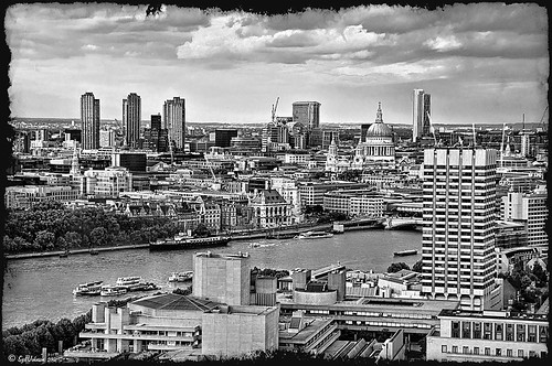
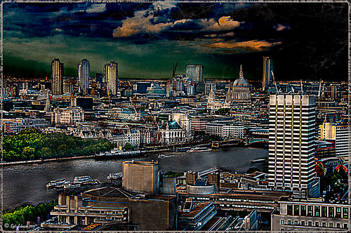
NIK Color Efex Pro 4 – First Try!
 |
Well, here is my old standby image from the London Eye used as an example of what the long-awaited NIK Color Efex Pro 4 upgrade will do. Hover over image to see original. I am still sorting through all the new features they have added to this wonderful plug-in. Check out my Fun Photoshop Blog “Nik Color Efex Pro 4 – Digital Lady Syd’s Review” for a more in depth discussion.
One of the major new features allows you to stack any number of filters and save the whole group as a preset to use again. I really stacked up this image just to see what results I could get. The filters in the order they are stacked are: Tonal Contrast, Brilliance/Warmth, Vignette: Lens (a new filter), Contrast Color Range, Remove Color Cast (Plus Control Point set on faded green trees on left – click to see original problem area), Graduated Filter, and Image Borders.
I believe the final result is quite striking. In the meantime I will still be playing with the filters and trying different stacks to see what really looks good. If you get a chance, go download the trial version and see what you think…..Digital Lady Syd
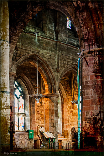
Spotlight Effect With the New Subtract Blend Mode
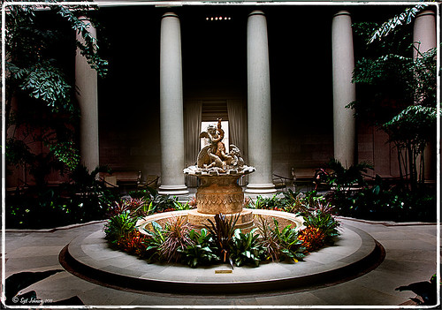 |
This beautiful sculpture, called Cherubs Playing with a Swan and created by Jean-Baptiste Tuby I in 1672-73, is located in the West Garden Court of the West Building of the National Gallery of Art in Washington, DC. I used an effect I learned from Calvin Hollywood recently in a video called “New Blend Modes – Divide and Subtract.” In this technique, the Subtract blend mode creates the dark feel to the image. Hover over the image to see the original camera raw image.
The basic steps used on the above image above are:
- Cropped image to balance in Lightroom.
- Opened image in Photoshop and duplicated the Background Layer.
- Change the top layer blend mode to Subtract.
- Went to Filter -> Bur -> Gaussian Blur and set Radius to 250. The image now has a night effect and not that blurry.
- Added a Layer Mask and painted white using a low opacity brush on the mask to emphasizing the sculpture and the areas to be lightened.
- A Curves Adjustment Layer and a Color Balance Adjustment Layer to adjust contrast and color were applied.
- A Composite Layer (CTRL+SHIFT+ALT+E) was created on top of the layer stack.
- Image was sharpened using the High Pass Filter set to a 9.1 radius and the blend mode changed to Soft Light.
I was surprised by the beautiful effect created on this image! It was interesting to learn that there is a useful purpose for this blend mode. Give it a try on an image and see what you get……Digital Lady Syd
Where Am I?

This image was processed as an HDR image in Photoshop CS5 using five images. I used Scott 5 preset (see my Fun Photoshop Blog “With One Good Photo – Try the Pseudo HDR Effect“) as a starting point and adjusted to my taste. I also changed out the sky as the day was very overcast when this image was taken and the HDR effect looked terrible in this area. The Puppet Warp Tool was used to straighten the left tower (see my Tidbits Blog “Straightening with Puppet Warp“).
So where am I?
If you have been to Washington, DC and spent any time on The Mall, you would have seen this very distinctive building called the Smithsonian Castle. I was interested in checking it out as the DC area experienced a 5.8 magnitude earthquake on August 23, 2011 and five decorative turrets on the east side of the Castle sustained damage. I did not take pictures on the east side of the building, but as far as I could tell, the building looked in good shape. The Castle was built and finished in 1855 by Mr. James Renwick, Jr. Apparently the museum did not expand beyond this building until the 1960s. I wish I could go back a 100 years in time for a few hours and see what was going on in this building. If you get a chance to visit this area, go check it out…..Digital Lady Syd
Get Rid of Those Power Lines Fast – with Paths and Spot Healing Tool!
Since I like to shoot old buildings, and there always seems to be a never-ending batch of power lines in these images, here is the technique that works best to clean up those lines.This tip is from Bryan Hughes, Product Manager for Adobe Photoshop, called simply “Remove Power Lines.” Below is an example of an image of the State Capital Building in Jackson, Mississippi, that had some real problems with lines. Hover over the image to see the original power-lined shot. It was processed with Topaz’s Black and White Effects plug-in.
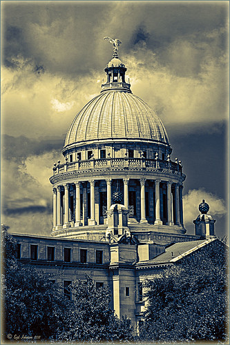 |
Most of the lines were removed following the steps below:
- Select the Pen Tool (P).
- Go to the Path Panel and click along the wire setting anchor points as you go.
- Next select the Spot Healing Brush (J) – in Options Bar be sure that the Content Aware box is checked and that the size of the brush is roughly twice the size of the wire you want to remove.
- In the Paths Panel, click the “Stroke Path with Brush” icon at bottom of panel (2nd over from left).
- Once the wire disappears, delete the Work Path by clicking on the Trash Can. If the wire did not completely disappear, just paint with the Spot Healing brush over the exposed area to clean up.
This technique works great as long as you are not in front of areas like the building columns or details. I found in this case, still use the Spot Healing Brush on these areas – but just click once and move along. It will do an amazing job in most cases. Note: To get rid of the path line on the image, open Path Panel and press DEL to remove the work path.
In the image above, the only areas that caused a problem was where one line went through the large ornamental balls – these had to be copied onto another layer, transformed, and layer masked to line up. Otherwise, no major problems and very fast even though there were lots of power lines. The traffic light was cloned out, and street light was removed using Edit -> Fill – Content-Aware after selecting with Lasso Tool. The new Topaz Black and White Effects was used to create the color effect on this image.
Try using this tip – it is really fast and great to have in your arsenal of quick tricks…..Digital Lady Syd
Just a Tree!
Sometimes I find that combining recent effects I have learned in Photoshop can create something that is quite unique. Obviously not all things I create are that great, but even so, I am learning something about how all the different elements go together. This image is an example of this type of creativity. Just had fun putting together some of my favorite brushes and filters and came up with this tree.

The tree is one of Mels Winter Tree Brushes placed on a layer above the background, and on the next layer foliage was added using several of Gorguss Grunge Again (click on upper right – Photoshop Brushes) brushes. Both brush sets are favorites of mine. Two of ShadowHouse Creation Textures (5 Assorted Textures Set and Vintage Oil Painting Texture Set-2) were stacked underneath. A composite layer was made (CTRL+SHIFT+ALT+E) and opened up in Topaz B&W Effects plug-in (see sidebar for link) – a Cyanotype Collection preset was used to get the bluish appearance, and the Transparency was lowered so some of the colors showed through. Back in Photoshop a new layer was created on top and using Texturemate’s Rough Sand Texture brush 9 in blue on top at 70% opacity. That was it. I really like the effect.
It can really be a lot of fun to mix and match – give it a try!…..Digital Lady Syd
Selective Desaturation – the Easy Way!
I came across this technique from John Paul Caponigro – absolutely the best when it comes to color and artistic applications of Photoshop. Check out his website if you have not already – it is full of useful information and articles and is very inspirational.
This is a very simple technique – simply add a New Layer on top of your image and set the blend mode to Saturation, select the Brush Tool, set color to black (white or gray will also work) and 15% opacity in the Options Bar. Paint over the area you want several times to building up the desaturated effect until you get the look you are after.
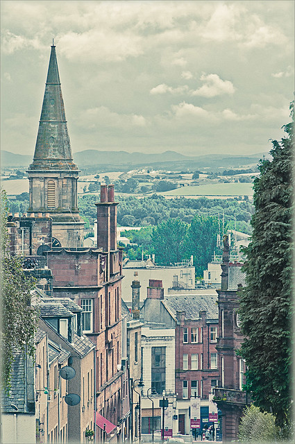 |
I have a few favorite images that I like to use for new techniques and this one of a street in Edinburgh, Scotland is one of them. The image was processed in Lightroom using one of my favorite presets, Matt’s 70’s Look preset (here is the ACR preset), applied (without the vignetting), and then it was brought into Photoshop. The green trees and the bright green bush in the right front were way too saturated for this vintage look. Therefore, the colors were slowly desaturated until they matched the image. Hover over the image as it came in from Lightroom and see the original bright green colors.
After each brush stroke, you can Edit -> Fade Effect if it was too much of a change – this can only be done immediately after applying the stroke. The layer opacity can also be reduced for overall reduction of the effect or a layer mask can be applied and paint in just specific areas. Very flexible way of localizing a change.
This technique can be very useful when you want to just de-emphasize something that is too bright in the image, especially on small areas. Also, green foliage tends to be over-bright as in this picture and it can be toned down just a small amount very easily.
Hope you find the tip useful – it is just one of those little things that help make or break a picture. Until next time…..Digital Lady Syd
Digital Lady Syd’s Rule No. 4: See What Others are Doing
I have found that if I do not keep looking for new ways of doing Photoshop and graphics, I get into a real rut. Check out my Digital Lady Syd’s Favs page for some excellent reference books (here is an image of one of my reference bookshelves) and websites/blogs I follow. There is a lot of inspiration out there – you just have to find it!

So take some time every now and then and see what is happening. You might see something that will really inspire you and help with your digital darkroom skills…..Digital Lady Syd
Straightening with Puppet Warp!
Who knew???? I listened to a short video by Bryan Hughes (the newest inductee to the Photoshop World Hall of Fame) who is the Product Manager for Adobe Photoshop. I had the fortune to attend one of his classes at Photoshop World a few years back and he was great. I picked up this trick listening to one of his videos, “Puppet Warp to Straighten Images,” that I thought would really work with this image. Below is the image I used the puppet warp on to straighten the columns in St. Giles Cathedral in Edinburgh, Scotland. Hover or click to see the original image before the puppet warp was applied.
 |
It is pretty easy to do but it did take me a couple of tries before I was able to get the lines straight. To access in Photoshop CS5, go to Edit -> Puppet Warp. Press Enter to return to Photoshop. To remove the crazy mesh lines as shown below, uncheck in the Options Bar.
Here are a couple of tips:
1) Convert your image to a Smart Object (right click layer and select Convert to Smart Object) – then you can come back and adjust your image if you do not like the results later.
2) Do what the video says, first place a pin at each corner of the image so you do not move the whole image when you adjust a new pin.
3) Find two places that you want to straighten and set new pins. Then drag or use the arrow keys and move very carefully to get the line to straight. If it starts to bend a little strange, set a pin down and put another one between to adjust the line more subtlety with the arrow keys again. Below is a screen capture of what the puppet warp on the image looked like right before I clicked Enter to set. See all the yellow pins down the left side – it took this many to get the column to line up right.

I believe Puppet Warp works as well as the Lens Correction Filter in many cases – it just takes a little practice to get it right. Give it a try, you might be surprised how good it works!…..Digital Lady Syd
PS. If you would like to know how I did the digital workflow for this image, see my Fun Photoshop Blog “Digital Landscape Effects with Nik Software.”
Just Another Topaz Black & White Effect Example

This image was taken at Edinburgh Castle in Scotland. I just keep playing around and finding new looks for images. The cannon and opening were selected and placed on their own layer, then a white layer was added below it, and a texture from ShadowHouse Creations Another Mixed Bag Texture Set (some really beautiful free textures on this site) was added. On several layers above and below using different colors from the image, various brush marks were added using Gorjuss Grunge Again brushes (unfortunately these are no long available), some really nice brushes to add a bit of color and detail. Create a composite and duplicate this layer. Next use the Topaz Black and White plug-in with the Opalotype Collection Effect and Yellow Lilac preset as a start. A lot of changes were made in the Conversion and Finishing Touches panels and Detail and Burn brushes were used to emphasize the stone. (See my Fun Photoshop Blog “Topaz B&W Effects Plug-in – a Real Winner!) and Tidbits Blog “Topaz B&W Effects vs. Nik’s Silver Efex Pro” for more information on this plug-in.) The plug-in layer was set to 52% opacity back in Photoshop. A Curves Adjustment Layer was added and some sharpening applied. It was a really fun image to do.
Hope you got an idea for creating a little different effect with this plug-in…..Digital Lady Syd
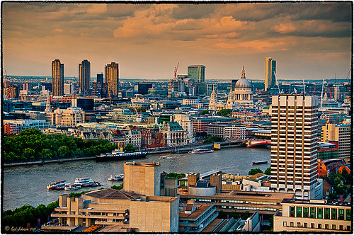
Topaz B&W Effects vs. Nik’s Silver Efex Pro
I did a blog on my Fun Photoshop Blog called “Topaz B&W Effect Plug-in – A Real Winner!” that touched on some of the differences of Topaz’s new plug-in and the great black and white standard plug-in by Nik called Silver Efex Pro 2.0. I thought I would just mention a few other things I noticed that are definitely different about the two programs.
Below is one of my favorite images for trying out new effects (the original has some basic flaws so I can see if the product will correct it) and was taken from the London Eye. Topaz B&W Effects was applied (hover over or click on image to see the Nik version).
 |
This is as close as I could get to making the two plug-ins look alike. The sky and some of the buildings’ contrast and detail are slightly different, but overall the results are pretty much the same. I am not sure which version I like best.
The image below I also used Topaz B&W Effects.

In this case, I could not duplicate the results in either NIK Silver Efex Pro 2.0 or Color Efex Pro 3.0. I liked the results and was surprised how nice the image turned out. By the way, I created for the Topaz plug-in a SJ-Cityscape preset for use in the Traditional Collection for both of the Topaz images – it can be downloaded here.
My final thought is to say that I think there is a place for both black and white plug-ins. Nik’s black and white plug-in is considered the best and I am not sure Topaz has created a better one, but it is very close. Topaz B&W Effects is definitely a great product since it does several things the other plug-in cannot do – and I really like that.
Well I hope you have fun (I sure am) trying out both of these excellent products. I plan on experimenting more with Topaz’s B&W Effects and will post more on it later……Digital Lady Syd
PS. Be sure to download the 30 day trial for Topaz B&W Effects – it is a fully functional trial to try out!
Pseudo HDR in the Works
I am working on a new technique for the Pseudo HDR look I wrote about last week. (See my blog post called “With One Good Photo – Try the Pseudo HDR Effect“) that I will be posting on my Fun Photoshop Blog soon. Here is a preview of what I am working on – hover over image to see original image with just ACR adjustments made.
 |
Check out my Fun Photoshop Blog shortly for more examples and instructions on how to do this….Digital Lady Syd


