
Houses in Marsh Harbour
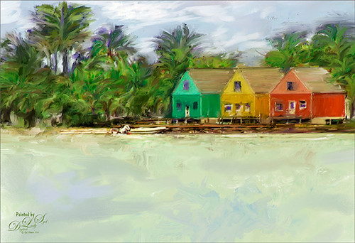
Just a quick post on this painting. The original photo was taken while actually leaving the channel at the small town of Marsh Harbour in The Bahamas. Still working on learning to use Corel Painter – Melissa Gallo’s Painter for Photographers Workshop is really helping me understand how to use this program. Lots to learn yet – this is really so much fun! I did do the final crop in Photoshop and used Viveza 2 to emphasize the focal point. Also a Curves Adjustment Layer and signature layers was added. Still not comfortable staying in Painter for this……Digital Lady Syd
Some Painter Magic!
I will be honest and say this is a totally “Bob Ross” Joy of Painting type of image I created in Corel Painter 2015. This was done by following the painting instruction of Corel Master Melissa Gallo’s videos in her Painter for Photographers Workshop. Am really enjoying her artistic teachings and brushes. Also in Photoshop used Nik Viveza 2 to enhance parts of this image to get the color saturation I liked. That was it! Fun! Fun! Fun!……Digital Lady Syd
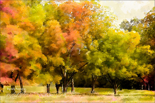
Fall Is In the Sky!
This is an oldie-but-goodie created in 2011 but I like the fall colors. Since I am into so much painting, this one was done with 11 layers using different brushes, one free texture, Shadowhouse Creations Oil Painting 5, one of my favorite textures, set to Overlay at 59% layer opacity just below a Nik Color Efex Pro Graduated Neutral Filter layer (don’t have settings – before I was saving that info). First a new document was created at 8 inches x 10 inches at 240 pp. Here are all the free brushes (thanks to the wonderful Deviant Art artists) used in this image, each on a different layer. On New Layer it looks like a large soft round brush was used to created the strong orange and reddish effect for the background just painting over the image at a lower opacity and building up a little. Glitter & Lines by Madeliniz gr set to 31% layer opacity; Glitter & Lines by Mandeliniz-g1 warped – brown lines; Texturemate swirls 35 png – green circles; grunge brushes by lydia -bright yellow on lower left; Another layer of grunge brushes by lydia – pink splotch lower right and set to 62% layer opacity; yet another layer of grunge brushes by lydia – blue object; Dollfie-Chan snowflake; Arsgrafik Snowflake Brushes 364 snowflake lower right yellow; another of the same brush that used pink and the Color Replacement Tool to add the color; Space by JaneDoeStock Space#2 – upper white galaxy spiral; and Space #4 – lower orange comet. Looks like a little white grunge was spread around to look outer spacey but not sure what brush. These type of images are so much fun to create. Give it a try if you get bored and want a change!…..Digital Lady Syd
The Most Delicious Caramel Apples!
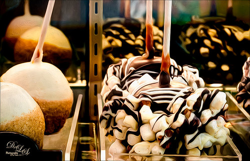
The above is what happens if I am in Photoshop when I am hungry! These delicious Rocky Road Candy Apples were located at Snookers Candy Store in Seuss Land at Universal Studios Orlando. May be the most tasty looking candy apples I have ever seen! Wanted to use this image as an example of just a subtle painterly effect added to an image for just a little enhancement. This image was processed in Lightroom where cropping and Seim’s Workflow 4 (see sidebar for website link) Hill and Lucas preset was applied. Photoshop’s Shake Reduction Filter was applied and it actually sharpened up the image just a little. Did lots of clean up since this was shot through a plastic case. Finally I went into Photoshop CC (CS6 also has it and Pixel Bender still has it for CS5) Oil Paint Filter – I am really sad this filter has been eliminated in the new CC 2014 version – I thought the marshmallows and chocolate would look nice with this effect. (Settings used: Brush Stylization 10, Cleanliness 10, Scale 1.14, Bristle Detail 10, Lighting Angular Direction 300, and Shine 1.35.) A layer mask was added and with my Chalk 60 brush, some of the effect was painted out in areas that looked overdone. To really make the image pop, Nik Viveza was applied – both globally and with control points to add just the right amount of vignette and sharpness. This filter is still just incredible! A Curves Adjustment Layer was added to lighten up the whites just a little more and a layer was used to add some burning to define the marshmallows in the front apple from the one further back. (See my The Best Dodging and Burning Technique! blog.) This was really a fun image to work with and just adding a little painterly effect really made it stand out!…..Digital Lady Syd
Just Painting!
Decided to practice some painting on these beautiful trees in Jackson, Mississippi. Basically just painted using the directions from my Fun Photoshop blog called How to Easily Create a Photoshop Brush for Painting but using a pastel brush instead of a watercolor brush. The principles are the same. Used Melissa Gallo of Painted Textures Yellow Dawn Texture setting it to Hue blend mode at 91% layer opacity – this gave it the fall looking colors – and then the second time it was set to Vivid Light at 26% layer opacity and in a black mask only the highlights were painted back. The top stamped layer was set to Multiply blend mode at 84% layer opacity to better bring out the colors and a Levels Adjustment Layer was used to add more contrast. That was it. It took a long time to paint, but the results are usually worth the time……Digital Lady Syd.
A Little More Painting with a Texture Brush from Your Image
Wanted to show you how I completed the image that I began in my You Tube Texture Video for my Fun Photoshop Blog How to Paint with a Texture Brush from Your Image. By creating a different brush and changing up my technique just a little, a totally different feel was given to the same image. So what did I do to get this totally different result from the same image?
The brush I created in the video I did save down as a “New with my settings” brush – I forgot to remind everyone of this rather vital step. You need to resave and rename your brush to keep the additional slider changes made from the initial brush created. A New Layer was added above and this time it was converted to a Mixer Brush – in the Options Bar turn off the “Load the brush after each stroke” icon and in the drop down, choose Very Wet, Heavy Mix. Now just make sure Sample All Layers is checked and you are ready to paint using this same brush as a Mixer “Blender” brush (see my Photoshop Blog How to Easily Create a Photoshop Brush for Painting for more info on this.) On a couple of layers, I just smoothed out edges and dabbed and then would go back to the regular brush with the same settings. Just went back and forth smoothing and adding a little texture and color. By doing that on this brush, the texture effect is not so over-the-top as it looked in the video and the rough edges were softened with the Mixer Brush. A Curves Adjustment Layer was added to increase the brightness since the painting darkened it down some. If you look closely, the pattern is over the objects just like the background – by adding the Pattern Fill Adjustment Layer on top and choosing this same texture set to 60% Scale, it blended beautifully with the texture – the layer opacity was set to just 26% for the blend. Then a Levels Adjustment Layer was added and the in the Output Levels, set the first number to 24 to take out the total black pixels which often darkens an image too much in paintings. I thought I was done but I tried a layer style called BMU_SSStyles_UltArtist_Watercolor-Dark from Scrap Girls packet which added a Pattern Overlay that resulted in the rather foggy spooky feel on the whole image – it felt so Harry Potterish! (See my Fun Photoshop Blog How to Get Painting Effects from Actions-Part 2 for info on this.) I was thinking I could have just used a fog brush at a low opacity and painted on a New Layer to get the same effect. I really liked how this version turned out – love the triangular shapes and still like my owl! Anyway wanted to show you how using this different texture, crop, and brush gives a totally different result! Hope you give this a try!…..Digital Lady Syd
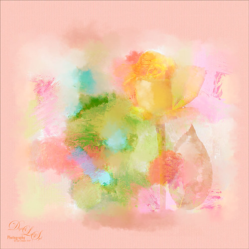
What Happened to My Yellow Rose?
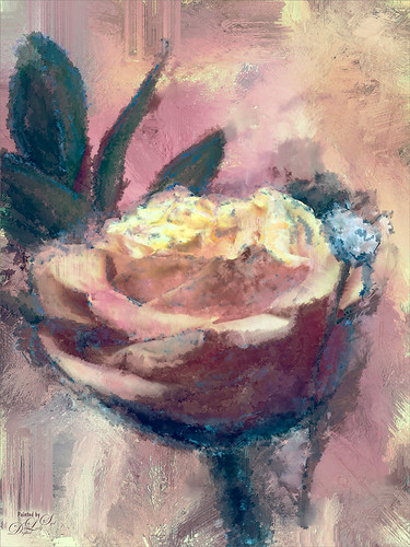
This is an alternate image of the yellow rose posted last week – see Mid-Year – Painting Project Progressing! I just wanted to let you see what using the wonderful Topaz (see sidebar for website link) ReStyle can do to an image – not sure which image I like best since I love the pink tones. Basically the yellow rose was opened into ReStyle and the Cream and Plum preset was selected. I use this preset a lot since it does have the color palette I love. The changed settings were: Hue Secondary -0.44 and Third -0.28; Sat Fifth -0.25; and Lum Primary 0.15, Third 0.03, Fourth 0.41, and Fifth -0.53; Basic Tone Black Level 0.03, Midtones -0.12, and White Level 0.41; and Detail Structure 0.45 and Sharpness 0.56. In Basic Mask painted in this effect in a black mask at the top of flower with Brush Strength 0.42, Brush Size 0.10 and Hardness 0.30. A New Layer was added above and the Mixer Brush was used to clean up the petals, but I did not like the way it looked, so I turned it off. The grungy look seems appropriate with this image and the blue specs look nice. The last step was adding a Curves Adjustment Layer to add more contrast. Not sure but I think I like it better than the yellow one. Decisions! Decisions!…..Digital Lady Syd
Mid-Year – Painting Project Progressing!
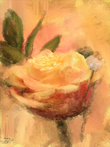
I am over halfway on my journey to achieving my New Years Resolution of learning to paint and here is an example of where I am at. This image was taken at the grocery store on my cell phone. Therefore I had a little sharpness issue, but with painting, you can do a little improvising. The texture was from Melissa Gallo at Painted Textures called Sunrise Canvas. This beautiful texture is one of several provided in her Painting with Photoshop workshop – this workshop is the first time it has really “sunk in” on how to do this. Melissa is an artist and Corel Master, but she teaches the Photoshop painting techniques very thoroughly. This image used her brushes. Anyway, I really am getting into this painting thing and it is totally fun! Oh yes, and how did I improvise that little bit of detail I wanted in the top of the flower? Well I used a technique covered in my blog called The Best Dodging and Burning Technique! and created a burn layer set to Overlay to sketch in a few lines with a small round brush at 12% brush opacity. Very subtle!…..Digital Lady Syd
A Dreamy Rose!
Really enjoyed making this image. This yellow rose, a free image from stock.xchng by MEJones, was used to begin my painting. Painted Textures Parisian Pool texture was used. The edges of various splotches of color on individual layers were blended in using a Mixer Brush – not sure which one, but the Adobe Chalk Brush with a Shape Dynamics set to 19% would work fine. This brush can be used both as a regular brush and a Mixer Brush. The Camera Raw Filter was used to adjust the color using the HSL sliders. A Curves Adjustment Layer was used to add a little contrast. That was it but lots of fun to do!…..Digital Lady Syd
Dainty Little Violet
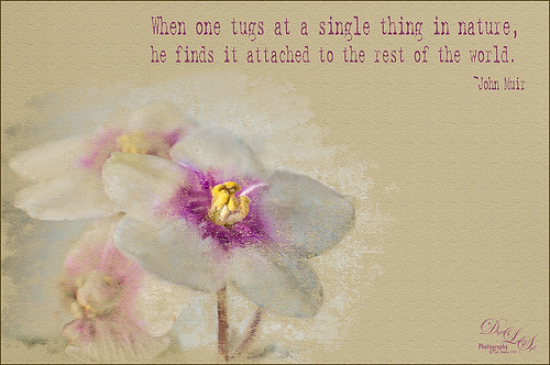 Just playing in Photoshop. This was a photo I took of my blooming violets a while back. Mainly just a little mixer brushing and the Texturizer Filter in Photoshop. The font is Batik Regular. This is just too much fun!…..Digital Lady Syd
Digital Lady Syd Related Blogs:
Learning to Paint in Photoshop
Painting the Old and the New
I call this image The Old and The New – these pink gerbera daisies were growing on my back porch. Pretty basic steps here. A pastel mixer brush was used to paint the image on a New Layer above the background layer. French Kiss Collection’s Atelier Valley texture set to Hard Light at 60% opacity was added on top. Topaz (see sidebar for website link) Detail 3 was used to localize the sharpening on the flower with a black mask and painting the effect back in. What really made this image was applying Topaz ReStyle and getting a more interesting color combination. Some contrast was supplied with a Curves Adjustment Layer. Just a lot of fun!…..Digital Lady Syd
The Valentine Tree

This is my Valentine Tree that I created using some of Melissa Gallo of Painted Textures painting tips in her wonderful videos on Painting with Photoshop. This was so much fun to do. French Kiss Tableaux Symphony texture was set to Darker Color blend mode at 40% layer opacity. Then an image I created giving the cloudlike feel was placed above it and set to Multiply blend mode. All the heart effects were created using just one brush – the Valentine Brush by Digital Touch – just set to different sizes and layer styles. The silhouette is Romantic Couples 2496 from photoshopfreebrushes.com. Obsidian Dawn’s Glitter Sets Hearts-Glitter was applied as a snow effect on top. The Valentine Tree text is by MC Sweetie Hearts font. The other text is from Cosmi and is called 31 – not sure it is available anymore. A little localized sharpening on the tree and some contrast to the whole image finished up the effect. I hope everyone has a wonderful Valentines Day and has a little Photoshop Fun also!…..Digital Lady Syd
Conquering Painting in Photoshop!
I have finally found someone who can relate to me exactly how to get a beautiful painterly look in Photoshop. This image was made following one of the many videos that Melissa Gallo at Painted Textures created for her Painting with Photoshop Workshop. After painting the trees, one of the provided textures for the workshop, Sea Storm Canvas, was set to Pin Light at 73% opacity and my SJ Snow1 Overlay was added. Now, I attempted to apply a little Digital Lady Syd on the image by taking a stamped layers (CTRL+ALT+SHIFT+E) into Topaz (see sidebar for website link) ReStyle and applied the Peppermint Gray preset to adjust the colors a little. (ReStyle settings: Set ReStyle section blend mode to Color; Texture Strength to 1.00; Basic section blend mode to Multiply; Color Temp -1.00, Tint 0.38, and White -0.56; Tone Black Level -1.00, Midtones 0.42, and White Level -0.56; and Detail Structure 0.97 and Sharpness -0.30.) Then added my watercolor border with color sampled from the image in a clipped Color Fill Adjustment Layer. Last step was to take the whole image into the Camera Raw Filter and add the radial filter for some saturation and clarity to draw the eye to the center of the image. If you are interested in learning painting techniques like this, look into getting her workshop. These are some of the best Photoshop videos I have followed. This is nothing but fun! — and that is what it is all about!…..Digital Lady Syd
Bamboo Forest Abstract
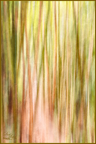
Got inspired by a short tutorial called Dustin Abbott’s Autumn Abstract with Snap Art 4 on Alien Skin’s website where he created this really interesting abstract painting. The image above is of a bamboo forest on the Big Island in Hawaii. I wanted a little less abstraction so some of the bamboo could be seen but the beautiful Hawaiian forest colors were the main interest. Therefore, I only used a Motion Blur Distance of 594 pixels. Next in Snap Art 4 Dustin Abbott’s Autumn Abstract preset (he graciously lets you download the preset in the tutorial link above) was applied. Back in Photoshop a layer mask was added where a few of the trees were painted back softly just to exaggerate the foreground tree shapes. Next Topaz ReStyle (see sidebar for website link) plug-in was added. (Started with Olivine Pastures preset to keep the Hawaiian green and pink colors intact. Color Style Hue Third -0.14, Sat Primary -0.28, Third 0.20, and Fifth -0.17, and Lum Third 0.63 and Fifth 0.59; Texture Strength 1.00; Basic Opacity 62%, Blend Mode Screen, Color Tint 0.16 and Sat 0.20; and Detail Structure 0.31.) The last step involved adding another of my favorite plug-ins, Nik Analog Efex Pro. (Used these filter settings: Basic Adjustments with Sat at 24%; Dirt & Scratches 82% using the last Organic thumbnail; Photo Plate Corroded – 2nd down 2nd over – at 20% Strength; and Levels & Curves with RGB and Luminosity Curves pulled just a little down and over at 81% Strength.) I think the image depicts exactly what I wanted to express – mainly emphasizing the gorgeous colors and the soft vertical feel of the forest. Give this technique a try and see what you can do……Digital Lady Syd
Digital Lady Syd Related Blogs:
Digital Lady Syd Reviews Alien Skin Snap Art 4
Feeling Like a Walk on the Island

Really loved how this image turned out – this is what the Bahamas (Great Guana Cay in this case) looked like to me when just walking around on some of the more deserted areas of the islands. This image was not that great to begin with, even with adjustments in Lightroom, but by adding Alien Skin’s Snap Art 3 Photoshop plug-in, it turned into a nice painterly effect. The Factory default preset was applied – I find I like it on many of my images. Using two layers in the plug-in, the focal point at the end of the path was painted with a more photorealistic slider detail and a few items in the foreground were slightly blurred. To finish up I used my free SJ Painter Oil Frame and painted around the edges with Fay Sirkis’s Mixer Brushes (used her Palette Knife Tap n Blend brush and Signature Palette Blender brush – brushes can be downloaded from her Four Seasons painting on-line training classes on NAPP – I think her brushes are the best out there!) to smooth the framing into the image a little more realistically. That was all that I did, but I think I might print this one for my wall……Digital Lady Syd
Jack Davis Painting Action Really Works!

Just started playing around with Jack Davis’s Davis-Mixer Painting SetUp – BETA action and ended up with this. I thought they actually turned out pretty nice. (To download this and several other actions and brushes, go to Jack Davis Wow Facebook page – just Like his page and go to the Freebies button and select Jack’s Painting Presets.) Not totally following his workflow in the action, but with a little fiddling around with some of the colors, it turned out pretty nice. I actually left a bit of outline layer in the image (67% opacity) as I thought it enhanced the lines of the flowers a little, but I had to erase out the image border on this layer. Also a Color Fill Layer was added just above the Pattern Fill Layer at the bottom of the stack and set to a peach color and set to 30% opacity. Other than that, it was just painting using Jack’s Mixer Brushes for his download. (For info on how to do this action, check out my Can You Get a Painting Look With a Photoshop Action? Jack Davis Can! blog and scroll down to the steps for Image 2.) This seems to be much easier for me to do than using Russell Brown’s Painting Assistant. Suggest you try them both out since they are both free……Digital Lady Syd
Digital Lady Syd’s Related Blogs:
Dr. Brown’s Painting Assistant Panel for CS6 and CS5!
Just a Simple Picture?????

This image definitely uses the colors I just love! Took a red spica and turned it into this gorgeous pink and turquoise rendition. What I did! Just regular Lightroom slider tone work before going into Photoshop. The image needed to be widened so the Canvas was extended on the left side to make room for the objects and text. Topaz (see sidebar for website link) Detail 3 was added using little medium detail and large detail settings and the Dark Foliage tone preset from drop-down in that section. I decided to select the spica using a layer mask and then applied it to make it an object. It needed Topaz DeNoise 5, so it was applied with just an Overall Strength setting set to 0.29. Topaz Simplify was added using the Oil Paint II preset. Then French Kiss Collections Tableaux Mirage texture was placed underneath the single spica object as a background texture and left at Normal at 100% opacity. A Hue/Saturation Adjustment Layer was placed above the texture and set Master to Hue -14, Saturation +48 and Lightness -22. At this point I did not realize I was going with the bluish color palette – I thought I was using the orange and yellow colors. I did a little clean up on the spica and then added a New Layer and added Diamond Head volcano as an object. Added some reddish clouds on a New Layer using my Clouds 5 brush at 54% and added an Inner Shadow, Color Overlay and Drop Shadow to them in brown and pink colors. Next French Kiss Collections Studio 3 White Wash texture (probably my most used texture) was set to Overlay blend mode at 100% opacity. Still had a brilliant yellow background so a Hue/Saturation Adjustment Layer was added on top. The Master was chosen and set to Hue +100, Saturation -35, and Lightness +22. Now I had this beautiful blue and turquoise color that really calmed the image down. On top of that a Photo Filter Adjustment Layer was added and set to Warming Filter 81 and Density 25%. Text was added using the Angelic War font and two layer styles added to it – Outer Glow and Drop Shadow. Next an overlay was added using 2 Lil’ Owls The Artisan Collection Big Set (see sidebar for website link) 2-2 texture. To turn textures into overlays check out my How to Create an Overlay Out of a Texture blog. Added a Layer Style by clicking on the FX at the bottom and moved the Underlying Layer black tab to 117/200 (this gives priority to the shadows of the underlying layer instead of the top one). See my How to Use Those Handy Blend-If Sliders! blog for more on this. Finally a Color Fill Adjustment Layer was clipped to the texture-overlay (ALT+click between the layers) and changed to a sampled color from the spica. Now I am done. Whew! Unfortunately this is how my brain works sometimes, but I really love the final result. I think it looks very Hawaiian and I could see this image on my wall!…..Digital Lady Syd
Painting a Dragon

This was the head on a wood boat pulled up on the sand in front of the Rainbow Tower at the Hilton Waikoloa Village on Waikiki Beach in Oahu, Hawaii. Recently I did a blog called Can You Get a Painting Look With a Photoshop Action? Jack Davis Can! where his Wow Smart Object Painting1 Action was applied to several images. This image uses the same action to create a nice basic painting. A darken layer was added above to show emphasize the edges for the dragon from the background image (see my The Best Dodging and Burning Technique blog). At this point I thought it looked pretty good, but the background was competing with the dragon in color, so I decided it needed to be pulled back some. Topaz (see sidebar for website link) Black and White Effects was used to soften the background. Several of the presets created really interesting looks due to the canvas effect being applied in the action first. I settled on an old wedding preset I had created back in version 1. (If you are interested, here they are: Conversion – Basic Exposure: Contrast 0.04, Brightness 0.10, Boost Blacks 0.35, and Boost Whites 0.01; and Finishing Touches – Silver and Paper Tones: Tonal Strength 0.44, Balance 0.96, Silver Hue 5.81, Silver Tone Strength 0.85, Paper Hue 77.42, and Paper Tone Strength 0.38; Transparency – Overall Transparency 0.80. A white border was then created around edge using Right Edge Size 0.11/Edge Exposure -1.00/Edge Transition 0.09; Left Edge Size 0.14/-1.00/0.08; Top 0.20/-1.00/0.09; and Bottom 0.09/-1.00/0.16.) Back in Photoshop a New Layer was created and the Clone Stamp was used to even out the border just a little around the image. A Curves Adjustment Layer was added to add contrast to the dragon and further separate it from the background – then the layer mask was filled with black (CTRL+I in mask) and just the dragon was painted back in white to reveal it (see my Using Curves Adjustment Layers to Get Rid of Shadows and Highlights blog). The last step was to add a Hue/Saturation Adjustment Layer to further adjust the background saturation (Saturation was set to -41 in Master) – but this time the dragon was painted in black to hide adjustment on it. This really turned out how I remember this image……Digital Lady Syd
Digital Lady Syd Related Blogs:
Digital Lady Syd Reviews Topaz Black & White Effects 2.1
My Parisian Violets!

These beautiful violets I recently bought at Wal-Mart and they are so pretty. They really like the filtered light from my south facing window in my kitchen. I used my handy, dandy 60 mm Nikkor macro lens at F/4.8, 1/90 sec, and ISO 200. A Bower 0.5 x High Resolution Digital Lens with Macro was added to the lens. In Lightroom 4 I just followed my workflow in my blog How to Use Adobe Camera Raw (ACR) or Lightroom 4 Quickly. I painted over the center of the flower using an Adjustment Brush set to a high sharpening and just a little Clarity. In Photoshop a Curves Adjustment Layer was used to selectively remove a shadow behind the front flower (see my Using Curves Adjustment Layers to Get Rid of Shadows and Highlights blog). Painted Textures Seafoam textures was added and just the flower lightly painted back using a white layer mask and painting in black. Next 2 Lil’ Owls Affetto Grunge Mosaic texture (see sidebar for website link) was added and the center painted out so only the darkened edges remained on most of the image. French Kiss’s Vintage French Brush No. 2 set -Dec 1924 was placed on the left side of the image and set to 89% opacity. A Layer Style was opened on this overlay layer. A dark Stroke set to 3 pixels inside was added, a Pattern Overlay using that wonderful default Photoshop pattern Bubbles was checked to add some variation in the text (I think this is the first time I have ever used it!), and an Outer Glow at 39% opacity was used. A Color Fill Adjustment Layer was clipped to the overlay and set to a light blue color. On the upper right French Kiss’s Vintage French Brush 1903 (same link as above) writing was applied and another Color Fill Adjustment Layer was clipped using the purple color from the flower. That was it! Lots of fun to do!…..Digital Lady Syd
Painterly Red Berries

These little red berries were growing in my neighbors yard – I really did not think they would look that great but I took a photo anyway. By adding the soft painterly texture, they turned into something quite beautiful. In Lightroom the basic panel sliders were manipulated and an adjustment brush was set to increased clarity and sharpening to paint around the edges of the front berries. The image was then opened in Photoshop where Topaz (see sidebar for website link) Detail 3 was opened and the Desaturated Blush I preset was applied. Painted Textures Creamsicle texture was set to Linear Burn at 100% opacity. A Levels Adjustment Layer was added and the Output level was changed to 54 to add a slight light haze to the image. The berries in front were painted out in the adjustment layer mask so they would appear slightly sharper. That is it! I love this texture – gives a real painterly look!…..Digital Lady Syd
Digital Lady Syd’s Related Blogs:
Beautiful Christmas Flowers
Painterly Effect using Topaz Detail and Simplify
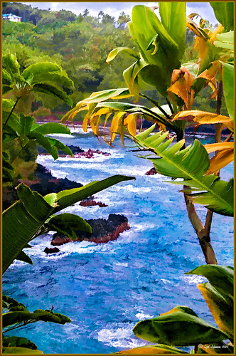 |
I was looking through my notes from last year and came across some nice info on using Topaz (see sidebar for website link) Simplify and Detail together to create an oil painting look. (See Creating an Oil Painting Effect from Topaz Labs.) My Hawaiian image from the east coast of the Big Island was one I had not originally processed as it really did not catch my eye – hoover over image to toggle to original. While doing a little Hawaii dreaming, I came across it again and thought it might look good using some of the settings from this video. (I really was thinking about how it would be to live in the house up in the top left – hum!) I actually did not follow the exact video workflow, but it did get me thinking about how to do this. Now that both Simplify and Detail have been updated, it was easier to get some different looks. Here are the steps I followed:
1. Duplicated the Background layer (CTRL+J). Topaz Detail 3 was opened and the settings from the second example in the video were applied: Small Detail .53, Medium Detail .46, and Large Detail .44.
2. Duplicated the Detail layer. Next Topaz Simplify 4 was opened and the Painting IV preset was applied. The only change to it is that the Edges section was turned off as it made the trees in the background stand out.
3. A Layer Mask was applied to the top Simplify layer. Some of the Detail Layer was brought back in by painting black on the mask on the foreground leaves. Also some detail in the little rock island was painted back.
4. What I did different was to add a New Layer and paint over the foreground leaves and trees in the midground to give a more painterly look and smoothing out some of the rough edges and colors that Simplify can bring into an image. A wet mixer brush was used for this.
5. Next a general Curves Adjustment Layer was added to bring in some contrast.
6. The sky was really blown out, so I added another Curves Adjustment Layer that brought back the natural clouds from the original image into the sky. The Layer Mask was filled with black and just the sky area was painted back with a soft black low opacity brush.
7. The water was way too cyan for my taste, so another Curves Adjustment Layer was added and the different color channels were adjusted to get a better color for the water.
8. I felt like the eye was not guided with a strong enough element to get you through the image. Therefore, a New Layer that was set to Overlay Blend Mode was added. With a large black brush set to 15% opacity, the edge of the bay was lightly painted on the water all the way to the back center. This burned in a slight contrast in the water for the eye to follow. Much better overall impact for the image.
9. The last step involved adding my SJ Thin Double Edge Frame layer style left at the default colors.
That is how I got this very Hawaiian Oil Paint feeling. Give these two plug ins a try and see what you think…..Digital Lady Syd
Digital Lady Syd Related Blogs:
Topaz Simplify and Topaz Detail Together
Where Am I?

This is the beautiful Scott Monument in Edinburgh, Scotland. There is an excellent tutorial called Processing with Textures by Colleen of Chasing Dreams Photography that shows you how to create a vintage feel that looks somewhat like this. After doing basic processing in Lightroom, the image was brought into Photoshop where Lenabem-Anna Texture – 208 was added and set to Overlay blend mode at 17%. She has such beautiful textures that can be downloaded from FlickR – see her Use Information before downloading. This texture was chosen to lighten the dark image in the center. The texture was removed by painting a sampled color from the texture over the building areas using a low opacity brush. Next her beautiful vintage sky Texture – 230 was applied and set to Darken at 100% – a layer mask was used to remove texture from the parts of the image where the texture should not be covering. A vintage action was run on the background layer to add more of the effect and the layer was set to 49% opacity. On top Flypaper Elysium Copy Taster Texture was added but a Hue/Saturation Adjustment Layer was added with Saturation set to -100 so no color but just the scratches were seen. The texture was set Overlay blend mode at 45% opacity. French Kiss free Glorious Grunge Edging Overlay was added and a Solid Color Adjustment Layer using a cream color for the edging. A dark vignette was applied at 54%. To get a better feel for all these steps, check out the video. This image was a lot of fun to do and I really like the vintage look!…..Digital Lady Syd
The Textured Flower Look!

Really enjoying processing the beautiful little white mums still blooming on my back porch. I recently found yet another wonderful texture site and decided to give it a try. The flower image was first processed in Lightroom – a preset called Summer Haze by Matt Kloskowski (one of the Photoshop guys at NAPP) was first applied and it turned everything into this soft warm summery feeling. With the Basic sliders a few tweaks were added to increase Exposure and open up the Shadows a little, and then a couple adjustment brushes were created to add sharpening and clarity to the flower centers. Once in Photoshop some blown out highlights were softened (see Getting Rid of Those Blown Out Areas in Your Image and a little Burning was done to bring out some of the flower lines. Next a beautiful Kim Klassen Texture called Organic was added and set to Hard Light blend mode at 92%. (Join her site and get lots of her beautiful textures for free including this one!) A Levels Adjustment Layer was added to increase the contrast a little. Next I added one of my own overlays I created (see How to Create Personal Overlays for Your Images) and used a layer mask to remove part of it – just wanted a little showing. I also used a small splatter brush at 15% opacity to reduce parts of the lettering without reducing all of it. The last step involved adding my favorite French Kiss Glorious Grunge Edging Overlay – a free overlay that can be downloaded at her site. That was it!…..Digital Lady Syd
Cold Dolphin Fountain in Florida

Sometimes I find I just need to do something sort of funny and just play around in Photoshop. That is how I got this crazy image of my cold dolphins instead of the warm Florida dolphin fountain in my front yard – actually it really was raining at the time I took this picture from the front porch. Essentially this image was just color corrected in Lightroom and brought into Photoshop where four textures were stacked using Dr. Brown’s Paper Texture panel (Ash texture 30, a bluish texture which is no long available, set to Hue at 74%; Bittbox Grunge Ice Texture set to Linear Dodge at 15%; Florabella Snow 3 texture, which may not be available anymore, set to Lighten at 15%; and ShadowHouse Creations Old Photo 6 texture set to Hard Light at 100% (see sidebar for blog link) – all are free except the Ash texture). Several Curves Layers were created to isolate and enhance parts of the image by filling the layer mask with black (CTRL+I on mask) and painting back using a low opacity brush. Not sure it is something I would put up on my wall, but it was a lot of fun to do!…..Digital Lady Syd
Digital Lady Syd Related Blogs:
Russell Brown’s Paper Texture Panel Updated!
Creating That Vintage Texture Feel
Click on Textures on right in Categories for more blogs


