
Free Calendar Template for Use with Elements

For my Elements friends, here is the same template following basically the exact same instructions as noted in my blog “Free Calendar Template” from last year. The template opens up great in Elements and the same steps to placing the items is totally the same. The only difference is that the step that it in the layer mask for the Gradient Layer. In this case, to copy the layer mask on the Color Fill 2 layer, you must: 1) click on the Color Fill 2 layer mask, 2) CTRL+A to select the whole mask, 3) CTRL+C to copy the whole mask, and 4) highlight the top layer and CTRL+V to paste the layer mask into this layer. A New Layer was created on top and snow was sprinkled around the edges. That’s it! Very simple.
The image is the top of the Standard Life building in Jackson, Mississippi. The gradient used is from Gorgeous Gradients – PrimaveraII, and the snow is a very useful snow brush called Snow Drop by Frostbo. The lettering on the building is called Kingsthings Christmas font, the Flying Santa Sleigh is by Fina, the fog was created using Sampled Brush #3 and #12 from Brushes Fogs and Mists, the green Christmas Tree and Icicles are in Obisian Dawn’s Holiday set, and the icy edges are an OnOne PhotoFrame Taufer Texture 08 frame (see sidebar for OnOne Perfect Photo Suite 6.0 for website). I have to admit this image was a bit of a challenge but I really liked the final effect.
Well, once again, it just goes to show that lots of what can be done in Photoshop can be done in Elements – sometimes with just a few workarounds. Try putting some of your new photos together and make a calendar for a family keepsake! Enjoy!…..Digital Lady Syd
Digital Lady Syd Related Blogs:
Free Calendar Template
Calendar Template for 2012
Create Calendar Photoshop Templates
Colorful Blown Out Look Lightroom and Adobe Camera Raw Preset
The Art Corner: Little Girl Knitting – A Mystery Sculpture!

I recently was visiting the Lightner Museum located in the old Alcazar Hotel in St. Augustine, Florida, and found this beautiful sculpture of a little girl sitting on a big pedestal in the corner. I think it turned out to be my favorite piece in the museum and the gorgeous antique mirror next to her is perfect for the setting. The sculpture is by Ella Pollock Bidwell of which very little known. The art was signed by the artist with Florence 1889, Carrera Marble was the medium used, and listed on a separate line “American(?).”
The Museum’s information sign by the work states “Despite the fact that this is a highly executed work of are, no concrete information has come to light on Ella Pollock Bidwell. Whether she actually sculpted this from marble herself or only did a clay maquette to be copied by others is left for us to speculate. There is some possibility that Ella Pollock Bidwell may have been an American working in Italy as many American Artists of the 19th Century were want to do. Alas we have no proof to offer of this either. Although the Artist is unknown to us today, her legacy remains with us in this charming and beautifully crafted work of art.” While searching on-line, the Bidwell Family Crest and History came up and listed that in 1892, a woman by the name of Ella P. Bidwell came through Ellis Island from London at the age of 30. Can’t help but wonder if this is the same woman who did this beautiful sculpture. You also have to wonder if this woman made more beautiful sculptures during her lifetime – what a shame we do not know!
The image was processed mainly in Lightroom. I created the tinted preset from reading David duChemin’s book “Vision & Voice – Refining Your Vision in Adobe Photoshop Lightroom.” See my blog “Inexpensive Gifts for the Photoshop Lover on Your List” No. 2. This book is a great read if you use Lightroom – he teaches you how to make some very beautiful presets. I use them all the time. The one applied to this image I named Maasai Chocolate split-tone & vignette to use as a starting point, but ended up changing several of the settings in the Black & White Mix. The image was also cropped to bring the mirror and the girl into closer view. In Photoshop a Curves Adjustment Layer was added and the Sharpen Tool was used on its own layer to locally sharpen parts of her features. Finally her face was Dodged just a small amount. I really loved the results of this preset on the sculpture…..Digital Lady Syd
Calendar Template for 2012

Above is another example of using the calendar template I created last year – the instructions are very easy to follow. Link over to my “Free Calendar Template” blog to download my calendar template and the calendar pdf file, and follow the easy steps. It prints out on an 8 1/2 inch X 11 inch sheet. (On Friday I will post how to do this in Elements – the same process except for copying the layer mask which is a copy and paste effort.)
For this calendar, I added a light colored gradient background instead of using a solid color. This was done by adding a New Layer on top and selecting the Gradient Tool. In the Options Bar, select your gradient, in this case it was from Muted Gradients Graphix1 – Muted 8, click first icon Linear, use Normal Mode at 100% opacity with Dither and Transparency checked. Copy the Layer Mask from the Color Fill 2 layer by clicking on the layer mask and ALT + Drag up to the top gradient layer. The bird image was taken at the St. Augustine Alligator Farm Zoological Park’s Rookery, one of the best places to take pictures of birds in the Spring, and a texture from Ash was used (not sure they are available anymore, but click on the Textures category on right to find many more wonderful texture sites). A 3 stroke gray line was added around the inside and outside of the template by adding a Layer Style to the top gradient layer.
This calendar template makes for a great present. It can also give you a chance to show off your latest artistic endeavor. Give it a try!…..Digital Lady Syd
Digital Lady Syd Related Blogs:
Free Calendar Template
Free Calendar Template for Use with Elements
Create Calendar Photoshop Templates
Colorful Blown Out Look Lightroom and Adobe Camera Raw Preset
Digital Lady Syd’s Free Christmas Card Template Using Photoshop Elements

This template was processed completely in Photoshop Elements. Same steps as with the regular Photoshop program. Open up your other image(s), CTRL+A to select the whole image, and CTRL+C to copy the image. (These are both images I took last Christmas.) Switch to the template file, highlight the layer(s) that indicates where the photo(s) should be placed, and press CTRL+V to place the image above that layer. Then use the Move Tool to scale, rotate, and move the image(s) to place it. The Background Image layer was changed to 73% opacity. That’s it. Below is an image of the layers as they appear in the finished image above.

Note the Text Layer has a 1 pixel Stroke layer style set to Black and Outside. The Frame Layer has an Outer Glow layer style set to Blend Mode Screen at 75% opacity and Size 16 pixels to make the frame stand out a little. To find the Layer Styles in Elements, highlight your layer to add effect to, go to Menu -> Layer -> Layer Style -> Style Settings. I painted a little beige color over the white flakes to make the lettering stand out better. The white snowflakes and frame snowflakes brushes are Design by Firgs Snowflake Brush 6. (Firg’s Snowflake Shape Pack is not free but now are for sale. To try a different option download Obsidian Dawn’s free Snowflakes Photoshop Custom Shapes.)Font is Fantaisie Artistique – if you do not have it on your computer, your computer will substitute a different font or you can download it (right click on it after downloading to add to font list) and it will appear correct.
****DOWNLOAD LINK TO MY BASIC HOLIDAY CARD TEMPLATE****
This is pretty simple and you should be able to get lots of different looks. See my blog for other examples on how to use this template. Have a good time and enjoy!…..Digital Lady Syd
Digital Lady Syd’s Related Blogs:
Digital Lady Syd’s Free Christmas Card Template
Free Christmas Card Templates-Part 2
Free Christmas Card Vectors and Brushes
Some Holiday Cheer
Digital Lady Syd’s Free Christmas Card Template

I have been wanting to create a versatile card template that could easily be used with your own images and background. Here is what I have come up with for a basic template for any kind of card. (Download at bottom.) It is set to 8 1/2 inches X 5 1/2 inches, one of the standard sizes for cards (and fits an 8 1/2 inch X 11 inch sheet). On the above image, the kids picture is one of mine that I scanned – it turned out pretty nice considering how old it is. The beautiful bokeh-like background is from ibJennyjenny Magical textures set 3, texture 3 with a Hue/Saturation Adjustment layer added to make color more greenish. I love the Christmas Toy Train font (look at the text file to learn how to use it if you download it) – it replaced the Fantaisie Artistique font in the template.
The file below is exactly how the card should look when using the downloaded template (with my images added). The one above has the “Place Your Photo Above” layer and the “Frame Snowflake 6…” layers turned 90 degrees. This is where the flexibility is – almost all elements can be swapped out and changed and you still have the basic template to follow.

To help you understand how to use the layers, below is a copy of the Layers Panel for the downloaded Basic Template and on the right is the Layers Panel for the image above to show you how it was created.


The type font can be easily changed by highlighting the type layer and double-clicking on the T icon to activate the editing mode for the layer. (The template and the above photo both use my favorite free font Fantaisie Artistique – when you open the template, if you do not have this font on your computer, one from your hard drive will be substituted or download this one, right click on the file and load to your computer.) Layer styles can be added to all the layers, like the Snowflake 6 brush (from Design by Firg’s Snowflake Shape Pack) layer with the White Inner Glow and Outer Glow. Firg’s Snowflake Shape Pack is not free but now are for sale. To try a different option download Obsidian Dawn’s free Snowflakes Photoshop Custom Shapes. All the snowflakes used in this image are the same brush. Need to give credit to the people who create these wonderful free resources on the internet: the tree image was created using a Winter Tree brush by Mels Brushes, Gorjuss Snowflake brushes for tree branches, and Snow Drops brush by FROSTBO for the pretty colored small snowflakes.
……

This image uses exactly the same template with a generic free family image (downloaded from stock.xchng). The Bitstream font is Freehand 575 BT. The same background is used from ibJennyjenny Magical textures set 3, texture 3, as used as above. The ornament is from Photoshop Free Brushes Christmas Balls set – painted a yellow ball on a layer, painted it in, then changed colors and painted it in a reddish color on top to make the design show through.
****DOWNLOAD LINK TO MY BASIC HOLIDAY CARD TEMPLATE****
To create the inside page, just turn off the photo image layers, make your text larger and create a little saying. Friday I will do a short example for my Photoshop Elements friends as this template works fine for this program also also. Have fun using the template and Happy Holidays!…..Digital Lady Syd
Digital Lady Syd’s Related Blogs:
Digital Lady Syd’s Free Christmas Card Template Using Photoshop Elements
Free Christmas Card Templates-Part 2
Free Christmas Card Vectors and Brushes
Some Holiday Cheer
Some Free Christmas Overlays to Spice Up Your Christmas Cards
Another OnOne Perfect Effects Pix – Got to Love It!
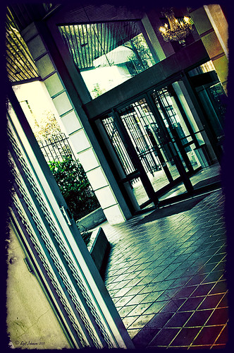 |
I discovered I really liked this image of an entryway into a building in Jackson, Mississippi, that was completely empty. Really sad to see such a nice space and nothing in it. Anyway, when I took the picture there was some vertical distortion (hover over image to see original) that I was not able to get rid of easily. While inside the Lens Correction Filter trying to straighten up these bowing lines, I discovered that the image looked really neat twisted – so that is how this picture started out.
The image was still a little flat so I decided to experiment some more in the updated plug-in from OnOne called Perfect Effects (see sidebar for website link). This image has three effects stacked – in Black & White tab, Roadie filter was chosen and set to Overlay blend mode at 73%; in Movie Looks, Urban Sickness set to Color blend mode at 78%; and in Vintage, Nicely Toasted set to Darken blend mode at 100%. The layer was duplicated and rasterized (right click layer and select rasterize to get rid of smart object) and the Sponge Tool was applied to the yellow leaves in the background to color them a bit more. On a duplicate layer a High Pass filter set to 9.1 was to sharpen the image and set to Soft blend mode. A final Curves Adjustment Layer was added for contrast and OnOne.s PhotoFilter acid burn controlled frame. That is it and I love the results!
This is how I like to experiment – just try different things as you go into the various parts of Photoshop – it can be amazing what you come up with. I did not imagine this image as a diagonal, but it really does the image justice. I hope this will give you some inspiration to try this technique on some of your pictures – it can be quite interesting…..Digital Lady Syd
Digital Lady Syd’s Related Blogs:
Digital Lady Syd’s Review of OnOne Perfect Effects
Pseudo HDR in OnOne Perfect Effects
First Try – OnOne’s Perfect Effects 3
Photoshop Elements Scene Cleaner
Since I am new to Photoshop Elements, I was surprised by the accolades Elements is receiving for their PhotoMerge capabilities, especially Scene Cleaner. It is something that cannot be done nearly as easily in Photoshop CS5 but has been in Elements since version 7. (For Photoshop CS5 people, Mike Hale’s Stack Mode Panel at Russell Brown’s website does have a panel that can be added to do this very thing.)

The image above is of a street corner in St. Augustine, Florida. Both the Scene Cleaner and the Saturated Slide Show effect were applied to this image. Here is how this was done:

1. For Scene Cleaner there must be at least two shots of the same image with the moving objects in different positions. In this case, it was the guy on the bicycle that road into my view while I was photographing. If lots of tourists are in your image, you will need several shots which you probably will have anyway if you shoot in bursts like most people do, especially if using a DSLR camera. If not, remember to do this when taking a picture of a famous place with lots of people around – this technique will save your picture!
2. Open Photoshop Elements and adjust all images at once in Adobe Camera Raw, trying to get their exposures as close as possible. (See my Tidbits Blog “Adobe Camera Raw – Not So Obvious in Photoshop Elements 10” on how to do this.) Click Open Image button and open all images up into Photoshop Elements. Do the adjustments this way so you do not have a bunch of layers to merge down before doing the next step.
3. Make sure the Project Bin at bottom is open (double click on the words Project Bin to toggle between open and closed) so all three images show up in it.
4. Go to Edit tab on right and select Guided, then PhotoMerge section, and finally Scene Cleaner. The program is now aligning the images. One of the images will appear in the left image box called the Source.
5. Need to look at all your images and decide which one is exposed the best for the final image. In the bin click and drag this image into the right Final image location. In the case above, the bottom image was used as the Final image and top image was the Source image. If more images had been available, different images can be changed out as the source image by just clicking on each one in the bottom bin.
6. Select a Source image that has an area cleared of any object or tourist that is ruining the other image. Select the pencil tool and set the brush size to about 35 pixels. This is key to getting this to work – Paint roughly in the Source image in the area where you think the interfering object is in the Final image – the object magically disappears in the other Final image. It may not be a perfect removal, but it does a pretty good job! A second image can be selected as a Source and marked up to remove other problem areas in the Final if needed. If you get lost, follow the Guide notes – they even have some advanced tips. The Show Regions box can be checked to see how each image is affecting the final result. Click Done to apply.
7. Use Crop Tool to cut away any mismatched white areas around Final image.
8. The image above still showed a bit of a hand. Therefore a Clone Layer was added and the hand blended out.
9. For the concrete shadow color issue (can see the different colors between the two images used above), the Lasso Tool was used to select the bad colored cement and it was placed on its own layer (with selection active, click CTRL+J). A Hue/Saturation Adjustment Layer was opened and the Colorize box was checked (these settings were set: Hue 210, Saturation 14, and Lightness -28) to match the cements.
10. The final step involved going to Edit -> Guided -> Saturated Slide Show Effect. It was applied 6 times to get the over-saturated look I liked.
This sounds like it was hard to do, but in reality it was really simple. The biggest issue is getting two or more shots that have different enough views to be able to remove the moving objects. Everyone says the Scene Cleaner is really a great addition and personally I wish they had it in Photoshop CS5. It has been fun learning a new technique in Elements. Give it a try!…..Digital Lady Syd
Another Pseudo HDR Image with NIK CEP4 – Got to Love the Effect!

I am loving this pseudo HDR effect with NIK Color Efex Pro 4 (CEP4). This image just about represents my look when I am processing a picture – just love the sharpness and color. Before it took a lot more manipulation to get to the same place but with CEP4, it just pops into place. The steps I used to process this image are as follows:
1. In Lightroom, I applied my Vivid Drawing Look ACR/Lightroom Preset (see below for my blog link where you can manually apply the settings or download the presets). The Exposure, Blacks and Fill Light were adjusted just a bit and it was opened up in Photoshop.
2. Open image up as a regular copy and do any clean up using Clone Stamp or Healing Brush.
3. Duplicate cleaned up image layer and Convert to a Smart Object by right clicking on the layer and selecting Convert to a Smart Object.
3. Go into CEP4 and use the following filter effects stacked top to bottom:
- Apply Tonal Contrast, Darken/Lighten Center, Detail Extractor, (these three filters are contained in my Pseudo HDR1 recipe (see Settings for Vivid Drawing Look ACR/Lightroom Preset and NIK’s CEP4 Pseudo HDR Recipe to download or enter slider amounts manually);
- Glamour Glow with 3 control points (each covering 20% of image) to remove most of the effect from clock face and center of porch (Glow 32%, Saturation -100%, and Glow Warmth -47%, Shadows 41%, and Highlights 44%);
- Photo Stylizer adding a plus control point in center of image to place effect just there covering 42% of image (Varitone, Style 6, Strength 67%); and
- Vignette (Vignette Color whitish as sampled from image, Shape 2, Adapt Edges 0%, Transition 80%, Size 0%, and Opacity 43%).
3. After coming out of the plug-in and back into Photoshop, the image was sharpened with the Unsharp Mask filter although I now prefer the more localized use of the Sharpen Tool.
4. Added Inner Glow and Stroke Layer Styles.
5. Added a Curves Adjustment Layer to get that good final contrast.
6. One of the things I did do on this image was double-click on the right side of the Color Efex Pro 4 layer inside the Smart Object and reduced the effect to 75%.
I love the final result – it really looks like the old historic St. Augustine on the day I visited. Try this little recipe on one of your detailed images and see if you like what you see…..Digital Lady Syd
Related Digital Lady Syd blogs:
Pseudo HDR Using NIK Color Efex Pro 4
Where Am I?
With One Good Photo – Try the Pseudo HDR Effect
Why I Love Topaz Adjust!
Adobe Camera Raw – Not So Obvious in Photoshop Elements 10

Accessing Adobe Camera Raw (ACR) in Photoshop Elements is not that obvious. I decided to write a quick post here on how to accomplish this without too much stress and show the results you can get with just a few adjustments to the sliders. Usually you use ACR for processing RAW files, but a JPG can also be opened up in ACR following the same steps.
To access ACR in Elements, first go to File -> Open As and click on the drop down arrow on the left of the bottom box that by default shows Photoshop (*PSD, *PDD) where a long list of file formats is displayed. Select Camera Raw (with a whole bunch RAW formats listed). Now you are in the basic ACR plug-in. This dialog is composed of three panels – Basic, Detail and Camera Calibration. There is a Straightening Tool and Crop Tool at top of dialog that should be used now if image needs to be straightened or cropped.
When I work in Camera Raw, I use the histogram as a basic guide for enhancing an image. Watch the edges and move the sliders so that the ends just touch the sides on both ends. Below is my workflow for processing an image before taking it into Photoshop Elements.
BASIC Panel:
White Balance drop-down – Click on the eyedropper icon on top and run over areas that are of a neutral gray content – the RGB numbers will show under the left side of the histogram. When numbers are all pretty close in range, click on that place in image to adjust color cast. (Usually never touch this unless there is an obvious color cast in the image.)
Exposure slider – slowly move the slider until the white line stretches to the right edge of the histogram. (For this image, exposure slider was set to -0.35)
Blacks slider – slowly move the slider left until the white line stretches to the left edge of the histogram. (Blacks slider set to 0)
Recovery slider – move right until you get a pleasing look to the colors. It darkens the the brightest areas. (Recovery set to 99 – usually I do not use this much, but the histogram required it.)
Fill Light slider – this slider may not need to be moved at all – each image is different so give it a try. It opens up detail in the shadow areas. (This slider was left to 0.)
Temperature and Tint – these are not moved much if at all – use if you think there is a color cast in the image. Add a little yellow if the image seems too cool and you want to warm up the feel of the image. (In this case, the Temp slider was set to 7150 and the Tine was set to +4.)
Brightness slider – do not use this slider too much – it can tend to wash out colors. (Set to +53)
Contrast slider – don’t overdo using this but it can make an image pop. (Set to +63)
Clarity slider – add some but not more than +75 to add a bit of sharpness to the image but watch out for haloing if too much is used. I always use this slider. (Set to +63)
Vibrance slider – use if the colors need to pop just a bit more – it makes the colors that are not so bright a little more colorful. (Set to +28)
Saturation slider – usually do this adjustment in Photoshop.
DETAIL Panel:
Sharpening Section – I use this at the default – Amount 25%; Radius 1.0; Detail 25; and Masking 0. If noise in image, set Amount to 0 and do localized sharpening in Photoshop using the Sharpen Tool. (The default was used on this image.)
Noise Reduction Section – Use if any noise is apparent in the image – look at the image at 100% to find it. (Did not use on this image as there was no noise but I do not hesitate to use it if any is present.)
The Luminance slider can be very helpful in keeping the noise under control but you must find it at this early point in the image adjustment since you cannot come back into Camera Raw in Elements to fix.
Color slider – you may not need it if no color pixels in the dark areas.
CAMERA CALIBRATION Panel:
Adobe Standard is the default. In the drop-down, try some of the other choices. Camera Vivid gives some really bright colors. (For this bright colorful image, Camera Vivid was used.)
Click Open Image button and it now opens into the Editing Screen in Elements.
There is a lot of information on how to do this but once you get a workflow you are comfortable using, the image can be adjusted very quickly and results are definitely worth it.
Hope this workflow helps when trying to sort through the sliders. Have fun experimenting…..Digital Lady Syd
PS: This same workflow is a great starting point for ACR in CS5 – do open as a Smart Object so you can get back to the settings if needed.
Defringe that Nasty Blue Edge from Trees On a Bright Blue Sky!
 |
This is a short but sweet way to get rid of most of those blue and cyan edges on trees shot in bright light against a blue sky. There are just times you have to take that image in the bright light of day and the fringe occurs frequently. These tips also work when you have a horizon line in a landscape shot that has similar issues.
Hue/Saturation Adjustment Layer: The image above has that very problem and this method was used to get rid of most of the fringe. Hover the above image to see the before defringing image.
1. Simply add a Hue/Sat Adjustment Layer in Photoshop and in the Master field drop-down, adjust the Saturation slider left quite a bit and possibly the Hue slider a little until the blue edging disappears. For the above both Blue (Saturation set to -50 and Hue set to -8) and Cyan (Saturation set to -64).
2. Then Fill the attached adjustment layer mask with black (click on mask and CTRL+Backspace).
3. Click on the black layer mask and use a white brush to paint around the edges at roughly 40% opacity to remove the fringe color. You may have to go over it a couple of times but it will look more natural than setting the brush to 100% and painting over just once. You may need to adjust the opacity of the brush down more so the desaturation is not so noticeable.
Sponge Tool Method: Perhaps the easiest way to get rid of any extra fringe that might still be lurking in the image is to select the Sponge Tool and set it to Mode Desaturate. Turn off Vibrance in the Options Bar since that will only work on the more or less saturated colors and not the already saturated colors which we want to get rid of. Brushed over the fringe areas but try not to discolor too much of the neighboring sky also – it will look white and not the natural blue sky color.
Camera Raw Method: Open image in Lightroom or ACR and go to the Lens Correction Panel Manual Tab in the Chromatic Aberration section, set the Defringe to All Edges and adjust the Red/Cyan slider to the left and Blue/Yellow slider to the right to get the best result. This may take a bit of adjusting to get the right balance and watch out for any color shifts in the sky area around the leaves. There is no way to use a Saturation Adjustment Brush effectively to paint out the fringe as it does not have the choice of colors to remove – it desaturates everything you paint over – and it is hard to just pinpoint the fringe.
Saturation Layer: Digital Lady Syd’s Favorite way to eliminate a slight fringe edge is with a tip I presented a while back in a Tidbits Blog called “Selective Desaturation – the Easy Way!” This is a very simple technique – simply add a New Layer on top of your image and set the blend mode to Saturation, select the Brush Tool, set color to black (white or gray will also work) and 15% opacity in the Options Bar. Paint over the area you want to desaturate several times until you get the look you are after. If too much desaturation occurs, add a layer mask back and use a black brush to paint back any areas that you did not mean to desaturate. I think this gives as good a result as the first method so give it a try if you do not like the results using any of the other methods. I would post the image again but it is very similar to after image above.
Here are four options to try: Bottom line, try it and if you don’t like the results, don’t use it and try something else!
The final thought is a great quote I found from TWCDM’s Blog: “While these tricks are fine and dandy the best way to fix purple fringing to is avoid it in the first place. You can prevent purple fringing by using high quality lenses, stopping down your lens (shooting at an aperature of f8-f22), and if you are using a zoom lens avoid using the maximum and minimum focal range. A lenses “sweet spot” is usually somewhere in the middle focal lengths.” If you shoot it right to begin with you will not have this problem. (That apparently is my problem – hum!)
Hope these tips help you on those bright outdoor daytime images…..Digital Lady Syd
Colorful Blown Out Look Lightroom and Adobe Camera Raw Preset
 |
While in Hawaii, after taking a lot of beautiful flower images, I created the above effect as a Lightroom preset that I have used many times. It looks especially nice for a calendar image. Hover over image above to see the original.

This preset I call “Colorful Blown Out” and mainly has Basic and Luminance settings. You can download the free Lightroom preset here and the Adobe Camera Raw preset here. For a softer look, try increasing the Recovery slider and the Brightness slider. It is a good starting point for a very nice flower look. For information on where to download the calendar template and how to apply it, see my Photoshop Fun Blog Free Calendar Template for instructions.
Give it a try on other types of images too. Hope you enjoy!…..Digital Lady Syd
Quad Tones in Topaz Black and White Effects Plug-in
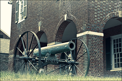 |
This image is of an old cannon on the grounds of the Historic Fairfax County Courthouse in Virginia. I do love NIK’s new Color Efex Pro 4 plug-in, but I keep going back to Topaz’s new Black and White Effects plug-in. (Hover over image to see original shot.)
The Topaz Black and White Effects preset I created gives a really nice sunny vintage feel and I think it is great for that historic look. To create the preset, select the Van Dyke Brown Collection Effect and Chamoisee Cyan preset as a starting point. The trick to getting this look is to set up in Finishing Touches the Quad Tones using these settings: Color 1 Region (R1 G1 B12) – 15.08; Color 2 Region (R63 G78 B85) – 143.9; Color 3 Region (R216 G211 B129) – 227.5; and Color 4 Region (R255 G254 B237) – 225.0. The sliders will need to be adjusted depending upon the image used. The Transparency setting was set to 1.00. For this image a small light Edge was added. Also, I was able to brush away the distortion over the back part of the left wheel using the Burn tool with a large brush and lightly clicking a few times, then using a smaller brush to run over the details just a bit. It totally disappeared! These brushes work wonders! To bring out the cannon a little more, back in Photoshop the image was sharpened using a High Pass Filter set to 9.1 Radius, a black mask was added to cover up the effect, and then by painting just the cannon on the mask, only it becomes sharp.
I really like the Quad Tone effect in this plug-in. Topaz has created a very nice video on how to use this section called “Quick Tip – Quad Toning Explored.” This may be the key to why it is hard to reproduce this look in other plug-ins.
For more information on this plug-in, see these related posts:
Fun Photoshop Blog: “Topaz B&W Effects Plug-In-A Real Winner!”
Tidbits Blog: “Topaz B&W Effects vs. Nik’s Silver Efex Pro”
Tidbits Blog: “Just Another Topaz Black and White Effect Example“
Spotlight Effect With the New Subtract Blend Mode
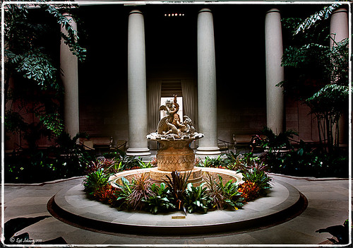 |
This beautiful sculpture, called Cherubs Playing with a Swan and created by Jean-Baptiste Tuby I in 1672-73, is located in the West Garden Court of the West Building of the National Gallery of Art in Washington, DC. I used an effect I learned from Calvin Hollywood recently in a video called “New Blend Modes – Divide and Subtract.” In this technique, the Subtract blend mode creates the dark feel to the image. Hover over the image to see the original camera raw image.
The basic steps used on the above image above are:
- Cropped image to balance in Lightroom.
- Opened image in Photoshop and duplicated the Background Layer.
- Change the top layer blend mode to Subtract.
- Went to Filter -> Bur -> Gaussian Blur and set Radius to 250. The image now has a night effect and not that blurry.
- Added a Layer Mask and painted white using a low opacity brush on the mask to emphasizing the sculpture and the areas to be lightened.
- A Curves Adjustment Layer and a Color Balance Adjustment Layer to adjust contrast and color were applied.
- A Composite Layer (CTRL+SHIFT+ALT+E) was created on top of the layer stack.
- Image was sharpened using the High Pass Filter set to a 9.1 radius and the blend mode changed to Soft Light.
I was surprised by the beautiful effect created on this image! It was interesting to learn that there is a useful purpose for this blend mode. Give it a try on an image and see what you get……Digital Lady Syd
Get Rid of Those Power Lines Fast – with Paths and Spot Healing Tool!
Since I like to shoot old buildings, and there always seems to be a never-ending batch of power lines in these images, here is the technique that works best to clean up those lines.This tip is from Bryan Hughes, Product Manager for Adobe Photoshop, called simply “Remove Power Lines.” Below is an example of an image of the State Capital Building in Jackson, Mississippi, that had some real problems with lines. Hover over the image to see the original power-lined shot. It was processed with Topaz’s Black and White Effects plug-in.
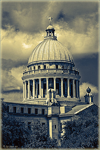 |
Most of the lines were removed following the steps below:
- Select the Pen Tool (P).
- Go to the Path Panel and click along the wire setting anchor points as you go.
- Next select the Spot Healing Brush (J) – in Options Bar be sure that the Content Aware box is checked and that the size of the brush is roughly twice the size of the wire you want to remove.
- In the Paths Panel, click the “Stroke Path with Brush” icon at bottom of panel (2nd over from left).
- Once the wire disappears, delete the Work Path by clicking on the Trash Can. If the wire did not completely disappear, just paint with the Spot Healing brush over the exposed area to clean up.
This technique works great as long as you are not in front of areas like the building columns or details. I found in this case, still use the Spot Healing Brush on these areas – but just click once and move along. It will do an amazing job in most cases. Note: To get rid of the path line on the image, open Path Panel and press DEL to remove the work path.
In the image above, the only areas that caused a problem was where one line went through the large ornamental balls – these had to be copied onto another layer, transformed, and layer masked to line up. Otherwise, no major problems and very fast even though there were lots of power lines. The traffic light was cloned out, and street light was removed using Edit -> Fill – Content-Aware after selecting with Lasso Tool. The new Topaz Black and White Effects was used to create the color effect on this image.
Try using this tip – it is really fast and great to have in your arsenal of quick tricks…..Digital Lady Syd
Selective Desaturation – the Easy Way!
I came across this technique from John Paul Caponigro – absolutely the best when it comes to color and artistic applications of Photoshop. Check out his website if you have not already – it is full of useful information and articles and is very inspirational.
This is a very simple technique – simply add a New Layer on top of your image and set the blend mode to Saturation, select the Brush Tool, set color to black (white or gray will also work) and 15% opacity in the Options Bar. Paint over the area you want several times to building up the desaturated effect until you get the look you are after.
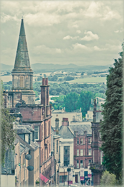 |
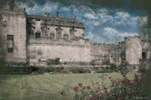
I have a few favorite images that I like to use for new techniques and this one of a street in Edinburgh, Scotland is one of them. The image was processed in Lightroom using one of my favorite presets, Matt’s 70’s Look preset (here is the ACR preset), applied (without the vignetting), and then it was brought into Photoshop. The green trees and the bright green bush in the right front were way too saturated for this vintage look. Therefore, the colors were slowly desaturated until they matched the image. Hover over the image as it came in from Lightroom and see the original bright green colors.
After each brush stroke, you can Edit -> Fade Effect if it was too much of a change – this can only be done immediately after applying the stroke. The layer opacity can also be reduced for overall reduction of the effect or a layer mask can be applied and paint in just specific areas. Very flexible way of localizing a change.
This technique can be very useful when you want to just de-emphasize something that is too bright in the image, especially on small areas. Also, green foliage tends to be over-bright as in this picture and it can be toned down just a small amount very easily.
Hope you find the tip useful – it is just one of those little things that help make or break a picture. Until next time…..Digital Lady Syd
Straightening with Puppet Warp!
Who knew???? I listened to a short video by Bryan Hughes (the newest inductee to the Photoshop World Hall of Fame) who is the Product Manager for Adobe Photoshop. I had the fortune to attend one of his classes at Photoshop World a few years back and he was great. I picked up this trick listening to one of his videos, “Puppet Warp to Straighten Images,” that I thought would really work with this image. Below is the image I used the puppet warp on to straighten the columns in St. Giles Cathedral in Edinburgh, Scotland. Hover or click to see the original image before the puppet warp was applied.
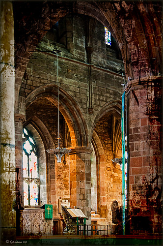 |
It is pretty easy to do but it did take me a couple of tries before I was able to get the lines straight. To access in Photoshop CS5, go to Edit -> Puppet Warp. Press Enter to return to Photoshop. To remove the crazy mesh lines as shown below, uncheck in the Options Bar.
Here are a couple of tips:
1) Convert your image to a Smart Object (right click layer and select Convert to Smart Object) – then you can come back and adjust your image if you do not like the results later.
2) Do what the video says, first place a pin at each corner of the image so you do not move the whole image when you adjust a new pin.
3) Find two places that you want to straighten and set new pins. Then drag or use the arrow keys and move very carefully to get the line to straight. If it starts to bend a little strange, set a pin down and put another one between to adjust the line more subtlety with the arrow keys again. Below is a screen capture of what the puppet warp on the image looked like right before I clicked Enter to set. See all the yellow pins down the left side – it took this many to get the column to line up right.

I believe Puppet Warp works as well as the Lens Correction Filter in many cases – it just takes a little practice to get it right. Give it a try, you might be surprised how good it works!…..Digital Lady Syd
PS. If you would like to know how I did the digital workflow for this image, see my Fun Photoshop Blog “Digital Landscape Effects with Nik Software.”
Got That Rainy Day Feeling!
 |
This week I found this really nice action called “Rainy Day Photoshop Action” whose link I thought I would share with you. I have never seen one that looks this realistic. There are three actions that you run one after the other to get the final cool effect: The Main Action, Little Drops, and Condensation (to give the water on the window feel). Hover over the image above to see the original image. (I will show you how to adjust the perspective with another blog shortly.) You can add layer masks and adjust opacity of each of the major elements to get the look you want.
Here is a little different look using the same action. (Hover over image for original also.)
 |
Try it out and see what effect you can get!…..Digital Lady Syd
Fixing up a Boring Picture
When you need a twist for an average looking image, try a texture or two to give it a new look. Here is a fairly average looking water tank image from Madison, Mississippi, that I shot because for some reason I love to photograph them. Hover over the image to see the before shot (only electrical lines had been removed at this point).
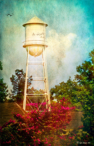 |
I was really pleased with the results. I found some beautiful vintage oil painting textures from a site called Shadowhouse Creations. This site has some wonderful resources so check it out when you have a chance. I applied the first two textures to my image, both layers set to Hard Light at 80% opacity. Added layer masks to clean up where the texture was too harsh. Painted in using my SJ-Cloud Brush Set – Brush #1 and some birds. That’s it.
I love the way Photoshop can make anything look great by just using a little creativity! Try it out!……..Digital Lady Syd
(BTW-For more information on textures, check out my Fun Photoshop Blog called “Adding a Texture for Flair!” )
I Didn’t Know That! Randomizing Gradients
Once again I stumbled upon another interesting feature in Photoshop. I learned from the new Practical Photoshop Magazine that you can actually generate a randomized gradient when in the Gradient Editor. This is not a feature that pops right out at you when looking for it.
- First click on the Gradient Tool and in the Options Bar, double click on the gradient preview window to bring up the Gradient Editor.
- Set the Gradient Type to Noise, Roughness to 100%, and check the Add Transparency box. If not set to Noise, you will never find the button.
- Click the Randomize button several times until you get the lines you like – then click OK
- Now drag the Gradient Tool on your layer to create the gradient.
Below is an image I used a Randomized Gradient to create a colorful background. I threw in a few of my cloud, a bird, tree and grass brushes from some of the posts I have done on my Fun Photoshop Blog.

Totally cool and fun! And now you know…..Digital Lady Syd
I Didn’t Know That! Comparing History States
Well once again I learned another little tidbit this week that really surprised me because basically I had never thought about it! Photoshop allows you to create a document from an earlier History State by just clicking a state you want to look at again, and dragging it down to the bottom of the History Panel’s left icon called “Create New Document from current State.” It will open up another window with the image as it appears in the older state. Below is an example of a photo I am currently adjusting where a Topaz Adjust Portrait Drama preset was applied (I know it is a landscape type image but it works!) and then a Nik Color Efex Pro Tonal Contrast filter was applied next. I wanted to compare the later combined filter state to the earlier Topaz Adjust only state. Pretty cool, huh?
There are those times when you just need to compare something you did before and this is perfect! Remember though, that you lose your History States when you close out of Photoshop so save that extra window if you want to keep the image for comparison. Later….Digital Lady Syd
Complimenting Those Complementary Colors
Have you ever started an image and thought – what color will really make my image pop with the color I am using?
I found this tip in a wonderful book (which it and its latest version are chocked full of tidbits and, no, they are not the same as some on Amazon have said) called “The Photoshop WOW! Book for CS/CS2” by Linnea Dayton and Cristen Gillespie. Remember, in this case complementary colors are based upon the “RGB Color Wheel.” (The “Artist Color Wheel” does not use the same complementary colors but here is a quick link that explains the basic difference.)
The very basic steps are as follows:
- It is easiest to convert your image to Black and White first. Use the Channel Mixer Adjustment Layer (click the Monochromatic box) or the Black and White Adjustment Layer – they can easily be deleted after you get your colors set up.
- Click on the Foreground swatch in the Toolbar to bring up the Color Picker. Move the vertical slider to pick a Color Family and choose a precise color in the large box.
- Create a New Layer above your current layer and fill with this Foreground Color (CTRL+BACKSPACE or COM+DELETE). Can now save color to Color Swatches by going to the Swatches Panel and clicking the “Create New Swatch of Foreground Color” icon to save.
- Now change the Layer Blend Mode to Difference – you will see the original Foreground color appear over the black areas, and the complementary color appear over the white.
- Exchange the Foreground and Background colors on the Toolbar swatch and sample the opposite color in the image for use on your image. Save new foreground color to the Swatches Panel to retain.
- Can now delete the adjustment layer converting the image to Black and White.
That’s it. In the photo below, I used a Channel Mixer Adjustment Layer with Monochromatic checked to make a black and white of my original image. Then I followed the above steps getting a brownish red as a complement to the light blue color.


I posted the black and white image so you can see that the original Foreground color which is a fairly light blue color (in the black area of the image like the foreground trees and top of the church door) created a fairly light brown complementary color (in the white of the clouds – sample in the white cloud to get the exact complementary color). The book noted that if the original color is dark, the complement will be the opposite tonality and the same goes for light colors. Both colors will be equally saturated or neutral.
Well I hope this little tidbit will help you get that perfect color to really make your images pop. ……Digital Lady Syd
I Didn’t Know That! Curves Adjustment Layers
Every now and then I find something that makes me go – “Wow – I didn’t know that!” Last week I watched a video by Moose Peterson, one of the very best wildlife photographers, called “Finishing Techniques using Nik Software.” Listen to this video if you have time – some very interesting images and processing tips are included.

In the image above of the Scottish Highlands, I used the Curves Adjustment Layer set to -1 Exposure Compensation so I could darken the foreground a bit and some parts of the clouds – the image was overall much brighter. The layer mask was then filled with black. With a white soft paintbrush set to 20% opacity, I painted over any areas that needed to be darkened slightly. The Curves Adjustment Layer was duplicated because I liked the vignette effect it was creating.
This tip could become very useful, if for example, you discover an image you really like is just a bit over-exposed. In Photoshop a Curves Adjustment Layer set as shown above could bring just a bit of contrast back into the image, as if you had adjusted the shot when taking the picture. Try using a +1 Exposure Compensation Curves Adjustment Layer if parts of an image need to be lightened a bit.
It had never occurred to me what I was really doing with the Curves Adjustment Layer. Thank you Moose! Hope this tip helped you a bit…..Digital Lady Syd
The Ruler Tool Rules in Photoshop CS5!
Have you ever gotten all the way through an image and suddenly realized that your horizon line is off just a tad and it starts driving you crazy? I try to straighten my images in Adobe Lightroom as a first step before I do anything, but there are times the horizon just gets messed up. I personally have never liked fixing horizons in Photoshop – I thought it was very cumbersome. Along comes CS5 with little known enhancement.
- First go to the Eyedropper Tool and select the Ruler Tool in the fly-out menu.
- Click and drag a line along the crooked horizon.
- Go to Options Bar and select the Straighten Button.
Voila, your horizon is straightened and cropped in one big swoop! By the way, if you do not want the image cropped, just straightened, hold down the ALT key when clicking the Straighten Button.

Sometimes it is not so obvious which is the horizon line as in the image above – it is easy to line up with the wrong horizontal or vertical line. Above is a before and after I used the Ruler Tool – it is a subtle but important difference. (Applied a Vintage preset in Adobe Lightroom to get the nostalgic look.) Hope this was helpful!…..Digital Lady Syd


